Transformative climate action vs delayed and insufficient action

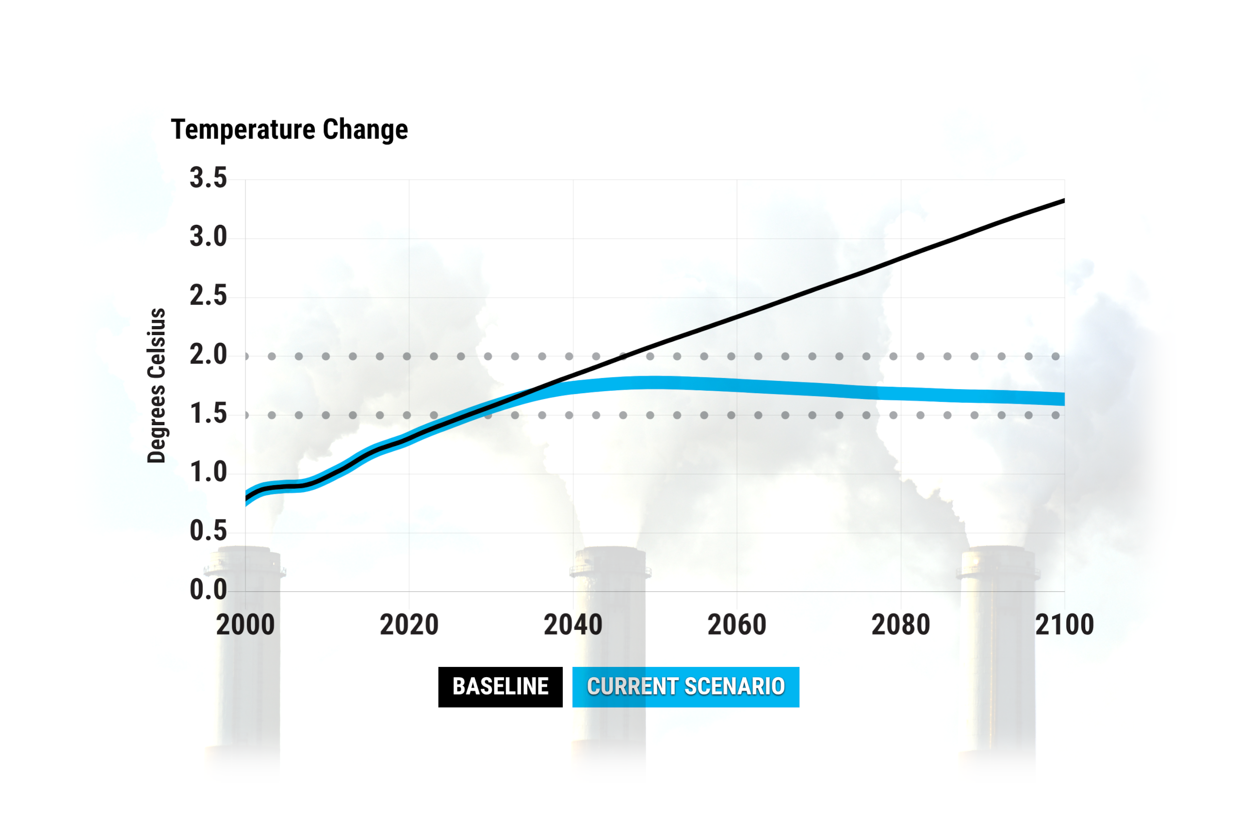
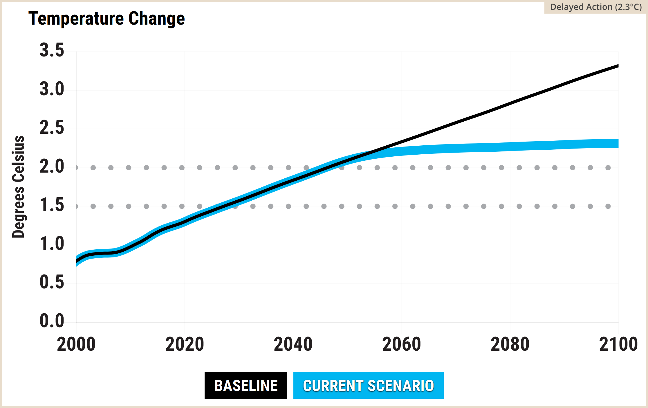
A line graph titled Temperature Change from the En-ROADS Simulator, superimposed over a faded background image of three industrial smokestacks emitting thick smoke. The vertical axis measures Degrees Celsius from 0.0 to 3.5 in increments of 0.5. The horizontal axis measures years from 2000 to 2100 in twenty-year increments. Horizontal dotted lines mark the 1.5 and 2.0 degrees Celsius thresholds. A legend centred at the bottom defines two colour-coded scenarios: Baseline in a black box and Current Scenario in a bright blue box. The black Baseline line rises steadily from approximately 0.8 degrees Celsius in the year 2000 to reach 3.3 degrees Celsius by 2100. The thick blue Current Scenario line tracks the baseline initially, peaks at approximately 1.8 degrees Celsius near 2050, and gradually declines to roughly 1.6 degrees Celsius by 2100. Source: background image Adobe Stock 95437745, foreground image Climate Interactive & MIT Sloan (2026) En-ROADS Simulator (Version 26.6.0).

Key ideas

In theory we can stabilise and reduce the global mean temperature in the 21st century via rapid decarbonisation and wise policies, to avoid a dangerous escalation of human-caused climate change. Climate Interactive & MIT Sloan’s En-ROADS Climate Solutions Simulator gives a simplified picture of some key aspects of the global decarbonisation challenge.

On En-ROADS website at this link you can move the sliders in the control panel to guide the global surface air temperature from the 3.3 deg°C in 2100 default level to something safer and more liveable. While it looks straightforward, exploring different combinations of mitigation options in En-ROADS simulator shows that it’s surprisingly difficult to stabilise the global mean temperature this century, but it’s definitely doable.

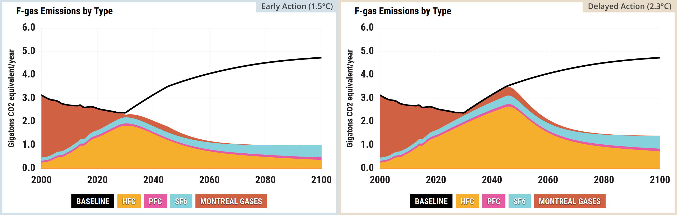
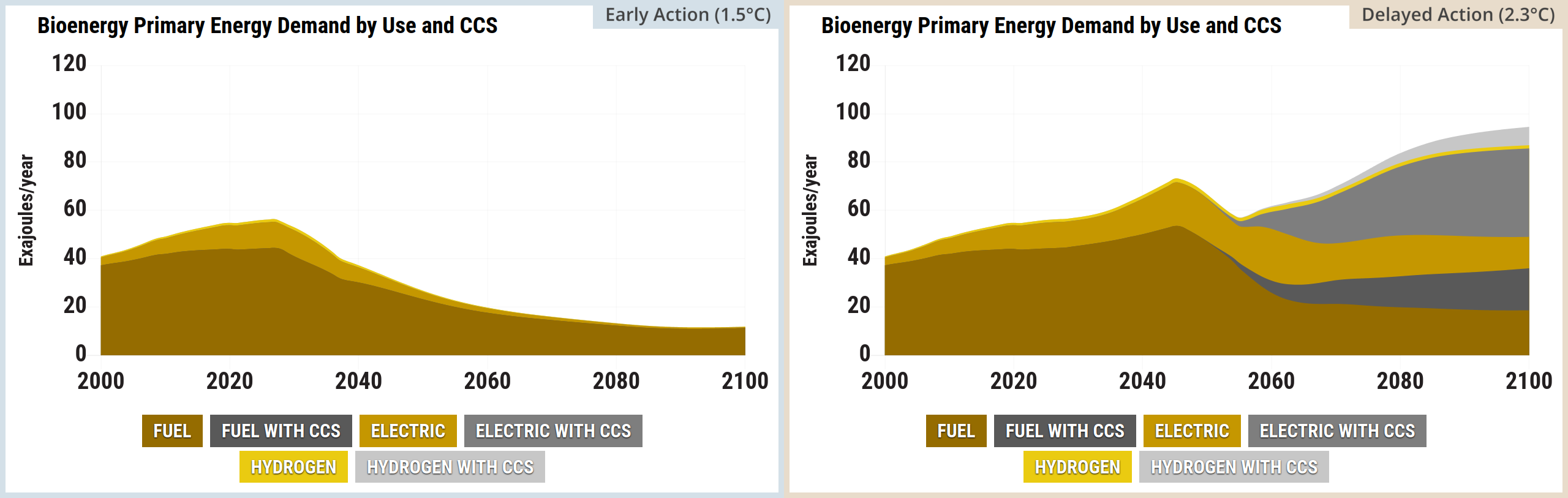
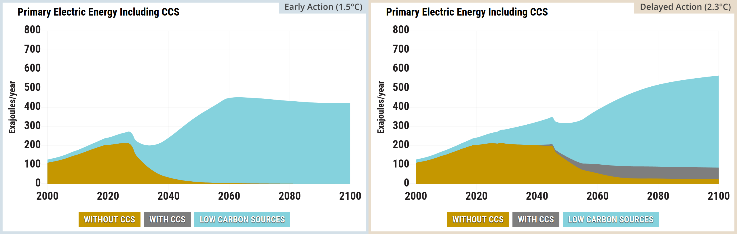
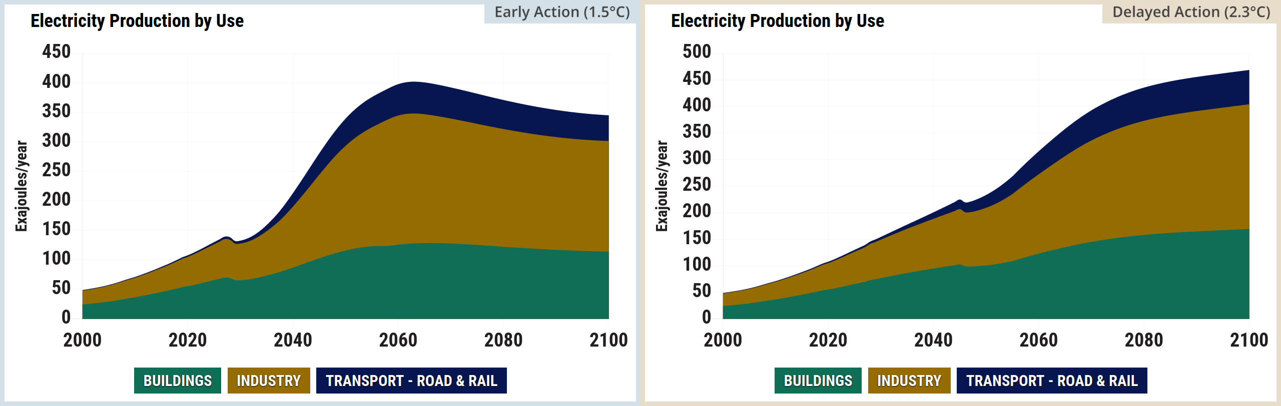
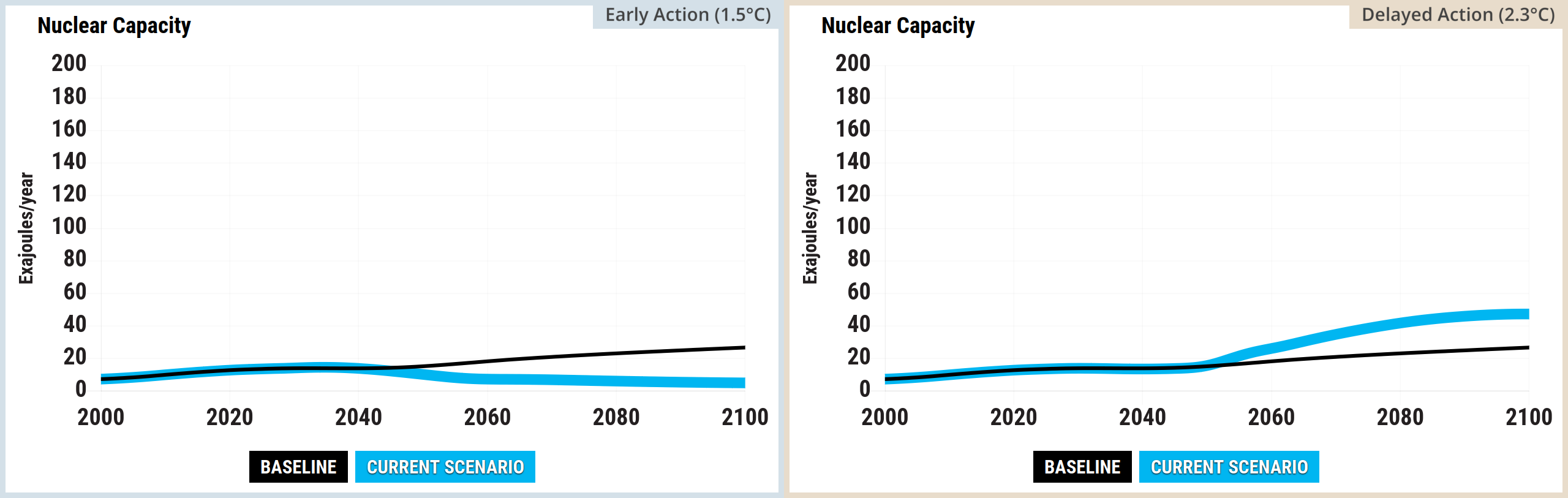
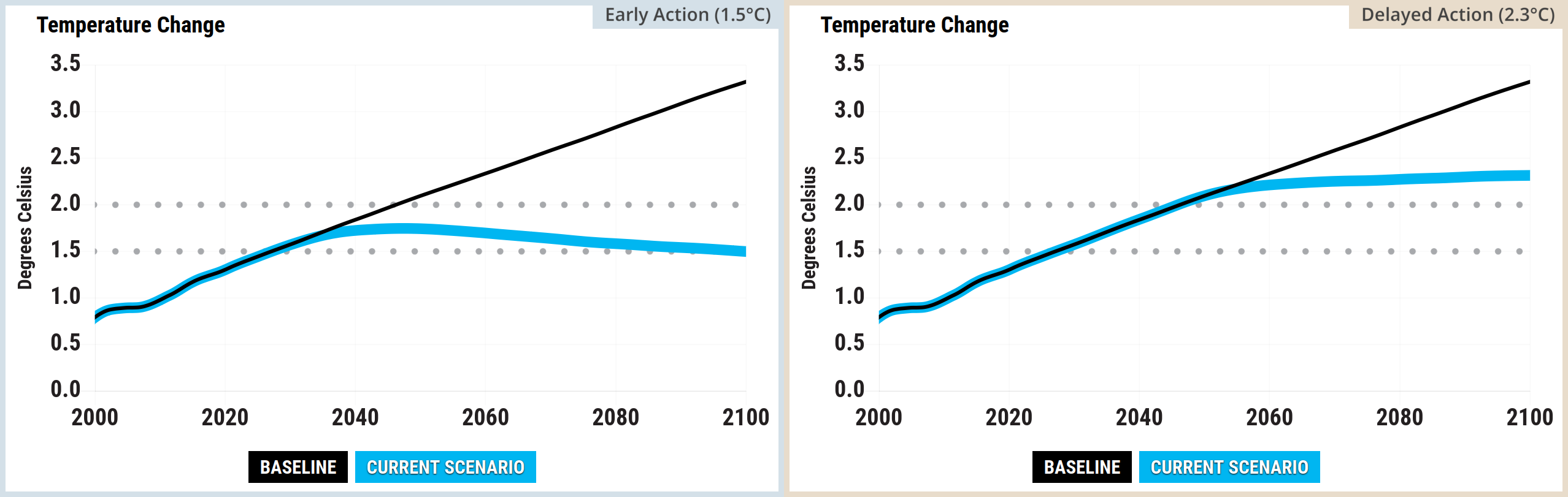
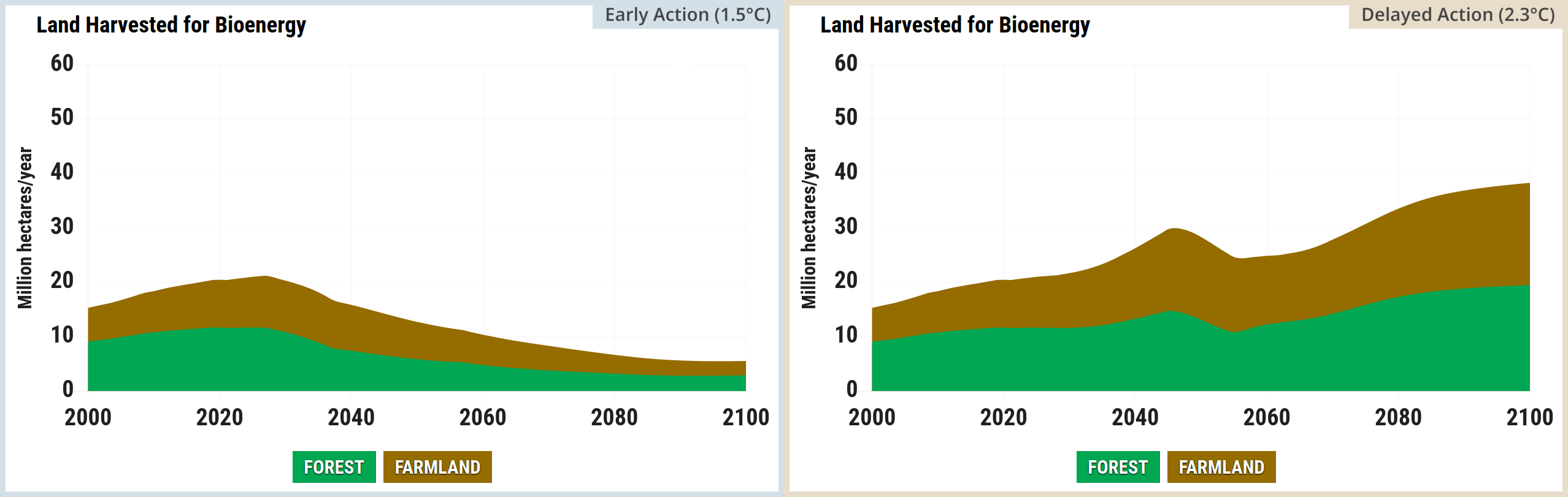
This post compares two scenarios: a more ambitious Early Action scenario resulting in 1.5°C by 2100 and a more believable Delayed Action scenario, which results in 2.3°C by 2100. Neither of these are radical scenarios in the sense that they’re both set to the status quo levels for ongoing population growth and ongoing economic growth (unless you consider that to be radical).

For the Early Action scenario, using En-ROADS default assumptions, market forces alone were apparently not sufficient to reduce the global temperature to 1.5°C by 2100. In addition to a range of the other measures, reaching 1.5°C by 2100 seemed to require the “reduction in utilization” slider in the detailed settings menus for coal, oil, and natural gas. A scenario like this can be useful to explore ideas, without being politically feasible.

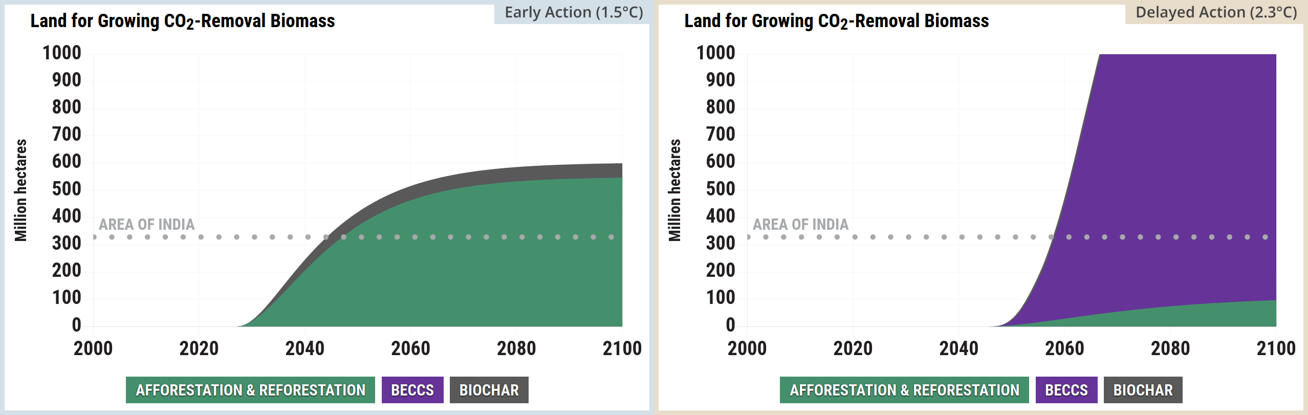
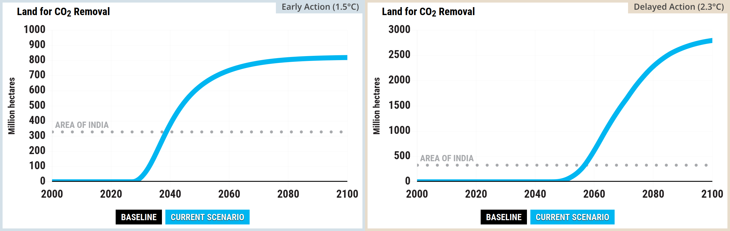
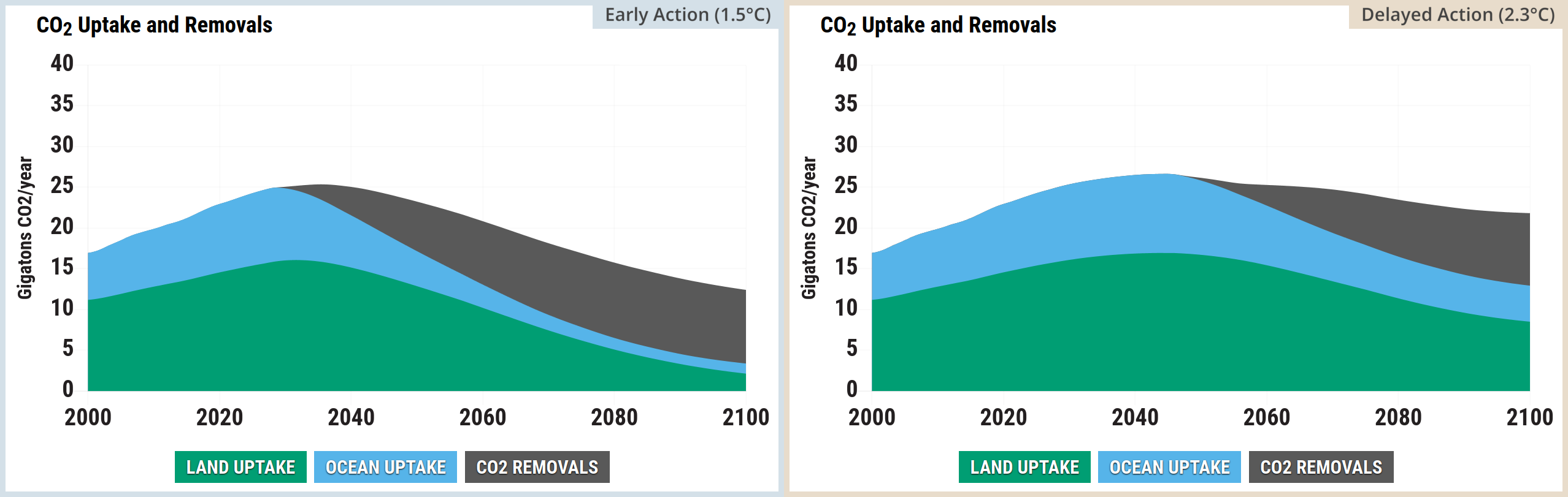
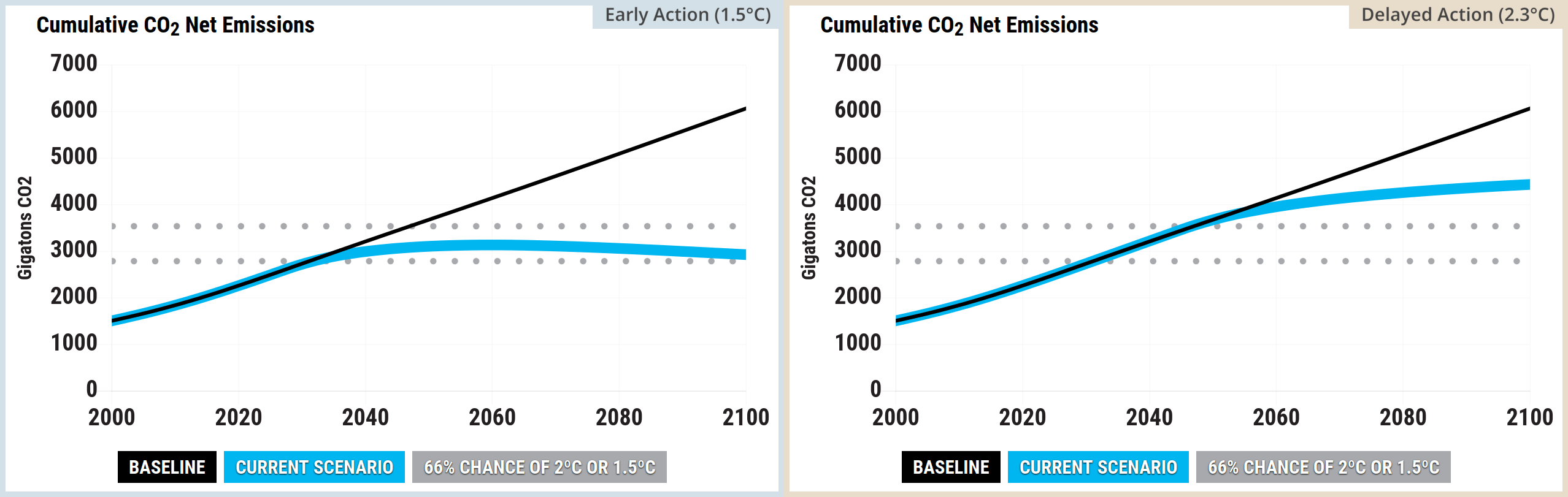
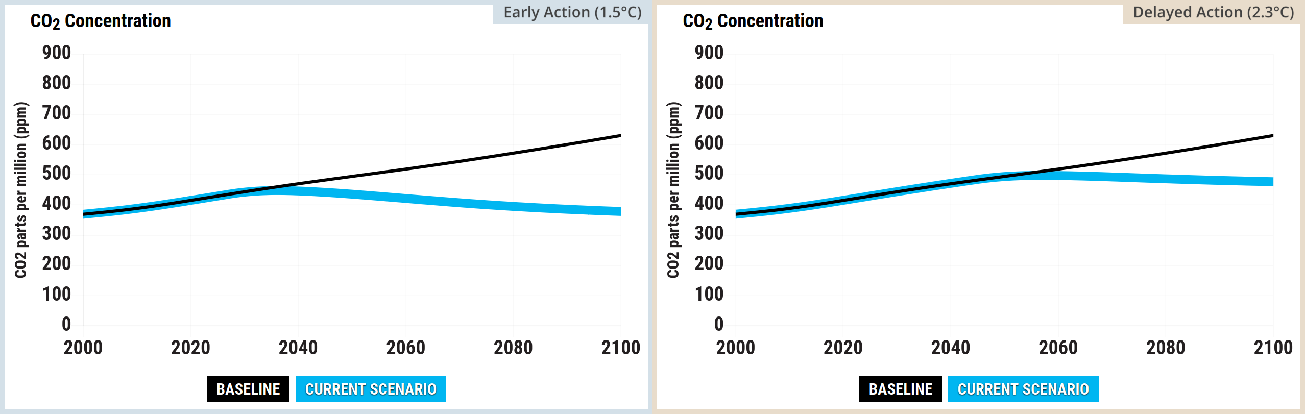
The Delayed Action scenario fails to effectively address the core problem for a couple of decades, and then belatedly introduces a high carbon price and a range of measures, steering clear of the “reduction in utilization” setting for fossil fuels. These measures are expensive, some use truly vast areas of land to capture CO2, and they don’t sufficiently counteract the overwhelming cumulative fossil fuel emissions, to reduce the atmospheric CO2 concentration fast enough to reduce the global surface air temperature. The Delayed Action scenario (2.3°C by 2100) fails to stabilise the global mean temperature by 2100, let alone meet the Paris Agreement target:

“Holding the increase in the global average temperature to well below 2°C above pre-industrial levels and pursuing efforts to limit the temperature increase to 1.5°C above pre-industrial levels”

Source: UN (2015) Paris Agreement, pg. 3

Explanations of the scientific basis of the simulations with references are available on En-ROADS Climate Solutions Simulator site and in the settings menus.

Note: this is an early version of this post. The two scenarios and the outcomes haven’t been properly explained yet.


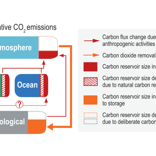
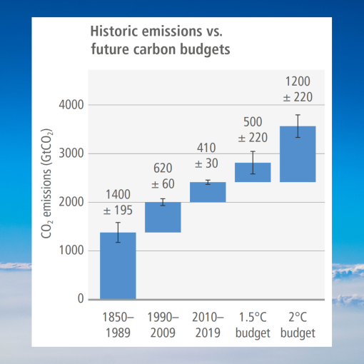
“From a physical science perspective, limiting human induced global warming to a specific level requires limiting cumulative CO2 emissions, reaching at least net zero CO2 emissions, along with strong reductions in other greenhouse gas emissions.”

Source: IPCC (2021) AR6 WGI Summary for Policymakers, D.1, pg. 27


The En-ROADS Climate Solutions Simulator makes it look easy… at first.

Climate Interactive & MIT Sloan’s En-ROADS Climate Solutions Simulator enables you to compare a wide range of potential climate solutions. It’s free and easy to use and was used to produce the En-ROADS plots below (and the early action and delayed action labels were added with free GIMP software).


An early action scenario: 1.5°C by 2100


This section explores a single En-ROADS scenario 1.5°C by 2100. You can modify the scenario by moving the sliders on the En-ROADS Simulator settings at the link

  • This is just one scenario out of a huge number of possibilities
  • All of the En-ROADS plots and images below labelled “Early Action (1.5°C)” use the same settings
  • Detailed settings are accessed on their website by clicking the vertical ellipsis symbol in En-ROADS settings: ⋮
  • Some detailed settings were modified, and these are summarised in the Actions and Outcomes screenshot at the end of this section
  • The default assumptions were left unchanged
  • Version 26.8.0 of Climate Interactive & MIT Sloan (2026) En-ROADS Simulator was used

For this scenario:

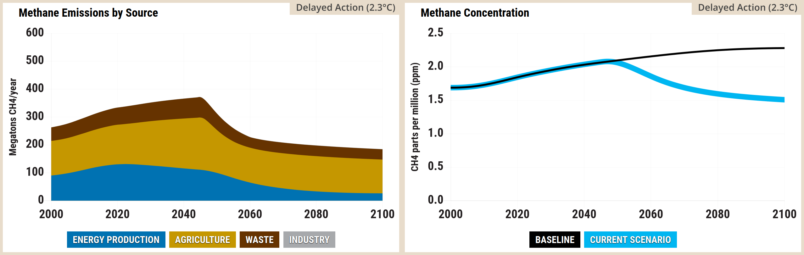
  • CH4 concentration peaks in 2030
  • Atmospheric GHG concentration peaks in 2036 and atmospheric CO2 concentration also peaks in 2036
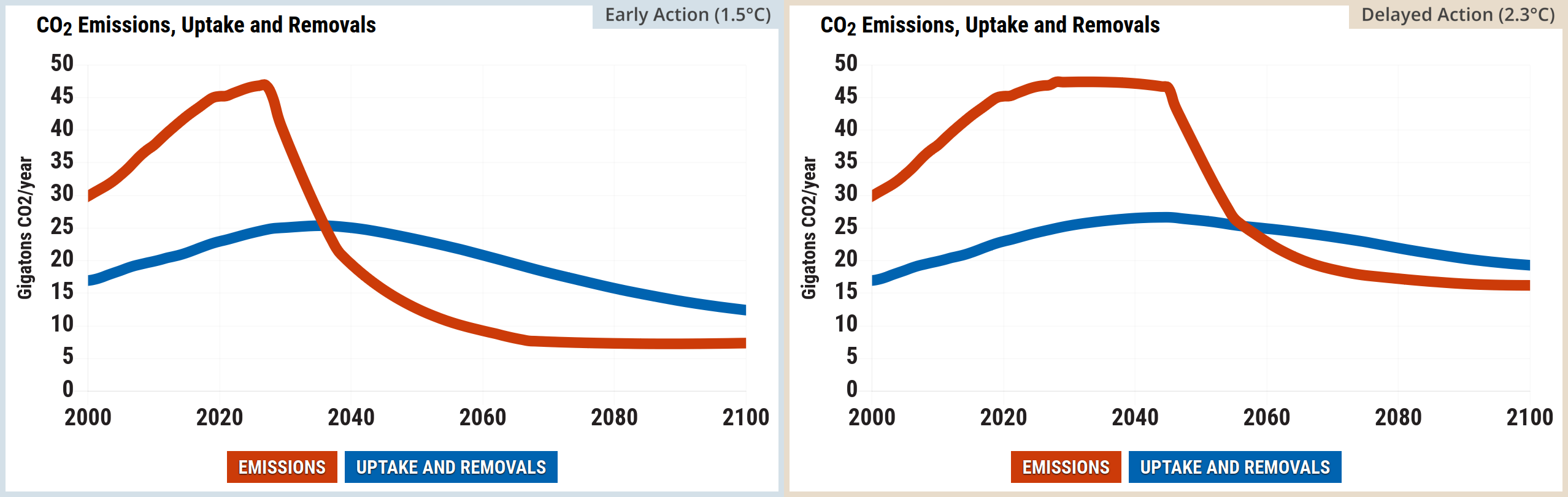
  • Net GHG emissions (anthropogenic) reach zero in 2083 and net CO2 emissions (anthropogenic) reach zero in 2060
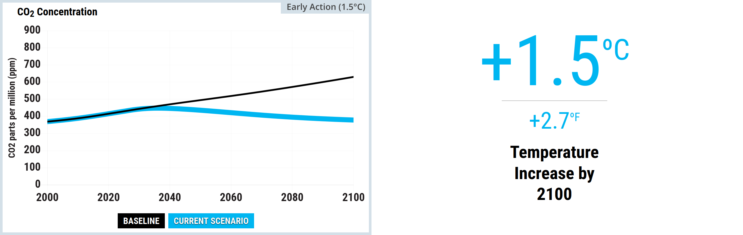
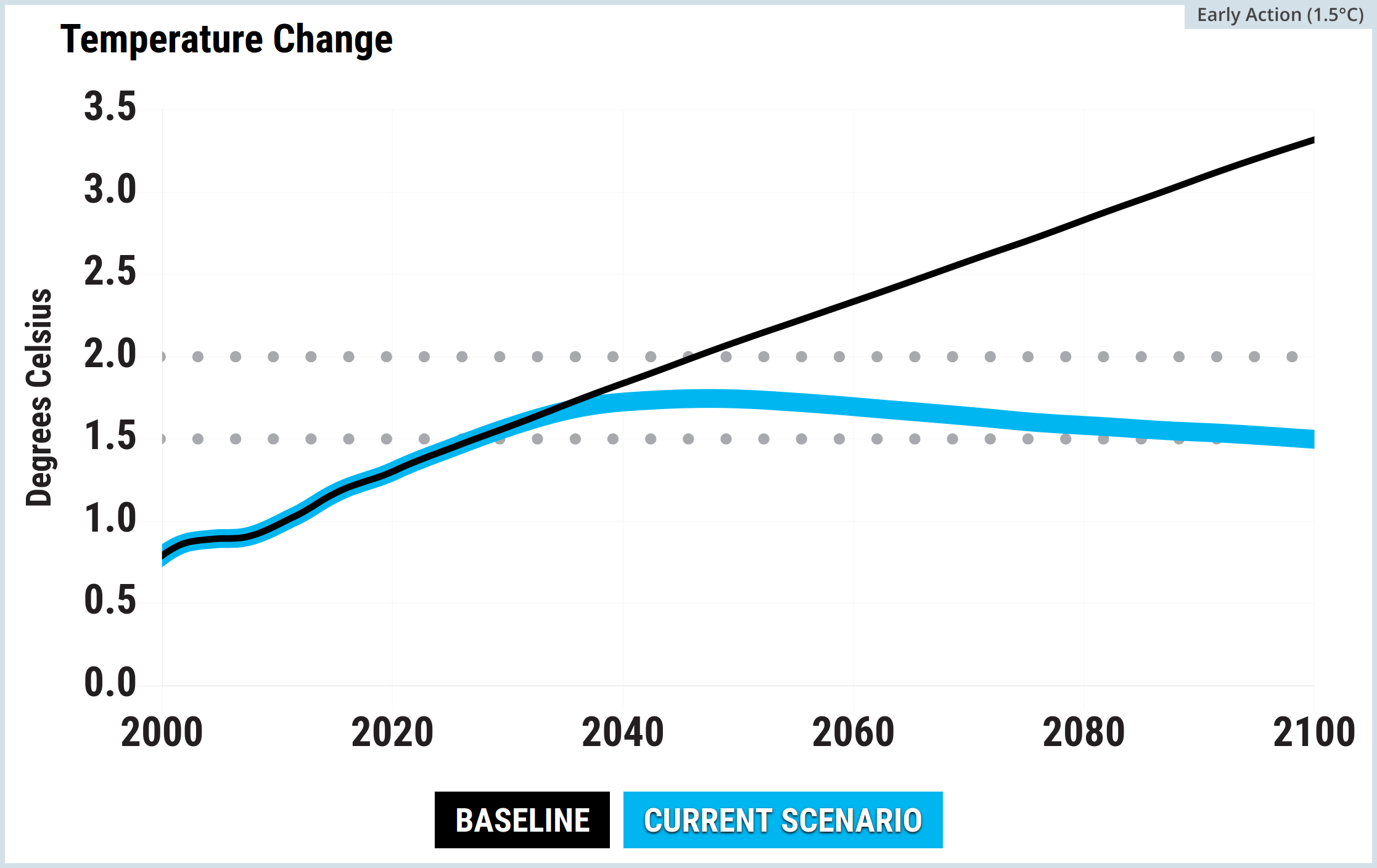
  • The global surface air temperature (GSAT) peaks in 2047 at 1.75°C, reducing to 1.50°C by 2100
  • The temperature peak (in 2047) lags the CO2 concentration peak (in 2036) by eleven years

Net-zero CO2 emissions: “Condition in which anthropogenic carbon dioxide (CO2) emissions are balanced by anthropogenic CO2 removals over a specified period.”

Source: IPCC (2022) AR6 WGIII Annex I, Glossary, pg. 1809
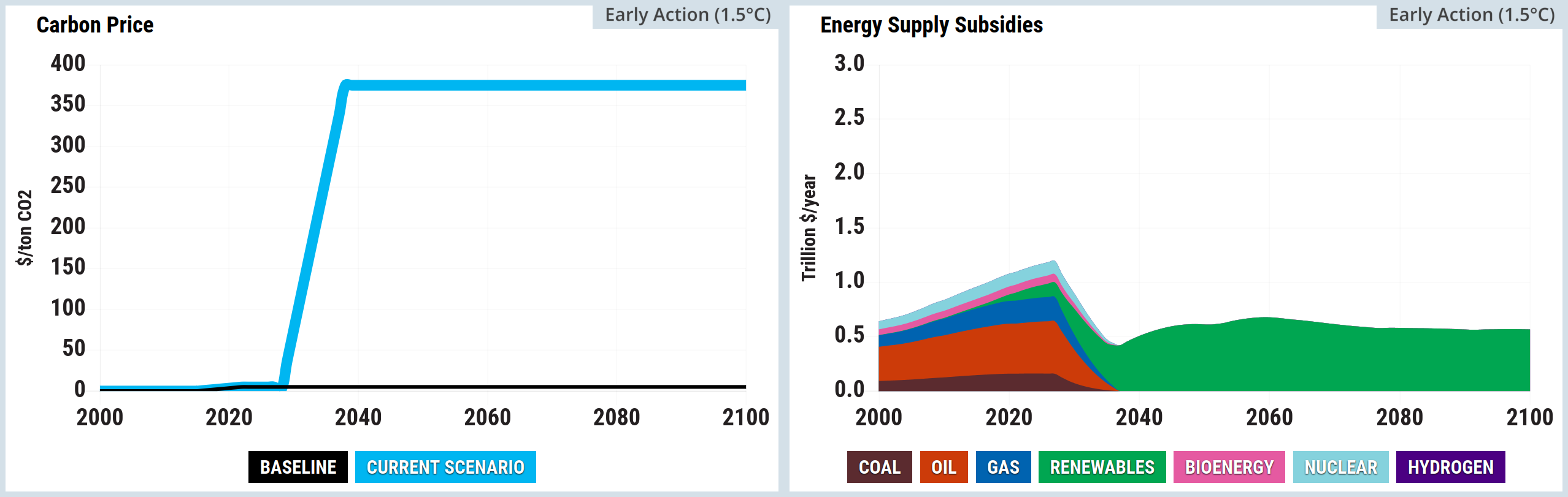

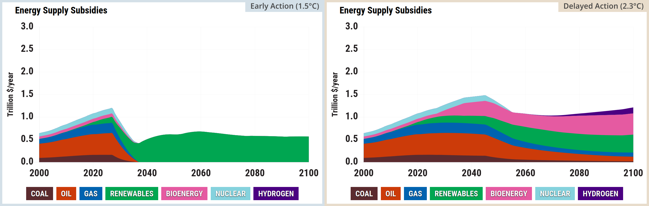
Screenshot of two side-by-side graphs from the En-ROADS simulator. The left graph, titled Carbon Price, is a line chart measuring dollars per ton of carbon dioxide from 2000 to 2100. The baseline remains flat at zero, whilst the current scenario rises steeply from the mid-2020s to plateau at approximately 200 dollars per ton before 2040, remaining constant until 2100. The right graph, titled Energy Supply Subsidies, is a stacked area chart measuring trillion dollars per year from 2000 to 2100. It illustrates subsidies for coal, oil, and gas peaking in the mid-2020s before dropping entirely to zero by the late 2030s. Concurrently, subsidies for renewables grow rapidly to dominate the energy supply, peaking near 1.6 trillion dollars per year around 2050 before slowly tapering towards 2100. Subsidies for bioenergy, nuclear, and hydrogen form a negligible portion of the overall chart.
Source: Climate Interactive & MIT Sloan (2026) En-ROADS Simulator (Version 26.8.0)
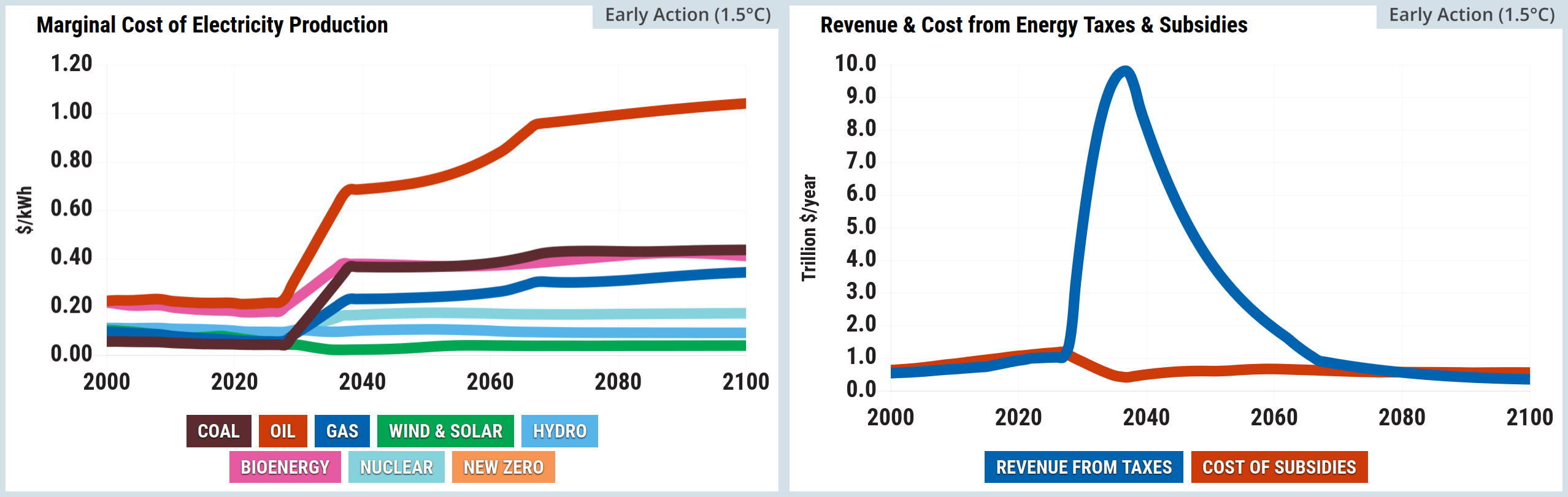
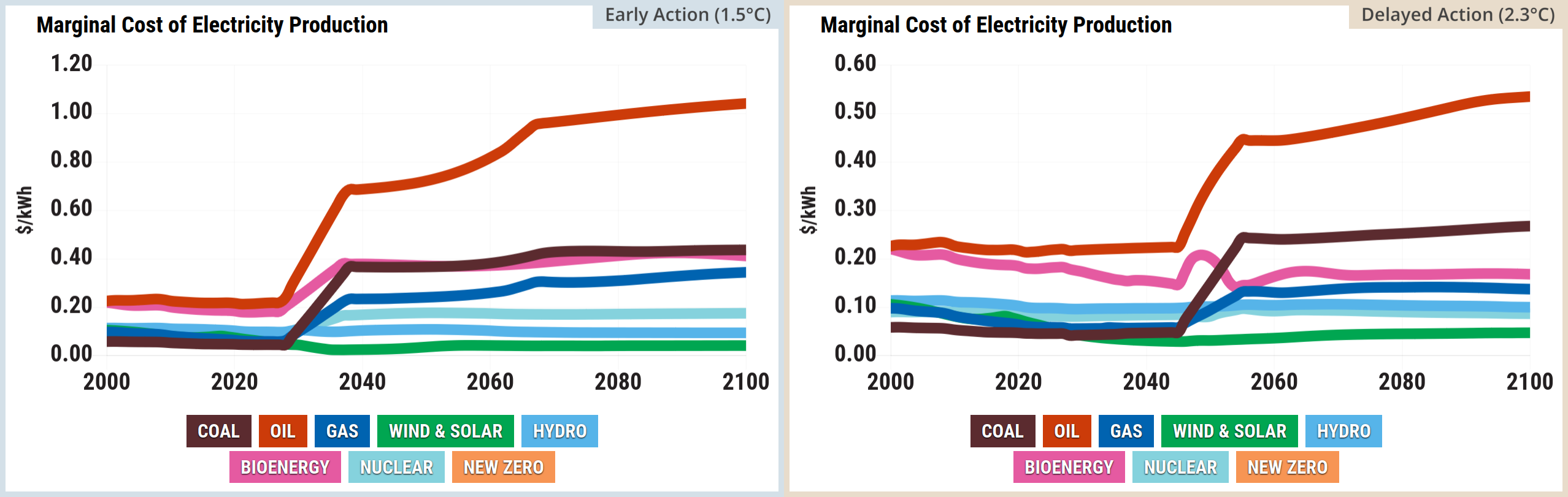
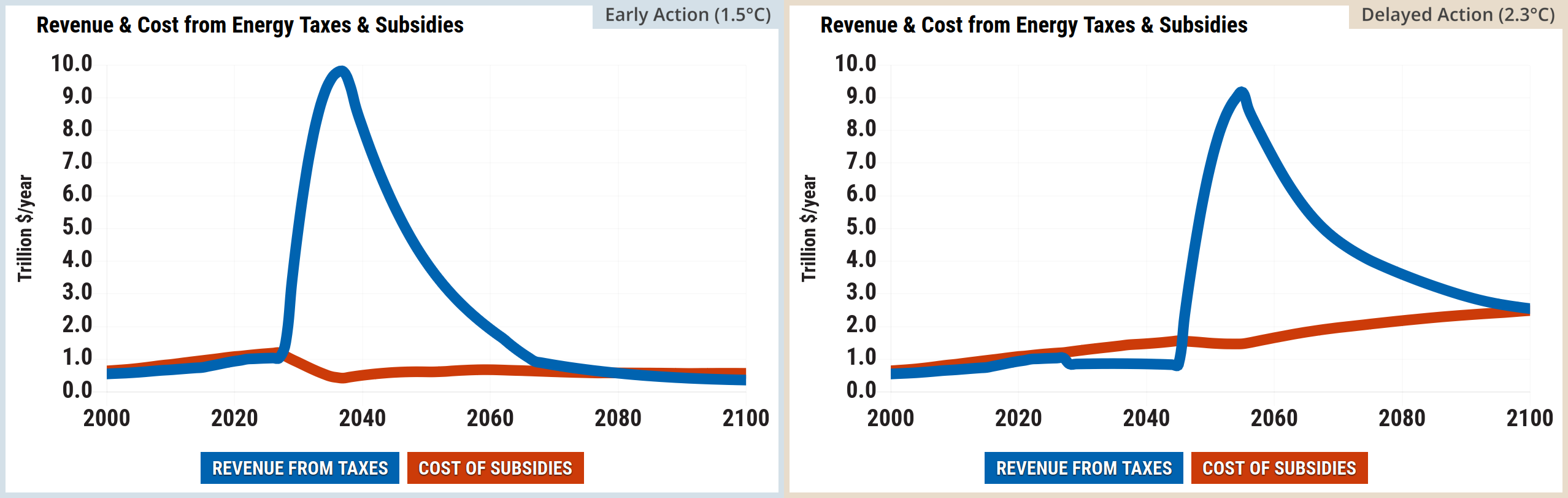
Screenshot of two side-by-side graphs from the En-ROADS simulator. The left graph, titled Marginal Cost of Electricity Production, is a line chart measuring dollars per kilowatt-hour from 2000 to 2100. Following the mid-2020s, the marginal cost of fossil fuels spikes sharply. Oil rises from roughly 0.20 to over 0.60 dollars by 2100. Coal and gas also show sharp increases before plateauing. Conversely, the cost of wind and solar drops significantly around the 2030s to become the cheapest energy source before stabilising at a very low cost. Bioenergy, nuclear, and hydro remain relatively stable or see only moderate increases. The right graph, titled Revenue and Cost from Energy Taxes and Subsidies, is a line chart measuring trillion dollars per year from 2000 to 2100. Revenue from taxes spikes dramatically from the mid-2020s, peaking at nearly 9.5 trillion dollars per year just before 2040, before steadily declining to around 2.0 trillion dollars by 2100. Meanwhile, the cost of subsidies remains relatively flat, hovering around 1.0 trillion dollars per year throughout the century.
Source: Climate Interactive & MIT Sloan (2026) En-ROADS Simulator (Version 26.8.0)

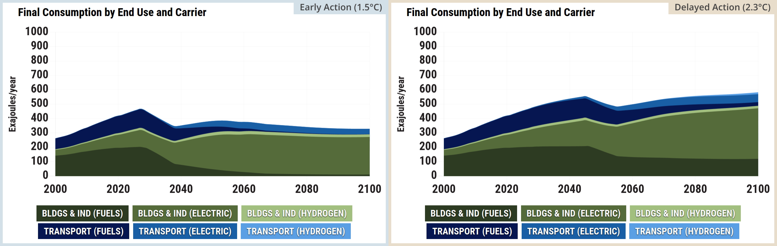
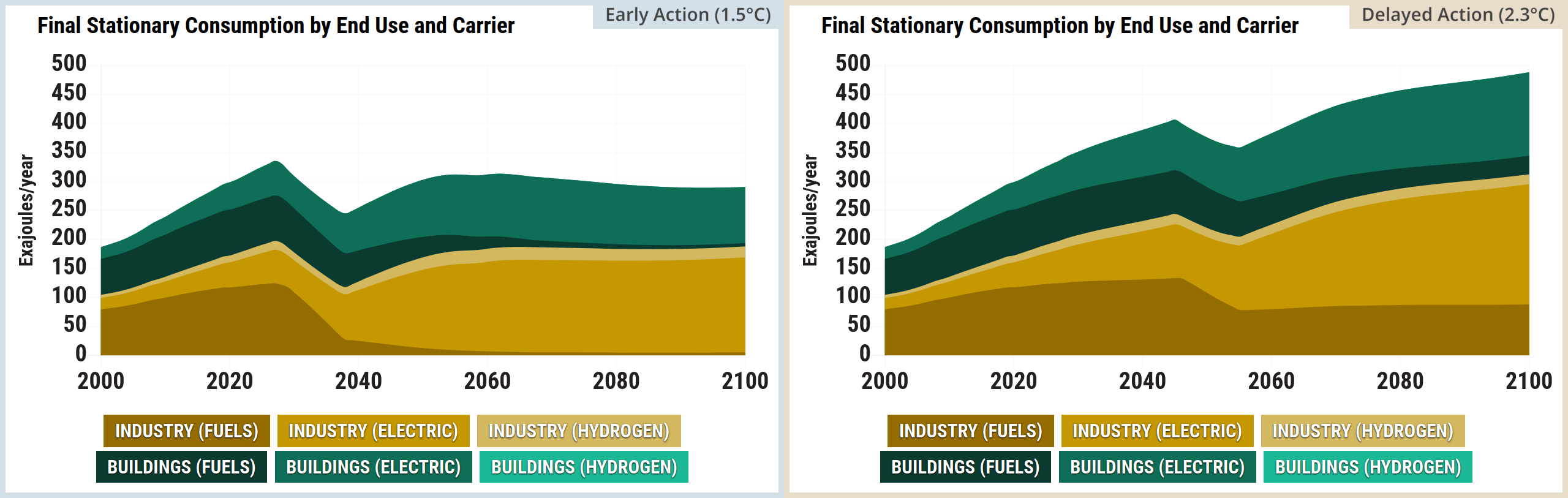
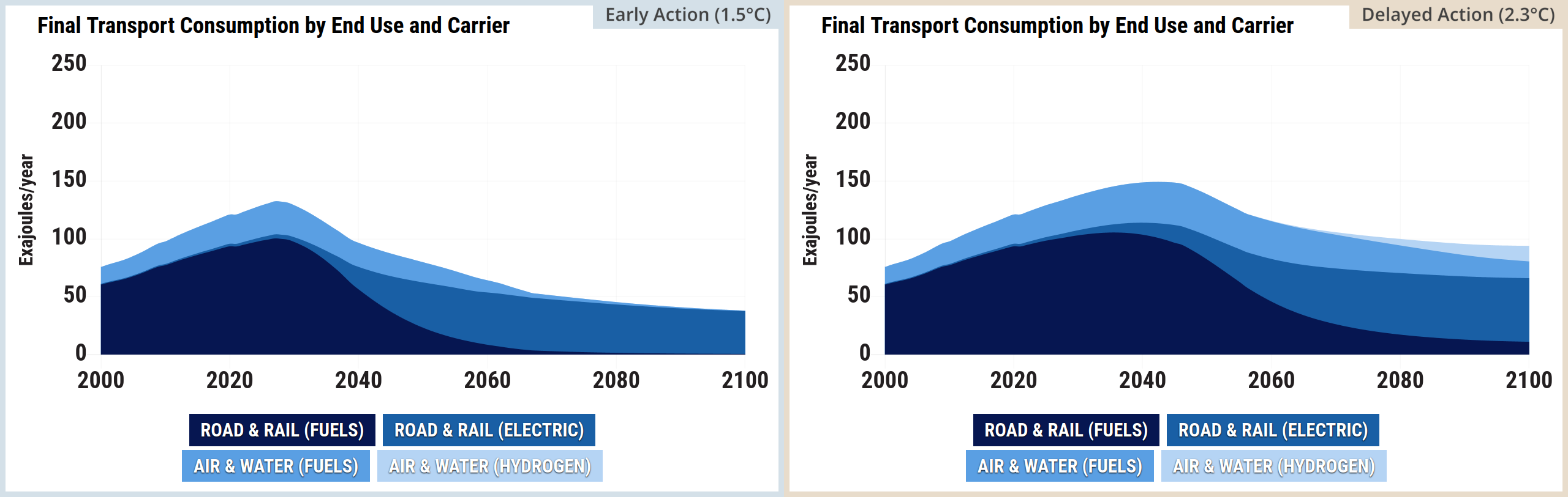
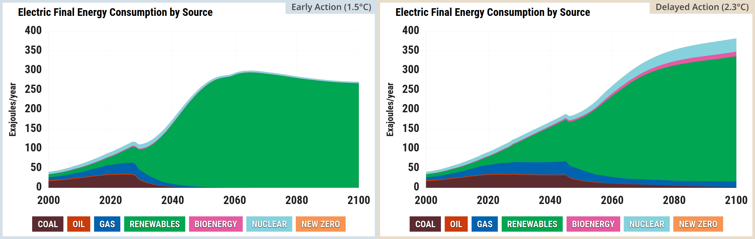
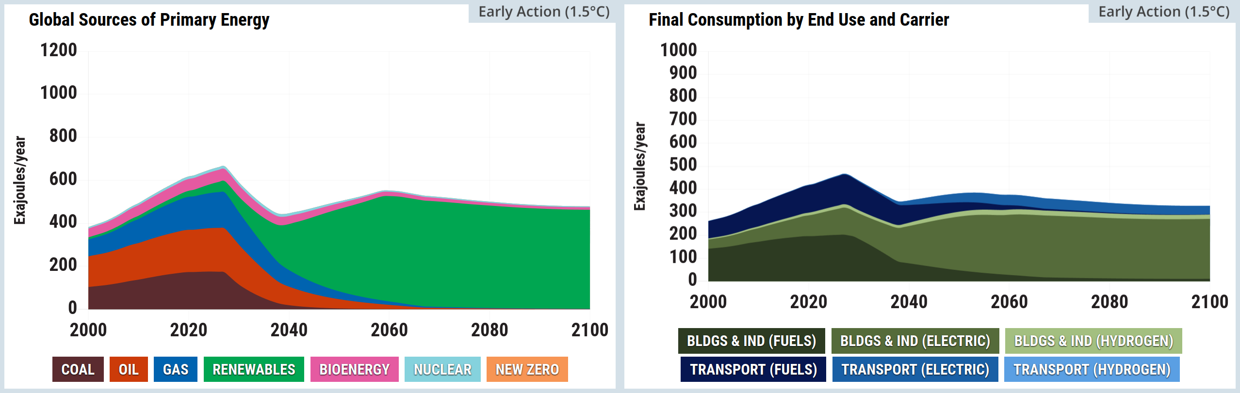
Screenshot of two side-by-side graphs from the En-ROADS simulator. The left graph, titled Global Sources of Primary Energy, is a stacked area chart measuring Exajoules per year from 2000 to 2100. It shows total primary energy peaking in the 2020s before slightly dipping and stabilising. Coal, oil, and gas decline sharply after the 2020s, whilst renewables expand dramatically to become the overwhelmingly dominant energy source by 2100. Bioenergy and nuclear maintain small, consistent shares, and new zero energy is virtually invisible. The right graph, titled Final Consumption by End Use and Carrier, is a stacked area chart measuring Exajoules per year from 2000 to 2100. It shows a clear transition towards electrification. Direct fuel consumption for buildings and industry, as well as transport, shrinks significantly after 2030. In their place, electricity consumption for both buildings and industry, and transport, grows substantially to dominate end use by 2100. Hydrogen consumption for both sectors remains negligible.
Source: Climate Interactive & MIT Sloan (2026) En-ROADS Simulator (Version 26.8.0)

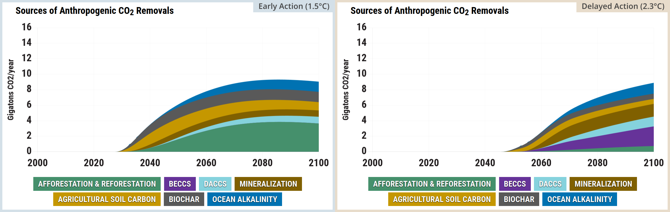
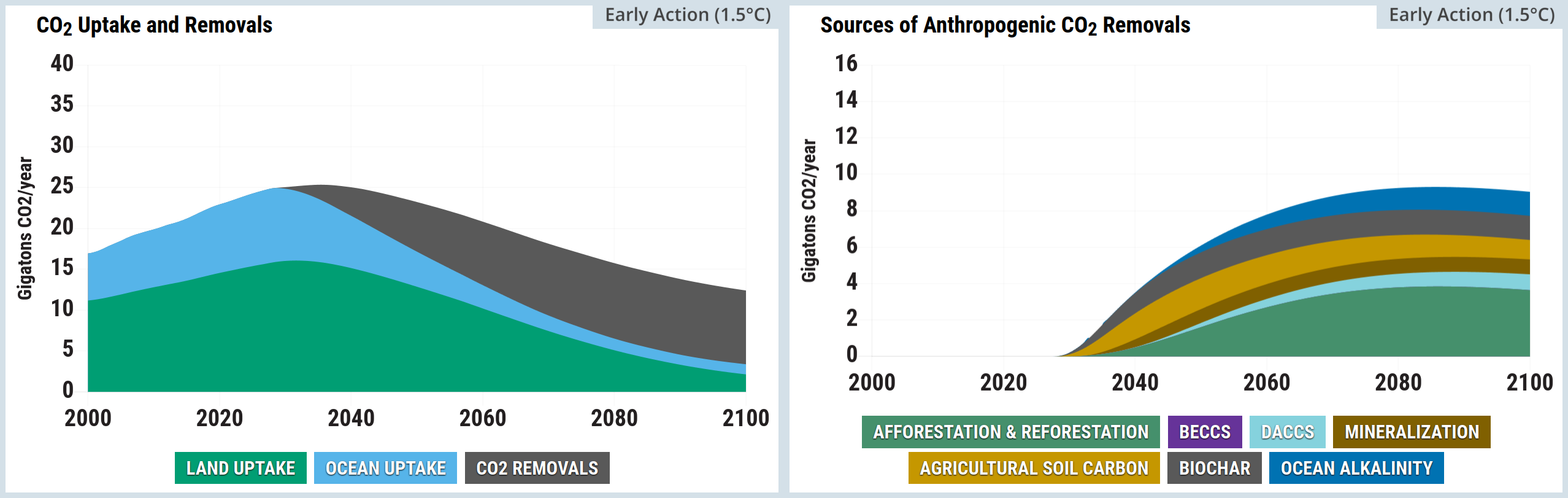
A two-panel stacked area chart from the En-ROADS Simulator.  The left panel is titled CO2 Uptake and Removals. The vertical axis measures Gigatonnes of CO2 per year from 0 to 40, and the horizontal axis spans the years 2000 to 2100. Three colour-coded categories are stacked: Land Uptake in green, Ocean Uptake in light blue, and CO2 Removals in grey. Both Land and Ocean uptake grow initially, peaking around 2030 at roughly 16 and 9 gigatonnes respectively, before steadily declining towards the year 2100. Conversely, the grey CO2 Removals area emerges at zero around 2030 and steadily expands to approximately 10 gigatonnes by 2100, offsetting the natural sink declines.  The right panel is titled Sources of Anthropogenic CO2 Removals, breaking down the grey removals area from the first chart in greater detail. The vertical axis measures Gigatonnes of CO2 per year on a smaller scale from 0 to 16, while the horizontal axis again spans the years 2000 to 2100. Seven categories are stacked, all remaining at zero until roughly 2030, after which they collectively grow to a combined total of nearly 10 gigatonnes by 2100. From bottom to top, these layers are: Afforestation and Reforestation in green, which forms the largest continuous share; followed by narrower bands of BECCS in purple, DACCS in light blue, Mineralisation in brown, Agricultural Soil Carbon in yellow, Biochar in dark grey, and Ocean Alkalinity in dark blue.
Source: Climate Interactive & MIT Sloan (2026) En-ROADS Simulator (Version 26.8.0)

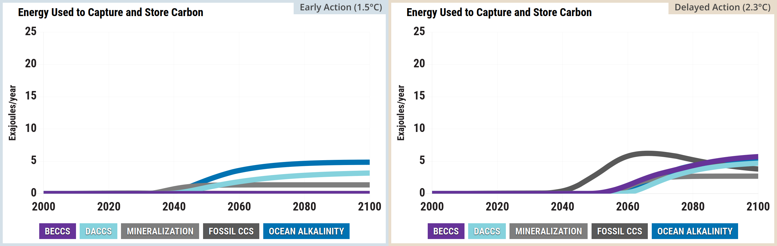
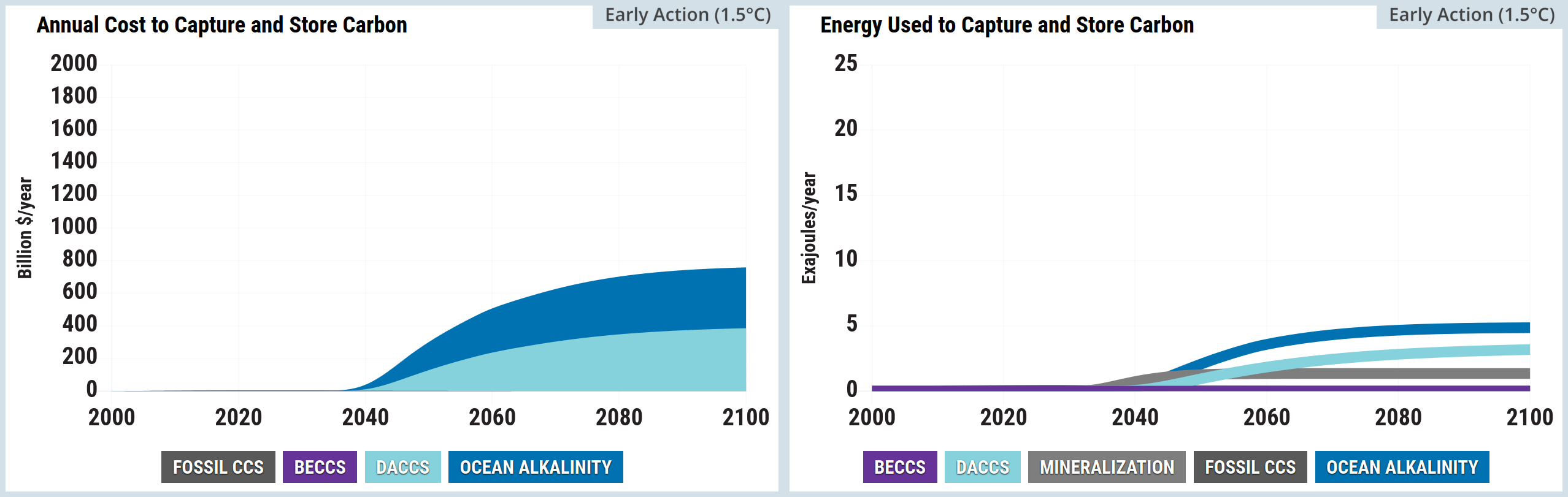
A two-panel stacked area chart from the En-ROADS Simulator. The left panel is titled Annual Cost to Capture and Store Carbon. The vertical axis measures Billion dollars per year from 0 to 2000, and the horizontal axis spans the years 2000 to 2100. Four colour-coded categories are stacked from bottom to top: Fossil CCS in dark grey, BECCS in purple, DACCS in light blue, and Ocean Alkalinity in dark blue. Costs remain at zero until approximately 2035, after which they rise rapidly before levelling off around 2080. By 2100, the total annual cost reaches over 1100 billion dollars, dominated primarily by the wide light blue DACCS and dark blue Ocean Alkalinity bands, while the dark grey and purple bands remain relatively thin near the baseline.  The right panel is titled Energy Used to Capture and Store Carbon. The vertical axis measures Exajoules per year from 0 to 25, and the horizontal axis spans the years 2000 to 2100. Five categories are stacked, again remaining at zero until roughly 2035, after which they grow to a combined total of approximately 6 exajoules per year by 2100. From bottom to top, these layers are: BECCS in purple, Fossil CCS in dark grey, Mineralisation in grey, DACCS in light blue, and Ocean Alkalinity in dark blue. The dark grey Fossil CCS layer peaks mid-century before narrowing, while the light blue DACCS layer expands to form the largest continuous share of energy used by the end of the century.
Source: Climate Interactive & MIT Sloan (2026) En-ROADS Simulator (Version 26.8.0)

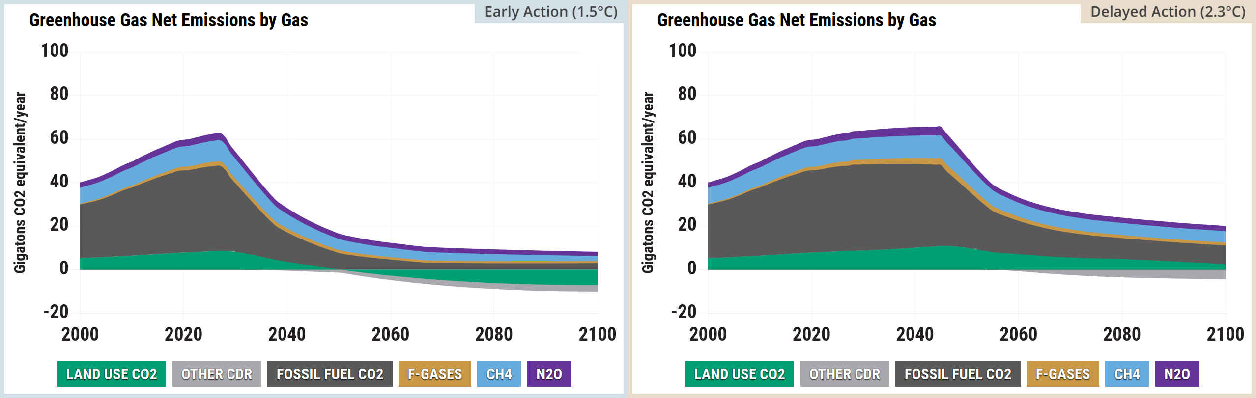
Screenshot of two side-by-side graphs from the En-ROADS simulator. The left graph, titled Greenhouse Gas Net Emissions by Gas, is a stacked area chart measuring gigatons of CO2 equivalent per year from 2000 to 2100. Total net emissions rise from approximately 40 in 2000 to peak just above 60 in the late 2020s, before falling sharply. Fossil Fuel CO2 constitutes the largest share but shrinks significantly after the peak. Land Use CO2 begins positive but drops below the zero line around 2060 to become a net removal, joining Other CDR. CH4, N2O, and a very thin band of F-Gases sit on top of the stack, shrinking slightly over the century. By 2100, the remaining positive emissions are heavily offset by the negative emissions. The right graph, titled Greenhouse Gas Concentration, is a line chart measuring CO2 equivalent parts per million from 2000 to 2100. The baseline scenario rises steadily from roughly 380 in 2000 to over 800 parts per million by 2100. The current scenario tracks the baseline until the early 2030s, peaking just over 500 parts per million near 2040, before gradually declining to roughly 450 parts per million by the end of the century.
Source: Climate Interactive & MIT Sloan (2026) En-ROADS Simulator (Version 26.8.0)

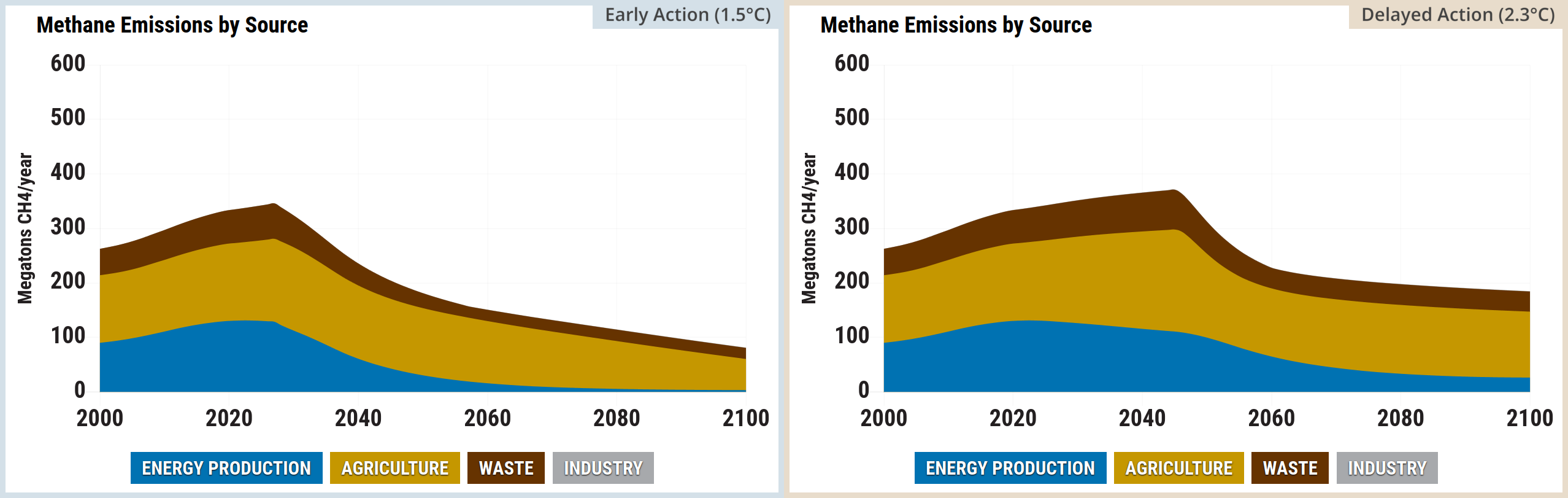
Screenshot of two side-by-side graphs from the En-ROADS simulator. The left graph, titled Methane Emissions by Source, is a stacked area chart measuring megatons of CH4 per year from 2000 to 2100. Total emissions rise from approximately 260 in 2000 to a peak of roughly 340 megatons per year in the late 2020s, before steadily declining to about 160 by 2100. This overall decline is driven by significant reductions in emissions from energy production, and waste, whilst industry remains negligible throughout. The right graph, titled Methane Concentration, is a line chart measuring CH4 parts per million from 2000 to 2100. Both the baseline and current scenario lines track together from roughly 1.7 in 2000, rising to nearly 2.0 parts per million by 2030. After 2030, the baseline trajectory continues to rise slowly to approximately 2.3 by 2100, whilst the current scenario diverges, dropping steadily to approximately 1.4 parts per million by the end of the century.
Source: Climate Interactive & MIT Sloan (2026) En-ROADS Simulator (Version 26.8.0)

A two-panel line graph from the En-ROADS Simulator. The left panel is titled CO2 Emissions per Capita. The vertical axis measures Tonnes of CO2 per year per person from negative 1 to 8, and the horizontal axis spans the years 2000 to 2100. A legend defines two scenarios: Baseline in a black box and Current Scenario in a light blue box. The thin black Baseline line starts near 5 in the year 2000, peaks just below 6 around 2020, and slowly drops to stabilise just below 5 through to 2100. The thick light blue Current Scenario line tracks the baseline until approximately 2025, after which it drops steeply, crossing the zero line into negative per capita emissions shortly after 2080 and ending slightly below zero by 2100.  The right panel is titled CO2 Emissions, Uptake and Removals. The vertical axis measures Gigatonnes of CO2 per year from 0 to 50, and the horizontal axis spans the years 2000 to 2100. A legend defines two metrics: Emissions in a red box and Uptake and Removals in a dark blue box. The thick red Emissions line rises steeply from 30 in 2000 to a sharp peak near 47 around 2025, before falling dramatically and levelling out around 12 gigatonnes by the 2080s. The thick dark blue Uptake and Removals line rises gradually from roughly 17 in 2000, crossing the falling red emissions line around the year 2040 at approximately 26 gigatonnes, before gently declining to around 16 gigatonnes by 2100.
Source: Climate Interactive & MIT Sloan (2026) En-ROADS Simulator (Version 26.8.0)

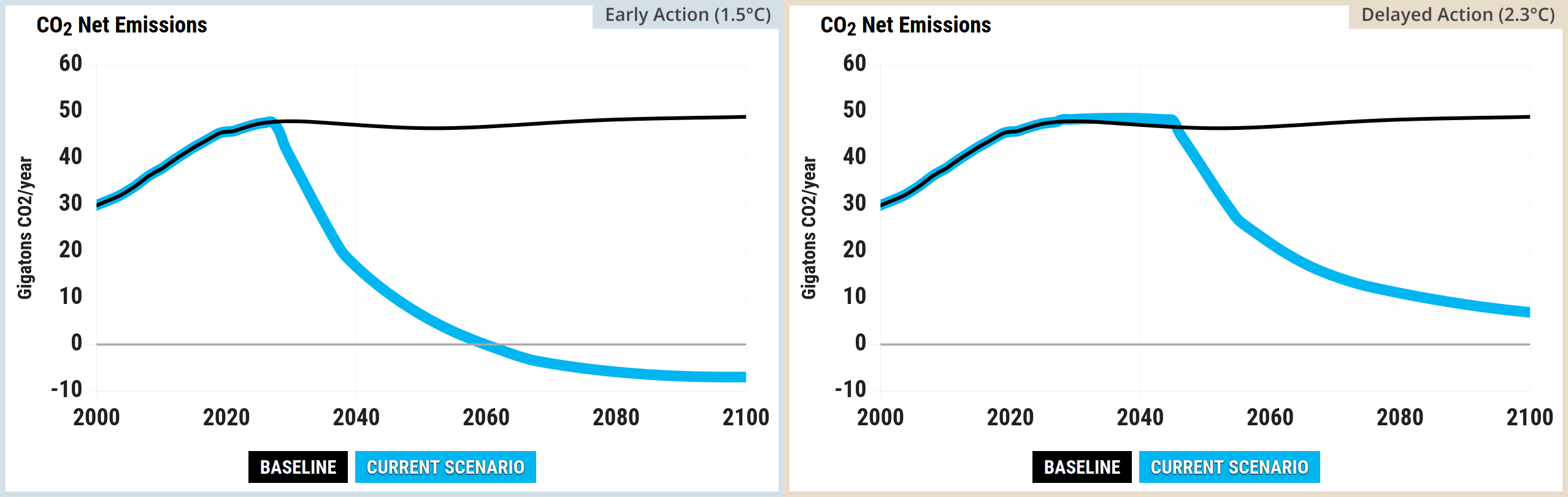
A two-panel line graph from the En-ROADS Simulator.  The left panel is titled CO2 Net Emissions. The vertical axis measures Gigatonnes of CO2 per year from negative 10 to 60, with a solid grey horizontal line indicating the zero baseline. The horizontal axis spans the years 2000 to 2100. A legend defines two scenarios: Baseline in a black box and Current Scenario in a light blue box. The thin black Baseline line starts near 30 in the year 2000, rises to peak near 48 around 2030, and remains high and relatively flat through to 2100. The thick light blue Current Scenario line tracks the baseline until approximately 2025, after which it drops steeply, crossing the zero line to achieve net-negative emissions just before 2080 and ending slightly below zero by 2100.  The right panel is titled Cumulative CO2 Net Emissions. The vertical axis measures Gigatonnes of CO2 from 0 to 7000, and the horizontal axis spans the years 2000 to 2100. The legend includes an additional metric: 66 percent chance of 2 degrees Celsius or 1.5 degrees Celsius in a grey box, which corresponds to two horizontal dotted grey lines crossing the chart between roughly 2800 and 3500 gigatonnes. The thin black Baseline line rises steadily and continuously from approximately 1500 in 2000 to reach 6000 gigatonnes by 2100, climbing far past both dotted target boundaries. In contrast, the thick light blue Current Scenario line tracks the baseline initially but begins to curve and flatten out after 2030, ultimately stabilising just below 3500 gigatonnes by 2100, successfully keeping cumulative emissions beneath the upper dotted grey target line.
Source: Climate Interactive & MIT Sloan (2026) En-ROADS Simulator (Version 26.8.0)

A two-part graphic from the En-ROADS Simulator.  The left panel is a line graph titled CO2 Concentration. The vertical axis measures CO2 parts per million, or ppm, from 0 to 900 in increments of 100. The horizontal axis spans the years 2000 to 2100 in twenty-year increments. A legend at the bottom defines two scenarios: Baseline in a black box and Current Scenario in a light blue box. The thin black Baseline line starts near 380 ppm in the year 2000 and rises steadily and continuously, reaching over 600 ppm by 2100. The thick light blue Current Scenario line tracks the baseline initially, peaks at approximately 450 ppm just before 2040, and then gradually declines to finish at 400 ppm by 2100.  The right panel is a typographic display highlighting the resulting Temperature Increase by 2100. It features large, light blue text reading plus 1.7 degrees Celsius, situated above a thin horizontal grey separator line. Immediately below this line, smaller light blue text reads plus 3.1 degrees Fahrenheit. Underneath the temperature values, black text confirms these represent the Temperature Increase by 2100.
Source: Climate Interactive & MIT Sloan (2026) En-ROADS Simulator (Version 26.8.0)

Screenshot of a line graph from the En-ROADS simulator titled Temperature Change, measuring Degrees Celsius from 2000 to 2100. The chart includes dotted horizontal reference lines at 1.5 and 2.0 degrees. Both the baseline and current scenario lines begin at roughly 0.8 degrees in 2000 and track together until the early 2030s. From there, the baseline trajectory continues to rise steadily, reaching approximately 3.3 degrees Celsius by 2100. Conversely, the current scenario diverges, plateauing at approximately 1.8 degrees mid-century before slowly declining to roughly 1.7 degrees Celsius by 2100, remaining well below the 2.0 degree threshold.
Source: Climate Interactive & MIT Sloan (2026) En-ROADS Simulator (Version 26.8.0)

Kaya graphs

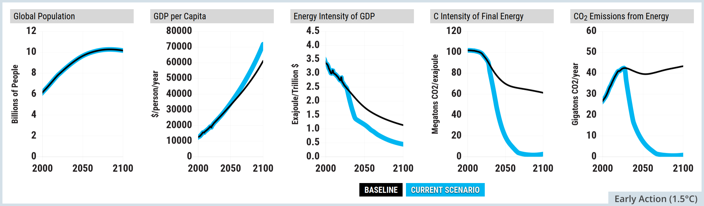
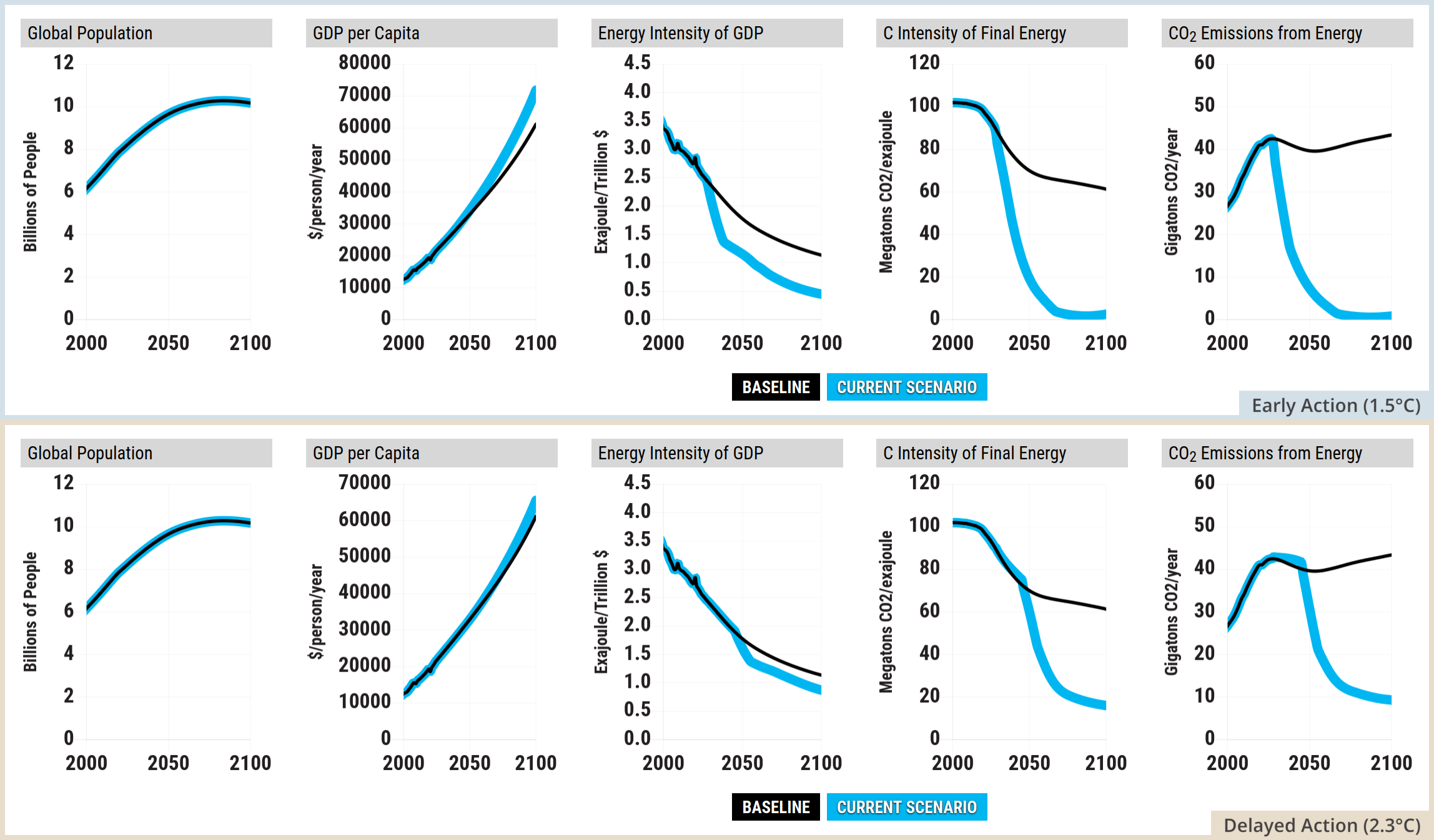
A five-panel line graph from the En-ROADS Simulator, displaying the five factors of the Kaya Identity. A legend at the bottom defines two scenarios: Baseline in a black box and Current Scenario in a light blue box. For all five panels, the horizontal axis spans the years 2000 to 2100.  The first panel is titled Global Population. The vertical axis measures Billions of People from 0 to 12. Both the thin black Baseline and thick light blue Current Scenario lines trace the exact same path, rising from roughly 6 billion in 2000 to peak just above 10 billion near 2080 before slightly plateauing.  The second panel is titled GDP per Capita. The vertical axis measures dollars per person per year from 0 to 70000. Both lines curve steeply upwards from roughly 10000 in 2000. They begin to diverge after 2050, with the light blue scenario line climbing higher to reach 70000 by 2100, while the black baseline ends closer to 60000.  The third panel is titled Energy Intensity of GDP. The vertical axis measures Exajoules per Trillion dollars from 0.0 to 4.5. Both lines trend downwards from a starting point of 3.5 in 2000. The light blue scenario line drops more aggressively, reaching roughly 0.5 by 2100, while the black baseline levels out near 1.2.  The fourth panel is titled C Intensity of Final Energy. The vertical axis measures Megatonnes of CO2 per exajoule from 0 to 120. The black baseline declines gradually from 100 in 2000 to settle around 60 by 2100. In sharp contrast, the light blue scenario line plummets rapidly after 2020, bottoming out near 10 by 2100.  The fifth panel is titled CO2 Emissions from Energy. The vertical axis measures Gigatonnes of CO2 per year from 0 to 60. The black baseline rises from roughly 25 in 2000 to a peak near 42 around 2030, then remains high, ending near 44 by 2100. The light blue scenario line matches this initial rise but diverges sharply after 2025, dropping steeply and continuously to reach roughly 5 gigatonnes by 2100.
Source: Climate Interactive & MIT Sloan (2026) En-ROADS Simulator (Version 26.8.0)

En-ROADS settings for the 1.5°C by 2100 scenario

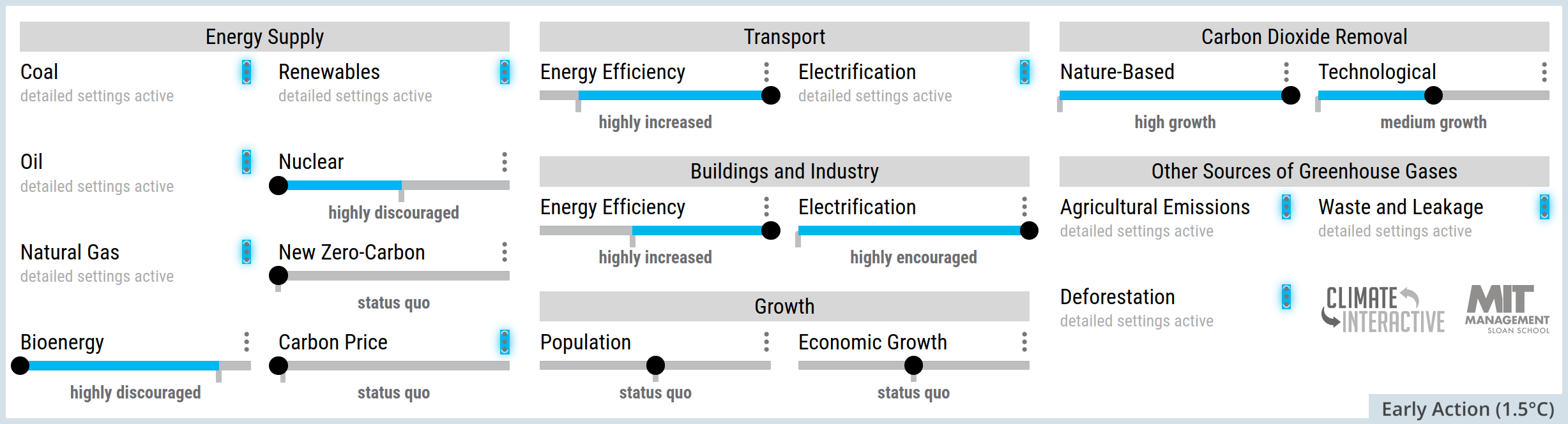
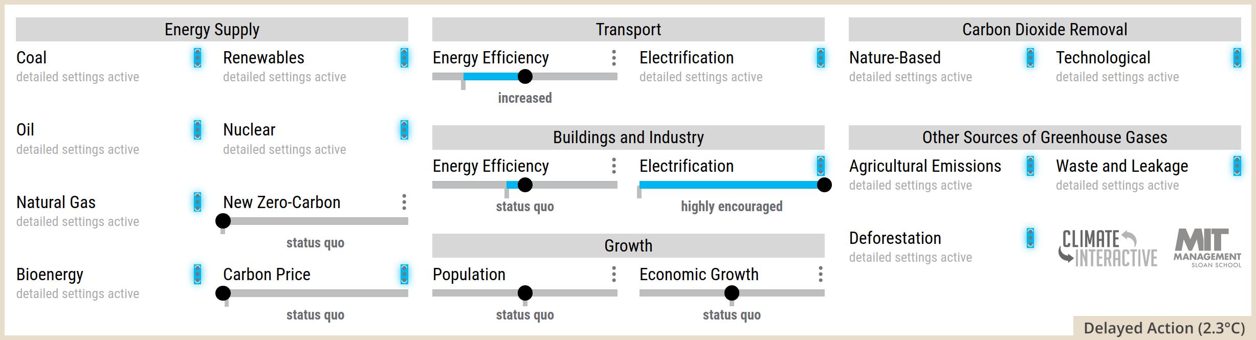
Screenshot of the En-ROADS simulator control panel showing specific climate policy slider settings. Under Energy Supply, Coal, Oil, Natural Gas, and Nuclear are highly discouraged, Bioenergy is discouraged, Renewables are highly encouraged, Carbon Price is set to very high, and New Zero-Carbon is at status quo. Under Transport, Energy Efficiency is highly increased and Electrification is highly encouraged. Under Buildings and Industry, Energy Efficiency is highly increased and Electrification is highly encouraged. Under Growth, Population and Economic Growth are at status quo. Under Carbon Dioxide Removal, Nature-Based and Technological both show high growth. Under Other Sources of Greenhouse Gases: Deforestation, Agricultural Emissions and Waste and Leakage are all highly reduced.
Source: Climate Interactive & MIT Sloan (2026) En-ROADS Simulator (Version 26.8.0)

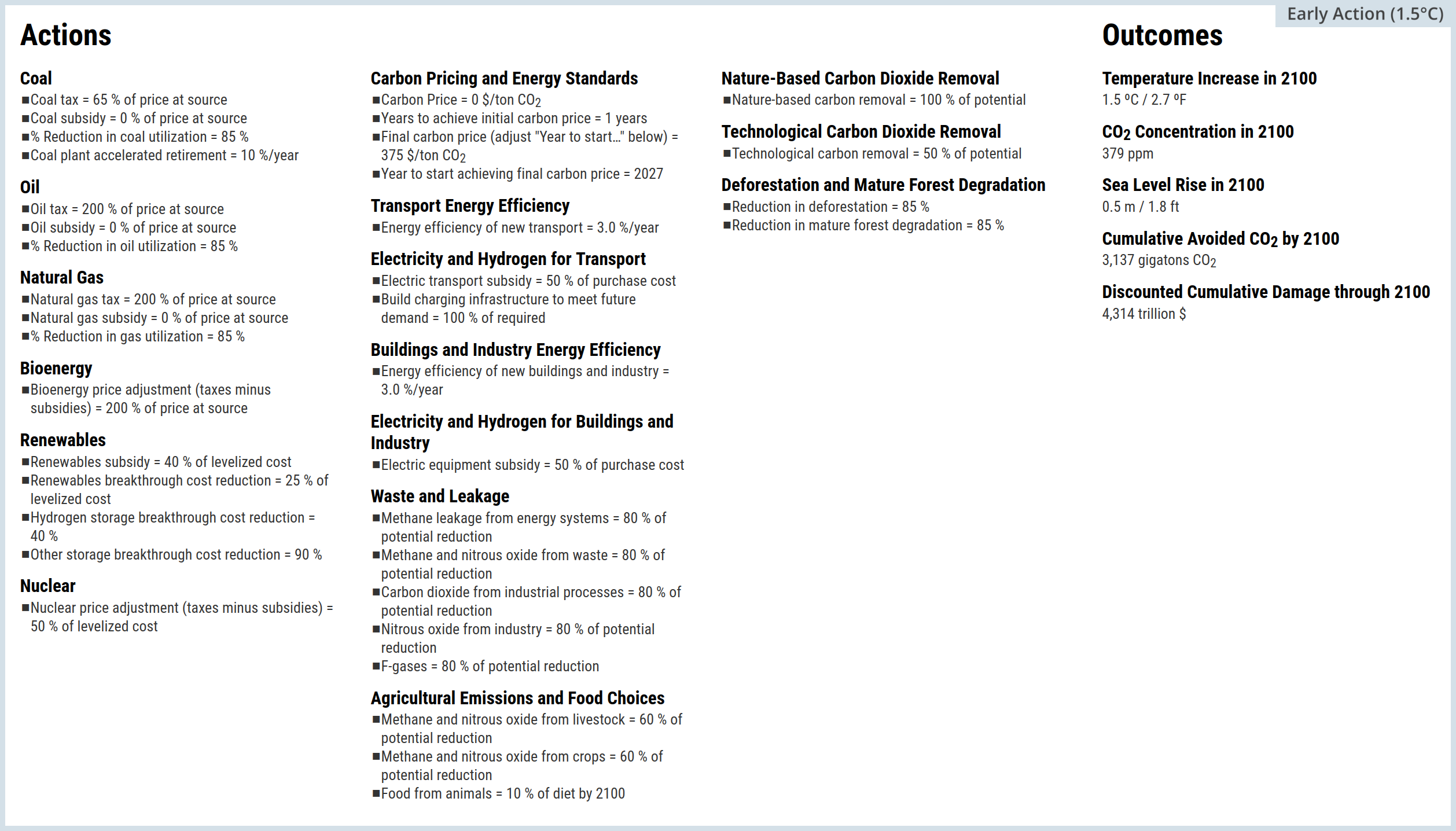
A text-based summary graphic from the En-ROADS Simulator, detailing specific policy actions and their resulting climate outcomes. The graphic is divided into a detailed Actions section on the left and a summary Outcomes section on the right.  Under Actions, energy price adjustments via taxes minus subsidies are set to 170 percent of price at source for Coal, Oil, and Natural Gas, 40 percent for Bioenergy, and 35 percent of levelised cost for Nuclear. Renewables receive a subsidy set at negative 85 percent of levelised cost. Carbon Pricing is implemented at 200 dollars per tonne of CO2. Energy efficiency for new transport, as well as new buildings and industry, is increased by 2.5 percent per year. Subsidies for electric transport, charging infrastructure, and electric equipment for buildings and industry are set to 42 percent of purchase cost. Reductions in methane and other gases from waste, leakage, and agriculture are set to 85 percent of their potential reduction. Both nature-based and technological carbon dioxide removal efforts are scaled to 85 percent of their potential. Finally, deforestation and mature forest degradation are set to a reduction of 8.5 percent per year.  Under Outcomes, the resulting Temperature Increase in 2100 is 1.7 degrees Celsius, or 3.1 degrees Fahrenheit. The CO2 Concentration in 2100 is 403 parts per million. Sea Level Rise in 2100 is 0.6 metres, or 1.9 feet. The Cumulative Avoided CO2 by 2100 is 2732 gigatonnes of CO2. Finally, the Discounted Cumulative Damage through 2100 is calculated at 4856 trillion dollars.
Source: Climate Interactive & MIT Sloan (2026) En-ROADS Simulator (Version 26.8.0)

A delayed action scenario: 2.3°C by 2100


This section explores a single En-ROADS scenario 2.3°C by 2100. You can modify the scenario by moving the sliders on the En-ROADS Simulator settings at the link

  • This is just one scenario out of a huge number of possibilities
  • All of the En-ROADS plots and images below labelled “Delayed Action (2.3°C)” use the same settings
  • Detailed settings are accessed on their website by clicking the vertical ellipsis symbol in En-ROADS settings: ⋮
  • Some detailed settings were modified, and these are summarised in the Actions and Outcomes screenshot at the end of this section
  • The default assumptions were left unchanged
  • Version 26.8.0 of Climate Interactive & MIT Sloan (2026) En-ROADS Simulator was used

For this scenario:

  • CH4 concentration peaks in 2047
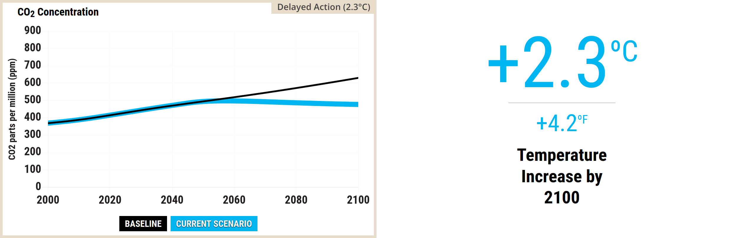
  • Atmospheric GHG concentration peaks in 2055 and atmospheric CO2 concentration peaks in 2057
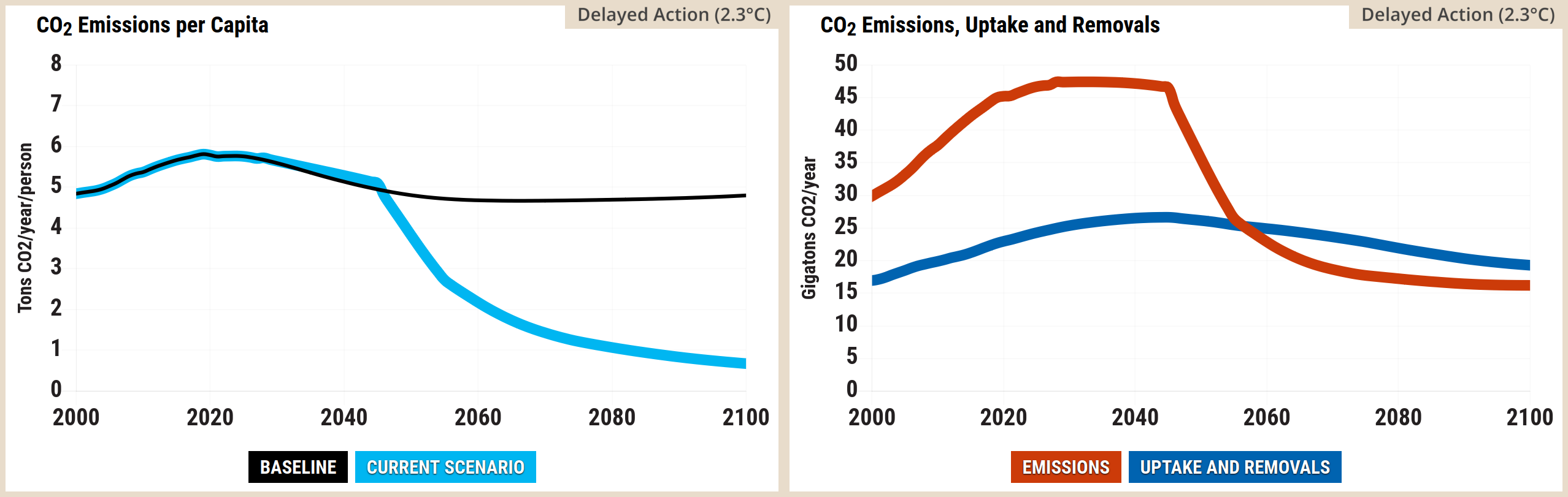
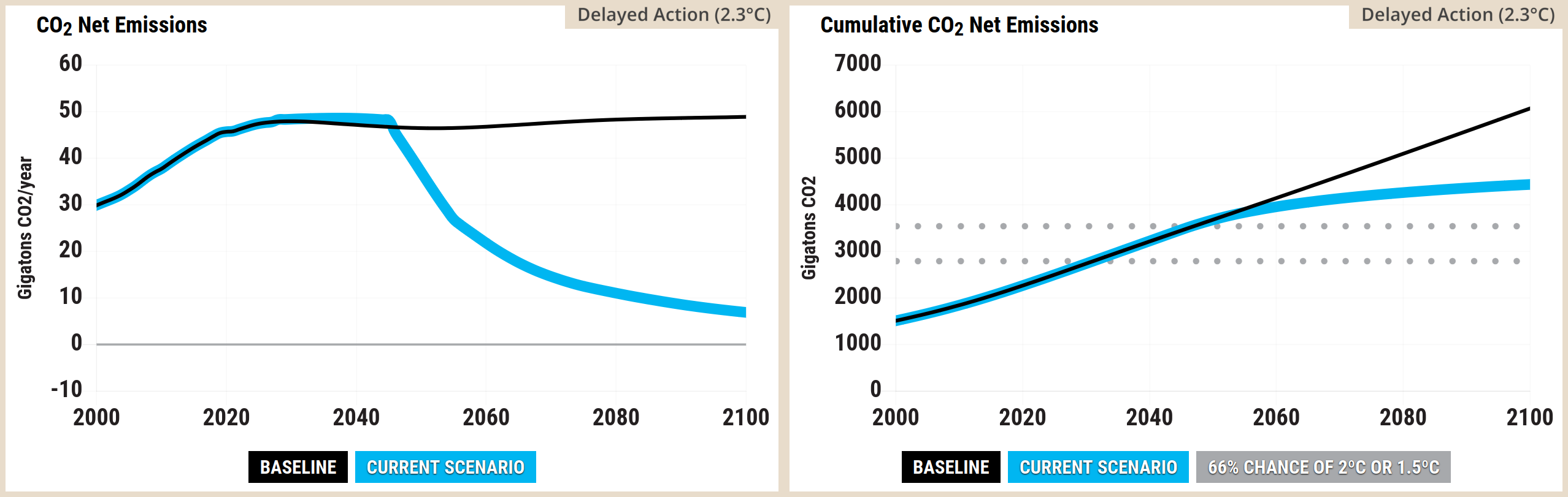
  • Net GHG emissions (anthropogenic) are still well above zero in 2100, as are net CO2 emissions (anthropogenic)
  • The global surface air temperature (GSAT) is 2.31°C in 2100 and increasing

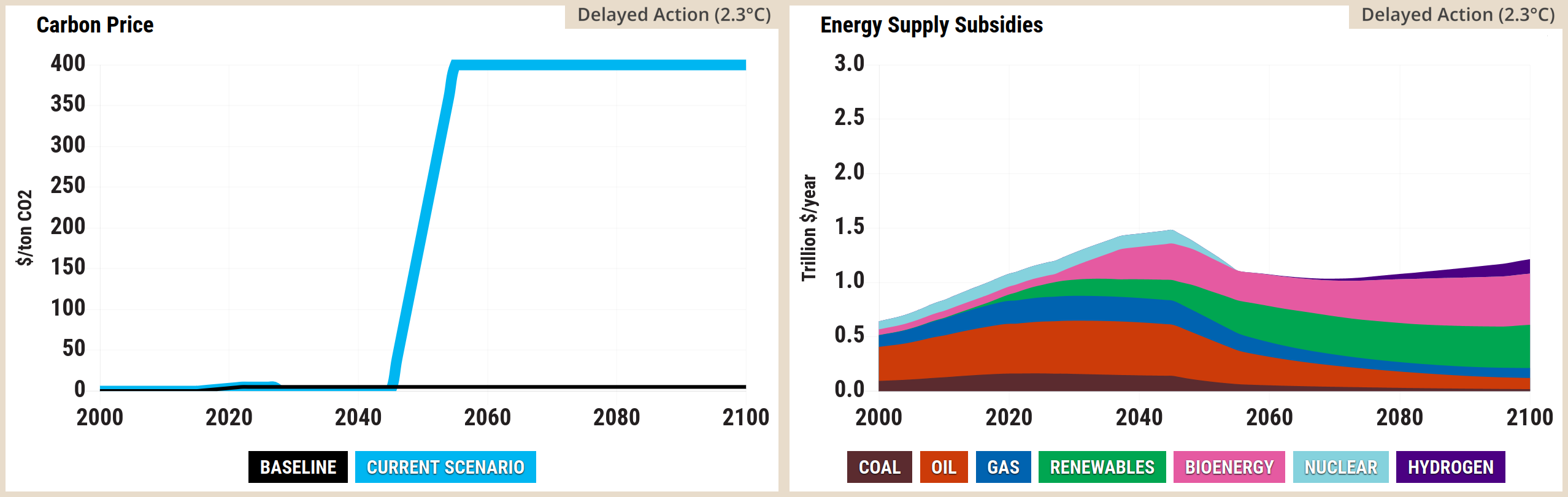
Screenshot of two side-by-side graphs from the En-ROADS simulator. The left graph, titled Carbon Price, is a line chart measuring dollars per ton of carbon dioxide from 2000 to 2100. The baseline remains flat at zero, whilst the current scenario rises steeply from the mid-2020s to plateau at approximately 200 dollars per ton before 2040, remaining constant until 2100. The right graph, titled Energy Supply Subsidies, is a stacked area chart measuring trillion dollars per year from 2000 to 2100. It illustrates subsidies for coal, oil, and gas peaking in the mid-2020s before dropping entirely to zero by the late 2030s. Concurrently, subsidies for renewables grow rapidly to dominate the energy supply, peaking near 1.6 trillion dollars per year around 2050 before slowly tapering towards 2100. Subsidies for bioenergy, nuclear, and hydrogen form a negligible portion of the overall chart.
Source: Climate Interactive & MIT Sloan (2026) En-ROADS Simulator (Version 26.8.0)

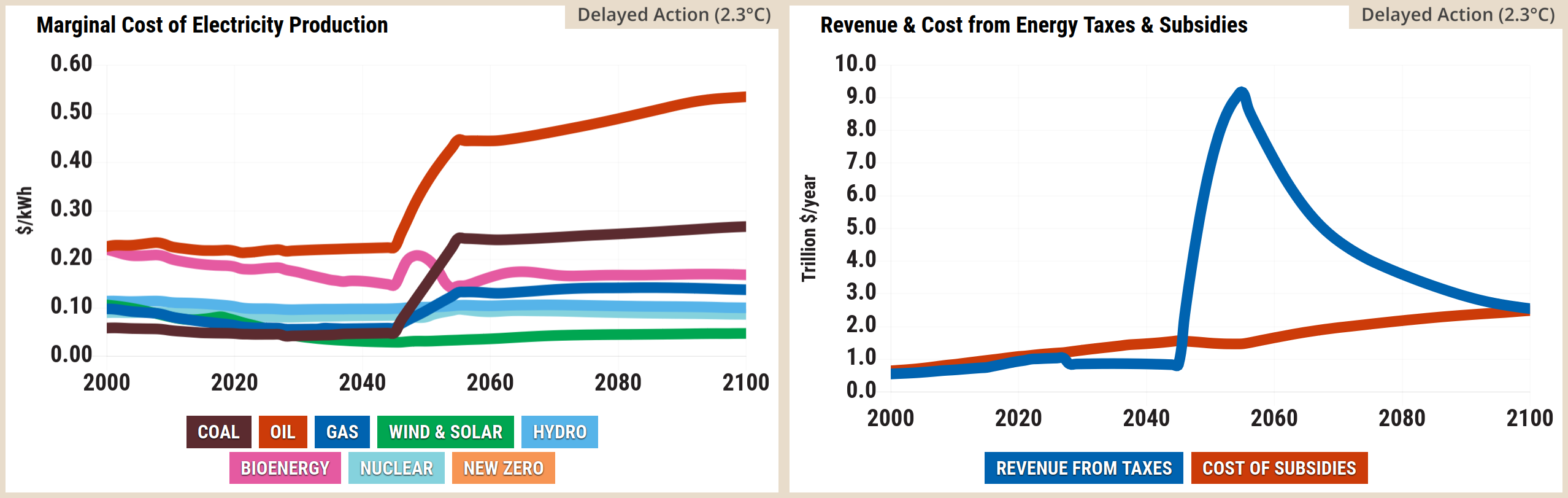
Screenshot of two side-by-side graphs from the En-ROADS simulator. The left graph, titled Marginal Cost of Electricity Production, is a line chart measuring dollars per kilowatt-hour from 2000 to 2100. Following the mid-2020s, the marginal cost of fossil fuels spikes sharply. Oil rises from roughly 0.20 to over 0.60 dollars by 2100. Coal and gas also show sharp increases before plateauing. Conversely, the cost of wind and solar drops significantly around the 2030s to become the cheapest energy source before stabilising at a very low cost. Bioenergy, nuclear, and hydro remain relatively stable or see only moderate increases. The right graph, titled Revenue and Cost from Energy Taxes and Subsidies, is a line chart measuring trillion dollars per year from 2000 to 2100. Revenue from taxes spikes dramatically from the mid-2020s, peaking at nearly 9.5 trillion dollars per year just before 2040, before steadily declining to around 2.0 trillion dollars by 2100. Meanwhile, the cost of subsidies remains relatively flat, hovering around 1.0 trillion dollars per year throughout the century.
Source: Climate Interactive & MIT Sloan (2026) En-ROADS Simulator (Version 26.8.0)

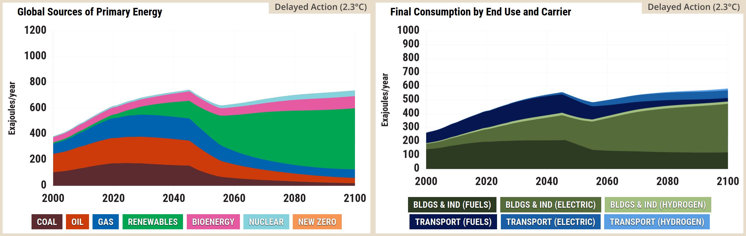
Screenshot of two side-by-side graphs from the En-ROADS simulator. The left graph, titled Global Sources of Primary Energy, is a stacked area chart measuring Exajoules per year from 2000 to 2100. It shows total primary energy peaking in the 2020s before slightly dipping and stabilising. Coal, oil, and gas decline sharply after the 2020s, whilst renewables expand dramatically to become the overwhelmingly dominant energy source by 2100. Bioenergy and nuclear maintain small, consistent shares, and new zero energy is virtually invisible. The right graph, titled Final Consumption by End Use and Carrier, is a stacked area chart measuring Exajoules per year from 2000 to 2100. It shows a clear transition towards electrification. Direct fuel consumption for buildings and industry, as well as transport, shrinks significantly after 2030. In their place, electricity consumption for both buildings and industry, and transport, grows substantially to dominate end use by 2100. Hydrogen consumption for both sectors remains negligible.
Source: Climate Interactive & MIT Sloan (2026) En-ROADS Simulator (Version 26.8.0)

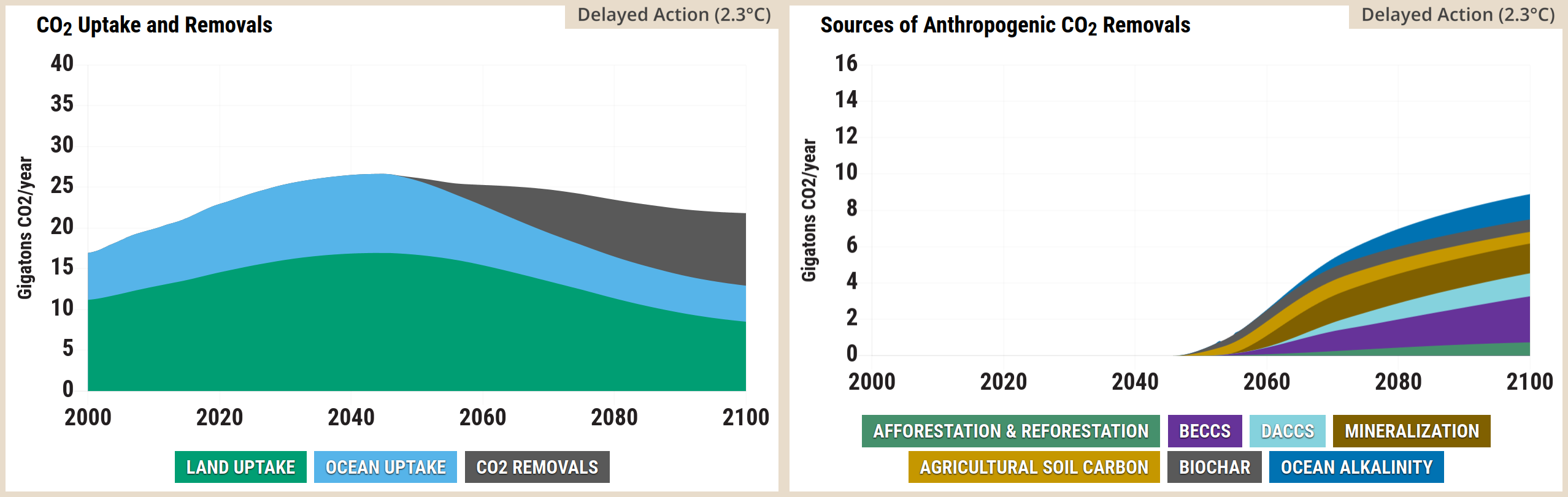
A two-panel stacked area chart from the En-ROADS Simulator.  The left panel is titled CO2 Uptake and Removals. The vertical axis measures Gigatonnes of CO2 per year from 0 to 40, and the horizontal axis spans the years 2000 to 2100. Three colour-coded categories are stacked: Land Uptake in green, Ocean Uptake in light blue, and CO2 Removals in grey. Both Land and Ocean uptake grow initially, peaking around 2030 at roughly 16 and 9 gigatonnes respectively, before steadily declining towards the year 2100. Conversely, the grey CO2 Removals area emerges at zero around 2030 and steadily expands to approximately 10 gigatonnes by 2100, offsetting the natural sink declines.  The right panel is titled Sources of Anthropogenic CO2 Removals, breaking down the grey removals area from the first chart in greater detail. The vertical axis measures Gigatonnes of CO2 per year on a smaller scale from 0 to 16, while the horizontal axis again spans the years 2000 to 2100. Seven categories are stacked, all remaining at zero until roughly 2030, after which they collectively grow to a combined total of nearly 10 gigatonnes by 2100. From bottom to top, these layers are: Afforestation and Reforestation in green, which forms the largest continuous share; followed by narrower bands of BECCS in purple, DACCS in light blue, Mineralisation in brown, Agricultural Soil Carbon in yellow, Biochar in dark grey, and Ocean Alkalinity in dark blue.
Source: Climate Interactive & MIT Sloan (2026) En-ROADS Simulator (Version 26.8.0)

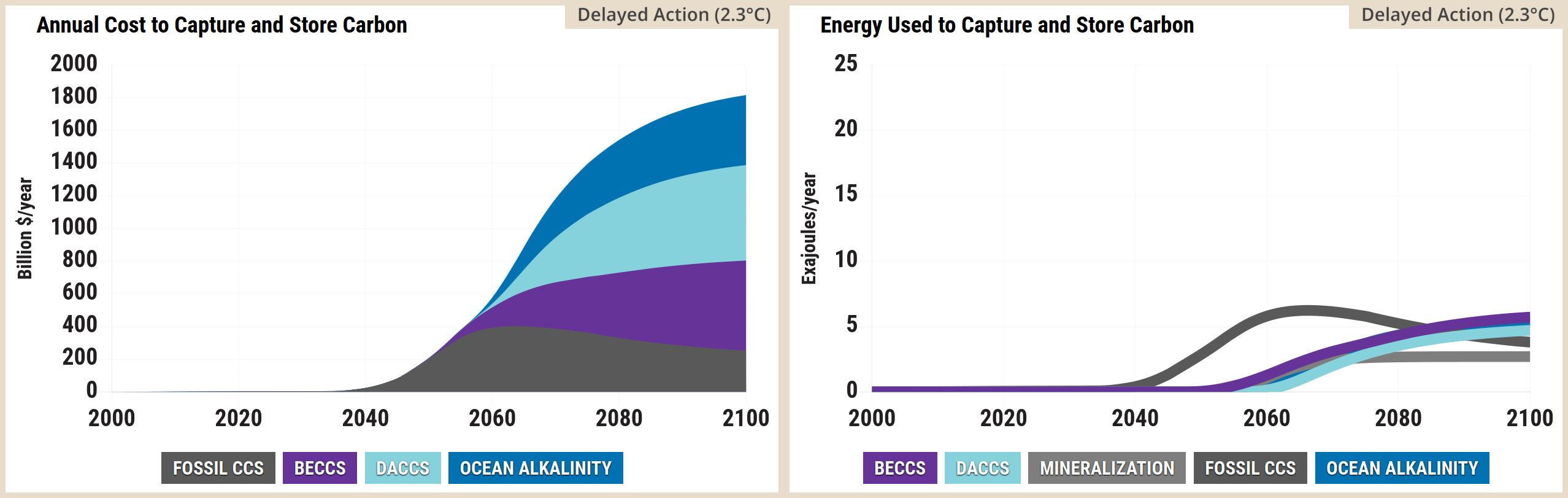
A two-panel stacked area chart from the En-ROADS Simulator. The left panel is titled Annual Cost to Capture and Store Carbon. The vertical axis measures Billion dollars per year from 0 to 2000, and the horizontal axis spans the years 2000 to 2100. Four colour-coded categories are stacked from bottom to top: Fossil CCS in dark grey, BECCS in purple, DACCS in light blue, and Ocean Alkalinity in dark blue. Costs remain at zero until approximately 2035, after which they rise rapidly before levelling off around 2080. By 2100, the total annual cost reaches over 1100 billion dollars, dominated primarily by the wide light blue DACCS and dark blue Ocean Alkalinity bands, while the dark grey and purple bands remain relatively thin near the baseline.  The right panel is titled Energy Used to Capture and Store Carbon. The vertical axis measures Exajoules per year from 0 to 25, and the horizontal axis spans the years 2000 to 2100. Five categories are stacked, again remaining at zero until roughly 2035, after which they grow to a combined total of approximately 6 exajoules per year by 2100. From bottom to top, these layers are: BECCS in purple, Fossil CCS in dark grey, Mineralisation in grey, DACCS in light blue, and Ocean Alkalinity in dark blue. The dark grey Fossil CCS layer peaks mid-century before narrowing, while the light blue DACCS layer expands to form the largest continuous share of energy used by the end of the century.
Source: Climate Interactive & MIT Sloan (2026) En-ROADS Simulator (Version 26.8.0)

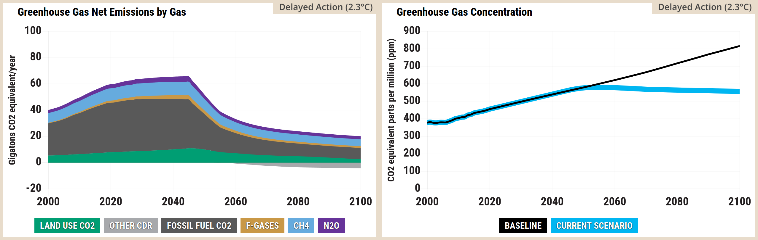
Screenshot of two side-by-side graphs from the En-ROADS simulator. The left graph, titled Greenhouse Gas Net Emissions by Gas, is a stacked area chart measuring gigatons of CO2 equivalent per year from 2000 to 2100. Total net emissions rise from approximately 40 in 2000 to peak just above 60 in the late 2020s, before falling sharply. Fossil Fuel CO2 constitutes the largest share but shrinks significantly after the peak. Land Use CO2 begins positive but drops below the zero line around 2060 to become a net removal, joining Other CDR. CH4, N2O, and a very thin band of F-Gases sit on top of the stack, shrinking slightly over the century. By 2100, the remaining positive emissions are heavily offset by the negative emissions. The right graph, titled Greenhouse Gas Concentration, is a line chart measuring CO2 equivalent parts per million from 2000 to 2100. The baseline scenario rises steadily from roughly 380 in 2000 to over 800 parts per million by 2100. The current scenario tracks the baseline until the early 2030s, peaking just over 500 parts per million near 2040, before gradually declining to roughly 450 parts per million by the end of the century.
Source: Climate Interactive & MIT Sloan (2026) En-ROADS Simulator (Version 26.8.0)

Screenshot of two side-by-side graphs from the En-ROADS simulator. The left graph, titled Methane Emissions by Source, is a stacked area chart measuring megatons of CH4 per year from 2000 to 2100. Total emissions rise from approximately 260 in 2000 to a peak of roughly 340 megatons per year in the late 2020s, before steadily declining to about 160 by 2100. This overall decline is driven by significant reductions in emissions from energy production, and waste, whilst industry remains negligible throughout. The right graph, titled Methane Concentration, is a line chart measuring CH4 parts per million from 2000 to 2100. Both the baseline and current scenario lines track together from roughly 1.7 in 2000, rising to nearly 2.0 parts per million by 2030. After 2030, the baseline trajectory continues to rise slowly to approximately 2.3 by 2100, whilst the current scenario diverges, dropping steadily to approximately 1.4 parts per million by the end of the century.
Source: Climate Interactive & MIT Sloan (2026) En-ROADS Simulator (Version 26.8.0)

A two-panel line graph from the En-ROADS Simulator. The left panel is titled CO2 Emissions per Capita. The vertical axis measures Tonnes of CO2 per year per person from negative 1 to 8, and the horizontal axis spans the years 2000 to 2100. A legend defines two scenarios: Baseline in a black box and Current Scenario in a light blue box. The thin black Baseline line starts near 5 in the year 2000, peaks just below 6 around 2020, and slowly drops to stabilise just below 5 through to 2100. The thick light blue Current Scenario line tracks the baseline until approximately 2025, after which it drops steeply, crossing the zero line into negative per capita emissions shortly after 2080 and ending slightly below zero by 2100.  The right panel is titled CO2 Emissions, Uptake and Removals. The vertical axis measures Gigatonnes of CO2 per year from 0 to 50, and the horizontal axis spans the years 2000 to 2100. A legend defines two metrics: Emissions in a red box and Uptake and Removals in a dark blue box. The thick red Emissions line rises steeply from 30 in 2000 to a sharp peak near 47 around 2025, before falling dramatically and levelling out around 12 gigatonnes by the 2080s. The thick dark blue Uptake and Removals line rises gradually from roughly 17 in 2000, crossing the falling red emissions line around the year 2040 at approximately 26 gigatonnes, before gently declining to around 16 gigatonnes by 2100.
Source: Climate Interactive & MIT Sloan (2026) En-ROADS Simulator (Version 26.8.0)

A two-panel line graph from the En-ROADS Simulator.  The left panel is titled CO2 Net Emissions. The vertical axis measures Gigatonnes of CO2 per year from negative 10 to 60, with a solid grey horizontal line indicating the zero baseline. The horizontal axis spans the years 2000 to 2100. A legend defines two scenarios: Baseline in a black box and Current Scenario in a light blue box. The thin black Baseline line starts near 30 in the year 2000, rises to peak near 48 around 2030, and remains high and relatively flat through to 2100. The thick light blue Current Scenario line tracks the baseline until approximately 2025, after which it drops steeply, crossing the zero line to achieve net-negative emissions just before 2080 and ending slightly below zero by 2100.  The right panel is titled Cumulative CO2 Net Emissions. The vertical axis measures Gigatonnes of CO2 from 0 to 7000, and the horizontal axis spans the years 2000 to 2100. The legend includes an additional metric: 66 percent chance of 2 degrees Celsius or 1.5 degrees Celsius in a grey box, which corresponds to two horizontal dotted grey lines crossing the chart between roughly 2800 and 3500 gigatonnes. The thin black Baseline line rises steadily and continuously from approximately 1500 in 2000 to reach 6000 gigatonnes by 2100, climbing far past both dotted target boundaries. In contrast, the thick light blue Current Scenario line tracks the baseline initially but begins to curve and flatten out after 2030, ultimately stabilising just below 3500 gigatonnes by 2100, successfully keeping cumulative emissions beneath the upper dotted grey target line.
Source: Climate Interactive & MIT Sloan (2026) En-ROADS Simulator (Version 26.8.0)

A two-part graphic from the En-ROADS Simulator.  The left panel is a line graph titled CO2 Concentration. The vertical axis measures CO2 parts per million, or ppm, from 0 to 900 in increments of 100. The horizontal axis spans the years 2000 to 2100 in twenty-year increments. A legend at the bottom defines two scenarios: Baseline in a black box and Current Scenario in a light blue box. The thin black Baseline line starts near 380 ppm in the year 2000 and rises steadily and continuously, reaching over 600 ppm by 2100. The thick light blue Current Scenario line tracks the baseline initially, peaks at approximately 450 ppm just before 2040, and then gradually declines to finish at 400 ppm by 2100.  The right panel is a typographic display highlighting the resulting Temperature Increase by 2100. It features large, light blue text reading plus 1.7 degrees Celsius, situated above a thin horizontal grey separator line. Immediately below this line, smaller light blue text reads plus 3.1 degrees Fahrenheit. Underneath the temperature values, black text confirms these represent the Temperature Increase by 2100.
Source: Climate Interactive & MIT Sloan (2026) En-ROADS Simulator (Version 26.8.0)

Screenshot of a line graph from the En-ROADS simulator titled Temperature Change, measuring Degrees Celsius from 2000 to 2100. The chart includes dotted horizontal reference lines at 1.5 and 2.0 degrees. Both the baseline and current scenario lines begin at roughly 0.8 degrees in 2000 and track together until the early 2030s. From there, the baseline trajectory continues to rise steadily, reaching approximately 3.3 degrees Celsius by 2100. Conversely, the current scenario diverges, plateauing at approximately 1.8 degrees mid-century before slowly declining to roughly 1.7 degrees Celsius by 2100, remaining well below the 2.0 degree threshold.
Source: Climate Interactive & MIT Sloan (2026) En-ROADS Simulator (Version 26.8.0)

Kaya graphs

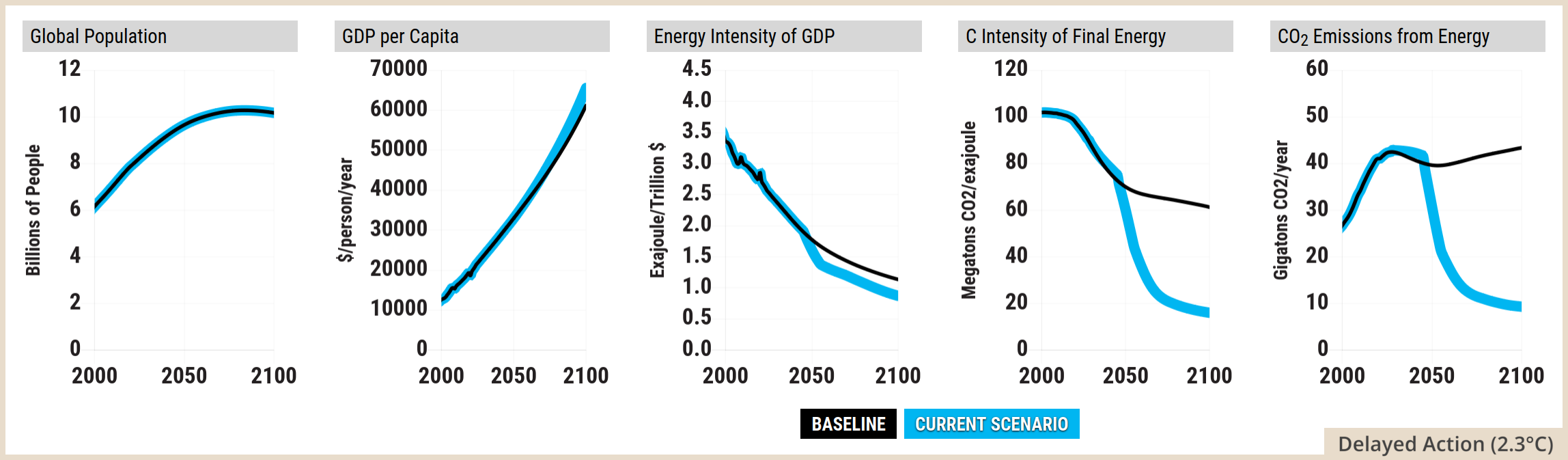
A five-panel line graph from the En-ROADS Simulator, displaying the five factors of the Kaya Identity. A legend at the bottom defines two scenarios: Baseline in a black box and Current Scenario in a light blue box. For all five panels, the horizontal axis spans the years 2000 to 2100.  The first panel is titled Global Population. The vertical axis measures Billions of People from 0 to 12. Both the thin black Baseline and thick light blue Current Scenario lines trace the exact same path, rising from roughly 6 billion in 2000 to peak just above 10 billion near 2080 before slightly plateauing.  The second panel is titled GDP per Capita. The vertical axis measures dollars per person per year from 0 to 70000. Both lines curve steeply upwards from roughly 10000 in 2000. They begin to diverge after 2050, with the light blue scenario line climbing higher to reach 70000 by 2100, while the black baseline ends closer to 60000.  The third panel is titled Energy Intensity of GDP. The vertical axis measures Exajoules per Trillion dollars from 0.0 to 4.5. Both lines trend downwards from a starting point of 3.5 in 2000. The light blue scenario line drops more aggressively, reaching roughly 0.5 by 2100, while the black baseline levels out near 1.2.  The fourth panel is titled C Intensity of Final Energy. The vertical axis measures Megatonnes of CO2 per exajoule from 0 to 120. The black baseline declines gradually from 100 in 2000 to settle around 60 by 2100. In sharp contrast, the light blue scenario line plummets rapidly after 2020, bottoming out near 10 by 2100.  The fifth panel is titled CO2 Emissions from Energy. The vertical axis measures Gigatonnes of CO2 per year from 0 to 60. The black baseline rises from roughly 25 in 2000 to a peak near 42 around 2030, then remains high, ending near 44 by 2100. The light blue scenario line matches this initial rise but diverges sharply after 2025, dropping steeply and continuously to reach roughly 5 gigatonnes by 2100.
Source: Climate Interactive & MIT Sloan (2026) En-ROADS Simulator (Version 26.8.0)

En-ROADS settings for the 2.3°C by 2100 scenario

Screenshot of the En-ROADS simulator control panel showing specific climate policy slider settings. Under Energy Supply, Coal, Oil, Natural Gas, and Nuclear are highly discouraged, Bioenergy is discouraged, Renewables are highly encouraged, Carbon Price is set to very high, and New Zero-Carbon is at status quo. Under Transport, Energy Efficiency is highly increased and Electrification is highly encouraged. Under Buildings and Industry, Energy Efficiency is highly increased and Electrification is highly encouraged. Under Growth, Population and Economic Growth are at status quo. Under Carbon Dioxide Removal, Nature-Based and Technological both show high growth. Under Other Sources of Greenhouse Gases: Deforestation, Agricultural Emissions and Waste and Leakage are all highly reduced.
Source: Climate Interactive & MIT Sloan (2026) En-ROADS Simulator (Version 26.8.0)

A text-based summary graphic from the En-ROADS Simulator, detailing specific policy actions and their resulting climate outcomes. The graphic is divided into a detailed Actions section on the left and a summary Outcomes section on the right.  Under Actions, energy price adjustments via taxes minus subsidies are set to 170 percent of price at source for Coal, Oil, and Natural Gas, 40 percent for Bioenergy, and 35 percent of levelised cost for Nuclear. Renewables receive a subsidy set at negative 85 percent of levelised cost. Carbon Pricing is implemented at 200 dollars per tonne of CO2. Energy efficiency for new transport, as well as new buildings and industry, is increased by 2.5 percent per year. Subsidies for electric transport, charging infrastructure, and electric equipment for buildings and industry are set to 42 percent of purchase cost. Reductions in methane and other gases from waste, leakage, and agriculture are set to 85 percent of their potential reduction. Both nature-based and technological carbon dioxide removal efforts are scaled to 85 percent of their potential. Finally, deforestation and mature forest degradation are set to a reduction of 8.5 percent per year.  Under Outcomes, the resulting Temperature Increase in 2100 is 1.7 degrees Celsius, or 3.1 degrees Fahrenheit. The CO2 Concentration in 2100 is 403 parts per million. Sea Level Rise in 2100 is 0.6 metres, or 1.9 feet. The Cumulative Avoided CO2 by 2100 is 2732 gigatonnes of CO2. Finally, the Discounted Cumulative Damage through 2100 is calculated at 4856 trillion dollars.
Source: Climate Interactive & MIT Sloan (2026) En-ROADS Simulator (Version 26.8.0)

Side by side: early transformative action vs. delayed and insufficient action


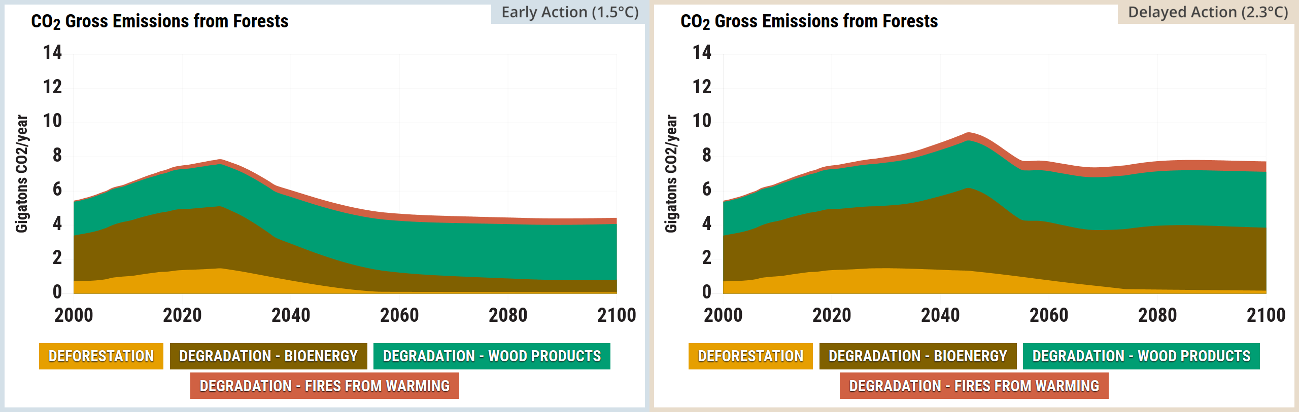
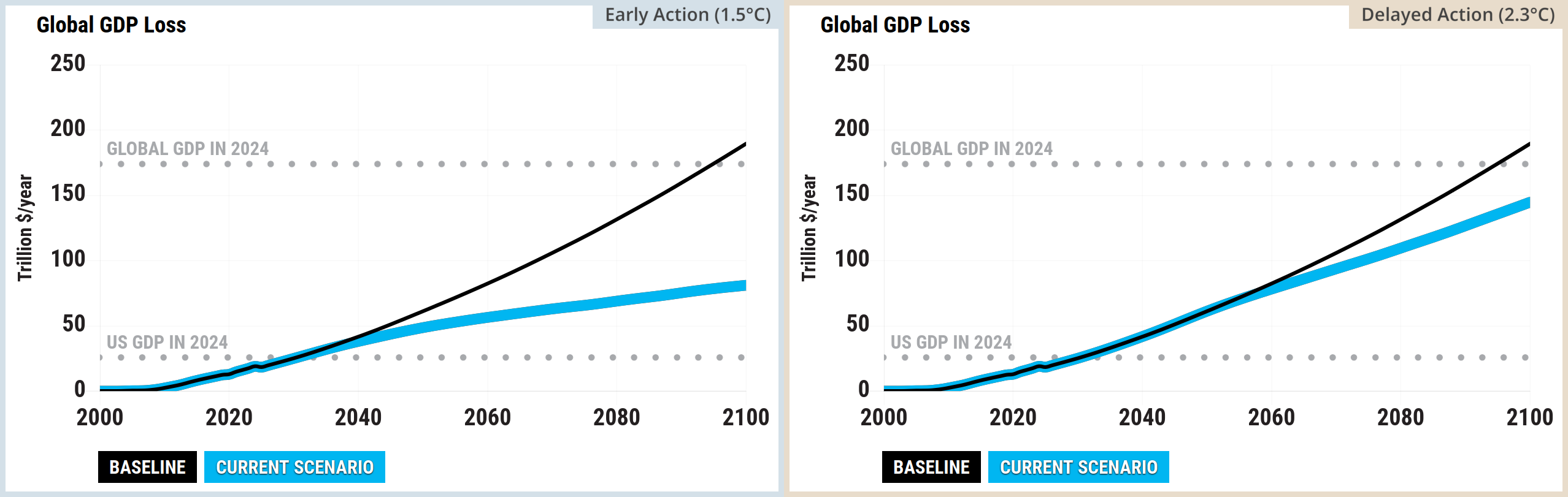
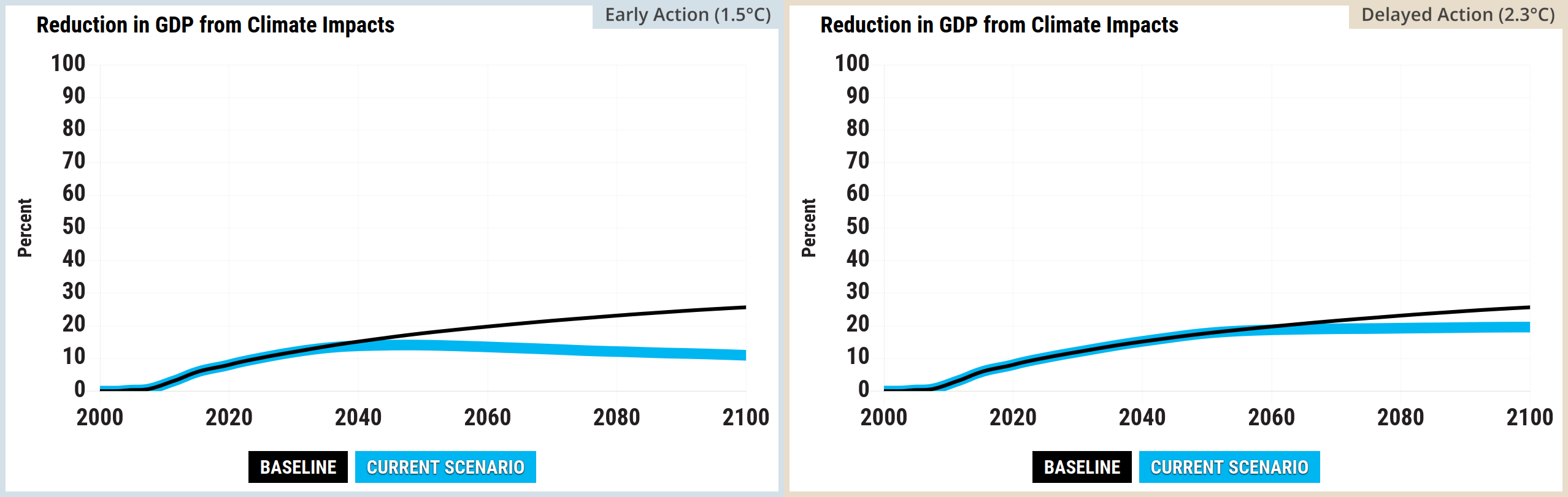
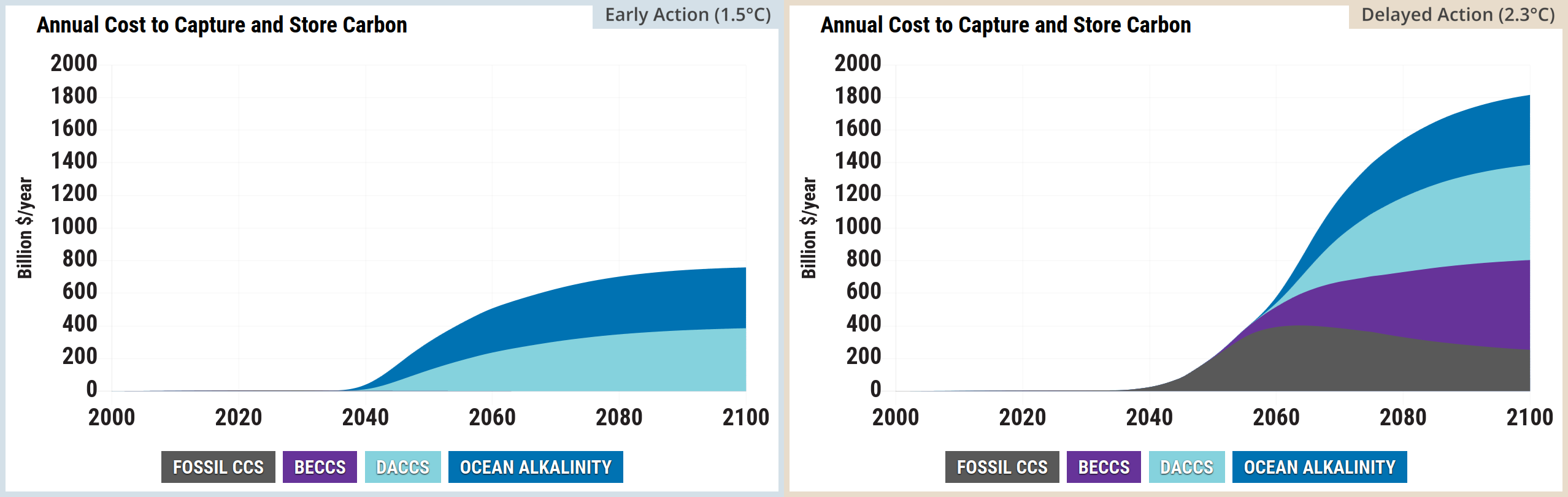
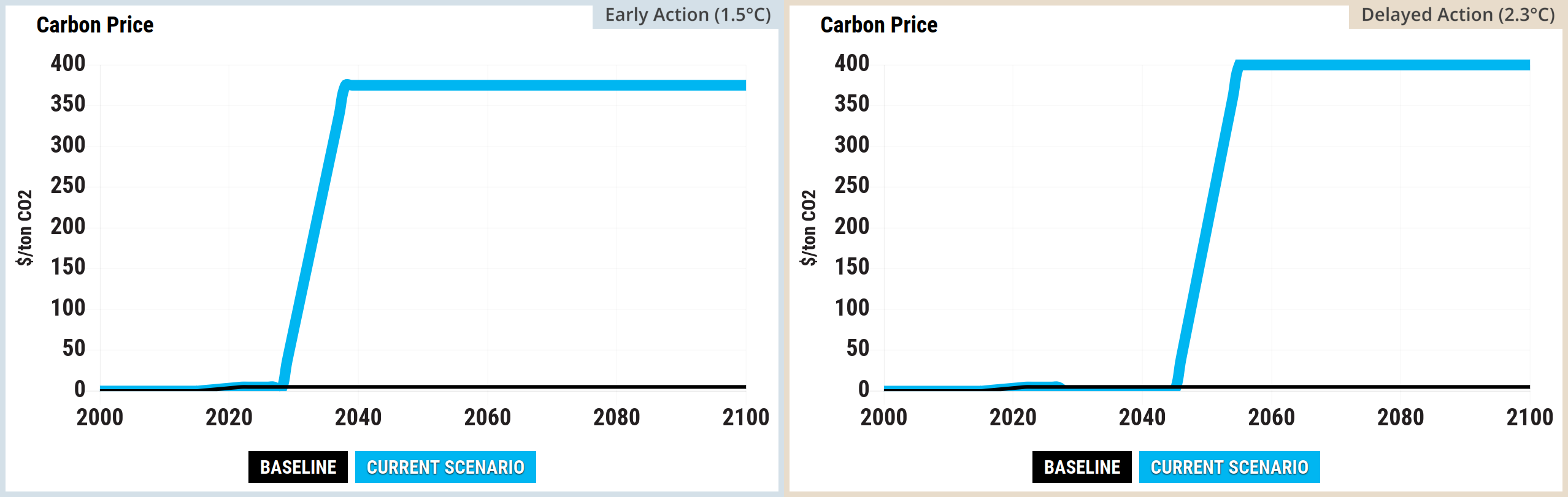
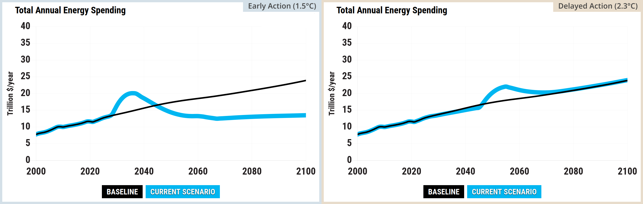
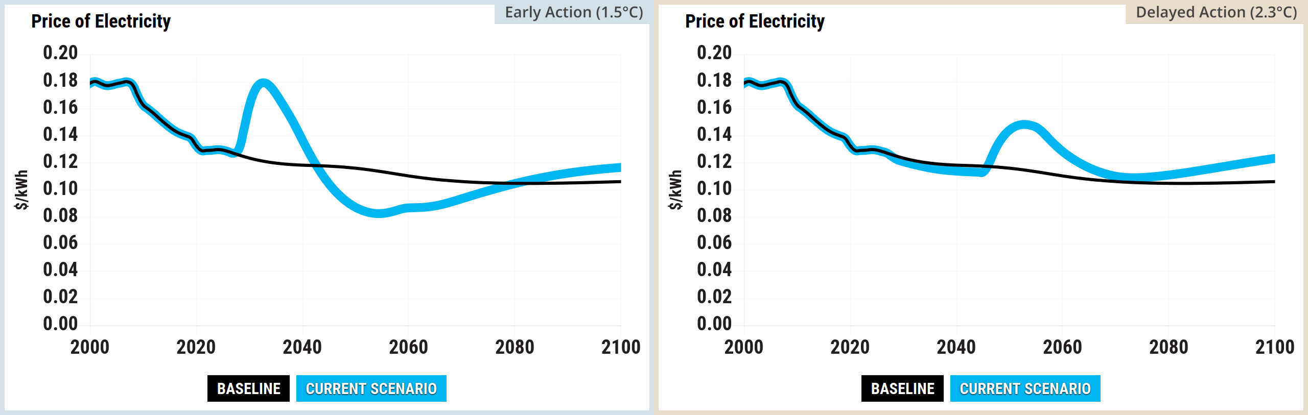
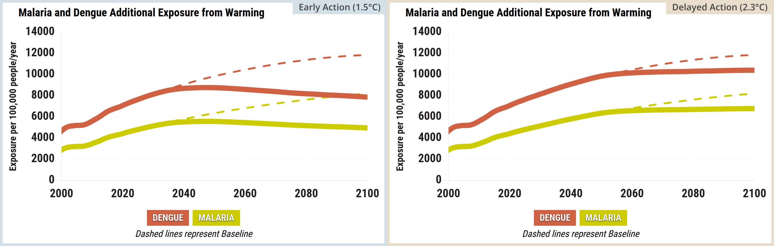
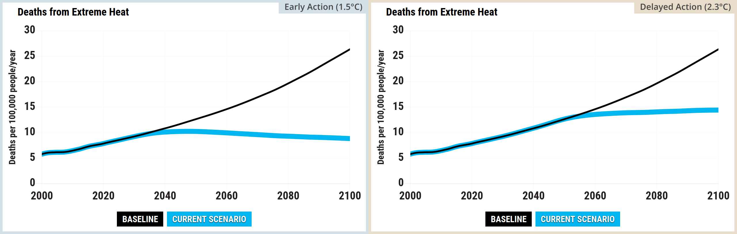
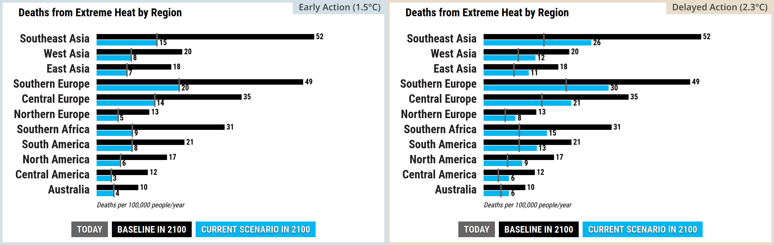
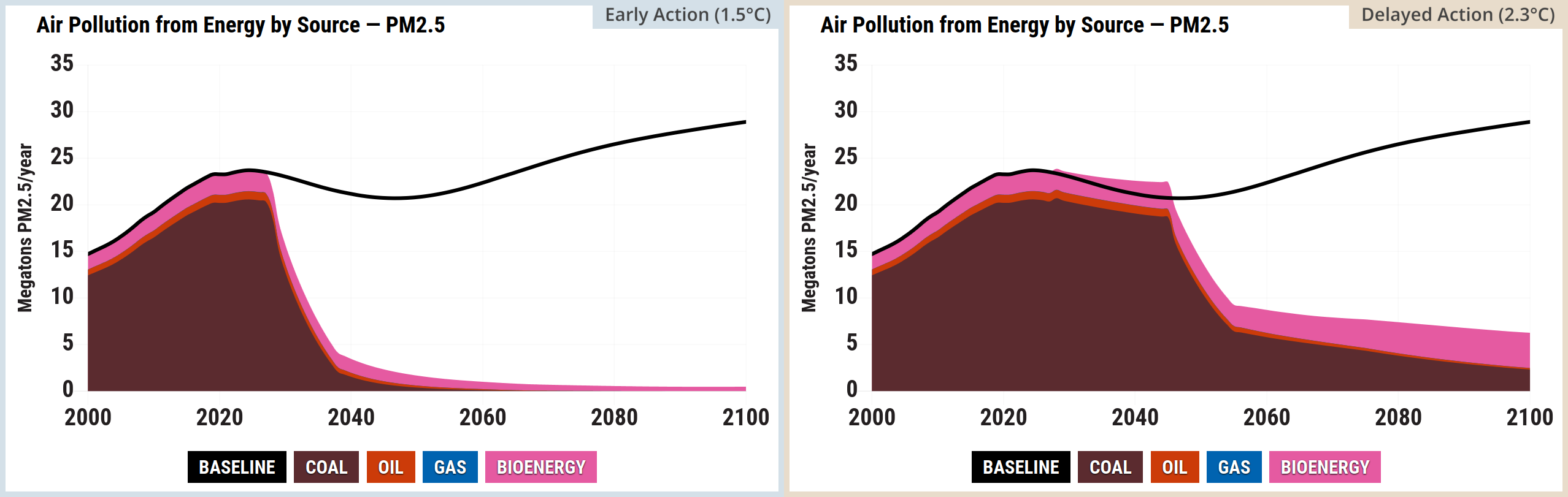
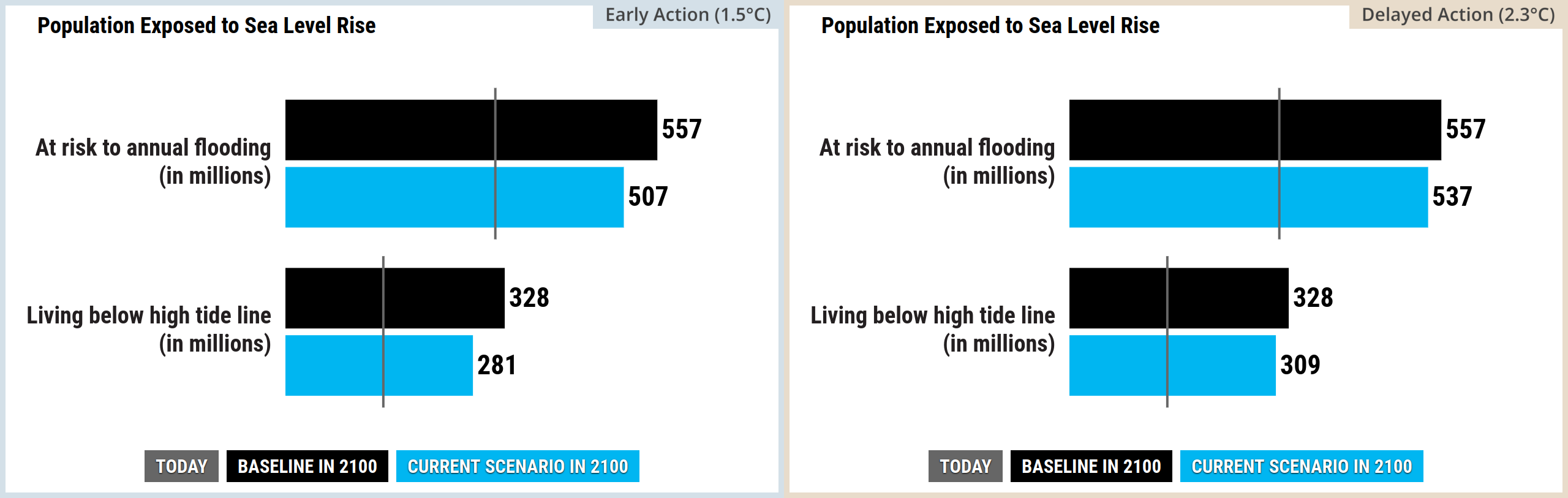
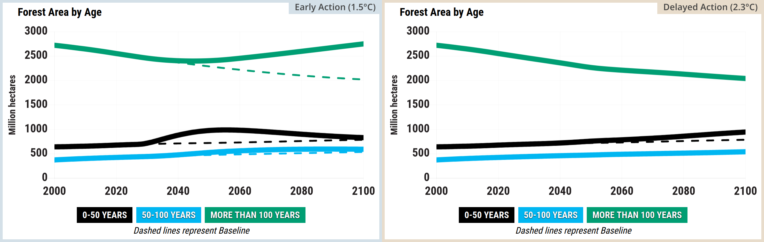
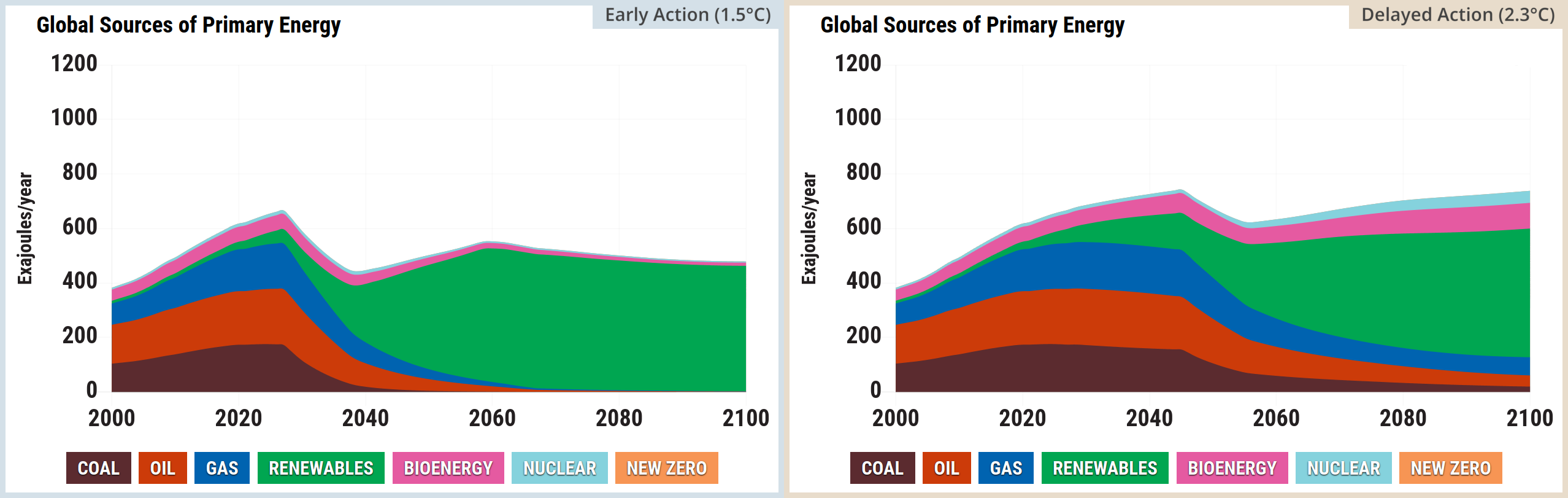
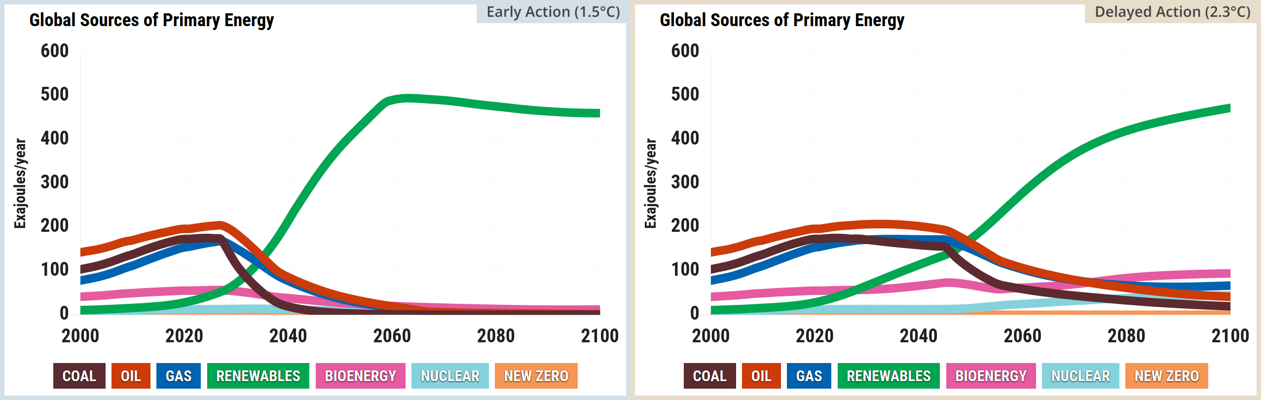
This section compares plots for two custom En-ROADS scenarios: 1.5°C by 2100 and 2.3°C by 2100.

This is an early version of this post:

  • The two scenarios haven’t been explained properly yet and the En-ROADS plots in this section haven’t been arranged properly yet
  • Some of the plots below won’t remain on the website, but they’re food for thought in the meantime. They were collected together to ensure that they came from the same version of the En-ROADS simulator

Explanations of the scientific basis of the simulations with references are available on En-ROADS Climate Solutions Simulator site and in the settings menus.


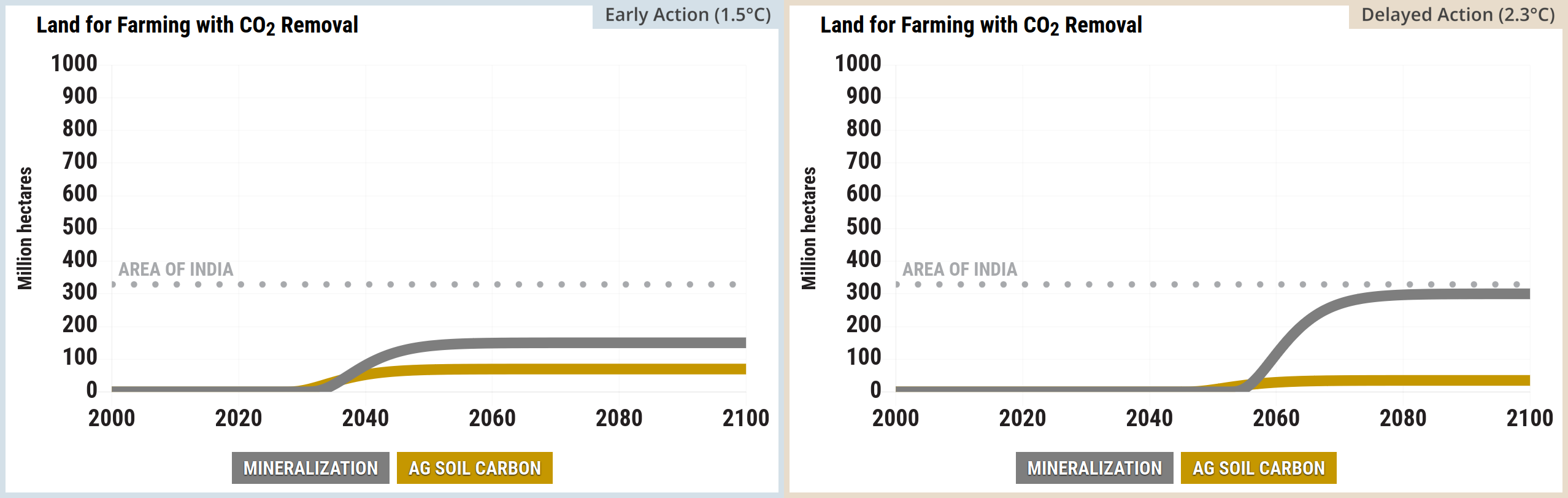
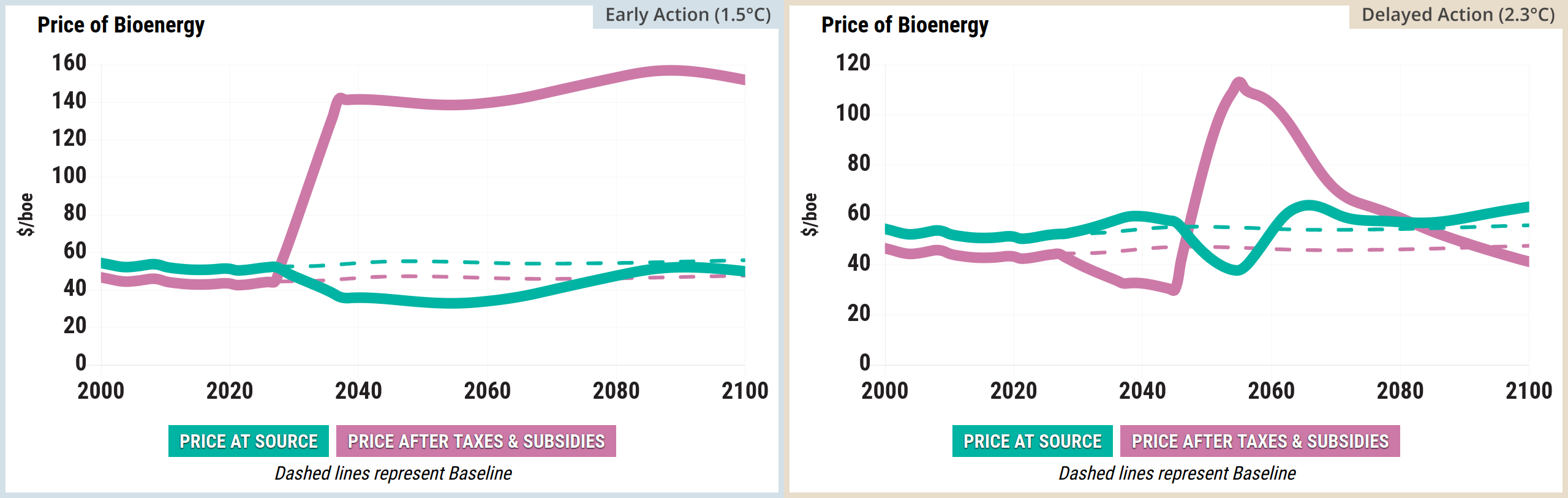
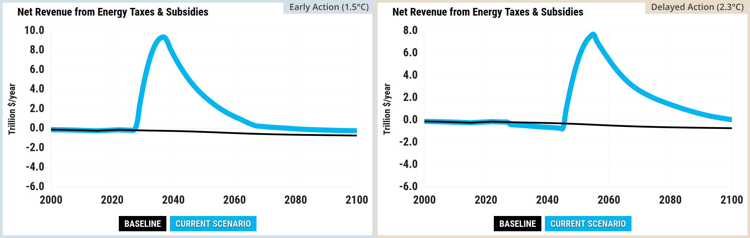
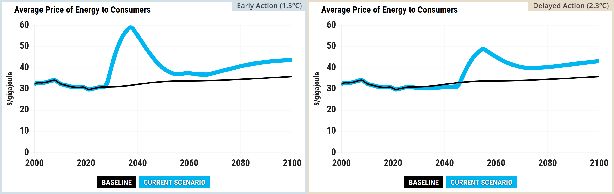
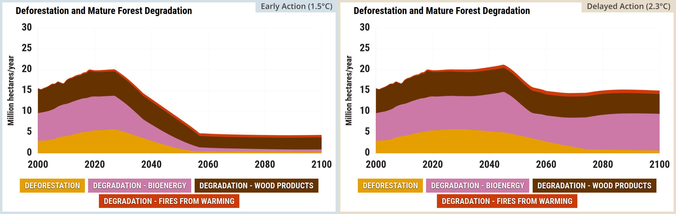
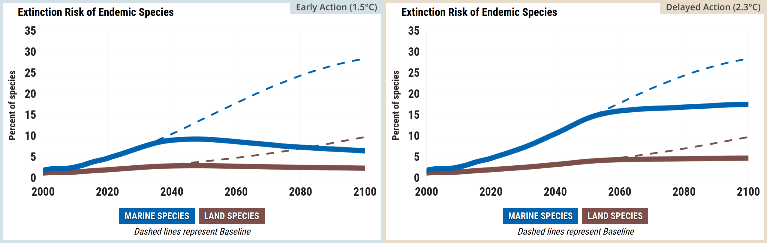
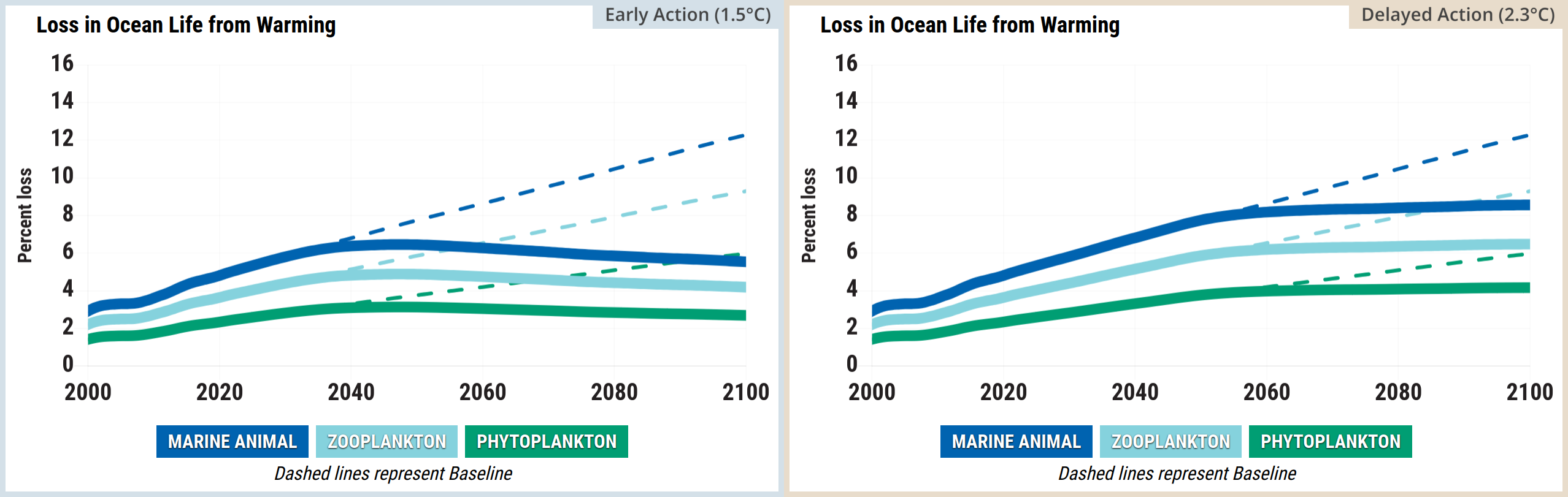
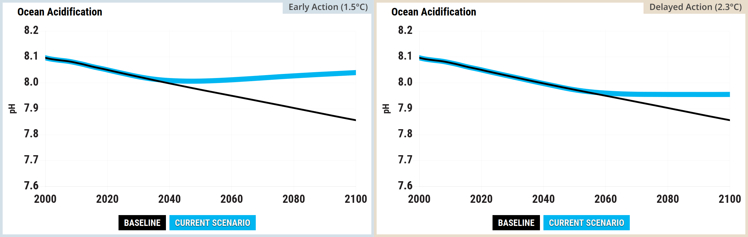
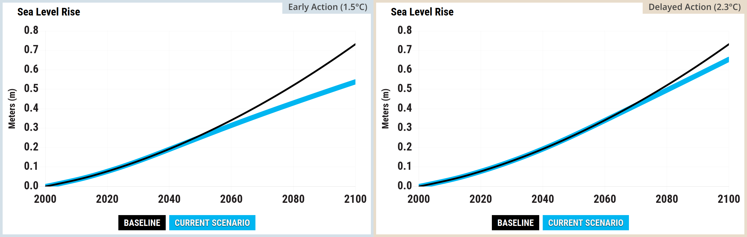
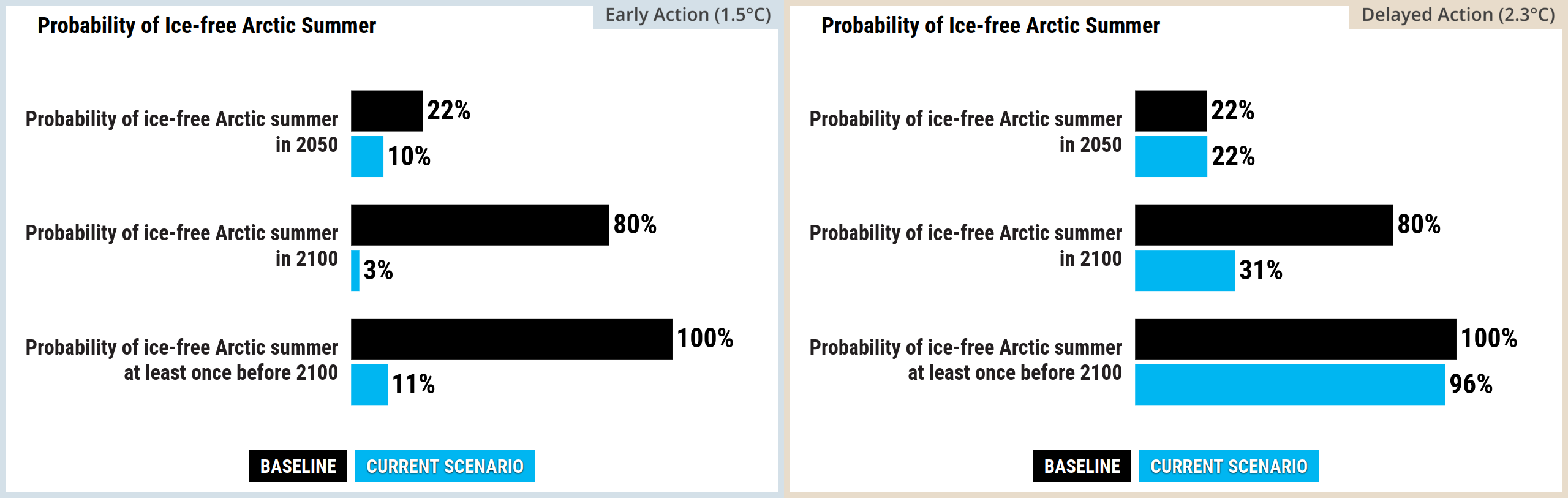
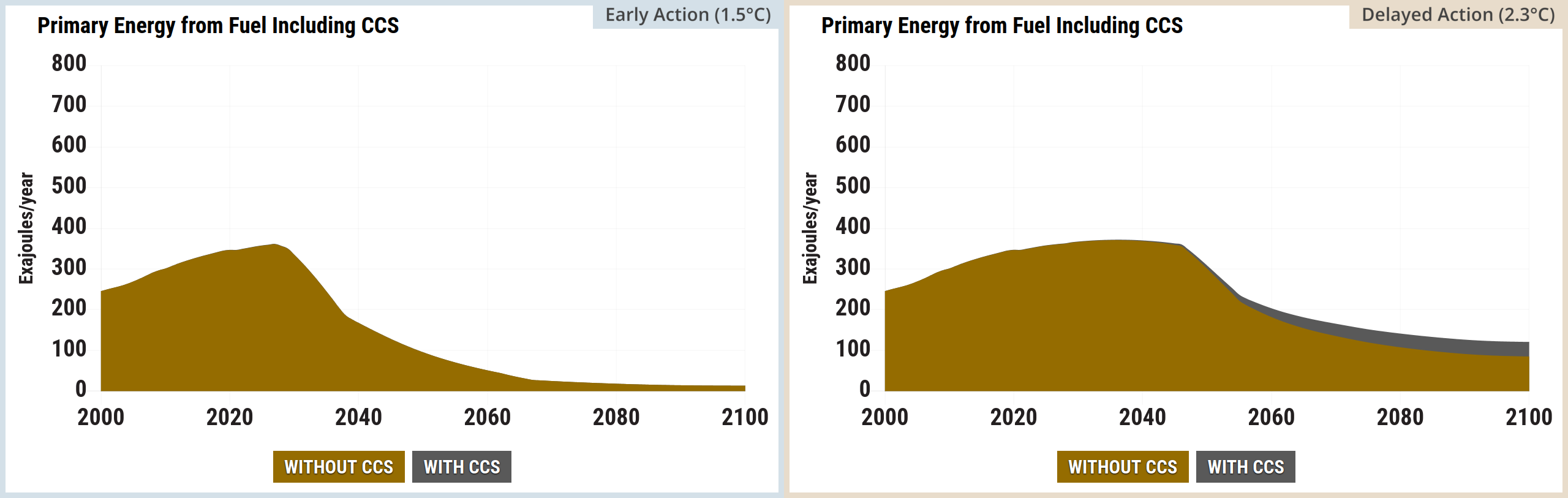
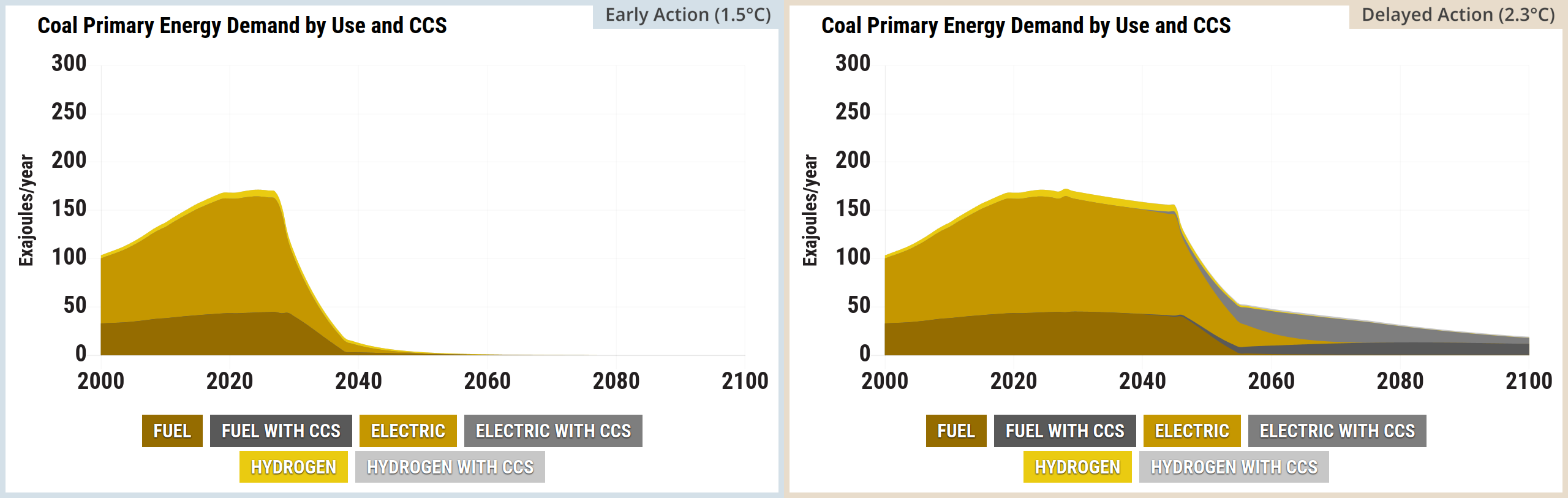
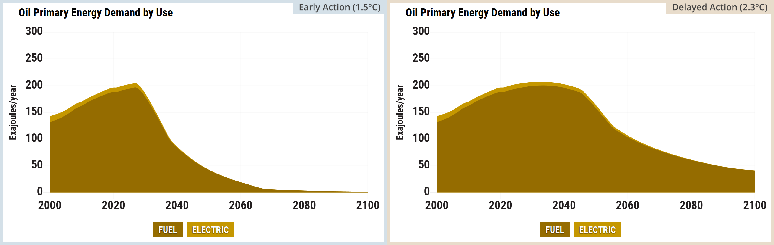
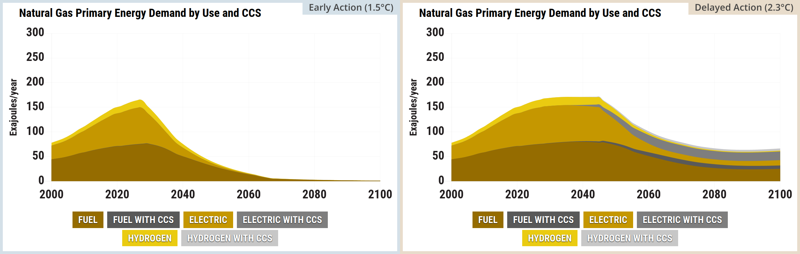
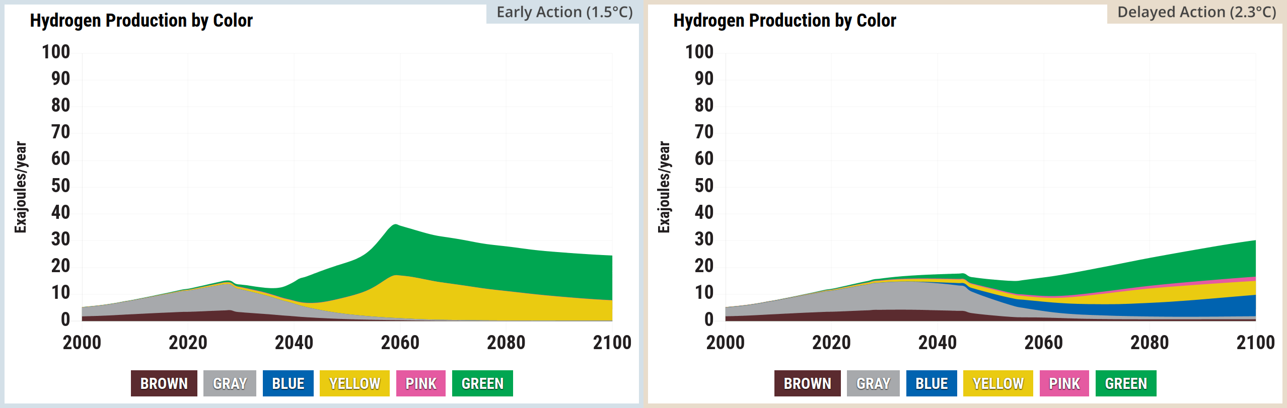
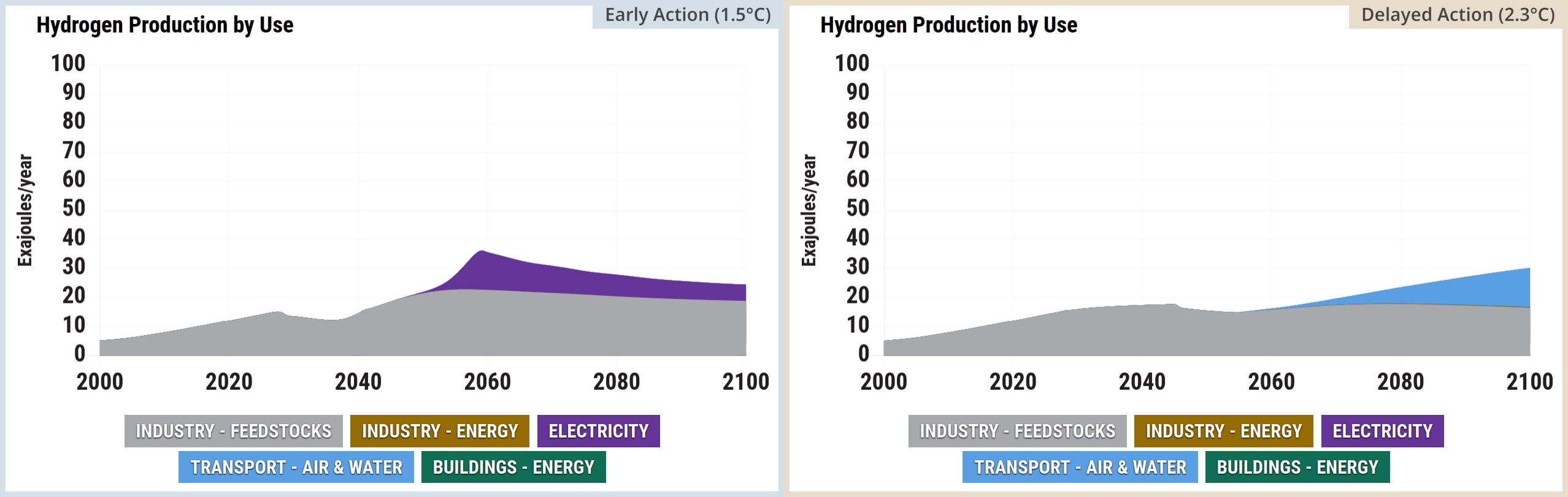
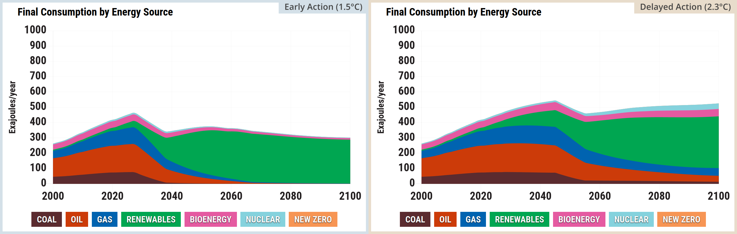
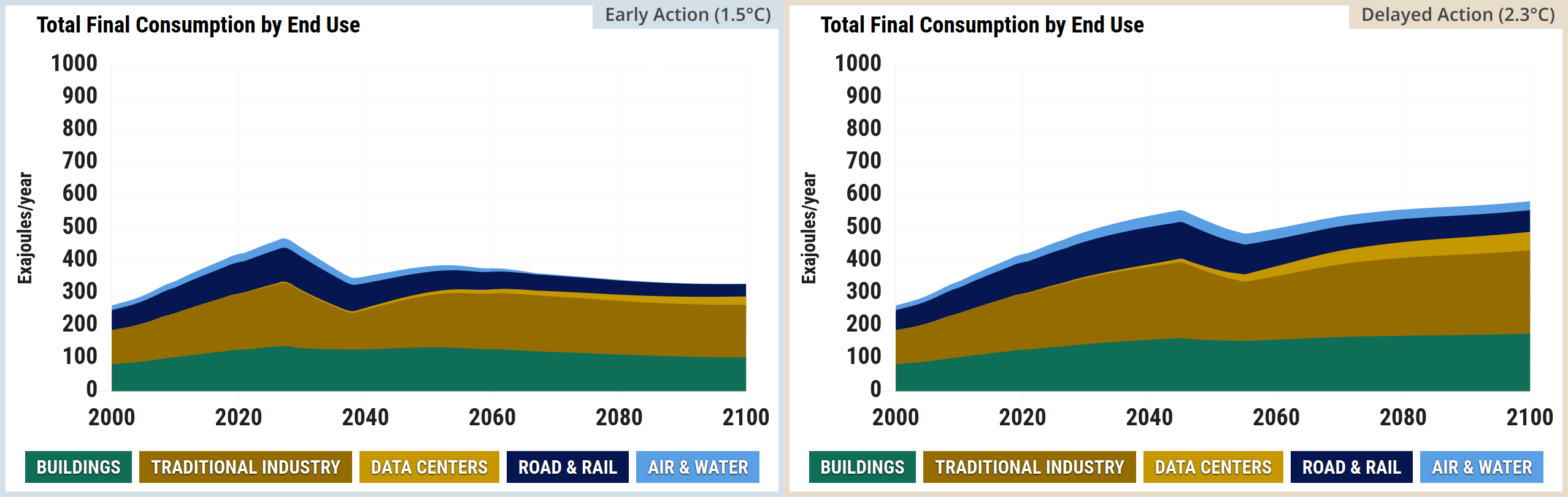
Source: Climate Interactive & MIT Sloan (2026) En-ROADS Simulator (Version 26.8.0)

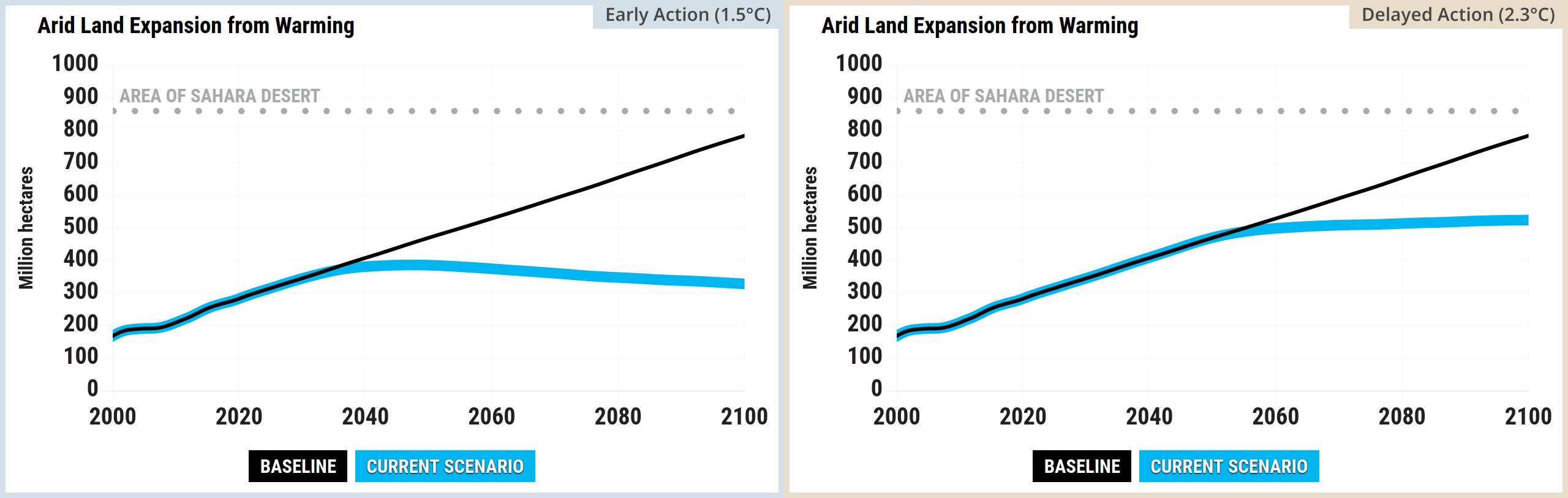
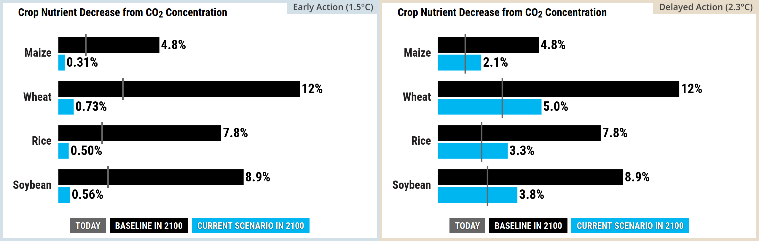
Source: Climate Interactive & MIT Sloan (2026) En-ROADS Simulator (Version 26.8.0)
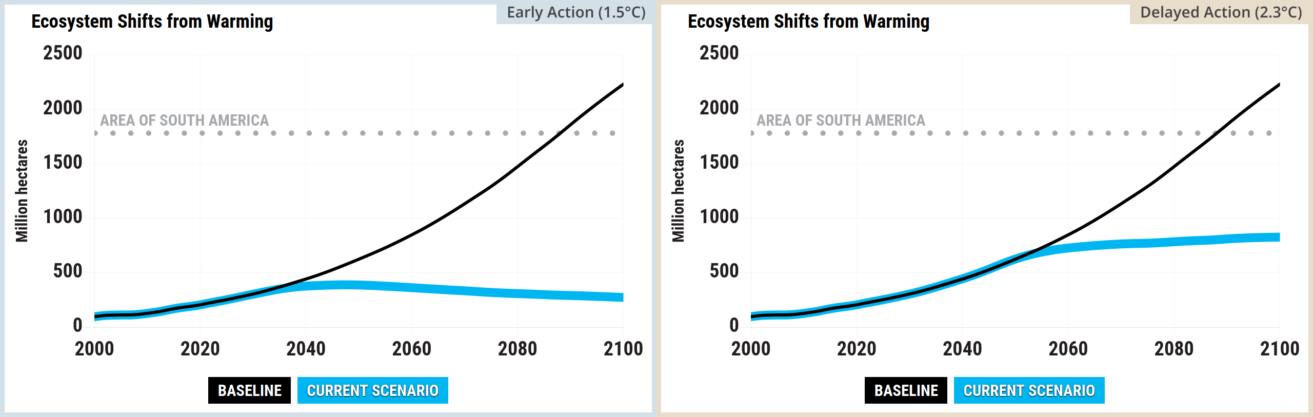
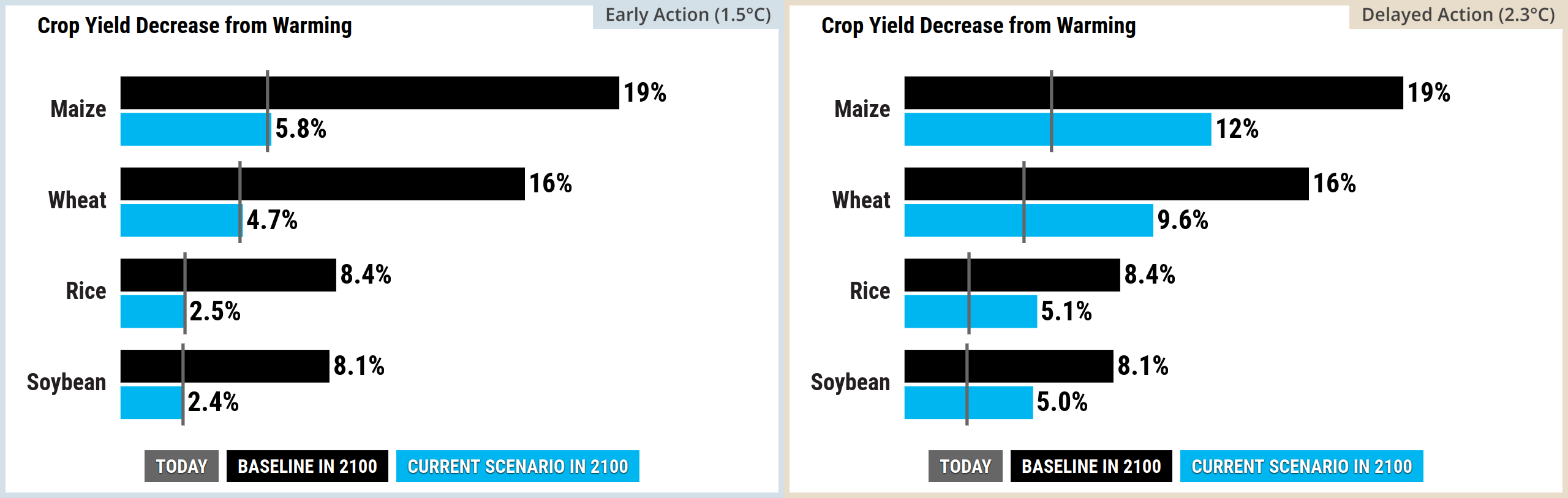
Source: Climate Interactive & MIT Sloan (2026) En-ROADS Simulator (Version 26.8.0)
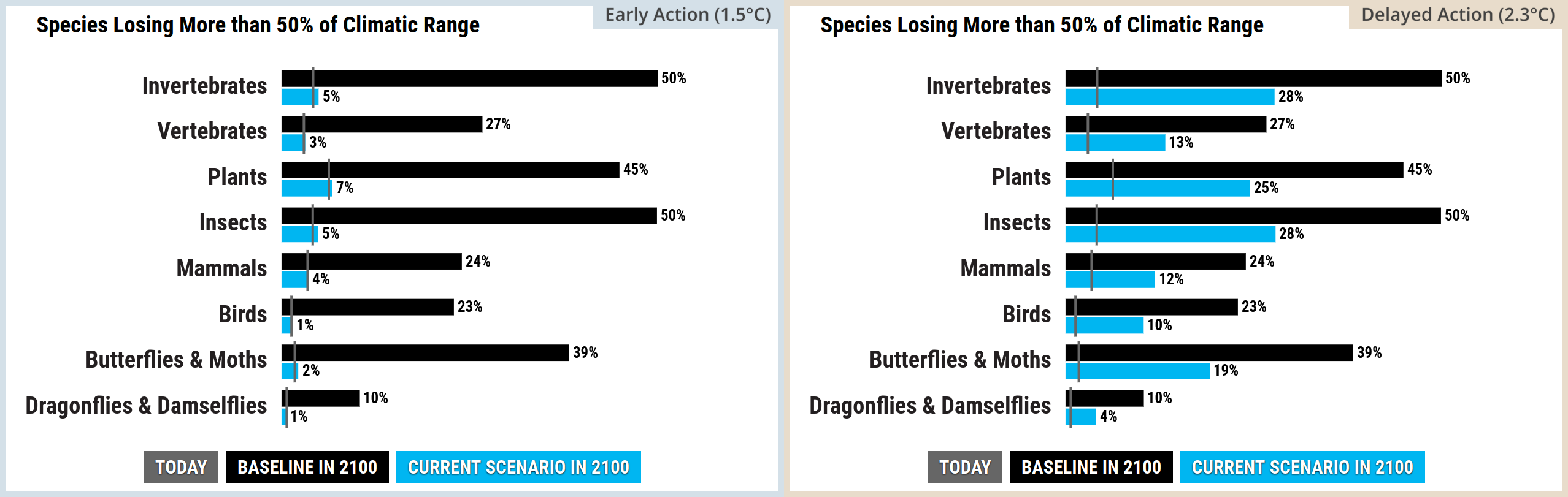
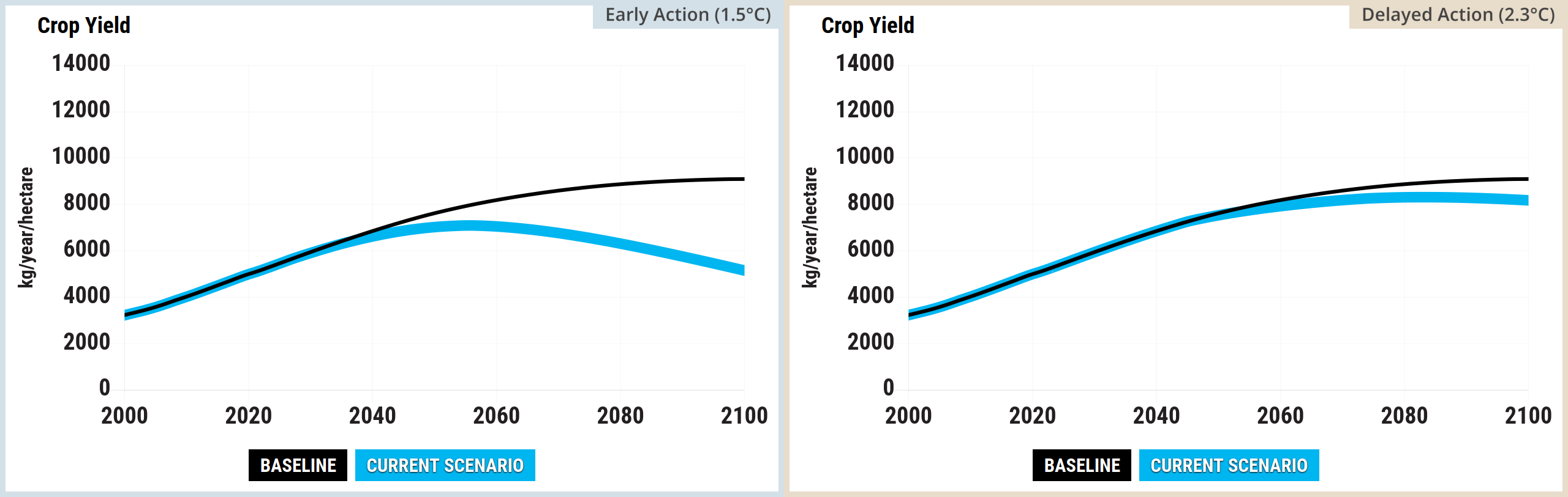
Source: Climate Interactive & MIT Sloan (2026) En-ROADS Simulator (Version 26.8.0)
Kaya graphs

Source: Climate Interactive & MIT Sloan (2026) En-ROADS Simulator (Version 26.8.0)

Source: Climate Interactive & MIT Sloan (2026) En-ROADS Simulator (Version 26.8.0)
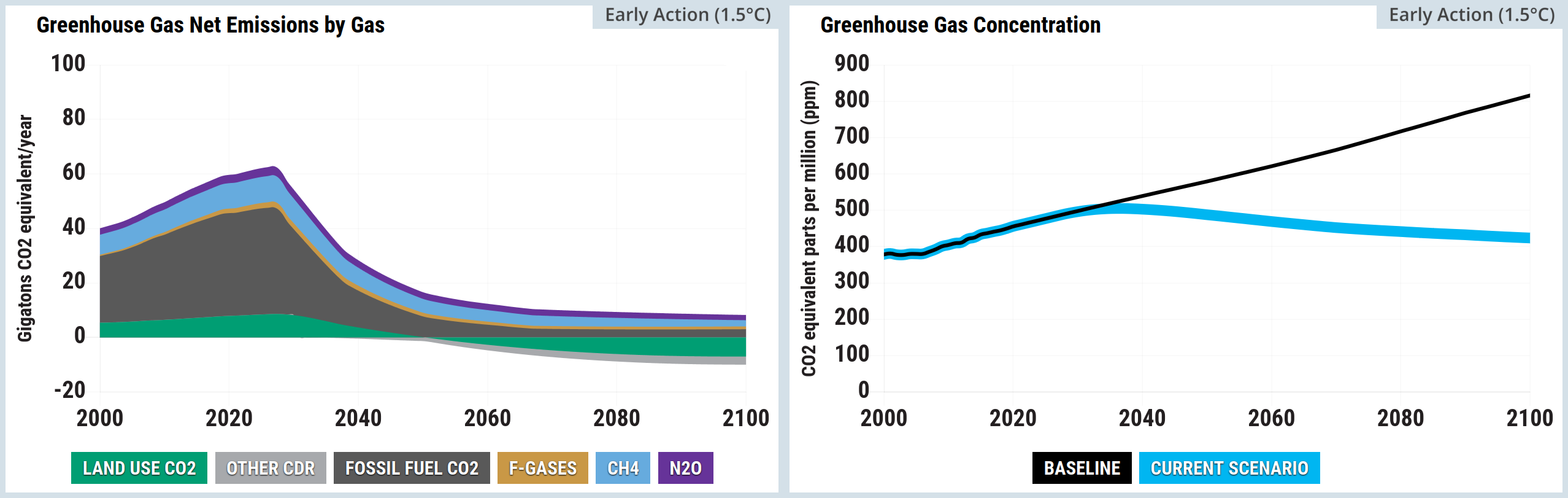
Source: Climate Interactive & MIT Sloan (2026) En-ROADS Simulator (Version 26.8.0)
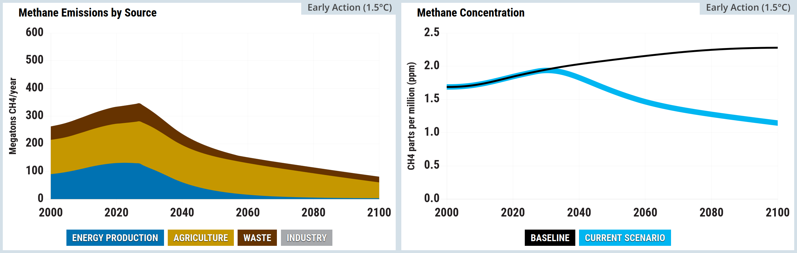
Source: Climate Interactive & MIT Sloan (2026) En-ROADS Simulator (Version 26.8.0)
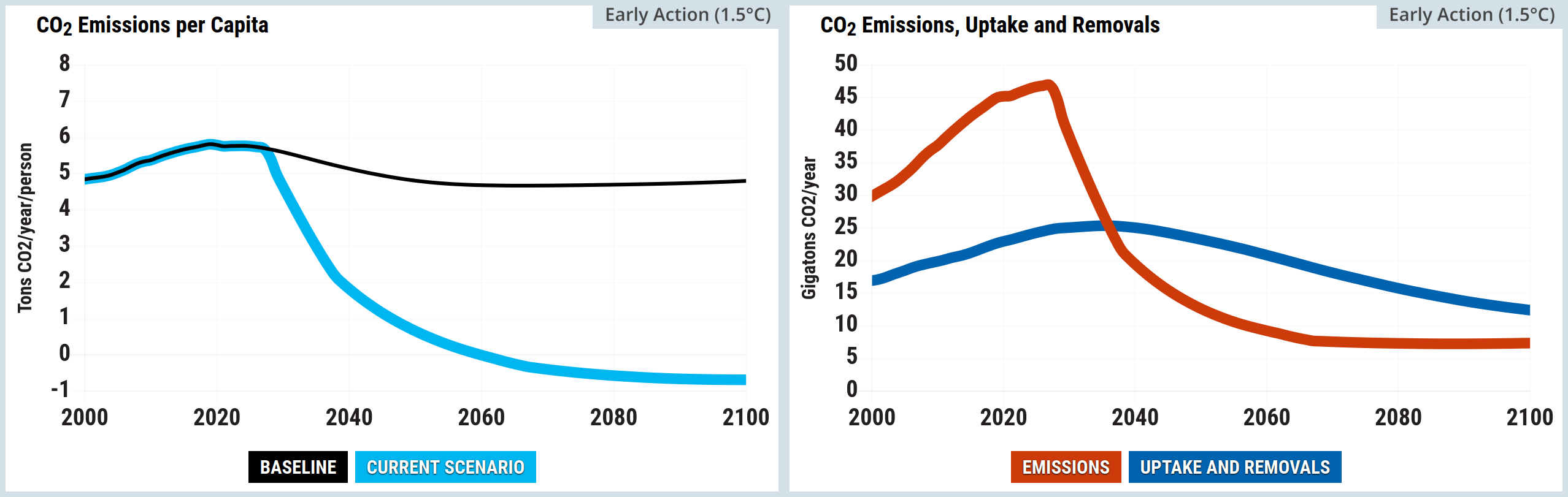
Source: Climate Interactive & MIT Sloan (2026) En-ROADS Simulator (Version 26.8.0)
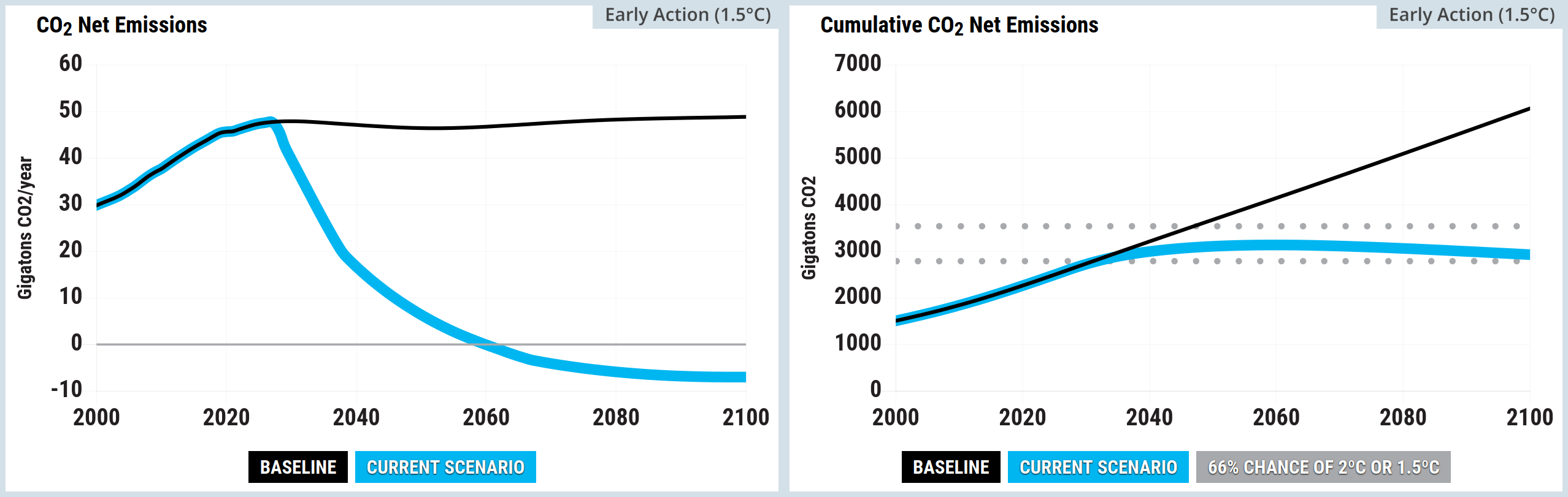
Source: Climate Interactive & MIT Sloan (2026) En-ROADS Simulator (Version 26.8.0)
Source: Climate Interactive & MIT Sloan (2026) En-ROADS Simulator (Version 26.8.0)
Source: Climate Interactive & MIT Sloan (2026) En-ROADS Simulator (Version 26.8.0)
Source: Climate Interactive & MIT Sloan (2026) En-ROADS Simulator (Version 26.8.0)
Source: Climate Interactive & MIT Sloan (2026) En-ROADS Simulator (Version 26.8.0)
Source: Climate Interactive & MIT Sloan (2026) En-ROADS Simulator (Version 26.8.0)
Source: Climate Interactive & MIT Sloan (2026) En-ROADS Simulator (Version 26.8.0)
Source: Climate Interactive & MIT Sloan (2026) En-ROADS Simulator (Version 26.8.0)
Source: Climate Interactive & MIT Sloan (2026) En-ROADS Simulator (Version 26.8.0)
Source: Climate Interactive & MIT Sloan (2026) En-ROADS Simulator (Version 26.8.0)
Source: Climate Interactive & MIT Sloan (2026) En-ROADS Simulator (Version 26.8.0)
Source: Climate Interactive & MIT Sloan (2026) En-ROADS Simulator (Version 26.8.0)
Source: Climate Interactive & MIT Sloan (2026) En-ROADS Simulator (Version 26.8.0)
Source: Climate Interactive & MIT Sloan (2026) En-ROADS Simulator (Version 26.8.0)

Source: Climate Interactive & MIT Sloan (2026) En-ROADS Simulator (Version 26.8.0)
Source: Climate Interactive & MIT Sloan (2026) En-ROADS Simulator (Version 26.8.0)
Source: Climate Interactive & MIT Sloan (2026) En-ROADS Simulator (Version 26.8.0)
Source: Climate Interactive & MIT Sloan (2026) En-ROADS Simulator (Version 26.8.0)

Source: Climate Interactive & MIT Sloan (2026) En-ROADS Simulator (Version 26.8.0)

Source: Climate Interactive & MIT Sloan (2026) En-ROADS Simulator (Version 26.8.0)

Source: Climate Interactive & MIT Sloan (2026) En-ROADS Simulator (Version 26.8.0)

Source: Climate Interactive & MIT Sloan (2026) En-ROADS Simulator (Version 26.8.0)

Source: Climate Interactive & MIT Sloan (2026) En-ROADS Simulator (Version 26.8.0)

Source: Climate Interactive & MIT Sloan (2026) En-ROADS Simulator (Version 26.8.0)

Source: Climate Interactive & MIT Sloan (2026) En-ROADS Simulator (Version 26.8.0)

Source: Climate Interactive & MIT Sloan (2026) En-ROADS Simulator (Version 26.8.0)

Source: Climate Interactive & MIT Sloan (2026) En-ROADS Simulator (Version 26.8.0)

Source: Climate Interactive & MIT Sloan (2026) En-ROADS Simulator (Version 26.8.0)

Source: Climate Interactive & MIT Sloan (2026) En-ROADS Simulator (Version 26.8.0)

Source: Climate Interactive & MIT Sloan (2026) En-ROADS Simulator (Version 26.8.0)

Source: Climate Interactive & MIT Sloan (2026) En-ROADS Simulator (Version 26.8.0)

Source: Climate Interactive & MIT Sloan (2026) En-ROADS Simulator (Version 26.8.0)

Source: Climate Interactive & MIT Sloan (2026) En-ROADS Simulator (Version 26.8.0)

Direct impacts to people


Source: Climate Interactive & MIT Sloan (2026) En-ROADS Simulator (Version 26.8.0)

Source: Climate Interactive & MIT Sloan (2026) En-ROADS Simulator (Version 26.8.0)

Source: Climate Interactive & MIT Sloan (2026) En-ROADS Simulator (Version 26.8.0)

Source: Climate Interactive & MIT Sloan (2026) En-ROADS Simulator (Version 26.8.0)

Source: Climate Interactive & MIT Sloan (2026) En-ROADS Simulator (Version 26.8.0)

Environmental impacts


Source: Climate Interactive & MIT Sloan (2026) En-ROADS Simulator (Version 26.8.0)

Source: Climate Interactive & MIT Sloan (2026) En-ROADS Simulator (Version 26.8.0)

Source: Climate Interactive & MIT Sloan (2026) En-ROADS Simulator (Version 26.8.0)

Source: Climate Interactive & MIT Sloan (2026) En-ROADS Simulator (Version 26.8.0)

Source: Climate Interactive & MIT Sloan (2026) En-ROADS Simulator (Version 26.8.0)

Source: Climate Interactive & MIT Sloan (2026) En-ROADS Simulator (Version 26.8.0)

Source: Climate Interactive & MIT Sloan (2026) En-ROADS Simulator (Version 26.8.0)

Source: Climate Interactive & MIT Sloan (2026) En-ROADS Simulator (Version 26.8.0)

Source: Climate Interactive & MIT Sloan (2026) En-ROADS Simulator (Version 26.8.0)

Source: Climate Interactive & MIT Sloan (2026) En-ROADS Simulator (Version 26.8.0)

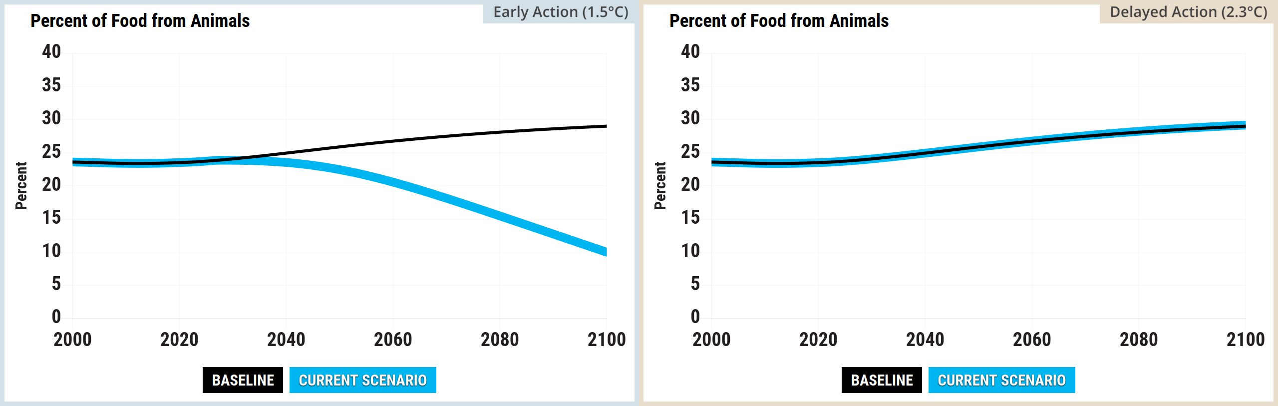
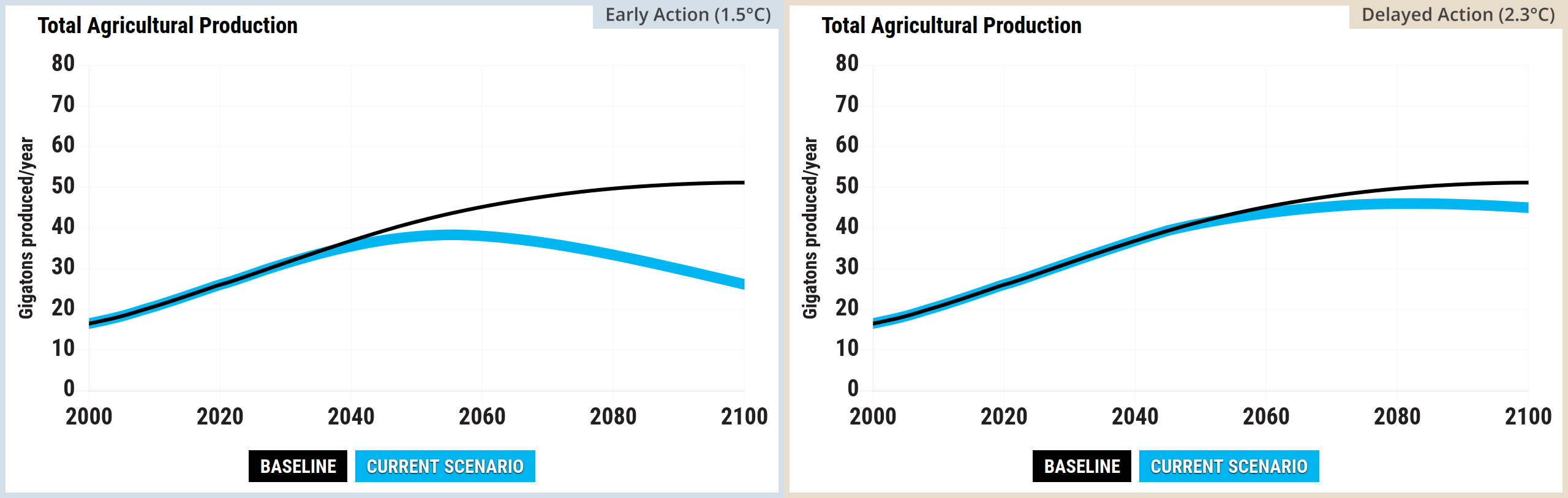
Agriculture


Source: Climate Interactive & MIT Sloan (2026) En-ROADS Simulator (Version 26.8.0)

Source: Climate Interactive & MIT Sloan (2026) En-ROADS Simulator (Version 26.8.0)

Source: Climate Interactive & MIT Sloan (2026) En-ROADS Simulator (Version 26.8.0)

Source: Climate Interactive & MIT Sloan (2026) En-ROADS Simulator (Version 26.8.0)

Source: Climate Interactive & MIT Sloan (2026) En-ROADS Simulator (Version 26.8.0)

GHG emissions


Source: Climate Interactive & MIT Sloan (2026) En-ROADS Simulator (Version 26.8.0)

Source: Climate Interactive & MIT Sloan (2026) En-ROADS Simulator (Version 26.8.0)

Source: Climate Interactive & MIT Sloan (2026) En-ROADS Simulator (Version 26.8.0)

Source: Climate Interactive & MIT Sloan (2026) En-ROADS Simulator (Version 26.8.0)

Source: Climate Interactive & MIT Sloan (2026) En-ROADS Simulator (Version 26.8.0)

Source: Climate Interactive & MIT Sloan (2026) En-ROADS Simulator (Version 26.8.0)

Source: Climate Interactive & MIT Sloan (2026) En-ROADS Simulator (Version 26.8.0)

Source: Climate Interactive & MIT Sloan (2026) En-ROADS Simulator (Version 26.8.0)

Source: Climate Interactive & MIT Sloan (2026) En-ROADS Simulator (Version 26.8.0)

Source: Climate Interactive & MIT Sloan (2026) En-ROADS Simulator (Version 26.8.0)

Source: Climate Interactive & MIT Sloan (2026) En-ROADS Simulator (Version 26.8.0)

Source: Climate Interactive & MIT Sloan (2026) En-ROADS Simulator (Version 26.8.0)

Source: Climate Interactive & MIT Sloan (2026) En-ROADS Simulator (Version 26.8.0)

Source: Climate Interactive & MIT Sloan (2026) En-ROADS Simulator (Version 26.8.0)

Source: Climate Interactive & MIT Sloan (2026) En-ROADS Simulator (Version 26.8.0)

Source: Climate Interactive & MIT Sloan (2026) En-ROADS Simulator (Version 26.8.0)

As stated above, this is an early version of this post:

  • The two scenarios haven’t been explained properly yet and the En-ROADS plots in this section haven’t been arranged properly yet
  • Some of the plots above won’t remain on the website, but they’re food for thought in the meantime. They were collected together to ensure that they came from the same version of the En-ROADS simulator

IPCC scenarios


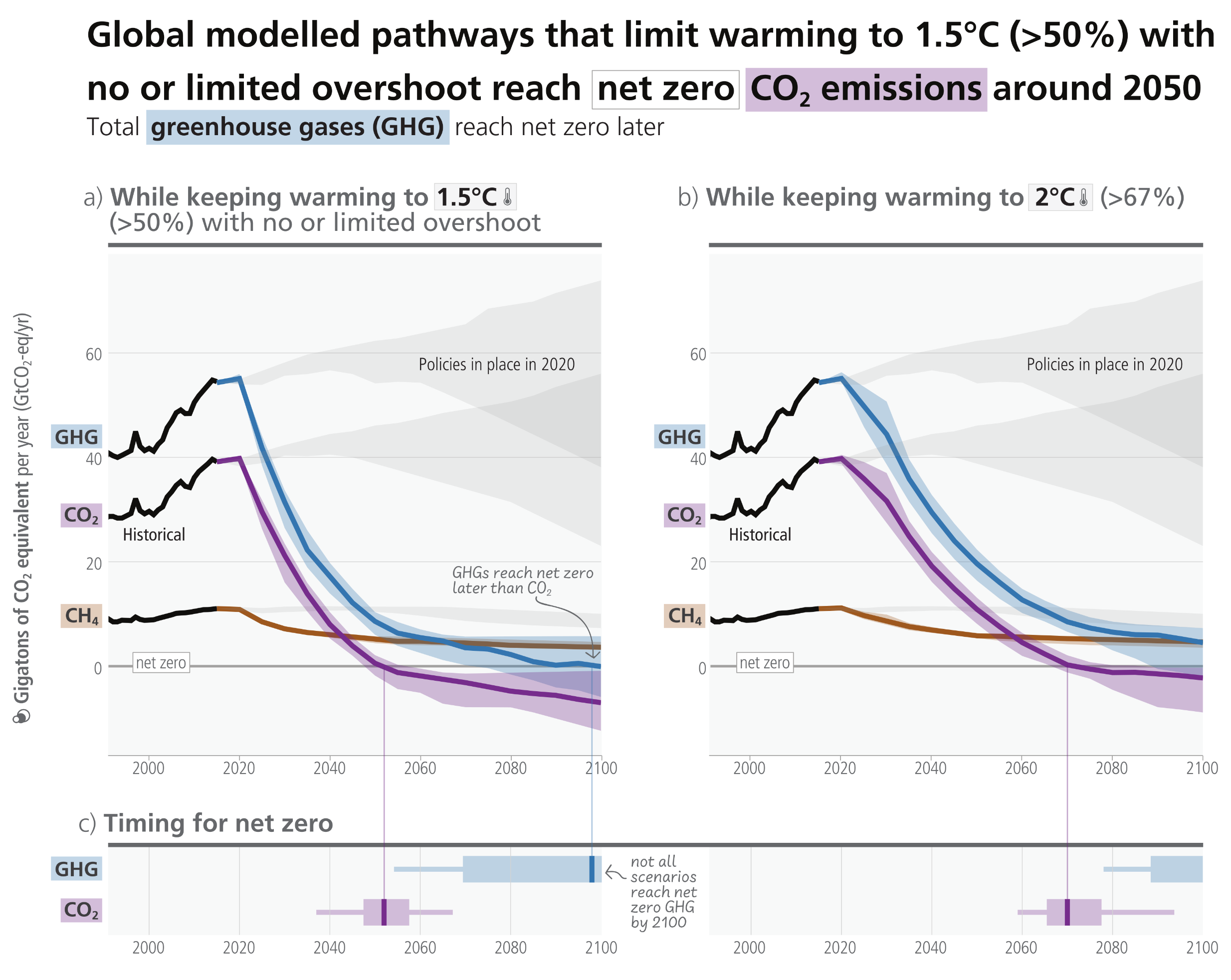
Infographic demonstrating emission pathways across three panels. Panel a, on the left, charts pathways keeping warming to 1.5 degrees Celsius. Against a rising grey background representing policies in place in 2020, the mitigation pathways drop steeply from the 2020 peak. The purple CO2 line crosses the net zero line just after 2050, whilst the blue GHG line crosses net zero just before 2100. The brown CH4 line declines but remains above zero. Panel b, on the right, charts pathways keeping warming to 2 degrees Celsius. Here, the emission drops are more gradual. The purple CO2 line crosses net zero around 2070, whilst the blue GHG line approaches zero but does not cross it by 2100. Panel c, along the bottom, displays horizontal box plots for the timing of net zero. For the 1.5 degree pathway on the left, the CO2 median is approximately 2050 and the GHG median is approximately 2095. For the 2 degree pathway on the right, the CO2 median is approximately 2070, with an accompanying note that not all scenarios reach net zero GHG by 2100.
Figure 3.6:  Total GHG, CO2 and CH4 emissions and timing of reaching net zero in different mitigation pathways. Top row: GHG, CO2 and CH4 emissions over time (in GtCO2eq) with historical emissions, projected emissions in line with policies implemented until the end of 2020 (grey), and pathways consistent with temperature goals in colour (blue, purple, and brown, respectively). Panel (a) (left) shows pathways that limit warming to 1.5°C (>50%) with no or limited overshoot (C1) and Panel (b) (right) shows pathways that limit warming to 2°C (>67%) (C3). Bottom row: Panel (c) shows median (vertical line), likely (bar) and very likely (thin lines) timing of reaching net zero GHG and CO2 emissions for global modelled pathways that limit warming to 1.5°C (>50%) with no or limited overshoot (C1) (left) or 2°C (>67%) (C3) (right).
Source: IPCC (2023) AR6 Synthesis Report, Figure 3.6

“Global net zero CO2 emissions are reached in the early 2050s in modelled pathways that limit warming to 1.5°C (>50%) with no or limited overshoot, and around the early 2070s in modelled pathways that limit warming to 2°C (>67%). Many of these pathways continue to net negative CO2 emissions after the point of net zero. These pathways also include deep reductions in other GHG emissions. The level of peak warming depends on cumulative CO2 emissions until the time of net zero CO2 and the change in non-CO2 climate forcers by the time of peaking. Deep GHG emissions reductions by 2030 and 2040, particularly reductions of methane emissions, lower peak warming, reduce the likelihood of overshooting warming limits and lead to less reliance on net negative CO2 emissions that reverse warming in the latter half of the century. Reaching and sustaining global net zero GHG emissions results in a gradual decline in warming. (high confidence)”

Source: IPCC (2022) AR6 WGIII Summary for Policymakers, C.2, pg. 23


Global emissions scenarios to 2100

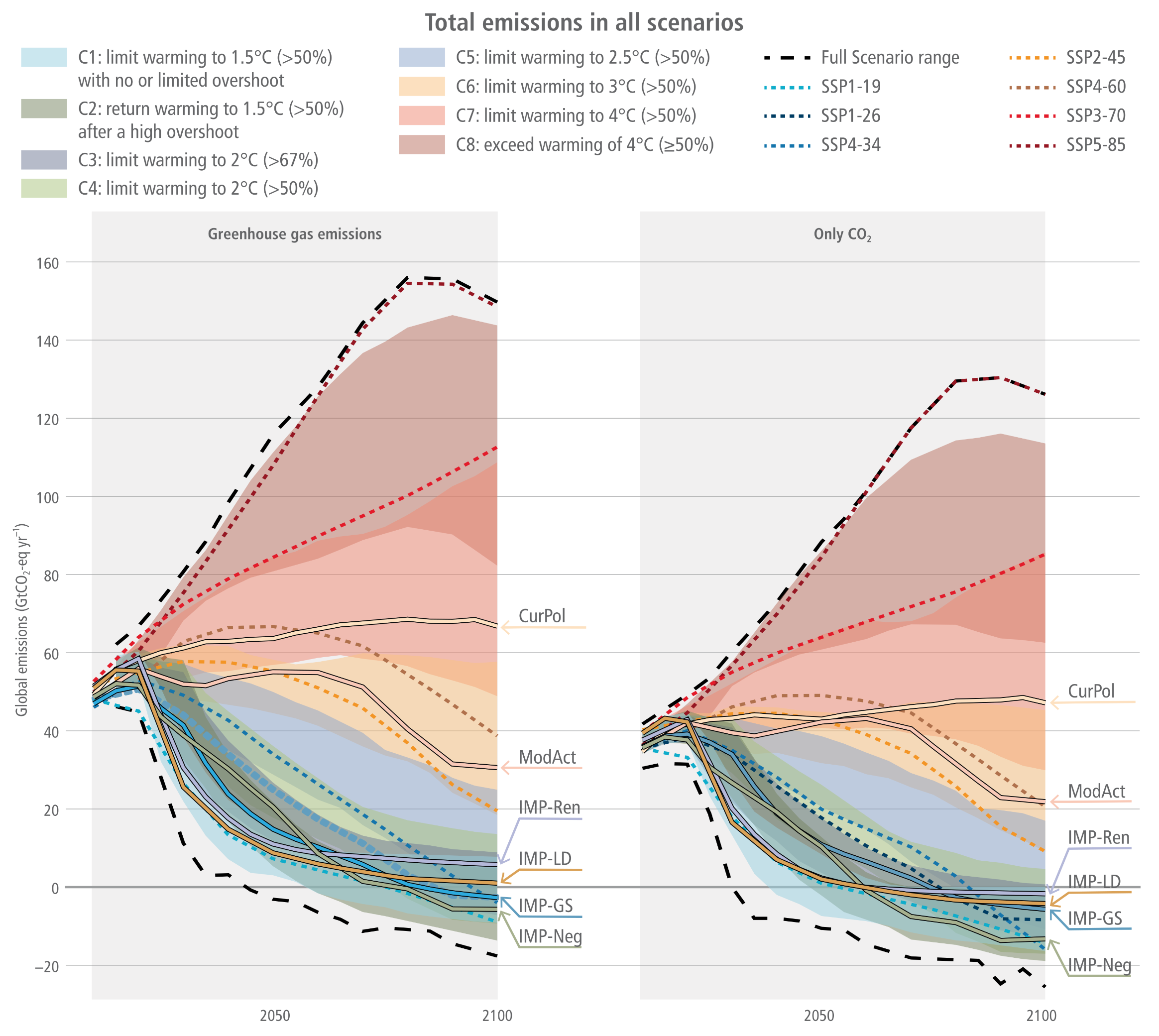
Two side-by-side graphs titled Total emissions in all scenarios. A comprehensive legend maps colour-coded shaded areas to climate categories, ranging from blue and green for scenarios limiting warming to 1.5 or 2.0 degrees Celsius, up to red and brown for scenarios exceeding 4.0 degrees Celsius. The left graph tracks Greenhouse gas emissions, and the right tracks Only CO2, both measuring gigatons of CO2 equivalent per year from historical levels up to 2100. Both panels show emissions rising to 2020 before diverging into a massive fan shape bounded by thick dashed black lines. High-emission pathways, such as Current Policies labelled CurPol, continue to rise or plateau, with the absolute highest scenario range peaking near 160 gigatons. Conversely, ambitious illustrative mitigation pathways, labelled with the prefix IMP, drop steeply after 2020. In the left panel, the lowest greenhouse gas pathways cross the zero line to become net negative around 2070. In the right panel, the CO2 only pathways plunge even more sharply, crossing the zero line before 2050 and reaching deeper negative values approaching minus 30 gigatons by the end of the century.
Figure 3.10:  Total emissions profiles in the scenarios based on climate category for GHGs (AR6 GWP-100) and CO2. The Illustrative mitigation pathways (IMPs) are also indicated.
Source: IPCC (2022) WGIII Chapter 3, Figure 3.10, pg. 315

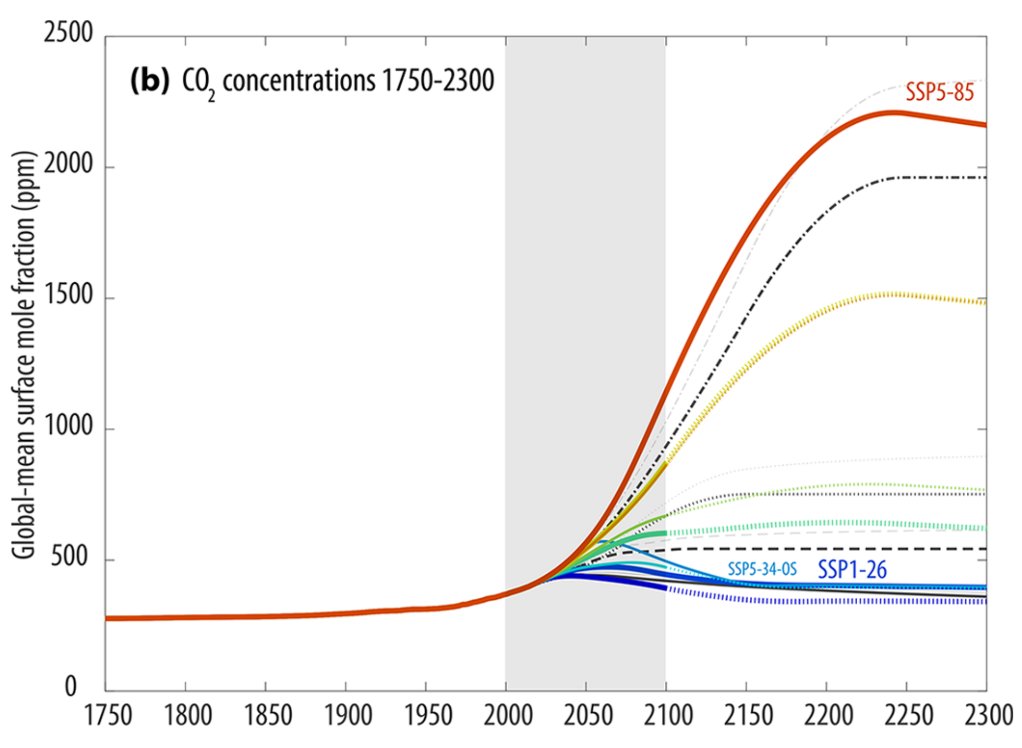
CO2 concentrations for SSPs

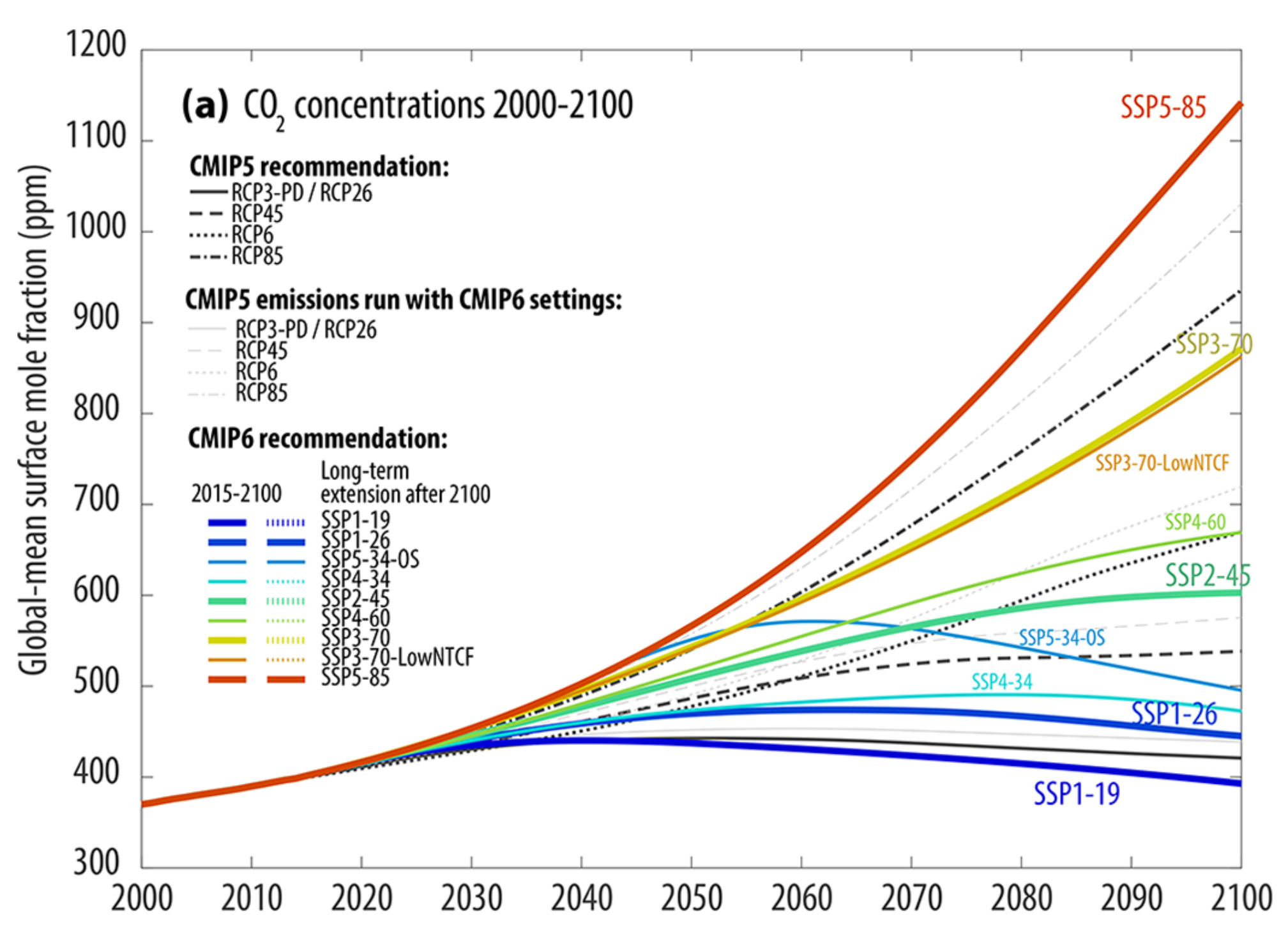
Two vertically stacked line graphs showing global-mean surface CO2 concentrations in parts per million. The top panel, labelled a, zooms in on the period from 2000 to 2100. All pathways start together just below 400 parts per million in 2000 and diverge significantly after 2015. The highest emission trajectory, the red SSP5-85 line, rises steeply to exceed 1100 parts per million by 2100. Middle trajectories like the yellow SSP3-70 and green SSP2-45 reach roughly 860 and 600 parts per million, respectively. The most ambitious pathways, such as the dark blue SSP1-19 and blue SSP1-26, peak mid-century before gradually declining to approximately 400 and 450 parts per million by 2100. Black lines represent the original RCP scenarios, whilst accompanying grey lines track slightly higher. The bottom panel, labelled b, provides a long-term historical and future view from 1750 to 2300. It shows historical concentrations remaining flat near 280 parts per million until a sharp rise begins in the twentieth century. Passing through a grey shaded block representing the 21st century, the long-term extensions show massive divergence. The extreme red SSP5-85 scenario continues soaring to peak above 2200 parts per million around the year 2250 before a slight dip, whilst lower-emission scenarios like the blue SSP1-26 stabilise and decline to below 400 parts per million by 2300.

Figure 11:  Overview of SSP concentrations in comparison with RCP concentrations for CO2. The original RCP scenarios are shown in thicker lines and various line styles. Applying the new MAGICC7 default setting used for the SSP scenarios to the RCP emissions results in generally higher concentrations (grey lines).
Source: Meinshausen et al. (2020) Figure 11 (modified to show CO2 only)

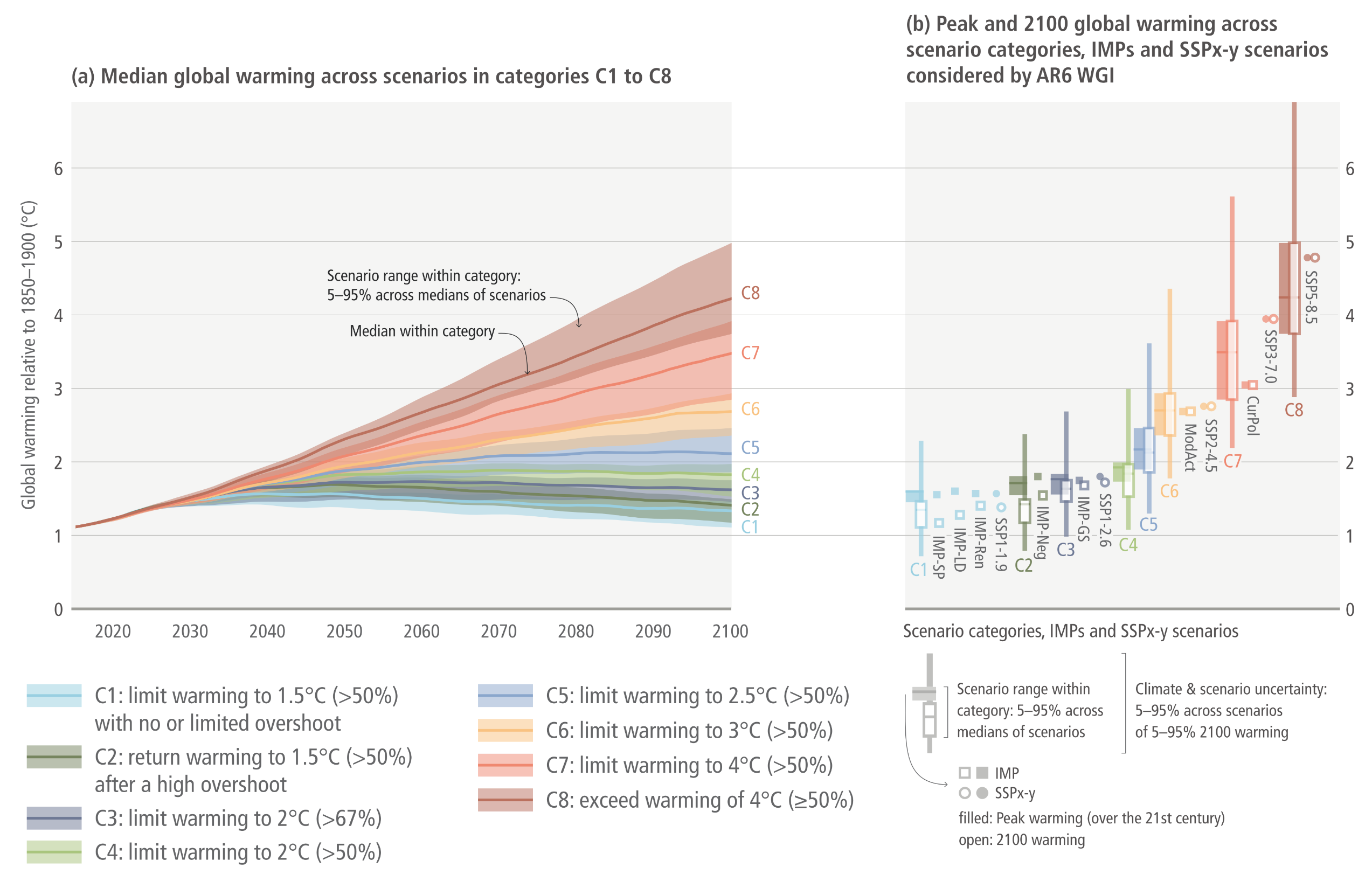
Global warming scenarios to 2100

Two side-by-side graphs illustrating global warming projections from 2020 to 2100. The left graph, labelled a, is a line chart tracking median global warming relative to 1850 to 1900 in degrees Celsius. All pathways begin clustered just above 1 degree in 2020 and fan out widely over the century. The highest emission category, C8 in dark red, arcs steeply upwards, crossing 4 degrees Celsius by 2100 with its upper shaded uncertainty band reaching 5 degrees. Middle categories, C5 through C7 in blues, oranges, and reds, rise steadily to end spread between roughly 2 and 4 degrees. The most ambitious mitigation categories, C1 through C4 in light blues and greens, plateau mid-century before gradually flattening or slightly declining, clustering tightly between roughly 1.2 and 1.8 degrees Celsius by 2100. The right graph, labelled b, displays vertical box and whisker plots for peak and 2100 warming across the same categories. It visually reinforces how uncertainty grows at higher emissions. The plots for C1 to C4 are relatively compact and remain below 2 degrees. As the categories progress from C5 to C8, the box plots stretch dramatically higher and wider, with the C8 plot spanning from roughly 3 degrees to over 6 degrees Celsius. Individual square and circle markers sit alongside the boxes to indicate specific illustrative mitigation pathways and shared socio-economic pathways.
Figure 3.11:  Global mean temperature outcome of the ensemble of scenarios included in the climate categories C1–C8 (based on a reduced complexity model – RCM – calibrated to the WGI assessment, both in terms of future and historic warming). The left panel shows the ranges of scenario uncertainty (shaded area) with the P50 RCM probability (line). The right panel shows the P5 to P95 range of combined RCM climate uncertainty (C1–C8 is explained in Table 3.1) and scenario uncertainty, and the P50 (line).
Source: IPCC (2022) AR6 WGIII Chapter 3, Figure 3.11, pg. 317

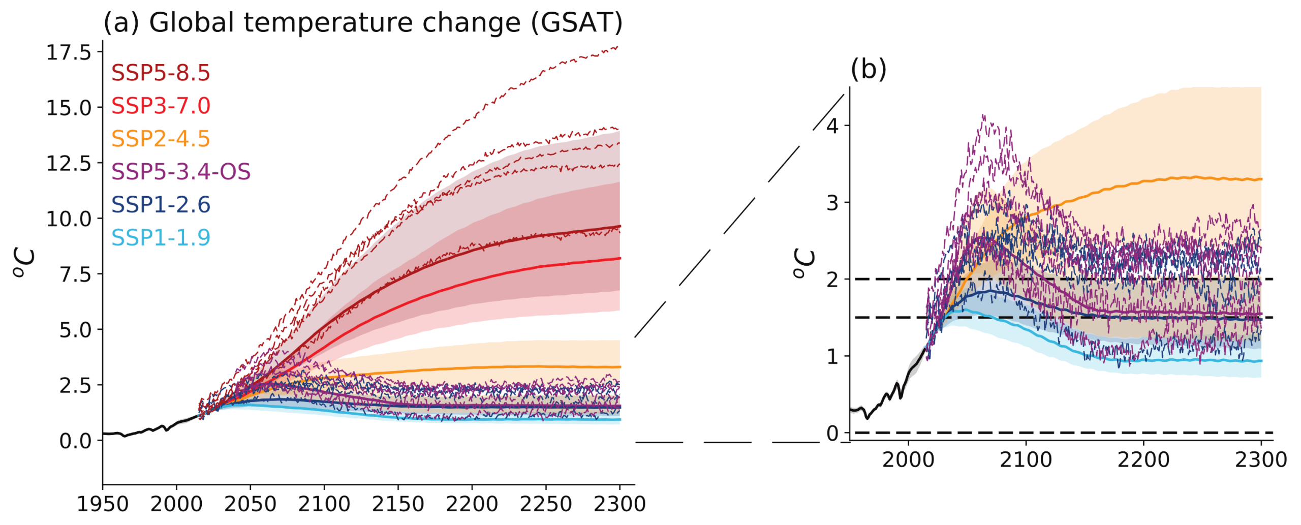
Simulated temperature change up to 2300 under the extended SSP scenarios

Two side-by-side graphs illustrating global temperature change from 1950 to 2300. The left graph, labelled a, shows temperature change in degrees Celsius with a massive divergence in pathways after the year 2000. High-emission scenarios, shown in red and dark red, rise continuously and steeply; the most extreme dashed line reaches nearly 17.5 degrees by 2300, whilst their shaded plumes centre between 7.5 and 10 degrees. The mid-range orange scenario plateaus around 3 to 4 degrees. The right graph, labelled b, zooms in on the lowest-emission scenarios and includes dashed horizontal reference lines at zero, 1.5, and 2.0 degrees. It shows the light blue SSP1-1.9 scenario peaking near 1.5 degrees before declining to roughly 1 degree by 2300. The dark blue SSP1-2.6 scenario peaks near 2.0 degrees before settling just above 1.5 degrees. The purple SSP5-3.4-OS scenario illustrates a large overshoot, peaking sharply between 2.5 and 4 degrees during the 21st century before plunging back down to join the 1.5 degree cluster by 2300.
Figure 4.40:  Simulated temperature change up to 2300 under the extended SSP scenarios.  (a) projected global surface air temperature (GSAT) change, relative to 1850–1900, from CMIP6 models (individual lines) and MAGICC7 (shaded plumes); (b) as (a) but zoomed in to show low-emissions scenarios;
Source: IPCC (2021) AR6 WGI Chapter 4, Figure 4.40, pg. 632


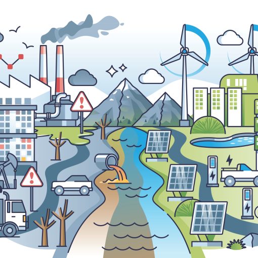
Featured image: background Adobe Stock 95437745, foreground Climate Interactive & MIT Sloan (2026) En-ROADS Simulator (Version 26.6.0)