Climate resilient development

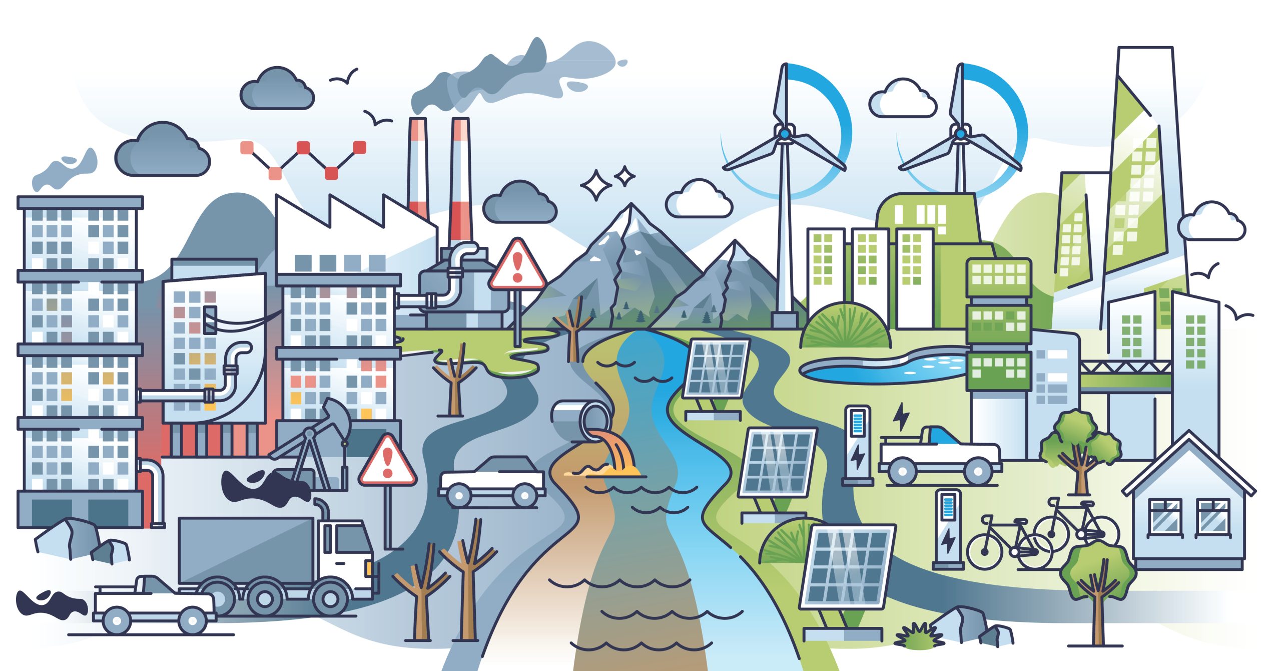
An image visually contrasting carbon-intensive industry with climate-resilient development. A central river flowing from distant mountains divides the scene into two distinct halves. The left side depicts a polluted, grey environment featuring factory smokestacks emitting dark clouds of smog, an active oil beam pump, heavy motor vehicle traffic, bare dead trees, red warning signs, and an outflow pipe discharging brown toxic waste into the left half of the river. In sharp contrast, the right side displays a clean, sustainable environment rendered in vibrant greens and blues. This side features tall wind turbines, ground-mounted solar panels, modern green buildings integrated with nature, electric vehicle charging stations, bicycles, and lush leafy trees. The right half of the river runs a clear blue, contrasting directly with the polluted water on the left, while the sky transitions from dark and smoggy on the industrial side to bright with crisp white clouds on the sustainable side. Source: Adobe Stock 714565142.

This post takes a quick look at greenhouse gas mitigation. For detailed explanations, links to the source articles (such as IPCC report chapters) are at the bottom.


There is a rapidly narrowing window of opportunity to enable climate resilient development
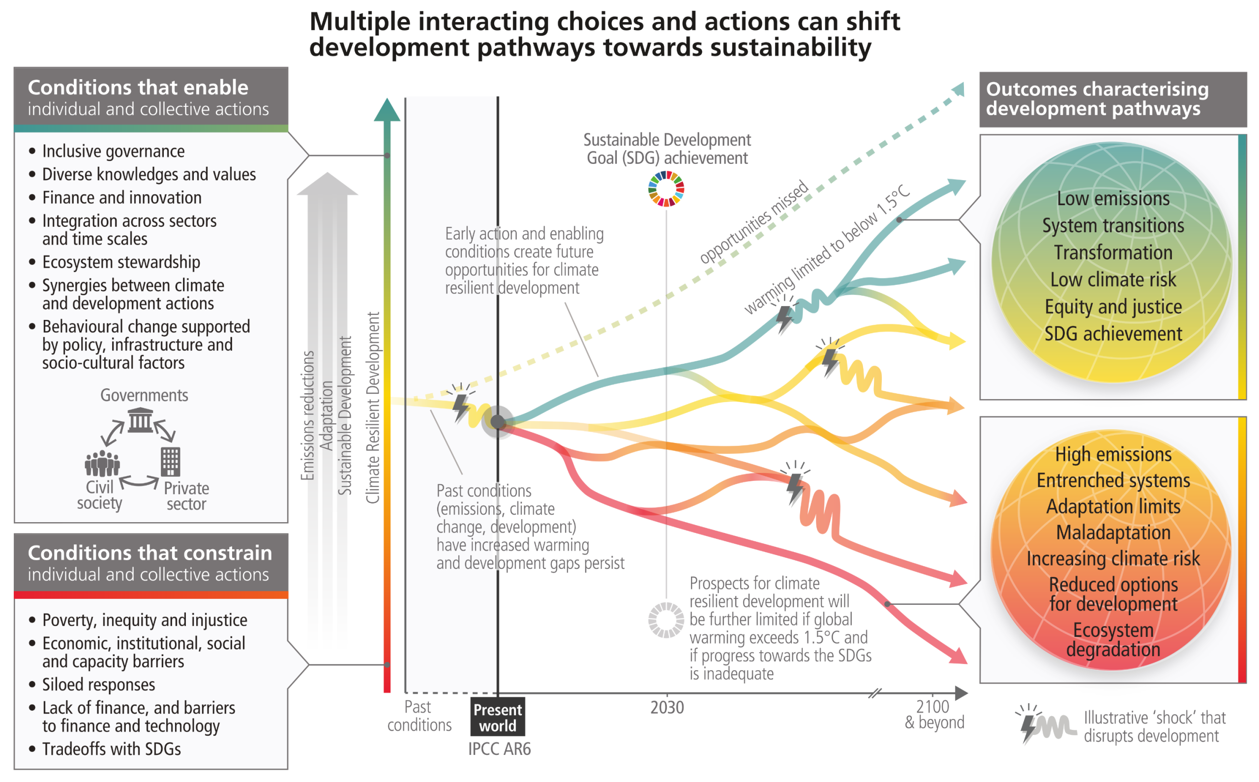
A complex diagram showing a timeline from the past to 2100. A single line forks into multiple development pathways ranging from red (high emissions, ecosystem degradation) to green (low emissions, sustainable development). The pathways are influenced by enabling or constraining conditions from governments and civil society, and are periodically disrupted by illustrative climate shocks.
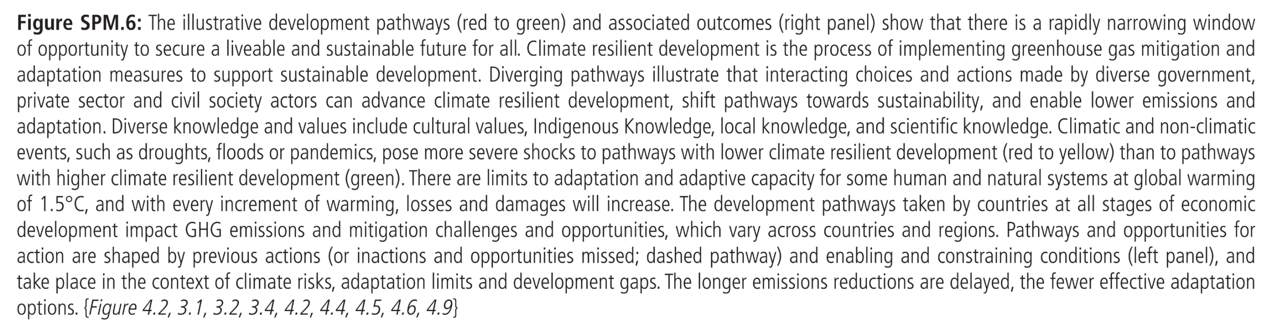
Figure SPM.6: The illustrative development pathways (red to green) and associated outcomes (right panel) show that there is a rapidly narrowing window of opportunity to secure a liveable and sustainable future for all. Climate resilient development is the process of implementing greenhouse gas mitigation and adaptation measures to support sustainable development. Diverging pathways illustrate that interacting choices and actions made by diverse government, private sector and civil society actors can advance climate resilient development, shift pathways towards sustainability, and enable lower emissions and
adaptation.
Source: IPCC (2023) AR6 SYR SPM, Figure SPM.6

Adverse impacts from human-caused climate change will continue to intensify
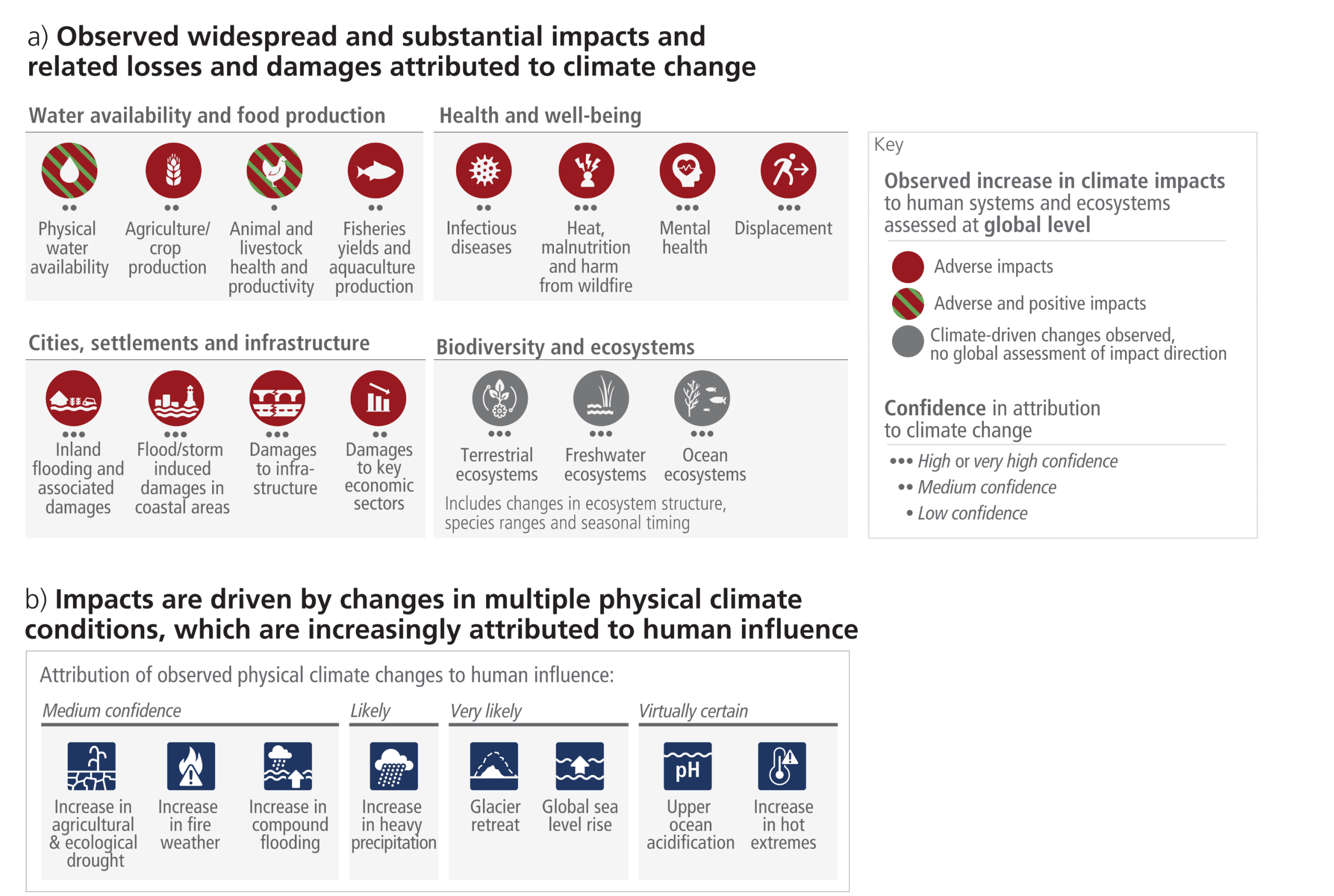
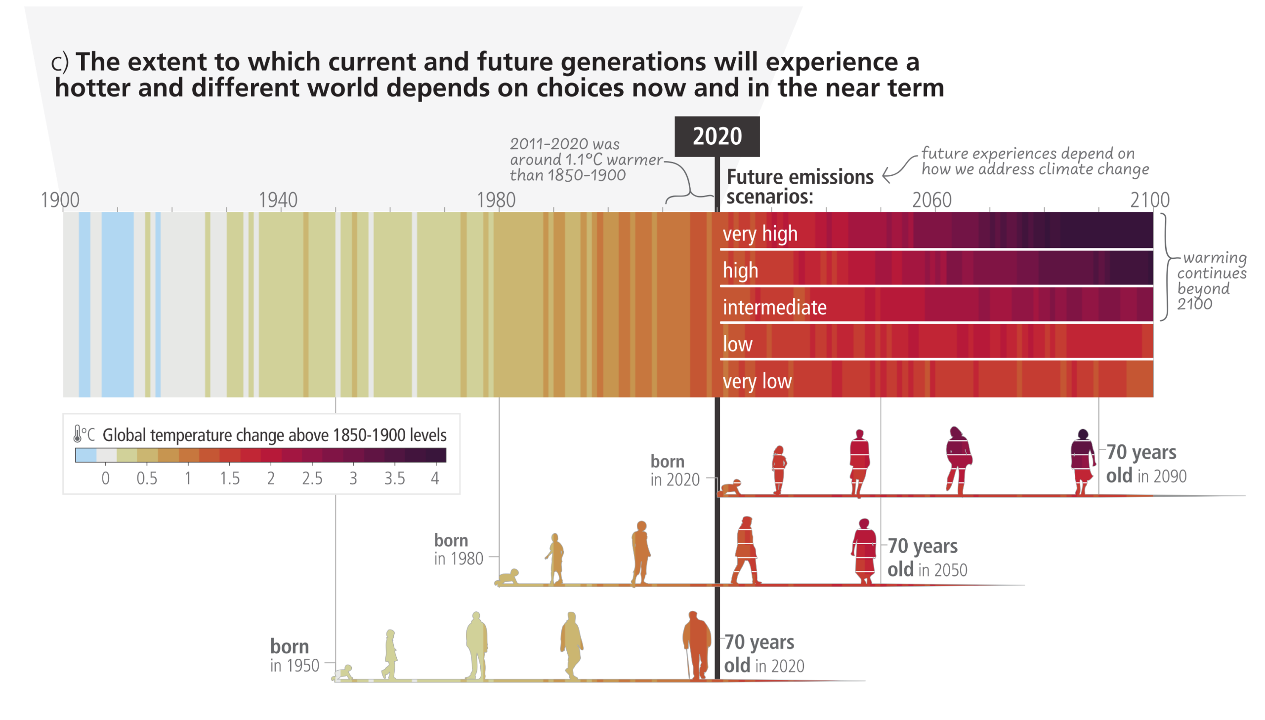
A three-panel infographic. Panel A displays a grid of circular icons categorized into water/food, health, infrastructure, and biodiversity, predominantly shaded red to indicate adverse impacts, with dots noting confidence levels. Panel B shows a horizontal spectrum of square icons for physical climate drivers, such as sea level rise and extreme heat, arranged by the certainty of human attribution. Panel C features a timeline from 1900 to 2100 using vertical climate stripes that transition from cool blue to dark red. Post-2020, the stripes branch into five distinct future emission scenarios. Below the stripes, the lifespans of three generations—born in 1950, 1980, and 2020—are represented by human silhouettes that change color to match the projected warming they will experience.

Figure SPM.1: (a) Climate change has already caused widespread impacts and related losses and damages on human systems and altered terrestrial, freshwater and ocean ecosystems worldwide. Physical water availability includes balance of water available from various sources including ground water, water quality and demand for water. Global mental health and displacement assessments reflect only assessed regions. Confidence levels reflect the assessment of attribution of the observed impact to climate change. (b) Observed impacts are connected to physical climate changes including many that have been attributed to human influence such as the selected climatic impact-drivers shown. Confidence and likelihood levels reflect the assessment of attribution of the observed climatic impact-driver to human influence. (c) Observed (1900–2020) and projected (2021–2100) changes in global surface temperature (relative to 1850-1900), which are linked to changes in climate conditions and impacts, illustrate how the climate has already changed and will change along the lifespan of three representative generations (born in 1950, 1980 and 2020). Future projections (2021–2100) of changes in global surface temperature are shown for very low (SSP1-1.9), low (SSP1-2.6), intermediate (SSP2-4.5), high (SSP3-7.0) and very high (SSP5-8.5) GHG emissions scenarios. Changes in annual global surface temperatures are presented as ‘climate stripes’, with future projections showing the human-caused long-term trends and continuing modulation by natural variability (represented here using observed levels of past natural variability). Colours on the generational icons correspond to the global surface temperature stripes for each year, with segments on future icons differentiating possible future experiences.
Source: IPCC (2023) AR6 SYR SPM, Figure SPM.1

Mitigation options


“All global modelled pathways that limit warming to 1.5°C (>50%) with no or limited overshoot, and those that limit warming to 2°C (>67%), involve rapid and deep and in most cases immediate GHG emission reductions in all sectors. Modelled mitigation strategies to achieve these reductions include transitioning from fossil fuels without CCS to very low- or zero-carbon energy sources, such as renewables or fossil fuels with CCS, demand side measures and improving efficiency, reducing non-CO2 emissions, and deploying carbon dioxide removal (CDR) methods to counterbalance residual GHG emissions.”

Source: IPCC (2022) AR6 WGIII, Summary for Policymakers, C.3, pg. 24


Cost reductions and adoption in solar photovoltaic and wind energy
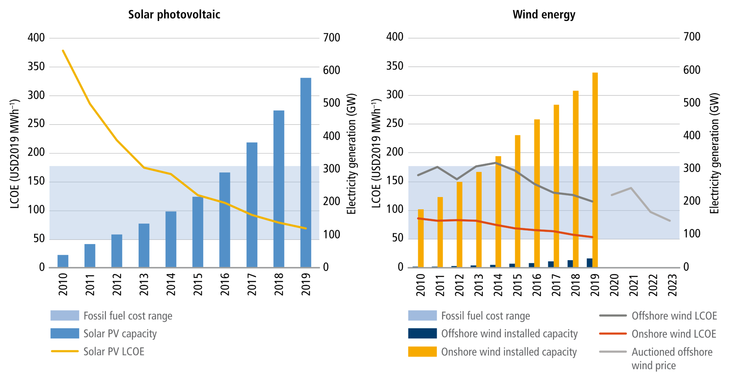
Two side-by-side combination charts plotting data from 2010 to 2019. The left chart for Solar Photovoltaic shows a yellow line representing cost falling steeply from high above the fossil fuel baseline band to near the bottom of the band, while blue bars indicate capacity rising exponentially. The right chart for Wind Energy shows onshore capacity (yellow bars) rising steadily and offshore capacity (dark blue bars) remaining comparatively low. Downward-trending lines show onshore wind costs remaining near the bottom of the fossil fuel band, while offshore wind costs drop steadily into the band, with a projected auctioned price line continuing to fall steeply through 2023.
Figure 1.3  Cost reductions and adoption in solar photovoltaic and wind energy. Fossil fuel Levelised Cost of Electricity (LCOE) is indicated by blue shading at USD50–177 MWh–1.
Source: IPCC (2022) AR6 WGIII Chapter 1, Figure 1.3

Unit cost reductions and use in some rapidly changing mitigation technologies
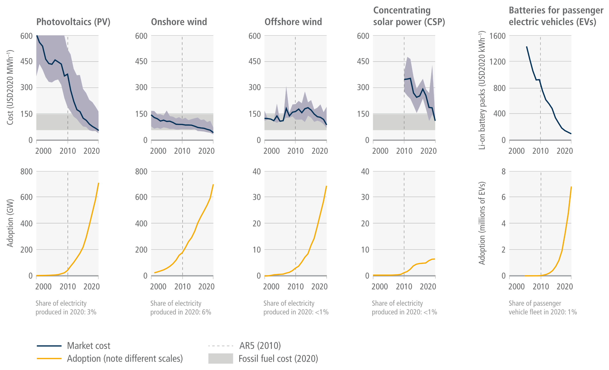
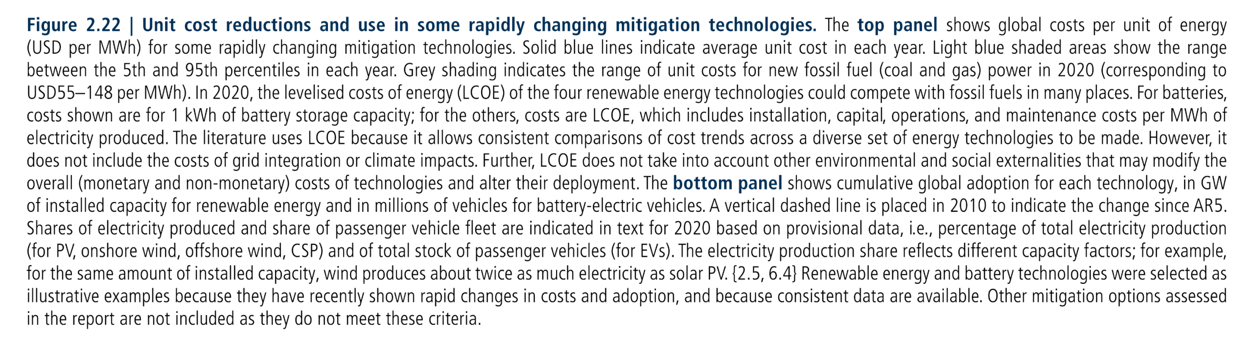
A grid of ten line charts arranged in two rows and five columns comparing Photovoltaics, Onshore wind, Offshore wind, Concentrating solar power, and EV batteries from 2000 to 2020. The top row shows market costs as blue lines: costs plummet steeply for PV and batteries, and decline or fluctuate downward for the other technologies. By 2020, the cost lines for all four energy generation methods fall into or below a horizontal grey band representing fossil fuel costs. The bottom row displays cumulative adoption as yellow lines: across all five technologies, the lines curve sharply upward, illustrating rapid exponential growth that accelerates significantly after 2010.
Figure 2.22 | Unit cost reductions and use in some rapidly changing mitigation technologies. The top panel shows global costs per unit of energy (USD per MWh) for some rapidly changing mitigation technologies. Solid blue lines indicate average unit cost in each year. Light blue shaded areas show the range between the 5th and 95th percentiles in each year. Grey shading indicates the range of unit costs for new fossil fuel (coal and gas) power in 2020 (corresponding to USD55–148 per MWh). In 2020, the levelised costs of energy (LCOE) of the four renewable energy technologies could compete with fossil fuels in many places. For batteries, costs shown are for 1 kWh of battery storage capacity; for the others, costs are LCOE, which includes installation, capital, operations, and maintenance costs per MWh of electricity produced. The literature uses LCOE because it allows consistent comparisons of cost trends across a diverse set of energy technologies to be made. However, it does not include the costs of grid integration or climate impacts. Further, LCOE does not take into account other environmental and social externalities that may modify the overall (monetary and non-monetary) costs of technologies and alter their deployment. The bottom panel shows cumulative global adoption for each technology, in GW of installed capacity for renewable energy and in millions of vehicles for battery-electric vehicles. A vertical dashed line is placed in 2010 to indicate the change since AR5. Shares of electricity produced and share of passenger vehicle fleet are indicated in text for 2020 based on provisional data, i.e., percentage of total electricity production (for PV, onshore wind, offshore wind, CSP) and of total stock of passenger vehicles (for EVs). The electricity production share reflects different capacity factors; for example, for the same amount of installed capacity, wind produces about twice as much electricity as solar PV. {2.5, 6.4} Renewable energy and battery technologies were selected as illustrative examples because they have recently shown rapid changes in costs and adoption, and because consistent data are available. Other mitigation options assessed in the report are not included as they do not meet these criteria.
Source: IPCC (2022) AR6 WGIII Chapter 2, Figure 2.22

Overview of mitigation options and their estimated ranges of costs and potentials in 2030
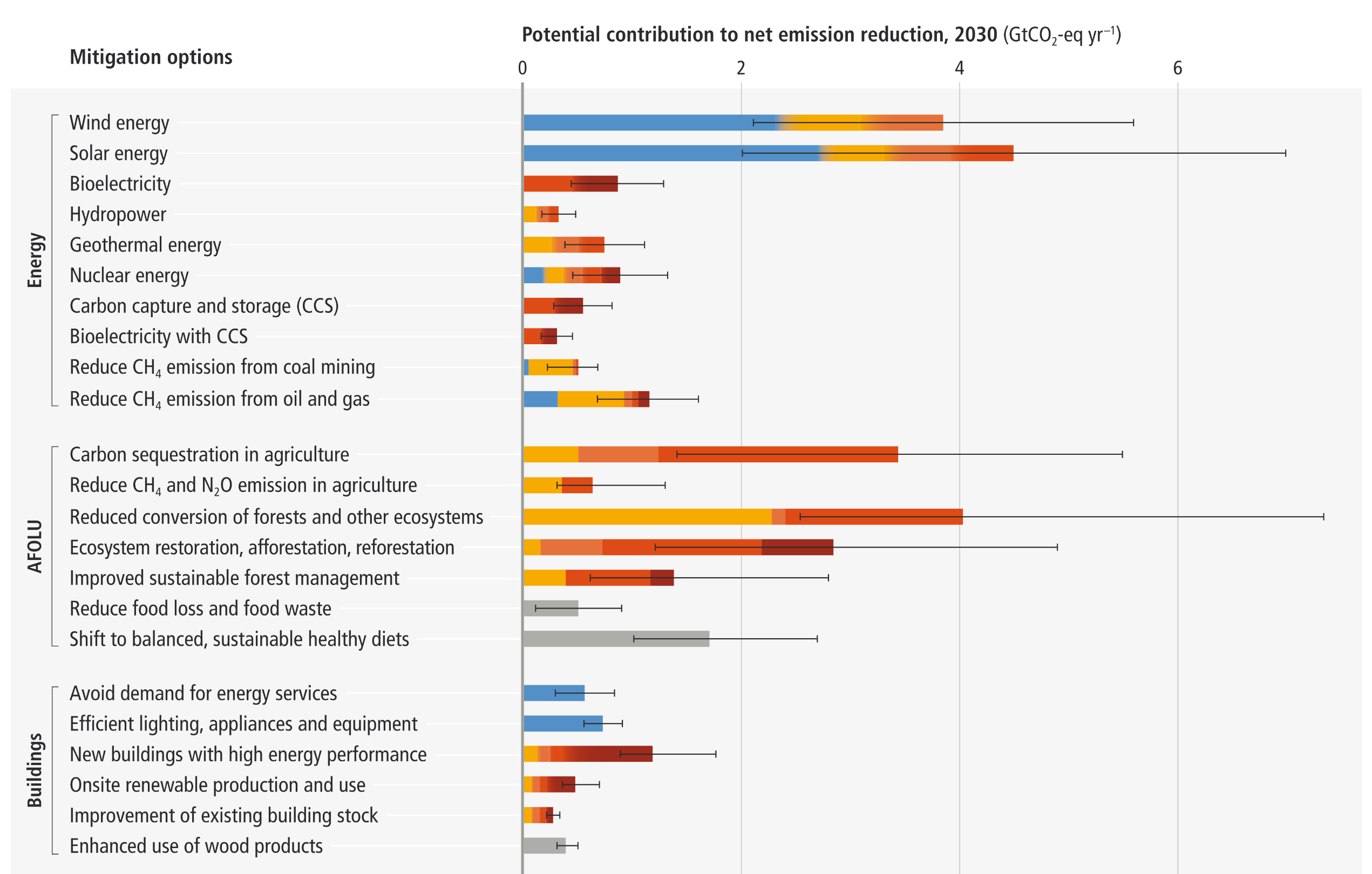
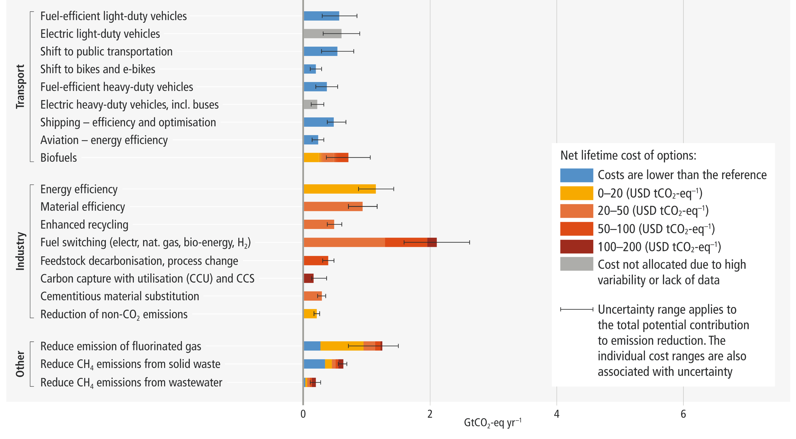
A horizontal stacked bar chart categorizing mitigation options into Energy, AFOLU, Buildings, Transport, Industry, and Other sectors. The length of each bar represents the potential contribution to net emission reduction by 2030, measured on an axis from 0 to 6 GtCO2-eq yr-1. The bars are segmented by colors representing net lifetime costs: blue indicates costs lower than the reference, progressing through yellow, orange, and red up to dark red for the highest costs, with grey for unallocated costs. Wind energy, solar energy, and reduced conversion of forests display the longest overall bars, featuring substantial blue and yellow low-cost segments. Horizontal error bars extend from the solid bars to indicate uncertainty ranges.

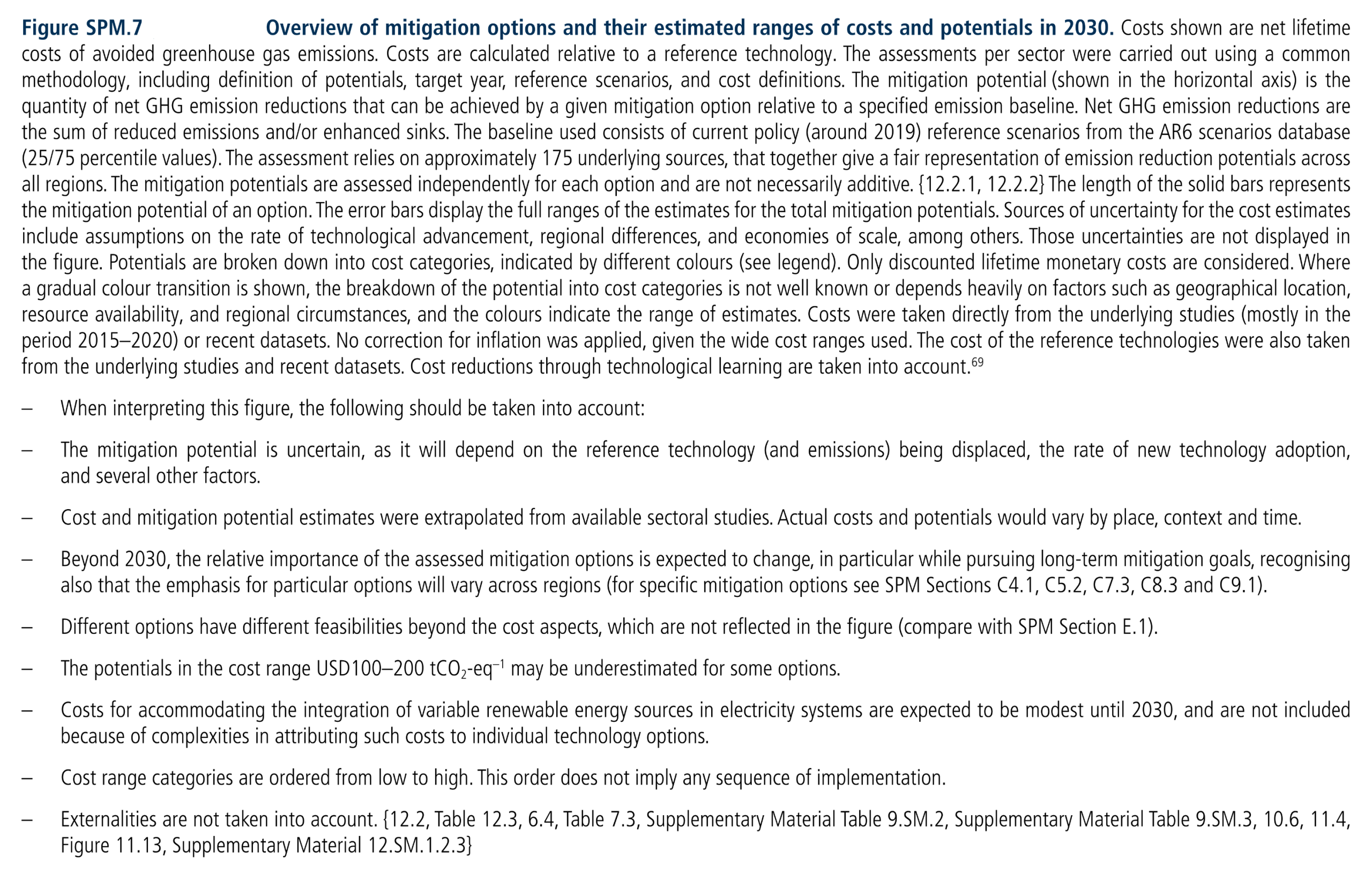
Figure SPM.7: Overview of mitigation options and their estimated ranges of costs and potentials in 2030. Costs shown are net lifetime costs of avoided greenhouse gas emissions. Costs are calculated relative to a reference technology. The assessments per sector were carried out using a common methodology, including definition of potentials, target year, reference scenarios, and cost definitions. The mitigation potential (shown in the horizontal axis) is the quantity of net GHG emission reductions that can be achieved by a given mitigation option relative to a specified emission baseline. Net GHG emission reductions are the sum of reduced emissions and/or enhanced sinks. The baseline used consists of current policy (around 2019) reference scenarios from the AR6 scenarios database (25/75 percentile values). The assessment relies on approximately 175 underlying sources, that together give a fair representation of emission reduction potentials across all regions. The mitigation potentials are assessed independently for each option and are not necessarily additive. {12.2.1, 12.2.2} The length of the solid bars represents the mitigation potential of an option. The error bars display the full ranges of the estimates for the total mitigation potentials. Sources of uncertainty for the cost estimates include assumptions on the rate of technological advancement, regional differences, and economies of scale, among others. Those uncertainties are not displayed in the figure. Potentials are broken down into cost categories, indicated by different colours (see legend). Only discounted lifetime monetary costs are considered. Where a gradual colour transition is shown, the breakdown of the potential into cost categories is not well known or depends heavily on factors such as geographical location, resource availability, and regional circumstances, and the colours indicate the range of estimates. Costs were taken directly from the underlying studies (mostly in the period 2015–2020) or recent datasets. No correction for inflation was applied, given the wide cost ranges used. The cost of the reference technologies were also taken from the underlying studies and recent datasets. Cost reductions through technological learning are taken into account. –When interpreting this figure, the following should be taken into account: –The mitigation potential is uncertain, as it will depend on the reference technology (and emissions) being displaced, the rate of new technology adoption, and several other factors. –Cost and mitigation potential estimates were extrapolated from available sectoral studies. Actual costs and potentials would vary by place, context and time. –Beyond 2030, the relative importance of the assessed mitigation options is expected to change, in particular while pursuing long-term mitigation goals, recognising also that the emphasis for particular options will vary across regions (for specific mitigation options see SPM Sections C4.1, C5.2, C7.3, C8.3 and C9.1). –Different options have different feasibilities beyond the cost aspects, which are not reflected in the figure (compare with SPM Section E.1). –The potentials in the cost range USD100–200 tCO2-eq–1 may be underestimated for some options. –Costs for accommodating the integration of variable renewable energy sources in electricity systems are expected to be modest until 2030, and are not included because of complexities in attributing such costs to individual technology options. –Cost range categories are ordered from low to high. This order does not imply any sequence of implementation. –Externalities are not taken into account.
Source: IPCC (2022) AR6 WGIII SPM, Figure SPM.7

Schematic of net-zero emissions energy system, including methods to address difficult-to-electrify sectors
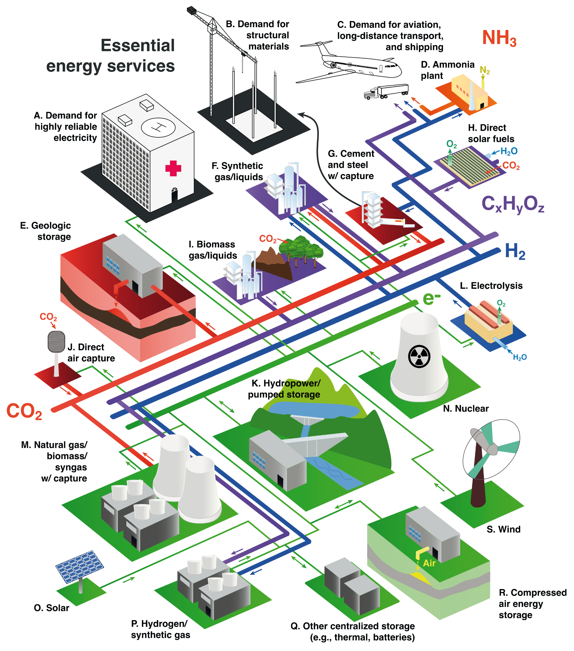

A flowchart mapping the interconnections of a net-zero energy system. At the bottom and right, generation sources like solar, wind, nuclear, and hydropower connect via green electricity lines to storage systems and an electrolysis plant. These feed into a central network of colored pipelines distributing hydrogen, hydrocarbons, ammonia, and carbon dioxide. The top and left sections show these resources supplying end-uses—illustrated by a hospital, a construction crane, and transport vehicles—alongside industrial nodes like cement plants, synthetic gas facilities, and direct air capture systems that route CO2 back into underground geologic storage.
Figure 6.23: Schematic of an integrated system that can provide essential energy services without adding any CO2 to the atmosphere. (A to S) Colors indicate the dominant role of specific technologies and processes. Green, electricity generation and transmission; blue, hydrogen production and transport; purple, hydrocarbon production and transport; orange, ammonia production and transport; red, carbon management; and black, end uses of energy and materials.
Source: IPCC (2022) AR6 WGIII Chapter 6, Figure 6.23, pg. 678, from Davis et al (2018) Net-zero emissions energy systems, Figure 1

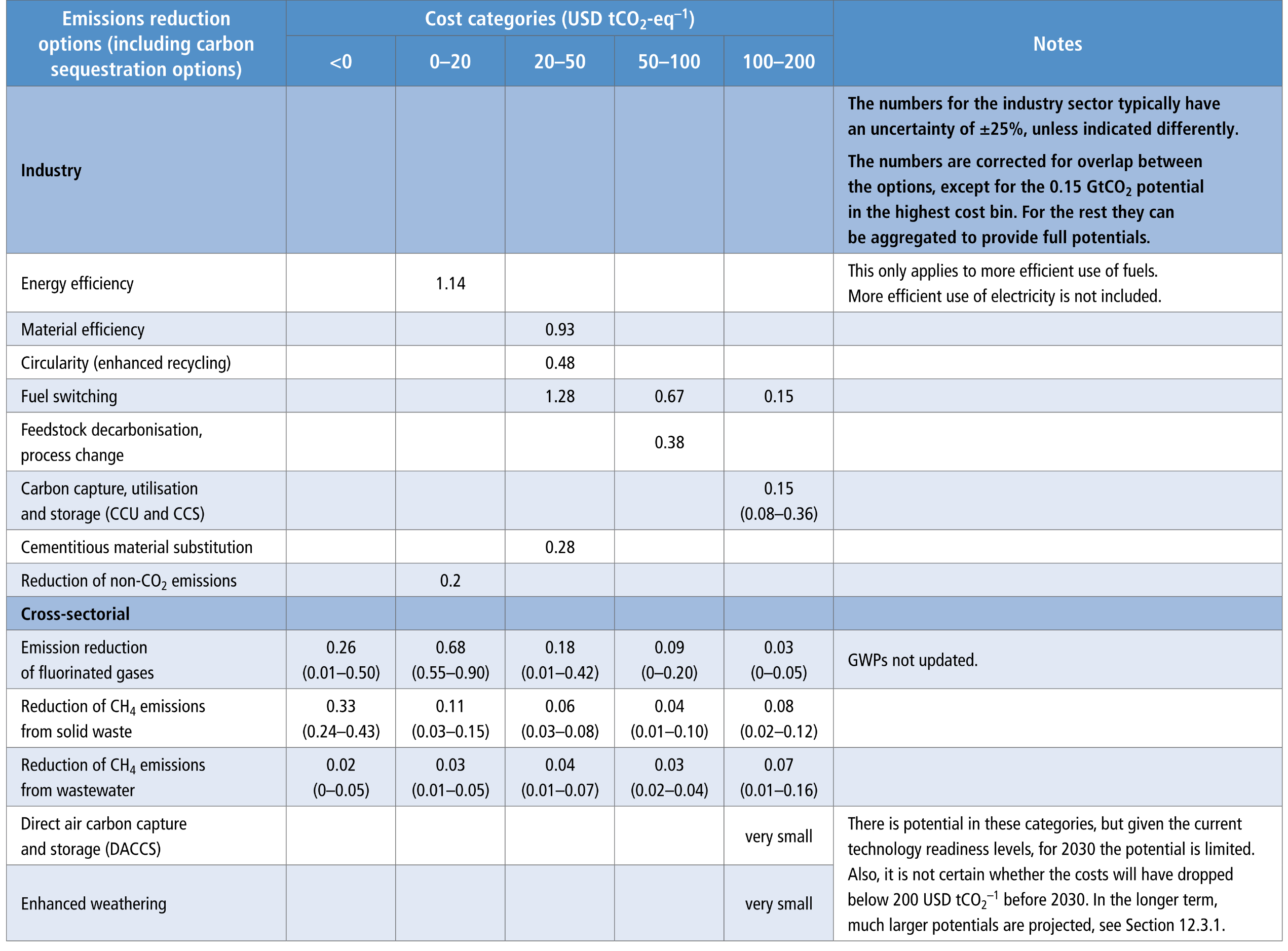
Detailed overview of global net GHG emissions reduction potentials (GtCO2-eq) in the various cost categories for the year 2030
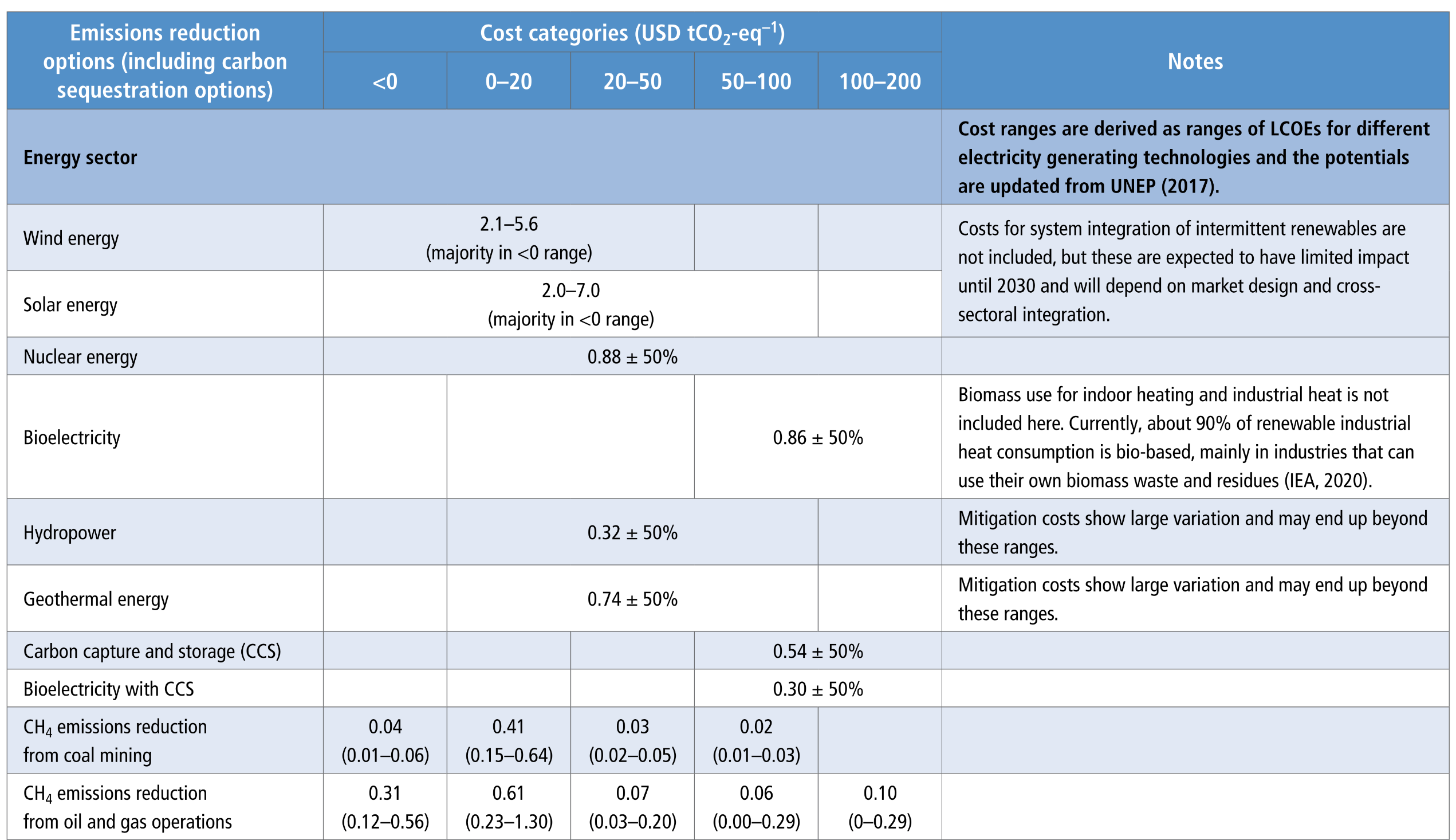
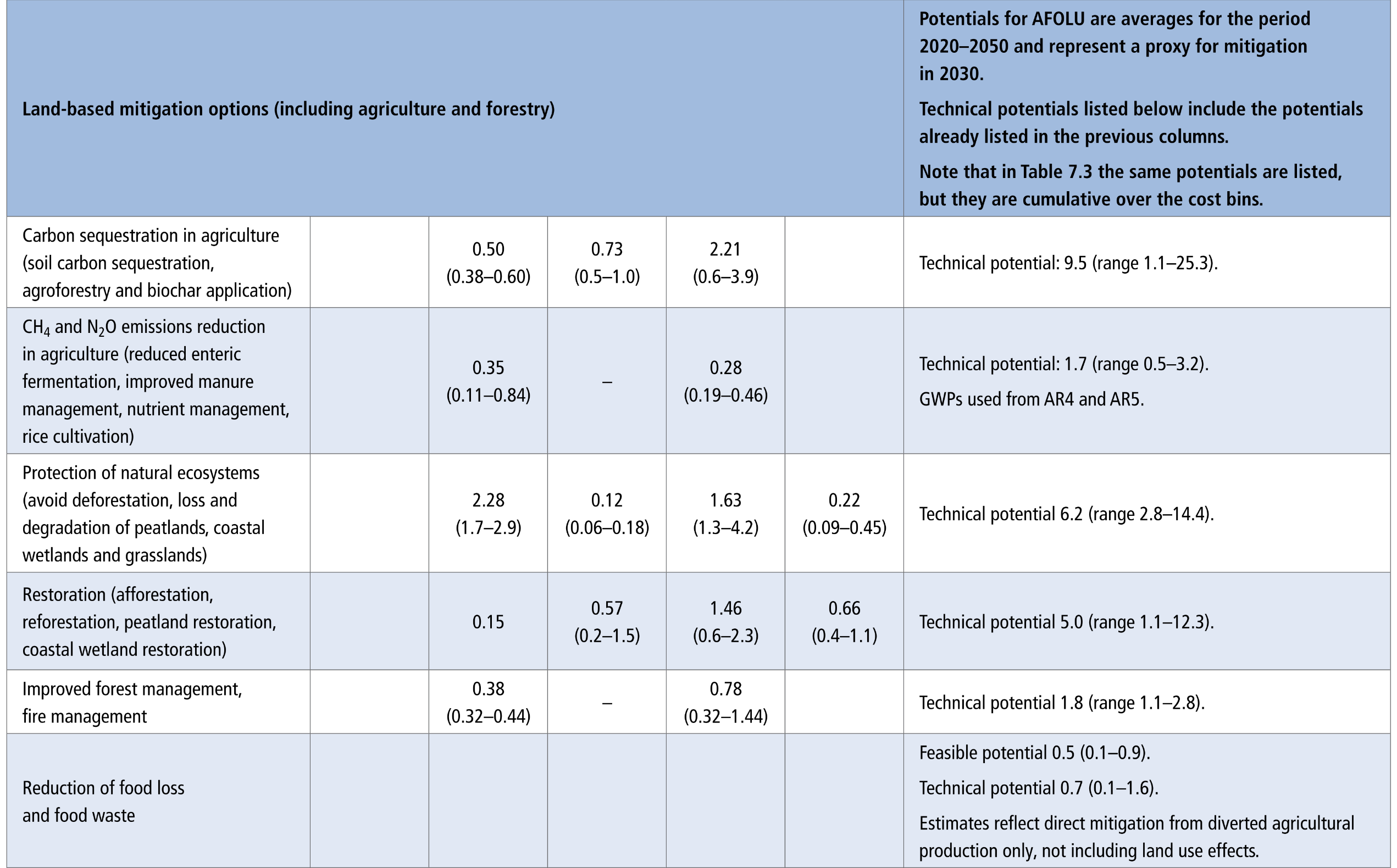
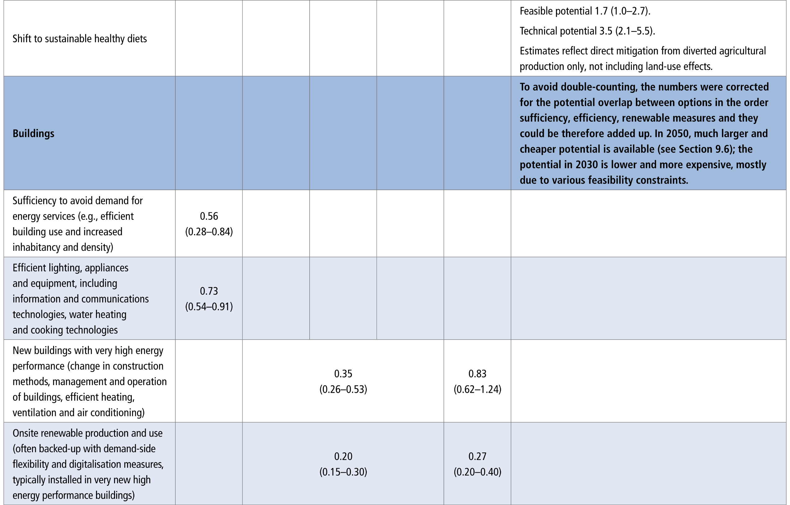
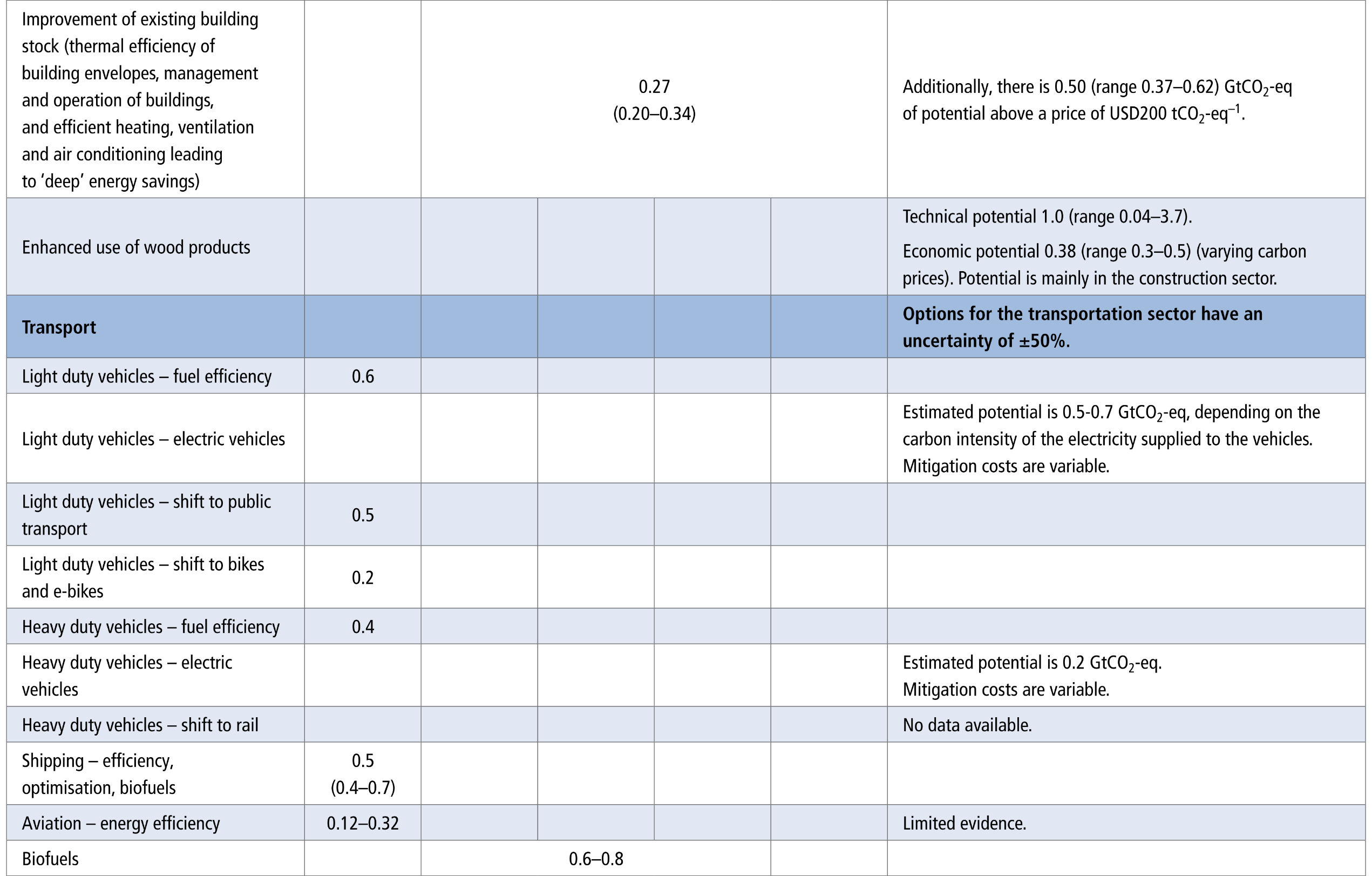
A comprehensive data table displaying numerical ranges for emission reduction potentials. The rows are categorised by six major sectors: Energy, Land-based options, Buildings, Transport, Industry, and Cross-sectorial, with each sector broken down into specific mitigation actions. The columns divide these actions into five cost categories ranging from less than zero to 200 USD per tCO2-eq, followed by a final column for methodological notes.


Table 12.3: Note that potentials within and across sectors cannot be summed, as the adoption of some options may affect the mitigation potentials of other options. Only monetary costs and benefits of options are taken into account. Negative costs occur when the benefits are higher than the costs. For wind energy, for example, this is the case if production costs are lower than those of the fossil alternatives. Ranges are indicated for each option separately, or indicated for the sector as a whole (see Notes column); they reflect full ranges. Cost ranges are not cumulative, e.g., to obtain the full potential below USD50 tCO2-eq–1, the potentials in the cost bins <USD0, USD0–20 and USD20–50 tCO2-eq–1 need to be summed together.
Source: IPCC (2022) AR6 WGIII, Chapter 12, Table 12.3, pg. 1254

Overview of aggregate sectoral net GHG emissions reduction potentials (GtCO2-eq) for the year 2030 at costs below USD100 tCO2-eq–1
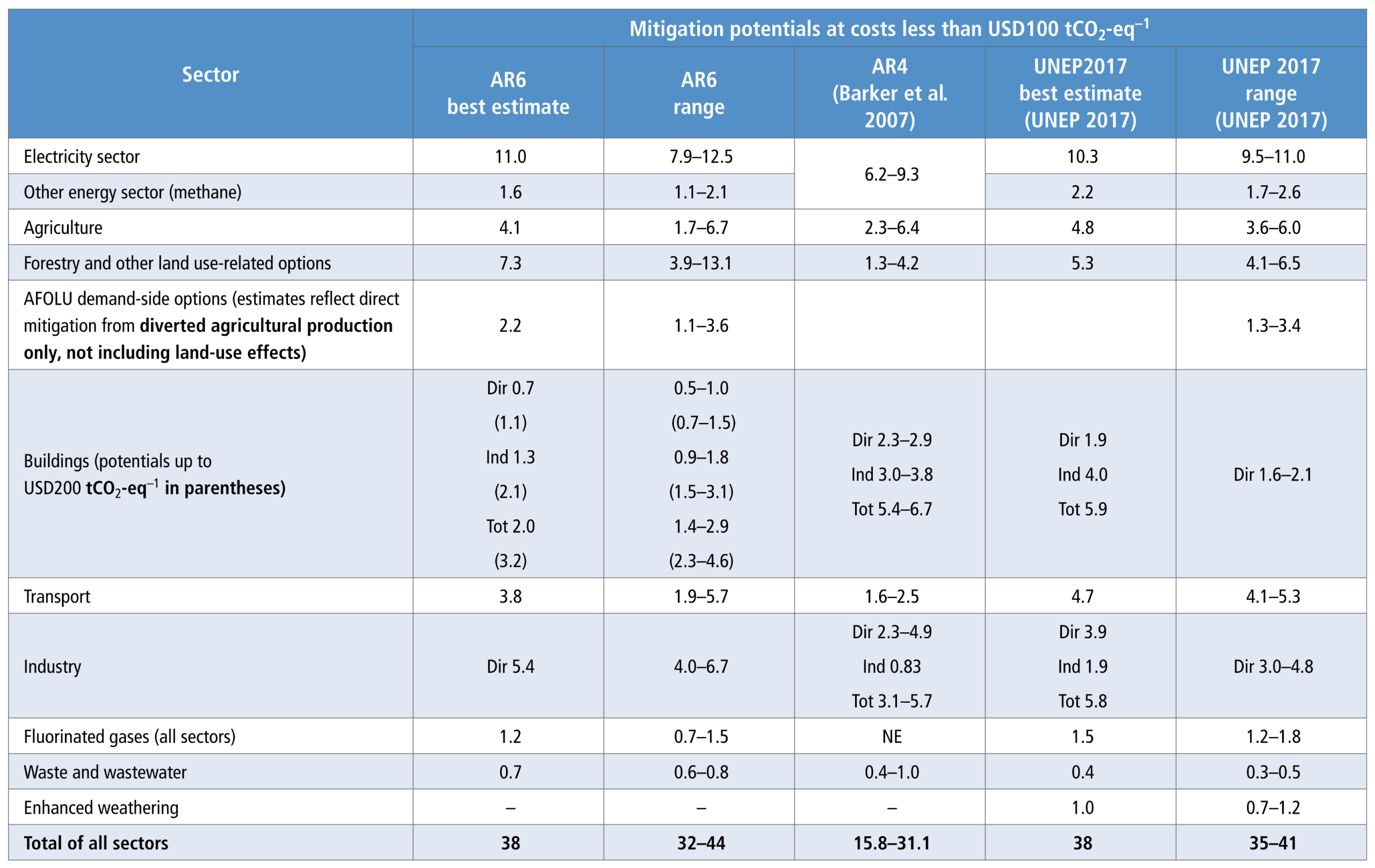

A data table comparing sectoral mitigation potentials across three different assessment reports. The rows list eleven specific categories, including the Electricity sector, Agriculture, Forestry, Buildings, Transport, and Industry, culminating in a final row for the total of all sectors. The columns display the 'best estimate' and 'range' numerical values for the current AR6 assessment, positioned alongside historical comparative data from the AR4 (2007) and UNEP 2017 reports.

Table 12.4: Comparisons with earlier assessments are also provided. Note that sectors are not entirely comparable across the three different estimates. Note: Dir = reduction of direct emissions, Ind = reduction of indirect emissions (related to electricity production), Tot = reduction of total emissions, NE = not estimated, AR4: Table 11.3, UNEP-2017: Chapter 4.
Source: IPCC (2022) AR6 WGIII, Chapter 12, Table 12.4, pg. 1257

Mitigation options and their characteristics for 2050
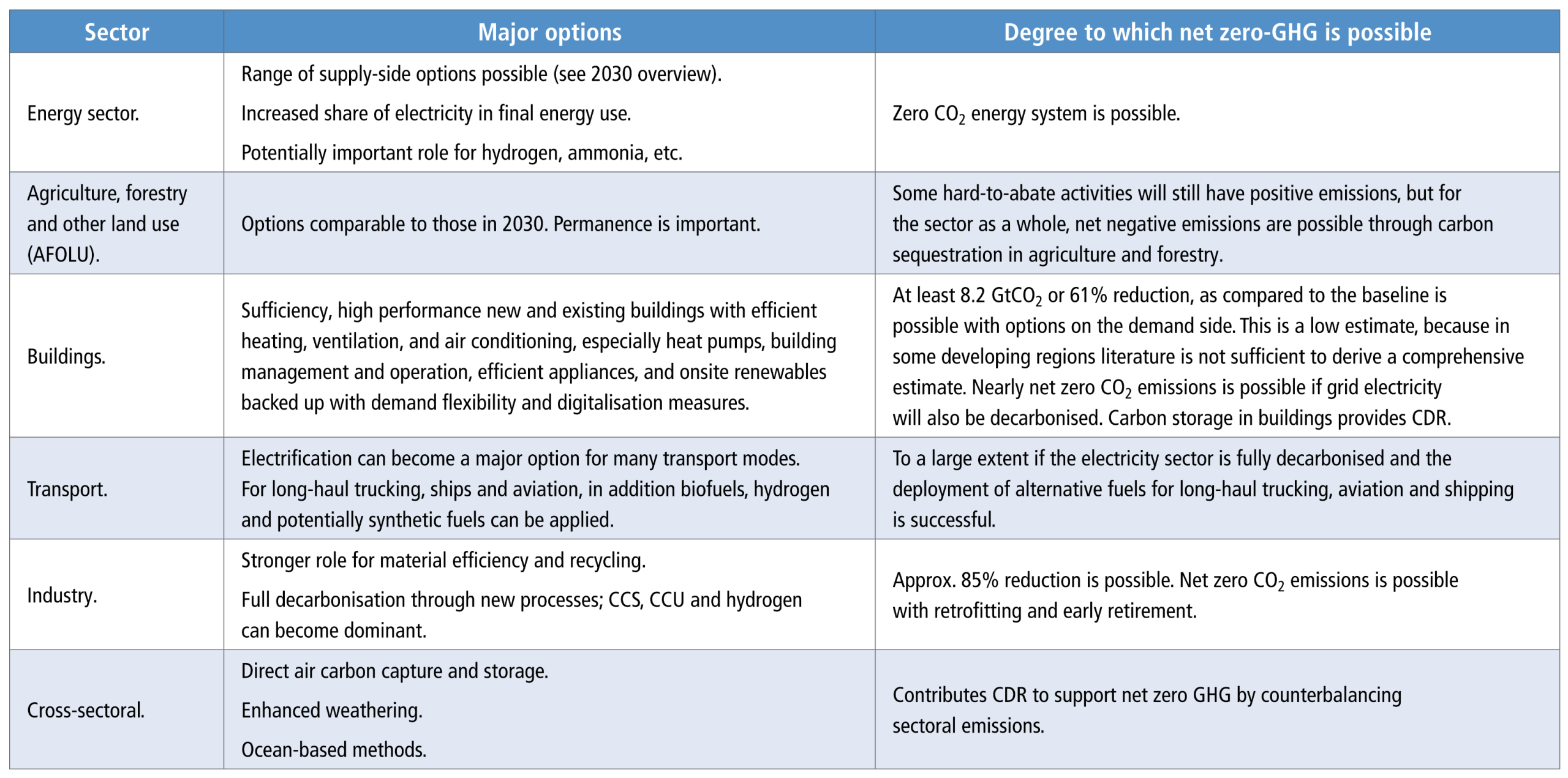
A text-based summary table outlining qualitative mitigation strategies. The table is structured with three main columns: 'Sector', 'Major options', and 'Degree to which net zero-GHG is possible'. The rows categorise these assessments across six key areas: the Energy sector, AFOLU (Agriculture, forestry and other land use), Buildings, Transport, Industry, and Cross-sectoral.
Source: IPCC (2022) AR6 WGIII, Chapter 12, Table 12.5, pg.1260

Raw natural materials extraction since 1970
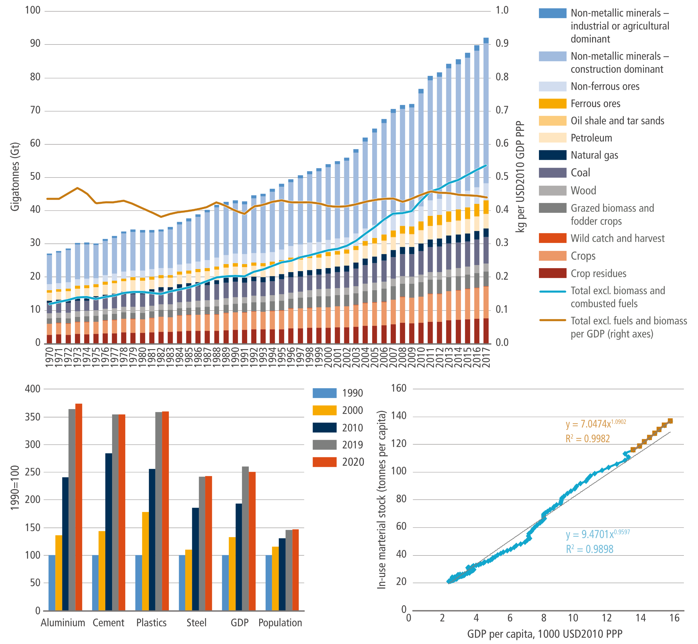
A composite graphic containing three charts. The top half is a massive stacked bar chart from 1970 to 2017 showing global extraction in Gigatonnes rising in a steep, accelerating curve, visibly dominated by a widening top layer of non-metallic construction minerals. The bottom left features a grouped bar chart where vertical bars representing the production of aluminum, cement, plastics, and steel skyrocket dramatically over time, towering far above the comparatively slow growth bars for global GDP and population. The bottom right is a scatter plot displaying a tight, steeply ascending diagonal line of data points mapping rising in-use material stock against rising GDP per capita.
Figure 11.3: In windows: left – growth of population, GDP and basic materials production (1990 = 100) in 1990–2020; right – in-use stock per capita vs income level (1900–2018; brown dots are for 2000–2018). The regressions provided show that for more recent years elasticity of material stock to GDP was greater than unity, comparing with the lower unity in preceding years.
Source: IPCC (2022) AR6 WGIII Chapter 11, Figure 11.3, pg. 1170

Growth in global demand for selected key materials and global population, 1990–2019
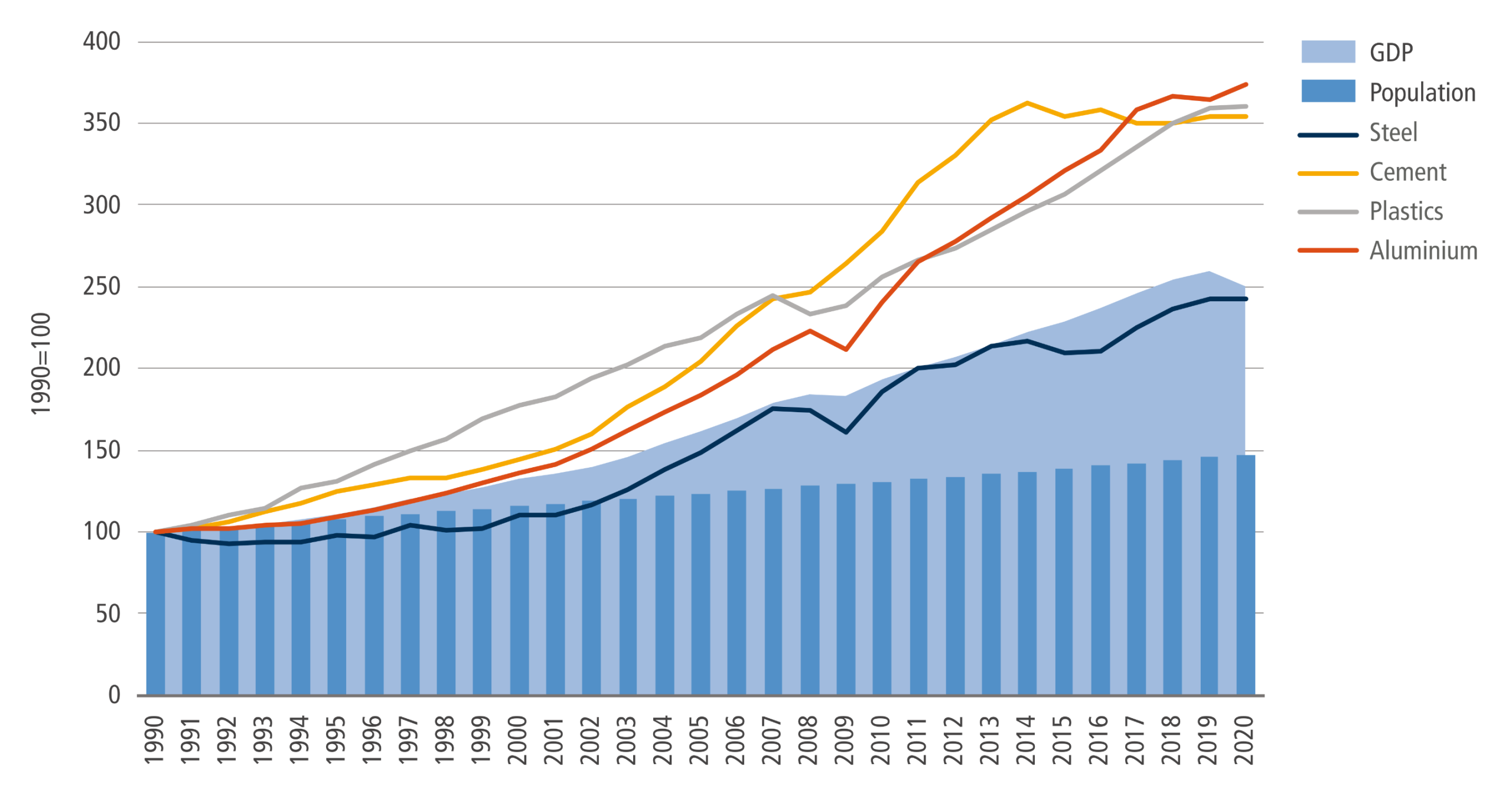
A combination chart tracking growth from 1990 to 2020. At the bottom, dark blue bars show global population growing in a slow, steady, linear progression. Behind the bars, a light blue shaded area representing GDP shows moderate, upward-curving growth. Above these baseline metrics are four lines representing the demand for Steel, Cement, Plastics, and Aluminium. While Steel tracks roughly similar to GDP over the period, the lines for Aluminium, Plastics, and Cement surge to the top of the chart, illustrating that material demand outpaced both population and economic growth.
Figure 11.6 Notes: based on global values, shown indexed to 1990 levels (=100). Steel refers to crude steel production. Aluminium refers to primary aluminium production. Plastic refers to the production of a subset of key thermoplastic resins. Cement and concrete follow similar demand patterns.
Source: IPCC (2022) AR6 WGIII Chapter 11, Figure 11.6, pg. 1177

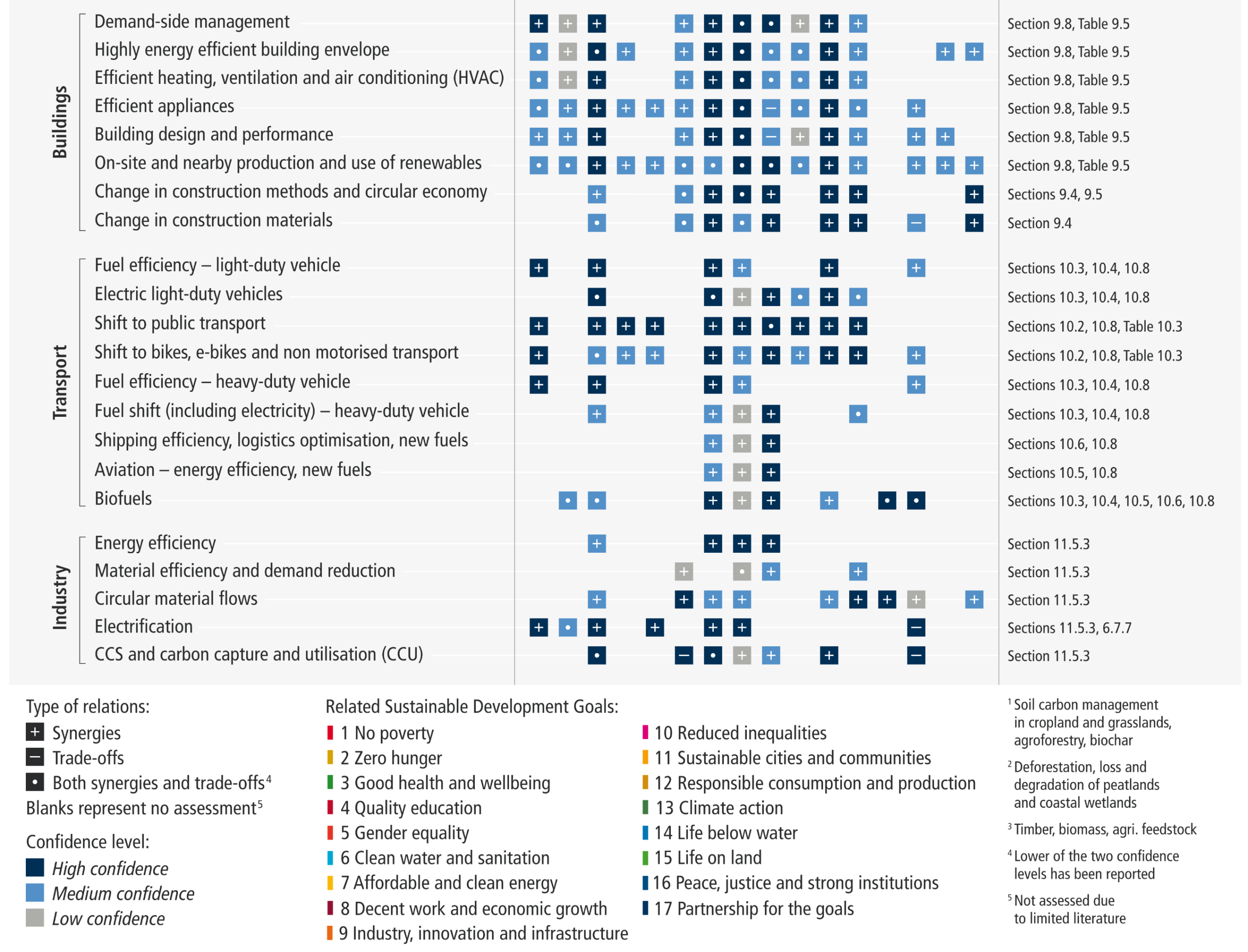
Synergies and trade-offs between sectoral and system mitigation options and the SDGs
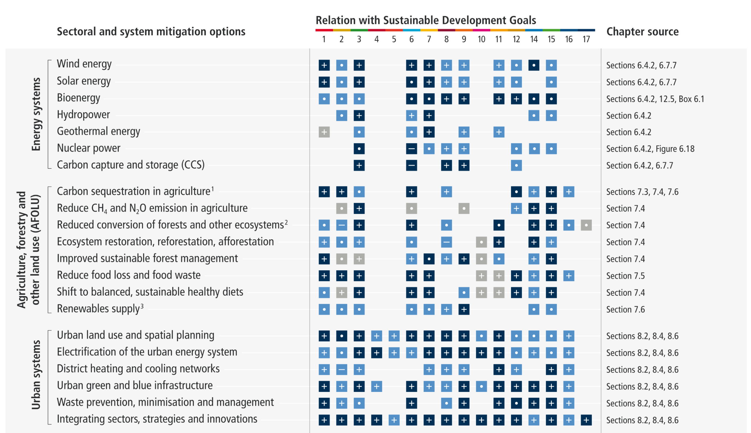
A large matrix table evaluating the relationship between mitigation options and the 17 Sustainable Development Goals (SDGs). The rows are categorized into six sectors: Energy systems, Agriculture, forestry and other land use (AFOLU), Urban systems, Buildings, Transport, and Industry. The columns are numbered 1 through 17 for each SDG. Inside the grid, intersecting cells contain visual symbols: plus signs indicate synergies, minus signs indicate trade-offs, and a combined symbol indicates both. These symbols are color-coded in dark blue, light blue, or grey to represent high, medium, or low confidence levels, with many cells left intentionally blank to represent an unassessed relation. A final right-hand column lists the IPCC chapter source for each row.

Figure SPM.8: Synergies and trade-offs between sectoral and system mitigation options and the SDGs. The sectoral chapters (Chapters 6–11) include qualitative assessments of synergies and trade-offs between sectoral mitigation options and the SDGs. Figure SPM.8 presents a summary of the chapter-level assessment for selected mitigation options (see Supplementary Material Table 17.SM.1 for the underlying assessment). The last column provides a line of sight to the sectoral chapters, which provide details on context specificity and dependence of interactions on the scale of implementation. Blank cells indicate that interactions have not been assessed due to limited literature. They do not indicate the absence of interactions between mitigation options and the SDGs. Confidence levels depend on the quality of evidence and level of agreement in the underlying literature assessed by the sectoral chapters. Where both synergies and trade-offs exist, the lower of the confidence levels for these interactions is used. Some mitigation options may have applications in more than one sector or system. The interactions between mitigation options and the SDGs might differ depending on the sector or system, and also on the context and the scale of implementation. Scale of implementation particularly matters when there is competition for scarce resources.
Source: IPCC (2022) AR6 WGIII SPM, Figure SPM.8

Transformative actions and system transitions characterize Climate Resilient Development Pathways
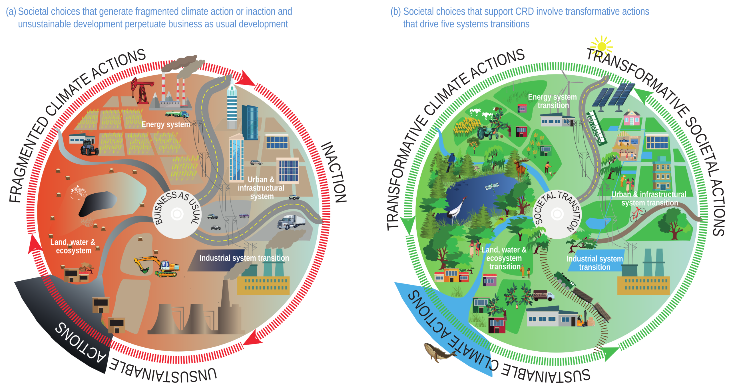

Two side-by-side circular diagrams illustrating contrasting development pathways. The left circle (a) uses a red, orange, and grey color palette, surrounded by arrows labeled 'Fragmented Climate Actions', 'Inaction', and 'Unsustainable Actions'. It features a 'Business as Usual' center surrounded by illustrations of fossil fuel extraction, deforestation, and polluting industry. The right circle (b) uses a vibrant green and blue color palette, surrounded by arrows for 'Transformative Climate Actions' and 'Transformative Societal Actions', and 'Sustainable Climate Actions'. It features a 'Societal Transition' center surrounded by illustrations of wind turbines, solar panels, restored natural ecosystems, and green urban infrastructure.
Figure 18.3  Transformative actions and system transitions characterize Climate Resilient Development Pathways (a) Societal choices that generate fragmented climate action or inaction and unsustainable development perpetuate business as usual and entrenched systems. (b) Societal choices that support CRD involve transformative adaptation, mitigation and sustainable development actions that drive five systems transitions (energy, land and other ecosystems, urban and infrastructure, industrial and societal). There is close interdependence between these systems. The system transition framework allows for a comprehensive assessment of the synergies and trade-offs between mitigation, adaptation and sustainable development. For example, land and water use in one system impacts the other systems and their surrounding ecosystems, thus reflecting how agricultural practices can have an impact on energy usage in urban centers. Finally, societal system transitions within each of the other systems enable the transitions to occur.
Source: IPCC (2022) AR6 WGII Chapter18, Figure 18.3

Demand-side mitigation

Demand-side strategies
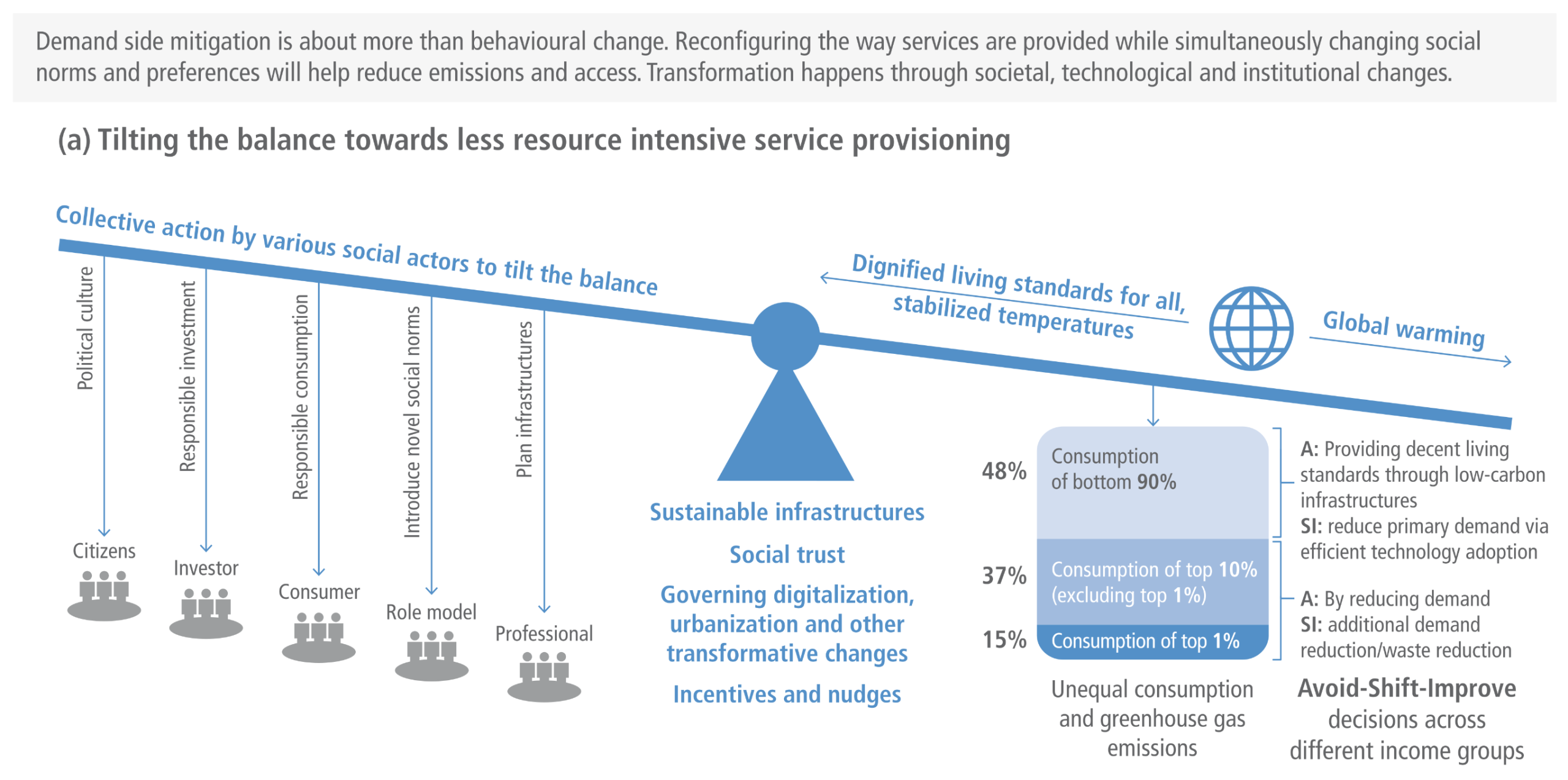
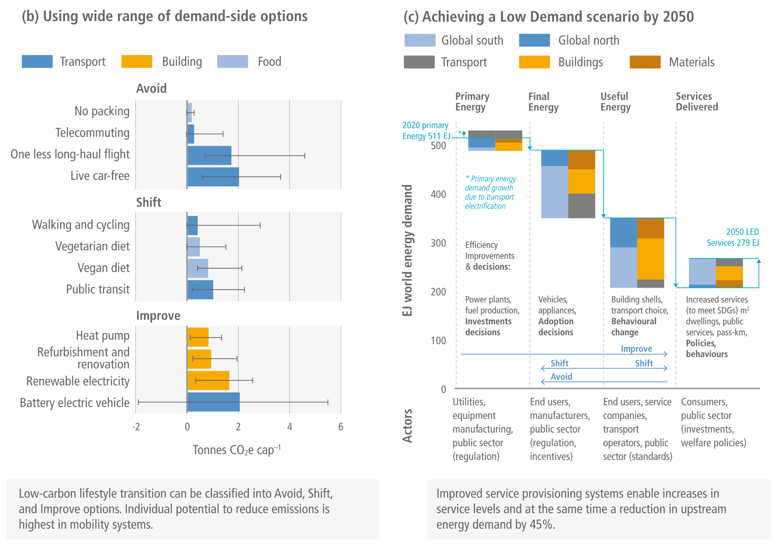
A comprehensive chart titled 'Demand side mitigation is about more than behavioural change.' It features three sections. - Section A (Tilting the balance): A seesaw graphic showing how collective actions by citizens, investors, consumers, role models, and professionals tilt the balance toward 'Dignified living standards' and away from 'Global warming.' It includes a breakdown showing the top 1% is responsible for 15% of consumption, while the bottom 90% is responsible for 48%. - Section B (Demand-side options): A bar chart categorising emissions reduction strategies into Avoid, Shift, and Improve. It highlights that 'Live car-free' (Avoid) and 'Battery electric vehicle' (Improve) offer the highest individual potential to reduce per-capita emissions in Tonnes of CO2 equivalent. - Section C (Low Demand scenario): A cascading waterfall chart illustrating a projected drop in world energy demand from 511 exajoules in 2020 down to 279 exajoules by 2050 through improvements across primary, final, and useful energy stages.

Figure TS.20 Demand-side mitigation is about more than behavioural change and transformation happens through societal, technological and institutional changes.
Source: IPCC (2022) AR6 WGIII TS, Figure TS.20, pg. 118

Examples of policies to enable ‘Avoid’ options
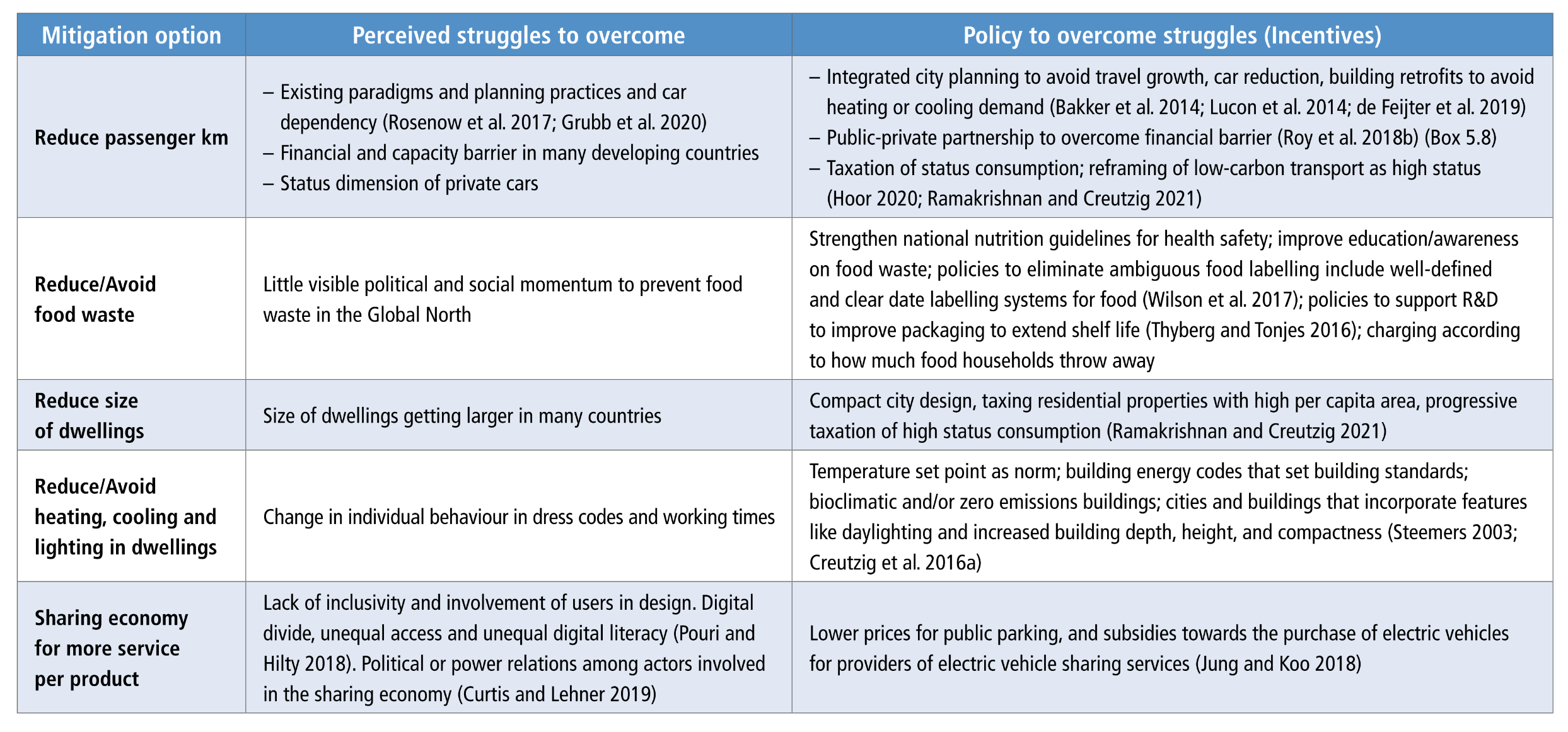
A table detailing policies for 'Avoid' mitigation strategies, organised into three columns: Mitigation option, Perceived struggles to overcome, and Policy to overcome struggles (Incentives). It lists five key mitigation options: 1) Reduce passenger kilometres, 2) Reduce or avoid food waste, 3) Reduce size of dwellings, 4) Reduce or avoid heating, cooling, and lighting in dwellings, and 5) Sharing economy for more service per product. For each option, the table describes social, financial, or infrastructural barriers, and pairs them with policy solutions such as integrated city planning, food labelling reforms, compact city design, and building energy codes.
Source: IPCC (2022) AR6 WGIII Chapter 5, Table 5.5, pg. 566

Examples of policies to enable ‘Shift’ options
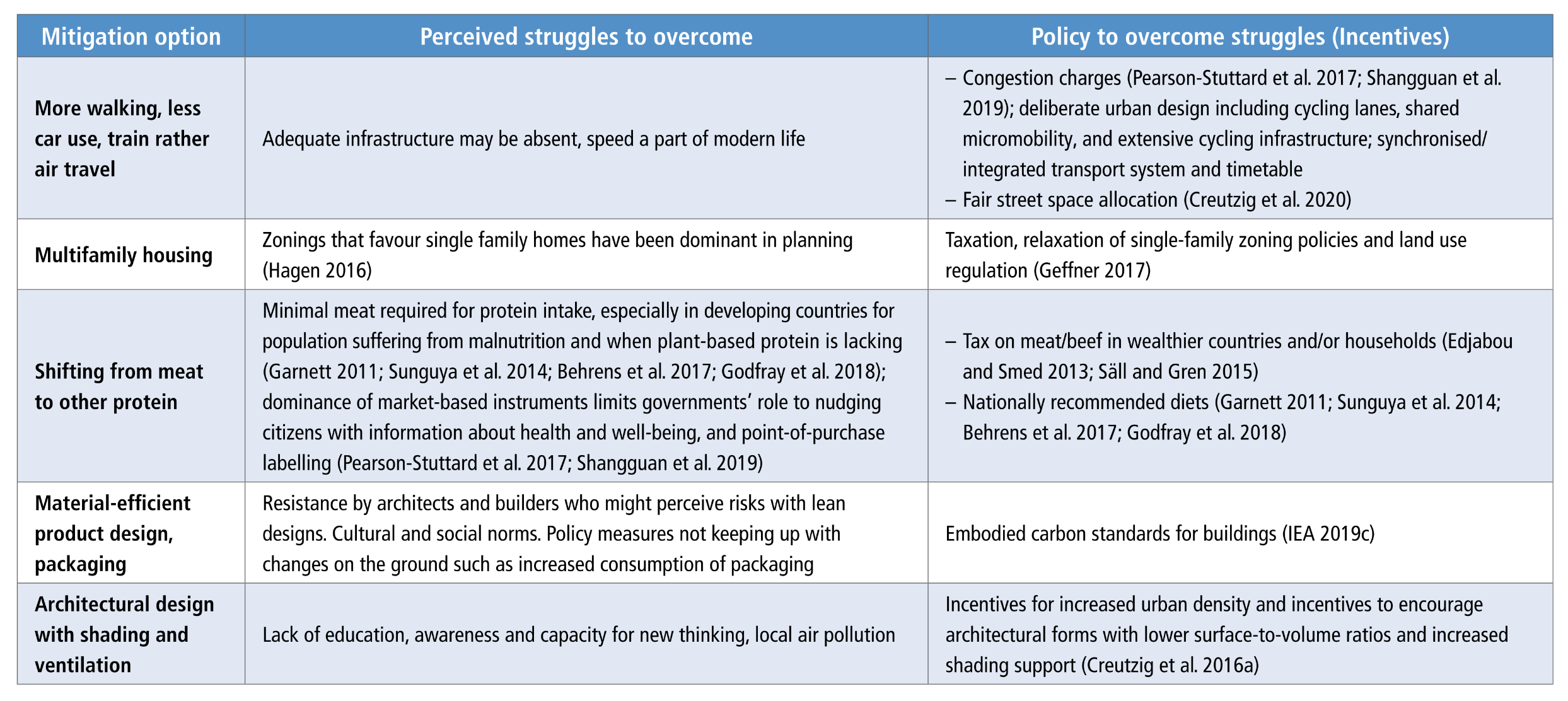
A table detailing policies for 'Shift' mitigation strategies, organised into three columns: Mitigation option, Perceived struggles to overcome, and Policy to overcome struggles (Incentives). It lists five key mitigation options: 1) More walking, less car use, and train rather than air travel, 2) Multifamily housing, 3) Shifting from meat to other protein, 4) Material-efficient product design and packaging, and 5) Architectural design with shading and ventilation. The table outlines barriers like cultural norms, zoning laws, and lack of infrastructure, suggesting policy solutions like congestion charges, relaxing single-family zoning laws, meat taxation, and embodied carbon standards.
Source: IPCC (2022) AR6 WGIII Chapter 5, Table 5.6, pg. 566

Examples of policies to enable ‘Improve’ options
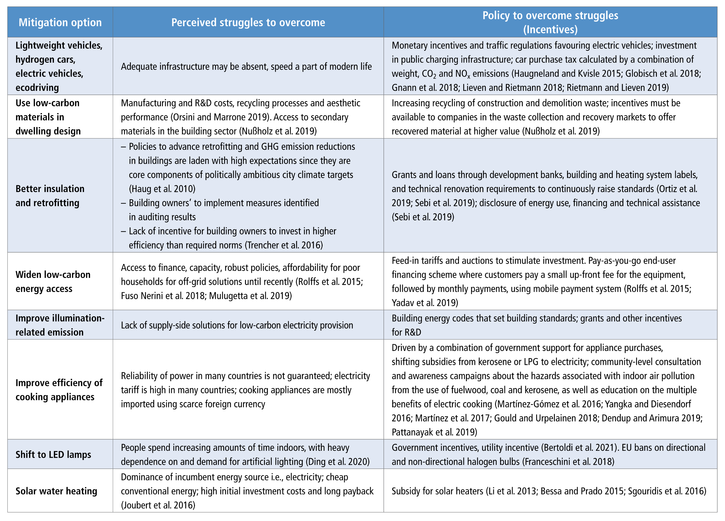
A table detailing policies for 'Improve' mitigation strategies, organised into three columns: Mitigation option, Perceived struggles to overcome, and Policy to overcome struggles (Incentives). It lists eight mitigation options: 1) Lightweight vehicles, hydrogen cars, electric vehicles, and ecodriving, 2) Low-carbon materials in dwelling design, 3) Better insulation and retrofitting, 4) Widen low-carbon energy access, 5) Improve illumination-related emissions, 6) Improve efficiency of cooking appliances, 7) Shift to LED lamps, and 8) Solar water heating. The table highlights barriers like high initial costs, manufacturing expenses, and lack of incentives, matching them with policy interventions like monetary incentives for electric vehicles, building renovation grants, feed-in tariffs, and shifting subsidies toward clean electricity.
Source: IPCC (2022) AR6 WGIII Chapter 5, Table 5.7, pg. 567

Demand-side mitigation can be achieved through changes in socio-cultural factors, infrastructure design and use, and end-use technology adoption by 2050
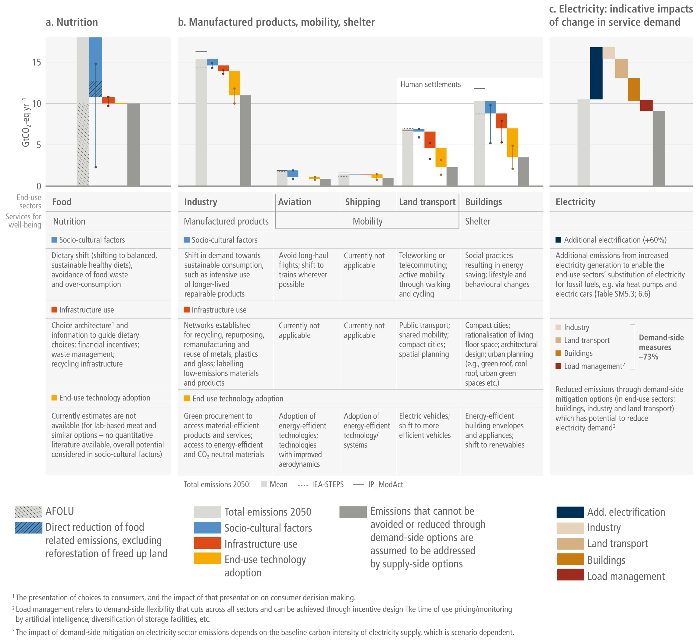
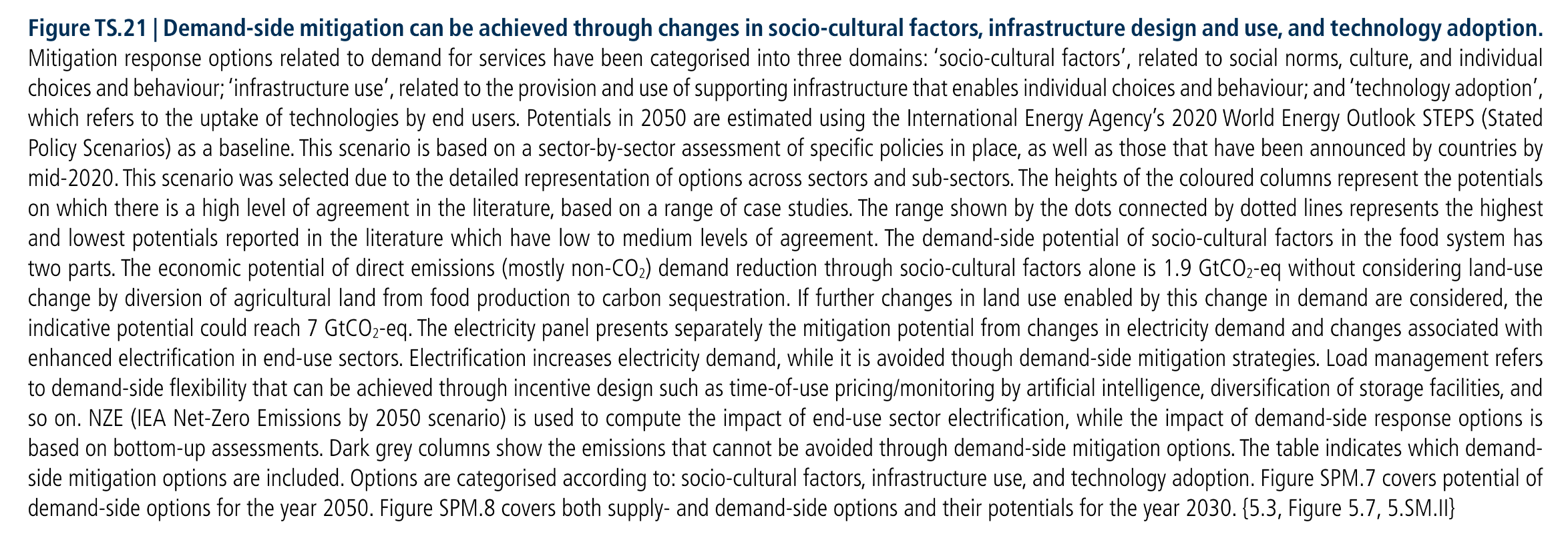
A three-part bar chart and corresponding data table illustrating demand-side mitigation potentials by 2050, measured in gigatonnes of CO2 equivalent per year. The chart is divided into three sections:  Panel A (Nutrition): Focuses on the Food sector, showing a large potential for emissions reduction driven primarily by 'Socio-cultural factors,' with the table detailing actions like dietary shifts and avoiding food waste.  Panel B (Manufactured products, mobility, shelter): Features individual bar charts for Industry, Aviation, Shipping, Land transport, and Buildings. Land transport and Buildings display the most significant reduction potentials. The table below categorises specific interventions into three colour-coded groups: Socio-cultural factors (blue, e.g., telecommuting), Infrastructure use (red, e.g., public transport, compact cities), and End-use technology adoption (yellow/orange, e.g., electric vehicles, energy-efficient appliances).  Panel C (Electricity): A waterfall chart showing that while additional end-use electrification will increase electricity demand (dark blue bar), demand-side measures across industry, transport, buildings, and load management can offset these emissions by 73%.  Across all charts, dark grey bars indicate the remaining emissions that cannot be avoided through demand-side options and must be addressed by supply-side options.
Figure TS.21  Mitigation response options related to demand for services have been categorised into three domains: ‘socio-cultural factors’, related to social norms, culture, and individual choices and behaviour; ‘infrastructure use’, related to the provision and use of supporting infrastructure that enables individual choices and behaviour; and ‘technology adoption’, which refers to the uptake of technologies by end users. Potentials in 2050 are estimated using the International Energy Agency’s 2020 World Energy Outlook STEPS (Stated Policy Scenarios) as a baseline. This scenario is based on a sector-by-sector assessment of specific policies in place, as well as those that have been announced by countries by mid-2020. This scenario was selected due to the detailed representation of options across sectors and sub-sectors. The heights of the coloured columns represent the potentials on which there is a high level of agreement in the literature, based on a range of case studies. The range shown by the dots connected by dotted lines represents the highest and lowest potentials reported in the literature which have low to medium levels of agreement. The demand-side potential of socio-cultural factors in the food system has two parts. The economic potential of direct emissions (mostly non-CO2) demand reduction through socio-cultural factors alone is 1.9 GtCO2-eq without considering land-use change by diversion of agricultural land from food production to carbon sequestration. If further changes in land use enabled by this change in demand are considered, the indicative potential could reach 7 GtCO2-eq. The electricity panel presents separately the mitigation potential from changes in electricity demand and changes associated with enhanced electrification in end-use sectors. Electrification increases electricity demand, while it is avoided though demand-side mitigation strategies. Load management refers to demand-side flexibility that can be achieved through incentive design such as time-of-use pricing/monitoring by artificial intelligence, diversification of storage facilities, and so on. NZE (IEA Net-Zero Emissions by 2050 scenario) is used to compute the impact of end-use sector electrification, while the impact of demand-side response options is based on bottom-up assessments. Dark grey columns show the emissions that cannot be avoided through demand-side mitigation options. The table indicates which demand- side mitigation options are included. Options are categorised according to: socio-cultural factors, infrastructure use, and technology adoption.
Source: IPCC (2022) AR6 WGIII TS, Figure TS.21, pg. 119

Synthesis of 60 demand-side options ordered by the median GHG mitigation potential found across all estimates from the literature
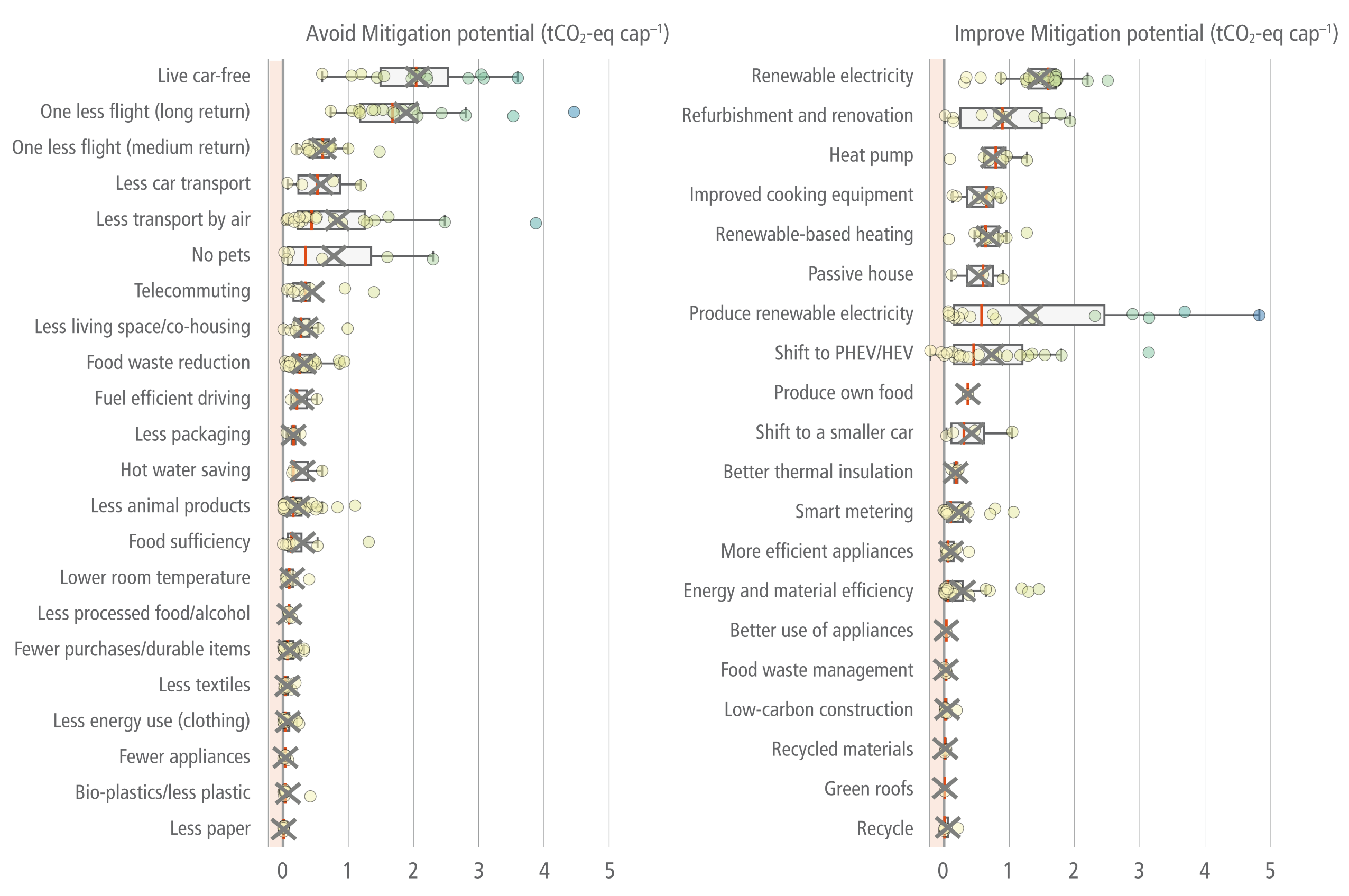
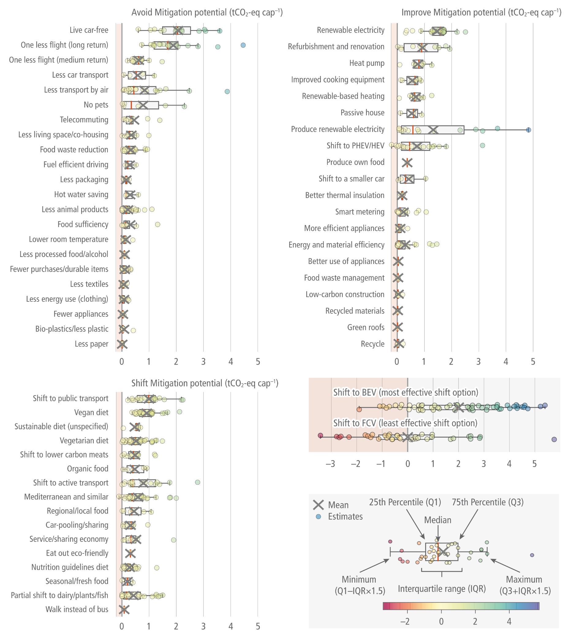
A multi-panel chart displaying horizontal box-and-whisker plots for 60 demand-side climate mitigation options, measured in tonnes of CO2 equivalent per capita. The options are categorised into Avoid, Improve, and Shift strategies.  Avoid Mitigation Potential: The options with the highest average reduction potential are living car-free, taking one less long-haul flight, and taking one less medium-haul flight.  Improve Mitigation Potential: The most effective options on average include purchasing renewable electricity, building refurbishment and renovation, and installing heat pumps. 'Produce renewable electricity' shows the widest variance, featuring the highest maximum potential but a highly variable range.  Shift Mitigation Potential: The leading strategies are shifting to public transport, adopting a vegan diet, and transitioning to an unspecified sustainable diet.  Specific Vehicle Shifts: A separate panel highlights shifting to Battery Electric Vehicles (BEV) as the most effective shift option, contrasted with shifting to Fuel Cell Vehicles (FCV) as the least effective. Both vehicle shifts show wide variance, including data points extending into the red zone, indicating a potential net increase in emissions (backfire). A legend at the bottom right visually defines the statistical metrics of the plots corresponding to the figure's caption.

Figure 5.8 The grey crosses are averages. The boxes represent the 25th percentile, median and 75th percentiles of study results. The whiskers or dots show the minimum and maximum mitigation potentials of each option. Negative values (in the red area) represent the potentials for backfire due to rebound, i.e., a net increase of GHG emissions due to adopting the option. Source: with permission from Ivanova et al. (2020).
Source: IPCC (2022) AR6 WGIII Chapter 5, Figure 5.8

A vibrant graphic illustration featuring the words 'LEVEL UP' in a retro, 8-bit pixelated font with an orange and yellow gradient and a thick black outline. The text is accented with glowing white sparkles and is set against a dynamic, comic-book style background featuring light and dark blue speed lines radiating from the center over a subtle halftone dot pattern.
AdobeStock 716667842

Nature-based solutions

Assessing nature-based solutions for climate change mitigation and adaptation
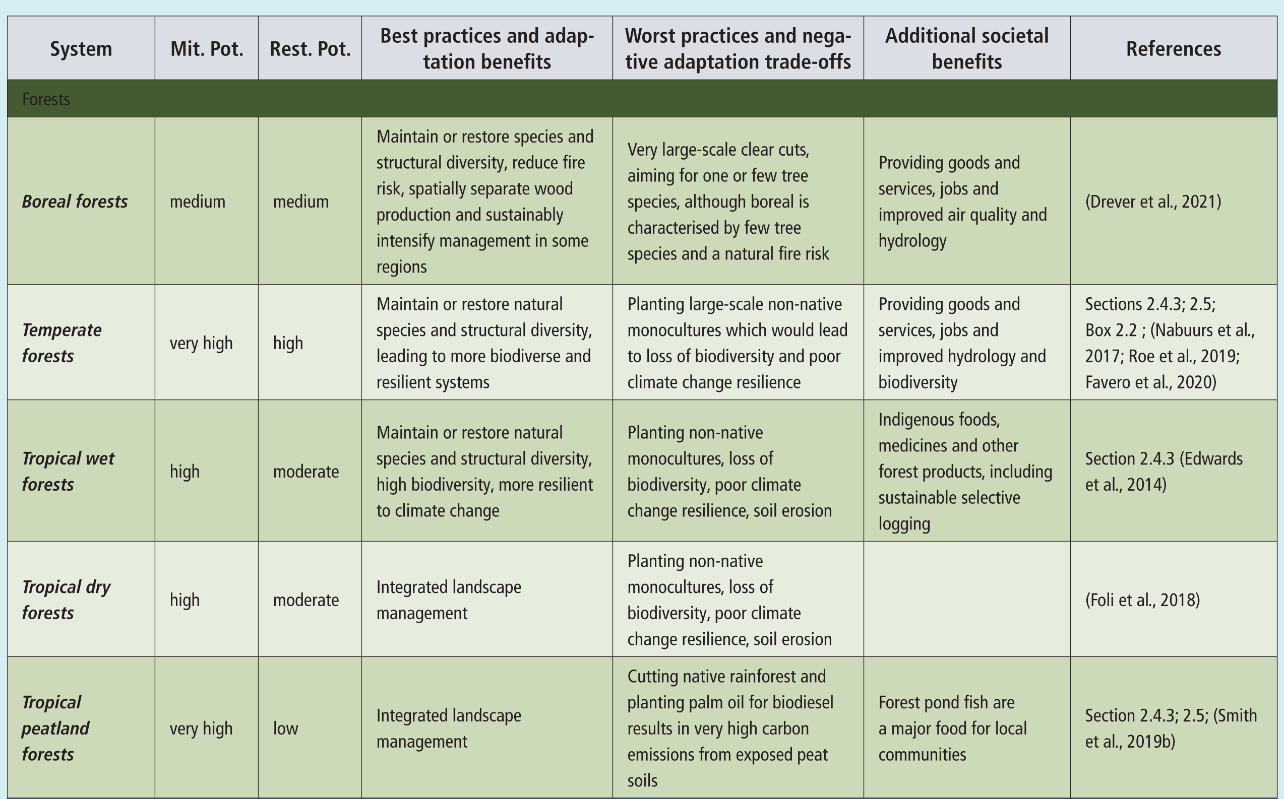
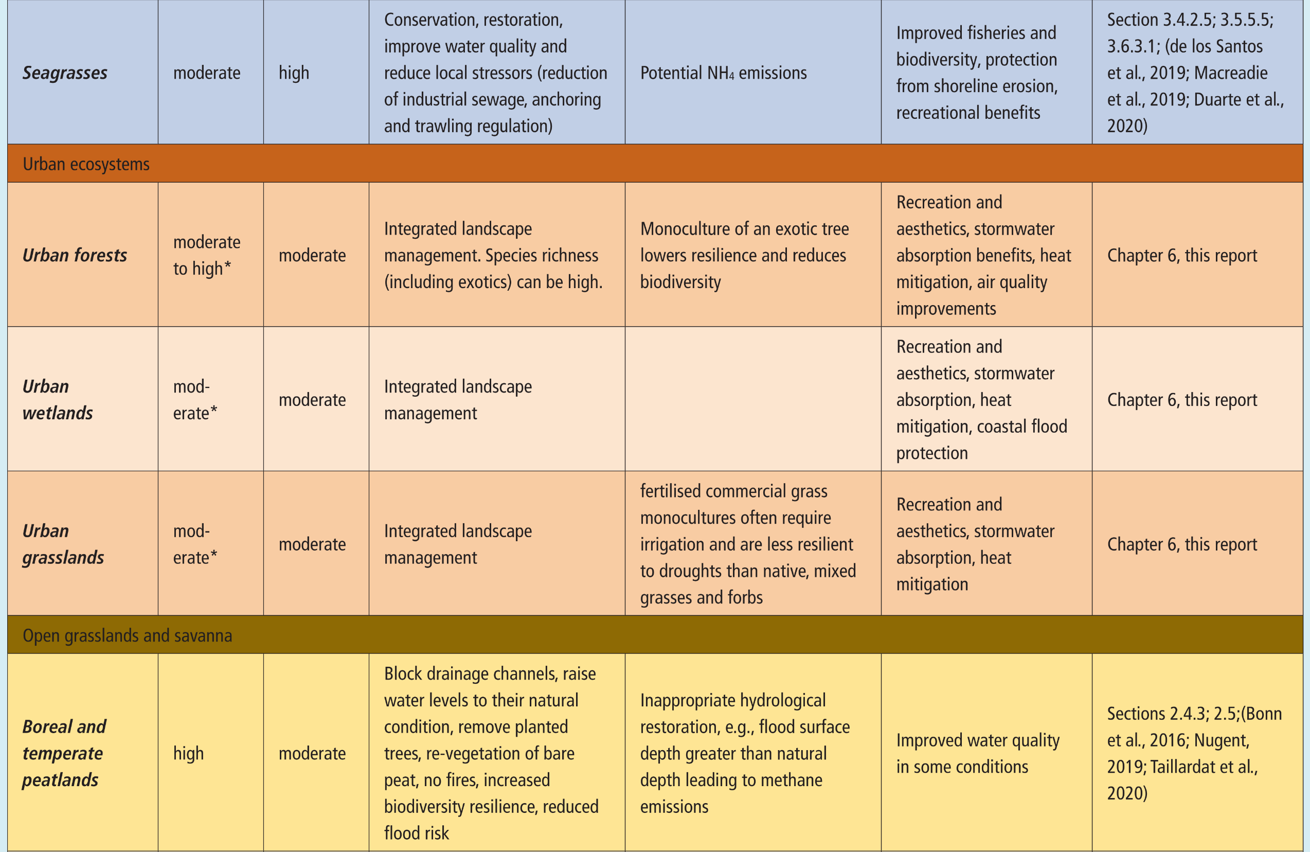
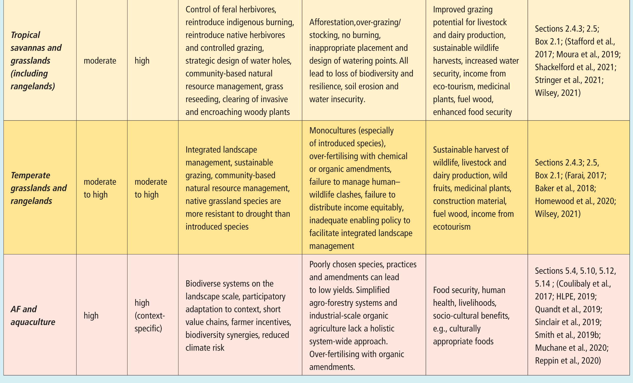
A multi-section table assessing nature-based solutions for climate change mitigation and adaptation across five major ecosystem categories: Forests, Blue Carbon, Urban Ecosystems, Open Grasslands and Savanna, and Agriculture/Aquaculture. Structured into six columns, the table outlines each system's Mitigation Potential, Restoration Potential, Best Practices and Adaptation Benefits, Worst Practices and Negative Trade-offs, Additional Societal Benefits, and References. Key findings across the categories include:  Forests & Blue Carbon: Potentials range from medium to very high. Best practices focus on maintaining natural species diversity, hydrological restoration, and native re-vegetation to protect against storm surges and improve water quality, while warning against monocultures, clear-cutting, and peatland palm oil development.  Urban Ecosystems & Open Grasslands: Highlight integrated landscape management, appropriate hydrological restoration, and native species use for heat mitigation, stormwater absorption, and biodiversity, contrasting with exotic monocultures, inappropriate afforestation, and overgrazing.  Agriculture & Aquaculture: Stresses the high restoration potential of biodiverse, participatory, context-specific food production systems over simplified industrial agriculture to enhance food security and climate resilience.
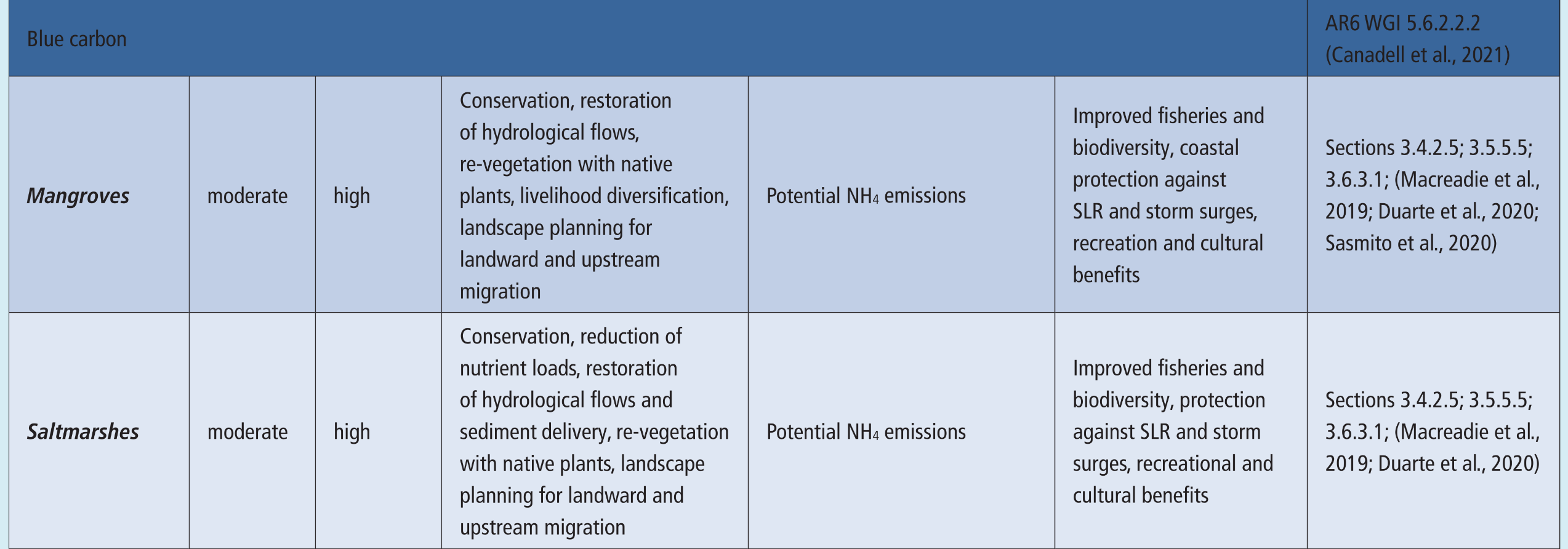


Table Cross-Chapter Box NATURAL.1  Assessment of benefits and trade-offs between mitigation and strategies for both biodiversity and human adaptation to future climate change. Best practices highlight approaches that lead to maximal positive synergy between mitigation and adaptation; worst practices are those most likely to lead to negative trade-offs for adaptation. Many best practices have additional societal benefits beyond adaptation, such as food provisioning, recreation and improved water quality. Mitigation Potential (Mit. Pot.) and Restoration Potential (Rest. Pot.) are considered.
Source: IPCC (2022) AR6 WGII, Chapter 2, Table Cross-Chapter Box NATURAL.1, pg. 308

Decision-making framework to co-maximise adaptation and mitigation benefits from natural systems
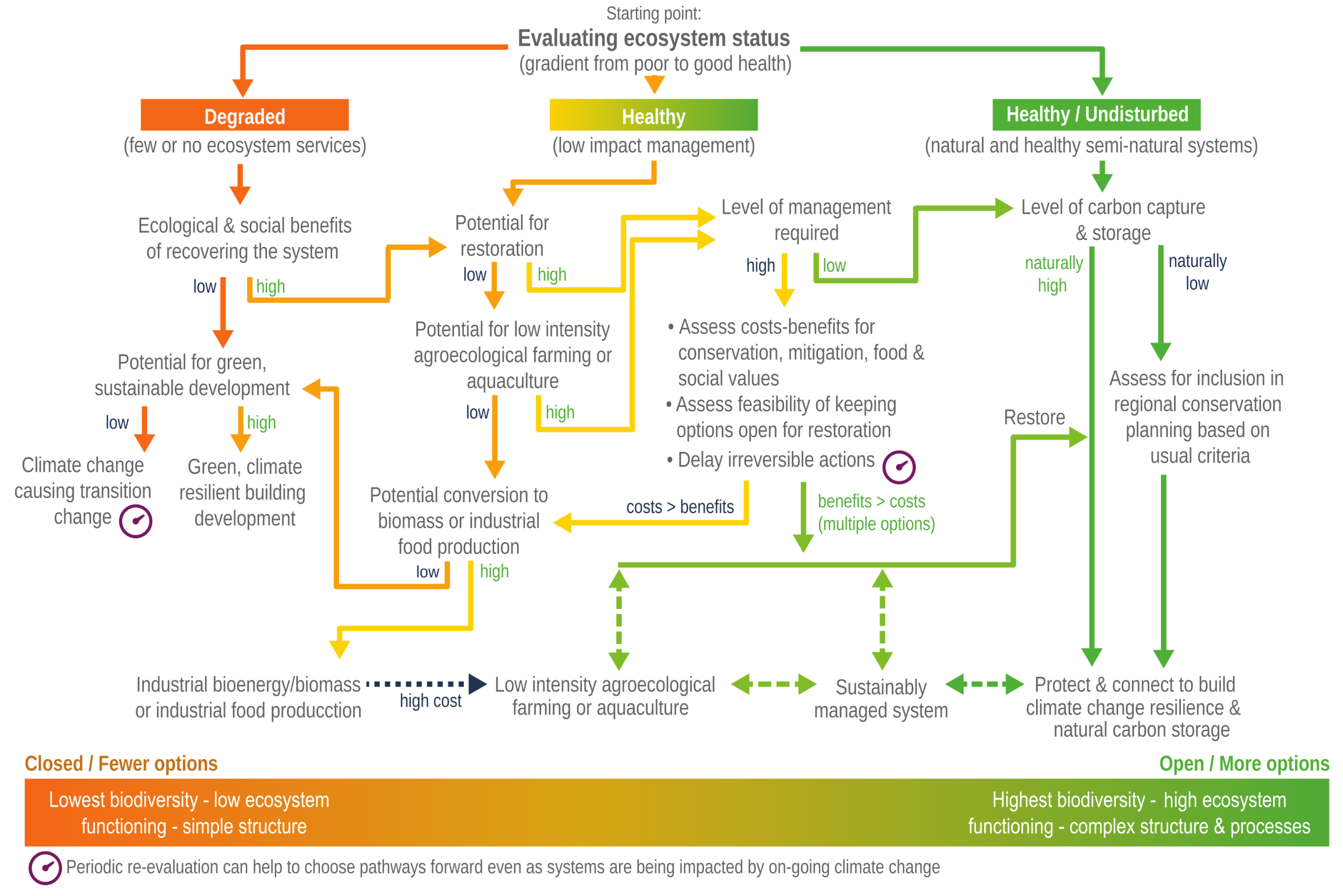
A flowchart illustrating a decision-making framework for natural systems, beginning with a starting point of 'Evaluating ecosystem status.' The chart splits into three main pathways based on a gradient from poor to good health:  Degraded (orange): Assesses the ecological and social benefits of recovery. High potential leads toward restoration or green, climate-resilient building development. Low potential leads to climate change causing transition change.  Healthy (yellow-green): Evaluates the potential for restoration and low-intensity agroecological farming or aquaculture, assessing the required level of management and costs versus benefits.  Healthy / Undisturbed (dark green): Evaluates the level of natural carbon capture and storage. Pathways lead to assessing regional conservation planning, restoring systems, and ultimately protecting and connecting them to build climate change resilience.  A central node emphasises assessing cost-benefits, delaying irreversible actions, and keeping options open. A gradient bar at the bottom demonstrates that pathways leaning toward industrial production result in 'Closed / Fewer options' with low biodiversity (orange), while pathways leaning toward sustainable management and protection provide 'Open / More options' with high biodiversity and complex structures (green). A clock icon placed throughout denotes that periodic re-evaluation helps choose pathways forward.
Figure Cross-Chapter Box NATURAL.1  Decision-making pathways are designed to add robustness in the face of uncertainties in future climate change and its impacts. Emphasis is on keeping open as many options as possible, for as long as possible, with periodic re-evaluation to aid in choosing pathways forward, even as systems are being impacted by ongoing climate change.
Source: IPCC (2022) AR6 WGII, Chapter 2, Figure Cross-Chapter Box NATURAL.1, pg.307

Global and regional mitigation potential (GtCO2-eq yr –1) in 2020–2050 for 20 land-based measures
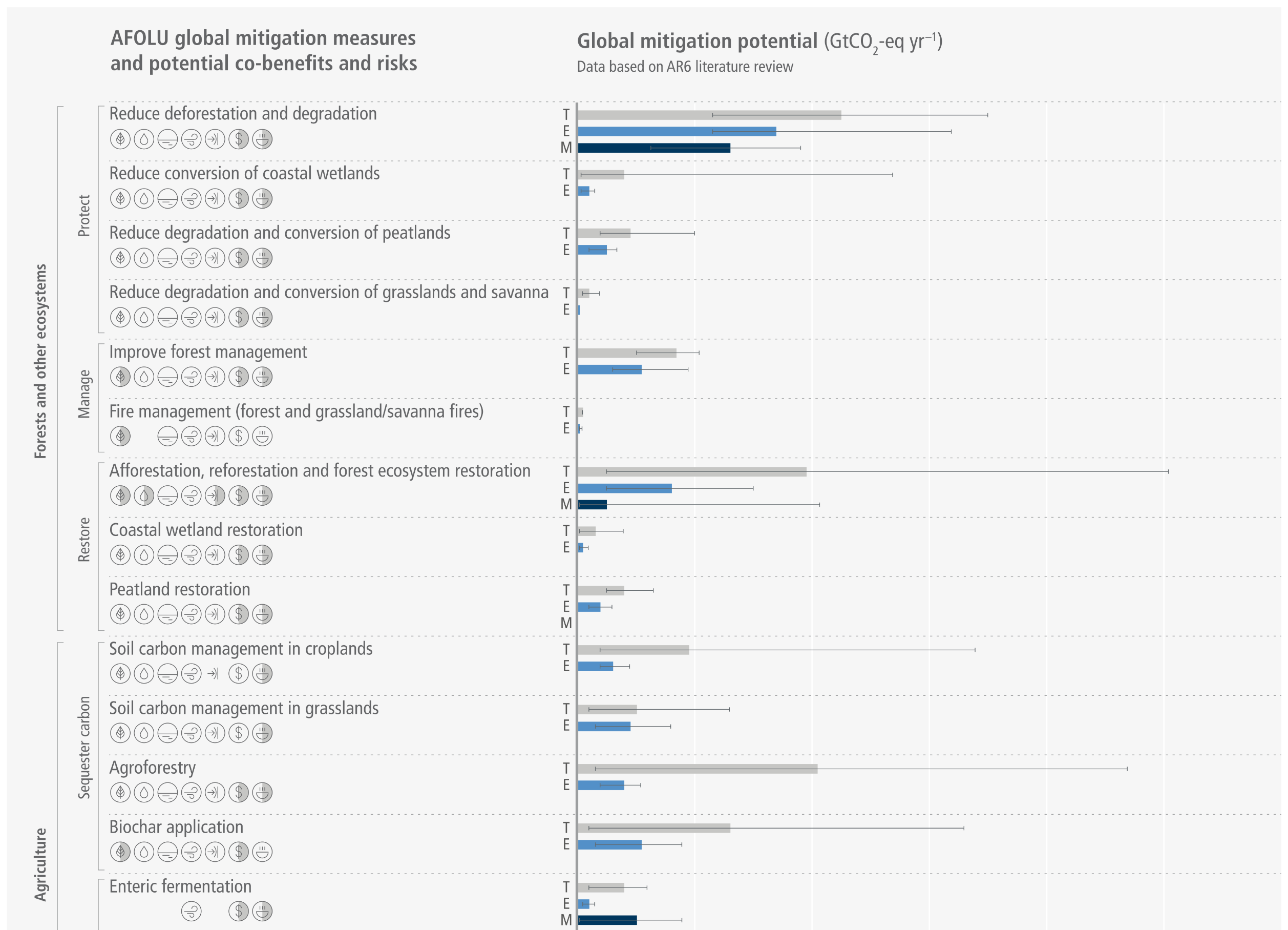
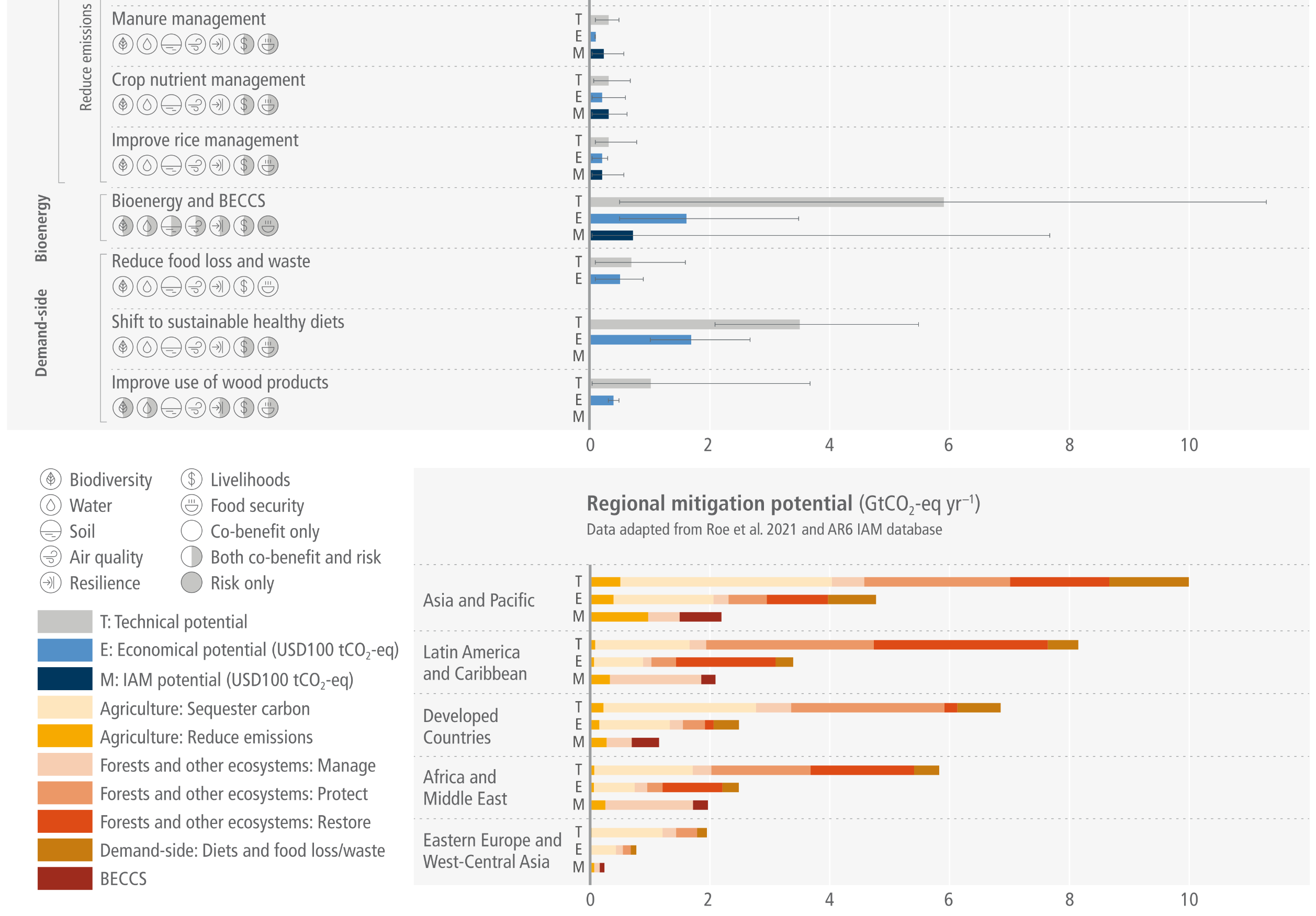
A two-part horizontal bar chart detailing the global and regional climate mitigation potential of 20 land-based (AFOLU) measures.  Top Panel (Global): Lists 20 mitigation measures grouped into four main sectors: Forests and other ecosystems (sub-divided into Protect, Manage, and Restore), Agriculture (Sequester carbon and Reduce emissions), Bioenergy, and Demand-side. For each measure, horizontal bars display the Technical (T), Economic (E), and IAM (M) mitigation potentials. The measures displaying the highest technical potentials include reducing deforestation and degradation, afforestation and forest ecosystem restoration, agroforestry, bioenergy and BECCS, and shifting to sustainable healthy diets. Beside each measure's label are circular icons indicating potential co-benefits and risks related to biodiversity, water, soil, air quality, resilience, livelihoods, and food security.  Bottom Panel (Regional): Uses stacked horizontal bar charts to break down the T, E, and M mitigation potentials across five global regions: Asia and Pacific, Latin America and Caribbean, Developed Countries, Africa and Middle East, and Eastern Europe and West-Central Asia. The Asia and Pacific region, followed closely by Latin America and Caribbean, display the highest total mitigation potentials. The color-coded stacks reveal that forest protection and restoration are the most significant drivers of mitigation in these top-performing regions.  Legends at the bottom left define the co-benefit and risk icons, the T, E, and M bar distinctions, and the color-coded categories used in the regional stacked charts.

Figure 7.11:  Global and regional mitigation potential (GtCO2-eq yr –1) in 2020–2050 for 20 land-based measures. (a) Global estimates represent the mean (bar) and full range (error bars) of the economic potential (up to USD100 tCO2-eq–1) based on a comprehensive literature review of sectoral studies (references are outlined in the sub-section for each measure in Sections 7.4.2–7.4.5). Potential co-benefits and trade-offs for each of the 20 measures are summarised in icons. (b) Regional estimates illustrate the mean technical (T) and economic (E) (up to USD100 tCO2-eq–1) sectoral potential based on data from (Roe et al. 2021). IAM economic potential (M) (USD100 tCO2-eq–1) data is from the IPCC AR6 database.
Source: IPCC (2022) AR6 WGIII Chapter 7, Figure 7.11

Estimated annual mitigation potential (GtCO2-eq yr –1) in 2020–2050 of AFOLU mitigation options by carbon price
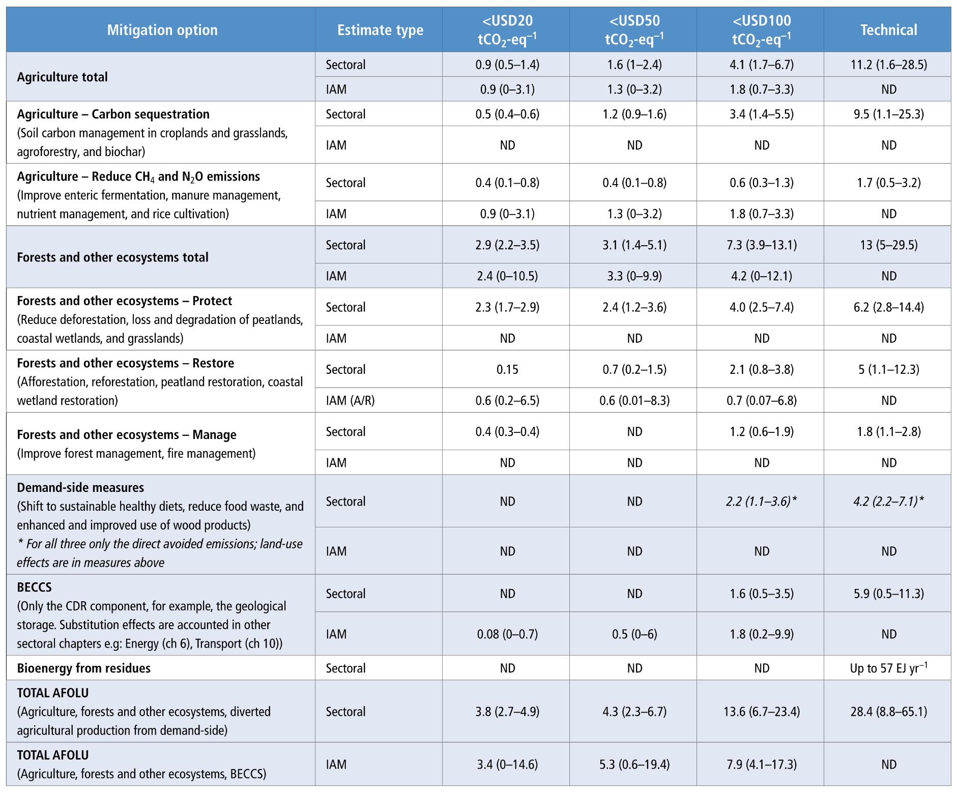
A comprehensive data table detailing the estimated annual mitigation potential of AFOLU (Agriculture, Forestry, and Other Land Use) mitigation options, categorized by carbon price thresholds. The table is organized into six columns: Mitigation option, Estimate type (comparing Sectoral versus IAM estimates), and four columns for cost brackets (<USD20, <USD100, <USD50, Technical and potential).> The rows are divided into major mitigation categories, including:  Agriculture: Broken down into carbon sequestration and emissions reduction.  Forests and other ecosystems: Broken down into protect, restore, and manage. This sector displays the highest individual mitigation potential across most price brackets.  Additional measures: Includes Demand-side measures, BECCS, and Bioenergy from residues.  TOTAL AFOLU: The bottom rows summarize the aggregate potential, showing a total Sectoral technical potential of 28.4 gigatonnes of CO2 equivalent per year, and a <USD100 13.6 IAM also are estimates for gigatonnes. of potential provided. the totals> Across the table, values are presented as means with their full ranges in parentheses. Several IAM (Integrated Assessment Model) and specific cost-bracket fields are marked 'ND,' indicating no data is available.
Table 7.3  Estimates reflect sectoral studies based on a comprehensive literature review updating data from (Roe et al. 2019) and integrated assessment models using the IPCC AR6 database (Section 7.5). Values represent the mean, and full range of potential. Sectoral mitigation estimates are averaged for the years 2020–2050 to capture a wider range of literature, and the IAM estimates are given for 2050 as many model assumptions delay most land-based mitigation to mid-century. The sectoral potentials are the sum of global estimates for the individual measures listed for each option. IAM potentials are given for mitigation options with available data; for example, net land-use CO2 for total forests and other ecosystems, and land sequestration from A/R, but not reduced deforestation (protect). Sectoral estimates predominantly use GWP100 IPCC AR5 values (CH4 = 28, N2O = 265), although some use GWP100 IPCC AR4 values (CH4 = 25, N2O = 298); and the IAMs use GWP100 IPCC AR6 values (CH4 = 27, N2O = 273). The sectoral and IAM estimates reflected here do not account for the substitution effects of avoiding fossil fuel emissions nor emissions from other more energy intensive resources/materials. For example, BECCS estimates only consider the carbon dioxide removal (CDR) via geological storage component and not potential mitigation derived from the displacement of fossil fuel use in the energy sector. Mitigation potential from substitution effects are included in the other sectoral chapters like energy, transport, buildings and industry. The total AFOLU sectoral estimate aggregates potential from agriculture, forests and other ecosystems, and diverted agricultural production from avoided food waste and diet shifts (excluding land-use impacts to avoid double counting). Because of potential overlaps between measures, sectoral values from BECCS and the full value chain potential from demand-side measures are not summed with AFOLU. IAMs account for land competition and resource optimisation and can therefore sum across all available categories to derive the total AFOLU potential. Key: ND = no data; Sectoral = as assessed by sectoral literature review; IAM = as assessed by integrated assessment models; EJ = exajoule primary energy.
Source: IPCC (2022) AR6 WGIII Chapter 7, Table 7.3

Possible actions to assist, protect and conserve natural ecosystems and prevent the loss of our planet’s endangered wildlife in the face of continued climate change
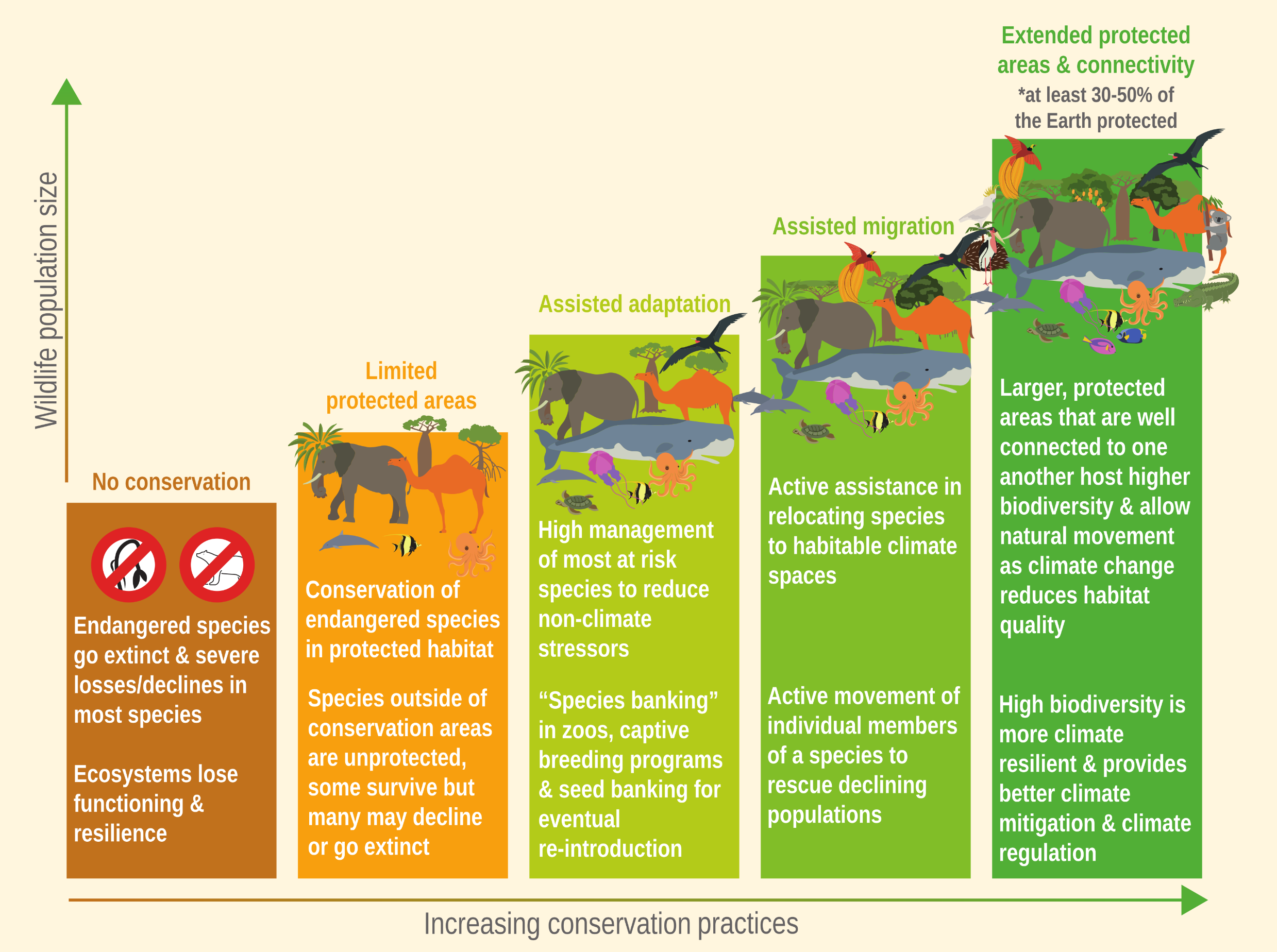

An infographic depicting a bar chart where the vertical axis represents increasing 'Wildlife population size' and the horizontal axis represents 'Increasing conservation practices.' The chart features five ascending bars from left to right, transitioning in colour from brown to dark green. The illustrations of animals and plants on top of each bar grow increasingly diverse and abundant as the bars get taller.  No conservation (brown, lowest bar): Shows crossed-out animal icons. It warns that endangered species go extinct, most species face severe declines, and ecosystems lose functioning and resilience.  Limited protected areas (orange): Explains that while endangered species are conserved in protected habitats, species outside these areas are unprotected, and many may decline or go extinct.  Assisted adaptation (light green): Focuses on the high management of at-risk species to reduce non-climate stressors, utilising 'species banking' in zoos, captive breeding programs, and seed banking for eventual re-introduction.  Assisted migration (medium green): Involves actively relocating species to habitable climate spaces and the active movement of individual members of a species to rescue declining populations.  Extended protected areas & connectivity (dark green, highest bar): Recommends protecting at least 30 to 50% of the Earth. It highlights that large, well-connected protected areas host higher biodiversity, allow for natural movement as climate change alters habitats, and create ecosystems that are more climate-resilient while providing better climate mitigation and regulation.
Figure FAQ2.1.1   Possible actions to assist, protect and conserve natural ecosystems and prevent the loss of our planet’s endangered wildlife in the face of continued climate change. (Inspired by the Natural Alliance website).
Source: IPCC (2022) AR6 WGII Chapter 2, Figure FAQ2.1.1, pg. 222

Ecosystem health influences prospects for climate resilient development
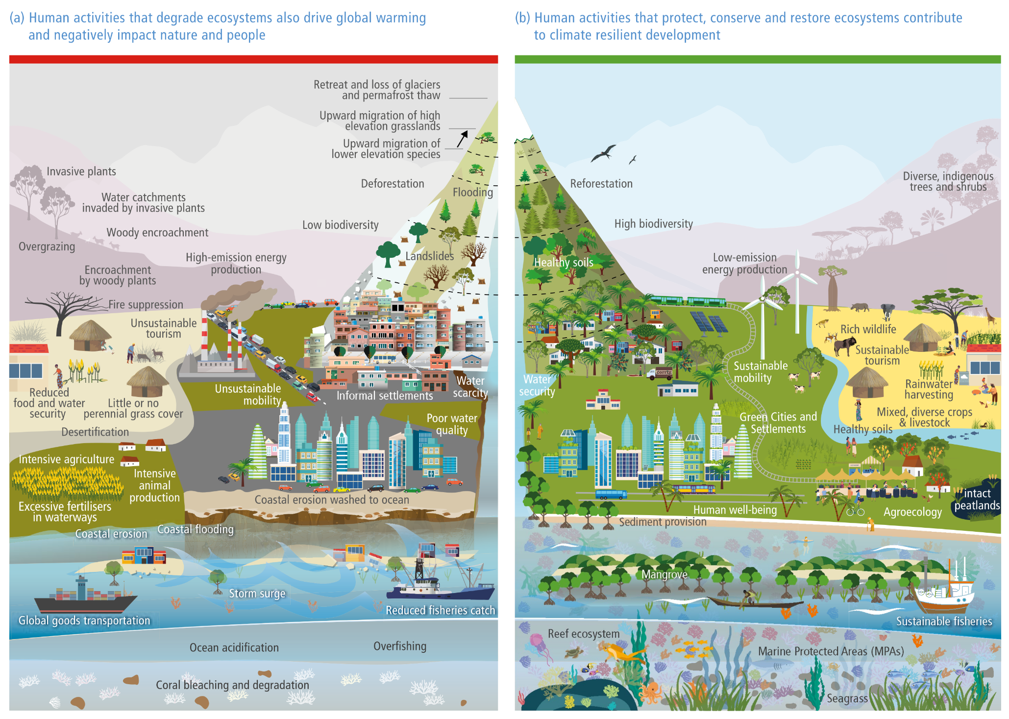
A side-by-side comparative illustration of a cross-section of land spanning from high mountains down to the ocean, showing two contrasting scenarios of human interaction with nature.   Panel a (Left): Titled 'Human activities that degrade ecosystems also drive global warming and negatively impact nature and people.' It depicts a muted, grey and brown landscape suffering from severe degradation. High elevations show retreating glaciers and deforestation, leading to landslides and flooding in densely packed informal settlements. A polluted city features high-emission smokestacks and severe traffic congestion. Rural areas are plagued by desertification, overgrazing, invasive plants, and intensive agriculture with excessive fertiliser runoff. The ocean is marked by coastal erosion, coral bleaching, acidification, and overfishing, heavily trafficked by global shipping vessels.   Panel b (Right): Titled 'Human activities that protect, conserve and restore ecosystems contribute to climate resilient development.' It depicts a vibrant, thriving, and green landscape. The mountains feature reforestation, high biodiversity, and healthy soils. The urban area is transformed into 'Green Cities and Settlements' utilising sustainable mobility (like passenger trains) and low-emission energy (wind turbines and solar panels). Rural areas demonstrate sustainable tourism, agroecology, mixed diverse crops and livestock, and intact peatlands. The coastal and ocean environments flourish with healthy mangroves, vibrant reef ecosystems, seagrass, marine protected areas (MPAs), and sustainable fisheries.
Figure TS.12 | This figure shows the interconnectedness between different ecosystems and system transitions, with human activities in urban, rural and coastal locations embedded in ecosystems. Maintaining biosphere integrity is essential for biodiversity, human and societal health and a precondition for climate resilient development. Panel a) illustrates how adaptation, mitigation and development actions characterised by exploitation and degradation lead to unsustainable development and adverse outcomes for human well-being and ecosystem integrity. Panel b) illustrates how adaptation options, implemented in an integrated way with mitigation and development and based on ecosystem stewardship, can support climate resilient development. The protection or restoration of one or more of these ecosystems also provides benefits to the other ecosystems and enhances the services provided that improve livelihoods. Protecting and restoring ecosystem health as a part of societal development and through societal choices is a key transformative solution space for climate resilient development.
Source: IPCC (2022) AR6 WGII TS, Figure TS.12


Sources for this post:


Featured image: Adobe Stock 714565142