Daily Archives: 12 April 2019

2 posts
A photograph of Earth viewed from space, showing the bright blue curve of the atmosphere against the black void. Swirling white clouds cover much of the planet below, while golden sunlight reflects off the ocean surface, casting long dark shadows from towering cloud formations. Source: ISS/NASA (downloaded 24 Aug. 2018) from https://www.theguardian.com/environment/2017/aug/18/climate-scientist-clouds-climate-change-interview-kate-marvel

A growing imbalance: carbon, ocean heat, and rising seas

Key ideas Our collective greenhouse gas (GHG) emissions are disrupting the Earth’s energy balance. This enhanced greenhouse effect is driving up global mean temperatures and pushing us out of the Holocene sweet spot, the stable climate window where civilisation developed. Due to the huge thermal inertia of the Earth’s oceans, […]

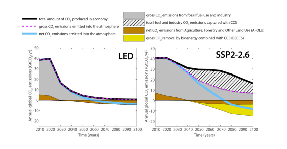
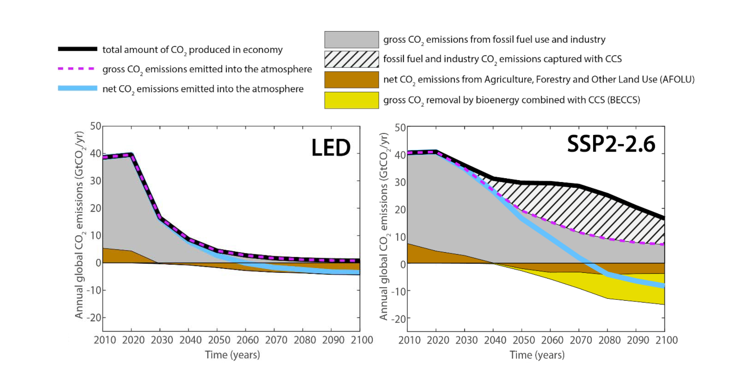
A two-panel line and area graph, comparing global carbon dioxide emissions from 2010 to 2100 across two different pathways: the Low Energy Demand, or LED, scenario on the left and a scenario labelled SSP2-2.6 on the right. A legend at the top explains the visual elements. A thick black line tracks the total amount of CO2 produced in the economy, a dashed purple line indicates gross CO2 emissions emitted into the atmosphere, and a solid light blue line tracks net CO2 emissions emitted into the atmosphere. Shaded areas represent specific sources and sinks: solid grey for gross fossil fuel and industry emissions, a hatched pattern for fossil fuel and industry emissions captured with carbon capture and storage (CCS), brown for net CO2 emissions from agriculture, forestry and other land use (AFOLU), and yellow for gross CO2 removal by bioenergy combined with CCS (BECCS). Both panels share a vertical axis measuring annual global CO2 emissions in gigatonnes per year, scaling from negative 20 to 50. The left panel for the LED scenario shows the thick black line for total CO2 produced dropping rapidly and steeply towards near zero, closely matched by the purple dashed line. It contains no hatched or yellow areas, relying solely on rapid fossil fuel emissions reduction and a small brown land-use sink to push the light blue net emissions line below zero around 2050. In contrast, the right panel for the SSP2-2.6 scenario shows the black total emissions line remaining much higher throughout the century. To achieve net-zero emissions, this scenario requires a massive hatched area emerging after 2030, representing extreme deployment of carbon capture to offset the delayed fossil fuel phase-out, alongside a deep yellow area appearing below the zero line representing heavy reliance on BECCS technologies. Consequently, the light blue net emissions line takes decades longer to reach zero, finally crossing the threshold around 2070. Source: a presentation by Arnulf Grubler on a Low Energy Demand scenario (downloaded in 2019).

Decarbonisation scenarios

“Scenarios with very low or low GHG emissions (SSP1-1.9 and SSP1-2.6) lead within years to discernible effects on greenhouse gas and aerosol concentrations and air quality, relative to high and very high GHG emissions scenarios (SSP3-7.0 or SSP5-8.5). Under these contrasting scenarios, discernible differences in trends of global surface temperature would begin to emerge from natural variability within around 20 years, and over longer time periods for many other climatic impact-drivers (high confidence).” [IPCC (2021) AR6 WGI Summary for Policymakers, D.2, pg. 30]