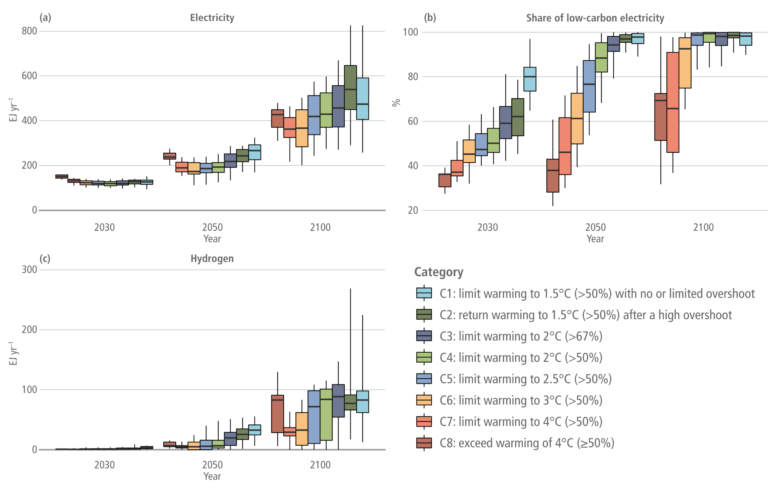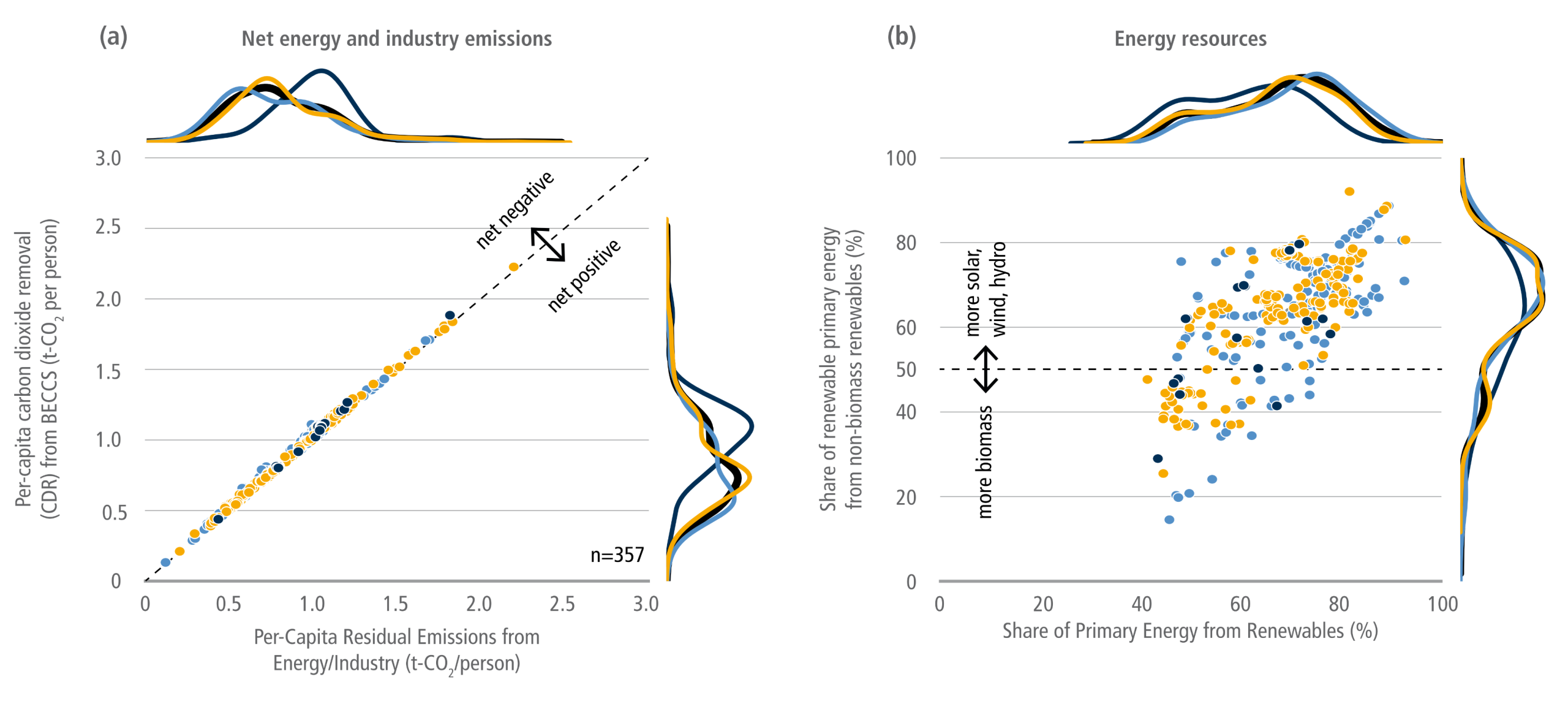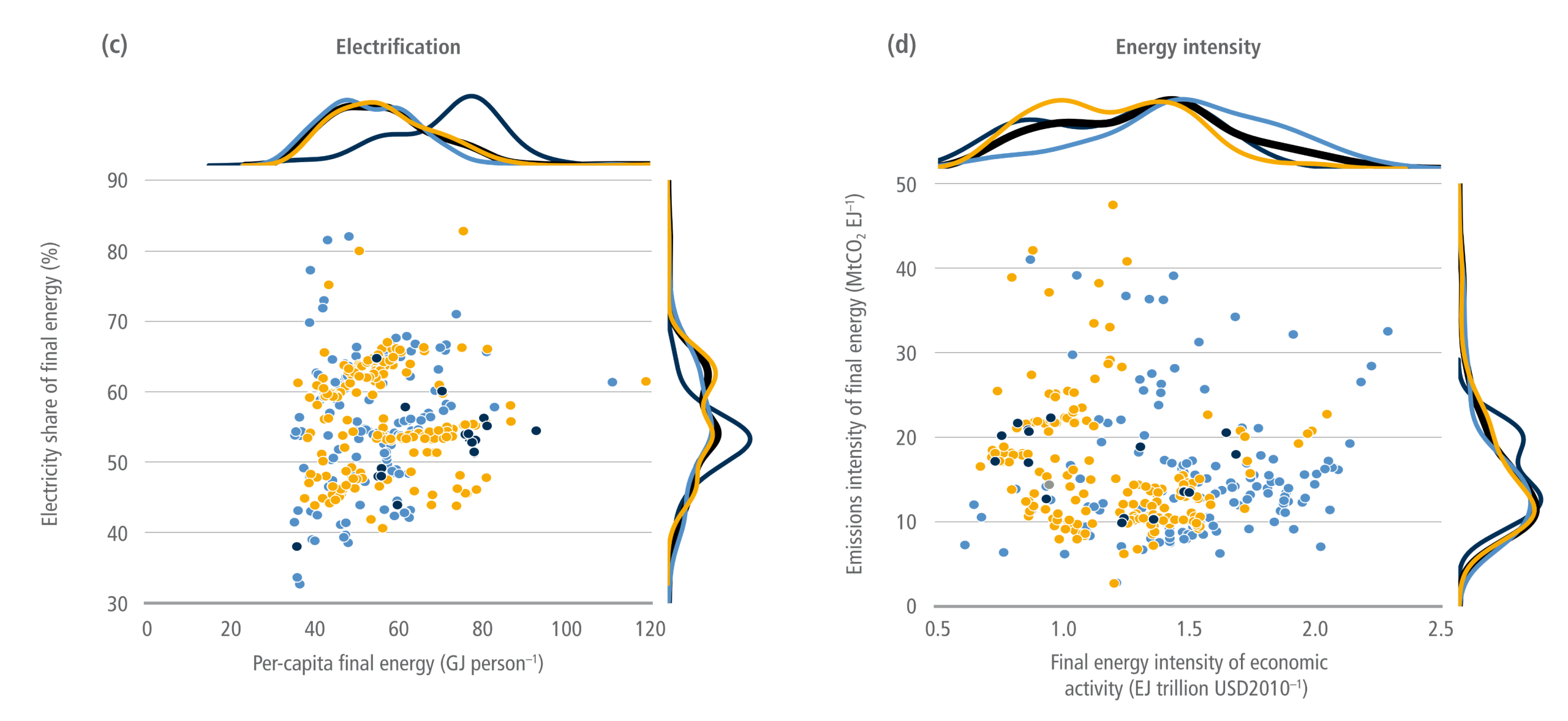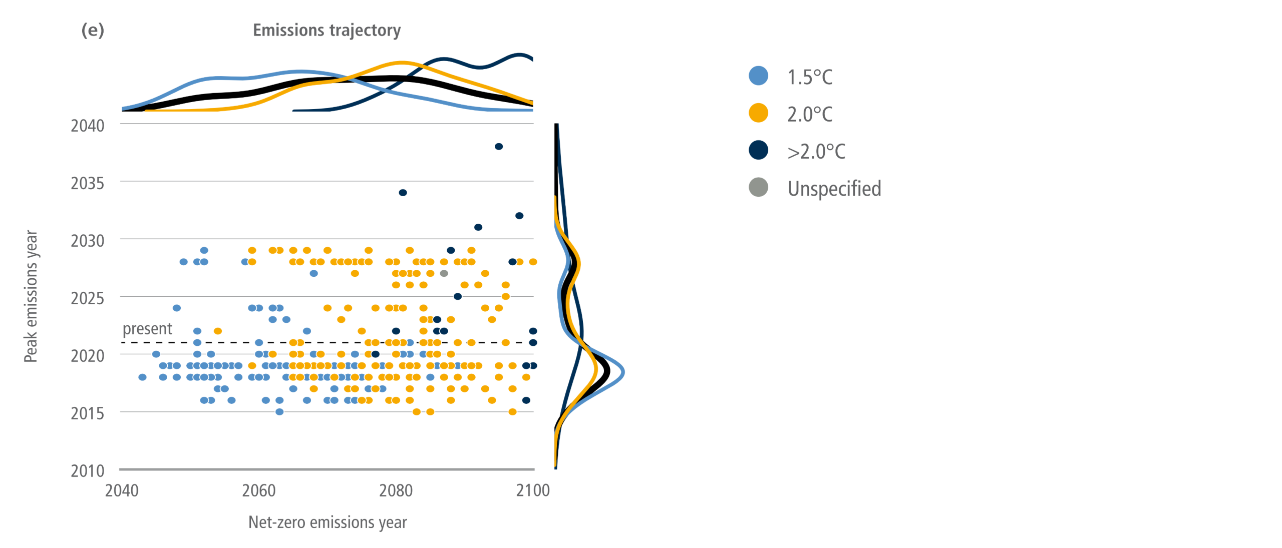
Decarbonisation scenarios

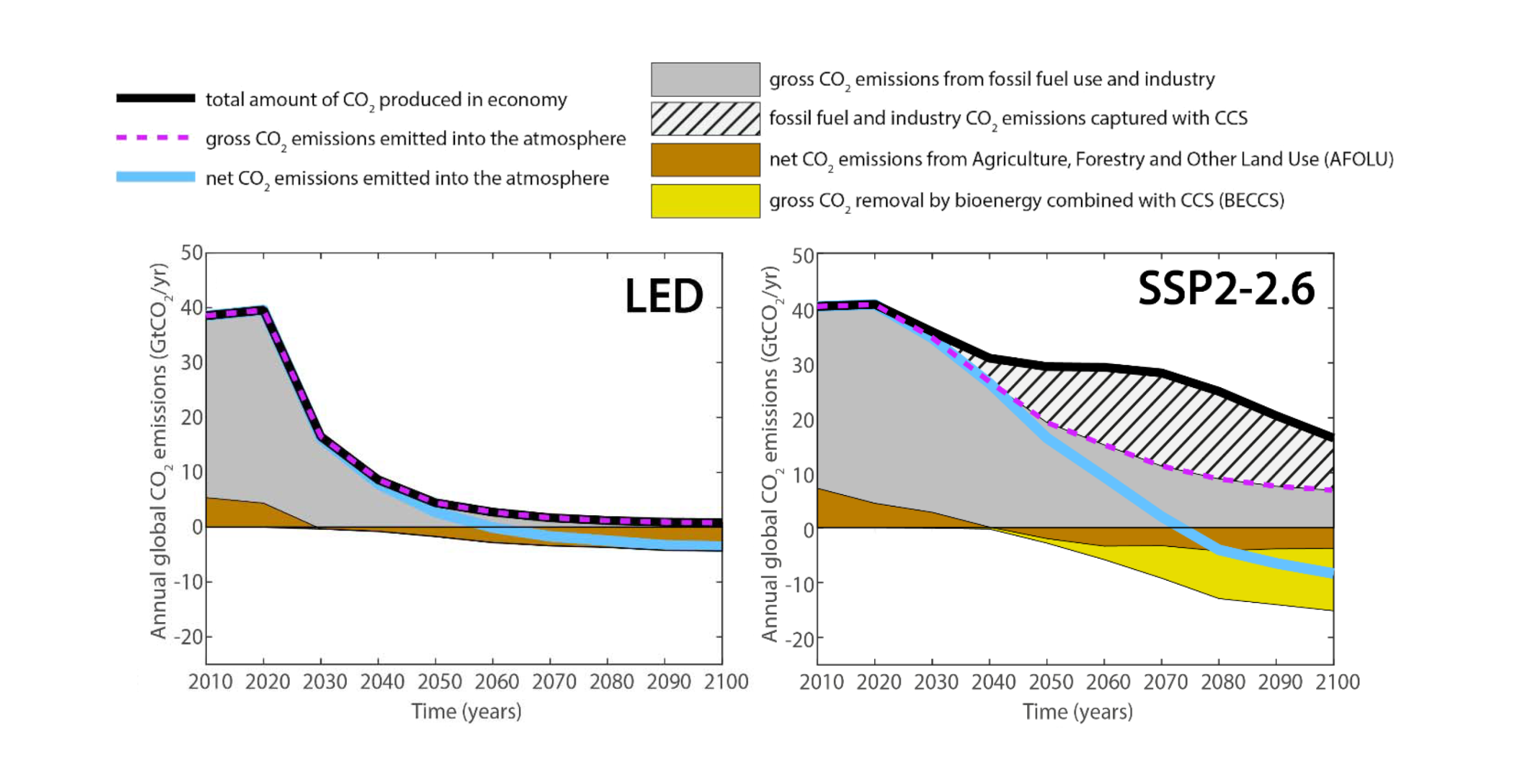
A two-panel line and area graph, comparing global carbon dioxide emissions from 2010 to 2100 across two different pathways: the Low Energy Demand, or LED, scenario on the left and a scenario labelled SSP2-2.6 on the right. A legend at the top explains the visual elements. A thick black line tracks the total amount of CO2 produced in the economy, a dashed purple line indicates gross CO2 emissions emitted into the atmosphere, and a solid light blue line tracks net CO2 emissions emitted into the atmosphere. Shaded areas represent specific sources and sinks: solid grey for gross fossil fuel and industry emissions, a hatched pattern for fossil fuel and industry emissions captured with carbon capture and storage (CCS), brown for net CO2 emissions from agriculture, forestry and other land use (AFOLU), and yellow for gross CO2 removal by bioenergy combined with CCS (BECCS). Both panels share a vertical axis measuring annual global CO2 emissions in gigatonnes per year, scaling from negative 20 to 50. The left panel for the LED scenario shows the thick black line for total CO2 produced dropping rapidly and steeply towards near zero, closely matched by the purple dashed line. It contains no hatched or yellow areas, relying solely on rapid fossil fuel emissions reduction and a small brown land-use sink to push the light blue net emissions line below zero around 2050. In contrast, the right panel for the SSP2-2.6 scenario shows the black total emissions line remaining much higher throughout the century. To achieve net-zero emissions, this scenario requires a massive hatched area emerging after 2030, representing extreme deployment of carbon capture to offset the delayed fossil fuel phase-out, alongside a deep yellow area appearing below the zero line representing heavy reliance on BECCS technologies. Consequently, the light blue net emissions line takes decades longer to reach zero, finally crossing the threshold around 2070. Source: a presentation by Arnulf Grubler on a Low Energy Demand scenario (downloaded in 2019).

This post takes a quick look at global decarbonisation scenarios. For detailed explanations, links to the source articles (such as IPCC report chapters) are at the bottom.


Decarbonisation


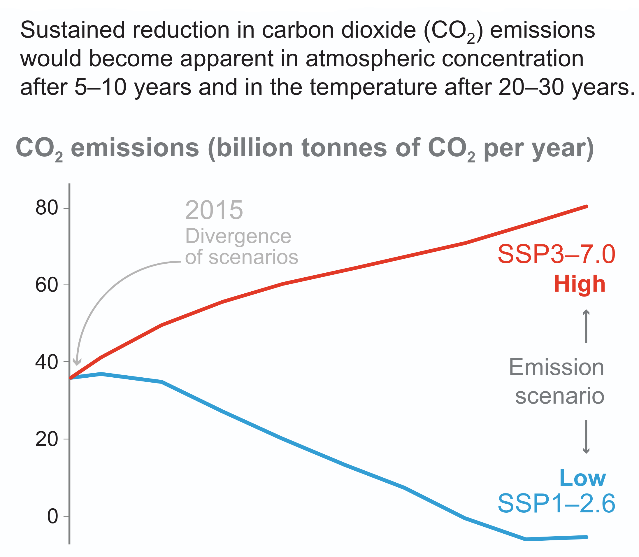
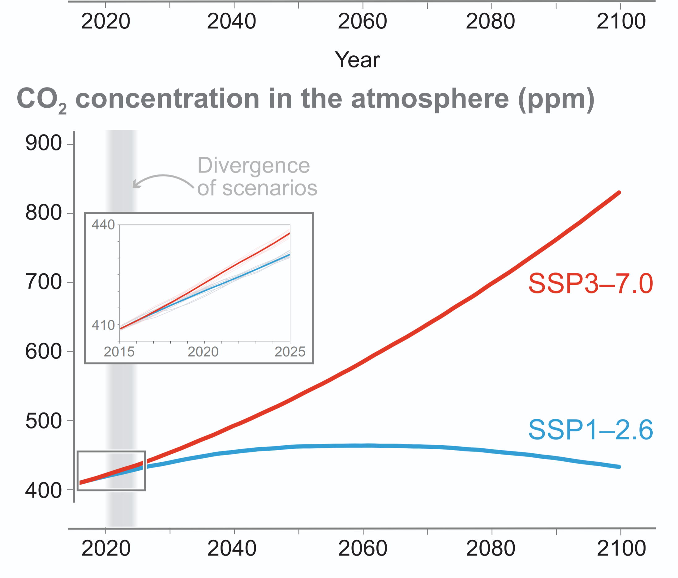
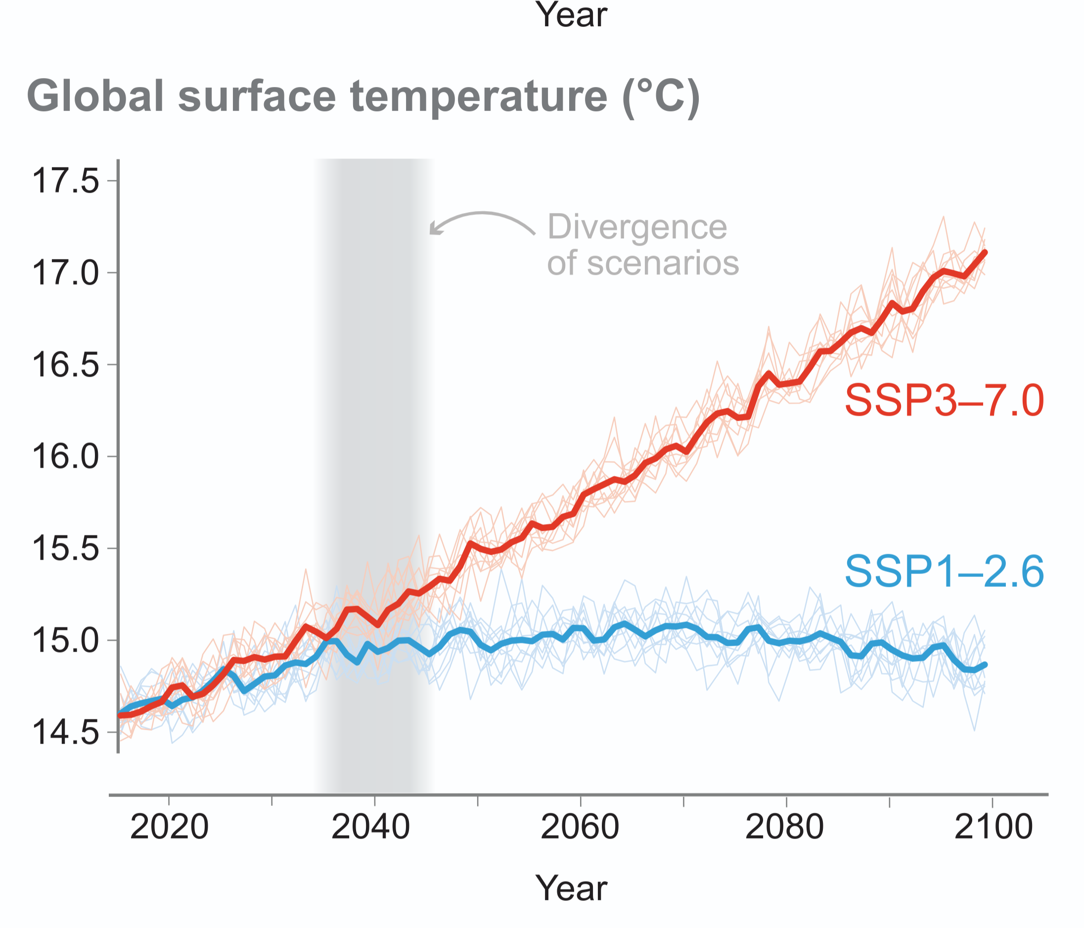
“Scenarios with very low or low GHG emissions (SSP1-1.9 and SSP1-2.6) lead within years to discernible effects on greenhouse gas and aerosol concentrations and air quality, relative to high and very high GHG emissions scenarios (SSP3-7.0 or SSP5-8.5). Under these contrasting scenarios, discernible differences in trends of global surface temperature would begin to emerge from natural variability within around 20 years, and over longer time periods for many other climatic impact-drivers (high confidence).”

Source: IPCC (2021) AR6 WGI Summary for Policymakers, D.2, pg. 30


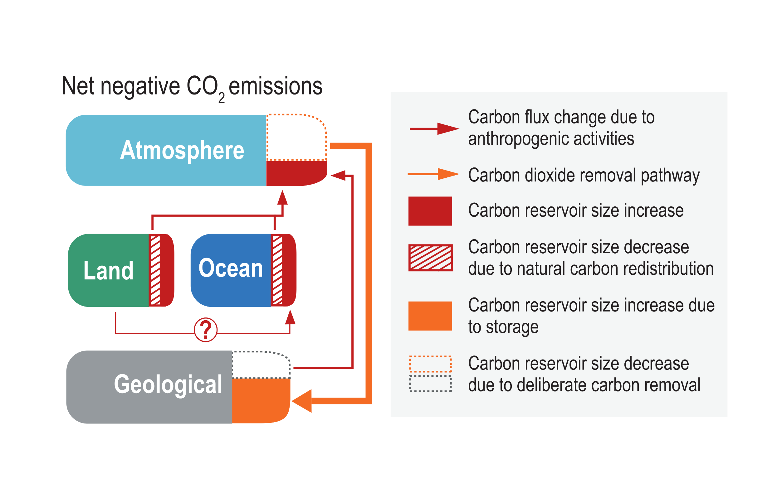
Roles of carbon dioxide removal (CDR) in global or national mitigation strategies
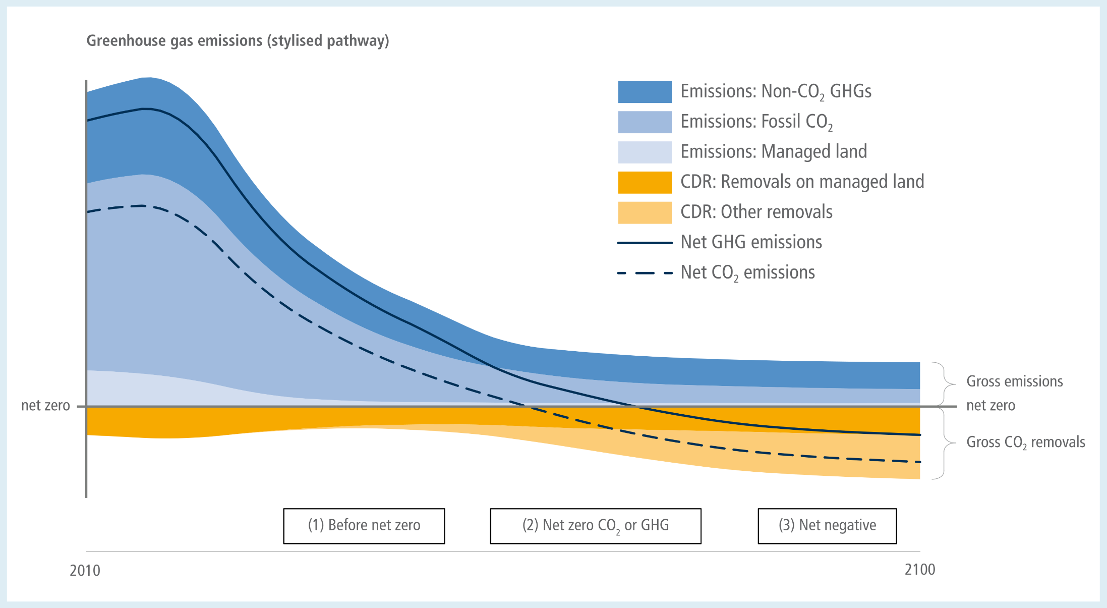
A stylised area graph illustrating the timeline of greenhouse gas emissions and removals from 2010 to 2100. A central horizontal line marks net zero. Above the line, blue shaded areas represent gross emissions from non-CO2 GHGs, fossil CO2, and managed land. These emission areas shrink significantly over time but never completely disappear. Below the line, orange shaded areas represent gross carbon dioxide removals on managed land and from other sources, which expand downwards over time.  Two trend lines track the overall balance: a solid line for net greenhouse gas emissions and a dashed line for net CO2 emissions. Both lines start high in the positive region during a phase labelled Before net zero. As time progresses, they slope steeply downwards to intersect the net zero line during a mid-term phase labelled Net zero CO2 or GHG, with the CO2 line crossing zero first. Finally, both lines continue downwards into the negative region, finishing the century in a phase labelled Net negative.
Cross-Chapter Box 8, Figure 2:  Roles of CDR in global or national mitigation strategies. Stylised pathway showing multiple functions of CDR in different phases of ambitious mitigation: (1) further reducing net CO2 or GHG emissions levels in near-term; (2) counterbalancing residual emissions to help reach net zero CO2 or GHG emissions in the mid-term; (3) achieving and sustaining net-negative CO2 or GHG emissions in the long-term.
Source: IPCC (2022) AR6 WGIII Chapter 12, Cross-Chapter Box 8, Figure 2

Shared Socio-Economic Pathways (SSPs)

Comparison of the range of fossil fuel and industrial CO2 emissions from scenarios used in previous assessments up to AR6
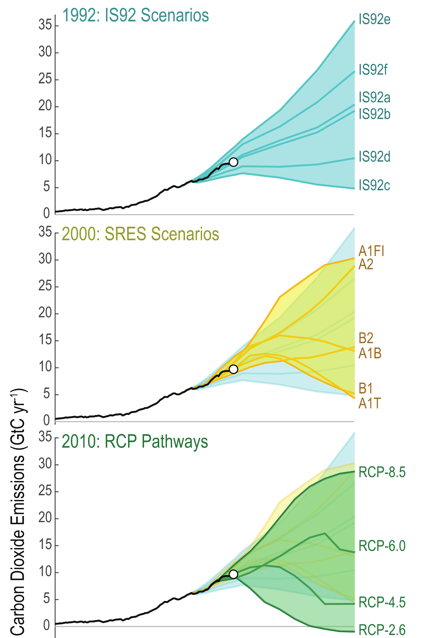
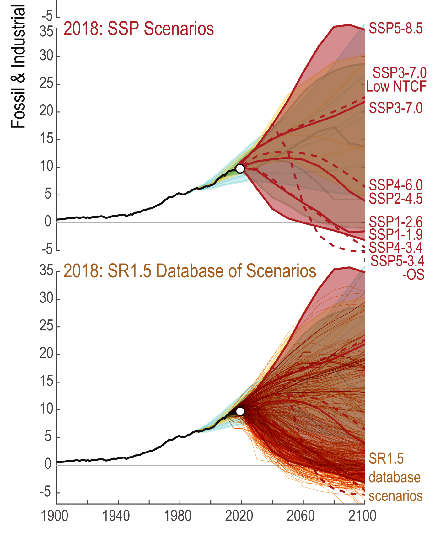
A five-panel vertical chart comparing the range of fossil fuel and industrial carbon dioxide emissions scenarios used in successive climate assessments from 1992 to 2018. The vertical axis on all panels measures emissions from minus 5 to 35 gigatonnes of carbon per year, while the horizontal axis spans from 1900 to 2100.  In every panel, a solid black line tracks historical emissions, rising steadily to near 10 gigatonnes by 2020, marked by a white dot. From this point, coloured fans of projected pathways diverge towards 2100. To show the evolution of the models, each new panel retains a faded shadow of the previous generations' ranges in the background.  The top panel shows the 1992 IS92 scenarios in light blue, fanning outwards but remaining entirely above zero. The second panel highlights the 2000 SRES scenarios in yellow. The third panel shows the 2010 RCP pathways in green, notably introducing scenarios like RCP-2.6 that drop down to cross the zero line into negative emissions before 2100. The fourth panel displays the 2018 SSP scenarios in red, showing a massive spread from the highest SSP5-8.5 pathway reaching above 35 gigatonnes, down to several lower pathways crossing into negative emissions. The bottom panel shows the 2018 SR1.5 database of scenarios as a dense cluster of hundreds of orange and brown lines. This final panel visually emphasises a significantly broadened modelling range, where a vast number of modern pathways rely on dropping well below zero to achieve net-negative emissions by the end of the century.

Figure 1.28:  Comparison of the range of fossil fuel and industrial CO2 emissions from scenarios used in previous assessments up to AR6. Previous assessments are the IS92 scenarios from 1992 (top), the Special Report on Emissions Scenarios (SRES) scenarios from the year 2000 (second panel), the Representative Concentration Pathway (RCP) scenarios designed around 2010 (third panel) and the Shared Socio-economic Pathways (SSP) scenarios (fourth panel). In addition, historical emissions are shown (black line; Figure 5.5); a more complete set of scenarios is assessed in SR1.5 (bottom); (Huppmann et al., 2018). Further details on data sources and processing are available in the chapter data table (Table 1.SM.1).
Source: IPCC (2021) AR6 WGI Chapter 1, Figure 1.28, pg. 237

Key Characteristics of the Five Shared Socio-Economic Pathways (SSPs)

A matrix table mapping the five Shared Socio-Economic Pathways, or SSPs, based on their socio-economic challenges to mitigation on the vertical axis and challenges to adaptation on the horizontal axis. Both axes are categorised as Low, Medium, or High.  The matrix outlines five pathways:  In the bottom-left, representing Low mitigation and Low adaptation challenges, is SSP1: Sustainable development. Key traits include low population, high economic and human development, environmentally oriented technological and behavioural change, resource-efficient lifestyles, and economic convergence with global cooperation.  In the centre, representing Medium challenges for both mitigation and adaptation, is SSP2: Middle of the road. It is characterised by medium population, medium and uneven economic and human development, uneven technological progress, resource-intensive lifestyles, and limited global cooperation.  In the top-left, with High mitigation and Low adaptation challenges, is SSP5: Fossil-fuelled development. It involves low population, very high economic growth and human development, ample fossil fuel resources, very resource-intensive lifestyles with high energy demand, and economic convergence with global cooperation.  In the bottom-right, with Low mitigation and High adaptation challenges, is SSP4: Inequality. It features a medium to high population, unequal low to medium economic and human development, unequal technological progress divided between high-tech sectors and domestic sectors, and a globally connected elite separated from disconnected domestic workforces.  In the top-right, representing High challenges for both mitigation and adaptation, is SSP3: Regional rivalry. It is defined by high population, low economic growth and human development, low technological progress, resource-constrained energy and food demand, a focus on regional security, and a general lack of global cooperation.
Source: IPCC (2018) SR15, Table 2.3

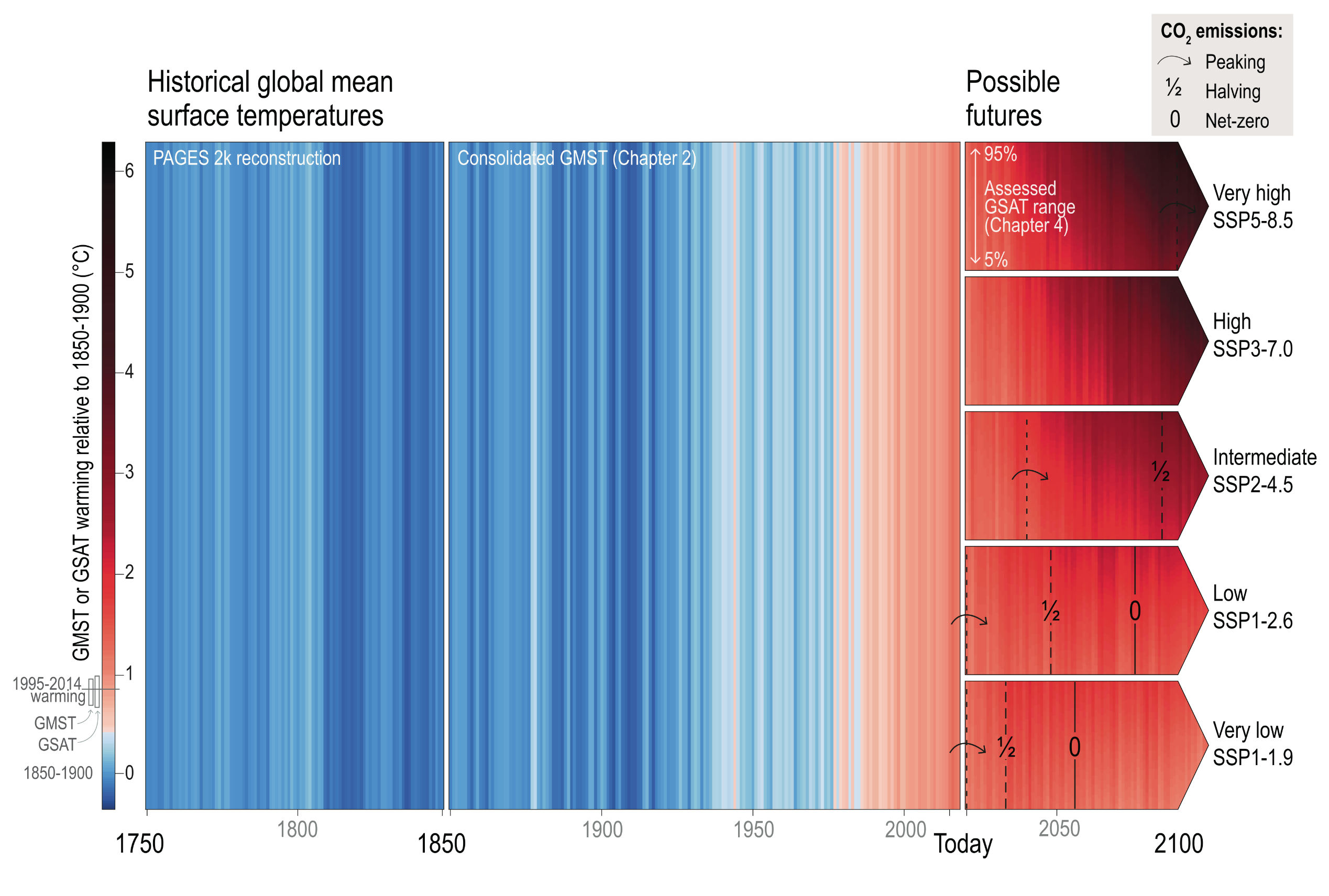
Global mean surface air temperature (GSAT) illustrated as warming stripes from blue (cold) to red (warm) over three different time periods.

An infographic using vertical warming stripes to visualise global mean surface air temperatures from 1750 to 2100. A vertical colour scale on the left assigns cooler temperatures to blue and warmer temperatures to increasingly dark shades of red, measuring warming up to 6 degrees Celsius relative to the 1850 to 1900 baseline.  The chart is divided chronologically. From 1750 to the mid-twentieth century, the vertical stripes are predominantly solid blue, indicating stable cooler temperatures. Approaching the year 2020, marked as Today, the stripes rapidly shift to white and then deep red, visually demonstrating sudden and intense historical warming.  From Today onwards, the chart splits into five horizontal arrows pointing towards 2100, each representing a different possible future scenario.  The top arrow represents the very high emissions scenario and turns a severe dark red to nearly black by 2100, indicating extreme continuous warming.  Moving downwards, the high, intermediate, and low scenarios show progressively lighter shades of red.  The bottom arrow represents the very low emissions scenario, which fades to a lighter orange-red, visually showing warming stabilising.  Overlaid on these future arrows are minimal symbols indicating when carbon dioxide emissions peak, halve, and reach net-zero. The lower emissions scenarios display all three milestones, showing net-zero being reached shortly after 2050, whereas the very high emissions scenario only shows emissions peaking near the end of the century.
Figure 1.25:  Global mean surface air temperature (GSAT) illustrated as warming stripes from blue (cold) to red (warm) over three different time periods. From 1750–1850 based on PAGES 2K reconstructions (PAGES 2k Consortium, 2017, 2019); from 1850–2018 showing the composite GSAT time series assessed in Chapter 2; and from 2020 onwards using the assessed GSAT projections for each Shared Socio-economic Pathway (SSP) (from Chapter 4). For the projections, the upper end of each arrow aligns with the colour corresponding to the 95th percentile of the projected temperatures and the lower end aligns with the colour corresponding to the 5th percentile of the projected temperature range. Projected temperatures are shown for five scenarios from ‘very low’ SSP1-1.9 to ‘very high’ SSP5-8.5 (see Cross-Chapter Box 1.4 for more details on the scenarios). For illustrative purposes, natural variability has been added from a single CMIP6 Earth system model (MRI ESM2). The points in time when total CO2 emissions peak; reach halved levels of the peak; and reach net zero emissions are indicated with arrows, ‘½’ and ‘0’ marks, respectively.
Source: IPCC (2021) WGI Chapter 1, Figure 1.25, pg. 228

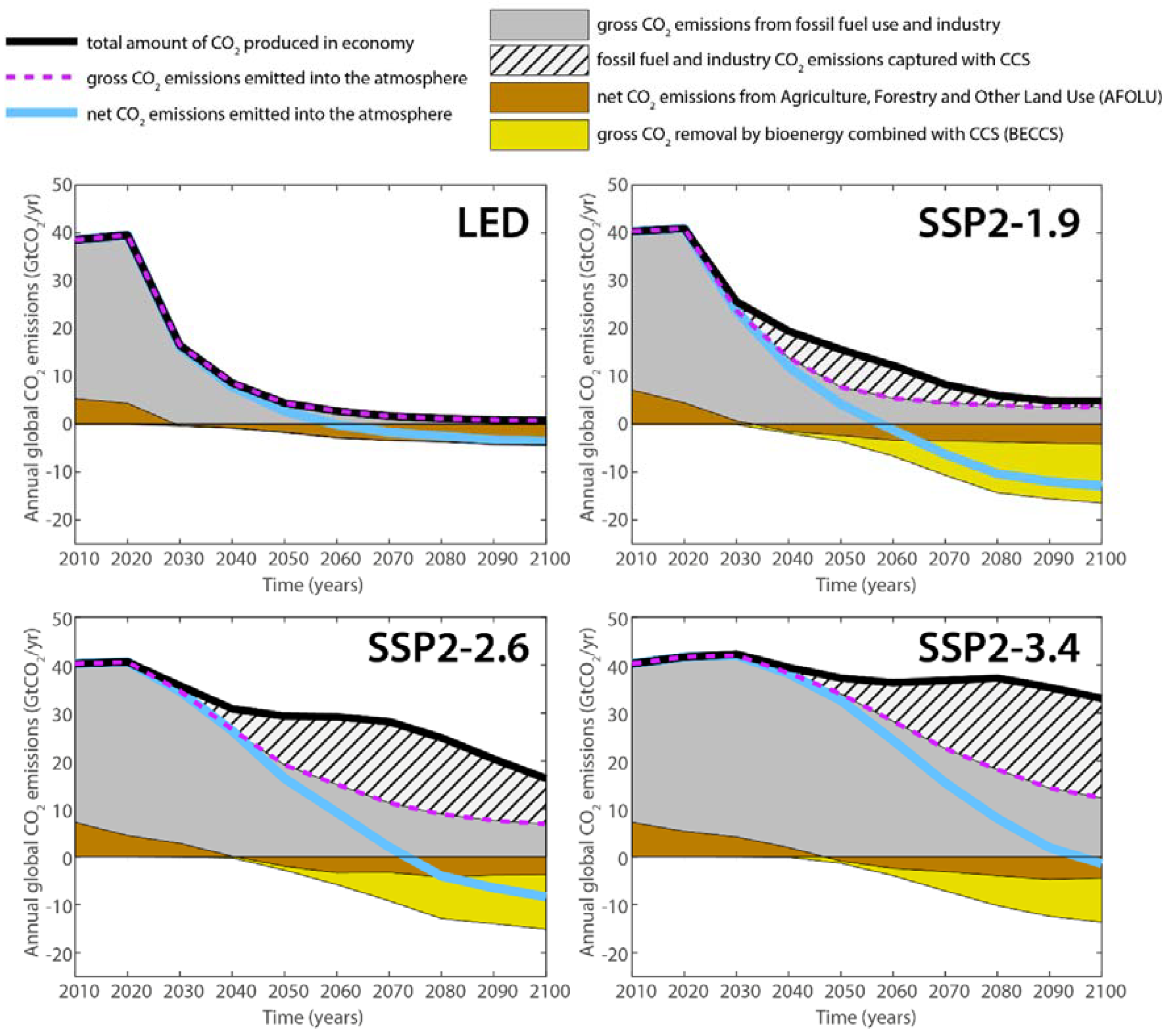
Global CO2 emissions in the Low Energy Demand (LED) and SSP2 scenarios

A four-panel line and area graph comparing global carbon dioxide emissions from 2010 to 2100 across four different pathways: the Low Energy Demand, or LED, scenario and three Middle of the Road scenarios labelled SSP2-1.9, SSP2-2.6, and SSP2-3.4.  A legend at the top explains the visual elements. A thick black line tracks the total amount of CO2 produced in the economy, and a light blue line tracks net CO2 emissions to the atmosphere. Shaded areas represent specific sources and sinks: solid grey for gross fossil fuel and industry emissions, a hatched pattern for fossil fuel emissions captured with carbon capture and storage (CCS), brown for land-use emissions and removals, and yellow for bioenergy combined with CCS (BECCS).  The top-left panel for the LED scenario shows the thick black line for total CO2 produced dropping rapidly and steeply towards zero. It contains no hatched or yellow areas, relying solely on rapid emissions reduction and a small brown land-use sink to push the light blue net emissions line below zero by 2050.  In contrast, the top-right panel for SSP2-1.9 achieves net zero at roughly the same time, but the black line remains much higher. To offset this, a large hatched area and a deep yellow area emerge, visually illustrating a heavy reliance on CCS and BECCS technologies.  The bottom two panels for SSP2-2.6 and SSP2-3.4 show the black total emissions line remaining very high throughout the century. Consequently, these panels are dominated by massive hatched areas representing extreme deployment of carbon capture to offset delayed fossil fuel phase-outs, with the light blue net emissions line taking decades longer to reach zero.
Supplementary Figure 17:  Global CO2 emissions in the LED and SSP2 scenarios. Emissions by source, use of CCS, and emissions removal by land‐use change (AFOLU) and by BECCS, are shown for the LED scenario (a) and the MESSAGE‐GLOBIOM SSP2‐1.9 (b), the MESSAGE‐ GLOBIOM SSP2‐2.6 (c), and the MESSAGE‐GLOBIOM SSP2‐3.4 (d) scenarios. Note that although net global CO2 emissions reach zero roughly at the same time in panels a and b (light blue line), this point is reached in contrasting ways in the two scenarios. LED achieves emissions reductions until carbon neutrality through a rapid near‐term decline of the total amount of CO2 produced in the economy (thick black line), offset by a limited contribution of AFOLU removal. The standard SSP2‐1.9 scenario reduces the total amount of CO2 produced in the economy much less, and instead requires CCS both to reduce CO2 emissions from fossil fuel and industry (hatched area) and to offset a large amount of emissions through BECCS. The SSP2‐2.6 and SSP2‐3.4 scenarios achieve weaker climate targets (2.6 and 3.4 W/m2 of radiative forcing by 2100) yet deploy larger absolute amounts of total CCS further delaying the phase out of fossil fuel‐related CO2 emissions.
Source: Grubler et al (2018) Supplementary Information – A low energy demand scenario for meeting the 1.5 °C target and sustainable development goals without negative emission technologies, Supplementary Figure 17

Illustrative Mitigation Pathways (IMPs)

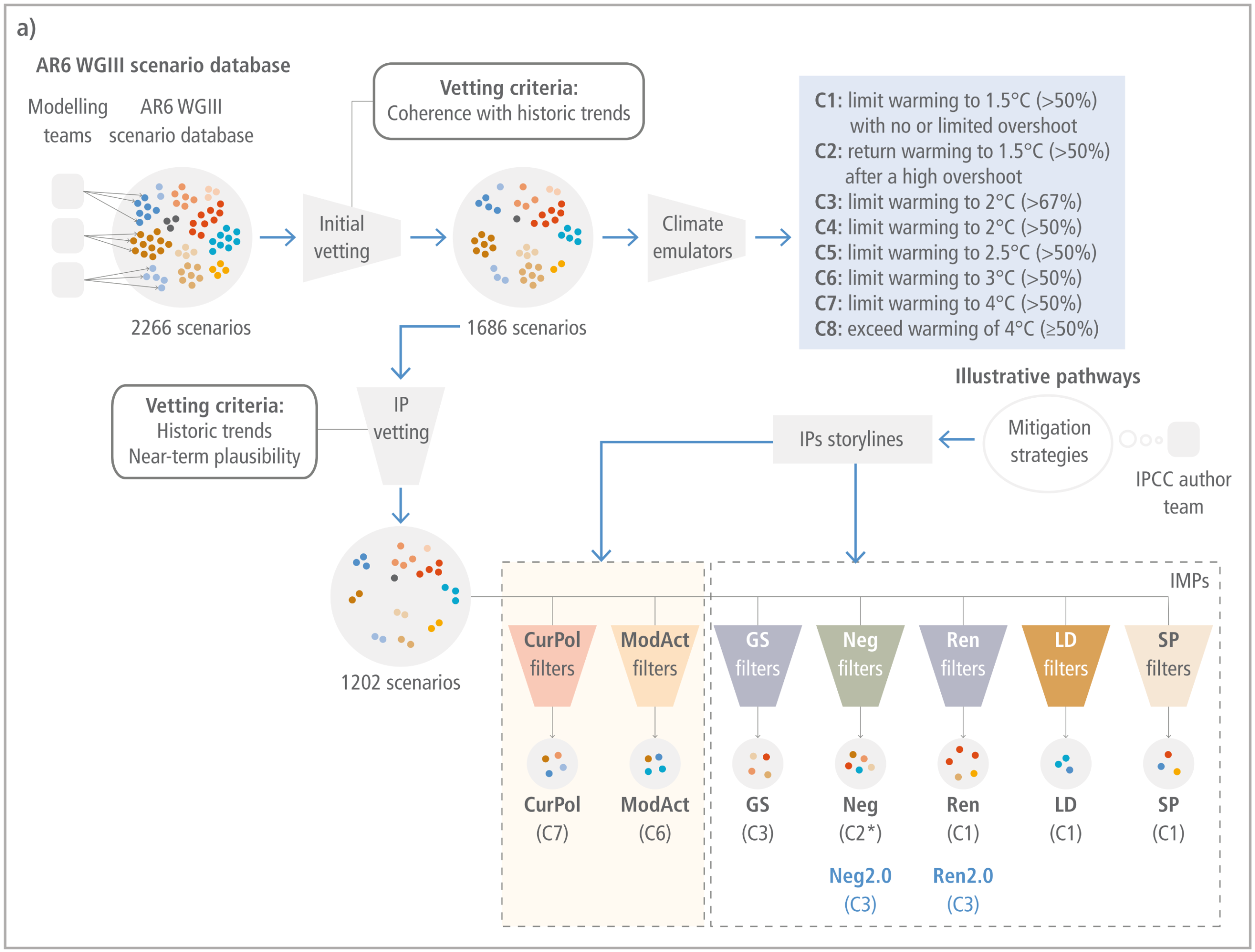
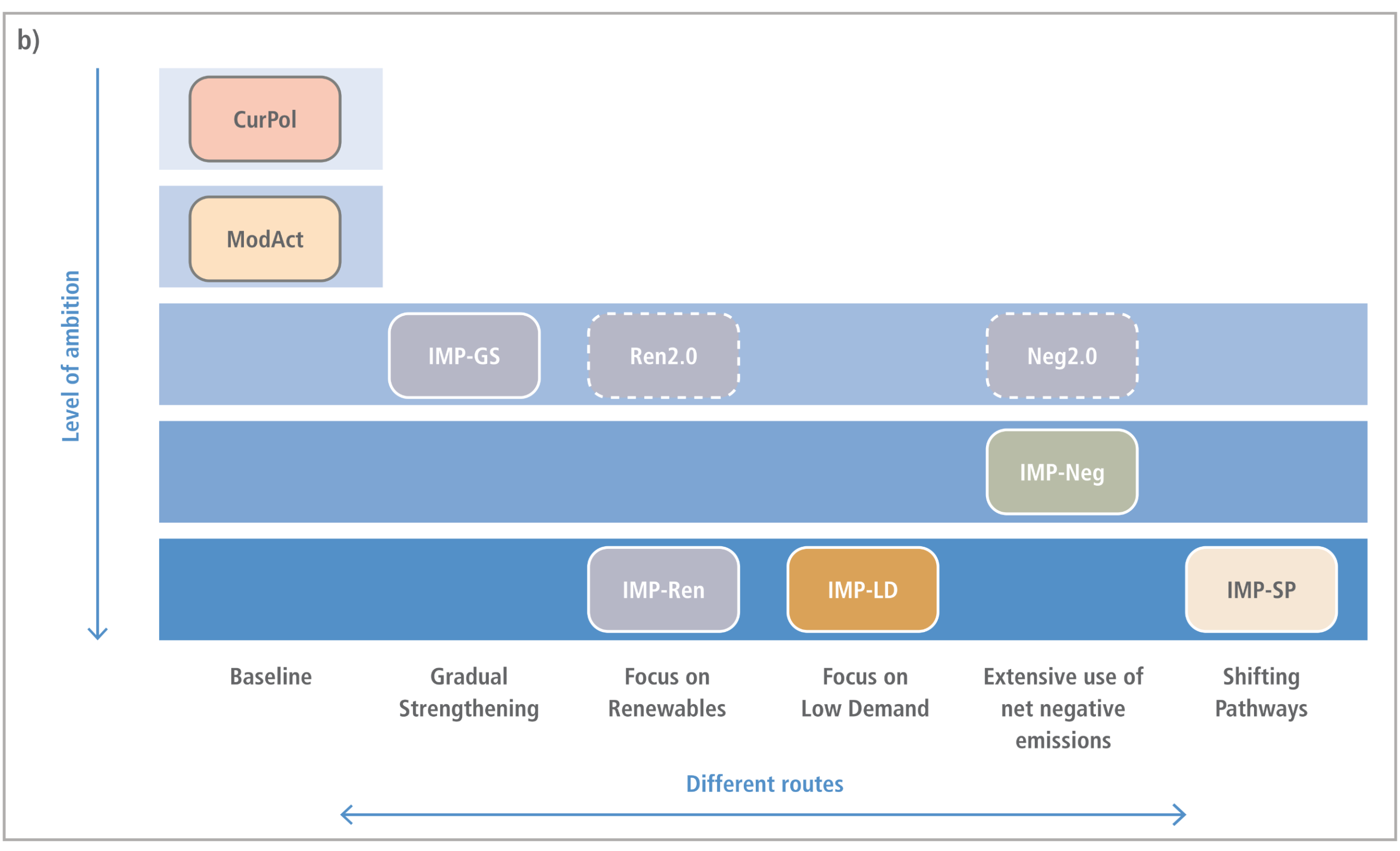
An overview of the Illustrative Pathways selected for use in IPCC AR6 WGIII

A two-part infographic visualising the selection process and categorisation of the IPCC AR6 Illustrative Pathways.  Panel A is a flowchart showing how an initial database of 2266 scenarios from modelling teams is systematically filtered. Initial vetting for historical coherence reduces the pool to 1686 scenarios, which are then passed through climate emulators and categorised into eight temperature classes from C1 to C8. A second vetting for near-term plausibility reduces the database to 1202 scenarios. Finally, these remaining scenarios are pushed through specific storyline funnels to isolate the final illustrative mitigation pathways, ranging from high emissions scenarios to ambitious 1.5-degree pathways.  Panel B is a block diagram mapping these final pathways against a vertical axis representing Level of ambition, which increases downwards, and a horizontal axis representing Different routes. At the top, indicating the lowest ambition, are the CurPol and ModAct pathways aligned under a Baseline route. Moving downwards to moderate ambition are the IMP-GS, Ren2.0, and Neg2.0 pathways. Further down is the IMP-Neg pathway, located under the route for extensive use of net negative emissions. At the very bottom, indicating the highest level of ambition, are the IMP-Ren, IMP-LD, and IMP-SP pathways, representing routes focused on renewables, low demand, and shifting pathways respectively.

Figure 3.5:  (a) Process for creating the AR6 scenario database and selecting the illustrative (mitigation) pathways. The compiled scenarios in the AR6 scenarios database were vetted for consistency with historical statistics and subsequently a temperature classification was added using climate model emulators. The illustrative (mitigation) pathways were selected from the full set of pathways based on storylines of critical mitigation strategies that emerged from the assessment. (b) An overview of the Illustrative Pathways selected for use in IPCC AR6 WGIII, consisting of pathways illustrative of higher emissions, Current Policies (CurPol) and Moderate Action (ModAct), and Illustrative Mitigation Pathways (IMPs): gradual strengthening of current policies (IMP-GS), extensive use of net negative emissions (IMP-Neg), renewables (IMP-Ren), low demand (IMP-LD), and shifting pathways (IMP-SP). The Ren2.0 and Neg2.0 scenarios are alternative scenarios to the IMPs. These pathways are based on renewables and extensive use of negative emissions, respectively, but leading to temperature levels comparable to the C3 category and have sometimes been used for comparison.
Source: IPCC (2022) AR6 WGIII Chapter 3, Figure 3.5

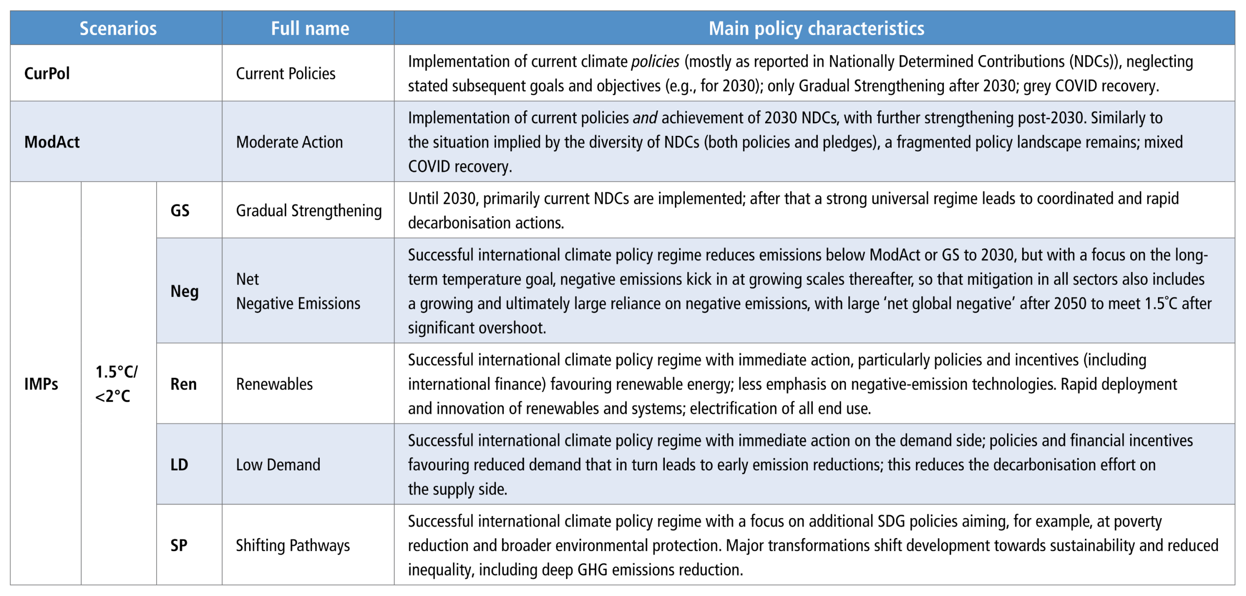
Illustrative Mitigation Pathways used in AR6

A table defining the Illustrative Mitigation Pathways used in the IPCC AR6 report. The table contains three columns: Scenarios, Full name, and Main policy characteristics.  The scenarios are divided into three main categories: First, CurPol stands for Current Policies, characterised by the implementation of current climate policies while neglecting subsequent goals, leading to a grey COVID recovery. Second, ModAct stands for Moderate Action, characterised by achieving 2030 targets with further strengthening post-2030, but remaining a fragmented policy landscape with a mixed COVID recovery.  The remaining five scenarios fall under the ambitious 1.5 to below 2 degrees Celsius Illustrative Mitigation Pathways: GS stands for Gradual Strengthening, implementing current targets until 2030, followed by a strong universal regime for rapid decarbonisation. Neg stands for Net Negative Emissions, focusing on long-term goals with a heavy reliance on negative emissions after 2050 to meet 1.5 degrees after significant overshoot. Ren stands for Renewables, focusing on immediate action favouring renewable energy, rapid innovation, and electrification, with less emphasis on negative emissions. LD stands for Low Demand, highlighting immediate action on the demand side to achieve early emission reductions. SP stands for Shifting Pathways, focusing on broader sustainable development goals such as poverty reduction, shifting development towards sustainability and reduced inequality.
Source: IPCC (2022) AR6 WGIII Chapter 1, Table 1.1, pg.175

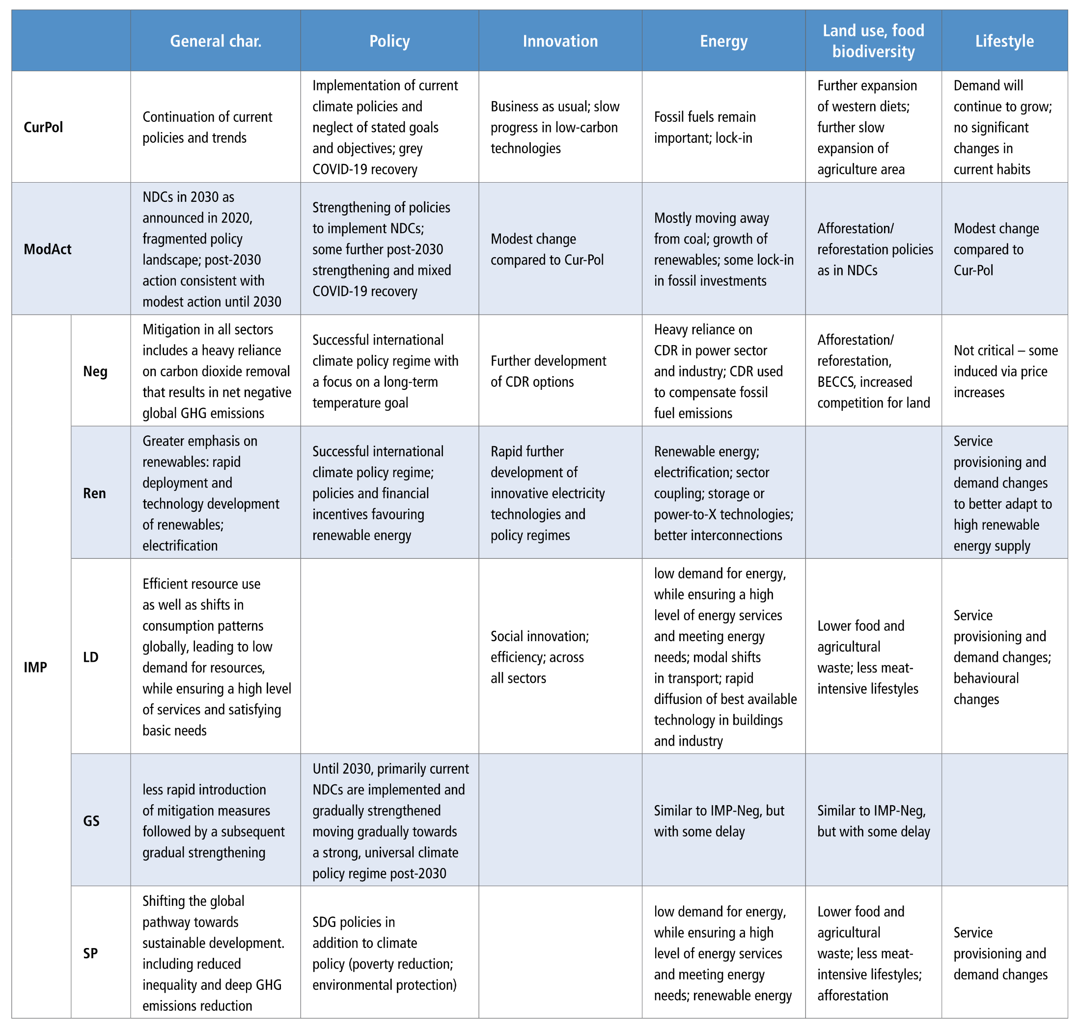
Storylines for the two reference pathways and five Illustrative Mitigation Pathways (IMPs) limiting warming to 1.5°C–2°C

A comprehensive table detailing the storylines for two reference pathways and five Illustrative Mitigation Pathways, or IMPs. The table compares these seven scenarios across six categories: General characteristics, Policy, Innovation, Energy, Land use, food and biodiversity, and Lifestyle.  The two reference pathways are: CurPol, representing Current Policies, characterised by a continuation of current trends, business-as-usual innovation, fossil fuel lock-in, and continued growth in demand and western diets. ModAct, representing Moderate Action, which involves a fragmented policy landscape implementing 2030 targets, with modest innovation and a gradual move away from coal.  The five Illustrative Mitigation Pathways are: Neg, which relies heavily on carbon dioxide removal technologies to achieve net negative emissions, driven by successful international climate policy. Ren, which emphasises rapid deployment, innovation, and financial incentives favouring renewable energy and broad electrification. LD, representing Low Demand, which highlights social innovation, efficient resource use, modal shifts in transport, and behavioural changes leading to less meat-intensive lifestyles. GS, representing Gradual Strengthening, which features a delayed introduction of mitigation measures that gradually transition into a strong universal climate policy regime post-2030. SP, representing Shifting Pathways, which integrates sustainable development goals, such as poverty reduction and environmental protection, alongside deep emissions reductions, low energy demand, and afforestation.
Source: IPCC (2022) AR6 WGIII Annex III, Table 9

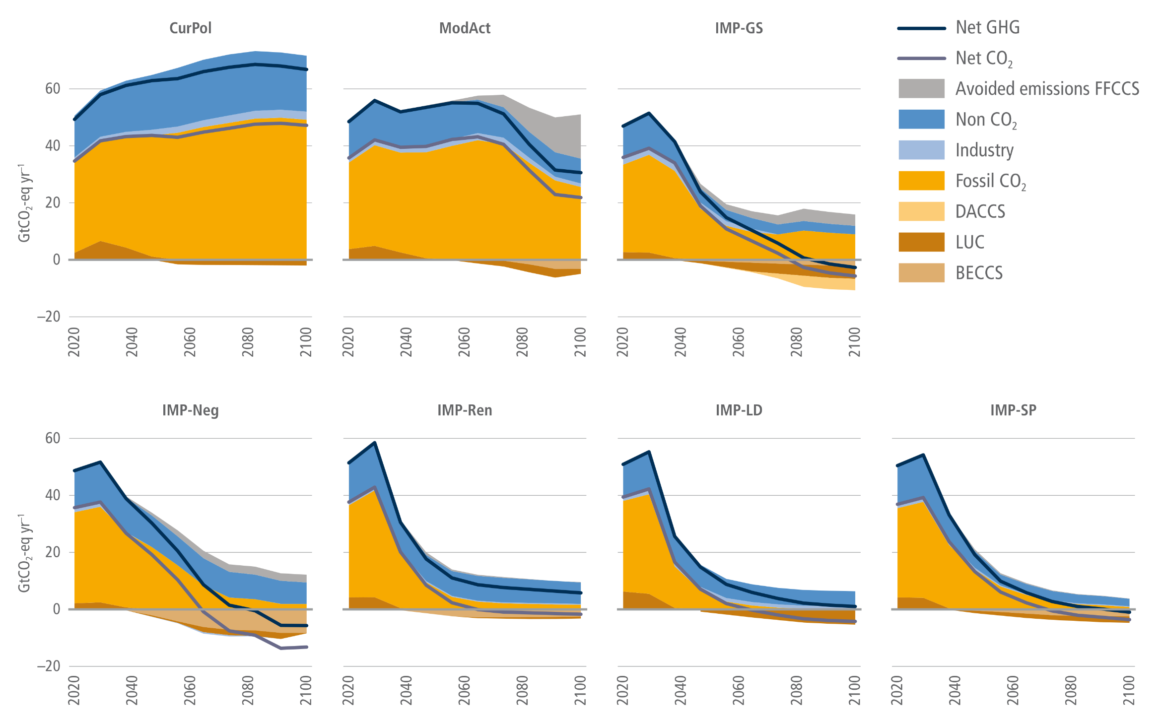
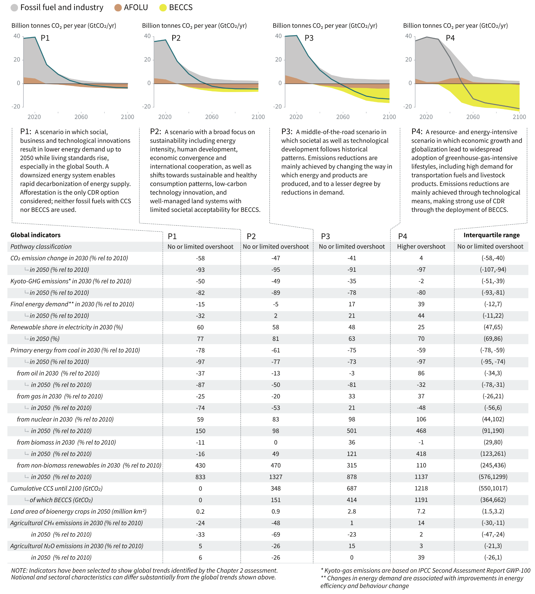
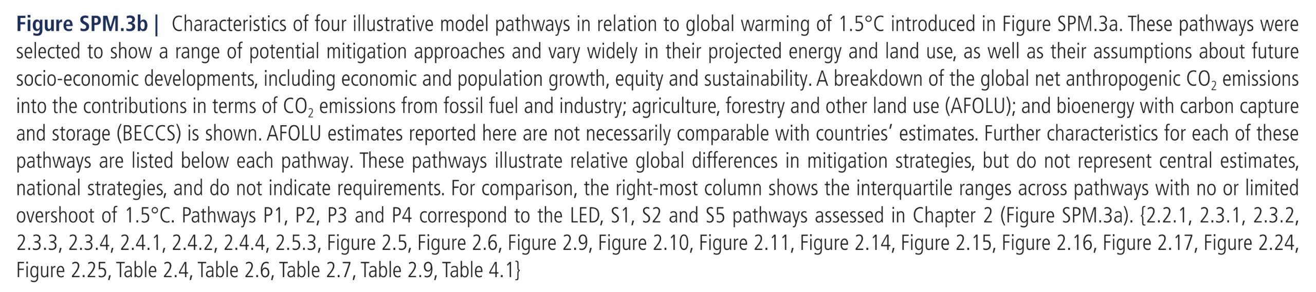
The residual fossil fuel and industry emissions, carbon dioxide removal (CDR) {LUC, DACCS, BECCS}, and non-CO2 emissions (using AR6 GWP-100) for each of the seven illustrative pathways (IPs)

A seven-panel stacked area graph comparing emission trajectories for seven illustrative pathways from 2020 to 2100. The vertical axis on each panel measures emissions from minus 20 to 80 gigatonnes of CO2 equivalent per year. A legend identifies lines for Net greenhouse gases and Net CO2. Shaded areas above the zero line represent positive emissions from Non-CO2, Industry, and Fossil CO2, alongside a grey band for avoided emissions from fossil carbon capture. Shaded areas below the zero line represent negative emissions from direct air capture, land use change, and bioenergy.  The top row displays three pathways. CurPol shows emissions rising and staying near 70 gigatonnes through 2100 with virtually no negative emissions. ModAct shows emissions remaining high before a modest decline after 2060. IMP-GS shows a steady decline, relying on significant, expanding bands of negative emissions to reach net-zero greenhouse gases around 2080.  The bottom row displays four highly ambitious mitigation pathways. IMP-Neg shows a steep decline, crossing net-zero before 2080 and expanding massive bands of negative emissions downwards to push net CO2 far below zero by 2100. In contrast, IMP-Ren, IMP-LD, and IMP-SP achieve steep emission cuts primarily by drastically shrinking the positive Fossil CO2 band. Visually, these last three pathways require much smaller amounts of negative emissions to approach or reach net-zero by the end of the century.
Figure 3.7:  The residual fossil fuel and industry emissions, carbon dioxide removal (CDR) {LUC, DACCS, BECCS}, and non-CO2 emissions (using AR6 GWP-100) for each of the seven illustrative pathways (IPs). Fossil CCS is also shown, though this does not lead to emissions to the atmosphere (Section 3.2.5).
Source: IPCC (2022) AR6 WGIII Chapter 3, Figure 3.7

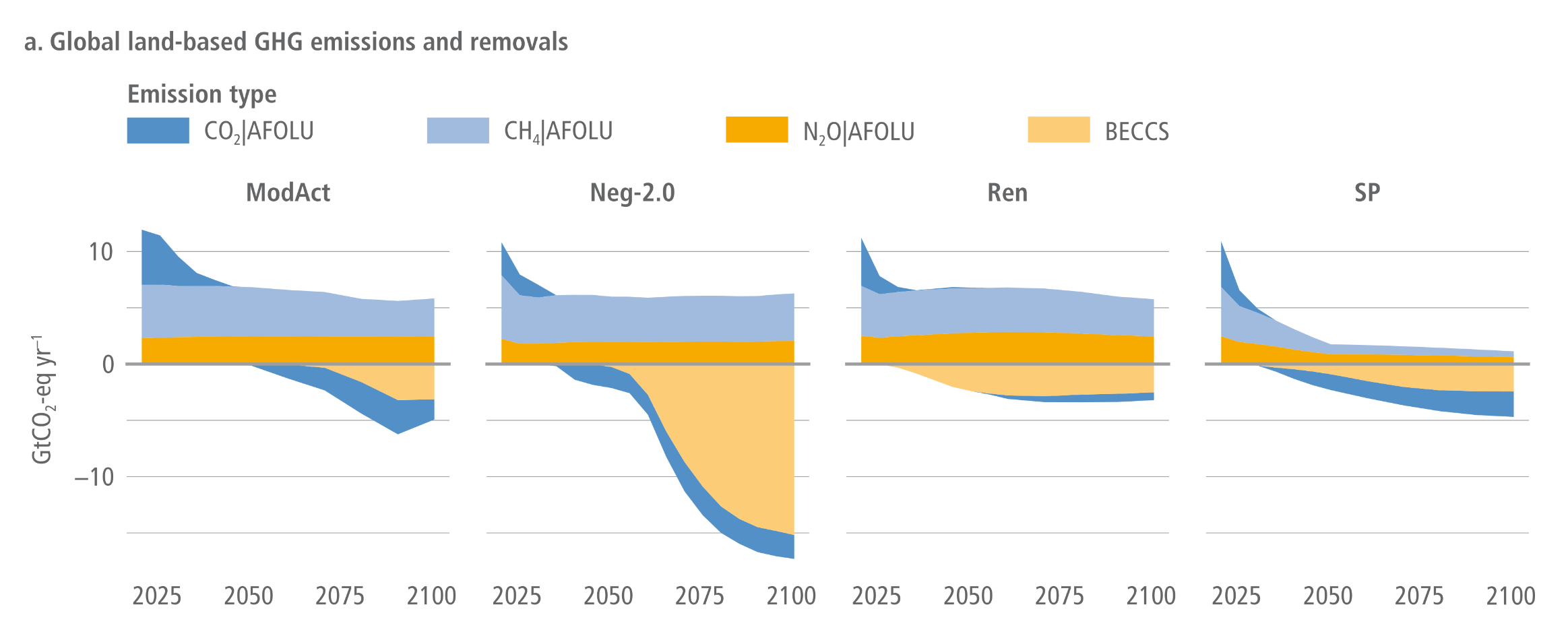
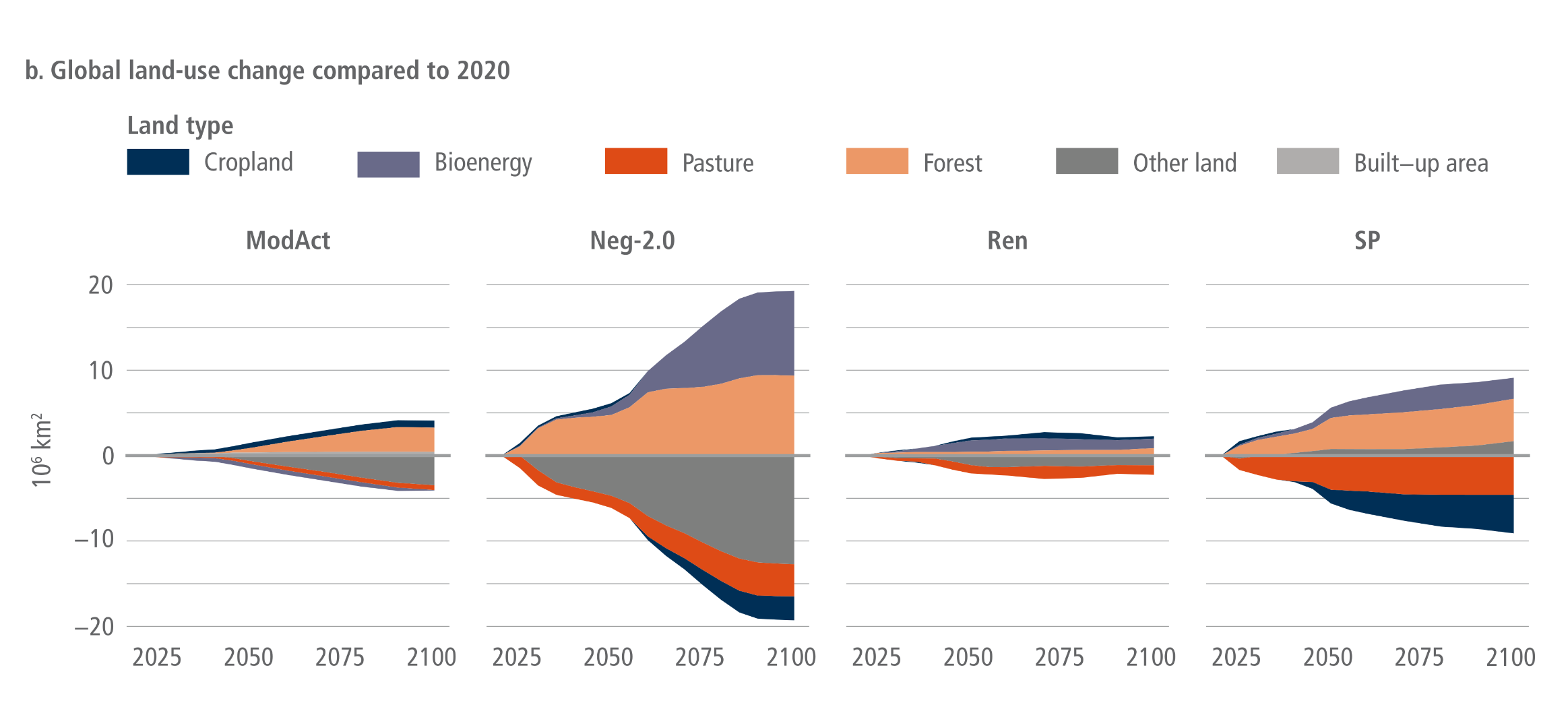
Evolution and breakdown of (a) global land-based GHG emissions and removals and (b) global land-use dynamics under four Illustrative Mitigation Pathways, which illustrate the differences in timing and magnitude of land-based mitigation approaches including afforestation and BECCS

A two-part, four-column infographic showing the evolution of global land-based greenhouse gas emissions and land-use dynamics from 2025 to 2100 across four mitigation pathways: ModAct, Neg-2.0, Ren, and SP.  Panel A shows stacked area graphs for global land-based emissions and removals in gigatonnes of CO2 equivalent per year. The horizontal zero line separates positive emissions from negative removals. Across all four scenarios, non-CO2 emissions from methane and nitrous oxide remain persistently positive above the zero line. In the ModAct, Ren, and SP pathways, negative emissions are achieved primarily through a growing band of CO2 removals from agriculture, forestry, and other land use, reaching roughly minus 5 gigatonnes by 2100. In stark contrast, the Neg-2.0 pathway relies on a massive expansion of bioenergy with carbon capture and storage, or BECCS, which visually dominates the panel and plunges total removals down to nearly minus 18 gigatonnes by the end of the century.  Panel B shows stacked area graphs for global land-use change compared to 2020, measured in millions of square kilometres. ModAct and Ren show relatively modest land-use changes over the century. The SP pathway shows a moderate increase of about 10 million square kilometres in bioenergy and forest areas, offset by similar reductions in pasture and cropland. Meanwhile, the Neg-2.0 pathway illustrates extreme land-use transformation, with bioenergy and forest expanding by nearly 20 million square kilometres, accompanied by an equally massive reduction in other land, pasture, and cropland.

Figure 7.17 | Evolution and breakdown of (a) global land-based GHG emissions and removals and (b) global land-use dynamics under four Illustrative Mitigation Pathways, which illustrate the differences in timing and magnitude of land-based mitigation approaches including afforestation and BECCS. All pathways are based on different IAM realisations: ModAct scenario (below 3.0°C, C6) from IMAGE 3.0; IMP Neg-2.0 (limit warming to 2°C (>67%), C3) from AIM/ CGE 2.2; IMP Ren (1.5°C with no or low overshoot, C1) from REMIND-MAgPIE 2.1–4.3; IMP SP (1.5°C with no or low overshoot, C1) from REMIND-MAgPIE 2.1–4.2. In panel A the categories CO2 AFOLU, CH4 AFOLU and N2O AFOLU include GHG emissions from land-use change and agricultural land use (including emissions related to bioenergy production). In addition, the category CO2 Land includes removals due to afforestation/reforestation. BECCS reflects the CO2 emissions captured from bioenergy use and stored in geological deposits. CH4 and N2O emissions are converted to CO2-eq using GWP100 factors of 27 and 273 respectively.
Source: IPCC (2022) AR6 WGIII Chapter 7, Figure 7.17, pg. 811

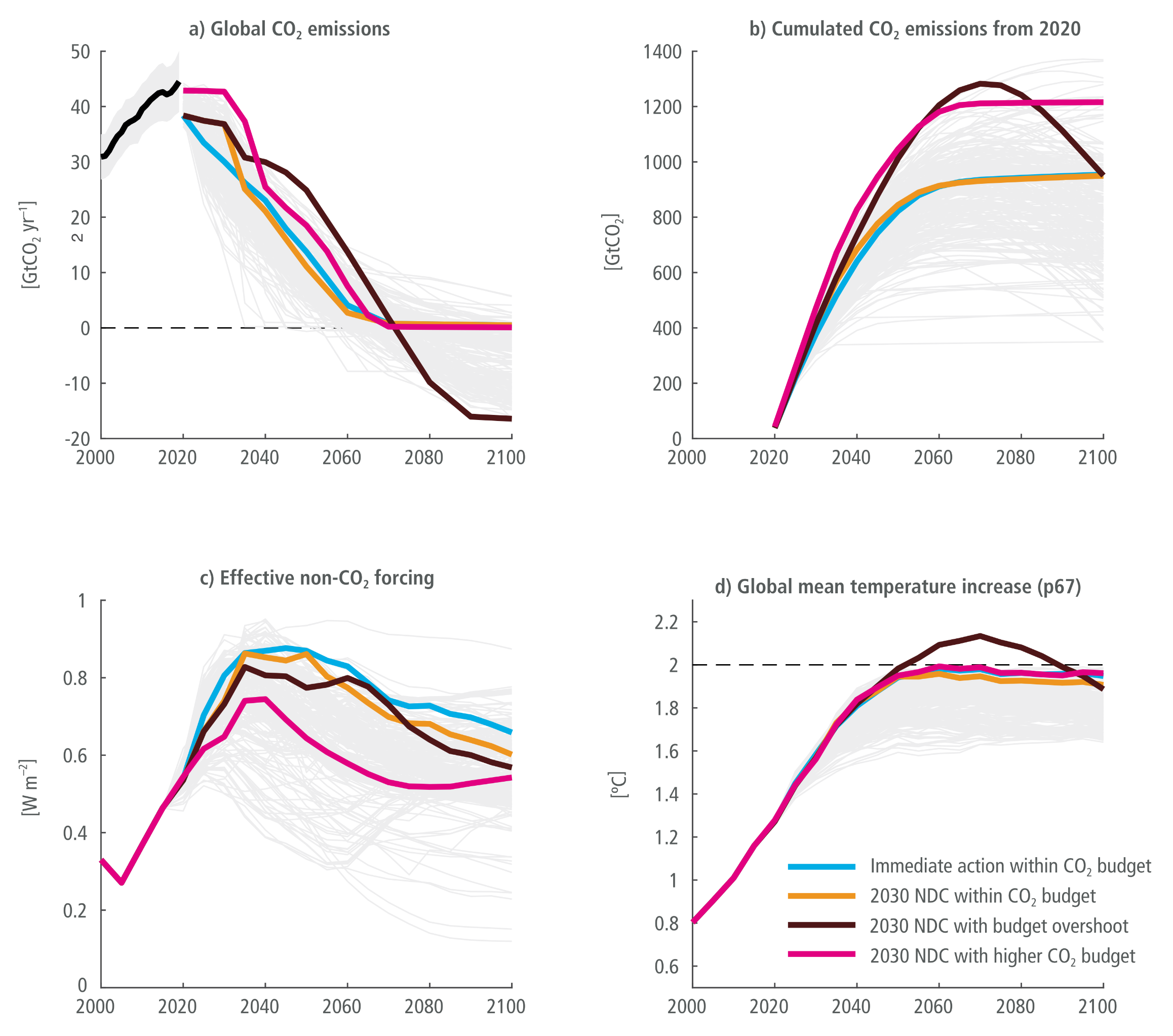
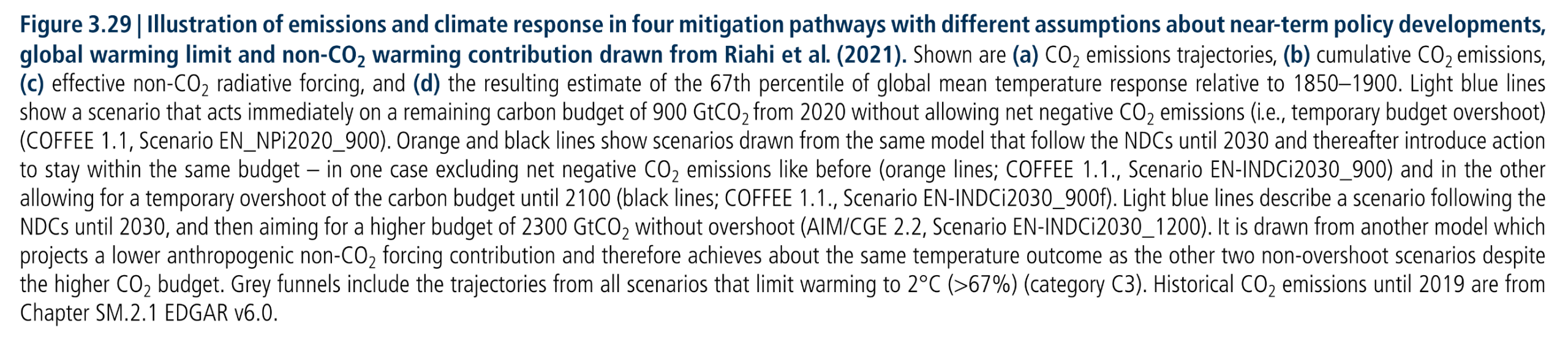
Four mitigation pathways with different assumptions

A four-panel line chart illustrating emissions and climate responses across four mitigation pathways from 2000 to 2100. A legend identifies four coloured lines representing different policy assumptions, set against a background of pale grey lines showing a range of similar modelled scenarios.  Panel A shows global CO2 emissions. The light blue line, representing immediate action, drops steeply from 2020. The orange and black lines, representing 2030 NDC targets, follow a delayed drop. The black line crosses zero around 2070 and goes deeply negative, while the orange and light blue lines stabilise near zero. A pink line, representing a higher CO2 budget, drops latest and remains slightly above zero.  Panel B shows cumulated CO2 emissions from 2020. The black line rises highest before curving downwards to meet the light blue and orange lines, visually illustrating a temporary budget overshoot. The pink line rises and plateaus at the highest cumulative level.  Panel C displays effective non-CO2 forcing. All lines rise sharply until roughly 2030 before slowly declining, with the pink line remaining noticeably lower than the others throughout the century.  Panel D tracks the estimated global mean temperature increase. The black line is the only pathway to briefly overshoot the 2 degrees Celsius mark mid-century before declining. By 2100, all four pathways converge just below 2 degrees Celsius, demonstrating that different combinations of immediate action, budget overshoots, and varying non-CO2 forcing can achieve similar long-term temperature outcomes.
Figure 3.29:  Illustration of emissions and climate response in four mitigation pathways with different assumptions about near-term policy developments, global warming limit and non-CO2 warming contribution drawn from Riahi et al. (2021). Shown are (a) CO2 emissions trajectories, (b) cumulative CO2 emissions, (c) effective non-CO2 radiative forcing, and (d) the resulting estimate of the 67th percentile of global mean temperature response relative to 1850–1900. Light blue lines show a scenario that acts immediately on a remaining carbon budget of 900 GtCO2 from 2020 without allowing net negative CO2 emissions (i.e., temporary budget overshoot) (COFFEE 1.1, Scenario EN_NPi2020_900). Orange and black lines show scenarios drawn from the same model that follow the NDCs until 2030 and thereafter introduce action to stay within the same budget – in one case excluding net negative CO2 emissions like before (orange lines; COFFEE 1.1., Scenario EN-INDCi2030_900) and in the other allowing for a temporary overshoot of the carbon budget until 2100 (black lines; COFFEE 1.1., Scenario EN-INDCi2030_900f). Light blue lines describe a scenario following the NDCs until 2030, and then aiming for a higher budget of 2300 GtCO2 without overshoot (AIM/CGE 2.2, Scenario EN-INDCi2030_1200). It is drawn from another model which projects a lower anthropogenic non-CO2 forcing contribution and therefore achieves about the same temperature outcome as the other two non-overshoot scenarios despite the higher CO2 budget. Grey funnels include the trajectories from all scenarios that limit warming to 2°C (>67%) (category C3). Historical CO2 emissions until 2019 are from Chapter SM.2.1 EDGAR v6.0.
Source: IPCC (2022) AR6 WGIII Chapter 3, Figure 3.29, pg. 350. The IPCC drew from this article:
Riahi et al (2021) Cost and attainability of meeting stringent climate targets without overshoot

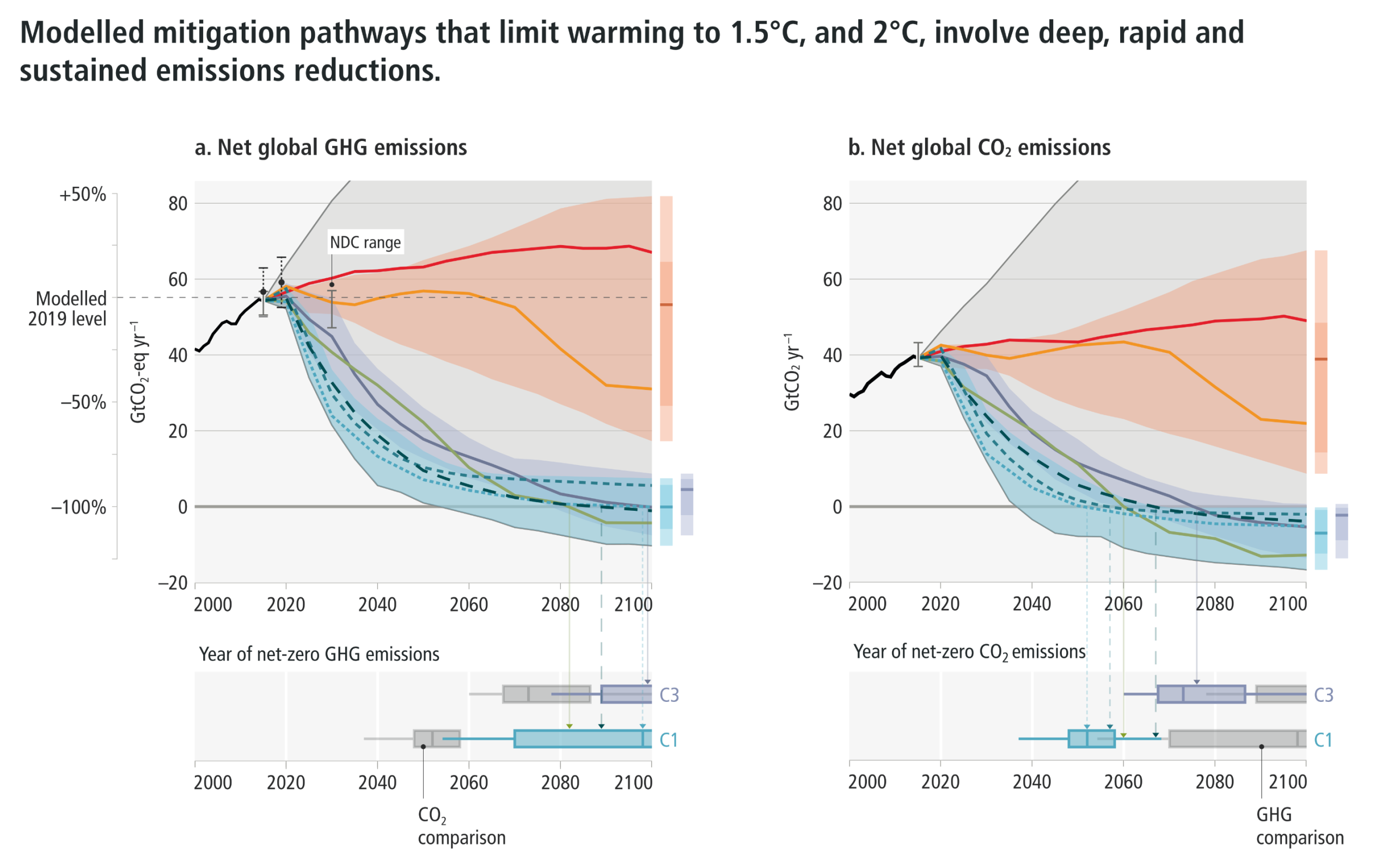
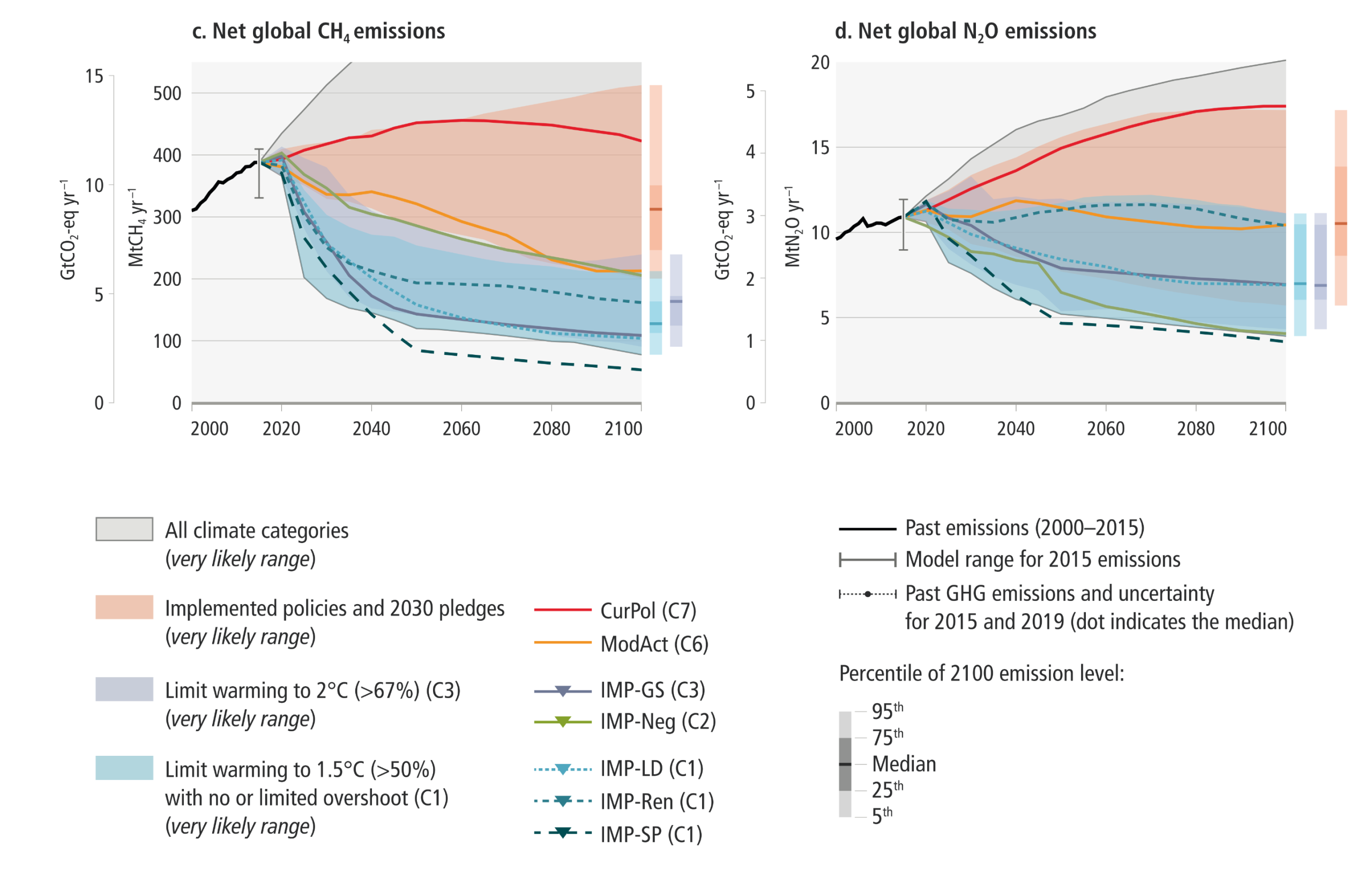
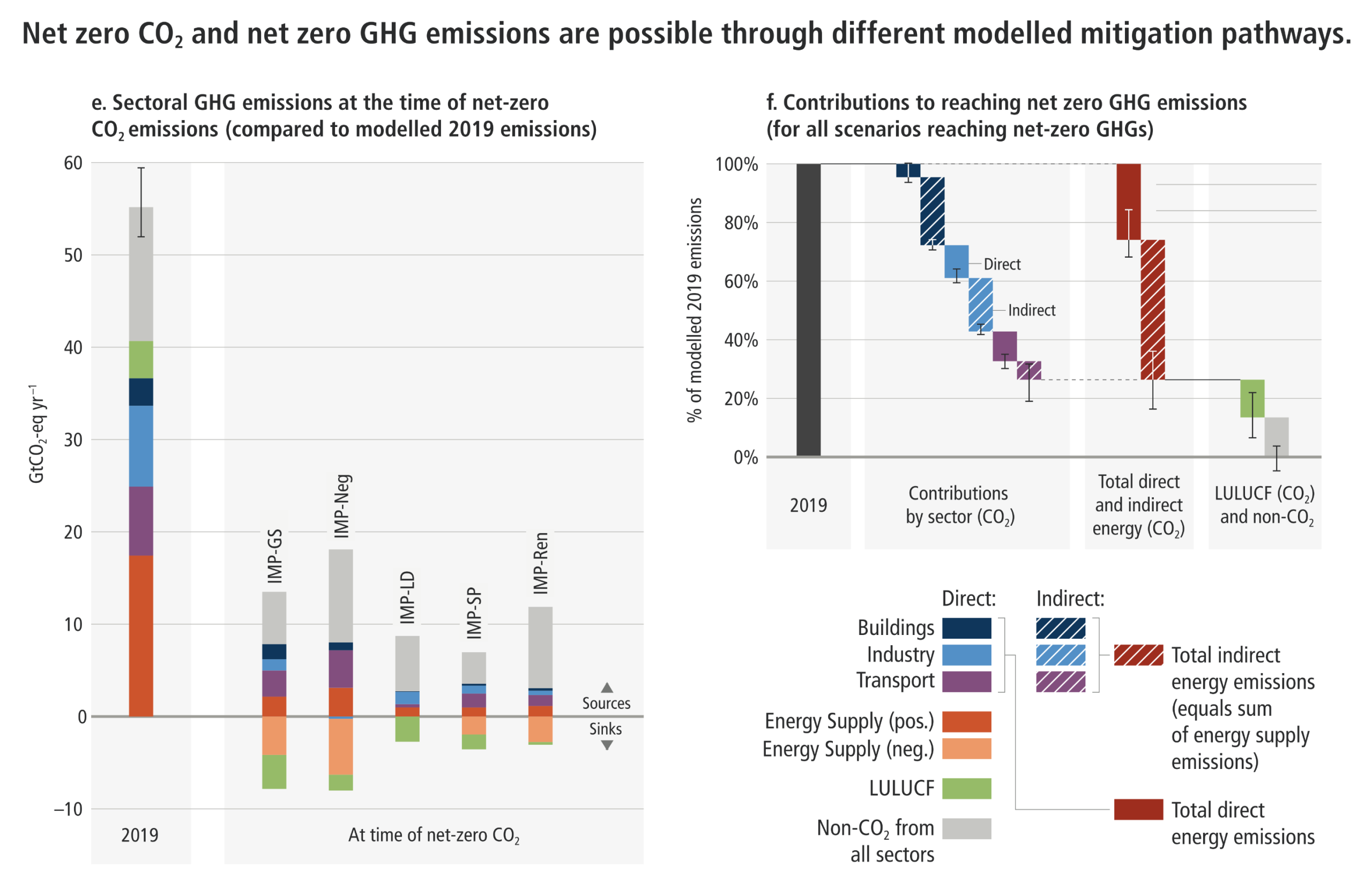
Illustrative Mitigation Pathways (IMPs) and net zero CO2 and GHG emissions strategies

A comprehensive six-panel infographic divided into two main sections, detailing modelled mitigation pathways for global emissions and strategies to reach net zero.  The top half features four line charts tracking different emissions from 2000 to 2100. Panel A tracks net global greenhouse gases, Panel B tracks net global carbon dioxide, Panel C tracks methane, and Panel D tracks nitrous oxide. Each chart shows historical emissions rising to a peak around 2020, followed by a wide divergence of projected future pathways. Red lines and shaded areas representing current policies show emissions remaining dangerously high. In stark contrast, purple and blue shaded areas, representing 1.5-degree and 2-degree warming limits, show steep and sustained declines. Horizontal box plots beneath panels A and B visually illustrate that to limit warming to 1.5 degrees, net-zero carbon dioxide must be reached roughly around 2050, and net-zero greenhouse gases around 2070.  The bottom half of the infographic focuses on the mechanisms of reaching net zero. Panel E is a stacked bar chart comparing sectoral emissions in 2019 with the five illustrative mitigation pathways at the exact time they reach net-zero carbon dioxide. The tall 2019 bar shows entirely positive emissions near 60 gigatonnes. The five pathway bars are significantly shorter; they show remaining positive emissions from buildings, industry, transport, and non-CO2 sources being perfectly counterbalanced by negative emissions extending below the zero line, primarily driven by land use and energy supply sinks.  Panel F is a downward-stepping waterfall chart illustrating the percentage contribution of various sectors to reaching net-zero greenhouse gases from the 2019 baseline. It breaks down the total required reductions into specific direct and indirect energy emissions across buildings, industry, and transport, alongside further necessary reductions from land use and non-CO2 sources.


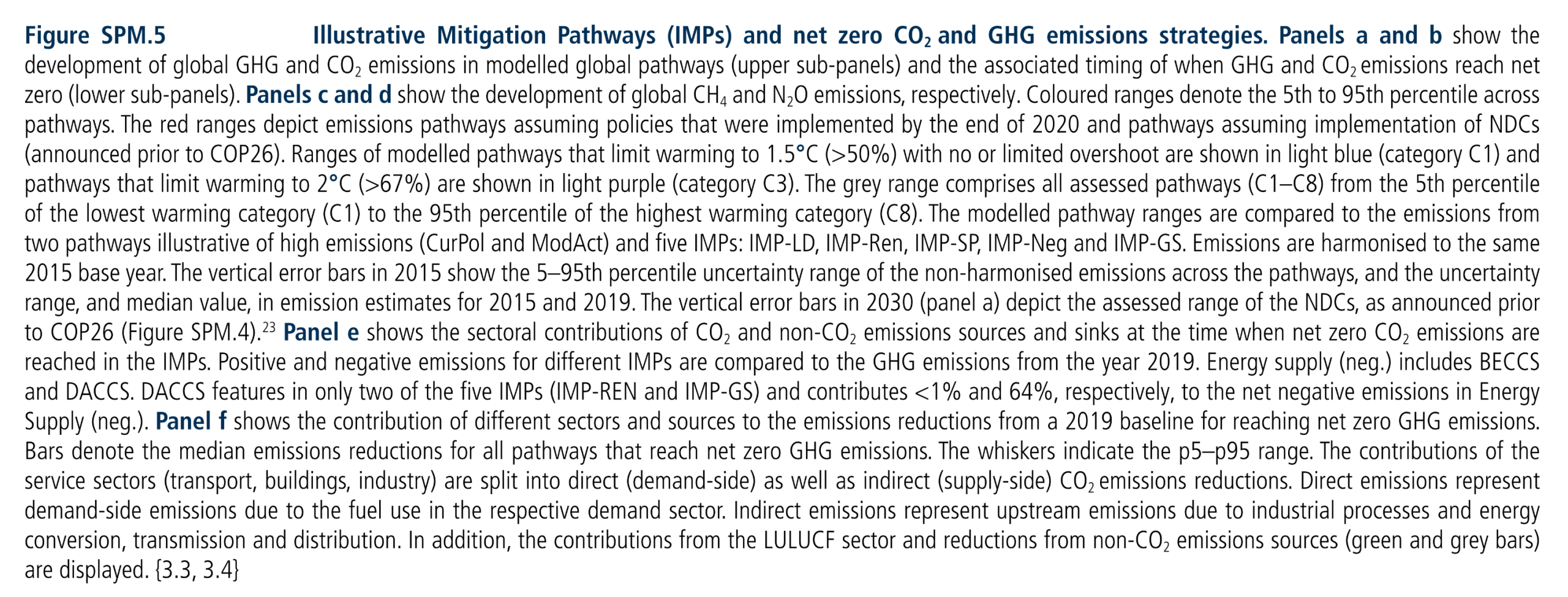
Figure SPM.5:  Illustrative Mitigation Pathways (IMPs) and net zero CO2 and GHG emissions strategies. Panels a and b show the development of global GHG and CO2 emissions in modelled global pathways (upper sub-panels) and the associated timing of when GHG and CO2 emissions reach net zero (lower sub-panels). Panels c and d show the development of global CH4 and N2O emissions, respectively. Coloured ranges denote the 5th to 95th percentile across pathways. The red ranges depict emissions pathways assuming policies that were implemented by the end of 2020 and pathways assuming implementation of NDCs (announced prior to COP26). Ranges of modelled pathways that limit warming to 1.5°C (>50%) with no or limited overshoot are shown in light blue (category C1) and pathways that limit warming to 2°C (>67%) are shown in light purple (category C3). The grey range comprises all assessed pathways (C1–C8) from the 5th percentile of the lowest warming category (C1) to the 95th percentile of the highest warming category (C8). The modelled pathway ranges are compared to the emissions from two pathways illustrative of high emissions (CurPol and ModAct) and five IMPs: IMP-LD, IMP-Ren, IMP-SP, IMP-Neg and IMP-GS. Emissions are harmonised to the same 2015 base year. The vertical error bars in 2015 show the 5–95th percentile uncertainty range of the non-harmonised emissions across the pathways, and the uncertainty range, and median value, in emission estimates for 2015 and 2019. The vertical error bars in 2030 (panel a) depict the assessed range of the NDCs, as announced prior to COP26 (Figure SPM.4). Panel e shows the sectoral contributions of CO2 and non-CO2 emissions sources and sinks at the time when net zero CO2 emissions are reached in the IMPs. Positive and negative emissions for different IMPs are compared to the GHG emissions from the year 2019. Energy supply (neg.) includes BECCS and DACCS. DACCS features in only two of the five IMPs (IMP-REN and IMP-GS) and contributes <1% and 64%, respectively, to the net negative emissions in Energy Supply (neg.). Panel f shows the contribution of different sectors and sources to the emissions reductions from a 2019 baseline for reaching net zero GHG emissions. Bars denote the median emissions reductions for all pathways that reach net zero GHG emissions. The whiskers indicate the p5–p95 range. The contributions of the service sectors (transport, buildings, industry) are split into direct (demand-side) as well as indirect (supply-side) CO2 emissions reductions. Direct emissions represent demand-side emissions due to the fuel use in the respective demand sector. Indirect emissions represent upstream emissions due to industrial processes and energy conversion, transmission and distribution. In addition, the contributions from the LULUCF sector and reductions from non-CO2 emissions sources (green and grey bars) are displayed.
Source: IPCC AR6 (2022) WGIII SPM, Figure SPM.5

Global emissions scenarios to 2100

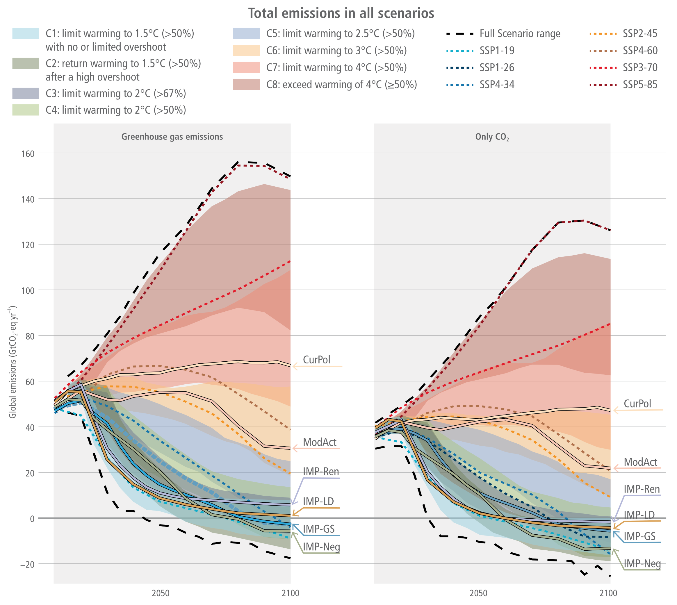
Two side-by-side graphs titled Total emissions in all scenarios. A comprehensive legend maps colour-coded shaded areas to climate categories, ranging from blue and green for scenarios limiting warming to 1.5 or 2.0 degrees Celsius, up to red and brown for scenarios exceeding 4.0 degrees Celsius. The left graph tracks Greenhouse gas emissions, and the right tracks Only CO2, both measuring gigatons of CO2 equivalent per year from historical levels up to 2100. Both panels show emissions rising to 2020 before diverging into a massive fan shape bounded by thick dashed black lines. High-emission pathways, such as Current Policies labelled CurPol, continue to rise or plateau, with the absolute highest scenario range peaking near 160 gigatons. Conversely, ambitious illustrative mitigation pathways, labelled with the prefix IMP, drop steeply after 2020. In the left panel, the lowest greenhouse gas pathways cross the zero line to become net negative around 2070. In the right panel, the CO2 only pathways plunge even more sharply, crossing the zero line before 2050 and reaching deeper negative values approaching minus 30 gigatons by the end of the century.
Figure 3.10:  Total emissions profiles in the scenarios based on climate category for GHGs (AR6 GWP-100) and CO2. The Illustrative mitigation pathways (IMPs) are also indicated.
Source: IPCC (2022) WGIII Chapter 3, Figure 3.10, pg. 315

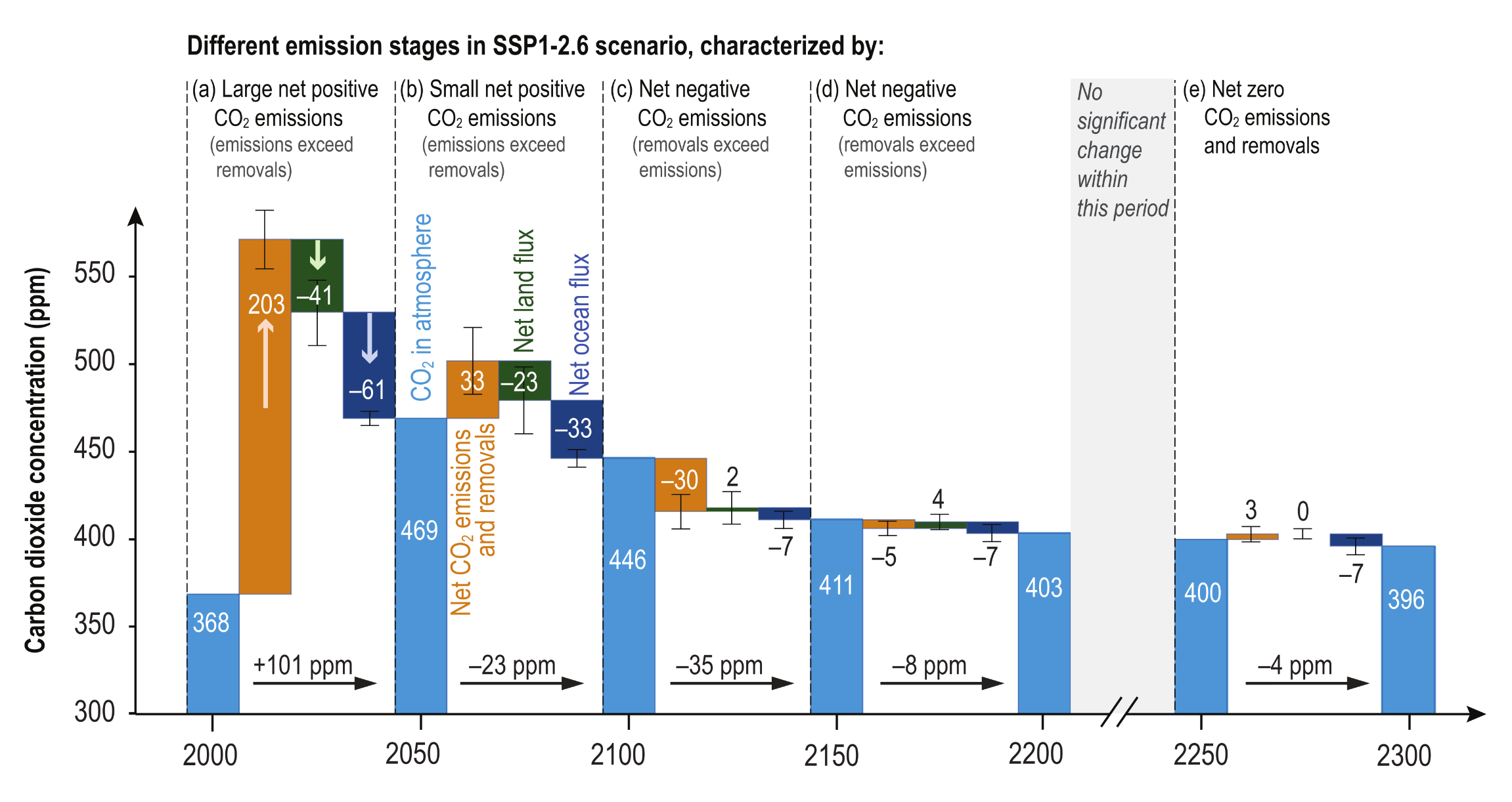
CO2 concentrations for SSPs

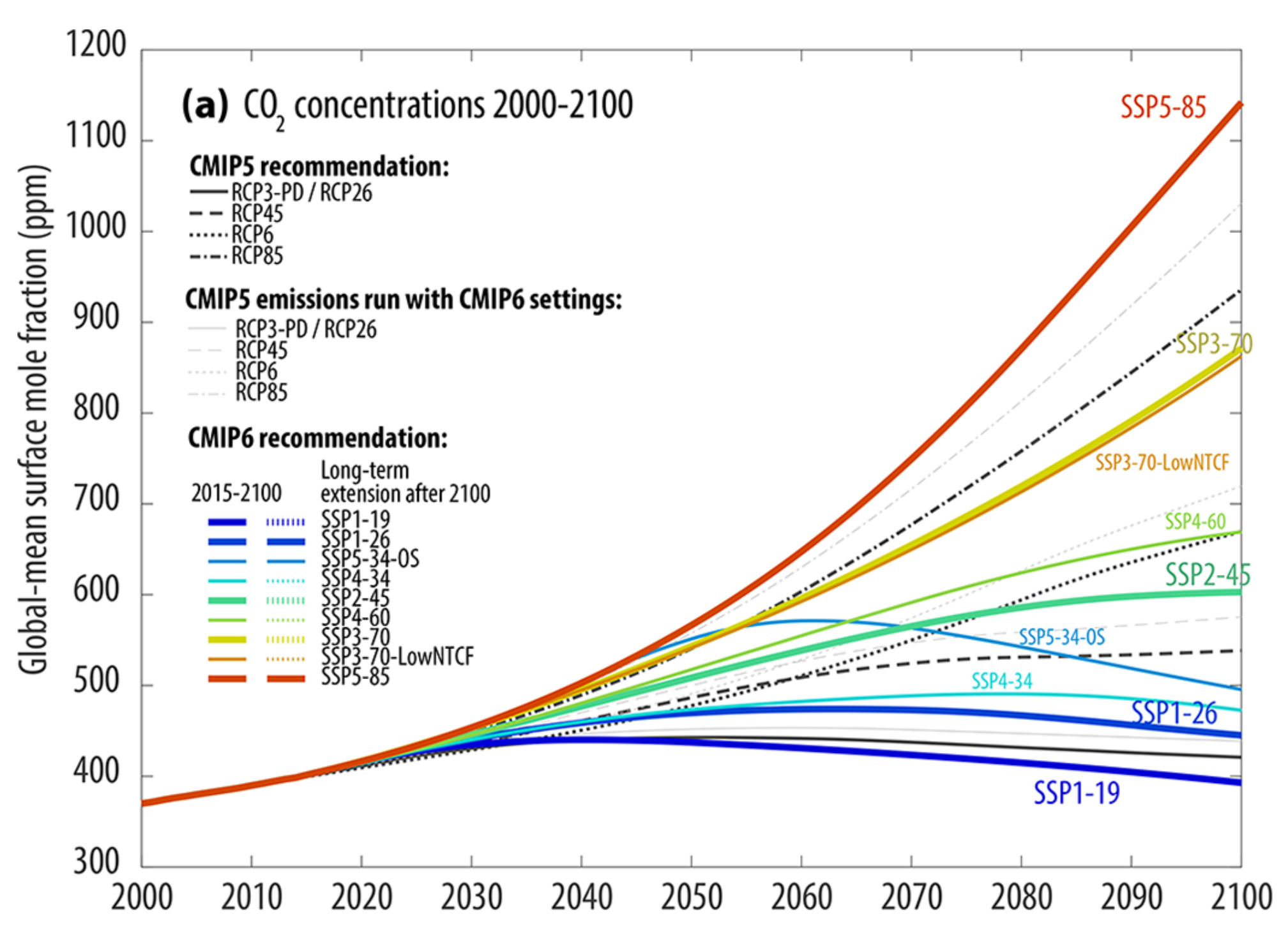
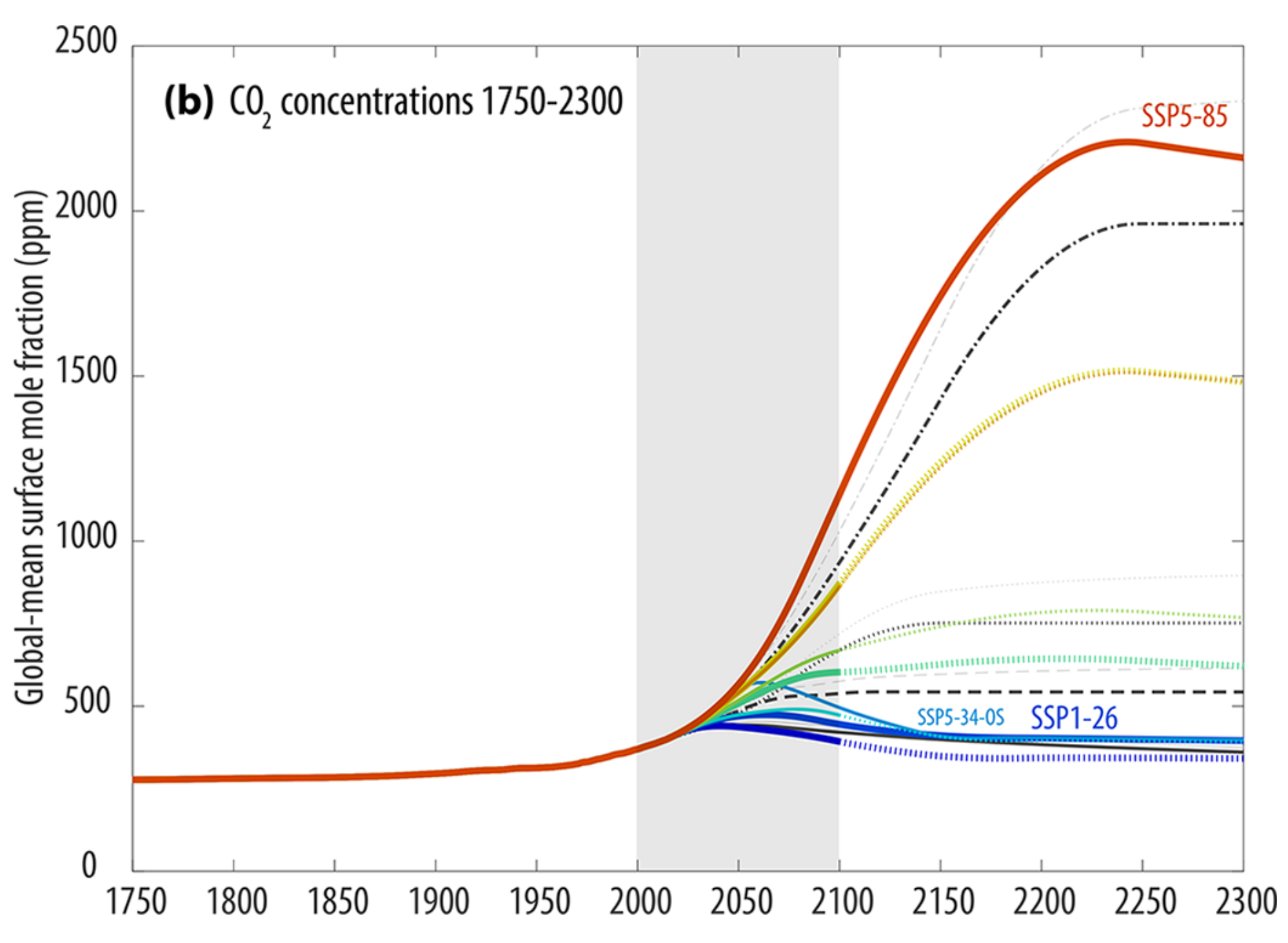
Two vertically stacked line graphs showing global-mean surface CO2 concentrations in parts per million. The top panel, labelled a, zooms in on the period from 2000 to 2100. All pathways start together just below 400 parts per million in 2000 and diverge significantly after 2015. The highest emission trajectory, the red SSP5-85 line, rises steeply to exceed 1100 parts per million by 2100. Middle trajectories like the yellow SSP3-70 and green SSP2-45 reach roughly 860 and 600 parts per million, respectively. The most ambitious pathways, such as the dark blue SSP1-19 and blue SSP1-26, peak mid-century before gradually declining to approximately 400 and 450 parts per million by 2100. Black lines represent the original RCP scenarios, whilst accompanying grey lines track slightly higher. The bottom panel, labelled b, provides a long-term historical and future view from 1750 to 2300. It shows historical concentrations remaining flat near 280 parts per million until a sharp rise begins in the twentieth century. Passing through a grey shaded block representing the 21st century, the long-term extensions show massive divergence. The extreme red SSP5-85 scenario continues soaring to peak above 2200 parts per million around the year 2250 before a slight dip, whilst lower-emission scenarios like the blue SSP1-26 stabilise and decline to below 400 parts per million by 2300.

Figure 11:  Overview of SSP concentrations in comparison with RCP concentrations for CO2. The original RCP scenarios are shown in thicker lines and various line styles. Applying the new MAGICC7 default setting used for the SSP scenarios to the RCP emissions results in generally higher concentrations (grey lines).
Source: Meinshausen et al. (2020) Figure 11 (modified to show CO2 only)

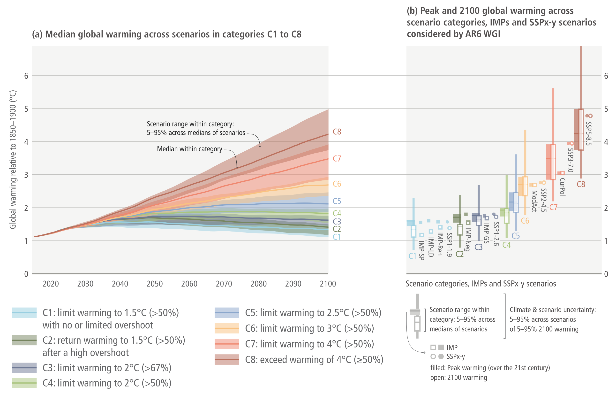
Global warming scenarios to 2100

Two side-by-side graphs illustrating global warming projections from 2020 to 2100. The left graph, labelled a, is a line chart tracking median global warming relative to 1850 to 1900 in degrees Celsius. All pathways begin clustered just above 1 degree in 2020 and fan out widely over the century. The highest emission category, C8 in dark red, arcs steeply upwards, crossing 4 degrees Celsius by 2100 with its upper shaded uncertainty band reaching 5 degrees. Middle categories, C5 through C7 in blues, oranges, and reds, rise steadily to end spread between roughly 2 and 4 degrees. The most ambitious mitigation categories, C1 through C4 in light blues and greens, plateau mid-century before gradually flattening or slightly declining, clustering tightly between roughly 1.2 and 1.8 degrees Celsius by 2100. The right graph, labelled b, displays vertical box and whisker plots for peak and 2100 warming across the same categories. It visually reinforces how uncertainty grows at higher emissions. The plots for C1 to C4 are relatively compact and remain below 2 degrees. As the categories progress from C5 to C8, the box plots stretch dramatically higher and wider, with the C8 plot spanning from roughly 3 degrees to over 6 degrees Celsius. Individual square and circle markers sit alongside the boxes to indicate specific illustrative mitigation pathways and shared socio-economic pathways.
Figure 3.11:  Global mean temperature outcome of the ensemble of scenarios included in the climate categories C1–C8 (based on a reduced complexity model – RCM – calibrated to the WGI assessment, both in terms of future and historic warming). The left panel shows the ranges of scenario uncertainty (shaded area) with the P50 RCM probability (line). The right panel shows the P5 to P95 range of combined RCM climate uncertainty (C1–C8 is explained in Table 3.1) and scenario uncertainty, and the P50 (line).
Source: IPCC (2022) AR6 WGIII Chapter 3, Figure 3.11, pg. 317

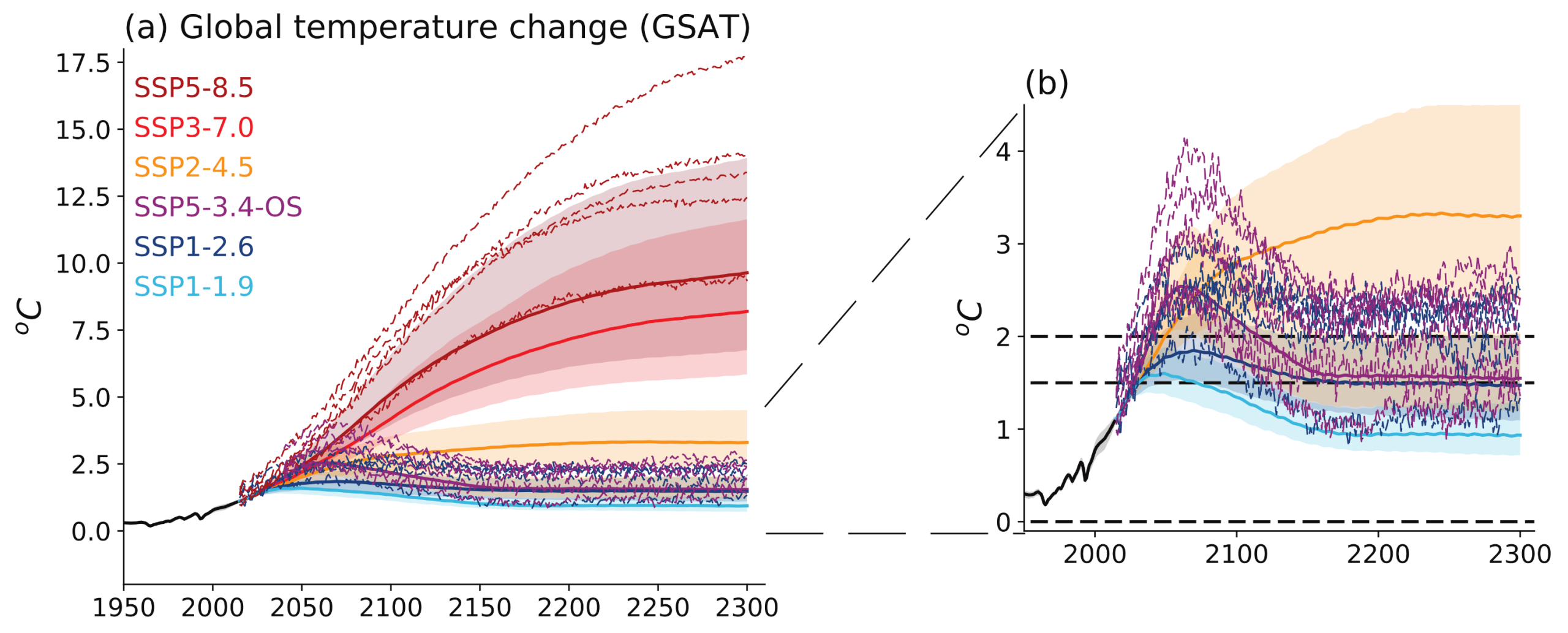
Simulated temperature change up to 2300 under the extended SSP scenarios

Two side-by-side graphs illustrating global temperature change from 1950 to 2300. The left graph, labelled a, shows temperature change in degrees Celsius with a massive divergence in pathways after the year 2000. High-emission scenarios, shown in red and dark red, rise continuously and steeply; the most extreme dashed line reaches nearly 17.5 degrees by 2300, whilst their shaded plumes centre between 7.5 and 10 degrees. The mid-range orange scenario plateaus around 3 to 4 degrees. The right graph, labelled b, zooms in on the lowest-emission scenarios and includes dashed horizontal reference lines at zero, 1.5, and 2.0 degrees. It shows the light blue SSP1-1.9 scenario peaking near 1.5 degrees before declining to roughly 1 degree by 2300. The dark blue SSP1-2.6 scenario peaks near 2.0 degrees before settling just above 1.5 degrees. The purple SSP5-3.4-OS scenario illustrates a large overshoot, peaking sharply between 2.5 and 4 degrees during the 21st century before plunging back down to join the 1.5 degree cluster by 2300.
Figure 4.40:  Simulated temperature change up to 2300 under the extended SSP scenarios.  (a) projected global surface air temperature (GSAT) change, relative to 1850–1900, from CMIP6 models (individual lines) and MAGICC7 (shaded plumes); (b) as (a) but zoomed in to show low-emissions scenarios;
Source: IPCC (2021) AR6 WGI Chapter 4, Figure 4.40, pg. 632

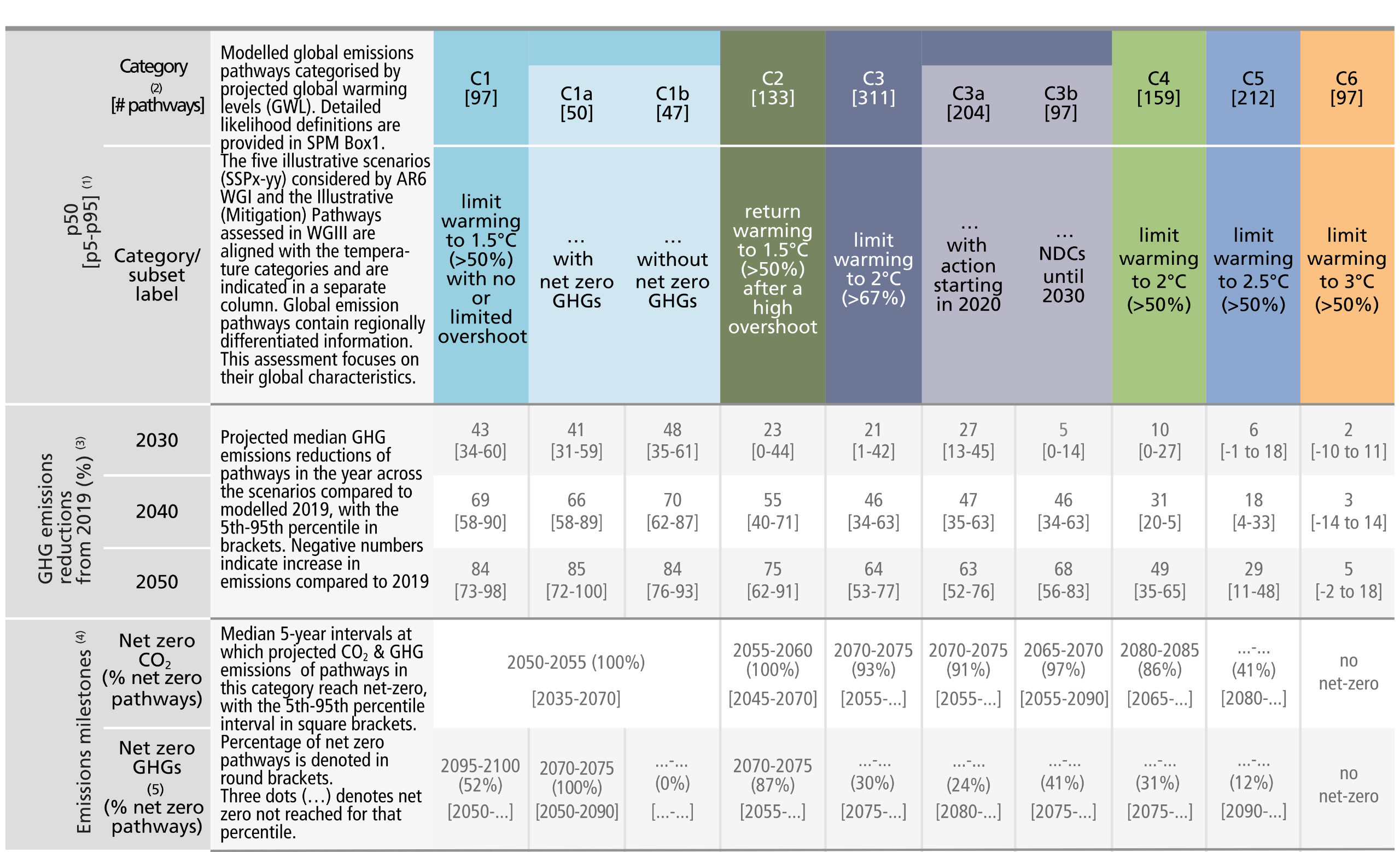
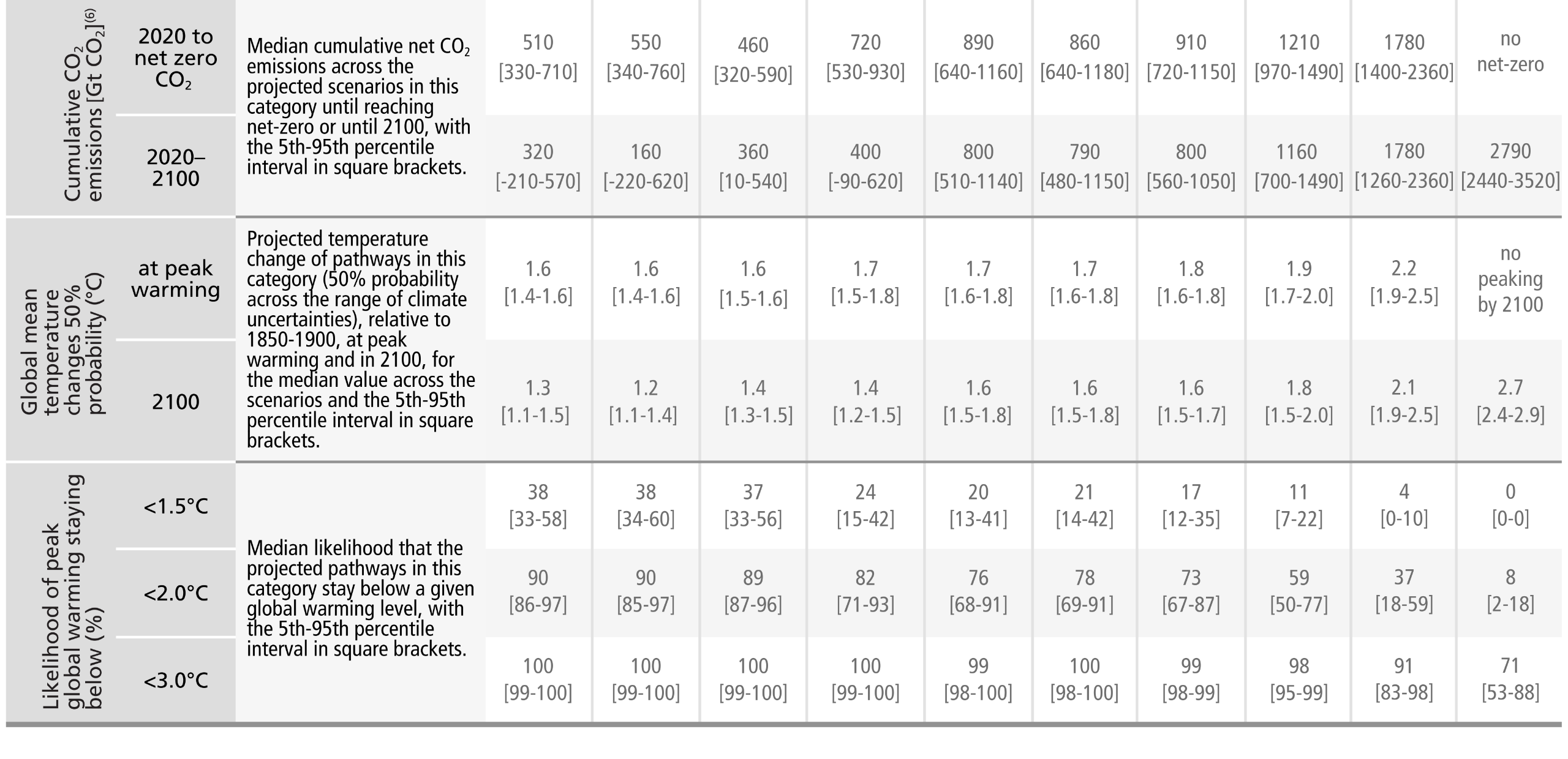
Key characteristics of the modelled global emissions pathways

A comprehensive data matrix. The table summarises projected carbon dioxide and greenhouse gas emissions, projected net-zero timings, and the resulting global warming outcomes.  Pathways are categorised in columns from C1 to C6 based on their likelihood of limiting peak warming and 2100 warming levels.  Category C1 aims to limit warming to 1.5 degrees Celsius with a greater than 50 percent probability and no or limited overshoot.  Category C2 aims to return warming to 1.5 degrees Celsius after a high overshoot.  Category C3 limits warming to 2 degrees Celsius with a greater than 67 percent probability.  Categories C4, C5, and C6 limit warming to 2 degrees, 2.5 degrees, and 3 degrees Celsius respectively, with a greater than 50 percent probability.  The rows display median values and the 5th to 95th percentiles for various metrics.  For greenhouse gas emission reductions, by 2050, median reductions compared to 2019 are 84 percent for C1 pathways, 64 percent for C3 pathways, and only 5 percent for C6 pathways.  For emissions milestones, C1 pathways project reaching net-zero carbon dioxide between 2050 and 2055, whilst C3 pathways project reaching it between 2070 and 2075. C6 pathways do not reach net-zero.  For cumulative carbon dioxide emissions from 2020 to 2100, median amounts are 320 gigatonnes for C1, compared to 2790 gigatonnes for C6.  For global mean temperature changes, C1 pathways show a median peak warming of 1.6 degrees Celsius, dropping to 1.3 degrees by 2100. C6 pathways show no peaking by 2100, ultimately reaching 2.7 degrees Celsius.

Table 3.1: Key characteristics of the modelled global emissions pathways. Summary of projected CO2 and GHG emissions, projected net zero timings and the resulting global warming outcomes. Pathways are categorised (columns), according to their likelihood of limiting warming to different peak warming levels (if peak temperature occurs before 2100) and 2100 warming levels. Values shown are for the median [p50] and 5–95th percentiles [p5–p95], noting that not all pathways achieve net zero CO2 or GHGs.  1 Detailed explanations on the Table are provided in WGIII Box SPM.1 and WGIII Table SPM.2. The relationship between the temperature categories and SSP/RCPs is discussed in Cross-Section Box.2. Values in the table refer to the 50th and [5–95th] percentile values across the pathways falling within a given category as defined in WGIII Box SPM.1. The three dots (…) sign denotes that the value cannot be given (as the value is after 2100 or, for net zero, net zero is not reached). Based on the assessment of climate emulators in AR6 WG I (Chapter 7, Box 7.1), two climate emulators were used for the probabilistic assessment of the resulting warming of the pathways. For the ‘Temperature Change’ and ‘Likelihood’ columns, the non-bracketed values represent the 50th percentile across the pathways in that category and the median [50th percentile] across the warming estimates of the probabilistic MAGICC climate model emulator. For the bracketed ranges in the “likelihood” column, the median warming for every pathway in that category is calculated for each of the two climate model emulators (MAGICC and FaIR). These ranges cover both the uncertainty of the emissions pathways as well as the climate emulators’ uncertainty. All global warming levels are relative to 1850-1900. 2 C3 pathways are sub-categorised according to the timing of policy action to match the emissions pathways in WGIII Figure SPM.4. 3 Global emission reductions in mitigation pathways are reported on a pathway by-pathway basis relative to harmonised modelled global emissions in 2019 rather than the global emissions reported in WGIII SPM Section B and WGIII Chapter 2; this ensures internal consistency in assumptions about emission sources and activities, as well as consistency with temperature projections based on the physical climate science assessment by WGI (see WGIII SPM Footnote 49). Negative values (e.g., in C5, C6) represent an increase in emissions. The modelled GHG emissions in 2019 are 55 [53–58] GtCO2-eq, thus within the uncertainty ranges of estimates for 2019 emissions [53-66] GtCO2-eq. 4 Emissions milestones are provided for 5-year intervals in order to be consistent with the underlying 5-year time-step data of the modelled pathways. Ranges in square brackets underneath refer to the range across the pathways, comprising the lower bound of the 5th percentile 5-year interval and the upper bound of the 95th percentile 5-year interval. Numbers in round brackets signify the fraction of pathways that reach specific milestones over the 21st century. Percentiles reported across all pathways in that category include those that do not reach net zero before 2100. 5 For cases where models do not report all GHGs, missing GHG species are infilled and aggregated into a Kyoto basket of GHG emissions in CO2-eq defined by the 100-year global warming potential. For each pathway, reporting of CO2, CH4, and N2O emissions was the minimum required for the assessment of the climate response and the assignment to a climate category. Emissions pathways without climate assessment are not included in the ranges presented here.  6 Cumulative emissions are calculated from the start of 2020 to the time of net zero and 2100, respectively. They are based on harmonised net CO2 emissions, ensuring consistency with the WG I assessment of the remaining carbon budget.
Source: IPCC (2023) AR6 SYR Table 3.1, pg. 84

Characteristics of scenarios as a function of the remaining carbon budget (mean decarbonisation rate is shown as the average reduction in the period 2010–2050 divided by 2010 emissions)

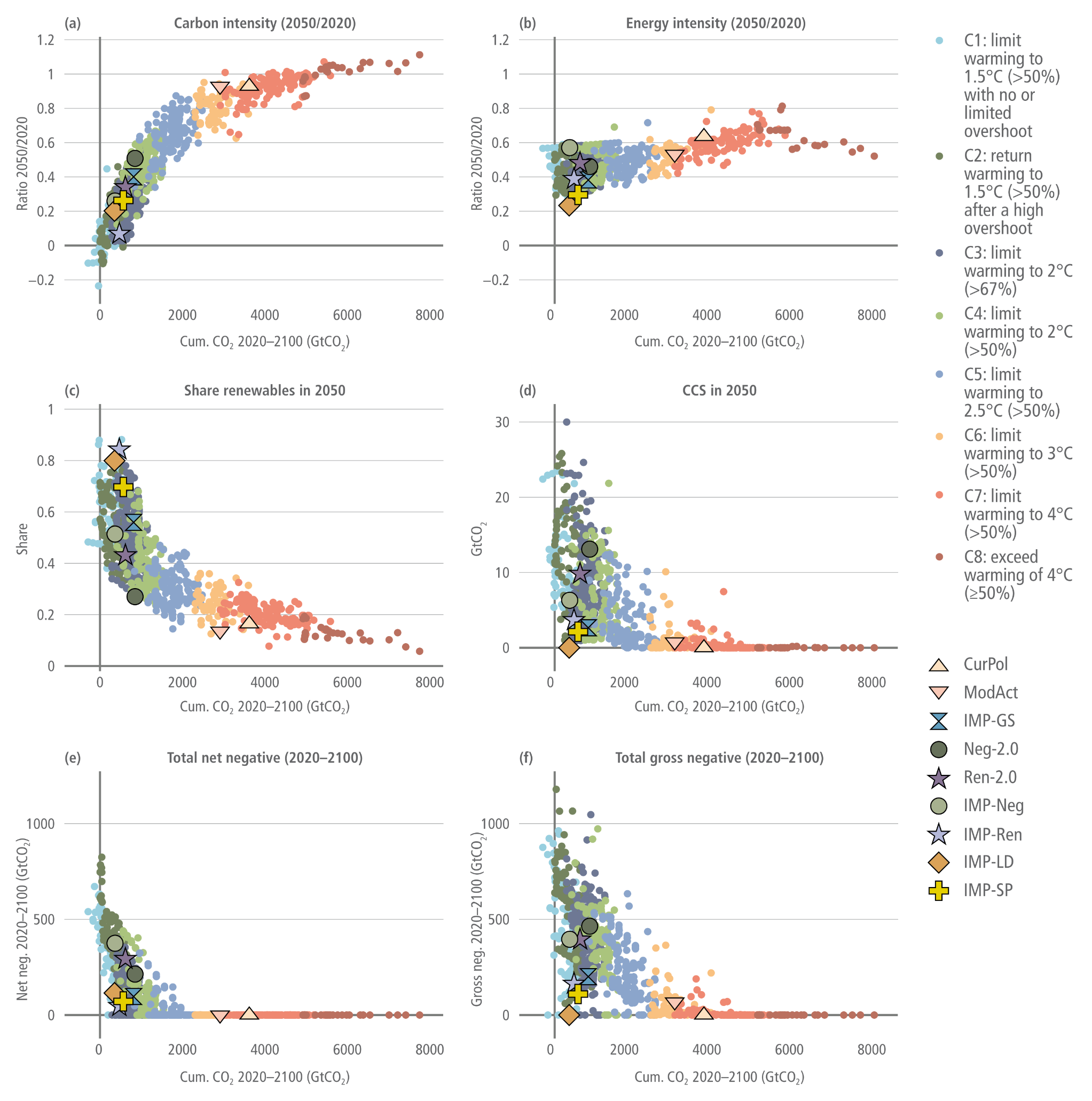
A six-panel scatter plot infographic illustrating the characteristics of scenarios as a function of the remaining carbon budget. Each panel plots a different variable on the vertical axis against cumulative carbon dioxide from 2020 to 2100 on the horizontal axis. The scattered data points are colour-coded into eight climate categories from C1 in light blue to C8 in brown. The most stringent mitigation scenarios, C1 and C2, cluster on the far left with the lowest cumulative CO2, while high-emission scenarios like C7 and C8 stretch far to the right. Specific illustrative pathways, such as current policies, moderate action, and various IMPs, are highlighted across the plots using distinct shaped markers.  Panel A shows the carbon intensity ratio between 2050 and 2020. It forms an upward curve, demonstrating that low cumulative CO2 scenarios achieve massive reductions in carbon intensity, clustering near zero, whereas high-emissions scenarios see almost no reduction.  Panel B shows the energy intensity ratio between 2050 and 2020. This displays a much flatter distribution, with the vast majority of scenarios clustering between 0.3 and 0.8 regardless of their cumulative carbon budget.  Panel C tracks the share of renewables in 2050. This forms a steep downward curve, showing that stringent mitigation scenarios on the left require very high renewable shares, reaching up to 0.9, while high-emission scenarios on the right remain largely below 0.3.  Panels D, E, and F track carbon capture and storage in 2050, total net negative emissions, and total gross negative emissions, respectively. All three of these panels display a similar L-shaped distribution: reliance on these technologies is highest and most highly variable within the most ambitious low-carbon scenarios on the far left, tapering off rapidly to near zero for all higher-emission scenarios on the right.
Figure 3.15:  Characteristics of scenarios as a function of the remaining carbon budget (mean decarbonisation rate is shown as the average reduction in the period 2010–2050 divided by 2010 emissions). The categories C1–C7 are explained in Table 3.1.
Source: IPCC (2022) AR6 WGIII Chapter 3, Figure 3.15, pg. 333

Decade in which sectoral CO2 emissions first reach net negative values

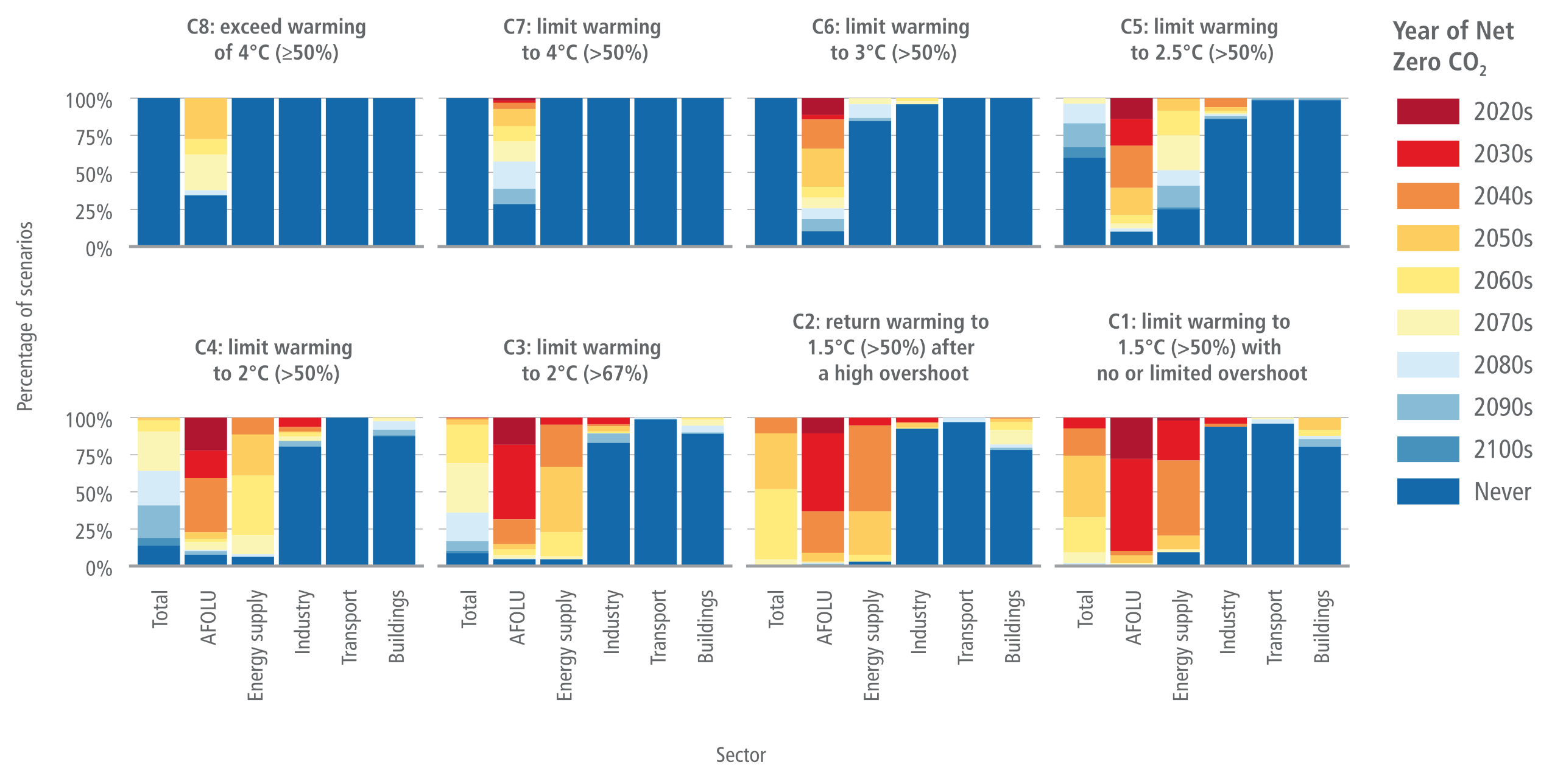
An eight-panel stacked bar chart illustrating the decade in which various sectors first reach net-zero or net-negative carbon dioxide emissions across eight different climate warming scenarios.  The chart is divided into two rows of four panels. The top row displays higher warming scenarios from C8 on the left down to C5 on the right. The bottom row displays increasingly stringent mitigation scenarios from C4 down to the highly ambitious C1 category.  In each panel, the vertical axis measures the percentage of modelled scenarios from 0 to 100 percent. The horizontal axis is divided into six sectoral bars: Total, AFOLU, Energy supply, Industry, Transport, and Buildings. The coloured segments within each bar correspond to a legend tracking the timeline: dark red represents the 2020s, shifting through orange, yellow, and light blue for subsequent decades, and ending in solid dark blue for scenarios that Never reach net-zero.  The visual narrative reveals a stark contrast depending on the climate ambition. In the high-warming C8 to C5 panels, the bars are overwhelmingly dark blue, showing that most sectors never reach net-zero, with only the AFOLU sector showing a small proportion reaching net-zero late in the century.  Conversely, in the ambitious 1.5-degree and 2-degree scenarios like C1 and C2 in the bottom row, the colours shift significantly. For these ambitious pathways, the AFOLU sector is dominated by red and orange, indicating net-negative emissions are achieved rapidly between the 2020s and 2040s. Energy supply follows, dominated by orange and yellow indicating the 2040s to 2060s. However, the Industry, Transport, and Buildings sectors retain large solid dark blue sections even in the most stringent C1 category. This visually demonstrates that these specific sectors often never reach net-zero on their own, requiring the early negative emissions from AFOLU and Energy supply to balance out the Total emissions.
Figure 3.19:  Decade in which sectoral CO2 emissions first reach net negative values. Each panel is a different temperature level. The colours indicate the decade in which CO2 emissions go negative; the y-axis indicates the share of scenarios achieving net zero in that decade. Only scenarios that pass the vetting criteria are included (Section 3.2). Scenarios achieving net zero prior to 2020 are excluded.
Source: IPCC AR6 (2022) WGIII Chapter 3, Figure 3.19, pg. 339

“In most modelled pathways that likely limit warming to 2°C (>67%) above pre-industrial levels and below in the most cost-effective way, the agriculture, forestry and other land-use (AFOLU) and energy supply sectors reach net zero CO2 emissions several decades earlier than other sectors; however, many pathways show much reduced, but still positive, net GHG emissions in the AFOLU sector in 2100.”

Source: IPCC (2022) AR6 WGIII Chapter 3, FAQ 3.2, pg. 385


“Not all regions and sectors must reach net zero CO2 or GHG emissions individually to achieve global net zero CO2 or GHG emissions, respectively; instead, positive emissions in one sector or region can be compensated by net negative emissions from another sector or region. The time each sector or region reaches net zero CO2 or GHG emissions depends on the mitigation options available, the cost of those options, and the policies implemented (including any consideration of equity or fairness).”

Source: IPCC (2022) AR6 WGIII Chapter 3, FAQ 3.2, pg. 385


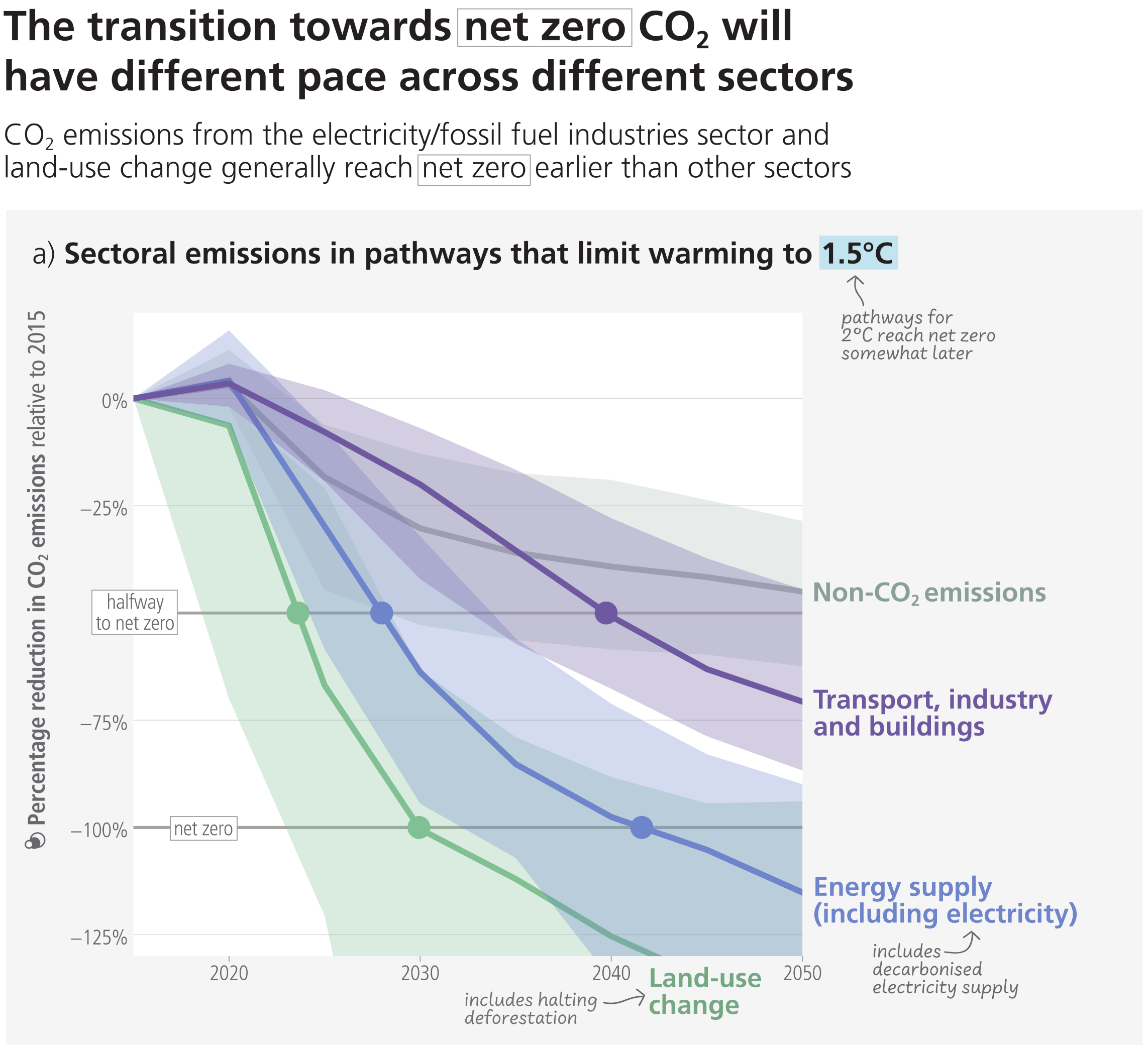
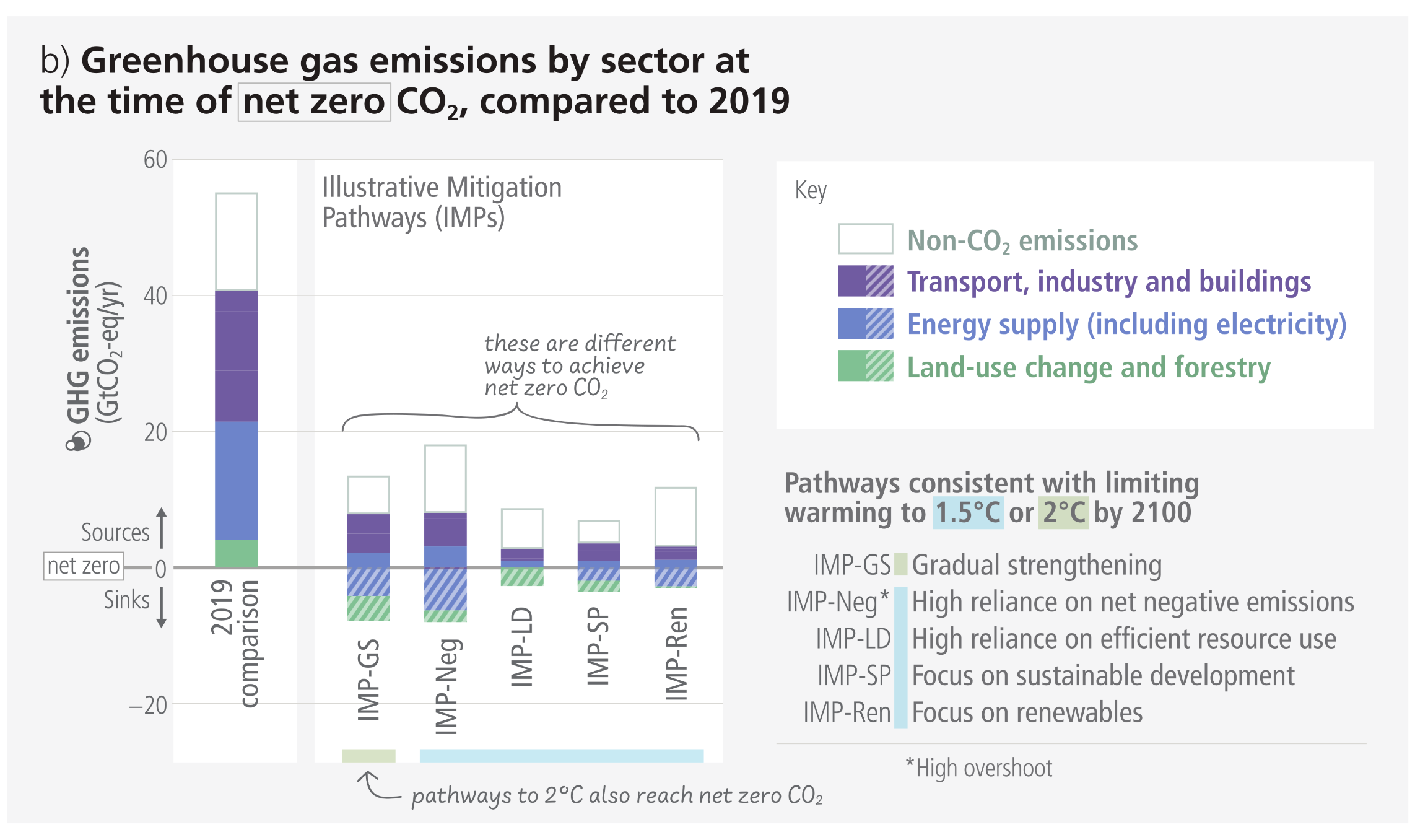
A two-panel infographic illustrating that the transition towards net zero carbon dioxide will occur at a different pace across various sectors.  Panel A is a line graph tracking the percentage reduction in sectoral emissions relative to 2015, plotted from 2020 to 2050 for pathways limiting warming to 1.5 degrees Celsius. It highlights a staggered timeline for decarbonisation:  Land-use change emissions fall most rapidly, crossing the net zero line around 2030 and continuing into deep negative percentages.  Energy supply, including electricity, crosses the net zero line around 2040.  Transport, industry, and buildings decline more slowly, reaching roughly a 75 percent reduction by 2050 but not achieving net zero.  Non-CO2 emissions are the slowest to decline, reaching a 50 percent reduction by 2050.  Panel B is a bar chart comparing total greenhouse gas emissions in 2019 to five specific Illustrative Mitigation Pathways at the exact time they reach net zero carbon dioxide. The tall 2019 bar shows nearly 60 gigatonnes of entirely positive emissions across all sectors. In contrast, the five pathway bars are significantly shorter and cross below the horizontal zero axis. They visually demonstrate that to reach net zero, the remaining positive emissions from transport, industry, buildings, and non-CO2 sources must be offset by negative emissions, depicted as hatched bars extending below zero, which are provided by sinks in land-use change, forestry, and energy supply.

Figure 4.1:  Sectoral emissions in pathways that limit warming to 1.5°C. Panel (a) shows sectoral CO2 and non-CO2 emissions in global modelled pathways that limit warming to 1.5°C (>50%) with no or limited overshoot. The horizontal lines illustrate halving 2015 emissions (base year of the pathways) (dashed) and reaching net zero emissions (solid line). The range shows the 5–95th percentile of the emissions across the pathways. The timing strongly differs by sector, with the CO2 emissions from the electricity/fossil fuel industries sector and land-use change generally reaching net zero earlier. Non-CO2 emissions from agriculture are also substantially reduced compared to pathways without climate policy but do not typically reach zero. Panel (b) Although all pathways include strongly reduced emissions, there are different pathways as indicated by the illustrative mitigation pathways used in IPCC WGIII. The pathways emphasise routes consistent with limiting warming to 1.5°C with a high reliance on net negative emissions (IMP-Neg), high resource efficiency (IMP-LD), a focus on sustainable development (IMP-SP) or renewables (IMP-Ren) and consistent with 2°C based on a less rapid introduction of mitigation measures followed by a subsequent gradual strengthening (IMP-GS). Positive (solid filled bars) and negative emissions (hatched bars) for different illustrative mitigation pathways are compared to GHG emissions from the year 2019. The category “energy supply (including electricity)” includes bioenergy with carbon capture and storage and direct air carbon capture and storage.
Source: IPCC (2023) AR6 Synthesis Report, Figure 4.1

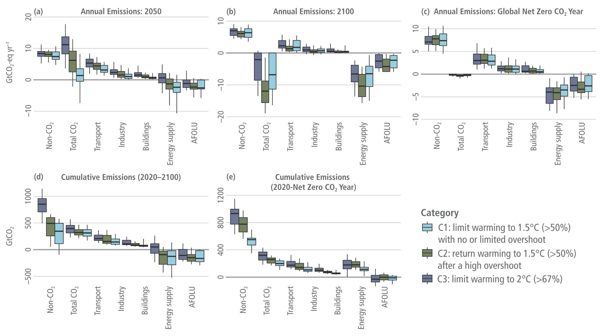
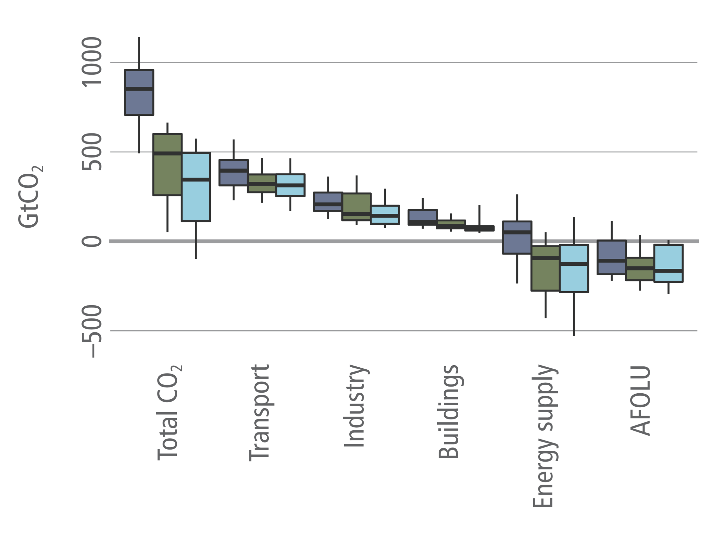
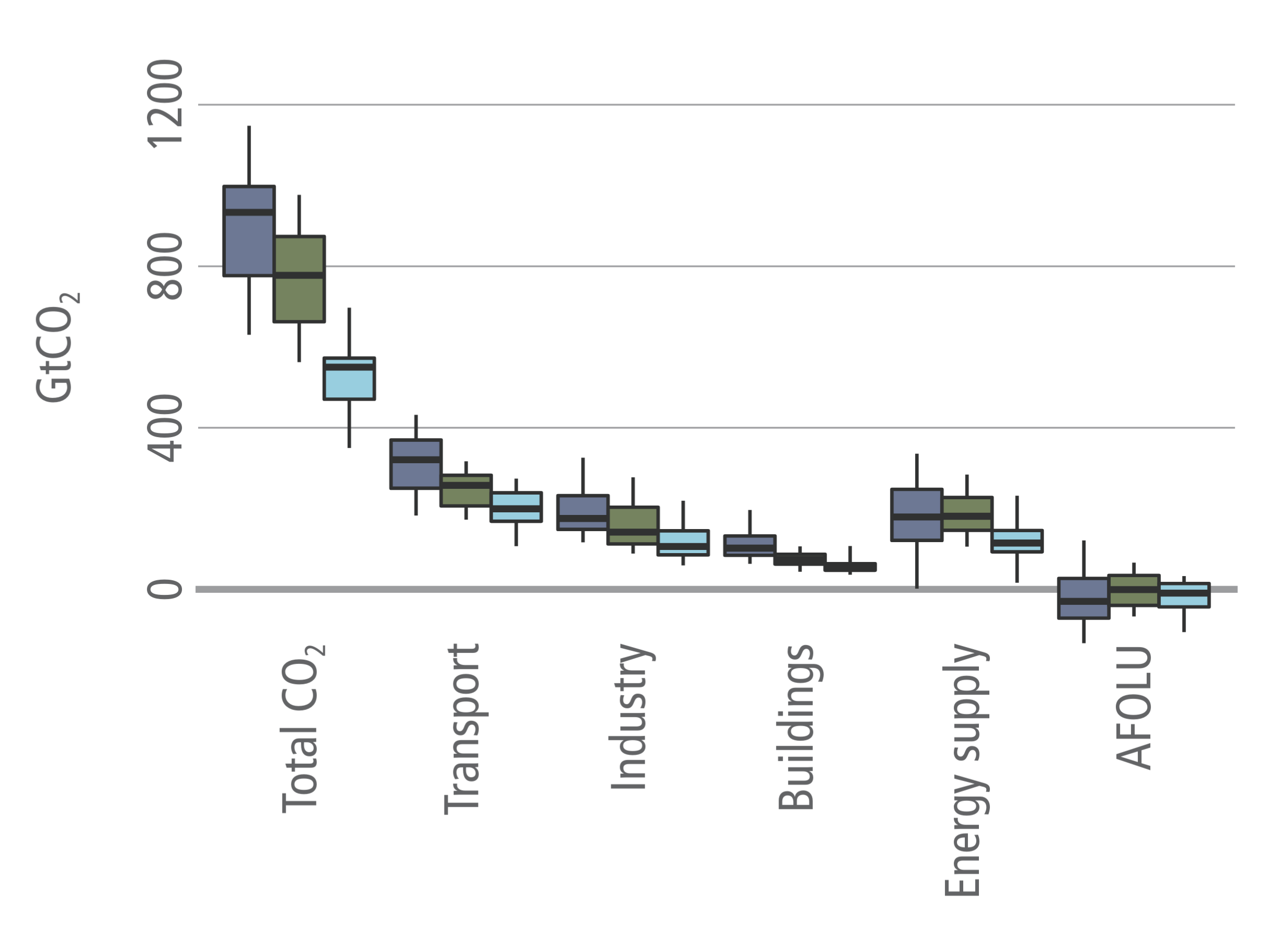
Greenhouse gas (GHG) emissions, including CO2 emissions by sector and total non-CO2 GHGs in 2050 (top left), 2100 (top middle), year of global net zero CO2 (top right), cumulative CO2 emissions from 2020–2100 (bottom left), and cumulative CO2 emissions from 2020 until the year of net zero CO2 for scenarios that limit warming to below 2°C

A five-panel infographic using box plots to visualise annual and cumulative greenhouse gas emissions across three climate warming categories. A legend identifies the categories: C1 in light blue for limiting warming to 1.5 degrees Celsius with limited overshoot, C2 in green for returning to 1.5 degrees after a high overshoot, and C3 in dark blue for limiting warming to 2 degrees.  The top row displays three panels tracking annual emissions for 2050, 2100, and the specific year of global net-zero carbon dioxide. The vertical axes measure gigatonnes of CO2 equivalent per year. Each panel breaks down emissions by sector. Across all panels, non-CO2 emissions remain firmly positive, sitting highest above the zero line. The transport, industry, and buildings sectors show declining emissions but also generally remain positive. To balance this and achieve net-zero total CO2, the energy supply and AFOLU sectors cross below the zero line, providing essential negative emissions. By 2100, the median total CO2 for all three pathways sits well below zero, driven primarily by deep negative emissions in the energy supply sector.  The bottom row contains two panels showing cumulative emissions from 2020 to 2100, and from 2020 to the year of net-zero CO2. These panels visually emphasise that the more ambitious C1 and C2 pathways require drastically lower cumulative total CO2 and non-CO2 emissions compared to the C3 pathway. This overall reduction is achieved by maintaining much tighter budgets on positive emitting sectors while relying heavily on cumulative negative emissions from the energy supply and AFOLU sectors.
Figure 3.20:  Greenhouse gas (GHG) emissions, including CO2 emissions by sector and total non-CO2 GHGs in 2050 (top left), 2100 (top middle), year of global net zero CO2 (top right), cumulative CO2 emissions from 2020–2100 (bottom left), and cumulative CO2 emissions from 2020 until the year of net zero CO2 for scenarios that limit warming to below 2°C. Scenarios are grouped by their temperature category. ‘Industry’ includes CO2 emissions associated with industrial energy use only; sectors shown in this figure do not necessarily sum to total CO2. In this, and other figures in Section 3.4, unless stated otherwise, only scenarios that pass the vetting criteria are included (Section 3.2). Boxes indicate the interquartile range, the median is shown with a horizontal black line, while vertical lines show the 5 95% interval.
Source: IPCC (2022) AR6 WGIII Chapter 3, Figure 3.20

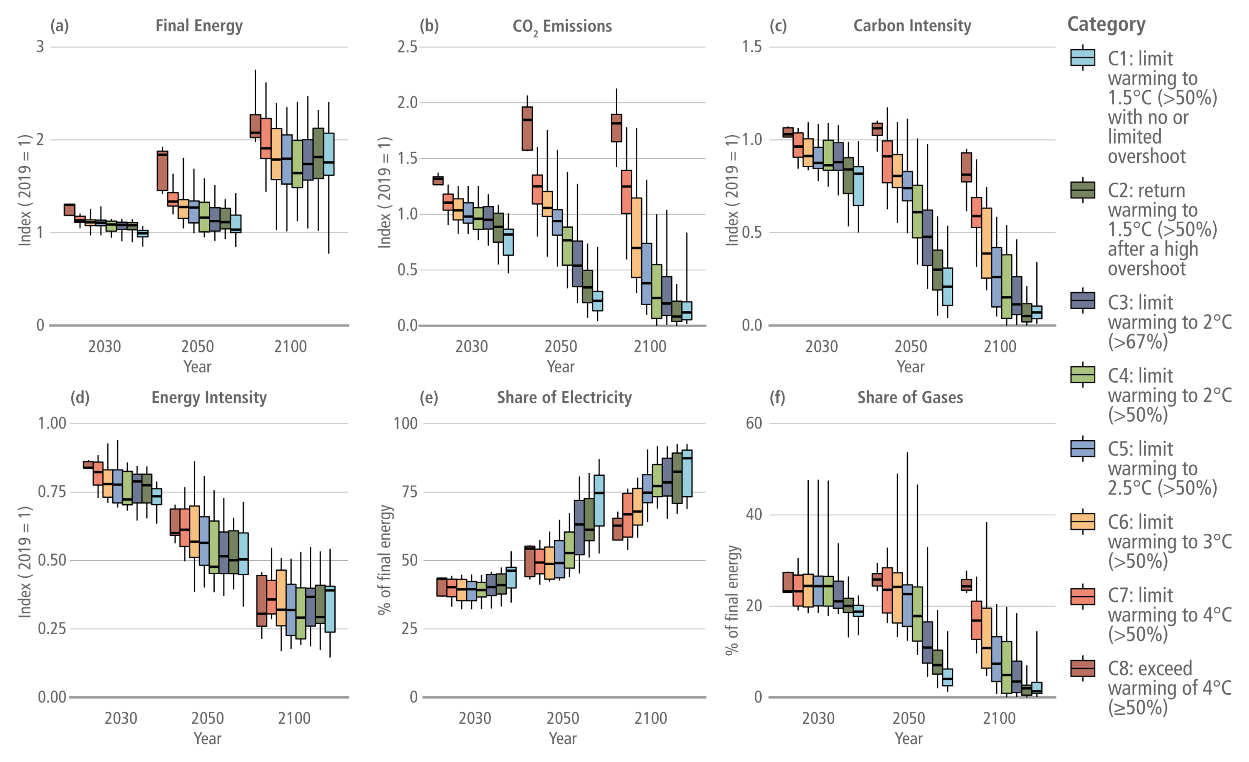
Buildings final energy (a), CO2 emissions (b), carbon intensity (c), energy intensity (d), share of final energy from electricity (e), and share of final energy from gases (f)

A six-panel infographic using box plots to illustrate projected energy and emission trends in the buildings sector for the years 2030, 2050, and 2100. A legend on the right categorises the scenarios into eight climate pathways, ranging from C1 in light blue, which limits warming to 1.5 degrees Celsius, through to C8 in dark red, which exceeds warming of 4 degrees Celsius.  The first four panels are indexed to 2019, where a value of 1 represents no change from the base year.  Panel A shows Final Energy. Values remain near 1 for most scenarios in 2030 but rise across the board by 2100, reaching highest near an index of 2 for the C8 high-emission pathway.  Panel B shows CO2 Emissions. The ambitious C1 to C3 mitigation pathways show a steep decline, dropping near zero by 2100. Conversely, the high-emission C8 pathway sees emissions sharply increase by 2050 before plateauing.  Panel C shows Carbon Intensity. This follows a similar trajectory to CO2 emissions, plunging towards zero by 2100 for stringent mitigation scenarios whilst remaining high for the C7 and C8 pathways.  Panel D shows Energy Intensity. Unlike the previous panels, this metric declines steadily across all climate categories, dropping to an index between 0.25 and 0.5 by 2100, visually indicating widespread improvements in efficiency regardless of the chosen climate pathway.  The final two panels measure percentages of final energy.  Panel E tracks the Share of Electricity. It shows a unified upward trend across all scenarios, rising from roughly 40 percent in 2030 to peak between 60 and 90 percent by 2100, with the most ambitious C1 and C2 pathways driving the highest electrification levels.  Panel F tracks the Share of Gases. This displays a contrasting downward trend, dropping from roughly 25 percent in 2030 to near zero for ambitious pathways by 2100, whilst high-emission scenarios retain a small but declining percentage.
Figure 3.24:  Buildings final energy (a), CO2 emissions (b), carbon intensity (c), energy intensity (d), share of final energy from electricity (e), and share of final energy from gases (f). Energy intensity is final energy per unit of GDP. Carbon intensity is CO2 emissions per EJ of final energy. The first four indicators are indexed to 2019, where values less than 1 indicate a reduction.
Source: IPCC (2022) AR6 WGIII Chapter 3, Figure 3.24

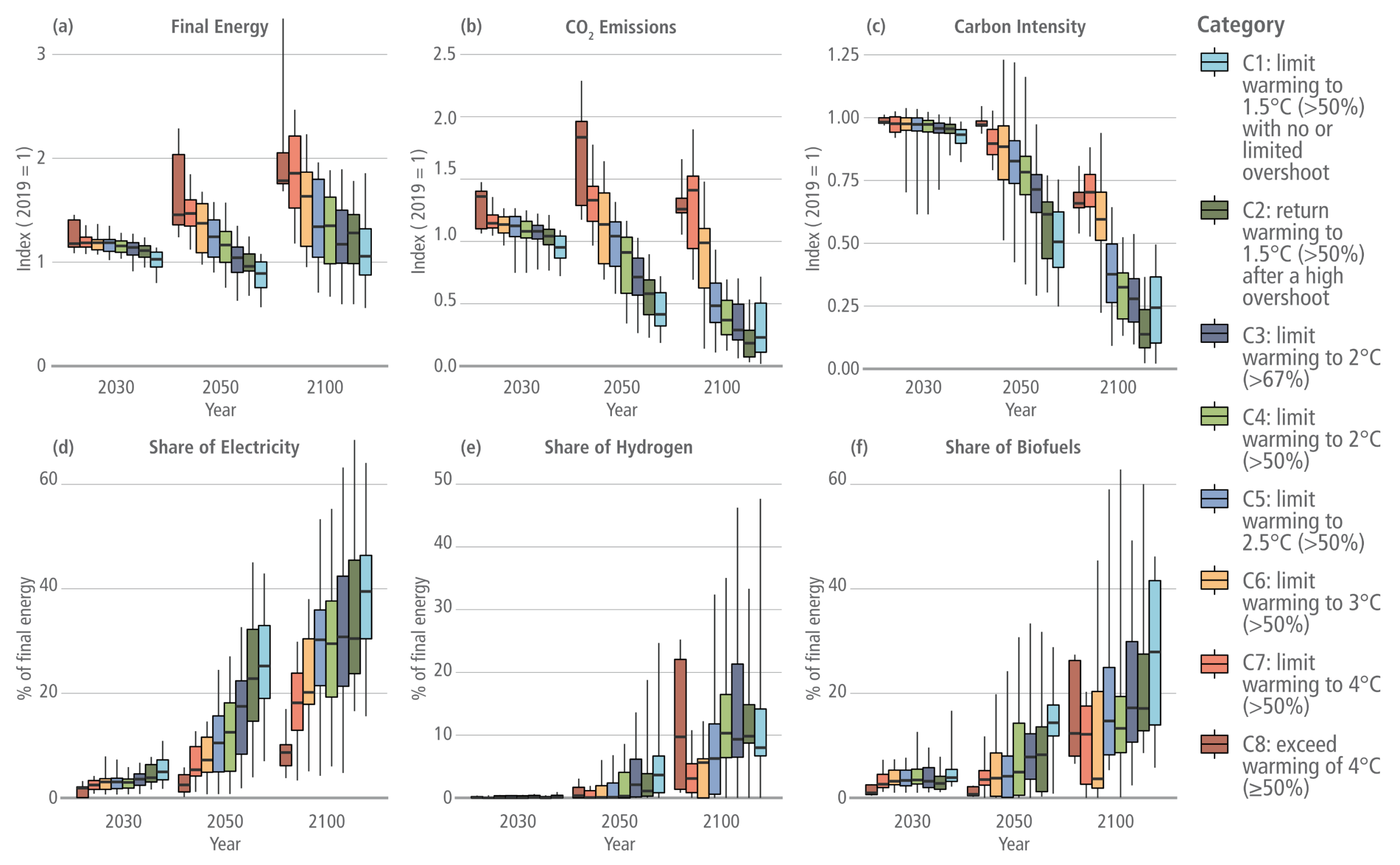
Transport final energy (a), CO2 emissions (b), carbon intensity (c), and share of final energy from electricity (d), hydrogen (e), and biofuels (f)

A six-panel infographic using box plots to illustrate projected energy and emission trends in the transport sector for the years 2030, 2050, and 2100. A legend on the right categorises the scenarios into eight climate pathways, ranging from C1 in light blue, which limits warming to 1.5 degrees Celsius, through to C8 in dark red, which exceeds warming of 4 degrees Celsius.  The first three panels are indexed to 2019, where a value of 1 represents no change from the base year.  Panel A shows Final Energy. Values remain near 1 for most scenarios in 2030. By 2100, energy demand rises significantly for high-emission pathways like C7 and C8, approaching an index of 2, whilst ambitious mitigation pathways like C1 and C2 remain near or slightly below 1.  Panel B shows CO2 Emissions. The ambitious C1 to C3 mitigation pathways show a steep decline, dropping near zero by 2100. Conversely, the high-emission C8 pathway sees emissions sharply increase near an index of 2 by 2050 before experiencing a modest decline by 2100.  Panel C shows Carbon Intensity. This follows a similar trajectory to CO2 emissions, steadily dropping towards zero by 2100 for stringent mitigation scenarios whilst remaining relatively high for the C7 and C8 pathways.  The final three panels measure percentages of final energy.  Panel D tracks the Share of Electricity. It shows an upward trend across all scenarios, rising from near zero in 2030 to peak at median values between 30 and 45 percent for the most ambitious C1 and C2 pathways by 2100.  Panel E tracks the Share of Hydrogen. Values remain near zero in 2030, with modest and highly variable growth by 2100, generally remaining below a 20 percent median share across most scenarios.  Panel F tracks the Share of Biofuels. This metric shows steady growth, rising from below 5 percent in 2030 to reach median shares between 10 and 30 percent by 2100 for ambitious pathways, though with significant variance indicated by long whiskers on the plots.
Figure 3.25:  Transport final energy (a), CO2 emissions (b), carbon intensity (c), and share of final energy from electricity (d), hydrogen (e), and biofuels (f). See Chapter 10 for a discussion of energy intensity. Carbon intensity is CO2 emissions per EJ of final energy. The first three indicators are indexed to 2019, where values less than 1 indicate a reduction.
Source: IPCC (2022) AR6 WGIII Chapter 3, Figure 3.25 (with label corrected for ‘(c)’)

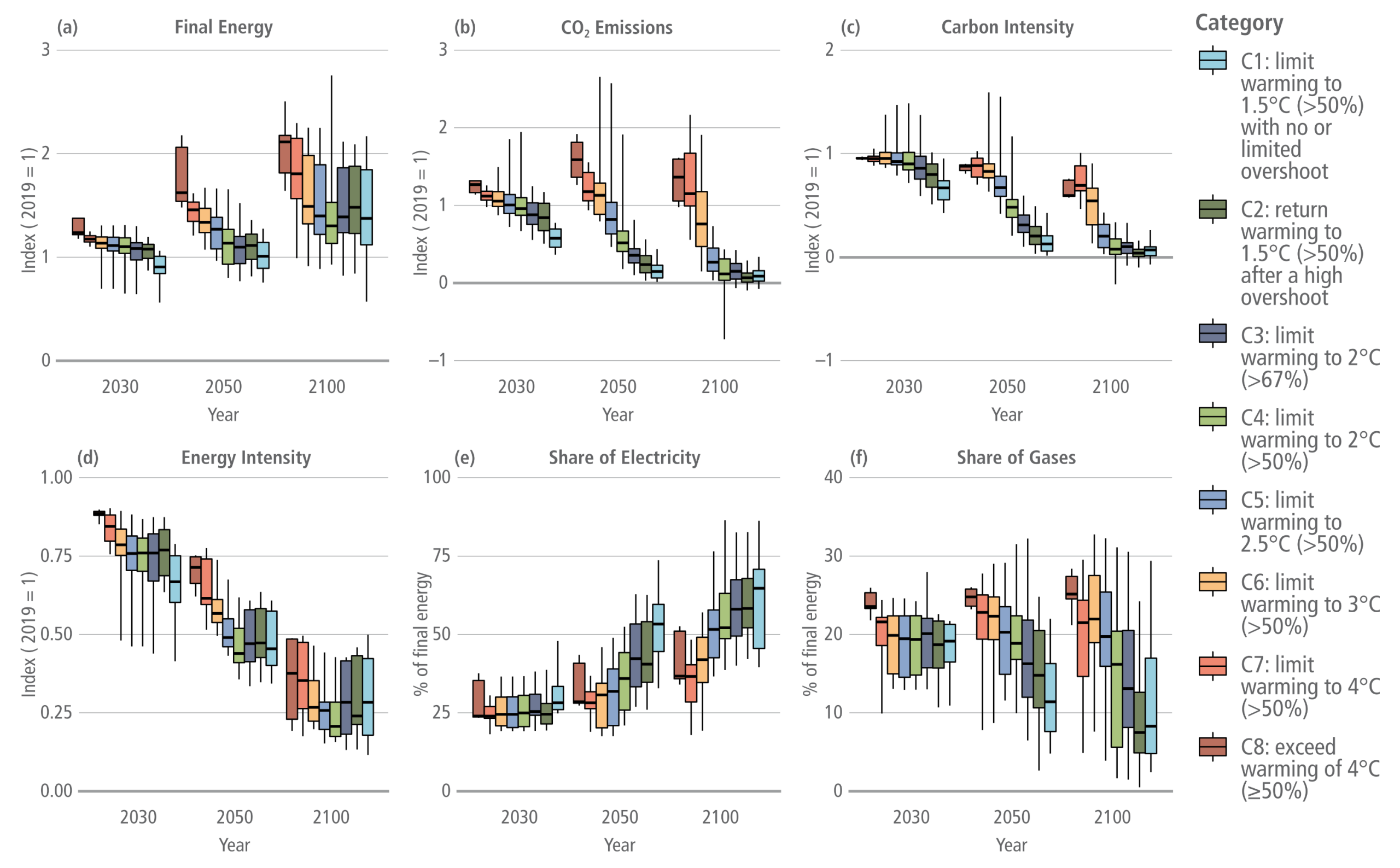
Industrial final energy, including feedstocks (a), CO2 emissions (b), carbon intensity (c), energy intensity (d), share of final energy from electricity (e), and share of final energy from gases (f)

A six-panel infographic using box plots to illustrate projected energy and emission trends in the industrial sector for the years 2030, 2050, and 2100. A legend on the right categorises the scenarios into eight climate pathways, ranging from C1 in light blue, which limits warming to 1.5 degrees Celsius, through to C8 in dark red, which exceeds warming of 4 degrees Celsius.  The first four panels are indexed to 2019, where a value of 1 represents no change from the base year.  Panel A shows Final Energy. Values remain near 1 for most scenarios in 2030 but diverge significantly by 2100, with high-emission pathways like C7 and C8 rising towards an index of 2, whilst ambitious mitigation pathways remain lower, typically between 1 and 1.5.  Panel B shows CO2 Emissions. The ambitious C1 to C3 mitigation pathways show a steep decline, dropping near zero by 2100. Conversely, the high-emission C8 pathway sees emissions increase and remain high, hovering between an index of 1 and 2 through to the end of the century.  Panel C shows Carbon Intensity. This follows a similar trajectory to CO2 emissions, steadily dropping near zero by 2100 for stringent mitigation scenarios whilst remaining relatively high for the C7 and C8 pathways.  Panel D shows Energy Intensity. Unlike final energy and emissions, this metric declines steadily across all climate categories, dropping to an index between 0.25 and 0.5 by 2100, visually indicating widespread improvements in efficiency regardless of the chosen climate pathway.  The final two panels measure percentages of final energy.  Panel E tracks the Share of Electricity. It shows an upward trend across all scenarios, rising from roughly 25 percent in 2030 to peak between 50 and 75 percent for the most ambitious C1 and C2 pathways by 2100.  Panel F tracks the Share of Gases. This displays a general downward trend for ambitious pathways, dropping from roughly 20 percent in 2030 to below 10 percent by 2100, whilst high-emission scenarios retain a larger share, generally remaining between 15 and 25 percent.
Figure 3.26:  Industrial final energy, including feedstocks (a), CO2 emissions (b), carbon intensity (c), energy intensity (d), share of final energy from electricity (e), and share of final energy from gases (f). Energy intensity is final energy per unit of GDP. Carbon intensity is CO2 emissions per EJ of final energy. The first four indicators are indexed to 2019, where values less than 1 indicate a reduction. Industrial sector CO2 emissions include fuel combustion emissions only.
Source: IPCC (2022) AR6 WGIII Chapter 3, Figure 3.26

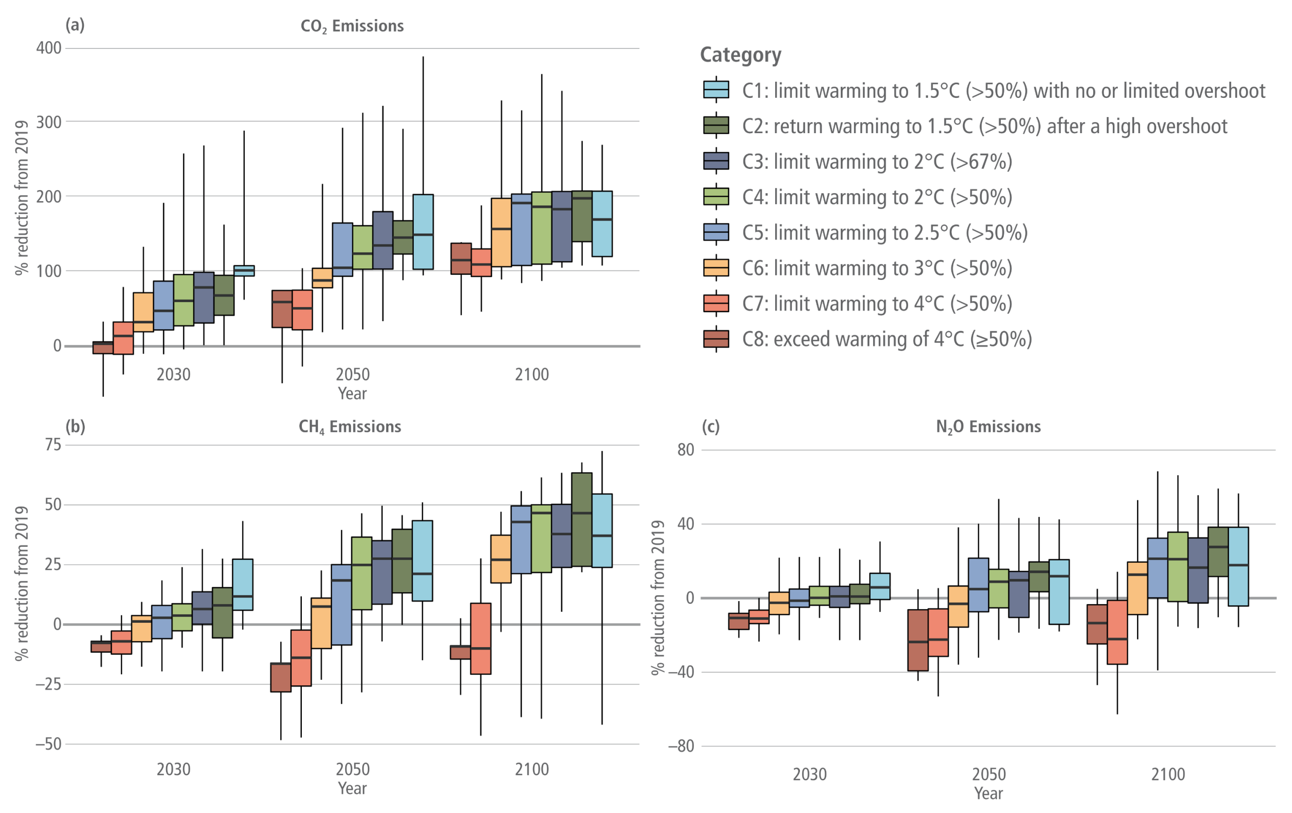
Reduction in AFOLU GHG emissions from 2019

A three-panel infographic using box plots to illustrate the projected percentage reduction in agriculture, forestry, and other land use, or AFOLU, greenhouse gas emissions compared to 2019 levels for the years 2030, 2050, and 2100. A legend categorises the scenarios into eight climate pathways, from C1 in light blue for limiting warming to 1.5 degrees Celsius, through to C8 in dark red for exceeding 4 degrees Celsius.  Panel A shows CO2 Emissions. It demonstrates massive percentage reductions for ambitious climate goals. By 2050 and 2100, the stringent C1 to C3 pathways exceed a 100 percent reduction, visually indicating net-negative emissions, with some upper quartiles reaching near 200 percent. High-emission C7 and C8 pathways show little reduction by 2030 but slowly climb towards 100 percent by 2100.  Panel B shows CH4, or methane, Emissions. This panel displays much smaller reduction potentials. The ambitious mitigation pathways achieve roughly 25 to 50 percent reductions by 2100. Conversely, the high-emission C7 and C8 pathways show emissions increasing relative to 2019, indicated by negative reduction values dropping below the zero line in 2030 and 2050, before slightly improving by 2100.  Panel C shows N2O, or nitrous oxide, Emissions. This panel shows the lowest reduction potential of the three gases. Ambitious pathways manage median reductions of roughly 10 to 30 percent by 2100. The high-emission C7 and C8 pathways display significant and sustained increases in emissions across the entire century, with their box plots dropping well below the zero line to between minus 20 and minus 40 percent.
Figure 3.27:  Reduction in AFOLU GHG emissions from 2019. The AFOLU CO2 estimates in this figure are not necessarily comparable with country GHG inventories (see Chapter 7).
Source: IPCC (2022) AR6 WGIII Chapter 3, Figure 3.27

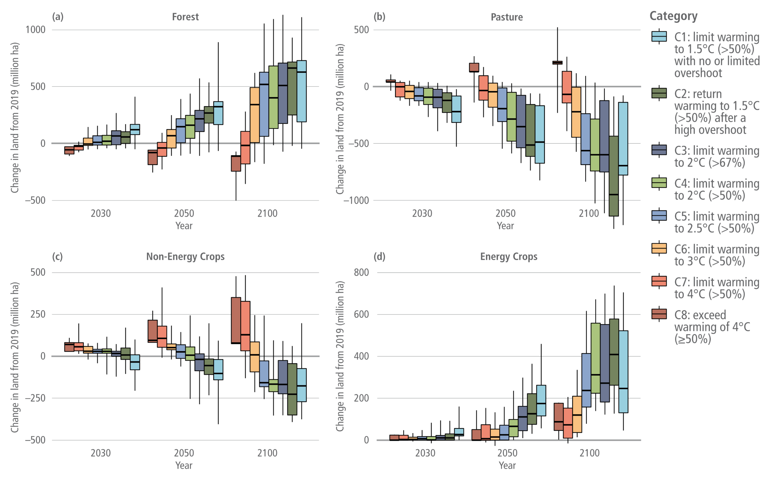
Change in land cover from 2019 in million hectares

A four-panel infographic using box plots to illustrate projected changes in land cover compared to 2019 levels, measured in million hectares, for the years 2030, 2050, and 2100. A legend on the right categorises the scenarios into eight climate pathways, ranging from C1 in light blue, which limits warming to 1.5 degrees Celsius, through to C8 in dark red, which exceeds warming of 4 degrees Celsius.  Panel A tracks Forest land. Ambitious mitigation pathways, like C1 and C2, show massive increases in forest area, growing steadily to reach median increases of roughly 500 to 600 million hectares by 2100. High-emission pathways like C7 and C8 show early decreases and remain near the zero line or slightly below by the end of the century.  Panel B tracks Pasture land. This panel displays a stark downward trend for ambitious pathways, which project a steady loss reaching between 500 and 1000 million hectares by 2100. Conversely, high-emission scenarios project an initial increase in pasture before dropping slightly below the zero line by 2100.  Panel C tracks Non-Energy Crops. Similar to pasture, ambitious climate pathways project steady declines, dropping by roughly 150 to 250 million hectares by 2100. High-emission pathways project the opposite, showing strong land increases of up to 250 million hectares over the century.  Panel D tracks Energy Crops. This panel shows dramatic growth for the ambitious C1 to C4 mitigation scenarios, starting slow in 2030 but rapidly expanding to median increases between 200 and over 400 million hectares by 2100. High-emission scenarios show minimal change, hovering near the zero line throughout the century.
Figure 3.28:  Change in land cover from 2019 in million hectares. Positive values indicate an increase in area.
Source: IPCC (2022) AR6 WGIII Chapter 3, Figure 3.28

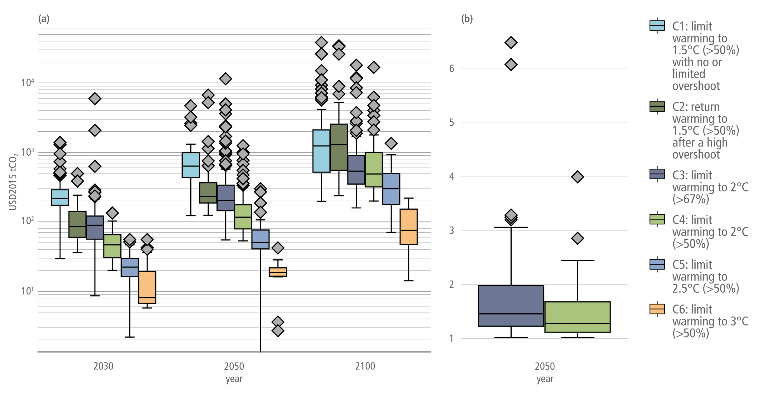
Marginal abatement cost of carbon in 2030, 2050 and 2100 for mitigation pathways with immediate global mitigation action (a), and ratio in 2050 between pathways that correspond to NDCs announced prior to COP26 in 2030 and strengthen action after 2030 and pathways with immediate global mitigation action, for C3 and C4 temperature categories (b)

A two-panel infographic using box plots to illustrate carbon abatement costs across different climate pathways. A legend on the right categorises the scenarios into six climate pathways, ranging from the highly ambitious C1 in light blue, through to the lower ambition C6 in orange.  Panel A displays the marginal abatement cost of carbon on a logarithmic vertical axis, ranging from ten to over ten thousand US dollars per tonne of CO2. The data is clustered by year: 2030, 2050, and 2100. Within each cluster, the box plots show that costs are highest for the most stringent C1 mitigation pathway and progressively decrease for the less ambitious pathways down to C6. The visual trend also shows that these costs increase substantially as time progresses from 2030 to 2100 across all categories. Numerous diamond-shaped markers sit high above the box plots, indicating high-cost outliers, particularly for the ambitious C1 to C4 pathways.  Panel B contains two box plots focusing solely on the C3 and C4 temperature categories in the year 2050. The vertical axis is on a linear scale measuring a cost ratio from 1 to just above 6. The median ratio for both categories sits relatively low, between 1 and 2. However, several diamond-shaped outliers extend far upwards, reaching up to 6.5. This visually demonstrates that pathways involving delayed action can result in costs several times higher than pathways that take immediate mitigation action.
Figure 3.32:  Marginal abatement cost of carbon in 2030, 2050 and 2100 for mitigation pathways with immediate global mitigation action (a), and ratio in 2050 between pathways that correspond to NDCs announced prior to COP26 in 2030 and strengthen action after 2030 and pathways with immediate global mitigation action, for C3 and C4 temperature categories (b).
Source: IPCC AR6 (2022) WGIII Chapter 3, Figure 3.32, pg. 360

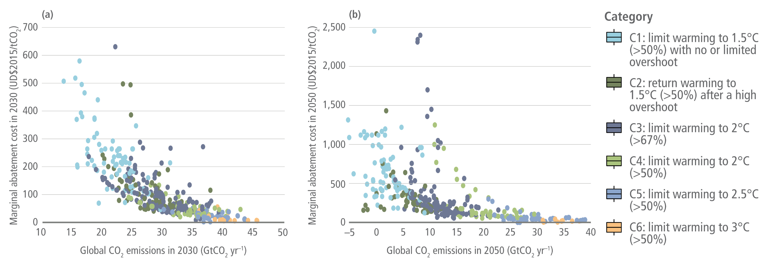
Marginal abatement cost of carbon with respect to CO2 emissions for mitigation pathways with immediate global mitigation action, in 2030 (a) and 2050 (b)

A two-panel scatter plot infographic illustrating the marginal abatement cost of carbon against global CO2 emissions for mitigation pathways with immediate global action. A legend on the right categorises the scenarios into six climate pathways, ranging from C1 in light blue for limiting warming to 1.5 degrees Celsius, through to C6 in orange for limiting warming to 3 degrees Celsius.  Panel A plots the data for the year 2030. The horizontal axis measures global CO2 emissions from 10 to 50 gigatonnes per year, and the vertical axis measures the abatement cost from 0 to 700 US dollars per tonne of CO2. The scatter points form a sweeping downward curve from left to right. This visually demonstrates that ambitious pathways like C1 and C2, which achieve lower emissions of roughly 15 to 25 gigatonnes, face steeply rising costs that reach up to 600 dollars. Conversely, less ambitious pathways clustering on the right with emissions above 30 gigatonnes face much lower costs, generally remaining below 100 dollars.  Panel B plots the data for the year 2050. The horizontal axis shifts to measure emissions from minus 5 to 40 gigatonnes per year, whilst the vertical axis expands significantly to measure costs up to 2500 US dollars. The scatter points display a similar but more extreme inverse relationship. As the ambitious C1 and C2 pathways push emissions towards zero and into negative territory on the far left, the marginal abatement costs scatter widely upwards, with some high-cost outliers approaching 2500 dollars. Meanwhile, higher-emission pathways remain clustered near the bottom right with relatively low, stable costs.
Figure 3.33:  Marginal abatement cost of carbon with respect to CO2 emissions for mitigation pathways with immediate global mitigation action, in 2030 (a) and 2050 (b).
Source: IPCC AR6 (2022) WGIII Chapter 3, Figure 3.33, pg. 360

Energy supply


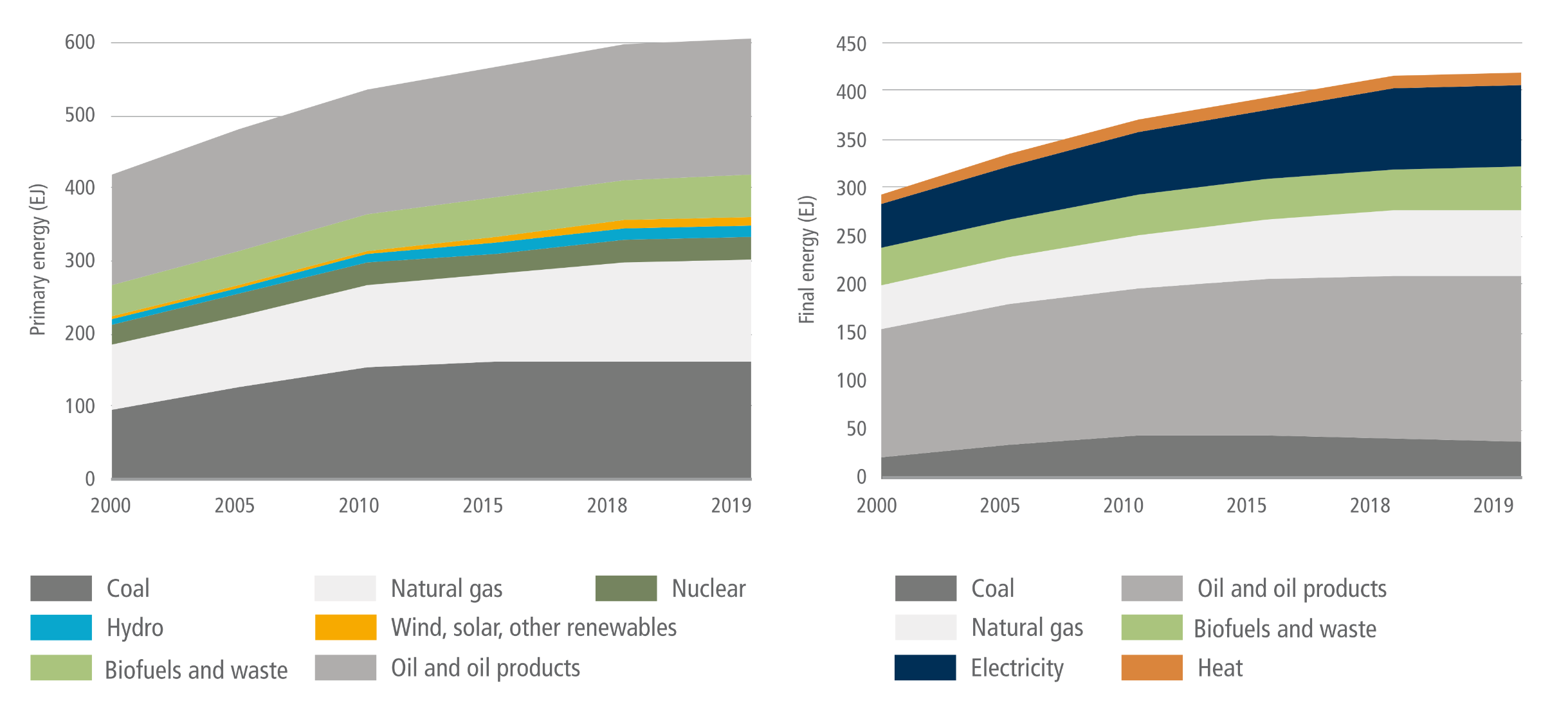
World total primary energy supply (TPES) (EJ) and total final energy consumption (TFC) 2000–2019

A side-by-side comparison of two stacked area charts illustrating global energy trends from 2000 to 2019.  The left chart displays World total primary energy supply, rising from roughly 420 to over 600 exajoules over the two decades. Coal, situated at the base, and oil and oil products, situated at the top, form the two largest bands and drive much of the overall growth, alongside a steadily expanding band of natural gas. Smaller contributions are shown for biofuels and waste, nuclear, and hydro. A very thin band representing wind, solar, and other renewables appears near the middle, remaining comparatively small despite slight growth towards 2019.  The right chart displays World total final energy consumption, which rises from roughly 300 to 420 exajoules over the same period. The visual breakdown differs from primary energy. Here, oil and oil products form the single largest band, taking up nearly half the chart area. Above oil, electricity forms a prominent and steadily expanding band, followed by natural gas, and biofuels and waste. Direct consumption of coal forms a relatively thin band at the bottom, while a very thin band for heat sits at the very top. Both charts demonstrate continuous overall growth in global energy reliance through to 2019.
Figure 6.5:  World total primary energy supply (TPES) (EJ) and total final energy consumption (TFC) 2000–2019. Primary energy in this figure is based on IEA accounting methods and not direct equivalents for several energy sources. Final energy does not include industry own use and losses. Source: adapted from IEA world energy balances, Minx et al. (2021b) database for IPCC.
Source: IPCC (2022) AR6 WGIII Chapter 6, Figure 6.5, pg. 622

“Reducing GHG emissions across the full energy sector requires major transitions, including a substantial reduction in overall fossil fuel use, the deployment of low emission energy sources, switching to alternative energy carriers, and energy efficiency and conservation. The continued installation of unabated fossil fuel infrastructure will ‘lock-in’ GHG emissions. (high confidence)”

Source: IPCC (2022) AR6 WGIII Summary for Policymakers, C.4, pg. 28


“Net-zero CO2 energy systems entail: a substantial reduction in overall fossil fuel use, minimal use of unabated fossil fuels, and use of CCS in the remaining fossil fuel system; electricity systems that emit no net CO2; widespread electrification of the energy system including end uses; energy carriers such as sustainable biofuels, low-emissions hydrogen, and derivatives in applications less amenable to electrification; energy conservation and efficiency; and greater physical, institutional, and operational integration across the energy system. CDR will be needed to counterbalance residual emissions in the energy sector. The most appropriate strategies depend on national and regional circumstances, including enabling conditions and technology availability. (high confidence)”

Source: IPCC (2022) AR6 WGIII Summary for Policymakers, C.4.1, pg. 28


“Global methane emissions from energy supply, primarily fugitive emissions from production and transport of fossil fuels, accounted for about 18% [13–23%] of global GHG emissions from energy supply, 32% [22–42%] of global CH4 emissions, and 6% [4–8%] of global GHG emissions in 2019 (high confidence). About 50–80% of CH4 emissions from these fossil fuels could be avoided with currently available technologies at less than USD50 tCO2-eq–1 (medium confidence).”

Source: IPCC (2022) AR6 WGIII Summary for Policymakers, C.4.5, pg. 28


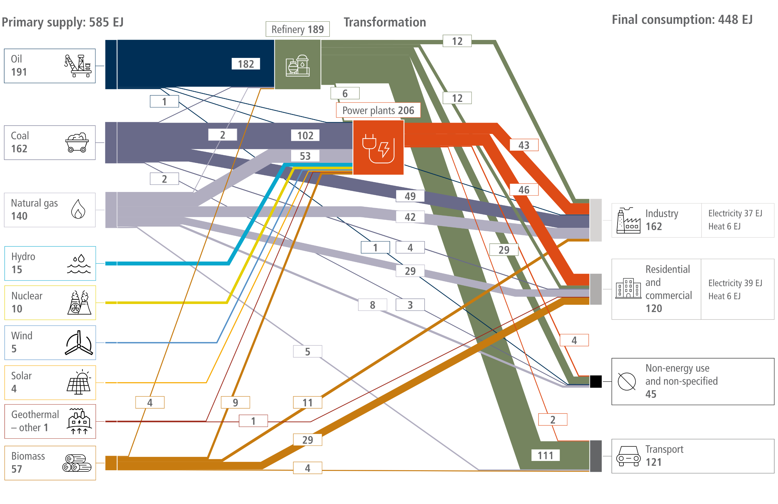
Global energy use, 2019

A Sankey diagram illustrating global energy flows in 2019. On the left, 'Primary supply' totals 585 EJ, overwhelmingly dominated by fossil fuels: Oil (191 EJ), Coal (162 EJ), and Natural gas (140 EJ). Smaller inputs include Biomass (57 EJ), Hydro (15 EJ), Nuclear (10 EJ), Wind (5 EJ), Solar (4 EJ), and Geothermal/other (1 EJ). In the centre, 'Transformation' occurs via Refineries (189 EJ, fed almost entirely by oil) and Power plants (206 EJ, fed primarily by coal and natural gas, alongside all nuclear and renewable inputs). On the right, 'Final consumption' totals 448 EJ, distributed across Industry (162 EJ), Transport (121 EJ, powered almost entirely by refined oil), Residential and commercial (120 EJ), and Non-energy use and non-specified (45 EJ). The visual thickness of the flow bands emphasises the heavy global reliance on fossil fuels for transport, electricity generation, and industrial processes.

Global energy use, 2060, Scenario IMP-REN-2.0

A Sankey diagram illustrating global energy flows in 2060 under the net-zero scenario IMP-REN-2.0. On the left, 'Primary supply' totals 554 EJ, heavily dominated by renewable energy: Solar (261 EJ), Wind (104 EJ), and Biomass (101 EJ). Fossil fuel usage is minimal, comprising Oil (28 EJ), Natural gas (20 EJ), and Coal (2 EJ). Additional sources include Hydro (24 EJ), Geothermal and other (10 EJ), and Nuclear (2 EJ). In the centre, 'Transformation' is driven by 'Power plants and heat' (425 EJ, powered almost entirely by renewables), a 'Refinery' sector (100 EJ, fed primarily by biomass and oil), and 'Hydrogen' production (63 EJ). On the right, 'Final consumption' totals 387 EJ, distributed across Residential and commercial (154 EJ), Industry (134 EJ), and Transport (99 EJ). The diagram visually emphasises a highly electrified global system, with thick red electricity bands supplying the vast majority of end-use energy needs, contrasting sharply with historical fossil-fuel-reliant models.

Global energy use, 2070, Scenario IMP-NEG-2.0

A Sankey diagram illustrating global energy flows in 2070 under the net-zero scenario IMP-NEG-2.0. On the left, 'Primary supply' totals 705 EJ, displaying a diverse mix of renewables and fossil fuels. The largest input is Biomass (156 EJ), followed by Oil (124 EJ), Natural gas (100 EJ), Wind (93 EJ), Solar (91 EJ), and Coal (82 EJ). Smaller contributions come from Hydro (30 EJ), Nuclear (28 EJ), and Geothermal and other (1 EJ). In the centre, 'Transformation' is dominated by 'Power plants and heat' (470 EJ, drawing heavily from biomass, wind, solar, natural gas, and coal) and a 'Refinery' sector (154 EJ, fed predominantly by oil and biomass). On the right, 'Final consumption' totals 508 EJ, distributed across Industry (238 EJ), Transport (139 EJ), Residential and commercial (120 EJ), and Non-energy use and non-specified (11 EJ). The diagram visually emphasises a highly electrified system with thick red electricity bands supplying end-use sectors, alongside a massive scale-up of biomass and continued fossil fuel usage compared to purely renewable scenarios.

Figure 6.1:  Global energy flows within the 2019 global energy system (top panel) and within two illustrative future, net-zero CO2 emissions global energy systems (bottom panels). Source: IEA, AR6 Scenarios Database. Flows below 1 EJ are not represented. Agricultural energy and energy own use are included in industry. Captured methane is included in natural gas supply where appropriate. The illustrative net-zero scenarios correspond to the years in which net energy system CO2 emissions reach zero – 2060 in IMP-Ren and 2070 in IMP-Neg-2.0. Source: data from IMP-Ren: Luderer et al. (2022); IMP-Neg-2.0: Riahi, K. et al. (2021).

Source: IPCC (2022) AR6 WGIII Chapter 6, Figure 6.1

The energy system in each of the illustrative pathways (IPs)

A seven-panel stacked area chart illustrating the projected global energy system mix across seven illustrative pathways from 2020 to 2100. The vertical axis for each panel measures energy from 0 to 1000 exajoules per year. A legend identifies the energy sources: a black line for Total energy, and coloured areas for non-biomass Renewables, non-traditional Biomass, traditional Biomass, Fossil fuels, and Nuclear energy.  The top row displays three pathways. CurPol and ModAct show total energy demand climbing steadily towards roughly 1000 and 800 exajoules respectively, with fossil fuels remaining the heavily dominant energy source through to 2100. In contrast, IMP-GS shows total energy dipping mid-century before rising near 950 exajoules, achieved by a significant decline in fossil fuels and a massive expansion of non-biomass renewables.  The bottom row displays four highly ambitious mitigation pathways: IMP-Neg, IMP-Ren, IMP-LD, and IMP-SP. All four show stark declines in fossil fuel usage over the century. IMP-Neg shows energy demand recovering to near 1000 exajoules, heavily relying on vast expansions of both non-traditional biomass and renewables. IMP-Ren shows a total transition away from fossil fuels, replacing them almost entirely with non-biomass renewables to meet a demand of roughly 750 exajoules. Finally, IMP-LD and IMP-SP illustrate scenarios where total energy demand is drastically reduced and stabilised at roughly 350 to 400 exajoules, met primarily by growing shares of renewables and shrinking fossil fuel use.
Source: IPCC (2022) AR6 WGIII Chapter 3, Figure 3.8

IMP characteristics: primary energy

A stacked bar chart titled IMP characteristics: primary energy, comparing global primary energy supply across seven scenarios for the years 2020, 2050, and 2100. The vertical axis measures primary energy in exajoules per year, ranging from 0 to 1000. A legend identifies ten energy sources, splitting coal, oil, gas, and biomass into categories with and without carbon capture and storage, or CCS, alongside nuclear and non-biomass renewables.  For the baseline scenarios, CurPol and ModAct, total energy demand grows steadily, reaching between 800 and over 1000 exajoules by 2100. Their energy mix remains heavily reliant on fossil fuels—specifically coal, oil, and gas without CCS.  In contrast, the five Illustrative Mitigation Pathways, or IMPs, show a sharp transition in the energy mix by 2100, though total demand varies significantly:  IMP-GS shows total primary energy dipping in 2050 before rising to roughly 950 exajoules by 2100, driven by a massive expansion of non-biomass renewables.  IMP-Neg reaches near 1000 exajoules by 2100, transitioning away from fossil fuels by relying heavily on a combination of non-biomass renewables and a vast expansion of biomass.  IMP-Ren reaches roughly 750 exajoules by 2100, with its energy mix overwhelmingly dominated by non-biomass renewables.  IMP-LD and IMP-SP illustrate low-demand futures where total primary energy drops significantly, stabilising between roughly 300 and 450 exajoules by 2100. These scenarios are supplied predominantly by non-biomass renewables and biomass, with fossil fuel use drastically reduced.
Source: IPCC (2022) AR6 WGIII Chapter 3, Figure 3.16a

Primary energy consumption across scenarios: total primary energy (a), fossil fuels (b), coal without CCS (c), non-biomass renewables (d), and biomass (e)

A five-panel infographic using box plots to illustrate primary energy consumption across different climate scenarios for the years 2030, 2050, and 2100. The vertical axes measure energy in exajoules per year. A legend on the bottom right categorises the scenarios into eight climate pathways, ranging from C1 in light blue for limiting warming to 1.5 degrees Celsius, through to C8 in dark red for exceeding warming of 4 degrees Celsius.  Panel A tracks Total Primary Energy. Values in 2030 are tightly grouped between 400 and 800 exajoules, but diverge significantly by 2100. High-emission pathways like C7 and C8 show total energy demand climbing rapidly, with medians exceeding 1200 exajoules. Ambitious mitigation pathways, such as C1 and C2, remain much lower, stabilising between roughly 800 and 1000 exajoules by the end of the century.  Panels B and C track Fossil fuels and Coal without carbon capture and storage, respectively. Both display a stark downward trend for ambitious climate pathways, plunging to near zero by 2050 and 2100. Conversely, the high-emission C7 and C8 pathways show fossil fuel and coal consumption remaining extremely high, with fossil fuel use climbing back towards 1000 exajoules by 2100.  Panels D and E track Non-Biomass Renewables and Biomass, displaying the inverse trend to fossil fuels. Both metrics show massive, accelerating growth across the century for the stringent mitigation scenarios. By 2100, ambitious pathways project non-biomass renewables climbing to a median of roughly 400 to 500 exajoules, whilst biomass rises to nearly 200 exajoules, visually demonstrating the vast expansion needed to replace fossil fuels. High-emission scenarios show much slower, modest growth in both of these renewable sectors.
Figure 3.22:  Primary energy consumption across scenarios: total primary energy (a), fossil fuels (b), coal without CCS (c), non-biomass renewables (d), and biomass (e). Scenarios are grouped by their temperature category. Primary energy is reported in direct equivalent, where one unit of nuclear or non-biomass renewable energy output is reported as one unit of primary energy. Not all subcategories of primary energy are shown.
Source: IPCC (2022) AR6 WGIII Chapter 3, Figure 3.22

Electricity (top left), share of low-carbon electricity (top right), and hydrogen (bottom left) production across all scenarios

A three-panel infographic using box plots to illustrate global electricity and hydrogen production trends across eight climate scenarios for the years 2030, 2050, and 2100. A legend on the bottom right categorises the pathways from C1 in light blue, which limits warming to 1.5 degrees Celsius, through to C8 in dark red, which exceeds warming of 4 degrees Celsius.  Panel A tracks Electricity production. The vertical axis measures from 0 to 800 exajoules per year. In 2030, all scenarios cluster tightly between roughly 100 and 150 exajoules. By 2100, electricity production expands massively across all climate pathways, reflecting widespread global electrification. The ambitious C1 and C2 mitigation pathways drive the highest growth, reaching median values near 500 exajoules, whilst high-emission pathways like C8 reach roughly 400 exajoules.  Panel B tracks the Share of low-carbon electricity as a percentage from 20 to 100. It demonstrates that ambitious climate action requires a rapid transition. By 2050, the stringent C1 to C3 pathways achieve between 80 and nearly 100 percent low-carbon electricity, whereas the high-emission C8 pathway remains near 40 percent. By 2100, the ambitious pathways consistently reach 100 percent, whilst less ambitious pathways show a wide variance but also trend heavily upwards.  Panel C tracks Hydrogen production. The vertical axis measures from 0 to 300 exajoules per year. Production remains near zero across all scenarios in 2030, showing only modest growth by 2050. However, by 2100, hydrogen production expands significantly. The ambitious mitigation scenarios like C1 through C4 reach median levels between 70 and 100 exajoules, accompanied by very long whiskers reaching up to 250 exajoules. This visually indicates high variability and the potential for a massive scale-up in hydrogen reliance to meet stringent climate targets.
Figure 3.23:  Electricity (top left), share of low-carbon electricity (top right), and hydrogen (bottom left) production across all scenarios, grouped by the categories introduced in Section 3.2. Low carbon includes non-biomass renewables, biomass, nuclear, and CCS.
Source: IPCC (2022) AR6 WGIII Chapter 3, Figure 3.23

Characteristics of global net-zero energy systems when global energy and industrial CO2 emissions reach net-zero

A comprehensive five-panel scatter plot chart from the IPCC AR6 report, mapping the characteristics of global net-zero energy systems. A legend at the bottom right defines climate scenarios by colour: light blue for 1.5 degrees Celsius, yellow for 2.0 degrees Celsius, dark blue for greater than 2.0 degrees Celsius, and grey for unspecified. All five panels feature probability density distribution curves along the top and right axes for each colour, plus a black curve representing all scenarios combined. Panel a, labelled Net energy and industry emissions, plots per-capita residual emissions on the horizontal axis against per-capita carbon dioxide removal on the vertical axis, both in tonnes of CO2 per person. A diagonal dashed line separates net negative and net positive emission regions. Panel b, labelled Energy resources, compares the percentage share of primary energy from renewables on the horizontal axis against the percentage share from non-biomass renewables on the vertical axis, with a horizontal dashed line at 50 percent separating a dominance of solar, wind, and hydro from a dominance of biomass. Panel c, labelled Electrification, plots per-capita final energy in gigajoules per person against the electricity share of final energy as a percentage. Panel d, labelled Energy intensity, plots the final energy intensity of economic activity in exajoules per trillion 2010 US dollars against the emissions intensity of final energy in megatonnes of CO2 per exajoule. Panel e, labelled Emissions trajectory, plots the net-zero emissions year from 2040 to 2100 on the horizontal axis against the peak emissions year from 2010 to 2040 on the vertical axis, including a horizontal dashed line labelled present at the year 2020.


Figure 6.22:  Characteristics of global net-zero energy systems when global energy and industrial CO2 emissions reach net-zero. Scenarios reaching net-zero emissions show differences in residual emissions and carbon removal (a), energy resources (b), electrification (c), energy intensity (as measured here by energy GDP–1) (d), and emissions trajectory (e), particularly with respect to warming levels (light blue = scenarios that limit warming to 1.5°C (>50%) with no or limited overshoot and scenarios that return warming to 1.5°C (>50%) after a high overshoot; yellow = scenarios that limit warming to 2°C (>67%) and scenarios that limit warming to 2°C (>50%); dark blue = scenarios that limit warming to 2.5°C (>50%), scenarios that limit warming to 3°C (>50%), scenarios that limit warming to 4°C (>50%), and scenarios that exceed warming of 4°C (≥50%); grey = unspecified warming). Points represent individual scenarios from the AR6 Scenarios Database, with probability density distributions shown along each axis for each warming level (colours corresponding to warming levels) and for all scenarios (black).
Source: IPCC (2022) AR6 WGIII Chapter 6, Figure 6.22, pg. 673

Characteristics of regional energy systems and emissions when global energy and industrial CO2 emissions reach net-zero

A comprehensive four-panel scatter plot chart from the IPCC AR6 report, plotting the characteristics of regional energy systems. The chart features a legend at the bottom defining six regions by colour: Africa in cyan, Latin America in purple, Eastern Europe plus Russia in yellow, Asia in red, the Middle East in dark grey, and the OECD plus EU in pale blue. Each of the four panels includes probability density distribution curves along the top and right margins to show data concentration. Panel a, labelled Net energy and industry emissions, plots per-capita residual emissions against per-capita carbon dioxide removal, both measured in tonnes of CO2 per person. A diagonal dashed line divides this plot into net negative and net positive areas. Panel b, labelled Energy resources, compares the share of primary energy from renewables against the share of non-biomass renewables, both as percentages. A horizontal dashed line at the 50 percent mark indicates a dominance of solar, wind, and hydro above the line, and a dominance of biomass below it. Panel c, labelled Electrification, plots per-capita final energy in gigajoules per person on the horizontal axis against the electricity share of final energy as a percentage on the vertical axis. Finally, Panel d, labelled Energy intensity, shows the final energy intensity of economic activity in exajoules per trillion 2010 US dollars on the horizontal axis, plotted against the emissions intensity of final energy in megatonnes of CO2 per exajoule on the vertical axis.

Figure 6.25:  Characteristics of regional energy systems and emissions when global energy and industrial CO2 emissions reach net-zero. Regional differences are shown for: (a) residual emissions and carbon removal; (b) energy resources; (c) electrification; and (d) energy intensity. Distributions of scenarios are shown along each axis for each region. Colour scheme is shown in (a). Points represent individual scenarios from the AR6 Scenarios Database (R6 regions dataset).
Source: IPCC (2022) AR6 WGIII Chapter 6, Figure 6.25, pg. 683

Projected energy sector GHG emissions for the 1.5°C scenarios (without and with overshoot), and likely below 2°C scenarios (without and with delayed policy action) during 2020–2050

A comprehensive three-panel box-and-whisker plot chart from the IPCC AR6 report, projecting energy sector emissions from 2020 to 2050. A legend at the bottom defines four climate scenarios by colour: light blue for limiting warming to 1.5 degrees Celsius with a greater than 50 percent probability and no or limited overshoot; dark olive green for returning warming to 1.5 degrees Celsius with a greater than 50 percent probability after a high overshoot; grey-purple for limiting warming to 2 degrees Celsius with a greater than 67 percent probability with action starting in 2020; and light green for limiting warming to 2 degrees Celsius with a greater than 67 percent probability with NDCs until 2030. Each of the three panels plots the decades 2030, 2040, and 2050 on the horizontal axis against Emissions relative to 2020 as a percentage on the vertical axis, which scales from negative 20 to 120 and includes a solid horizontal baseline at zero. For each decade, a cluster of four box plots corresponds to the four colour-coded scenarios. Panel one, labelled GHG, shows total greenhouse gas emissions declining over time, with the light blue scenario median reaching near zero by 2050. Panel two, labelled CO2, displays a similar downward trend for carbon dioxide emissions, with the light blue scenario dropping below zero by 2050. Panel three, labelled CH4, maps methane emissions, which also steadily decrease across all scenarios through to 2050 but generally remain above the zero baseline.
Figure 6.26:  Projected energy sector GHG emissions for the 1.5°C scenarios (without and with overshoot), and likely below 2°C scenarios (without and with delayed policy action) during 2020–2050 (Source: AR6 Scenarios Database). Boxes indicate 25th and 75th percentiles, while whiskers indicate 5th and 95th percentiles. GHG emissions are inclusive of energy sector CO2, CH4, N2O emissions and 80% of global HFC emissions. Number of model-scenario combinations in AR6 Scenarios Database: limit warming to 1.5°C (>50%) with no or limited overshoot: 77; return warming to 1.5°C (>50%) after a high overshoot: 110; limit warming to 2(C (>67%) with action starting in 2020: 164; limit warming to 2°C (>67%) with NDCs until 2030: 97.
Source: IPCC (2022) AR6 WGIII Chapter 6, Figure 6.26, pg. 685

The timing of net-zero emissions for full economy greenhouse gases (GHGs), energy sector CO2, and electricity sector CO2

A comprehensive three-panel horizontal box plot chart from the IPCC AR6 report, detailing the timing of net-zero emissions. The chart is divided into three vertically stacked sections: Economy-wide GHGs at the top, Energy sector CO2 in the middle, and Electricity sector CO2 at the bottom. A shared horizontal axis at the bottom is labelled Year of netzero, spanning from 2030 to 2100 in ten-year increments, with a final category on the far right labelled No NZ for scenarios not reaching net-zero by the century's end. Within each of the three sections, two horizontally oriented box plots compare two climate scenarios. The upper plot in each section is coloured orange, representing scenarios that limit warming to 2 degrees Celsius with a greater than 67 percent probability. The lower plot in each section is coloured blue, representing scenarios that limit warming to 1.5 degrees Celsius with a greater than 50 percent probability with no or limited overshoot. To the far left of the plots, text details the fraction and percentage of total scenarios reaching net-zero before 2100. Each box indicates the 25th to 75th percentiles with a solid black centre median line, while horizontal whiskers extend to 1.5 times the interquartile range. Individual scenario projections are overlaid as small dots, coloured orange or blue to match their respective scenarios. Additionally, vertical dashed lines mark the median point where emissions drop by 95 percent in pink and 97.5 percent in purple. Visually, the distributions show the timeline for reaching net-zero shifting progressively earlier from Economy-wide GHGs down to Electricity sector CO2.
Figure 6.28:  The timing of net-zero emissions for full economy greenhouse gases (GHGs), energy sector CO2, and electricity sector CO2. Boxes indicate 25th and 75th percentiles, centre black line is the median, while whiskers indicate 1.5x the inter quartile range. The vertical dashed lines represent the median point at which emissions in the scenarios have dropped by 95% (pink) and 97.5% (purple), respectively. Dots represent individual scenarios. The fraction indicates the number of scenarios reaching net-zero by 2100 out of the total sample. Source: AR6 Scenario Database.
Source: IPCC (2022) AR6 WGIII Chapter 6, Figure 6.28, pg. 686

Reductions in CO2 emissions relative to 2020 levels for scenarios that limit/return warming to 1.5°C (>50%) with no or limited/after a high, overshoot, and scenarios that limit warming to 2°C (>67%), with action starting in 2020 or NDCs until 2030, during 2030–2050

A comprehensive four-panel box-and-whisker plot chart from the IPCC AR6 report, projecting reductions in carbon dioxide emissions relative to 2020 levels across four sectors. A legend at the bottom defines four climate scenarios by colour: light blue for limiting warming to 1.5 degrees Celsius with a greater than 50 percent probability and no or limited overshoot; dark olive green for returning warming to 1.5 degrees Celsius with a greater than 50 percent probability after a high overshoot; grey-purple for limiting warming to 2 degrees Celsius with a greater than 67 percent probability with action starting in 2020; and light green for limiting warming to 2 degrees Celsius with a greater than 67 percent probability with NDCs until 2030. Each panel plots the decades 2030, 2040, and 2050 on the horizontal axis against Emissions relative to 2020 as a percentage on the vertical axis. For each decade, a cluster of four box plots corresponds to the four colour-coded scenarios. The boxes indicate the 25th and 75th percentiles with a median line, and whiskers indicate the 5th and 95th percentiles. The top-left panel, labelled Electricity, has a vertical axis ranging from negative 60 to 120 and shows the most rapid emissions decline, with the light blue scenario crossing the zero baseline into negative emissions by 2040. The top-right panel, labelled Transport, scales from 0 to 140. The bottom-left panel, labelled Industry, scales from 0 to 250. The bottom-right panel, labelled Residential and commercial, scales from 0 to 140. Across the Transport, Industry, and Residential and commercial panels, emissions show steady downward trends through to 2050 but generally remain above the zero baseline across all depicted scenarios.
Figure 6.29:  Reductions in CO2 emissions relative to 2020 levels for scenarios that limit/return warming to 1.5°C (>50%) with no or limited/after a high, overshoot, and scenarios that limit warming to 2°C (>67%), with action starting in 2020 or NDCs until 2030, during 2030–2050. Boxes indicate 25th and 75th percentiles while whiskers indicate 5th and 95th percentiles. Source: AR6 Scenarios Database.
Source: IPCC (2022) AR6 WGIII Chapter 6, Figure 6.29, pg. 687

Shares of low-carbon energy (all sources except unabated fossil fuels) and bioenergy (including both traditional and commercial biomass) in total primary energy, and solar+wind, CCS and nuclear in electricity for scenarios that limit/return warming to 1.5°C (>50%) with no or limited/after a high, overshoot, and scenarios that limit warming to 2°C (>67%), with action starting in 2020 or NDCs until 2030, during 2030–2050

A comprehensive six-panel box-and-whisker plot chart from the IPCC AR6 report, detailing the projected shares of various energy technologies from 2020 to 2050. A legend at the bottom defines four climate scenarios by colour: light blue for limiting warming to 1.5 degrees Celsius with a greater than 50 percent probability and no or limited overshoot; dark olive green for returning warming to 1.5 degrees Celsius with a greater than 50 percent probability after a high overshoot; grey-purple for limiting warming to 2 degrees Celsius with a greater than 67 percent probability with action starting in 2020; and light green for limiting warming to 2 degrees Celsius with a greater than 67 percent probability with NDCs until 2030. Each panel plots the decades 2020, 2030, 2040, and 2050 on the horizontal axis against the Share as a percentage on the vertical axis. For each decade, a cluster of four box plots corresponds to the four colour-coded scenarios. The boxes indicate the 25th and 75th percentiles with a median line, and whiskers indicate the 5th and 95th percentiles. The top-left panel, labelled Low-carbon energy in primary energy, scales from 0 to 100 and shows a steep upward trend across all scenarios. The top-middle panel, labelled Bioenergy in primary energy, scales from 0 to 40 with moderate growth. The top-right panel, labelled Low-carbon energy in electricity, scales from 0 to 100, displaying a rapid climb from roughly 40 percent in 2020 to nearly 100 percent across all scenarios by 2050. The bottom-left panel, labelled Solar and wind in electricity, scales from 0 to 90, demonstrating significant growth. The bottom-middle panel, labelled CCS in electricity, scales from 0 to 40, starting at near zero in 2020 and showing a highly variable increase by 2050 depending heavily on the scenario. The bottom-right panel, labelled Nuclear in electricity, scales from 0 to 30, showing relatively flat median trends from 2020 but with percentile ranges widening substantially by 2050.
Figure 6.30:  Shares of low-carbon energy (all sources except unabated fossil fuels) and bioenergy (including both traditional and commercial biomass) in total primary energy, and solar+wind, CCS and nuclear in electricity for scenarios that limit return warming to 1.5°C (>50%) with no or limited/after a high, overshoot, and scenarios that limit warming to 2°C (>67%), with action starting in 2020 or NDCs until 2030, during 2030–2050 (Source: AR6 Scenarios Database). Boxes indicate 25th and 75th percentiles while whiskers indicate 5th and 95th percentiles.
Source: IPCC (2022) AR6 WGIII Chapter 6, Figure 6.30, pg. 688

Shares of electricity and hydrogen in final energy in scenarios that limit/return warming to 1.5°C (>50%) with no or limited/after a high, overshoot, and scenarios that limit warming to 2°C (>67%), with action starting in 2020 or NDCs until 2030, during 2030–2050

A comprehensive eight-panel box-and-whisker plot chart from the IPCC AR6 report, detailing the projected shares of electricity and hydrogen in final energy from 2020 to 2050. The chart is arranged in two horizontal rows of four panels each. A legend at the bottom defines four climate scenarios by colour: light blue for limiting warming to 1.5 degrees Celsius with a greater than 50 percent probability and no or limited overshoot; dark olive green for returning warming to 1.5 degrees Celsius with a greater than 50 percent probability after a high overshoot; grey-purple for limiting warming to 2 degrees Celsius with a greater than 67 percent probability with action starting in 2020; and light green for limiting warming to 2 degrees Celsius with a greater than 67 percent probability with NDCs until 2030. Each panel plots the decades 2020, 2030, 2040, and 2050 on the horizontal axis against the Share as a percentage on the vertical axis. For each decade, a cluster of four box plots corresponds to the four colour-coded scenarios. The boxes indicate the 25th and 75th percentiles with a median line, and whiskers indicate the 5th and 95th percentiles. The top row focuses on electricity. The top-left panel, labelled Electricity in final energy, scales from 0 to 70 and shows steady growth. The top-middle-left panel, labelled Electricity in final energy transport, scales from 0 to 50, starting near zero in 2020 and rising sharply. The top-middle-right panel, labelled Electricity in final energy industry, scales from 0 to 80. The top-right panel, labelled Electricity in final energy residential and commercial, scales from 0 to 100. Across all top row panels, the electricity share shows significant upward trends by 2050. The bottom row focuses on hydrogen. The bottom-left panel, labelled Hydrogen in final energy, scales from 0 to 9. The bottom-middle-left panel, labelled Hydrogen in final energy transport, scales from 0 to 30. The bottom-middle-right panel, labelled Hydrogen in final energy industry, scales from 0 to 16. The bottom-right panel, labelled Hydrogen in final energy residential and commercial, scales from 0 to 4 point 5. Across all bottom row panels, hydrogen shares start near zero in 2020 and demonstrate slight to moderate increases by 2050, with wide percentile variations depending heavily on the specific climate scenario.
Figure 6.31:  Shares of electricity and hydrogen in final energy in scenarios that limit/return warming to 1.5°C (>50%) with no or limited/after a high, overshoot, and scenarios that limit warming to 2°C (>67%), with action starting in 2020 or NDCs until 2030, during 2030–2050 (Source: AR6 Scenarios Database). Boxes indicate 25th and 75th percentiles while whiskers indicate 5th and 95th percentiles.
Source: IPCC (2022) AR6 WGIII Chapter 6, Figure, 6.31, pg. 692

Global average annual investments from 2023 to 2052 (undiscounted, in USD billion yr –1) for electricity supply sub-sectors and for extraction of fossil fuels in scenarios that limit warming to 2°C (>67%) or lower (C1-C3) (Source: AR6 Scenarios Database and Chapter 3)

A comprehensive bar chart from the IPCC AR6 report, depicting global average annual investments from 2023 to 2052 across various energy sectors. The vertical axis measures average annual investments in billion US dollars per year, scaling from 0 to 1200 in increments of 300. The horizontal axis lists ten specific sub-sectors: Solar, Wind, Storage, T and D (representing Transmission and Distribution), Nuclear, Hydro, Bio, Geothermal, Fossil, and Extraction. A legend at the bottom defines three climate scenario projections represented by a cluster of three bars for each sector: a light blue bar for the C1 scenario limiting warming to 1.5 degrees Celsius with a greater than 50 percent probability and no or limited overshoot; an olive green bar for the C2 scenario returning warming to 1.5 degrees Celsius with a greater than 50 percent probability after a high overshoot; and a grey-purple bar for the C3 scenario limiting warming to 2 degrees Celsius with a greater than 67 percent probability. The height of each bar indicates the median value across models, with black vertical whiskers extending upwards and downwards to show the interquartile ranges. Additionally, a yellow dot overlays each sector column to denote the historical 2019 investment level. Visually, the chart highlights that T and D requires the highest projected investments across all scenarios, significantly exceeding its 2019 baseline. Solar, Wind, and Storage also project large increases compared to 2019. Conversely, the Extraction sector displays a drastic projected reduction, with all future scenario bars falling far below its exceptionally high 2019 historical investment dot.
Figure 6.32:  Global average annual investments from 2023 to 2052 (undiscounted, in USD billion yr –1) for electricity supply sub-sectors and for extraction of fossil fuels in scenarios that limit warming to 2°C (>67%) or lower (C1 C3) (Source: AR6 Scenarios Database and Chapter 3). Historical investments are also shown for comparison (Source: IEA 2021; approximations are made for hydro and geothermal based on available data; solar and wind values are for 2020). T&D: transmission and distribution of electricity. Bars show median values across models-scenarios, and whiskers the interquartile ranges. See Chapters 3 and 15 for additional information on investments and finance.
Source: IPCC (2022) AR6 WGIII Chapter 6, Figure 6.32, pg. 694

Global average yearly investments from 2023–2052 for nine electricity supply subcomponents and for extraction of fossil fuels (in billion USD2015), in pathways by temperature categories

A comprehensive bar chart from the IPCC AR6 report, depicting global average yearly investments from 2023 to 2052 across ten energy variables. The vertical axis measures average yearly investments until 2050 in billion US dollars, scaling from 0 to 1500 in increments of 500. The horizontal axis, labelled Variable, lists ten specific sub-sectors: Solar, Wind, Storage, T and D for transmission and distribution, Nuclear, Hydro, Bio, Geothermal, Fossil, and Extraction. A legend on the right defines eight climate scenario categories by colour. C1 is light blue for limiting warming to 1.5 degrees Celsius with a greater than 50 percent probability and no or limited overshoot. C2 is olive green for returning to 1.5 degrees Celsius after a high overshoot. C3 is dark grey-blue for limiting warming to 2 degrees Celsius with a greater than 67 percent probability. C4 is light green for limiting warming to 2 degrees Celsius with a greater than 50 percent probability. C5 is medium blue for limiting warming to 2.5 degrees Celsius with a greater than 50 percent probability. C6 is orange for limiting warming to 3 degrees Celsius with a greater than 50 percent probability. C7 is coral red for limiting warming to 4 degrees Celsius with a greater than 50 percent probability. C8 is dark brown for exceeding warming of 4 degrees Celsius with a greater than or equal to 50 percent probability. For each sector on the horizontal axis, a cluster of eight bars corresponds sequentially to these C1 through C8 scenarios, with the exact number of pathways printed vertically beneath each bar. The height of the bars indicates median values, with black vertical whiskers showing interquartile ranges. Visually, low-carbon and infrastructure sectors like Solar, Wind, and T and D show the highest investments in the stricter C1 to C3 scenarios, steadily declining as the warming categories increase. Conversely, the Fossil and Extraction sectors display the exact opposite trend, with investments remaining exceptionally low in C1 but surging dramatically in the higher warming scenarios, most notably with Extraction peaking near 1400 billion US dollars in the C8 scenario.
Figure 3.36:  Global average yearly investments from 2023–2052 for nine electricity supply subcomponents and for extraction of fossil fuels (in billion USD2015), in pathways by temperature categories. T&D: transmission and distribution of electricity. Bars show the median values (number of pathways at the bottom), and whiskers show the interquartile ranges.
Source: IPCC (2022) WGIII Chapter 3, Figure 3.36, pg. 363

Global fossil fuel pathways for scenarios that limit/return warming to 1.5°C (>50%) with no or limited/after a high, overshoot, and scenarios that limit warming to 2°C (>67%), with action starting in 2020 or NDCs until 2030, during 2030–2050

A comprehensive seven-panel box-and-whisker plot chart from the IPCC AR6 report, detailing global fossil fuel pathways from 2020 to 2050. A legend at the bottom defines four climate scenarios by colour: light blue for 1.5 degrees Celsius without overshoot; dark olive green for 1.5 degrees Celsius with overshoot; grey-purple for likely below 2 degrees Celsius; and light green for likely below 2 degrees Celsius with delay. The chart is arranged with six panels in a three-by-two grid on the left, and a seventh taller panel on the far right. For each decade plotted on the horizontal axis, a cluster of four box plots corresponds to the four colour-coded scenarios. The boxes indicate the 25th and 75th percentiles with a median line, and whiskers indicate the 5th and 95th percentiles. Five of the panels measure Primary energy relative to 2020 as a percentage on the vertical axis across the decades 2030, 2040, and 2050. The top-left panel, labelled Coal without CCS, scales from 0 to 120. The top-middle panel, labelled Gas without CCS, scales from 0 to 140. The top-right panel, labelled Oil, scales from 0 to 140. The bottom-left panel, labelled Total fossil without CCS, scales from 0 to 120. The far-right tall panel, labelled Total fossil, scales from 0 to 120. Across all these five panels, fossil fuel usage shows a steady downward trend through to 2050, with the most aggressive reductions seen in the light blue scenario. The remaining two panels measure absolute Primary energy in exajoules on the vertical axis across the decades 2020, 2030, 2040, and 2050. The bottom-middle panel, labelled Coal with CCS, scales from 0 to 90. The bottom-right panel, labelled Gas with CCS, scales from 0 to 140. Both of these CCS panels start near zero in 2020 and display substantial but highly variable increases by 2050 across the different scenarios.
Figure 6.35:  Global fossil fuel pathways for scenarios that limit/return warming to 1.5°C (>50%) with no or limited/after a high, overshoot, and scenarios that limit warming to 2°C (>67%), with action starting in 2020 or NDCs until 2030, during 2030–2050. Boxes indicate 25th and 75th percentiles while whiskers indicate 5th and 95th percentiles. Results for total consumption are expressed as a percentage relative to 2020 consumption. Results for fossil energy with CCS are expressed in total energy consumption. Oil use with CCS is not shown here as it remains below 5% of total use. Source: AR6 Scenarios Database.
Source: IPCC (2022) AR6 WGIII Chapter 6, Figure 6.35, pg. 699

IPCC (2018) Special Report: Global Warming of 1.5 ºC

Cumulative CO2 emissions for the four 1.5°C-consistent pathway archetypes

A comprehensive two-part diagram from the IPCC SR15 report, detailing the accounting of cumulative carbon dioxide emissions for four 1.5 degrees Celsius consistent pathway archetypes.  The top section serves as a visual legend explaining the dual bar plots. The left-hand bar breaks down the total amount of CO2 produced by the economy. Its top hatched section represents the amount not emitted due to Fossil CCS. Below this is a red horizontal line marking Gross CO2 emissions. Further down, a grey section represents BECCS and a green section represents AFOLU CDR. These are intersected by an orange horizontal line marking Maximum or peak CO2 emissions, and they end at a purple horizontal line marking Net CO2 emissions. The right-hand bar mirrors these horizontal lines: between the red and orange lines is a white section with black dots representing CDR compensating residual CO2 emissions, and between the orange and purple lines is a black section with white dots representing net negative CO2.  The bottom section plots these dual bars for four specific scenarios on a vertical axis measuring Cumulated CO2 from 2018 to 2100 in gigatonnes, scaling from 0 to 1500. Two horizontal shaded bands stretch across the background: a blue band from roughly 400 to 600 gigatonnes representing the remaining 1.5 degrees Celsius carbon budget, and a lower overlapping grey band from roughly 300 to 500 gigatonnes accounting for additional Earth-system feedbacks.  Four pathway classes are plotted on the horizontal axis. The first, S1, is a 1.5 degrees Celsius low overshoot scenario showing gross emissions near 800 gigatonnes and net emissions near 400 gigatonnes, using both BECCS and AFOLU. The second, S2, is a low overshoot scenario showing higher gross emissions near 950 gigatonnes but lower net emissions near 350 gigatonnes, relying heavily on BECCS and Fossil CCS. The third, S5, is a high overshoot scenario featuring the highest gross emissions at roughly 1300 gigatonnes and the lowest net emissions near 150 gigatonnes, driven entirely by massive BECCS usage with no AFOLU, resulting in a large net negative CO2 section. The fourth, LED, is a low overshoot scenario with the lowest overall production, showing gross emissions near 750 gigatonnes and net emissions near 500 gigatonnes, relying solely on AFOLU for carbon removal with zero BECCS or Fossil CCS.
Figure 2.10:  Accounting of cumulative CO2 emissions for the four 1.5°C-consistent pathway archetypes. See top panel for explanation of the bar plots. Total CDR is the difference between gross (red horizontal bar) and net (purple horizontal bar) cumulative CO2 emissions over the period 2018–2100, and it is equal to the sum of the BECCS (grey) and AFOLU CDR (green) contributions. Cumulative net negative emissions are the difference between peak (orange horizontal bar) and net (purple) cumulative CO2 emissions. The blue shaded area depicts the estimated range of the remaining carbon budget for a two-in-three to one-in-two chance of staying below1.5°C. The grey shaded area depicts the range when accounting for additional Earth system feedbacks.
Source: IPCC (2018) SR15 Chapter 2, Figure 2.10, pg. 123

Evolution and break down of global anthropogenic CO2 emissions until 2100

A comprehensive three-part diagram from the IPCC SR15 report, detailing the evolution and breakdown of global anthropogenic CO2 emissions until 2100.  The top-left panel is a line graph with the vertical axis measuring Annual global CO2 in gigatonnes per year from negative 20 to 50, and the horizontal axis spanning the Years 2010 to 2100. A background cluster of grey lines depicts various climate pathways dropping from roughly 40 gigatonnes down toward or below a horizontal dashed zero line. Four specific 1.5 degrees Celsius-consistent archetypes are highlighted in blue: LED as a dotted line, S1 as a dashed line, S2 as a dash-dot line, and S5 as a long-dash dot line. At the bottom, horizontal range bars indicate the timeframe for reaching net-zero across different pathway classes.  The top-right panel is a schematic area chart legend explaining emission contributions. Above the zero line, gross CO2 emissions are stacked by sector: Electricity in light grey, Other supply in dark grey, Buildings in light blue, Transport in medium blue, Industry in dark blue, and AFOLU CO2 emissions in brown. An uppermost boundary line marks gross total CO2 emissions. A descending orange wedge represents emissions avoided through fossil-fuel and industry CCS. A thick black line plunging downward represents the net amount of CO2 released to the atmosphere. Below the zero line, carbon removal contributions are shown: AFOLU CDR in brown and technological CDR, specifically BECCS, in yellow.  The bottom row features four individual area charts projecting these sector contributions from 2010 to 2100 for the LED, S1, S2, and S5 archetypes. The vertical axes mirror the top-left panel. The LED panel shows a rapid drop in emissions with minimal reliance on carbon dioxide removal, displaying only a thin brown AFOLU band below the zero line. The S1 panel shows a more gradual decline utilizing both AFOLU and a small amount of yellow BECCS for removal, alongside a visible orange wedge of avoided emissions. The S2 panel shows a slightly delayed emission peak and slower decline, requiring a larger deployment of BECCS. Finally, the S5 panel depicts the most delayed emission reduction, resulting in a massive deployment of yellow BECCS below the zero line and a deep drop into net-negative emissions by 2100, coupled with a large orange wedge of avoided emissions above zero.
Figure 2.5:  Evolution and break down of global anthropogenic CO2 emissions until 2100. The top-left panel shows global net CO2 emissions in Below-1.5°C, 1.5°C-low-overshoot (OS), and 1.5°C-high-OS pathways, with the four illustrative 1.5°C-consistent pathway archetypes of this chapter highlighted. Ranges at the bottom of the top-left panel show the 10th–90th percentile range (thin line) and interquartile range (thick line) of the time that global CO2 emissions reach net zero per pathway class, and for all pathways classes combined. The top-right panel provides a schematic legend explaining all CO2 emissions contributions to global CO2 emissions. The bottom row shows how various CO2 contributions are deployed and used in the four illustrative pathway archetypes (LED, S1, S2, S5, referred to as P1, P2, P3, and P4 in the Summary for Policymakers) used in this chapter (see Section 2.3.1.1). Note that the S5 scenario reports the building and industry sector emissions jointly. Green-blue areas hence show emissions from the transport sector and the joint building and industry demand sector, respectively.
Source: IPCC (2018) SR15 Chapter 2, Figure 2.5, pg.133

Breakdown of contributions to global net CO2 emissions in four illustrative model pathways

A comprehensive infographic from the IPCC SR15 report, displaying the breakdown of contributions to global net CO2 emissions across four illustrative model pathways labelled P1, P2, P3, and P4. The image is structured into three main vertical sections: area charts, textual summaries, and a detailed data table.  The top section features four area charts side-by-side. The vertical axes measure Billion tonnes of CO2 per year from negative 20 to 40, and the horizontal axes span the years 2020 to 2100. A legend defines three colour contributions: Fossil fuel and industry in grey, AFOLU in brown, and BECCS in yellow. The P1 chart shows a rapid decline in grey fossil fuel emissions, reaching near zero by 2050, with a small brown AFOLU band dipping slightly below zero, and no yellow BECCS. The P2 chart shows a steady decline in grey emissions, with a narrow yellow BECCS band appearing below zero after 2050. The P3 chart shows a slower decline in grey emissions and a moderately growing yellow BECCS band below zero. The P4 chart shows grey emissions remaining high until a steep drop begins after 2030, paired with a massive yellow BECCS band dominating below the zero line, reaching near negative 20 billion tonnes by 2100.  The middle section contains text boxes summarising each scenario. P1 describes a scenario with lower energy demand, rising living standards, and afforestation as the only carbon dioxide removal option. P2 focuses on sustainability, healthy consumption patterns, and well-managed land systems with limited BECCS. P3 is a middle-of-the-road scenario with emissions reductions mainly achieved by changing energy production rather than reducing demand. P4 describes a resource and energy-intensive scenario with high demand for transport and livestock, heavily reliant on BECCS to achieve reductions.  The bottom section is a large data table titled Global indicators, comparing metrics across the four pathways alongside an interquartile range column. The indicators include pathway classifications, percentage changes in CO2 and Kyoto greenhouse gas emissions in 2030 and 2050 relative to 2010, final energy demand, and renewable share in electricity. It also details primary energy percentage changes from coal, oil, gas, nuclear, biomass, and non-biomass renewables, as well as absolute values for cumulative CCS, land area of bioenergy crops, and agricultural emissions. The table data highlights a clear diverging trend: P1 relies heavily on reducing energy demand and rapidly phasing out fossil fuels, while P4 projects increased energy demand met by heavy reliance on nuclear energy, biomass, and massive cumulative CCS deployment.
Figure SPM.3b:  Characteristics of four illustrative model pathways in relation to global warming of 1.5°C introduced in Figure SPM.3a. These pathways were selected to show a range of potential mitigation approaches and vary widely in their projected energy and land use, as well as their assumptions about future socio-economic developments, including economic and population growth, equity and sustainability. A breakdown of the global net anthropogenic CO2 emissions into the contributions in terms of CO2 emissions from fossil fuel and industry; agriculture, forestry and other land use (AFOLU); and bioenergy with carbon capture and storage (BECCS) is shown. AFOLU estimates reported here are not necessarily comparable with countries’ estimates. Further characteristics for each of these pathways are listed below each pathway. These pathways illustrate relative global differences in mitigation strategies, but do not represent central estimates, national strategies, and do not indicate requirements. For comparison, the right-most column shows the interquartile ranges across pathways with no or limited overshoot of 1.5°C. Pathways P1, P2, P3 and P4 correspond to the LED, S1, S2 and S5 pathways assessed in Chapter 2.
Source: IPCC (2018) SR15 SPM, Figure SPM.3b

Potential synergies and trade-offs between the sectoral portfolio of climate change mitigation options and the Sustainable Development Goals (SDGs)

A comprehensive matrix infographic from the IPCC SR15 report, depicting the potential synergies and trade-offs between sectoral climate mitigation options and the Sustainable Development Goals. The top section provides a dual legend. First, the length of the horizontal bars shows the overall strength of the connection. Second, the shades of the coloured bars depict the level of confidence, ranging from very high in dark shades to low in light shades. Trade-offs are coloured in shades of red and brown and extend horizontally to the left of a vertical baseline. Synergies are coloured in shades of teal and blue and extend horizontally to the right.  The vertical axis on the far left lists sixteen of the seventeen Sustainable Development Goals, intentionally skipping SDG 13 for climate action. Each row includes the official goal icon and title, running sequentially from SDG 1 No Poverty down to SDG 17 Partnerships for the Goals.  The main chart area is divided into three major vertical columns representing mitigation sectors: Energy Supply, Energy Demand, and Land. Each sector column features a central vertical dotted line, with Trade-offs plotted to the left and Synergies plotted to the right for every single SDG row.  Visually, the data illustrates distinct impact patterns across the three sectors. The Energy Supply sector displays strong synergies for Affordable and Clean Energy, alongside notable trade-off risks extending to the left for Clean Water and Sanitation, and Life on Land. The Energy Demand sector demonstrates overwhelmingly positive synergies across nearly all goals, particularly strong in Industry, Innovation and Infrastructure, Sustainable Cities, and Responsible Consumption, with exceptionally minimal trade-offs. Finally, the Land sector displays a complex mixture of impacts, featuring strong synergies for ecosystem health but prominent trade-off bars extending to the left for Zero Hunger, Clean Water and Sanitation, and Life on Land, highlighting the competing global demands for agricultural and ecological land use.
Figure SPM.4 | Potential synergies and trade-offs between the sectoral portfolio of climate change mitigation options and the Sustainable Development Goals (SDGs). The SDGs serve as an analytical framework for the assessment of the different sustainable development dimensions, which extend beyond the time frame of the 2030 SDG targets. The assessment is based on literature on mitigation options that are considered relevant for 1.5°C. The assessed strength of the SDG interactions is based on the qualitative and quantitative assessment of individual mitigation options listed in Table 5.2. For each mitigation option, the strength of the SDG-connection as well as the associated confidence of the underlying literature (shades of green and red) was assessed. The strength of positive connections (synergies) and negative connections (trade-offs) across all individual options within a sector (see Table 5.2) are aggregated into sectoral potentials for the whole mitigation portfolio. The (white) areas outside the bars, which indicate no interactions, have low confidence due to the uncertainty and limited number of studies exploring indirect effects. The strength of the connection considers only the effect of mitigation and does not include benefits of avoided impacts. SDG 13 (climate action) is not listed because mitigation is being considered in terms of interactions with SDGs and not vice versa. The bars denote the strength of the connection, and do not consider the strength of the impact on the SDGs. The energy demand sector comprises behavioural responses, fuel switching and efficiency options in the transport, industry and building sector as well as carbon capture options in the industry sector. Options assessed in the energy supply sector comprise biomass and non-biomass renewables, nuclear, carbon capture and storage (CCS) with bioenergy, and CCS with fossil fuels. Options in the land sector comprise agricultural and forest options, sustainable diets and reduced food waste, soil sequestration, livestock and manure management, reduced deforestation, afforestation and reforestation, and responsible sourcing. In addition to this figure, options in the ocean sector are discussed in the underlying report. {5.4, Table 5.2, Figure 5.2} SPM Information about the net impacts of mitigation on sustainable development in 1.5°C pathways is available only for a limited number of SDGs and mitigation options. Only a limited number of studies have assessed the benefits of avoided climate change impacts of 1.5°C pathways for the SDGs, and the co-effects of adaptation for mitigation and the SDGs. The assessment of the indicative mitigation potentials in Figure SPM.4 is a step further from AR5 towards a more comprehensive and integrated assessment in the future.
Source: IPCC (2018) SR15 SPM Figure SPM.4, pg. 20

Cumulative CDR deployment in 1.5°C-consistent pathways in the literature until 2050 and 2100

A comprehensive two-panel box-and-whisker plot chart from the IPCC SR15 report, detailing cumulative carbon dioxide removal deployment in climate pathways. A legend at the top right defines five climate scenario classes by colour: light blue for Below 1.5 degrees Celsius, medium blue for 1.5 degrees Celsius low overshoot, dark blue for 1.5 degrees Celsius high overshoot, orange for Lower 2 degrees Celsius, and red for Higher 2 degrees Celsius. The legend also defines four specific archetype pathways marked by individual shapes: a white square for S1, a yellow square for S2, a black square for S5, and a white circle for LED. The chart is divided vertically into two panels. For both panels, the horizontal axis groups the data into five categories separated by vertical dashed lines: Total CDR, AFOLU CDR, BECCS, Net negative CO2, and Compensatory CDR. Within each category, a cluster of five box plots corresponds to the colour-coded scenarios, displaying median lines and vertical whiskers for the distribution ranges. The specific archetype shapes are overlaid on these box plots to pinpoint their exact values. Panel a, the top chart, measures Cumulative CO2 until 2050 on the vertical axis in gigatonnes, scaling from 0 to 300. In this mid-century timeframe, Net negative CO2 remains near zero for most scenarios, while Total CDR relies heavily on Compensatory CDR. Panel b, the bottom chart, measures Cumulative CO2 until 2100 on the vertical axis in gigatonnes, scaling much higher from 0 to 1200. Over this extended timeframe, deployment scales massively, particularly for the dark blue high overshoot scenario and the black square S5 archetype, which project huge increases in BECCS and Net negative CO2 deployment to meet climate targets by the end of the century.
Figure 2.9:  Cumulative CDR deployment in 1.5°C-consistent pathways in the literature as reported in the database collected for this assessment until 2050 (panel a) and until 2100 (panel b). Total CDR comprises all forms of CDR, including AFOLU CDR and BECCS, and, in a few pathways, other CDR measures like DACCS. It does not include CCS combined with fossil fuels (which is not a CDR technology as it does not result in active removal of CO2 from the atmosphere). AFOLU CDR has not been reported directly and is hence represented by means of a proxy: the additional amount of net negative CO2 emissions in the AFOLU sector compared to a baseline scenario (see text for a discussion). ‘Compensatory CO2’ depicts the cumulative amount of CDR that is used to neutralise concurrent residual CO2 emissions. ‘Net negative CO2’ describes the additional amount of CDR that is used to produce net negative CO2 emissions, once residual CO2 emissions are neutralized. The two quantities add up to total CDR for individual pathways (not for percentiles and medians, see Footnote 4).
Source: IPCC (2018) SR15 Chapter 2, Figure 2.9, pg. 122

Primary energy supply for the four illustrative pathway archetypes plus the IEA’s Faster Transition Scenario (OECD/IEA and IRENA, 2017) (panel a), and their relative location in the ranges for pathways limiting warming to 1.5°C with no or limited overshoot (panel b)

A comprehensive two-panel chart from the IPCC SR15 report, depicting primary energy supply projections across various climate pathways.  Panel a, the top chart, features a series of stacked bar charts measuring Primary energy by illustrative pathway in exajoules per year on the vertical axis, scaling from 0 to 1000. A horizontal dashed line indicates the 2015 reference level just below 600 exajoules. The horizontal axis groups five pathway archetypes: S1, S2, S5, LED, and the IEA Faster Transition Scenario. The S1, S2, S5, and LED pathways plot the years 2030, 2050, and 2100, while the IEA pathway plots only 2030 and 2050. The bars are stacked by energy source, defined in a legend: black for Fossil without CCS, grey for Fossil with CCS, dark green for Biomass without CCS, light green for Biomass with CCS, red for Nuclear, light blue for Wind, yellow for Solar, and orange for Other renewables. Visually, the S5 scenario shows massive energy growth exceeding 1000 exajoules by 2100, heavily reliant on light green biomass with CCS and yellow solar. Conversely, the LED scenario shows a sharp contraction in total energy demand well below the 2015 reference line.  Panel b, the bottom chart, uses box-and-whisker plots to show Primary energy by fuel type in exajoules per year on the vertical axis, scaling from 0 to 500. The horizontal axis groups the same eight energy sources from panel a, showing distributions for 2030, 2050, and 2100 within each group. The colour-coded boxes indicate the interquartile range with a median line, and whiskers show the minimum to maximum range. Symbols overlay the boxes to pinpoint where the specific archetypes fall: a white square for S1, a yellow square for S2, a black square for S5, a white circle for LED, and a red circle for the IEA scenario. Dashed horizontal lines indicate the 2015 reference levels for each specific fuel. The plots reveal a steep decline in Fossil without CCS across all scenarios, while Wind and Solar show massive, highly variable growth by 2100, with Solar notably featuring an outlier marker of 4 above its 2100 whisker indicating four pathways exceed the 500 exajoule scale.
Figure 2.15:  Primary energy supply for the four illustrative pathway archetypes plus the IEA’s Faster Transition Scenario (OECD/IEA and IRENA, 2017) (panel a), and their relative location in the ranges for pathways limiting warming to 1.5°C with no or limited overshoot (panel b). The category ‘Other renewables’ includes primary energy sources not covered by the other categories, for example, hydro and geothermal energy. The number of pathways that have higher primary energy than the scale in the bottom panel are indicated by the numbers above the whiskers. Black horizontal dashed lines indicates the level of primary energy supply in 2015 (IEA, 2017e). Box plots in the lower panel show the minimum–maximum range (whiskers), interquartile range (box), and median (vertical thin black line). Symbols in the lower panel show the four pathway archetypes S1 (white square), S2 (yellow square), S5 (black square), LED (white disc), as well as the IEA–(red disc). Pathways with no or limited overshoot included the Below-1.5°C and 1.5°C-low-OS classes.
Source: IPCC (2018) SR15 Chapter 2, Figure 2.15, pg. 131

Electricity generation for the four illustrative pathway archetypes plus the IEA’s Faster Transition Scenario (IEA, 2017d) (panel a), and their relative location in the ranges for pathways limiting warming to 1.5°C with no or limited overshoot (panel b)

A comprehensive two-panel chart from the IPCC SR15 report, depicting electricity generation projections across various climate pathways.  Panel a, the top chart, features a series of stacked bar charts measuring Electricity generation by illustrative pathway in exajoules per year on the vertical axis, scaling from 0 to 600. A horizontal dashed line indicates the 2015 reference level just below 100 exajoules. The horizontal axis groups five pathway archetypes: S1, S2, S5, LED, and the IEA Faster Transition Scenario. The S1, S2, S5, and LED pathways plot the years 2030, 2050, and 2100, while the IEA pathway plots only 2030 and 2050. The bars are stacked by energy source, defined in a legend top right: black for Fossil without CCS, grey for Fossil with CCS, dark green for Biomass without CCS, light green for Biomass with CCS, red for Nuclear, light blue for Wind, yellow for Solar, and orange for Other renewables. Visually, the S5 scenario shows massive electricity generation growth exceeding 600 exajoules by 2100, heavily reliant on yellow solar and light blue wind. The LED scenario shows the lowest overall growth, though still rising above the 2015 reference line.  Panel b, the bottom chart, uses box-and-whisker plots to show Electricity generation by fuel type in exajoules per year on the vertical axis, scaling from 0 to 350. The horizontal axis groups the same eight energy sources from panel a, showing distributions for 2030, 2050, and 2100 within each group. The colour-coded boxes indicate the interquartile range with a median line, and whiskers show the minimum to maximum range. Symbols overlay the boxes to pinpoint where the specific archetypes fall: a white square for S1, a yellow square for S2, a black square for S5, a white circle for LED, and a red circle for the IEA scenario. Dashed horizontal lines indicate the 2015 reference levels for each specific fuel. The plots reveal a steep decline in Fossil without CCS across all scenarios, while Wind and Solar show massive, highly variable growth by 2100, with Solar displaying the widest variance and highest generation potential, stretching to the top of the 350 exajoule scale.
Figure 2.16:  Electricity generation for the four illustrative pathway archetypes plus the IEA’s Faster Transition Scenario (IEA, 2017d) (panel a), and their relative location in the ranges for pathways limiting warming to 1.5°C with no or limited overshoot (panel b). The category ‘Other renewables’ includes electricity generation not covered by the other categories, for example, hydro and geothermal. The number of pathways that have higher primary energy than the scale in the bottom panel are indicated by the numbers above the whiskers. Black horizontal dashed lines indicate the level of primary energy supply in 2015 (IEA, 2017e). Box plots in the lower panel show the minimum–maximum range (whiskers), interquartile range (box), and median (vertical thin black line). Symbols in the lower panel show the four pathway archetypes – S1 (white square), S2 (yellow square), S5 (black square), LED (white disc) – as well as the IEA’s Faster Transition Scenario (red disc). Pathways with no or limited overshoot included the Below- 1.5°C and 1.5°C-low-OS classes.
Source: IPCC (2018) SR15 Chapter 2, Figure 2.16, pg. 135

CCS deployment in 1.5°C and 2°C pathways for (a) biomass, (b) coal and (c) natural gas (EJ of primary energy) and (d) the cumulative quantity of fossil (including from, e.g., cement production) and biomass CO2 stored via CCS (in GtCO2 stored)

A comprehensive four-panel box-and-whisker plot chart from the IPCC SR15 report, detailing carbon capture and storage deployment across various climate pathways. The chart features two legends. In panel a, a legend defines five temperature classes by colour: light blue for Below 1.5 degrees Celsius, medium blue for 1.5 degrees Celsius low overshoot, dark blue for 1.5 degrees Celsius high overshoot, orange for Lower 2 degrees Celsius, and red for Higher 2 degrees Celsius. In panel c, a second legend defines five specific illustrative archetypes marked by individual shapes: a white square for S1, a yellow square for S2, a black square for S5, a white circle for LED, and a red circle for the IEA WEM scenario.  All four panels group data by decade along the horizontal axis, generally spanning from 2020 to 2100. Within each decade, a cluster of box plots corresponds to the colour-coded scenarios, displaying median lines and vertical whiskers for the full range, with the specific archetype shapes overlaid.  Panel a, at the top left, is labelled Bioenergy with CCS on the vertical axis in exajoules, scaling from 0 to 400. It shows substantial growth over time, particularly for the dark blue high overshoot scenario and the black square S5 archetype, which climbs to 400 exajoules by 2100. Panel b, at the top right, is labelled Coal with CCS on the vertical axis in exajoules, scaling from 0 to 160. It displays highly variable deployment, with the red higher 2 degrees Celsius scenario showing the highest continued usage, while the tighter 1.5 degrees Celsius scenarios remain much lower. Panel c, at the bottom left, is labelled Gas with CCS on the vertical axis in exajoules, scaling from 0 to 175. It shows a mid-century peak for many scenarios before usage tapers off towards 2100. Panel d, at the bottom right, is labelled Cumulative CO2 stored on the vertical axis in gigatonnes, scaling from 0 to 1400. This panel illustrates a massive, accelerating accumulation of stored carbon over time across most pathways, heavily dominated by the dark blue scenario and the S5 archetype, with numbers above the 2090 and 2100 whiskers indicating outliers exceeding the chart scale.
Figure 2.17:  CCS deployment in 1.5°C and 2°C pathways for (a) biomass, (b) coal and (c) natural gas (EJ of primary energy) and (d) the cumulative quantity of fossil (including from, e.g., cement production) and biomass CO2 stored via CCS (in GtCO2 stored). TBox plots show median, interquartile range and full range of pathways in each temperature class. Pathway temperature classes (Table 2.1), illustrative pathway archetypes, and the IEA’s Faster Transition Scenario (IEA WEM) (OECD/IEA and IRENA, 2017) are indicated in the legend.
Source: IPCC (2018) SR15 Chapter 2, Figure 2.17, pg.136

Global price of carbon emissions consistent with mitigation pathways

A comprehensive two-panel box-and-whisker plot chart from the IPCC SR15 report, detailing the global price of carbon emissions consistent with mitigation pathways.  Panel a, the top chart, illustrates the undiscounted price of carbon. The vertical axis measures the Price of carbon in US dollars per tonne of CO2 on a logarithmic scale, ranging from 10 to 10,000. The horizontal axis groups the data by the years 2030, 2050, 2070, and 2100. A legend defines five temperature classes by colour: light blue for Below 1.5 degrees Celsius; medium blue for 1.5 degrees Celsius low overshoot; dark blue for 1.5 degrees Celsius high overshoot; orange for Lower 2 degrees Celsius; and red for Higher 2 degrees Celsius. The legend also defines four specific illustrative archetypes marked by individual shapes: a white square for S1, a yellow square for S2, a black square for S5, and a white circle for LED, alongside grey crosses for other scenarios. Within each year, a cluster of box plots corresponds to the colour-coded scenarios, displaying median lines and vertical whiskers for the full range, overlaid with the archetype shapes and grey crosses. Single numbers at the very top of the panel indicate a few outlier pathways falling outside the figure range. Visually, projected carbon prices rise exponentially over time, with the strictest light blue Below 1.5 degrees Celsius scenario demanding the highest carbon prices, frequently stretching between 1,000 and 10,000 dollars by 2100.  Panel b, the bottom chart, illustrates the average price of carbon discounted at a 5 percent discount rate to 2020. The vertical axis measures the Price of carbon in US dollars per tonne of CO2 on a linear scale from 0 to 650. The horizontal axis is labelled Annual compounded net-present-value carbon price from 2030 until 2100. This panel features a single cluster of five broad box plots corresponding to the five colour-coded temperature classes. The chart demonstrates a clear step-down pattern: the light blue Below 1.5 degrees Celsius class has the highest median near 450 dollars and the widest variance, while the median price drops progressively across the other scenarios, with the red Higher 2 degrees Celsius class displaying the lowest median near 30 dollars. Numbers above the light blue, medium blue, and dark blue boxes indicate 2, 1, and 1 pathways respectively that fall above the 650 dollar upper limit of the chart.
Figure 2.26:  Global price of carbon emissions consistent with mitigation pathways. Panels show (a) undiscounted price of carbon (2030–2100) and (b) average price of carbon (2030–2100) discounted at a 5% discount rate to 2020 in USD2010. AC: Annually compounded. NPV: Net present value. Median values in floating black line. The number of pathways included in box plots is indicated in the legend. Number of pathways outside the figure range is noted at the top.
Source: IPCC (2018) SR15 Chapter 2, Figure 2.26, pg. 153

Historical and projected global energy investments

A comprehensive three-panel chart from the IPCC SR15 report, detailing historical and projected global energy investments.  Panel a, at the top, is a horizontal bar chart displaying historical investment estimates. The vertical axis lists eight categories from top to bottom: Total in orange; Extraction and conversion of fossil fuels in dark red; Electricity transmission, distribution and storage in yellow-orange; Electricity non-bio renewables in dark blue; Energy efficiency in white; Electricity from fossil fuels without carbon capture and storage in red; Extraction and conversion nuclear in light yellow; and Extraction and conversion bioenergy in light blue. The horizontal axis measures Investment in billion 2010 US dollars per year, scaling from 0 to 2500. Bars represent model means with black whiskers showing the full model range, and a small triangle overlays each bar to denote the IEA historical estimate.  Panel b, at the bottom left, is a stacked vertical bar chart projecting total annual average investments from 2016 to 2050. The vertical axis measures billion 2010 US dollars per year, scaling from 0 to 4000. The horizontal axis groups four pathway classes: Baseline, NDC, 2 degrees Celsius, and 1.5 degrees Celsius. The bars are stacked by sector, defined by a legend matching the colours from panel a, replacing the white and light blue with a consolidated light blue for Energy efficiency, and combining Nuclear and CCS into light yellow. Narrow bars to the right of the main bars show analogous IEA scenarios. Black dots with vertical whiskers overlay each stacked segment to indicate model ranges. Visually, total investment increases in the stricter climate scenarios, driven by massive expansions in the dark blue renewables and light blue energy efficiency sectors, while the dark red and red fossil fuel sectors shrink considerably.  Panel c, at the bottom right, is a vertical bar chart detailing the change in annual average investment for the 2016 to 2030 period relative to the baseline. The vertical axis measures the change in billion 2010 US dollars per year, scaling from negative 600 to positive 600, with a solid zero baseline. Six columns correspond to the sector colours from panel b. The solid coloured portion of each bar shows the investment change from the baseline to the 2 degrees Celsius pathway, while an overlaid hatched section shows the additional investment shift required to reach the 1.5 degrees Celsius pathway. Whiskers show the full multi-model range. The chart clearly illustrates huge positive mitigation investments required in energy efficiency, renewables, nuclear and CCS, and transmission, which are counterbalanced by massive disinvestments, shown as negative bars plunging well below zero, for fossil fuel extraction and fossil electricity.
Figure 2.27:  Historical and projected global energy investments. (a) Historical investment estimates across six global models from (McCollum et al., 2018) (bars = model means, whiskers full model range) compared to historical estimates from IEA (International Energy Agency (IEA) 2016) (triangles). (b) Average annual investments over the 2016–2050 period in the “baselines” (i.e., pathways without new climate policies beyond those in place today), scenarios which implement the NDCs (‘NDC’, including conditional NDCs), scenarios consistent with the Lower-2°C pathway class (‘2°C’), and scenarios in line with the 1.5°C-low-OS pathway class (‘1.5°C’). Whiskers show the range of models; wide bars show the multimodel means; narrow bars represent analogous values from individual IEA scenarios (OECD/IEA and IRENA, 2017). (c) Average annual mitigation investments and disinvestments for the 2016–2030 periods relative to the baseline. The solid bars show the values for ‘2°C’ pathways, while the hatched areas show the additional investments for the pathways labelled with ‘1.5°C’. Whiskers show the full range around the multimodel means. T&D stands for transmission and distribution, and CCS stands for carbon capture and storage. Global cumulative carbon dioxide emissions, from fossil fuels and industrial processes (FF&I) but excluding land use, over the 2016-2100 timeframe range from 880 to 1074 GtCO2 (multimodel mean: 952 GtCO2) in the ‘2°C’ pathway and from 206 to 525 GtCO2 (mean: 390 GtCO2) in the ‘1.5°C’ pathway.
Source: IPCC (2018) SR15 Chapter 2, Figure 2.27, pg. 155

Overview of land-use change transitions in 2030 and 2050, relative to 2010 based on pathways based on the Shared Socio-Economic Pathways (SSPs)

A comprehensive four-panel bar chart from the IPCC SR15 report, detailing land-use change transitions in 2030 and 2050 relative to 2010. A legend on the right defines the scenario classes by colour: grey for the no climate policy baseline; green for 2.6 watts per square metre pathways; purple for 1.9 watts per square metre pathways; and pink for subsets of the 1.9 watts per square metre pathways grouped by different underlying socio-economic drivers. These pink subsets are ordered from left to right as Sustainability SSP1, Middle-of-the-road SSP2, and Fossil-fuelled development SSP5. Plus signs overlay the bars to indicate single SSP pathways. A secondary legend defines specific Chapter 2 archetype pathways with shapes: a white circle for LED, a white square for S1, a yellow square for S2, and a black square for S5.  The four panels are arranged in a two-by-two grid. For all panels, the horizontal axis groups the projections into the decades 2030 and 2050, and the vertical axis measures the Change relative to 2010 in million hectares, abbreviated as Mha.  The top-left panel, labelled Pasture, scales from negative 800 to 400. It shows substantial land area decreases by 2050, particularly in the strict 1.9 watts per square metre pathways which drop well below the zero baseline.  The top-right panel, labelled Food and feed crops, scales from negative 600 to 400. It demonstrates a general decline in land use for these crops in stringent mitigation scenarios by 2050, contrasting with potential growth in the grey baseline scenarios.  The bottom-left panel, labelled Energy crops, scales from 0 to 800. This chart reveals massive projected growth, with the 1.9 watts per square metre pathways surging from near zero to well over 600 million hectares by 2050 to support mitigation efforts.  The bottom-right panel, labelled Forest, scales from negative 500 to 1000. It sharply contrasts the grey baseline, which shows forest loss or stagnation, against the green and purple mitigation pathways, which project massive afforestation efforts reaching up to roughly 900 million hectares by 2050.
Figure 2.24:  Overview of land-use change transitions in 2030 and 2050, relative to 2010 based on pathways based on the Shared Socio-Economic Pathways (SSPs) (Popp et al., 2017; Riahi et al., 2017; Rogelj et al., 2018). Grey: no-climate-policy baseline; green: 2.6 W m−2 pathways; blue: 1.9 W m−2 pathways. Pink: 1.9 W m−2 pathways grouped per underlying socio-economic assumption (from left to right: SSP1 sustainability, SSP2 middle-of-the-road, SSP5 fossil-fuelled development). Ranges show the minimum–maximum range across the SSPs. Single pathways are shown with plus signs. Illustrative archetype pathways are highlighted with distinct icons. Each panel shows the changes for a different land type. The 1.9 and 2.6 W m−2 pathways are taken as proxies for 1.5°C and 2°C pathways, respectively. The 2.6 W m−2 pathways are mostly consistent with the Lower-2°C and Higher-2°C pathway classes. The 1.9 W m−2 pathways are consistent with the 1.5°C-low-OS (mostly SSP1 and SSP2) and 1.5°C-high-OS (SSP5) pathway classes. In 2010, pasture was estimated to cover about 3–3.5 103 Mha, food and feed crops about 1.5–1.6 103 Mha, energy crops about 0–14 Mha and forest about 3.7–4.2 103 Mha, across the models that reported SSP pathways (Popp et al., 2017). When considering pathways limiting warming to 1.5°C with no or limited overshoot, the full set of scenarios shows a conversion of 50–1100 Mha of pasture into 0–600 Mha for energy crops, a 200 Mha reduction to 950 Mha increase forest, and a 400 Mha decrease to a 250 Mha increase in non-pasture agricultural land for food and feed crops by 2050 relative to 2010. The large range across the literature and the understanding of the variations across models and assumptions leads to medium confidence in the size of these ranges.
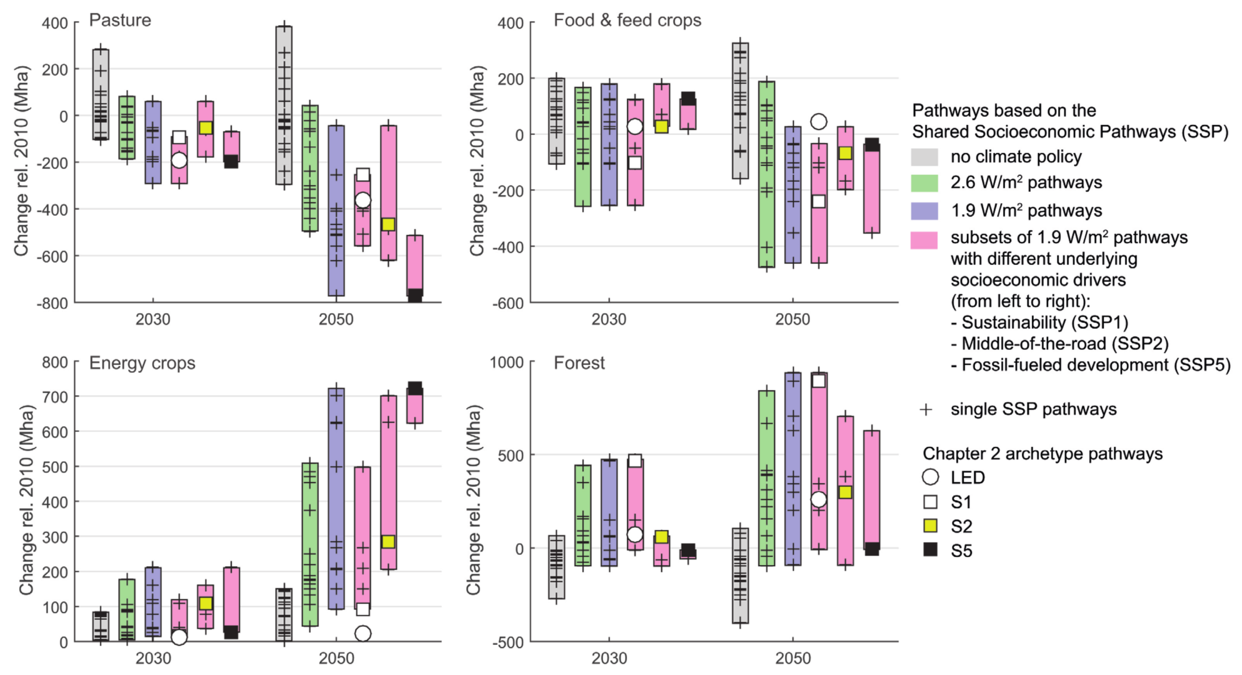
Source: IPCC (2018) SR15 Chapter 2, Figure 2.24, pg. 145

Land-use changes in 2050 and 2100 in the illustrative 1.5°C-consistent pathway archetypes

A comprehensive diverging stacked bar chart from the IPCC SR15 report, detailing projected land-use changes in 2050 and 2100 across four illustrative 1.5 degrees Celsius-consistent pathway archetypes.  The vertical axis measures Land use change with respect to 2010 in million hectares, abbreviated as Mha, scaling from negative 2000 to positive 2000 with a dashed horizontal zero baseline. The horizontal axis groups the projections into four distinct pathway archetypes: S1, S2, S5, and LED. Within each archetype, two vertical stacked bars represent the years 2050 and 2100.  A legend at the top right defines five land-use categories by colour: pink for Food Crops, orange for Energy Crops, light blue for Forest, dark blue for Other Natural Land, and light green for Pasture. Changes resulting in an increase in land area are stacked above the zero baseline, while reductions in land area are stacked below the zero baseline.  Visually, the chart illustrates distinct land management strategies for each archetype by 2100: The S1 pathway shows massive afforestation, with the light blue Forest segment dominating the growth above zero, offset by huge reductions below zero in Pasture, Other Natural Land, and Food Crops. The S2 pathway displays a balanced but large expansion of both Forest and Energy Crops above zero, driven by substantial reductions in Pasture and Food Crops below zero. The S5 pathway illustrates a heavy reliance on bioenergy, with the orange Energy Crops segment dominating the above-zero growth alongside a small increase in Other Natural Land, while Pasture sees a massive reduction below zero. The LED pathway projects the lowest overall magnitude of land displacement among the four scenarios, showing moderate increases in Forest and Energy Crops above zero, balanced by moderate reductions in Pasture and Food Crops below zero.
Figure 2.11:  Land-use changes in 2050 and 2100 in the illustrative 1.5°C-consistent pathway archetypes (Fricko et al., 2017; Fujimori, 2017; Kriegler et al., 2017; Grubler et al., 2018; Rogelj et al., 2018). Changes in land for food crops, energy crops, forest, pasture and other natural land are shown, compared to 2010.

Source: IPCC (2018) SR15 Chapter 2, Figure 2.11, pg.126


Sources for this post:


Featured image: from a presentation by Arnulf Grubler on a Low Energy Demand scenario
The link for the presentation is no longer active, but in 2019 it was downloaded from: “http://www.iiasa.ac.at/web/home/research/researchPrograms/TransitionstoNewTechnologies/LED_Greenpeace_Gruebler.pdf”