A growing imbalance: carbon, ocean heat, and rising seas

A photograph of Earth viewed from space, showing the bright blue curve of the atmosphere against the black void. Swirling white clouds cover much of the planet below, while golden sunlight reflects off the ocean surface, casting long dark shadows from towering cloud formations. Source: ISS/NASA (downloaded 24 Aug. 2018) from https://www.theguardian.com/environment/2017/aug/18/climate-scientist-clouds-climate-change-interview-kate-marvel

Key ideas

Our collective greenhouse gas (GHG) emissions are disrupting the Earth’s energy balance. This enhanced greenhouse effect is driving up global mean temperatures and pushing us out of the Holocene sweet spot, the stable climate window where civilisation developed.

Due to the huge thermal inertia of the Earth’s oceans, a worrying amount of long-term sea-level rise is currently being baked in by the carbon that we emit before we reach net zero CO2 emissions.

Science shows that periods of higher global mean temperatures in ancient times corresponded to much higher global mean sea levels. Those past records align with current climate models that project thousands of years of future sea-level rise driven by our cumulative CO2 emissions.

Given the Earth’s natural resilience, deep decarbonisation and responsible policy over the next century could stabilise and reduce the global mean surface temperature, while the oceans and the rest of the climate system rebalance over centuries and millennia. But if we push the Earth’s systems beyond their tipping points by disrupting the carbon cycle via GHG emissions and place our faith in theoretical interventions like massive carbon dioxide removal (CDR) and solar radiation modification (SRM), the immense thermal inertia of the oceans and ice sheets will take over. We’d lose the ability to dial the temperature back down and expect the Earth to return to a naturally self-sustaining balance where life can thrive and the climate doesn’t require continuous, planetary-scale engineering.


Excess greenhouse gas (GHG) emissions are pushing us out of the Holocene sweet spot


“The Holocene has seen the growth and impacts of the human species worldwide, including all of its written history, development of major civilizations, and overall significant transition toward urban living in the present.”

Source: Wikipedia, ‘Holocene’, accessed 12 May 2019


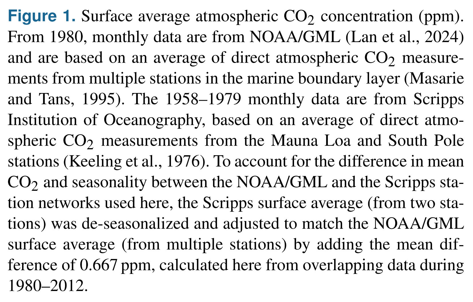
Atmospheric CO2 concentration
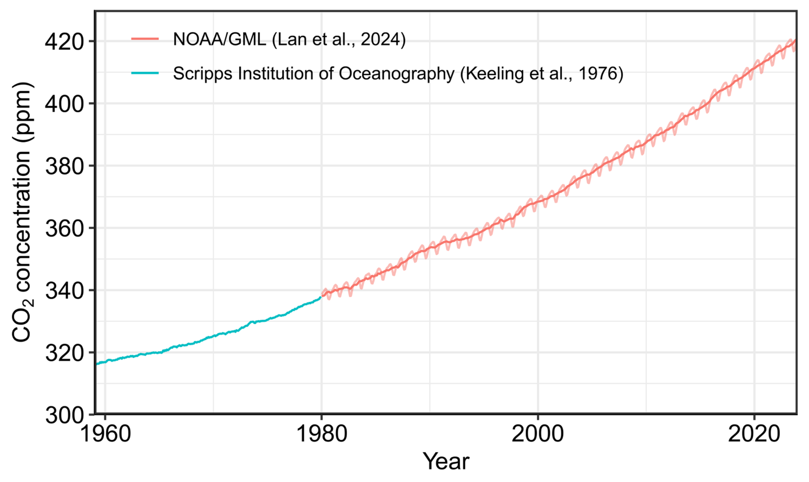
A line graph tracking atmospheric CO2 concentration in parts per million from 1960 to recent years. The vertical y-axis ranges from 300 to over 420 ppm, and the horizontal x-axis represents the Year. A solid teal line represents Scripps Institution of Oceanography data prior to 1980, starting at approximately 316 ppm. From 1980 onward, a red line with a distinct seasonal sawtooth pattern represents NOAA/GML data. Both datasets combine to show a steady, continuous upward trend, with CO2 concentrations climbing above 420 ppm by the end of the chart.
Figure 1. Surface average atmospheric CO2 concentration (ppm). From 1980, monthly data are from NOAA/GML (Lan et al., 2024) and are based on an average of direct atmospheric CO2 measurements from multiple stations in the marine boundary layer (Masarie and Tans, 1995). The 1958–1979 monthly data are from Scripps Institution of Oceanography, based on an average of direct atmospheric CO2 measurements from the Mauna Loa and South Pole stations (Keeling et al., 1976). To account for the difference in mean CO2 and seasonality between the NOAA/GML and the Scripps station networks used here, the Scripps surface average (from two stations) was de-seasonalized and adjusted to match the NOAA/GML surface average (from multiple stations) by adding the mean difference of 0.667 ppm, calculated here from overlapping data during 1980–2012.
Source: Friedlingstein et al (2025) Global Carbon Budget 2024, Figure 1

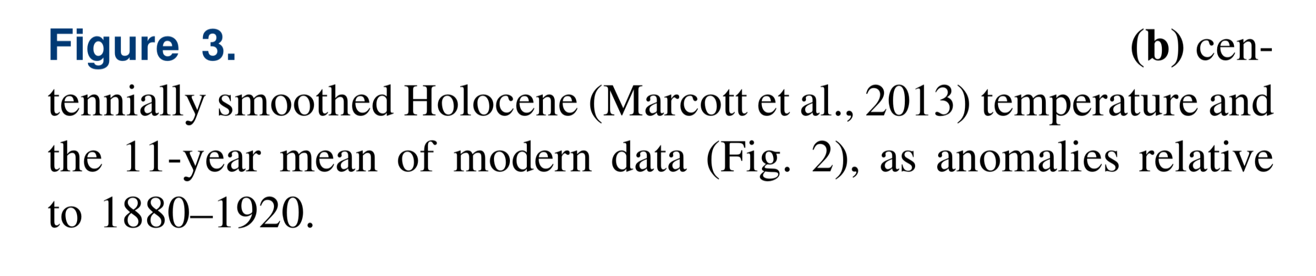
Holocene up to the present day: ‘temperature anomaly’
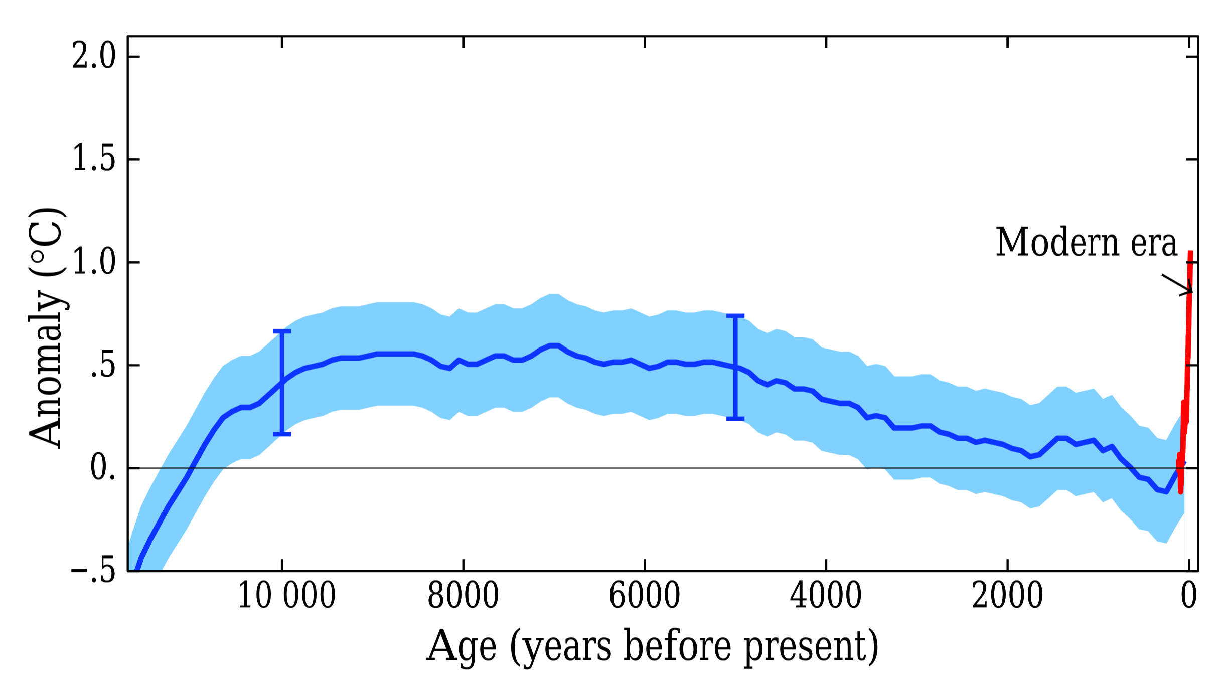
A line graph showing temperature anomalies in degrees Celsius over the Holocene epoch up to the present day. The vertical y-axis represents the temperature anomaly, ranging from -0.5 to 2.0 degrees Celsius. The horizontal x-axis represents Age in years before present, starting from over 10000 on the left and decreasing to 0 on the right. A blue line, enveloped by a light blue shaded uncertainty band, shows historical temperatures rising to a gentle plateau around 0.5 degrees Celsius between 8000 and 5000 years ago, before gradually declining back to near zero. On the far right edge of the graph at year 0, an arrow points to a sharp, nearly vertical red line labelled Modern era. This red line spikes dramatically upward past 1.0 degrees Celsius, starkly contrasting with the slow, gradual temperature shifts of the previous 10000 years.
Figure 3b: centennially smoothed Holocene (Marcott et al., 2013) temperature and the 11-year mean of modern data (Fig. 2), as anomalies relative to 1980-1920.
Source: Hansen et al (2017) Young people’s burden: requirement of negative CO2 emissions, Figure 3b

Global surface temperature relative to 1880-1920
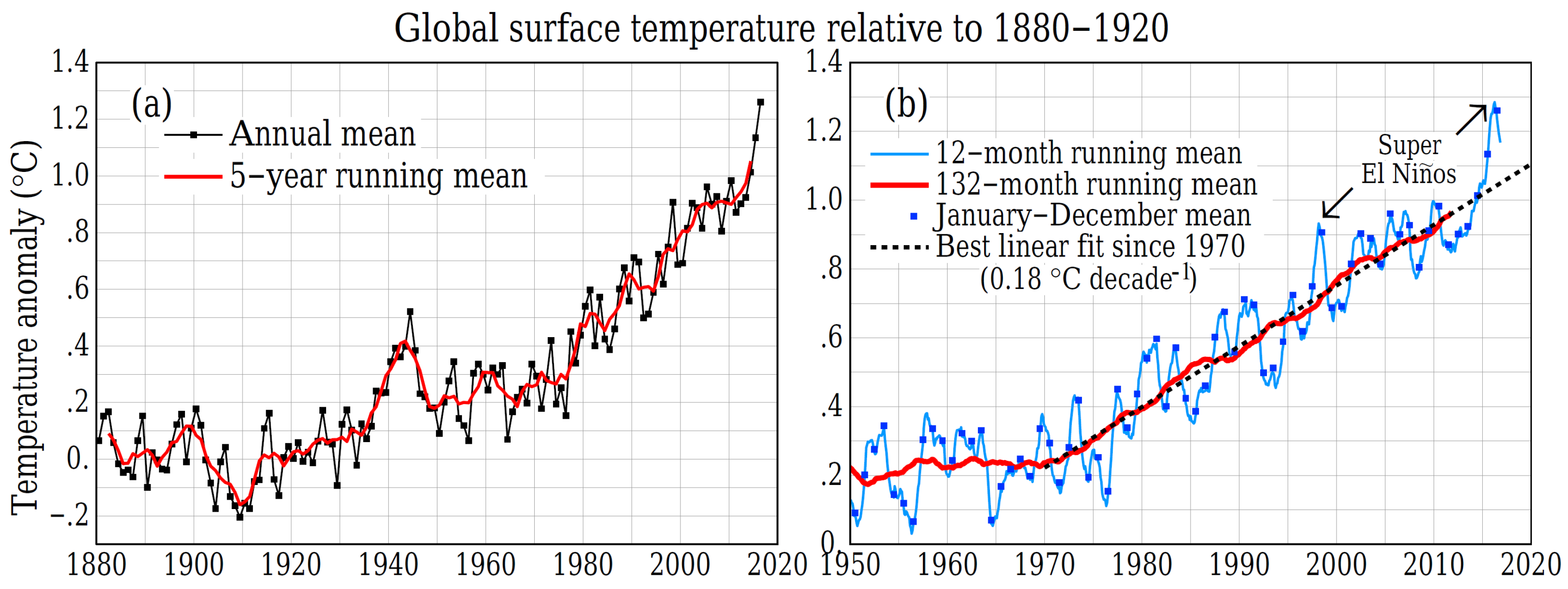
A two-panel line graph tracking global surface temperature anomalies in degrees Celsius relative to the 1880-1920 base period. Panel A on the left charts the annual mean and 5-year running mean from 1880 to approximately 2017. The data shows temperatures fluctuating near zero for the first half of the century, followed by a steep and continuous upward climb starting around 1970, eventually spiking well above 1.0 degrees Celsius. Panel B on the right zooms in on the timeframe from 1950 onward, detailing 12-month and 132-month running means to highlight shorter-term variability alongside the long-term trend. A dotted line maps the best linear fit since 1970, showing a steady warming rate of 0.18 degrees Celsius per decade. Two distinct, sharp temperature spikes occurring around 1998 and 2016 are highlighted with arrows and labelled as Super El Ninos.
Figure 2: Global surface temperature relative to 1880–1920 based on GISTEMP data (Appendix A3). (a) Annual and 5-year means since 1880, (b) 12- and 132-month running means since 1970. Blue squares in (b) are calendar year (January–December) means used to construct (a). Panel (b) uses data through April 2017.
Source: Hansen et al (2017) Young people’s burden: requirement of negative CO2 emissions, Figure 2

Global CO2 levels

https://www.climatelevels.org/

Global CH4 levels

https://www.climatelevels.org/

Global N2O levels

https://www.climatelevels.org/

Global temperature anomaly relative to the years 1951-1980

https://www.climatelevels.org/

Global mean sea level

https://www.climatelevels.org/

Possible future pathways of the climate against the background of the typical glacial–interglacial cycles
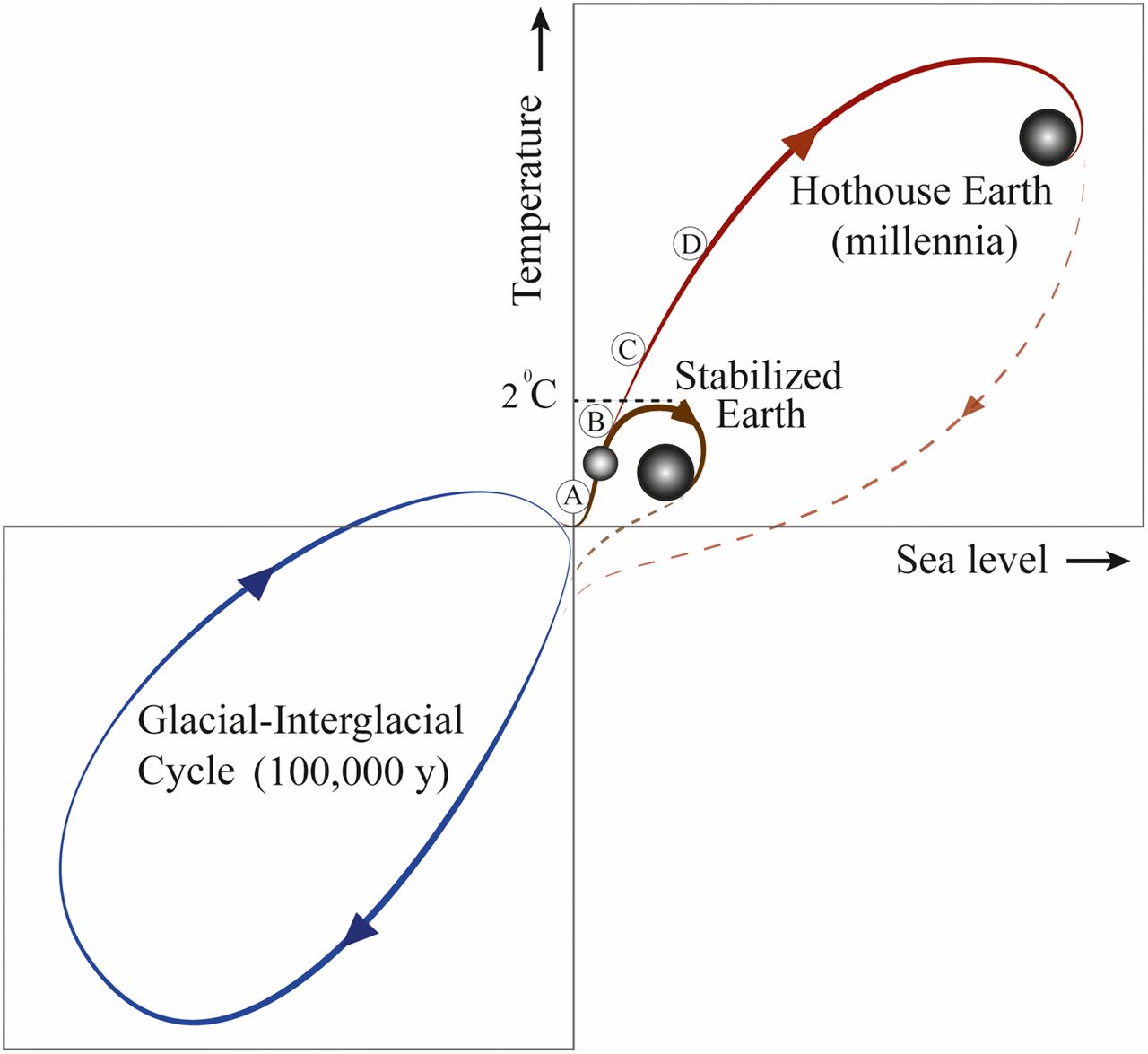
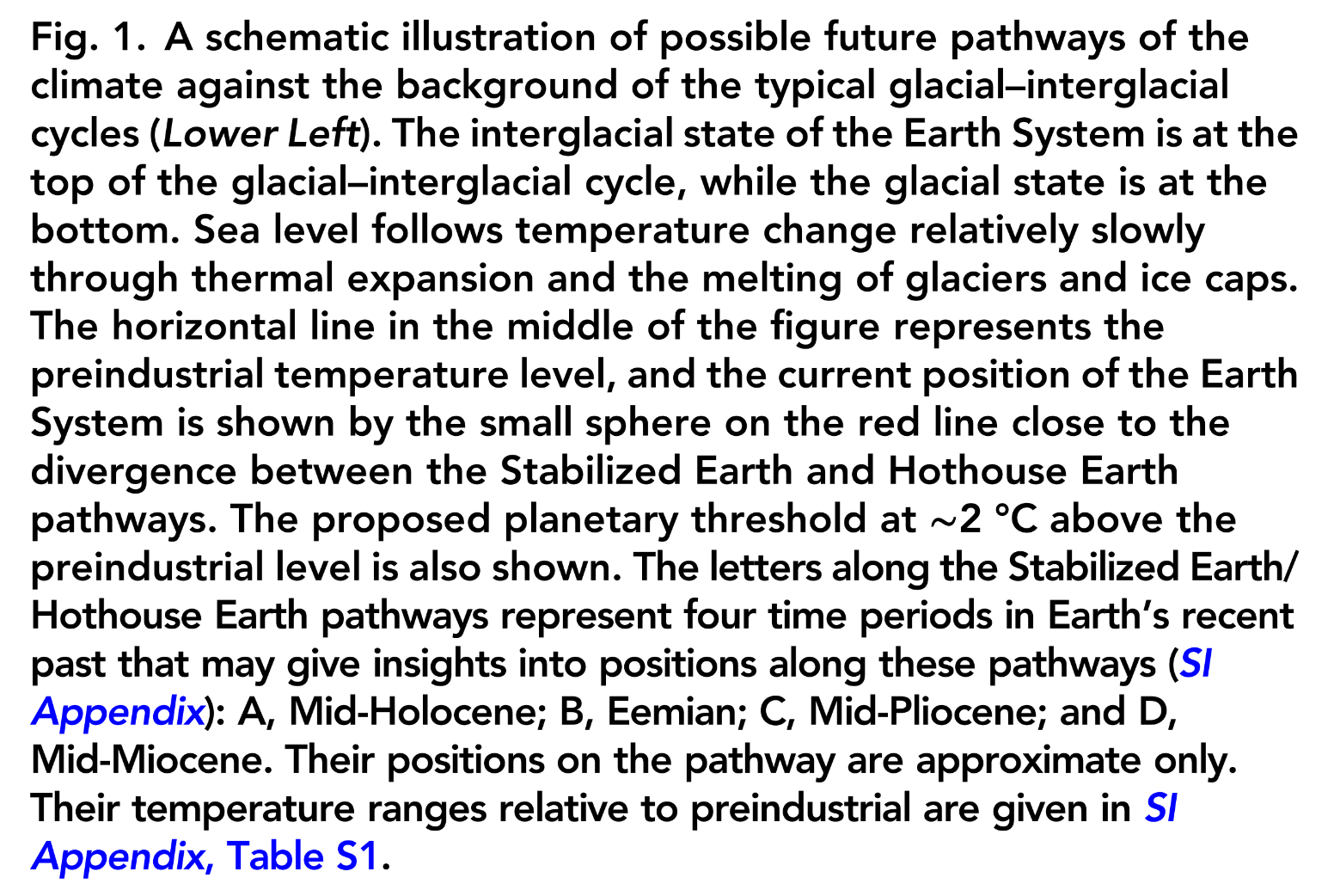
A schematic graph illustrating Earths climate trajectory with Temperature on the vertical axis and Sea level on the horizontal axis. The central intersection of the axes represents preindustrial baseline levels. In the bottom-left quadrant, a blue oval loop depicts the natural 100,000-year Glacial-Interglacial Cycle, characterised by lower temperatures and lower sea levels. Moving into the top-right quadrant, a rising line shows the recent warming trend, with a small sphere marking Earths current position. Just above this sphere, a dotted horizontal line marks a 2 degrees Celsius planetary threshold. At this threshold, the trajectory splits into two potential futures. One path, labelled Stabilised Earth, curls back on itself to settle in a stable state just below the 2-degree mark. The second path, labelled Hothouse Earth, arcs dramatically higher and further to the right, representing extreme long-term increases in both temperature and sea level over millennia. Small markers labelled A, B, C, and D are plotted along the warming trajectories to represent comparative geological periods.
Fig. 1: A schematic illustration of possible future pathways of the climate against the background of the typical glacial–interglacial cycles (Lower Left). The interglacial state of the Earth System is at the top of the glacial–interglacial cycle, while the glacial state is at the bottom. Sea level follows temperature change relatively slowly through thermal expansion and the melting of glaciers and ice caps. The horizontal line in the middle of the figure represents the preindustrial temperature level, and the current position of the Earth System is shown by the small sphere on the red line close to the divergence between the Stabilised Earth and Hothouse Earth pathways. The proposed planetary threshold at approximately 2 degrees Celsius above the preindustrial level is also shown. The letters along the Stabilised Earth/ Hothouse Earth pathways represent four time periods in Earths recent past that may give insights into positions along these pathways (SI Appendix): A, Mid-Holocene; B, Eemian; C, Mid-Pliocene; and D, Mid-Miocene. Their positions on the pathway are approximate only. Their temperature ranges relative to preindustrial are given in SI Appendix, Table S1.
Source: Steffen et al (2018) Trajectories of the Earth System in the Anthropocene, Figure 1

Stability landscape showing the pathway of the Earth System out of the Holocene
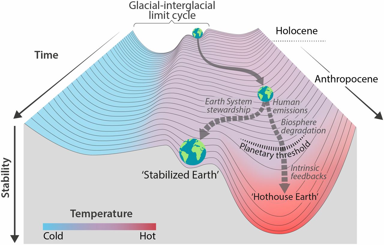
A 3D topographical diagram illustrating the stability landscape of the Earth System over time. The vertical axis represents Stability, with a downward-pointing arrow indicating that deeper valleys represent more stable states. The landscape surface features a temperature colour gradient ranging from cold blue on the left to hot red on the right. At the top of the slope, representing the Holocene epoch, a small Earth globe sits in a shallow depression labelled 'Glacial-interglacial limit cycle'. A solid grey arrow shows Earth rolling out of this cycle and forward in time into the Anthropocene, where it reaches a fork in the landscape. From Earths current position at this fork, two dotted pathways diverge. The left path, guided by 'Earth System stewardship', leads into a moderately stable, cooler basin labelled 'Stabilised Earth'. The right path, driven by 'Human emissions' and 'Biosphere degradation', slopes downward toward a dotted line labelled 'Planetary threshold'. Beyond this threshold, 'Intrinsic feedbacks' pull the Earth down into a remarkably deep, steep, and bright red valley labelled 'Hothouse Earth'.
Fig. 2: Stability landscape showing the pathway of the Earth System out of the Holocene and thus, out of the glacial–interglacial limit cycle to its present position in the hotter Anthropocene. The fork in the road in Fig. 1 is shown here as the two divergent pathways of the Earth System in the future (broken arrows). Currently, the Earth System is on a Hothouse Earth pathway driven by human emissions of greenhouse gases and biosphere degradation toward a planetary threshold at approximately 2 degrees Celsius (horizontal broken line at 2 degrees Celsius in Fig. 1), beyond which the system follows an essentially irreversible pathway driven by intrinsic biogeophysical feedbacks. The other pathway leads to Stabilised Earth, a pathway of Earth System stewardship guided by human-created feedbacks to a quasistable, human-maintained basin of attraction. Stability (vertical axis) is defined here as the inverse of the potential energy of the system. Systems in a highly stable state (deep valley) have low potential energy, and considerable energy is required to move them out of this stable state. Systems in an unstable state (top of a hill) have high potential energy, and they require only a little additional energy to push them off the hill and down toward a valley of lower potential energy.
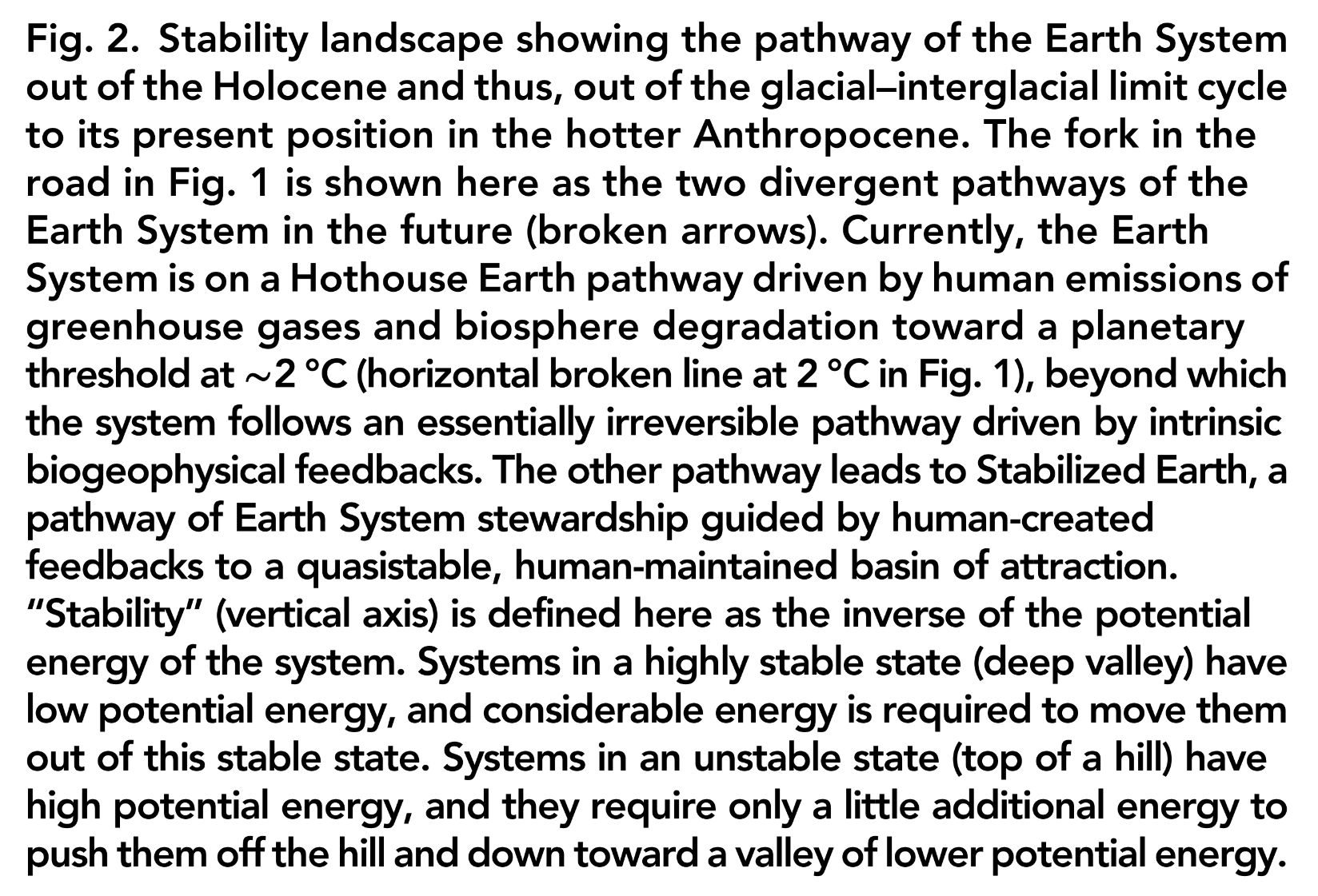
Source: Steffen et al (2018) Trajectories of the Earth System in the Anthropocene, Figure 2

We can decarbonise and we can protect the biosphere—to move back to the ‘stabilised Earth’ sweet spot.


Information from multiple ice cores depicts a strong increase of CO2, CH4, and N2O since the 19th century
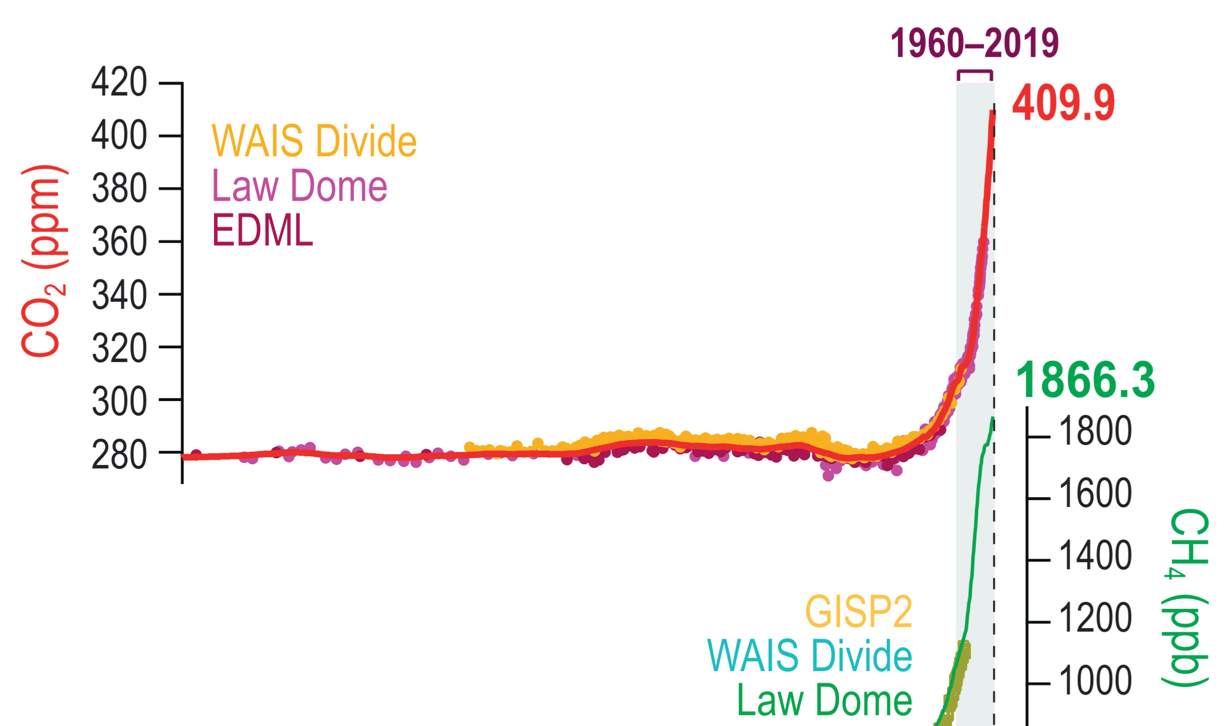
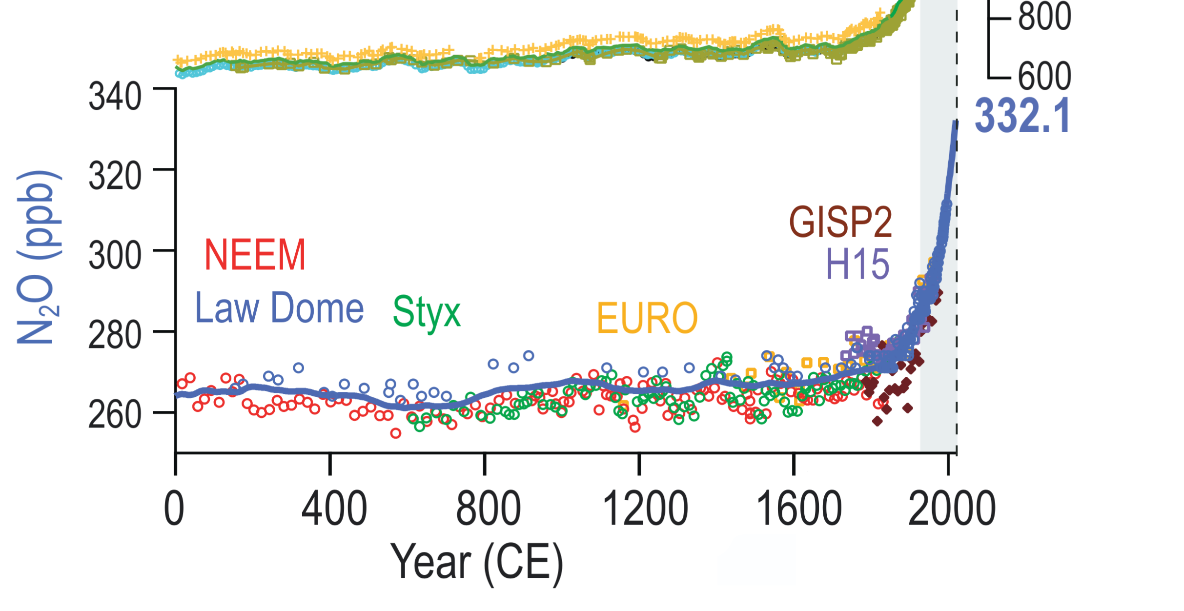
A three-panel line graph tracking the concentrations of three major greenhouse gases over the Common Era, from the year 0 to the present day. The horizontal x-axis represents the Year CE. Top Panel (CO2): Shows carbon dioxide levels in parts per million. The concentration remains stable around 280 ppm for nearly two millennia before spiking drastically starting in the 19th century, culminating at 409.9 ppm. Middle Panel (CH4): Tracks methane levels in parts per billion. It maintains a steady baseline near 600 to 700 ppb for most of the graph, followed by a sharp, nearly vertical climb to 1866.3 ppb in modern times. Bottom Panel (N2O): Displays nitrous oxide in parts per billion. The levels hover gently around 260 to 270 ppb before surging abruptly up to 332.1 ppb. A shaded vertical grey band on the far right highlights the period from 1960 to 2019, emphasising the simultaneous and extreme modern increases across all three gases. Text labels and differently coloured data points throughout the charts identify the specific ice core records used, such as Law Dome, WAIS Divide, GISP2, and others.

Figure TS.9b:  Changes in all three WMGHGs from ice core records over the Common Era.
Source: IPCC (2021) AR6 WGI, Technical Summary, Figure TS.9b, pg. 68 (modified to remove part d)

Atmospheric well-mixed greenhouse gas (WMGHG) concentrations from ice cores
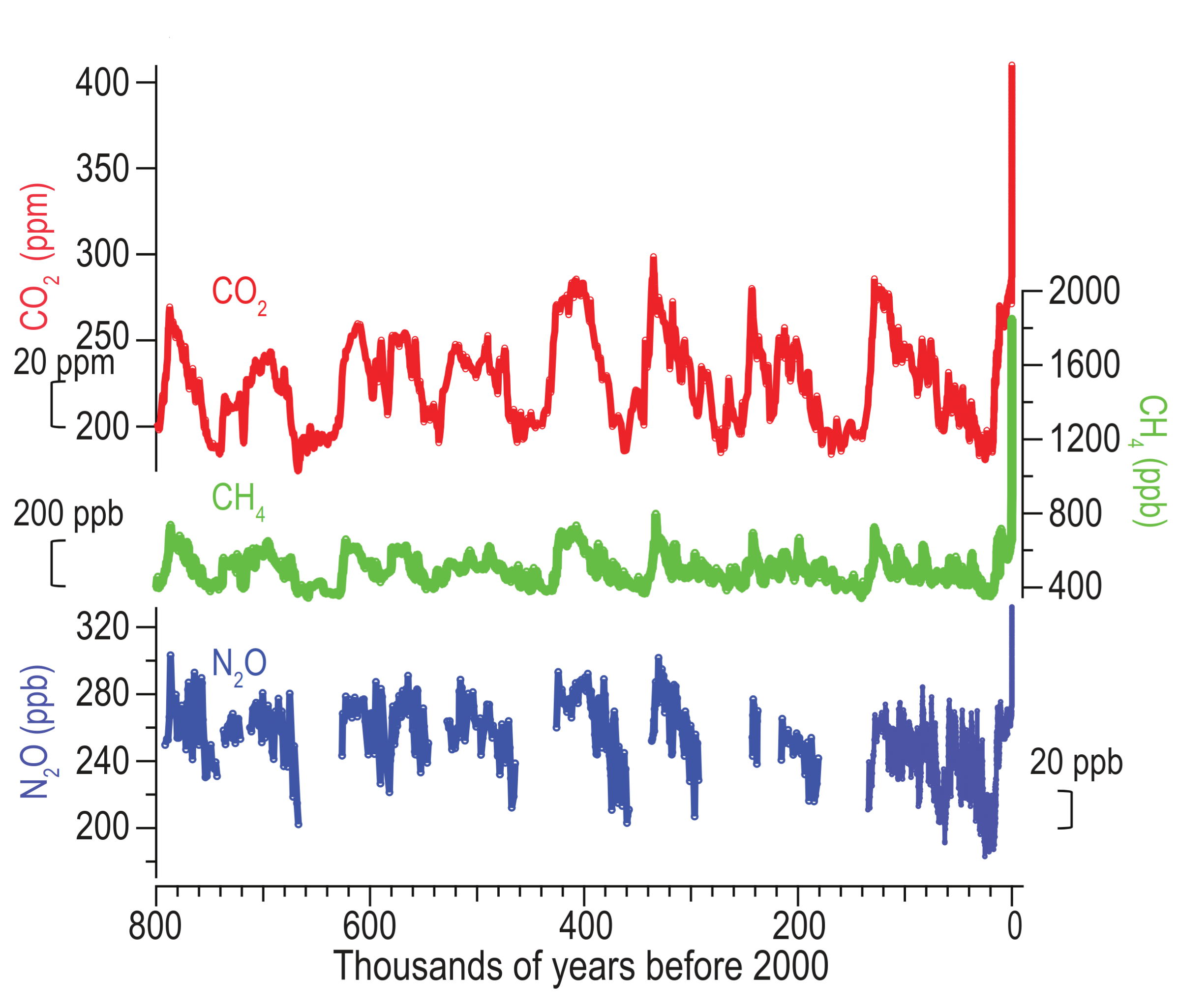
A three-panel line graph displaying ice core records of atmospheric greenhouse gas concentrations over the last 800 thousand years. The horizontal x-axis represents thousands of years before 2000, counting down from 800 on the left to zero on the far right. Top Panel (CO2): Tracks carbon dioxide in parts per million in red, showing cyclical oscillations between roughly 180 and 300 ppm over millennia, before sharply spiking off the scale to over 400 ppm at the modern zero-year mark. Middle Panel (CH4): Tracks methane in parts per billion in green, showing regular historical cycles between approximately 400 and 700 ppb, followed by a dramatic modern surge past 1800 ppb. Bottom Panel (N2O): Displays nitrous oxide in parts per billion in blue, illustrating historical fluctuations generally ranging between 200 and 300 ppb, culminating in a steep upward spike at the present day.
Figure 2.4a:  Records during the last 800 kyr
Source: IPCC (2021) AR6 WGI, Chapter 2, Figure 2.4a, pg. 301 (modified to remove the inset and remove part b)

Ice core data and modelling: CO2 & CH4, sea level, climate forcing, and global mean surface temperature anomaly (over the last 800,000 years)
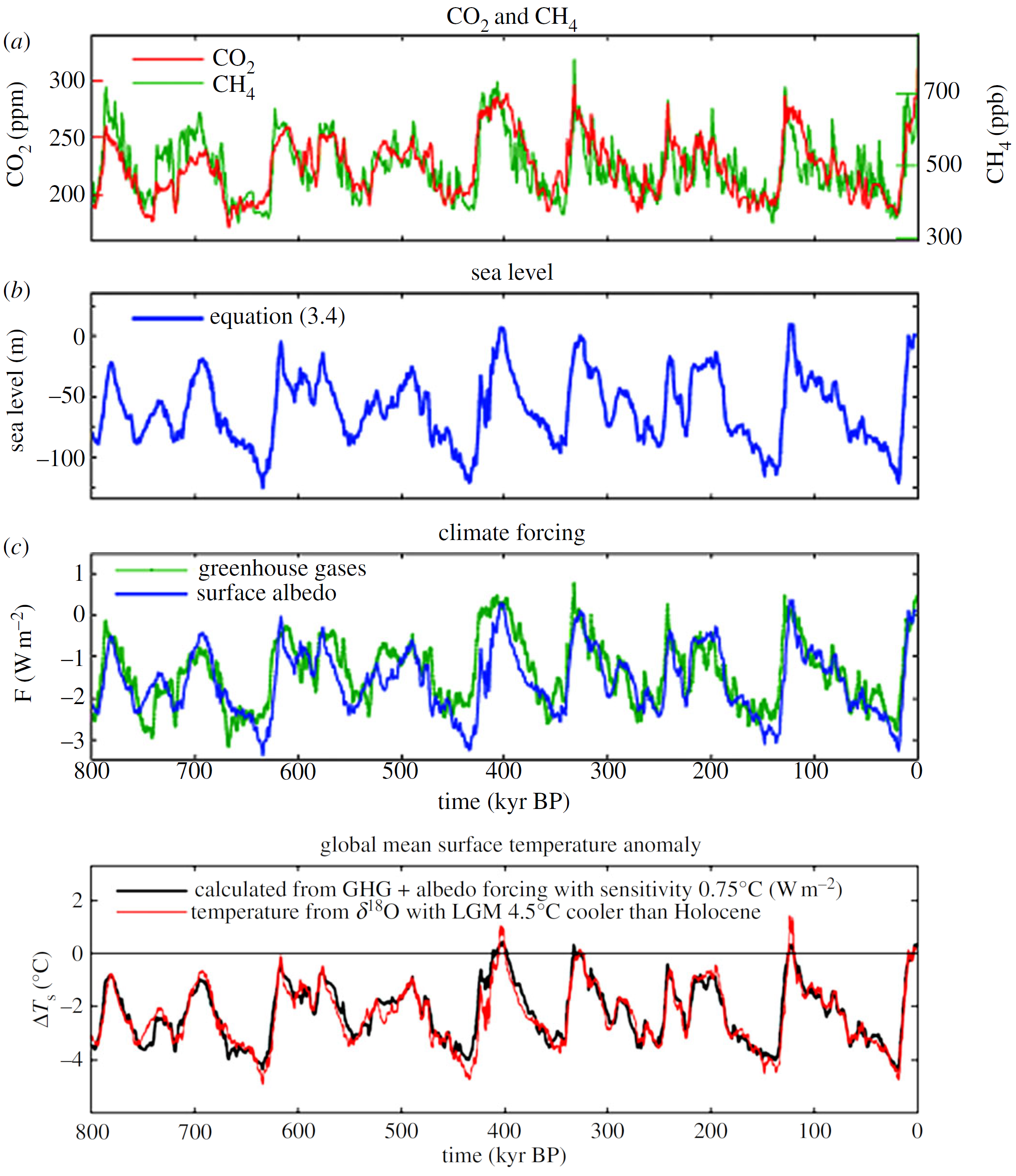

A vertically stacked, four-panel line graph displaying ice core data and modelled climate metrics over the last 800 thousand years. The horizontal axis for all four panels represents time in thousands of years before present, starting at 800 on the left and ending at zero on the right. Panel A shows carbon dioxide in parts per million as a red line and methane in parts per billion as a green line, both exhibiting synchronised, natural cyclical fluctuations. Panel B shows sea level in metres as a blue line, continuously cycling between roughly zero and negative 120 metres in time with the greenhouse gas concentrations. Panel C displays climate forcing in watts per square metre, with a green line representing greenhouse gases and a blue line representing surface albedo. Finally, Panel D tracks the global mean surface temperature anomaly in degrees Celsius, comparing a black line calculated from forcing data against a red line derived from oxygen isotope records. Across all four panels, the data illustrates highly correlated, regular glacial and interglacial cycles occurring approximately every 100 thousand years.

Figure 5. (a) CO2 and CH4 from ice cores; (b) sea level from equation (3.4) and (c) resulting climate forcings (see text). Figure 6. Calculated surface temperature for forcings of figure 5c with a climate sensitivity of 0.75 degrees Celsius per W m-2 , compared with 2 times delta Tdo . Zero point is the Holocene (10 kyr) mean.
Source: Hansen et al (2013) Climate sensitivity, sea level, and atmospheric carbon dioxide, Figures 5 & 6

The last time CO2 levels were as high as present was at least 2 million years ago
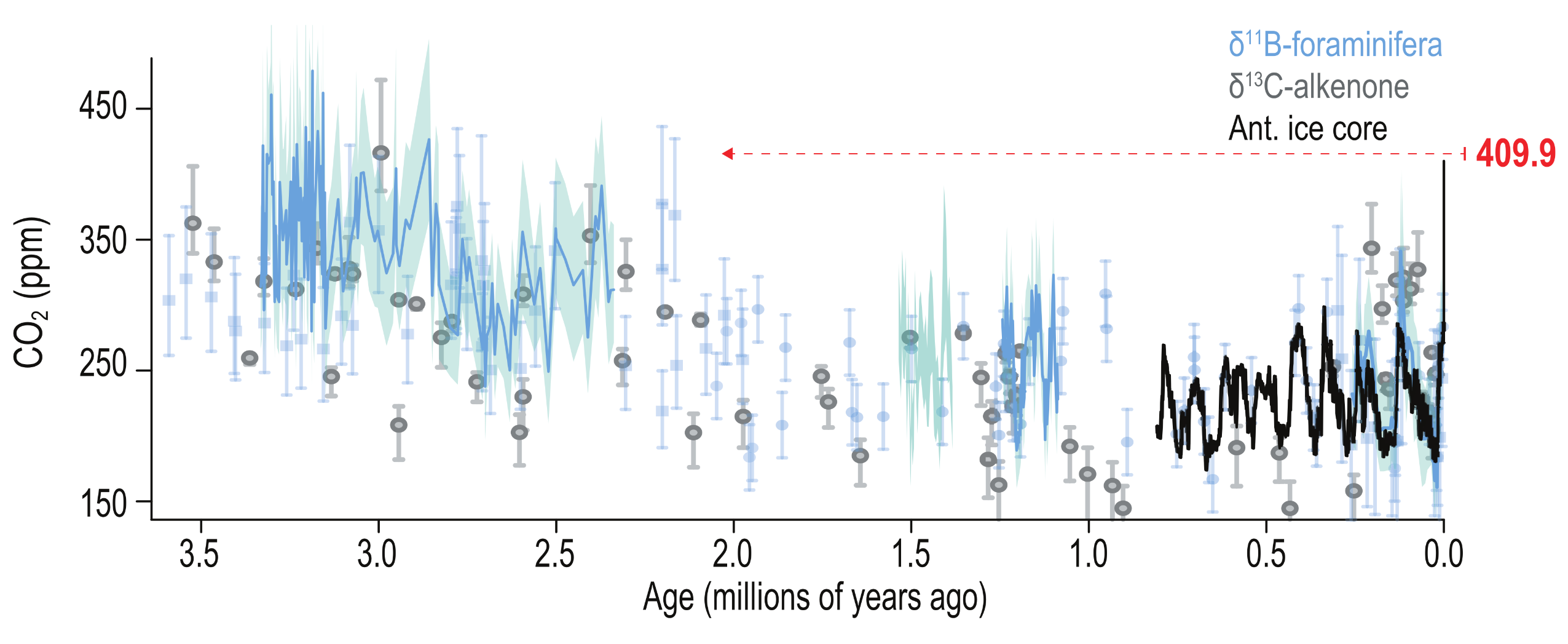
A scatter plot and line graph showing changes in carbon dioxide concentrations over the past 3.5 million years. The vertical axis measures CO2 in parts per million from 150 to over 450. The horizontal axis represents Age in millions of years ago, starting at 3.5 on the left and ending at 0.0 on the right. The chart compiles data from three proxy records: foraminifera in light blue, alkenone in grey, and a solid black line representing Antarctic ice core data covering the most recent 800 thousand years. The historical data shows CO2 levels fluctuating mostly between 150 and 300 parts per million for the last 2 million years, with higher, more variable levels prior to that. At the far right margin, a modern CO2 reading of 409.9 parts per million is marked in red. A red dashed arrow traces this modern value horizontally backwards across the graph, demonstrating that one must look back at least 2 million years to find historical CO2 levels that match or exceed present-day concentrations.
Figure TS.9a: Changes in carbon dioxide (CO2) from proxy records over the past 3.5 million years.
Source: IPCC (2021) AR6 WGI, Technical Summary, Figure TS.9a, pg. 68

Atmospheric CO2 concentration and global surface temperature change during the last 60 million years and projections for the next 300 years
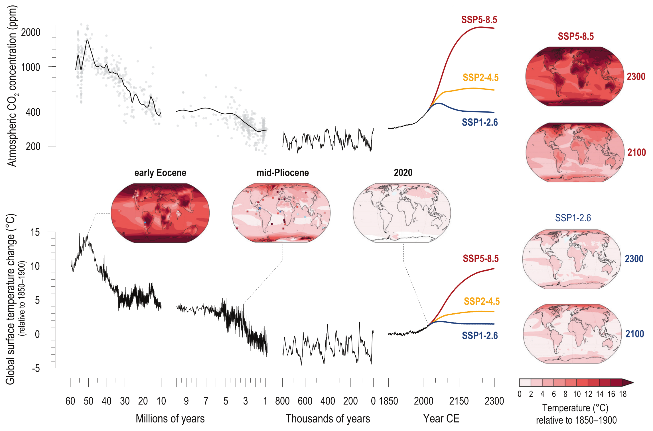
A complex, multi-part graphic displaying changes in atmospheric CO2 and global surface temperature from 60 million years ago through to projections for the year 2300. The graphic is split horizontally. The top panel tracks CO2 concentrations in parts per million, and the bottom panel tracks global surface temperature change in degrees Celsius. Both panels share a horizontal time axis divided into three segments: Millions of years, Thousands of years, and Year CE. Historically, both CO2 and temperature show a tightly linked pattern, starting very high 60 million years ago, gradually declining, and then oscillating in natural cycles over the last 800 thousand years. From the year 1850 onward, both metrics spike sharply. Three future scenarios, SSP1-2.6 in blue, SSP2-4.5 in yellow, and SSP5-8.5 in red, show potential pathways to 2300. The worst-case scenario, SSP5-8.5, shows CO2 soaring to roughly 2000 parts per million and temperatures rising by nearly 10 degrees Celsius, mirroring the extreme highs of the deep past. Additionally, inset global maps visualise temperature distribution across the Earth. Maps for past periods, such as the early Eocene, show deep red to indicate extreme global warming. Maps on the right contrast the future scenarios, showing the SSP5-8.5 pathway turning the entire globe dark red by 2300, while the SSP1-2.6 pathway remains a much lighter, stabilised pink.
Figure TS.1 Changes in atmospheric CO2 and global surface temperature (relative to 1850–1900) from the deep past to the next 300 years. The intent of this figure is to show that CO2 and temperature covary, both in the past and into the future, and that projected CO2 and temperatures are similar to those only from many millions of years ago. CO2 concentrations from millions of years ago are reconstructed from multiple proxy records (grey dots are data from Section 2.2.3.1, Figure 2.3 shown with cubic- spline fit). CO2 levels for the last 800,000 years through the mid-20th century are from air trapped in polar ice; recent values are from direct air measurements. Global surface temperature prior to 1850 is estimated from marine oxygen isotopes, one of multiple sources of evidence used to assess paleo temperatures in this Report. Temperature of the past 170 years is the AR6 assessed mean. CO2 levels and global surface temperature change for the future are shown for three Shared Socio-economic Pathway (SSP) scenarios through 2300 CE, using Earth system model emulators calibrated to the assessed global surface temperatures. Their smooth trajectories do not account for inter-annual to inter-decadal variability, including transient response to potential volcanic eruptions. Global maps for two paleo reference periods are based on Coupled Model Intercomparison Project Phase 6 (CMIP6) and pre-CMIP6 multi-model means, with site-level proxy data for comparison (squares and circles are marine and terrestrial, respectively). The map for 2020 is an estimate of the total observed warming since 1850–1900. Global maps at right show two SSP scenarios at 2100 (2081 2100) and at 2300 (2281–2300; map from CMIP6 models; temperature assessed in 4.7.1). A brief account of the major climate forcings associated with past global temperature changes is in Cross-Chapter Box 2.1.
Source: IPCC (2021) AR6 WGI TS, Figure TS.1

Earth’s energy imbalance (EEI) is driven by the global carbon imbalance


A simplified diagram illustrating the greenhouse effect (IPCC, 1990)
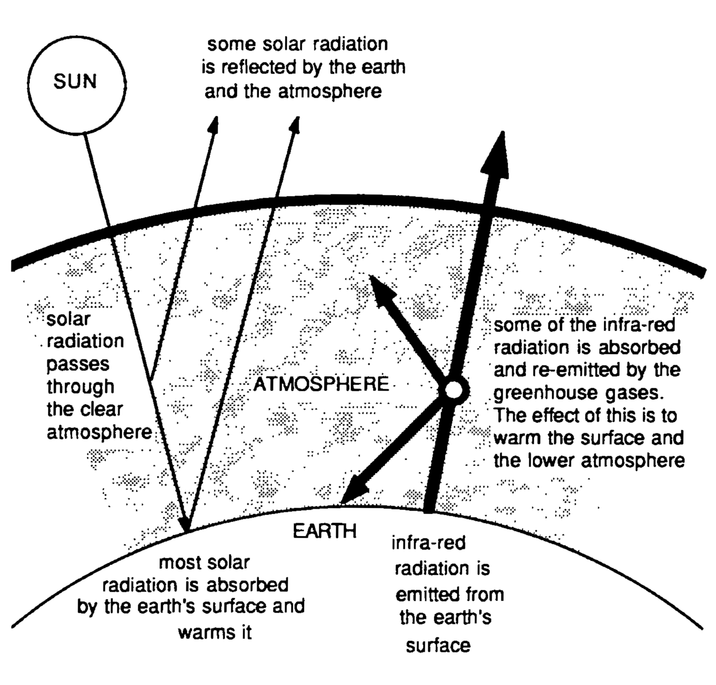
A black-and-white diagram illustrating the greenhouse effect. A circle in the top left labelled SUN emits solar radiation downwards. Arrows demonstrate that while some solar radiation is reflected back into space by the Earth and the atmosphere, most of it passes through the clear atmosphere and is absorbed by the surface of the Earth, warming it. On the right side, a thick arrow pointing upwards indicates that infra-red radiation is emitted from the surface of the Earth. As this infra-red radiation travels upwards through a stippled band representing the ATMOSPHERE, a central node splits the arrow into multiple directions, including back down towards the ground. An accompanying label explains that some of the infra-red radiation is absorbed and re-emitted by the greenhouse gases, and the effect of this is to warm the surface and the lower atmosphere.
Source: IPCC (1990) AR1 WGI, Figure 3, pg. 66
IPCC First Assessment Report (1990) Policymaker Summary of Working Group I

“Our planet receives vast amounts of energy every day in the form of sunlight. Around a third of the sunlight is reflected back to space by clouds, by tiny particles called aerosols, and by bright surfaces such as snow and ice. The rest is absorbed by the ocean, land, ice and atmosphere. The planet then emits energy back out to space in the form of thermal radiation. In a world that was not warming or cooling, these energy flows would balance. Human activity has caused an imbalance in these energy flows.”

Source: IPCC (2021) AR6 WGI Chapter 7, FAQ 7.1, pg. 1020


“Altogether, the global energy flow imbalance since the 1970s has been just over half a watt per square metre of the Earth’s surface. This sounds small, but because the imbalance is persistent and because Earth’s surface is large, this adds up to about 25 times the total amount of primary energy consumed by human society, compared over 1971 to 2018.”

Source: IPCC (2021) AR6 WGI Chapter 7, FAQ 7.1, pg. 1020


Since at least 1970, there has been a persistent imbalance in the energy flows that has led to excess energy being absorbed by different components of the climate system
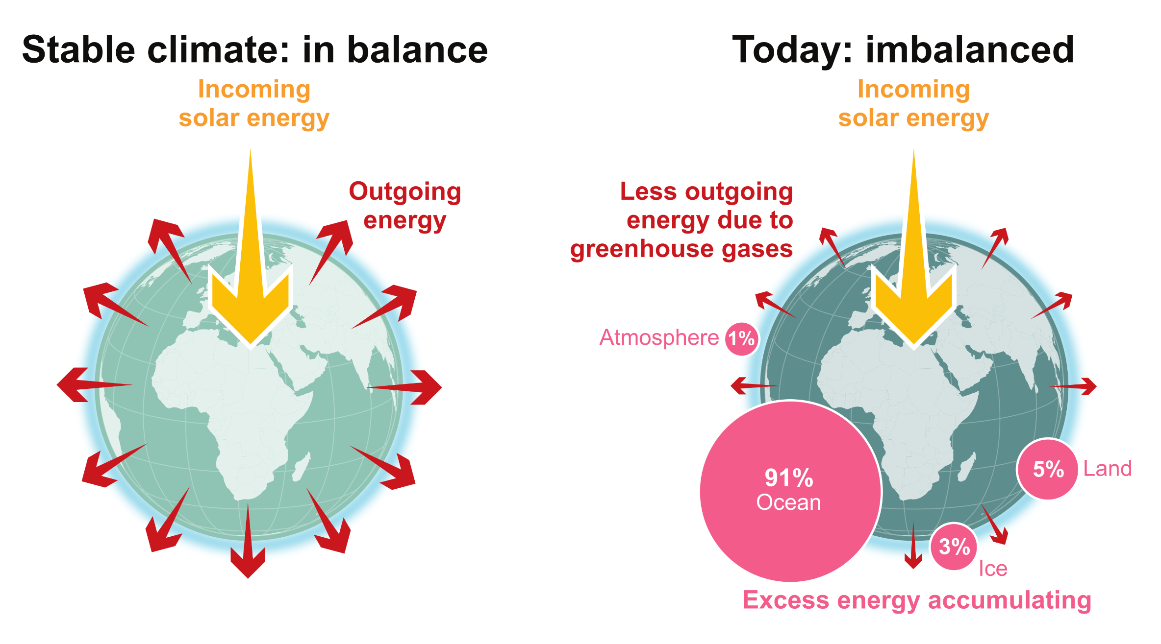

A side-by-side comparison of two globes illustrating the energy budget of the Earth. The left globe, labelled Stable climate in balance, shows a large yellow arrow of incoming solar energy matched by many red arrows of outgoing energy radiating evenly into space. The right globe, labelled Today imbalanced, shows the same incoming solar energy but fewer and smaller red arrows, indicating less outgoing energy due to greenhouse gases. Next to the imbalanced globe, four pink circles of varying sizes illustrate where the excess energy is accumulating, showing 91 percent is absorbed by the Ocean, 5 percent by Land, 3 percent by Ice, and 1 percent by the Atmosphere.
FAQ 7.1, Figure 1: The Earths energy budget compares the flows of incoming and outgoing energy that are relevant for the climate system. Since at least the 1970s, less energy is flowing out than is flowing in, which leads to excess energy being absorbed by the ocean, land, ice and atmosphere, with the ocean absorbing 91 percent.
Source: IPCC (2021) AR6 WGI Chapter 7, FAQ 7.1, Figure 1

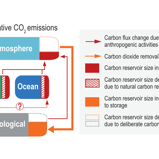
The human-caused global carbon imbalance and Earth’s energy imbalance (EEI) are inextricably linked. By pumping millions of years’ worth of fossil carbon into the atmosphere in just over a century we’ve created a global carbon imbalance. The resulting excess GHG’s in the atmosphere trap outgoing heat causing the energy imbalance (via the enhanced greenhouse effect). The excess energy has to go somewhere and more than 90% of it is absorbed by the oceans, resulting in an immense build-up of heat in the oceans.


Cumulative energy added (1971–2018)
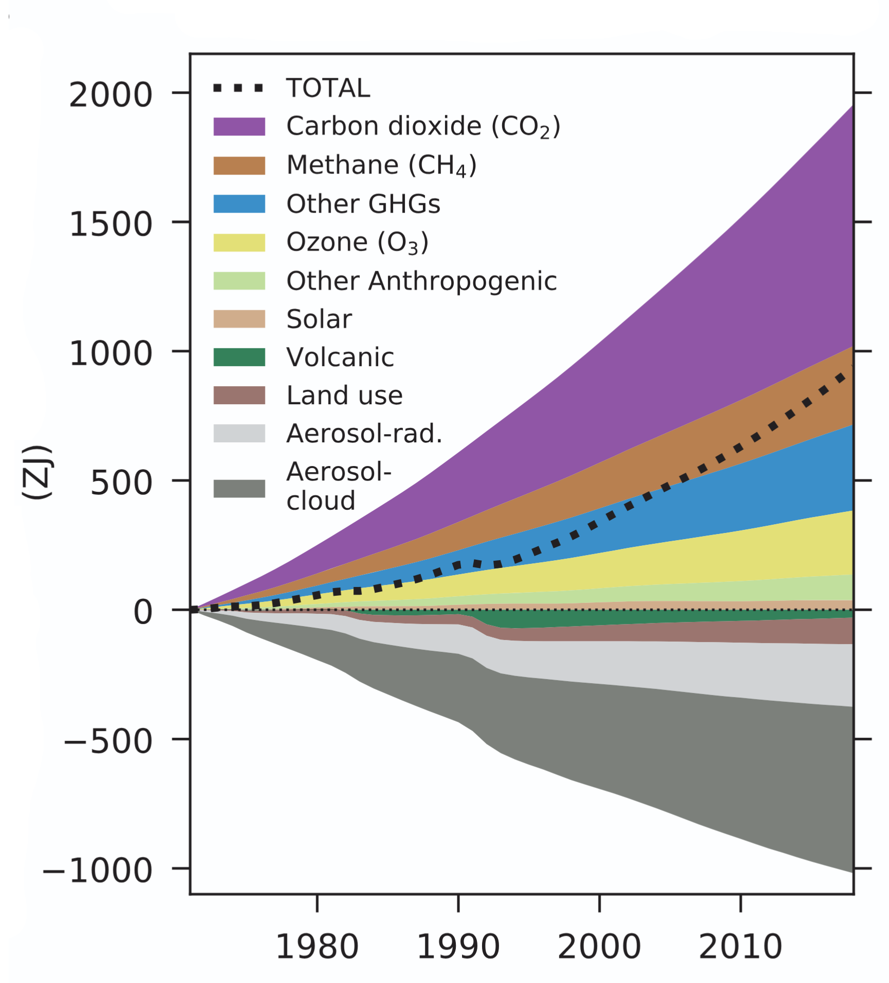
A stacked area chart illustrating cumulative energy added in Zettajoules from 1971 to 2018. The vertical axis ranges from negative 1000 to 2000 Zettajoules, and the horizontal axis tracks the passage of time in years. Above the zero line, positive energy contributors are stacked, with Carbon dioxide being the largest driver by a wide margin, followed by Methane, Other GHGs, Ozone, Other Anthropogenic, and a very small amount for Solar. Below the zero line, negative cooling factors are stacked, dominated by Aerosol-cloud and Aerosol-rad, with smaller negative contributions from Land use and Volcanic activity. A thick black dotted line labelled TOTAL tracks the net cumulative energy. This total line trends steadily upwards throughout the tracked period, reaching approximately 1000 Zettajoules by 2018, clearly demonstrating that positive warming factors significantly overpower the negative cooling factors.
Source: IPCC (2021) AR6 WGI, Chapter 7, Box 7.2, Figure 1e, pg. 940

Energy inventory components (1971–2018)
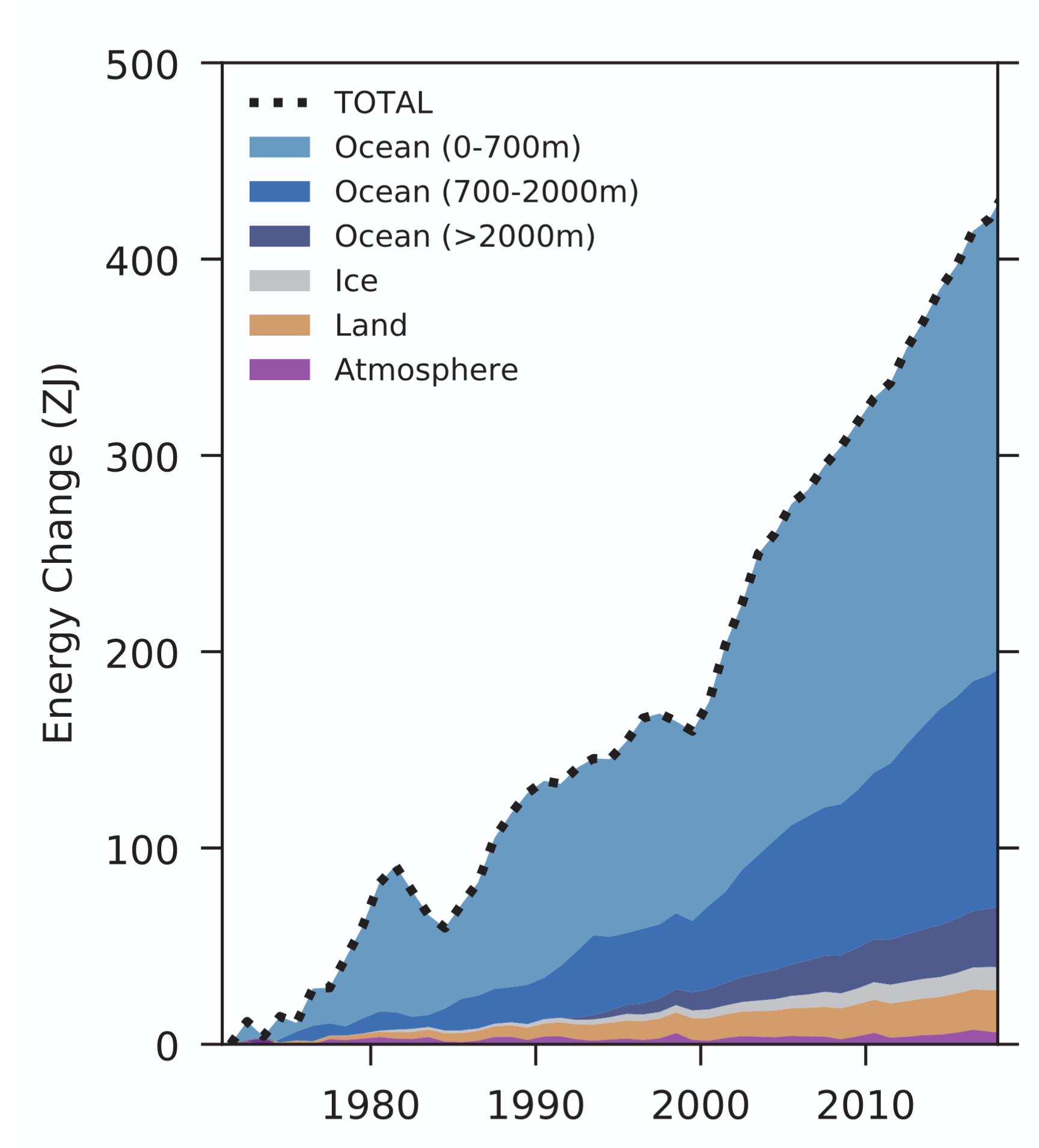
A stacked area chart illustrating the change in energy inventory components in Zettajoules from 1971 to 2018. The vertical axis measures Energy Change from 0 to 500 Zettajoules, whilst the horizontal axis tracks time through the decades. A thick black dotted line labelled TOTAL caps a series of stacked coloured bands, showing the total energy change climbing steeply and consistently over time, surpassing 400 Zettajoules by 2018. The vast majority of this accumulated energy is visually shown to be absorbed by the ocean, which is divided into three blue bands: 0 to 700 metres, 700 to 2000 metres, and greater than 2000 metres depth. At the very bottom of the stack, extremely thin bands represent the comparatively tiny amounts of energy absorbed by Ice in grey, Land in tan, and the Atmosphere in purple.
Source: IPCC (2021) AR6 WGI, Chapter 7, Box 7.2, Figure 1d, pg. 940

Cooling events in the graph:

  • 1982 & 1991: Volcanic eruptions blocked energy from the sun. El Chichón in Mexico erupted in April 1982. Mount Pinatubo in the Philippines erupted in June 1991.
  • 1997–2000: A powerful El Niño in 1997–1998 caused the Pacific Ocean to vent heat energy into the atmosphere and out into space, resulting in a temporary reduction of stored energy. This was followed by a multi-year La Niña.

“If global net negative CO2 emissions were to be achieved and be sustained, the global CO2-induced surface temperature increase would be gradually reversed but other climate changes would continue in their current direction for decades to millennia (high confidence). For instance, it would take several centuries to millennia for global mean sea level to reverse course even under large net negative CO2 emissions (high confidence).”

Source: IPCC (2021) AR6 WGI Summary for Policymakers, D.1.6, pg. 28


Long-term global mean sea level (GMSL) rise


Projected sea level rise during our lifetimes might seem trivial, but global commitments over multiple centuries and millennia are surprisingly large. This is highlighted in the consensus-based IPCC reports.


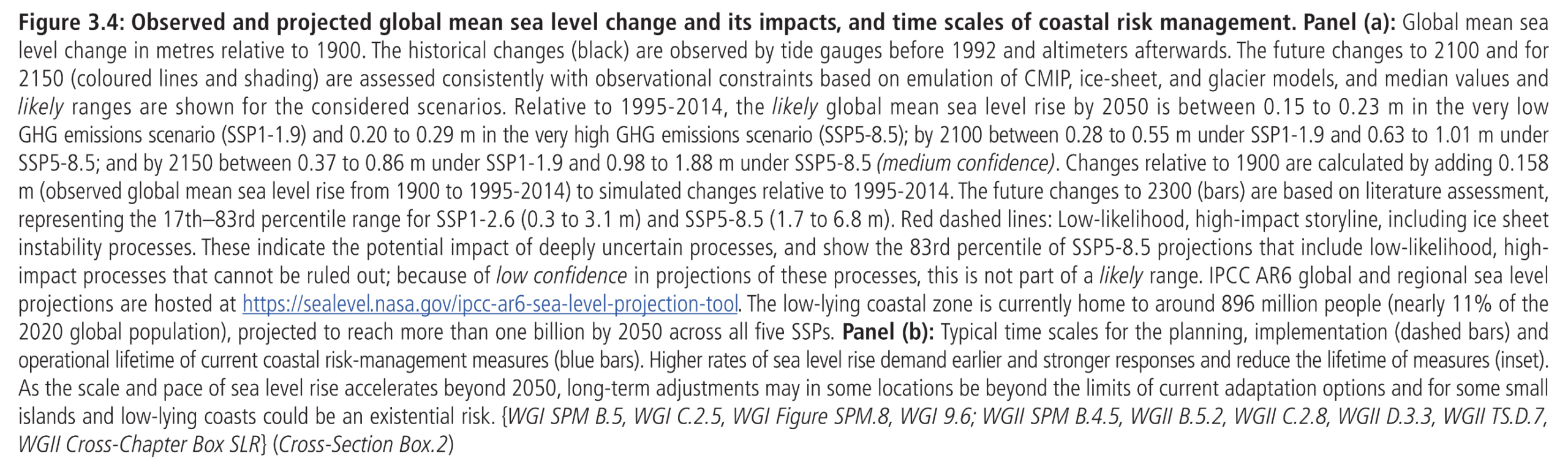
Observed and projected global mean sea level change and its impacts, and time scales of coastal risk management
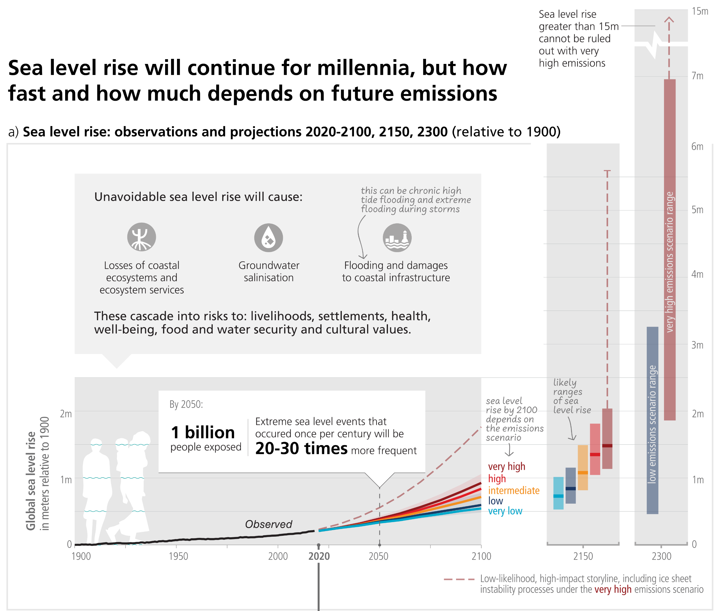
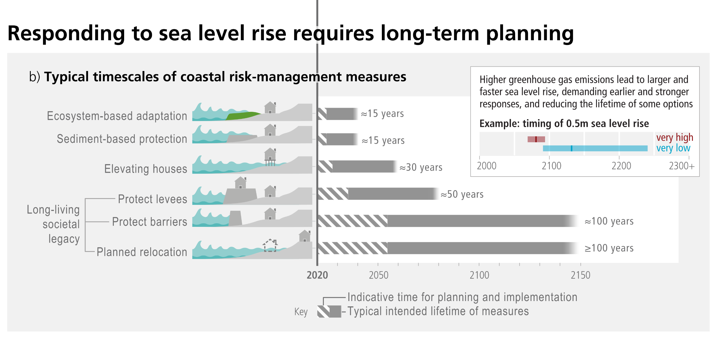
A two-part infographic detailing sea level rise observations, projections, and risk management timescales. Panel A is a line graph showing global sea level rise in metres relative to 1900. Observed historical levels rise gradually up to 2020. Projections to 2100 fan out into five coloured pathways based on emissions scenarios, ranging from very low to very high. The very high emissions pathway rises most sharply, accompanied by a dashed red line showing a low-likelihood but high-impact trajectory climbing much higher. Text notes state that unavoidable sea level rise will cascade into widespread societal risks, and that by 2050, 1 billion people will be exposed to extreme sea level events that will become 20 to 30 times more frequent. Vertical bars on the right show long-term projections for 2150 and 2300. By 2300, the very high emissions scenario could reach nearly 7 metres, with a warning that rises greater than 15 metres cannot be ruled out. Panel B uses a horizontal bar chart to illustrate the typical timescales of coastal risk-management measures. Short-term options like ecosystem-based adaptation and sediment-based protection have lifetimes of around 15 years. Long-living societal legacy measures, such as large barriers and planned relocation, require decades of planning but offer protection for 100 years or more. An inset diagram highlights that higher emissions will bring about a 0.5 metre sea level rise much earlier, demanding earlier and stronger responses.

Figure 3.4: Panel (a): Global mean sea level change in metres relative to 1900. The historical changes (black) are observed by tide gauges before 1992 and altimeters afterwards. The future changes to 2100 and for 2150 (coloured lines and shading) are assessed consistently with observational constraints based on emulation of CMIP, ice-sheet, and glacier models, and median values and likely ranges are shown for the considered scenarios. Relative to 1995-2014, the likely global mean sea level rise by 2050 is between 0.15 to 0.23 m in the very low GHG emissions scenario (SSP1-1.9) and 0.20 to 0.29 m in the very high GHG emissions scenario (SSP5-8.5); by 2100 between 0.28 to 0.55 m under SSP1-1.9 and 0.63 to 1.01 m under SSP5-8.5; and by 2150 between 0.37 to 0.86 m under SSP1-1.9 and 0.98 to 1.88 m under SSP5-8.5 (medium confidence). Changes relative to 1900 are calculated by adding 0.158 m (observed global mean sea level rise from 1900 to 1995-2014) to simulated changes relative to 1995-2014. The future changes to 2300 (bars) are based on literature assessment, representing the 17th–83rd percentile range for SSP1-2.6 (0.3 to 3.1 m) and SSP5-8.5 (1.7 to 6.8 m). Red dashed lines: Low-likelihood, high-impact storyline, including ice sheet instability processes. These indicate the potential impact of deeply uncertain processes, and show the 83rd percentile of SSP5-8.5 projections that include low-likelihood, high- impact processes that cannot be ruled out; because of low confidence in projections of these processes, this is not part of a likely range. IPCC AR6 global and regional sea level projections are hosted at https://sealevel.nasa.gov/ipcc-ar6-sea-level-projection-tool. The low-lying coastal zone is currently home to around 896 million people (nearly 11 percent of the 2020 global population), projected to reach more than one billion by 2050 across all five SSPs. Panel (b): Typical time scales for the planning, implementation (dashed bars) and operational lifetime of current coastal risk-management measures (blue bars). Higher rates of sea level rise demand earlier and stronger responses and reduce the lifetime of measures (inset). As the scale and pace of sea level rise accelerates beyond 2050, long-term adjustments may in some locations be beyond the limits of current adaptation options and for some small islands and low-lying coasts could be an existential risk.
Source: IPCC (2023) AR6 Synthesis Report Figure 3.4

Projected global mean sea level rise under different SSP scenarios
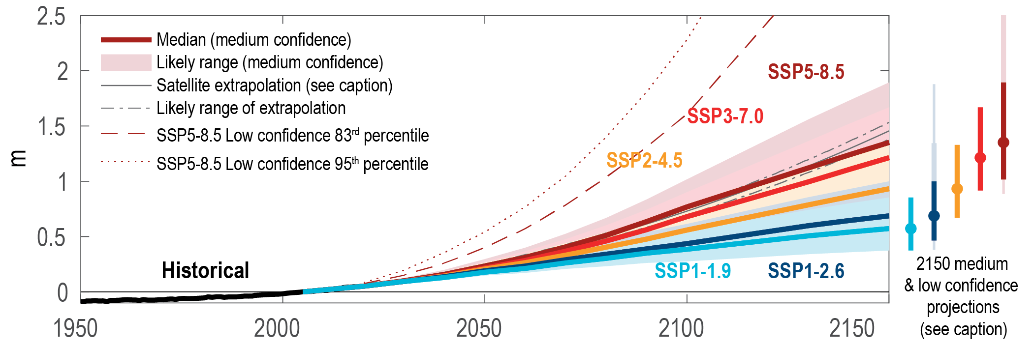
A line graph illustrating projected global mean sea level rise under different Shared Socio-economic Pathway scenarios. The vertical axis measures sea level rise in metres from 0 to 2.5. The horizontal axis tracks time from the year 1950 to 2150. A solid black line shows historical sea level staying near zero from 1950 into the early 21st century. From there, the projections fan out into five coloured pathways. The lowest scenario, SSP1-1.9 in light blue, projects a gradual rise to roughly 0.5 metres by 2150. The projected rise steadily increases across SSP1-2.6 in dark blue, SSP2-4.5 in orange, and SSP3-7.0 in red. The highest emissions scenario, SSP5-8.5 in dark red, projects a median rise of over 1.3 metres by 2150, with a shaded likely range extending near 1.8 metres. Above these main pathways, a dashed and a dotted red line represent low confidence, high-impact 83rd and 95th percentile projections for SSP5-8.5, which arc steeply upwards and shoot past the 2.5 metre mark well before the year 2150. On the far right, a series of vertical bar charts summarise the spread of the 2150 medium and low confidence projections for each corresponding scenario.
Figure 9.27: Projected global mean sea level rise under different Shared Socio-economic Pathway (SSP) scenarios. Likely global mean sea level (GMSL) change for SSP scenarios resulting from processes in whose projection there is medium confidence. Projections and likely ranges at 2150 are shown on right. Lightly shaded ranges and thinner lightly shaded ranges on the right show the 17th–83rd and 5th–95th percentile ranges for projections including low confidence processes for SSP1-2.6 and SSP5-8.5 only, derived from a p-box including structured expert judgement and marine ice-cliff instability projections. Black lines show historical GMSL change, and thick solid and dash-dotted black lines show the mean and likely range extrapolating the 1993–2018 satellite altimeter trend and acceleration. Further details on data sources and processing are available in the chapter data table.
Source: IPCC Sixth Assessment Report WG1 (2021) Chapter 9, Figure 9.27

Global mean sea level (GMSL) projections and commitments for exceedance of five global warming levels
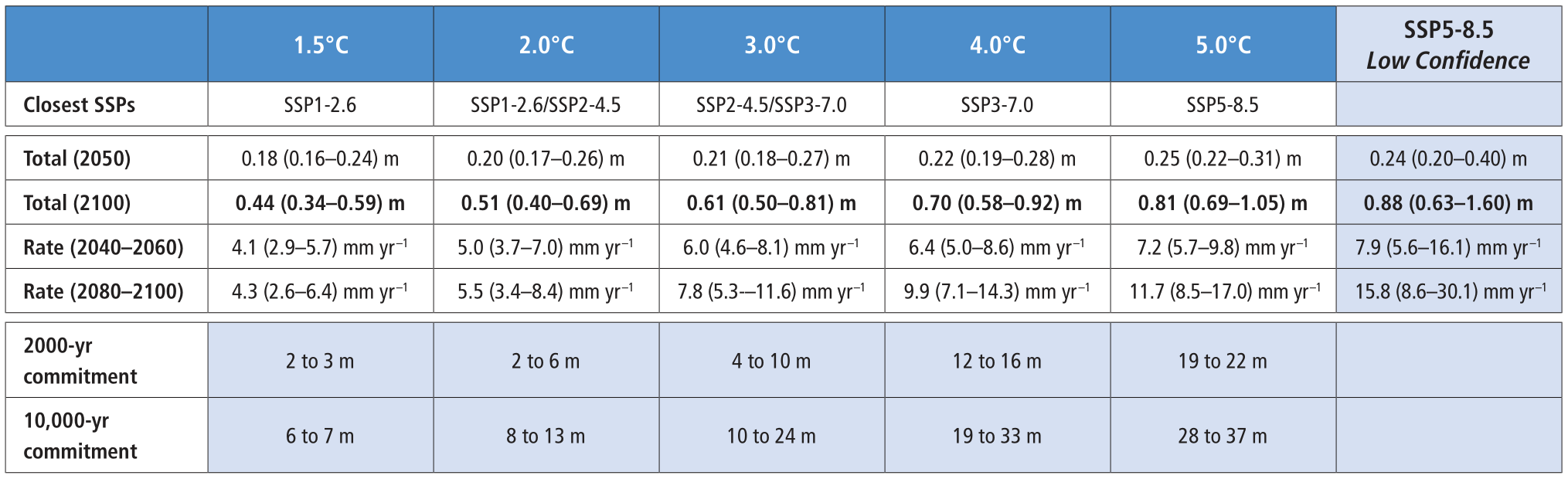

A detailed data table outlining global mean sea level projections and commitments across five global warming levels: 1.5, 2.0, 3.0, 4.0, and 5.0 degrees Celsius, alongside a final column for an SSP5-8.5 Low Confidence scenario. The rows provide specific metrics for each temperature threshold, including the closest Shared Socio-economic Pathways, the total projected sea level rise in metres by 2050 and 2100, and the rate of rise in millimetres per year for the periods of 2040 to 2060 and 2080 to 2100. The bottom two rows, shaded in light blue, show long-term sea level commitments over 2000 and 10000 years. The data demonstrates that as global warming levels increase, both the total sea level rise and its annual rate of increase scale significantly. For instance, the total median rise by 2100 scales from 0.44 metres at 1.5 degrees Celsius up to 0.81 metres at 5.0 degrees Celsius. Similarly, the 10000-year commitment jumps from a range of 6 to 7 metres at the 1.5-degree level, up to 28 to 37 metres at the 5.0-degree level.
Table 9.10: Global mean sea level (GMSL) projections and commitments for exceedance of five global warming levels, defined by sorting GSAT change in 2081–2100 with respect to 1850–1900. Median values and (likely) ranges are in metres relative to a 1995–2014 baseline. Rates are in mm yr -1. Unshaded cells represent processes in whose projections there is medium confidence. Shaded cells incorporate a representation of processes in which there is low confidence; in particular, the SSP5-8.5 low confidence column shows the 17th–83rd percentile range from a p-box, including projections based on structured expert judgement (SEJ) and marine ice cliff instability (MICI) rather than an assessed likely range. Methods are described in 9.6.3.2.
Source: IPCC Sixth Assessment Report WG1 (2021)8 Ch. 9 Table 9.10

“In the longer term, sea level is committed to rise for centuries to millennia due to continuing deep-ocean warming and ice-sheet melt and will remain elevated for thousands of years (high confidence).”

Source: IPCC (2021) AR6 WGI Summary for Policymakers, B.5.4


“Research has shown that the excess energy since the 1970s has mainly gone into warming the ocean (91%), followed by the warming of land (5%) and the melting of ice sheets and glaciers (3%). The atmosphere has warmed substantially since 1970, but because it is comprised of thin gases it has absorbed only 1% of the excess energy (FAQ 7.1, Figure 1). As the ocean has absorbed the vast majority of the excess energy, especially within its top two kilometres, the deep ocean is expected to continue to warm and expand for centuries to millennia, leading to long-term sea level rise – even if atmospheric greenhouse gas levels were to decline (see FAQ 5.3). This is in addition to the sea level rise expected from melting ice sheets and glaciers.”

Source: IPCC (2021) AR6 WGI Chapter 7, FAQ 7.1, pg. 1020


Global Mean Sea Level (GMSL) change on 100- (blue), 2,000- (green) and 10,000-year (magenta) time scales as a function of global surface temperature, relative to 1850–1900
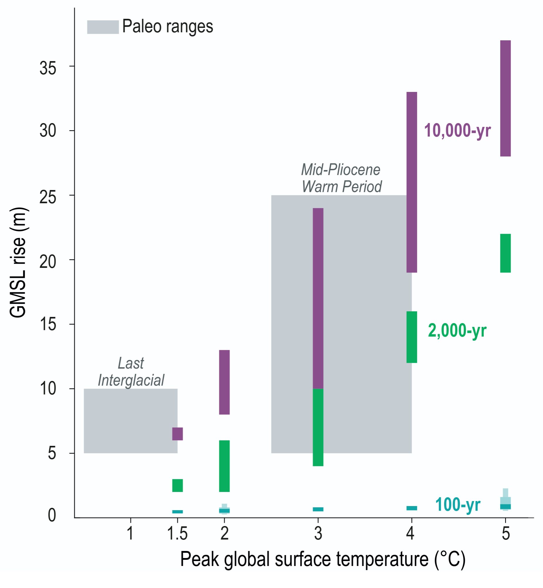

A bar chart illustrating Global Mean Sea Level rise in metres against Peak global surface temperature in degrees Celsius. The vertical axis measures sea level rise from 0 to 40 metres. The horizontal axis tracks peak temperature increments at 1.5, 2, 3, 4, and 5 degrees. For each temperature level, three coloured vertical bars show projected sea level rise over different time scales. Small teal bars at the very bottom represent 100-year projections, indicating a relatively small rise of roughly 1 to 2 metres even at the extreme 5 degree mark. Above these, green bars representing 2000-year commitments scale up significantly, demonstrating roughly 2 to 3 metres of rise at 1.5 degrees, and jumping to roughly 20 metres at 5 degrees. The highest bars in magenta represent 10000-year commitments, showing massive long-term sea level rise that spans from roughly 6 metres at 1.5 degrees up to nearly 37 metres at 5 degrees. Additionally, two broad grey shaded boxes in the background indicate historical paleo ranges for comparison. The box for the Last Interglacial period sits between 0.5 and 1.5 degrees of warming with 5 to 10 metres of sea level rise, whilst the Mid-Pliocene Warm Period box spans from 2.5 to 4 degrees of warming with 5 to 25 metres of sea level rise.
Box TS.4, Figure 1b: For 100-year projections, GMSL is projected for the year 2100, relative to a 1995–2014 baseline, and temperature anomalies are average values over 2081–2100. For longer-term commitments, warming is indexed by peak warming above 1850–1900 reached after cessation of emissions. Shaded regions show paleo-constraints on global surface temperature and GMSL for the Last Interglacial and mid-Pliocene Warm Period. Lightly shaded thick/thin blue bars show 17th–83rd/5th–95th percentile low confidence ranges for SSP1-2.6 and SSP5-8.5 in 2100, plotted at 2 degrees Celsius and 5 degrees Celsius.
Source: IPCC (2021) AR6 WGI TS, Box TS.4, Figure 1b

Past and future changes in global mean sea level
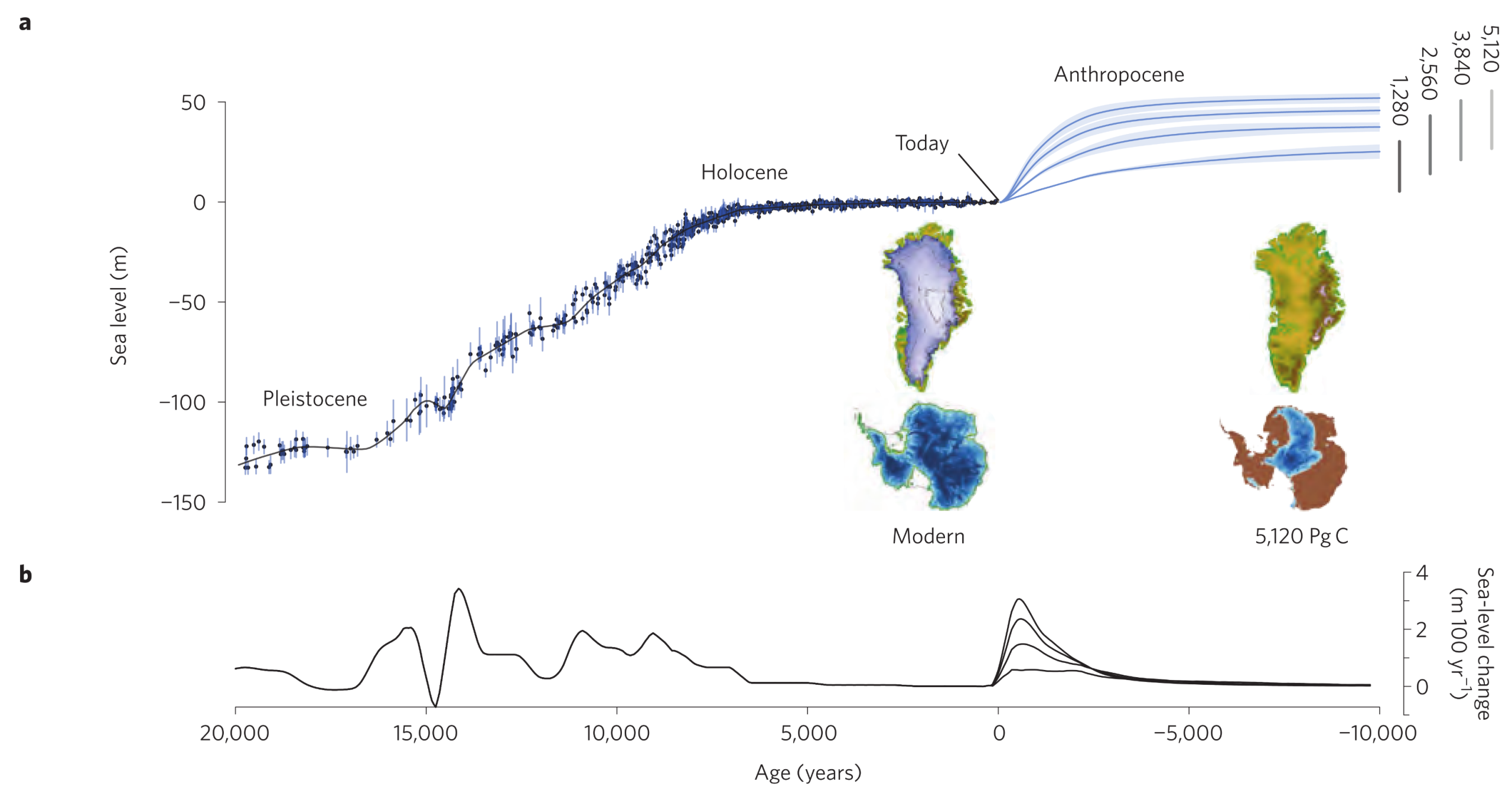
A two-part diagram illustrating past and future changes in global mean sea level. Panel A displays sea level in metres from negative 150 to positive 50 on the vertical axis, plotted against age in years from 20000 years ago to 10000 years into the future on the horizontal axis. A black line tracks historical data, showing sea level rising from roughly negative 130 metres during the Pleistocene epoch, before levelling off near zero during the Holocene epoch up to the present day. From today into the Anthropocene, the line branches into four blue projections representing different cumulative carbon emission scenarios ranging from 1280 to 5120 Petagrams of Carbon. These projections climb rapidly, projecting future sea levels between 25 and 50 metres above current levels. Inset maps compare the Modern Greenland and Antarctic ice sheets, which are shown mostly covered in solid ice, to the extreme 5120 emission scenario, which depicts both landmasses severely depleted and mostly devoid of ice. Panel B below tracks the rate of sea-level change in metres per 100 years. It shows several large historical spikes, a period of near-zero stability in the recent past, and a sharp, immediate spike corresponding to the future emission projections before trailing off towards zero in the deep future.
Figure 2: (a) Long-term global mean sea-level change for the past 20,000 years (black line) based on palaeo sea level records (black dots with depth uncertainties shown by blue vertical lines) and projections for the next 10,000 years for four emission scenarios (1,280, 2,560, 3,840, and 5,120 Pg C). Time series for future projections (mean and one standard deviation) are based on thermosteric contributions from the UVic and Bern3D-LPX models, from modelled land-ice changes driven by UVic model runs with an equilibrium climate sensitivity of 3.5 degrees Celsius, and from Bern3D-LPX model runs in which the total land-ice contribution was estimated from the relation between the UVic and land-ice model results (see Supplementary Information). Vertical grey bars show range of long-term sea-level rise for each emission scenario derived from a range in equilibrium climate sensitivity (1.5–4.5 degrees Celsius) from Bern3D-LPX model runs. Images show reconstructions of the Greenland (top) and Antarctic (bottom) ice sheets for today (left) and for the 5,120 Pg C emission scenario (right). (b) The rates of change in global mean sea level (using a 500 year smoothing window).
Source: Clark et al (2016) Figure 2

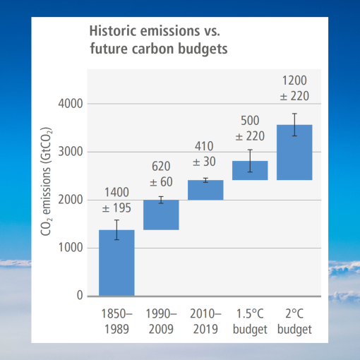
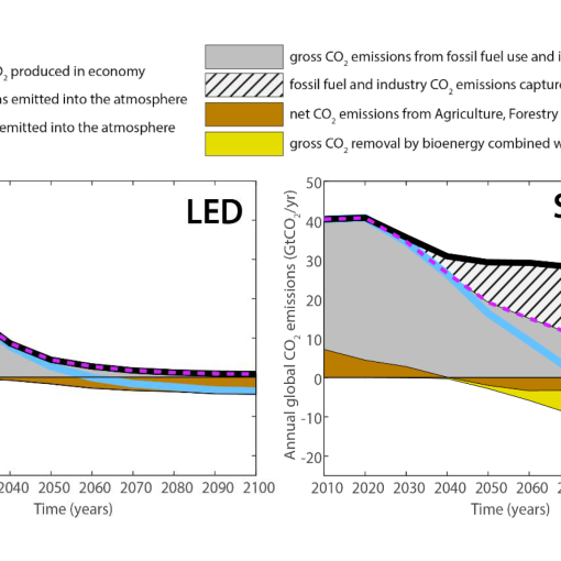
The models in the figure above project sea-level rise based on four cumulative emissions totals, but they don’t explore scenarios where carbon is drawn down from the atmosphere later on. This doesn’t imply that carbon dioxide removal (CDR) is the solution to the problem. Rather, rapid decarbonisation avoids these extreme sea-level projections in the first place. We can choose a far safer pathway with lower cumulative CO2 emissions. If we avoid the extreme cumulative emissions pathways, we avoid the need for extreme CDR measures to try to deal with the problem later.

Long-term global sea-level rise is determined by our net cumulative CO2 emissions. The carbon we emit before we reach net zero CO2 locks in centuries of ocean thermal expansion, ice-sheet melt, and ecologically damaging ocean acidification. This highlights the danger of treating net zero as a simple accounting exercise and an end in itself: relying on massive future carbon drawdown might eventually make net zero emissions calculations balance on a spreadsheet, but it ignores physical reality. Even if unprecedented future CDR could theoretically reduce atmospheric carbon decades from now, it can’t reverse the acidification of the oceans or correct the massive energy imbalance driving long-term sea-level rise in timeframes that are useful to us.


“Many changes due to past and future greenhouse gas emissions are irreversible for centuries to millennia, especially changes in the ocean, ice sheets and global sea level.”

Source: IPCC (2021) AR6 WGI Summary for Policymakers, B.5


Irreversibility: “A perturbed state of a dynamical system is defined as irreversible on a given time scale if the recovery from this state due to natural processes takes substantially longer than the time scale of interest.”

Source: IPCC (2021) AR6 WGI Annex VII, Glossary, pg. 2236


Global mean sea level (GMSL) as a function of cumulative carbon emissions
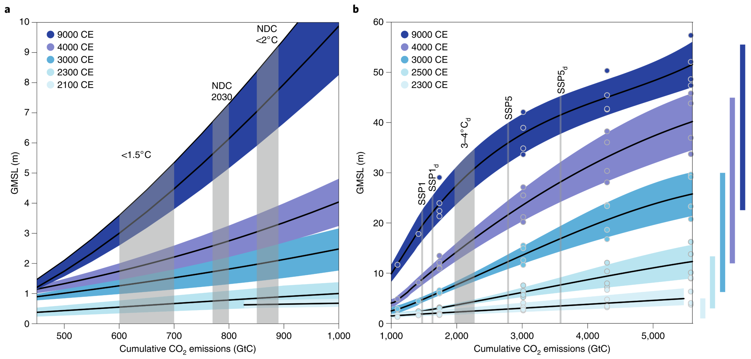
A two-part line graph illustrating Global mean sea level as a function of cumulative carbon emissions. Panel A displays cumulative carbon emissions from 450 to 1000 Gigatonnes of Carbon on the horizontal axis and sea level rise from 0 to 10 metres on the vertical axis. Five curves in increasingly dark shades of blue represent projections for the years 2100, 2300, 3000, 4000, and 9000 CE. The 2100 CE line remains relatively flat under 1 metre, whilst the 9000 CE line curves steeply upwards, reaching 10 metres. Vertical grey bands mark specific scenarios labelled less than 1.5 degrees Celsius, NDC 2030, and NDC less than 2 degrees Celsius. Panel B extends the horizontal axis from 1000 to 5600 Gigatonnes of Carbon and the vertical axis from 0 to 60 metres. It displays similar projection curves for the years 2300, 2500, 3000, 4000, and 9000 CE. The highest curve for 9000 CE projects a massive sea level rise exceeding 50 metres at the highest emission levels. Vertical lines mark various modelled scenarios such as SSP1 and SSP5, and a series of vertical blue bars on the far right indicates the spread of uncertainty for each corresponding time point.
Figure 1: GMSL as a function of cumulative carbon emissions. (a) GMSL at five future time points for cumulative carbon emissions (relative to the pre-industrial) of between 450 and 1,000 GtC. The 2100 ce scenario is based on four RCPs, with cumulative emissions beginning at 830 GtC. The black line and colour envelope represent mean sea level and 1 sigma uncertainties. The 2300 ce, 3000 ce, 4000 ce and 9000 ce scenarios are from Clark and colleagues, with black lines and colour envelopes representing polynomial fits and uncertainty (1 sigma) to model data from ref. 10. (b) GMSL at five future time points for cumulative carbon emissions (relative to the pre-industrial) of between 1,000 and 5,600 GtC. The 2300 ce scenario is based on four RCPs, with a maximum value of 5,470 GtC. The black line and colour envelope represent mean sea level and 1 sigma uncertainty. The 2500 ce, 3000 ce, 4000 ce and 9000 ce scenarios are as shown in a; coloured circles represent model results from ref. 10. Vertical grey bars identify cumulative emissions for several scenarios from the literature (see text and Supplementary Information). Vertical bars to the right of b show the spread in GMSLR for the two simulations with the Bern3D-LPX model for uncertainty in ECS values ranging from 1.5 to 4.5 degrees Celsius (ref. 10), which the IPCC assessed as the likely range (66–100 percent probability).
Source: Clark et al (2018) Sea-level commitment as a gauge for climate policy, Figure 1

Global Mean Sea Level (GMSL) rise projections as a function of peak global surface air temperature
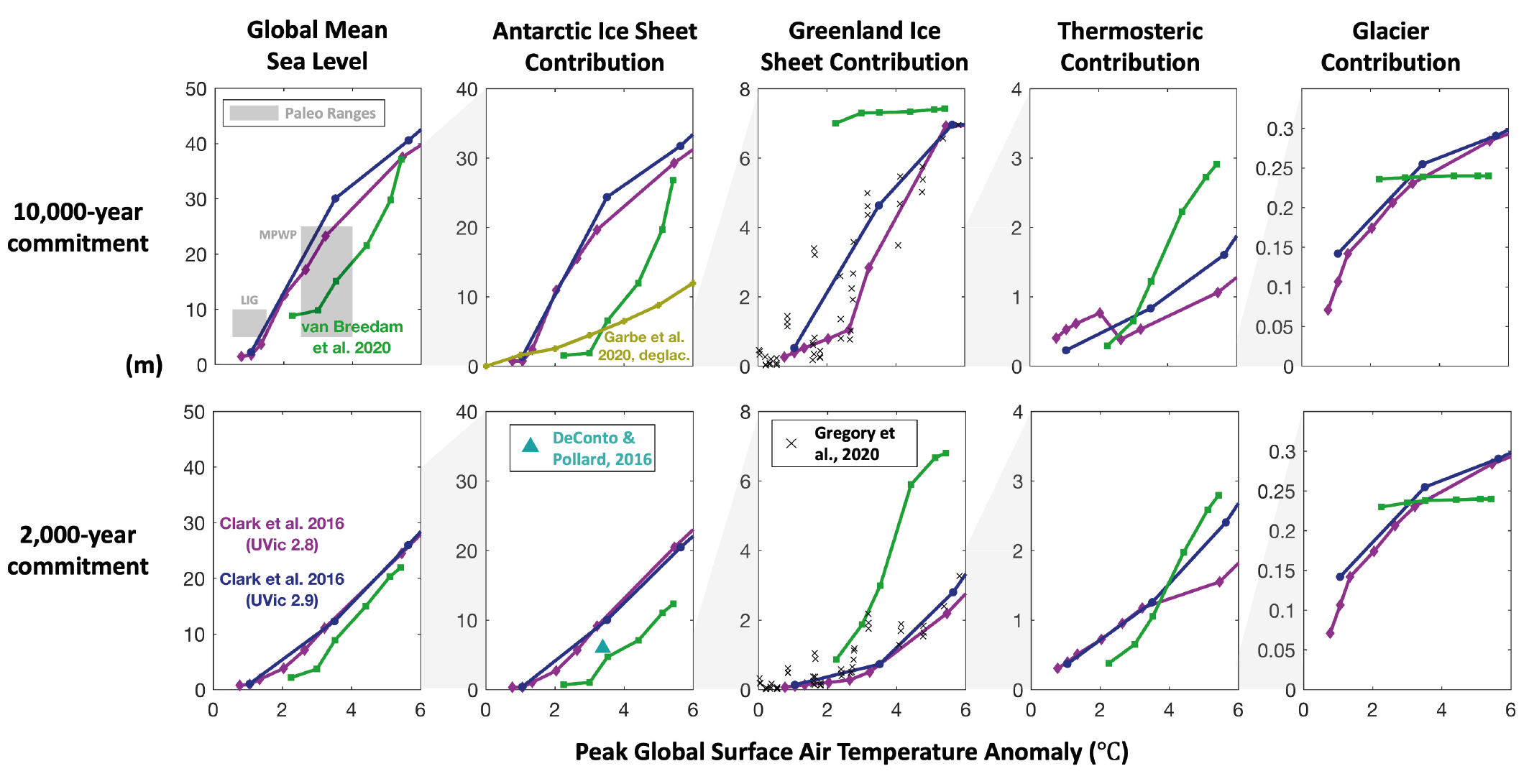

A grid of ten line graphs arranged in two rows and five columns, displaying sea level rise projections in metres against peak global surface air temperature anomalies ranging from 0 to 6 degrees Celsius. The top row illustrates the 10000-year commitment, whilst the bottom row illustrates the 2000-year commitment. The columns, from left to right, break down the contributors to this sea level rise. The first column shows the total Global Mean Sea Level, which reaches over 40 metres in the 10000-year projection at 6 degrees of warming. The second column shows the Antarctic Ice Sheet Contribution, identifying it as the dominant source of sea level rise by reaching over 30 metres. The third column tracks the Greenland Ice Sheet Contribution, rising to roughly 7 or 8 metres. The fourth column shows the Thermosteric Contribution, projecting up to 3 or 4 metres. The final column shows the Glacier Contribution, which caps out at a comparatively tiny 0.3 metres. Across all panels, multiple coloured lines representing different scientific models show a clear, steep upward trend in sea level rise as temperature anomalies increase. Additionally, the top left panel includes grey shaded boxes denoting historical paleo ranges for contextual comparison.
Figure 9.30: Global mean sea level (GMSL) commitment as a function of peak global surface air temperature. From models (Clark et al., 2016; DeConto and Pollard, 2016; Garbe et al., 2020; Van Breedam et al., 2020) and paleo data on 2000-year (lower row) and 10,000 year (upper row) time scales. Columns indicate different contributors to GMSL rise (from left to right: total GMSL change, Antarctic Ice Sheet, Greenland Ice Sheet, global mean thermosteric sea level rise, and glaciers). Further details on data sources and processing are available in the chapter data table.
Source: IPCC Sixth Assessment Report WGI (2021) Chapter 9, Figure 9.30

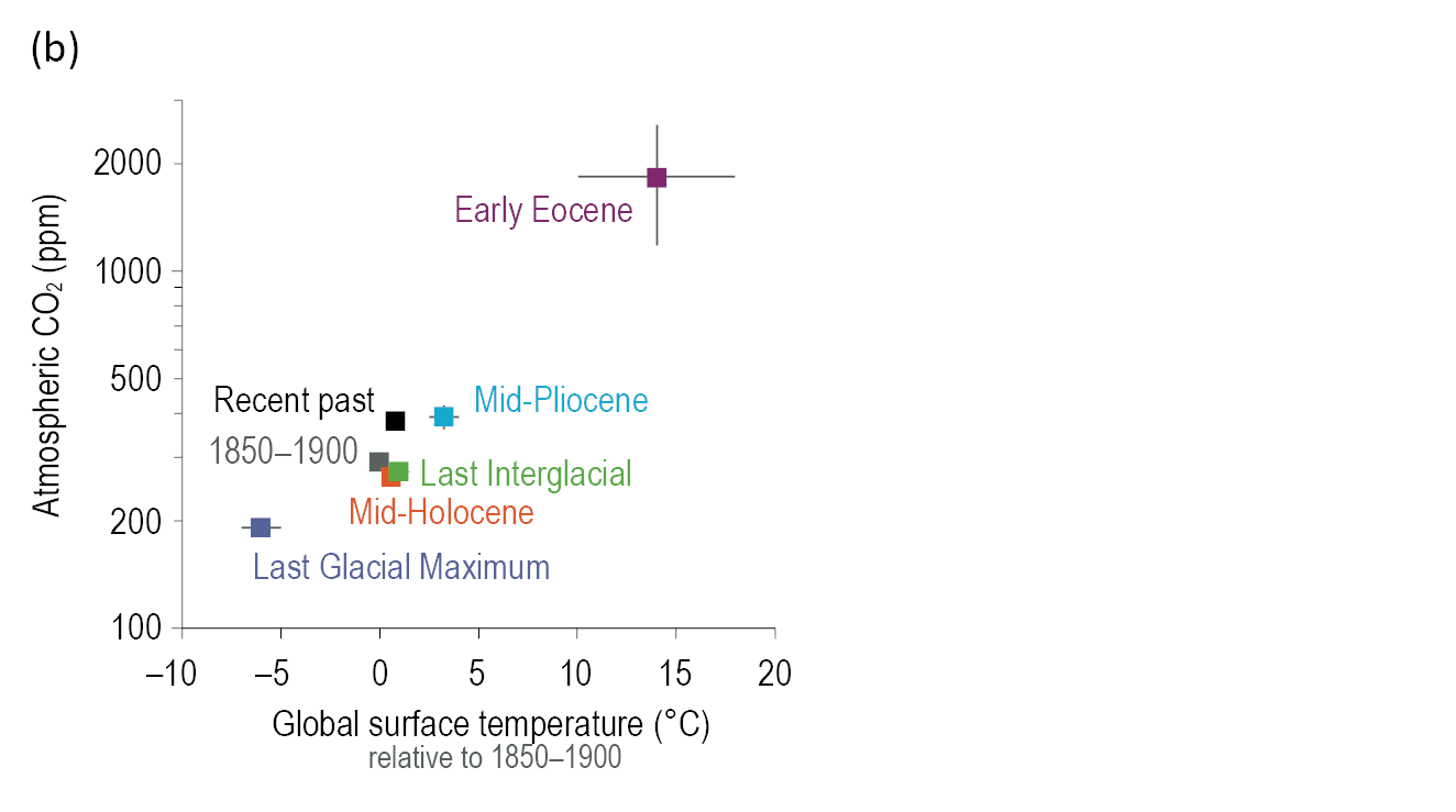
Three selected global climate indicators covary across multiple paleoclimate reference periods
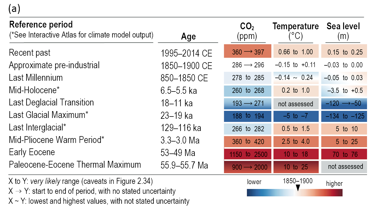
A two-part graphic summarising global climate indicators across multiple palaeoclimate reference periods. Panel A is a data table listing ten periods from the Recent past back to the Paleocene-Eocene Thermal Maximum, approximately 55 million years ago. It compares CO2 in parts per million, Temperature in degrees Celsius, and Sea level in metres. Cells are colour-coded on a scale from cold blue to hot red relative to the 1850 to 1900 baseline. The data shows strong covariation, for example, the Early Eocene shows extremely high CO2 up to 2500 parts per million, temperatures 10 to 18 degrees hotter, and sea levels 70 to 76 metres higher. Conversely, the Last Glacial Maximum shows very low CO2 around 190 parts per million, temperatures 5 to 7 degrees colder, and sea levels roughly 130 metres lower than the baseline. Panel B is a scatter plot mapping Global surface temperature on the horizontal axis against Atmospheric CO2 on a logarithmic vertical axis. Data points for seven reference periods are plotted, forming a clear diagonal trend that visually reinforces the strong positive correlation between higher atmospheric CO2 and higher global temperatures from the deep past to the present day.

Box TS.2, Figure 1: Paleoclimate and recent reference periods, with selected key indicators. The intent of this figure is to list the paleoclimate reference periods used in this Report, to summarize three key global climate indicators, and compare CO2 with global temperature over multiple periods. (a) Three large-scale climate indicators (atmospheric CO2, global surface temperature relative to 1850–1900, and global mean sea level relative to 1900), based on assessments in Chapter 2, with confidence levels ranging from low to very high. (b) Comparison between global surface temperature (relative to 1850–1900) and atmospheric CO2 concentration (shown on a log scale) for multiple reference periods (mid-points with 5–95 percent ranges).
Source: IPCC (2021) AR6 WGI, Technical Summary, Errata, Box TS.2, Figure 1 (https://www.ipcc.ch/report/ar6/wg1/downloads/report/IPCC_AR6_WGI_ErrataFigure_Box_TS_2_Fig_1.png)

“Projections of multi-millennial global mean sea level rise are consistent with reconstructed levels during past warm climate periods: likely 5–10 m higher than today around 125,000 years ago, when global temperatures were very likely 0.5°C–1.5°C higher than 1850–1900; and very likely 5–25 m higher roughly 3 million years ago, when global temperatures were 2.5°C–4°C higher (medium confidence).”

Source: IPCC (2021) AR6 WGI Summary for Policymakers, B.5.4


Estimates for historical atmospheric CO2 levels and coinciding sea levels

A side-by-side two-panel chart, displaying cross-plots of estimates for historical atmospheric CO2 against coinciding relative sea level. The vertical axis on both panels measures Relative Sea-Level in metres from negative 120 to positive 80. The top horizontal axis measures Atmospheric CO2 in parts per million by volume from 200 to 1600, whilst the bottom horizontal axis displays the natural logarithm of the CO2 ratio. Panel A on the left shows a scatter plot of data points with error bars, categorised by historical time period and measurement technique, including Pleistocene, Pliocene, Miocene, and Eocene-Oligocene epochs. The markers use different shapes and colours such as green squares, blue diamonds, and red circles to differentiate the datasets. The data clearly shows lower sea levels corresponding with lower CO2 concentrations, and higher sea levels with higher CO2 concentrations. Dotted black lines denote the preindustrial conditions of zero metres and 280 parts per million of CO2. A distinct horizontal orange line is marked at positive 14 metres, representing the sea-level rise associated with the total melting of the Western Antarctic Ice Sheet and the Greenland Ice Sheet. Panel B on the right displays the same scatter data faded into light grey, overlaid with a series of blue curves representing a probabilistic analysis of the relationship. A thick solid blue line represents the Probability Maximum, flanked by thinner dashed and solid lines representing statistical percentiles ranging from 2.5 to 97.5 percent. The blue probability curves demonstrate a steep and rapid increase in sea level as CO2 rises from roughly 200 to 400 parts per million, followed by a continued but slightly less steep upward trend at higher CO2 levels.
Figure 3: Cross-plot of estimates of atmospheric CO2 and coinciding sea level. (A) Data are split according to time period and technique used. Symbols as in Fig. 2. Note for the Eocene Oligocene from delta 11B and delta 18O, only data that form a decreasing CO2 trend are plotted for clarity. (B) Results from our probabilistic analysis of the data that fully accounts for uncertainty in both X and Y parameters (see text; Dataset S2).
Source: Foster & Rohling (2013) Relationship between sea level and climate forcing by CO2 on geological timescales, Figures 3a & 3b

The “dotted lines denote the preindustrial conditions of 0 m and 280 ppm CO2. The horizontal orange line shows +14 m, which is the sea-level rise associated with the total melting of WAIS and GrIS” (the Western Antarctic Ice Sheet and the Greenland Ice Sheet).

Source: Foster & Rohling (2013)

“During the Eocene, when CO2 levels were higher than 1,000 ppm, sea level was 60–70 m higher than today, reflecting the absence of any of the major ice sheets that currently reside at high latitudes”

Source: Foster & Rohling (2013)

We can’t easily move back to the left on this graph over the coming centuries or millennia due to the immense thermal inertia of the Earth’s oceans. But by decarbonising our economies today, we can work on halting our movement to the right of the graph and limit how high future global sea levels will eventually rise in response to our cumulative CO2 emissions.


Sources for this post:


Featured image: View from International Space Station
Photograph: ISS/Nasa (downloaded 24 Aug. 2018) https://www.theguardian.com/environment/2017/aug/18/climate-scientist-clouds-climate-change-interview-kate-marvel