Carbon budgets

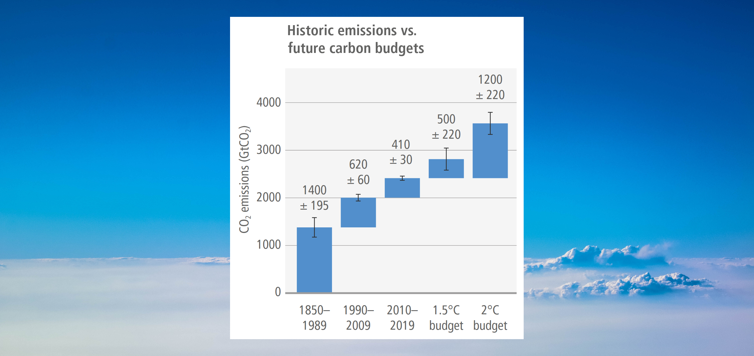
A floating step bar chart set against a photographic background of a bright blue sky and white clouds, comparing historic carbon dioxide emissions against future carbon budgets. The vertical axis measures CO2 emissions in gigatonnes, scaling from 0 to 4000 in increments of 1000. The chart uses blue rectangular blocks to stack cumulative emissions over time, with black vertical whiskers on each block indicating uncertainty ranges. The historical sequence begins with a block for 1850 to 1989 adding 1400 plus or minus 195 gigatonnes. Floating directly above this, the 1990 to 2009 block adds 620 plus or minus 60 gigatonnes. Floating above that, the 2010 to 2019 block adds 410 plus or minus 30 gigatonnes. This creates a cumulative historical baseline of 2430 gigatonnes by the end of 2019. From this identical 2019 baseline level, two alternative future budget blocks are plotted side-by-side. The 1.5 degrees Celsius budget block adds 500 plus or minus 220 gigatonnes. Next to it, the 2 degrees Celsius budget block adds 1200 plus or minus 220 gigatonnes. Visually, the chart emphasises that the remaining budget for 1.5 degrees Celsius is exceptionally small, representing less than the emissions produced in just the single 1990 to 2009 historical time block.

This post takes a quick look at global carbon budgets. For detailed explanations, links to the source articles (such as IPCC report chapters) are at the bottom.


“Cumulative net CO2 emissions over the last decade (2010–2019) are about the same size as the remaining carbon budget to limit warming to 1.5°C (>67%) (medium confidence). 62% of total cumulative CO2 emissions from 1850 to 2019 occurred since 1970 (1500 ± 140 GtCO2), about 43% since 1990 (1000 ± 90 GtCO2), and about 17% since 2010 (410 ± 30 GtCO2). For comparison, the remaining carbon budget for keeping warming to 1.5°C with a 67% (50%) probability is about 400 (500) ± 220 GtCO2

Source: IPCC (2022) AR6 WGIII Technical Summary, pg. 61


Historic anthropogenic CO2 emission and cumulative CO2 emissions (1850–2019) as well as remaining carbon budgets for limiting warming to 1.5°C (>67%) and 2°C (>67%)
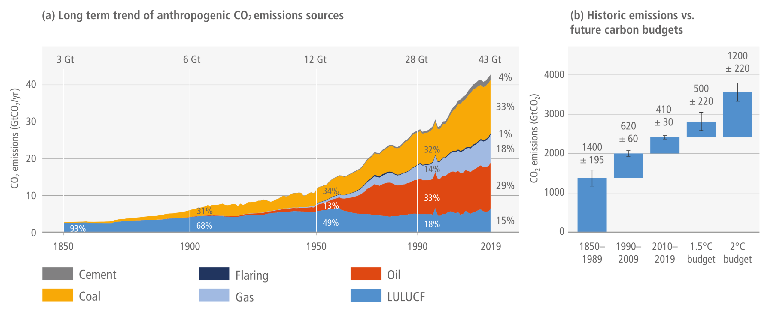

A two-panel infographic visualising historical carbon dioxide emissions and remaining carbon budgets. Panel A is a stacked area graph showing annual emissions rising steeply from 3 gigatonnes in 1850 to 43 gigatonnes in 2019. Coal, oil, and gas are shown expanding significantly over time to become the dominant sources of recent emissions, alongside contributions from land use, cement, and flaring. Panel B is a step bar chart comparing historical cumulative emissions in three time blocks against the remaining future carbon budgets. It visually demonstrates that the combined past emissions from 1850 to 2019 are substantially larger than the remaining carbon budget allowed to limit global warming to 1.5 or 2 degrees Celsius.
Figure TS.3: Historic anthropogenic CO2 emission and cumulative CO2 emissions (1850–2019) as well as remaining carbon budgets for limiting warming to 1.5°C (>67%) and 2°C (>67%). Panel (a) shows historic annual anthropogenic CO2 emissions (GtCO2 yr –1) by fuel type and process. Panel (b) shows historic cumulative anthropogenic CO2 emissions for the periods 1850–1989, 1990–2009, and 2010–2019 as well as remaining future carbon budgets as of 1 January 2020 to limit warming to 1.5°C and 2°C at the 67th percentile of the transient climate response to cumulative CO2 emissions. The whiskers indicate a budget uncertainty of ±220 GtCO2-eq for each budget and the aggregate uncertainty range at one standard deviation for historical cumulative CO2 emissions, consistent with WGI.
Source: IPCC (2022) AR6 WGIII TS, Figure TS.3

Estimates of historical carbon dioxide (CO2) emissions and remaining carbon budgets.
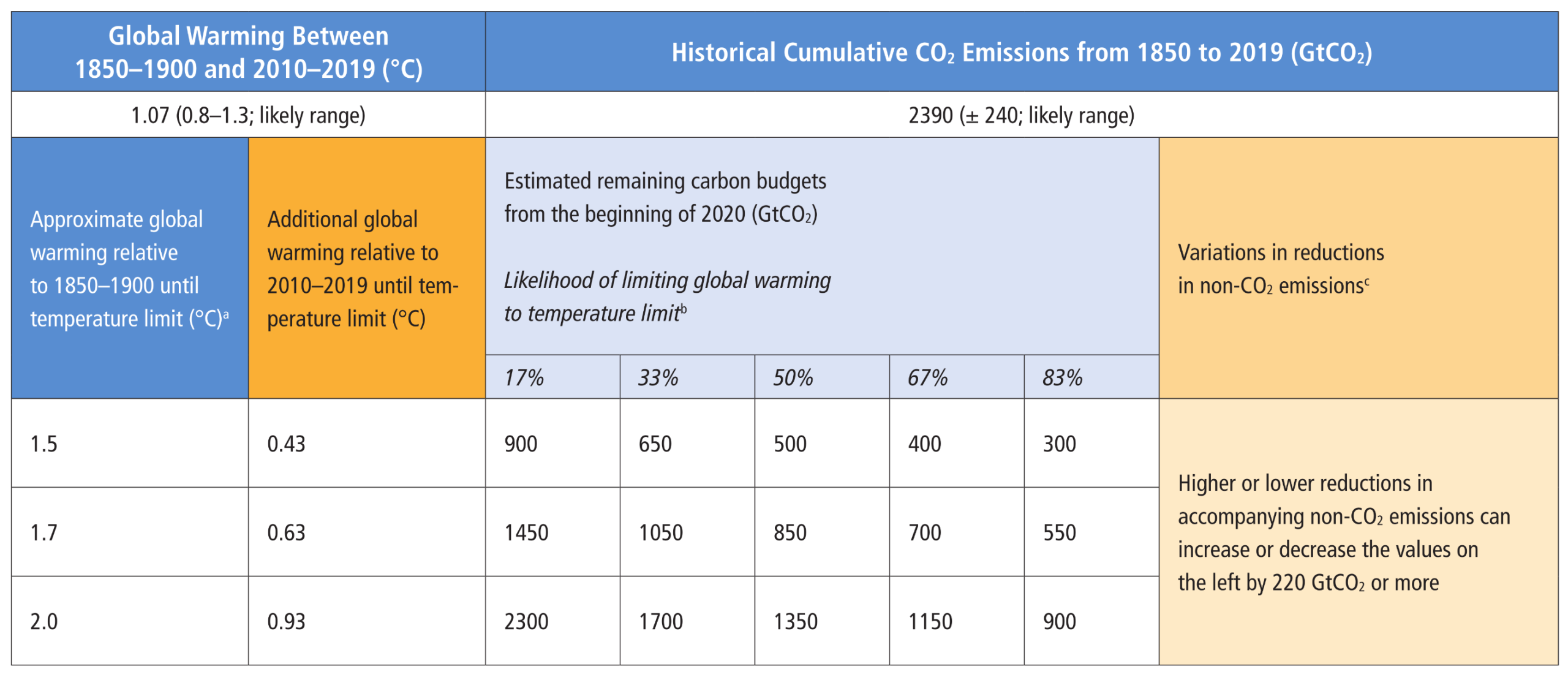
A table displaying estimates of historical CO2 emissions and remaining carbon budgets. The top section notes historical global warming between 1850 to 1900 and 2010 to 2019 was 1.07 degrees Celsius, and historical cumulative CO2 emissions from 1850 to 2019 were 2390 gigatonnes. The main body lists remaining carbon budgets from the beginning of 2020 needed to limit warming to 1.5, 1.7, and 2.0 degrees Celsius, spread across five probability levels ranging from 17 to 83 percent. For a 1.5-degree limit, the remaining budget drops from 900 gigatonnes at a 17 percent likelihood to 300 gigatonnes at an 83 percent likelihood. For a 2.0-degree limit, the budget ranges from 2300 down to 900 gigatonnes. A final column indicates that variations in non-CO2 emissions can shift these budget values by 220 gigatonnes or more.

Table SPM.2:  Estimates of historical carbon dioxide (CO2) emissions and remaining carbon budgets. Estimated remaining carbon budgets are calculated from the beginning of 2020 and extend until global net zero CO2 emissions are reached. They refer to CO2 emissions, while accounting for the global warming effect of non-CO2 emissions. Global warming in this table refers to human-induced global surface temperature increase, which excludes the impact of natural variability on global temperatures in individual years.

Source: IPCC (2021) AR6 WGI SPM, Table SPM.2

Future CO2 emissions from existing and currently planned fossil fuel infrastructure in the context of Paris carbon budgets in GtCO2 based on historic patterns of infrastructure lifetimes and capacity utilisation
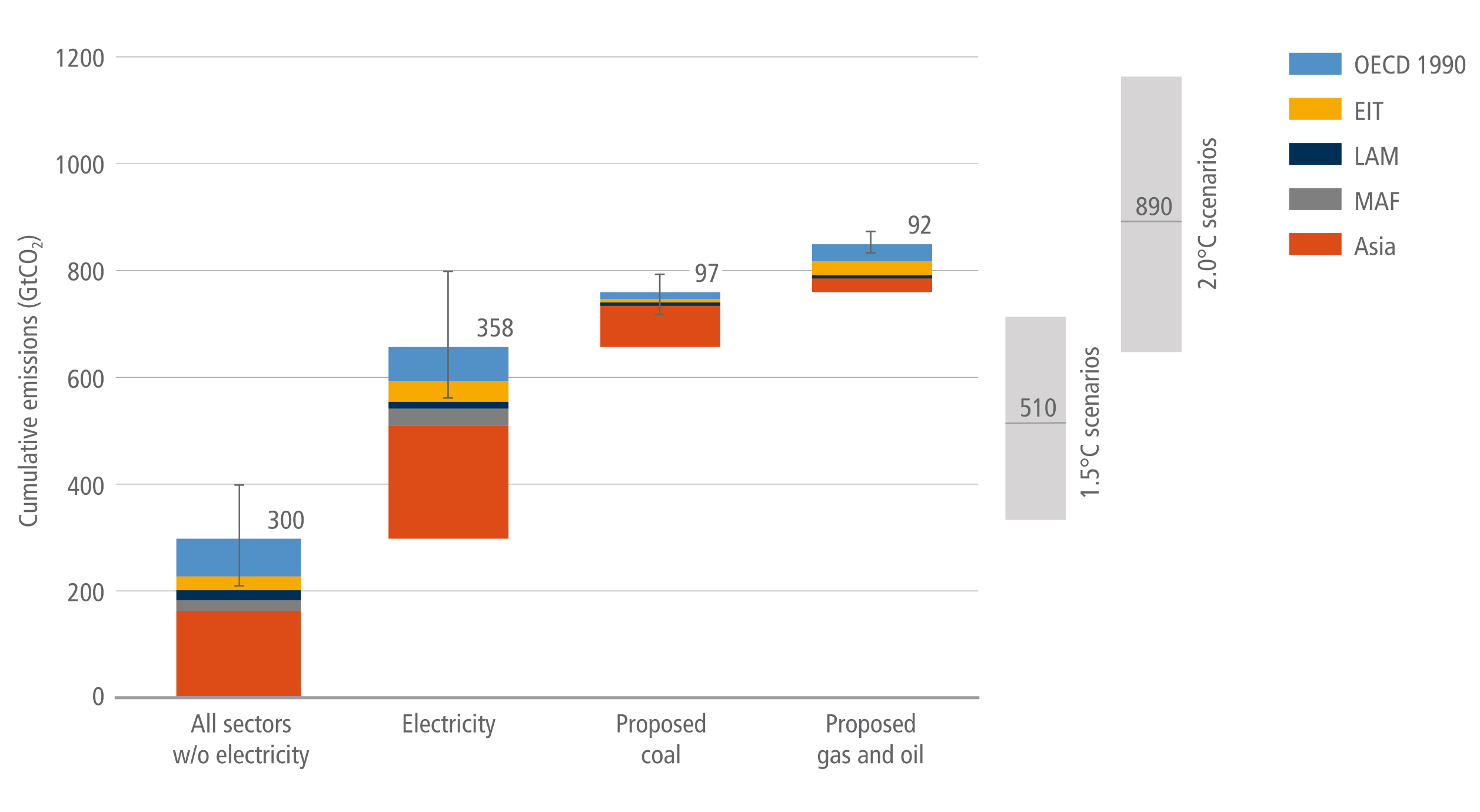

A waterfall chart visualising cumulative future carbon dioxide emissions from existing and planned fossil fuel infrastructure, compared against carbon budget scenarios. The chart builds cumulatively from left to right across four stacked bars. The first bar shows 300 gigatonnes from all sectors excluding electricity. The second adds 358 gigatonnes from existing electricity. The third adds 97 gigatonnes from proposed coal, and the fourth adds 92 gigatonnes from proposed gas and oil, reaching a total cumulative projection of 847 gigatonnes. Each bar is colour-coded by global region, showing Asia contributing the largest share across all sectors. On the right side, two grey floating bars depict the carbon budgets: the 1.5 degrees Celsius scenario has a median of 510 gigatonnes, and the 2.0 degrees scenario has a median of 890 gigatonnes. Visually, the chart shows that cumulative emissions from current and planned infrastructure significantly overshoot the median 1.5 degree budget and nearly reach the 2.0 degree budget.
Figure 2.26:  Future CO2 emissions from existing and currently planned fossil fuel infrastructure in the context of Paris carbon budgets in GtCO2 based on historic patterns of infrastructure lifetimes and capacity utilisation. Future CO2 emissions estimates of existing infrastructure for the electricity sector as well as all other sectors (industry, transport, buildings, other fossil fuel infrastructures) and of proposed infrastructures for coal power as well as gas and oil power. Grey bars on the right depict the range (5th–95th percentile) in overall cumulative net CO2 emissions until reaching net zero CO2 in pathways that limit warming to 1.5°C with no or limited overshoot (1.5°C scenarios), and in pathways that limit warming to 2°C (<67%) (2°C scenarios). Source: based on Edenhofer et al. (2018) and Tong et al. (2019).
Source: IPCC (2022) AR6 WGIII Chapter 2, Figure 2.26, pg. 267

Total anthropogenic direct and indirect GHG emissions for the year 2019 (in GtCO2-eq) by sector and subsector
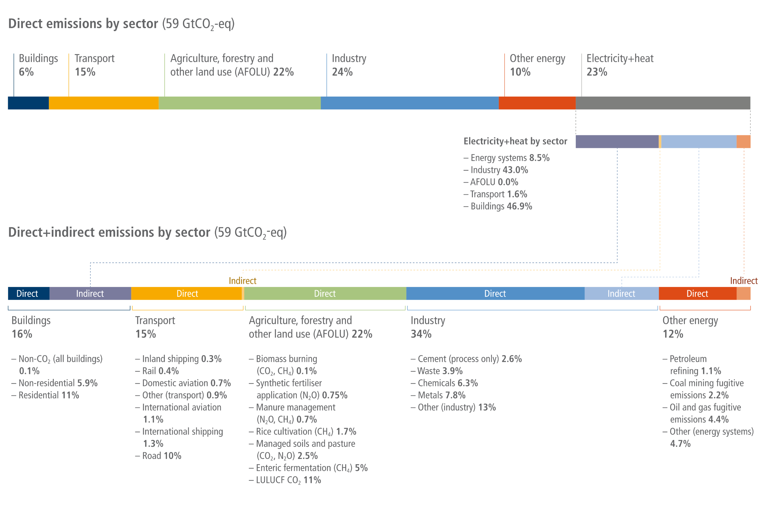

A two-part stacked bar chart illustrating how 59 gigatonnes of global greenhouse gas emissions are reallocated when accounting for indirect emissions. The top bar displays direct emissions: Buildings at 6 percent, Transport at 15 percent, Agriculture, Forestry and Other Land Use at 22 percent, Industry at 24 percent, Other energy at 10 percent, and Electricity and heat at 23 percent. Dotted lines show the 23 percent from Electricity and heat being redistributed mainly to Buildings and Industry. The bottom bar shows the resulting direct plus indirect emissions totals: Buildings jump to 16 percent, Transport stays at 15 percent, Agriculture and land use stays at 22 percent, Industry grows to 34 percent, and Other energy rises to 12 percent. Text below the bottom bar lists subsector breakdowns, highlighting major contributors like residential buildings at 11 percent, road transport at 10 percent, land-use CO2 at 11 percent, and metals at 7.8 percent.
Figure 2.1:  Total anthropogenic direct and indirect GHG emissions for the year 2019 (in GtCO2-eq) by sector and subsector. Direct emissions estimates assign emissions to the sector in which they arise (scope 1 reporting). Indirect emissions – as used here – refer to the reallocation of emissions from electricity and heat to the sector of final use (scope 2 reporting). Note that cement refers to process emissions only, as a lack of data prevents the full reallocation of indirect emissions to this sector. More comprehensive conceptualisations of indirect emissions including all products and services (scope 3 reporting) are discussed in Section 2.3 of this chapter. Emissions are converted into CO2-equivalents based on global warming potentials with a 100-year time horizon (GWP100) from the IPCC Sixth Assessment Report. Percentages may not add up to 100 across categories due to rounding at the second significant digit. Source: based on Lamb et al. (2021b); data: Minx et al. (2021).
Source: IPCC (2022) AR6 WGIII Chapter 2, Figure 2.12, pg. 237

The role of CO2 in driving future climate change in comparison to other greenhouse gases (GHGs)
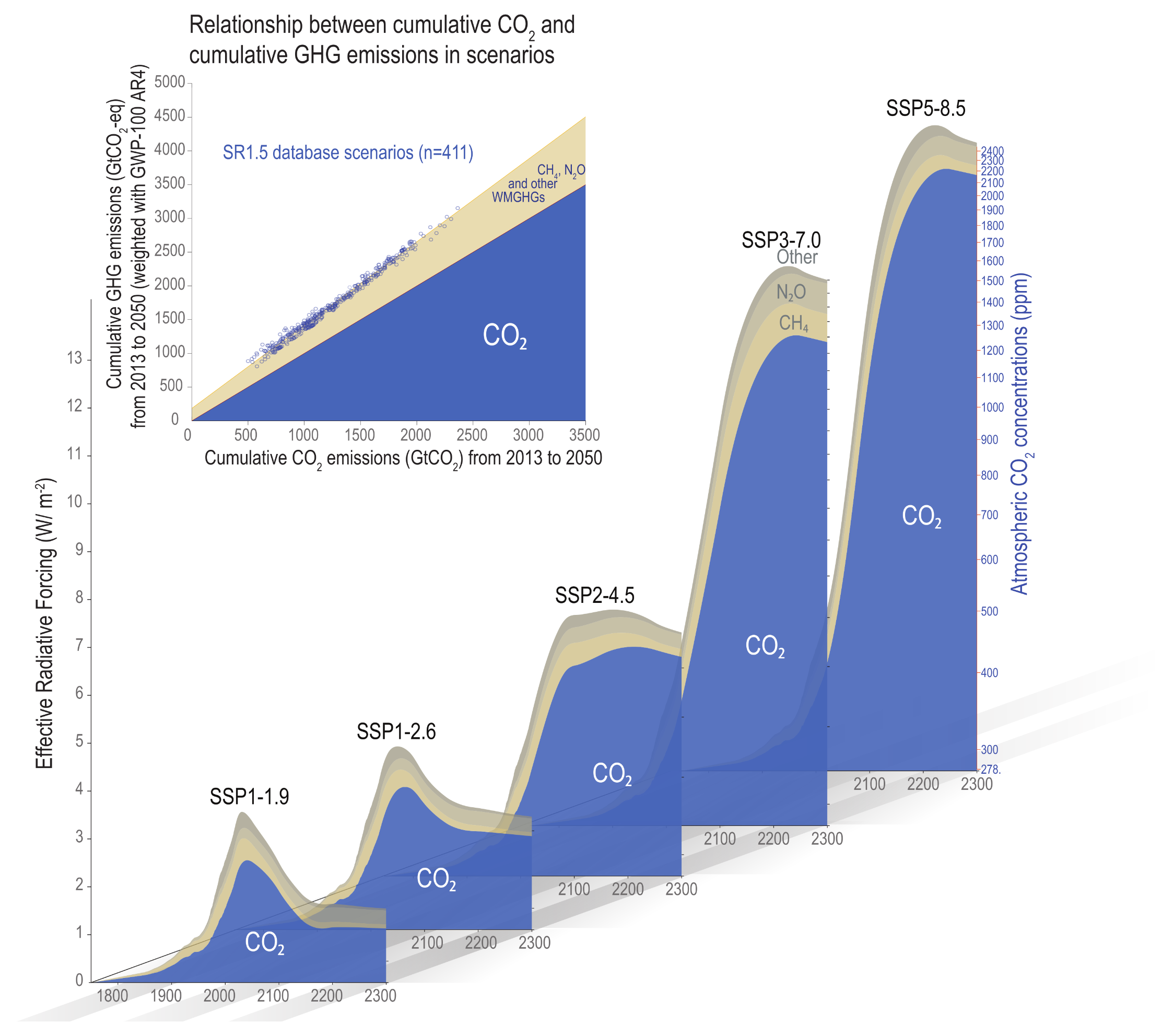
A complex infographic visualising the dominant role of carbon dioxide in driving future climate change compared to other greenhouse gases. The main graphic consists of five 3D-style area charts plotted along a timeline from 1800 to 2300. Each chart represents a different Shared Socio-economic Pathway, ranging from the lowest emissions scenario, SSP1-1.9, to the highest, SSP5-8.5. The vertical axis measures Effective Radiative Forcing, with a right-hand axis showing corresponding atmospheric CO2 concentrations. In every scenario, a massive blue shaded area representing CO2 accounts for the vast majority of the forcing. Thin bands of tan and grey layered on top represent the much smaller, combined contributions of methane, nitrous oxide, and other gases. An inset graph in the top left plots cumulative CO2 emissions against total cumulative greenhouse gas emissions up to 2050. It shows a tight, linear upward trend, visually reinforcing that total greenhouse gas emissions are dominated by, and closely correlated with, the large blue area representing CO2.
Figure 1.29:  The role of CO2 in driving future climate change in comparison to other greenhouse gases (GHGs). The GHGs included here are CH4, N2O, and 40 other long-lived, well-mixed GHGs. The blue shaded area indicates the approximate forcing exerted by CO2 in Shared Socio-economic Pathways (SSP) scenarios, ranging from very low SSP1-1.9 to very high SSP5-8.5 (Chapter 7). The CO2 concentrations under the SSP1-1.9 scenarios reach approximately 350 ppm after 2150, while those of SSP5-8.5 exceed 2000 ppm CO2 in the longer term (up to year 2300). Similar to the dominant radiative forcing share at each point in time (lower area plots), cumulative GWP-100- weighted GHG emissions happen to be closely correlated with cumulative CO2 emissions, allowing policymakers to make use of the carbon budget concept in a policy context with multi-gas GHG baskets as it exhibits relatively low variation across scenarios with similar cumulative emissions until 2050 (inset panel).
Source: IPCC (2021) AR6 WGI Chapter 1, Figure 1.29

Global surface temperature change 10 and 100 years after a one-year pulse of present-day emissions
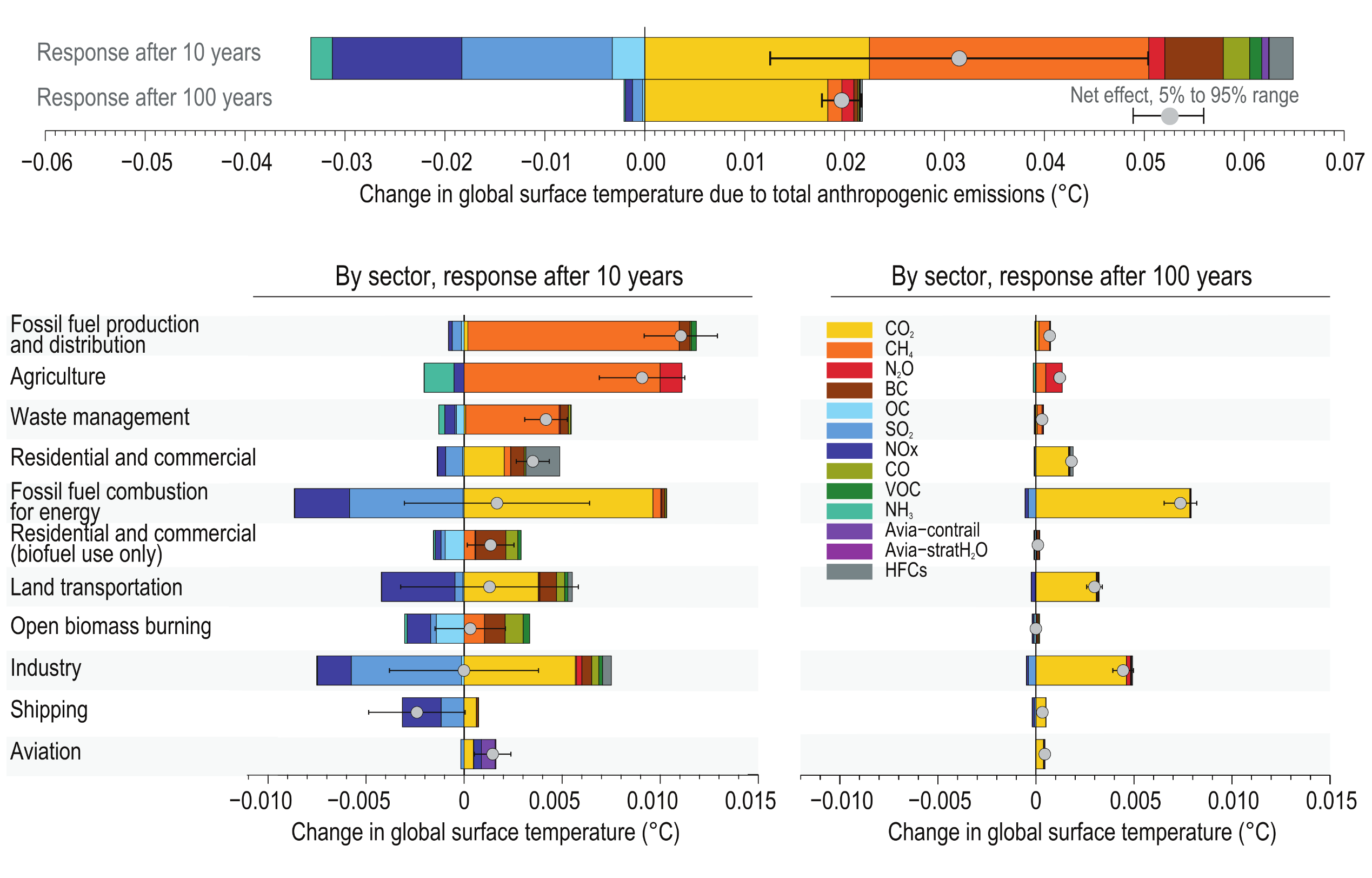

A complex multi-panel bar chart visualising global surface temperature changes 10 and 100 years after a one-year pulse of present-day emissions. The top panel compares total anthropogenic emissions at these two time scales. The 10-year response shows wide colour-coded bands extending both negatively for cooling effects, such as nitrogen oxides and sulphur dioxide, and positively for warming effects, such as methane and carbon dioxide. In contrast, the 100-year response bar is much shorter overall; cooling effects nearly disappear, and the positive warming effect is heavily dominated by the yellow band representing carbon dioxide. Below, two side-by-side panels break this data down by sector. The bottom-left panel for the 10-year response shows sectors like agriculture and fossil fuel production causing strong short-term warming, while shipping and fossil fuel combustion produce significant short-term cooling that offsets some warming. The bottom-right panel for the 100-year response visually demonstrates that long-term warming is almost entirely driven by carbon dioxide, most prominently in the fossil fuel combustion, industry, and land transportation sectors.
Figure TS.20:  Global surface temperature change 10 and 100 years after a one-year pulse of present-day emissions. The intent of this figure is to show the sectoral contribution to present-day climate change by specific climate forcers, including carbon dioxide (CO2) as well as short-lived climate forcers (SLCFs). The temperature response is broken down by individual species and shown for total anthropogenic emissions (top), and sectoral emissions on 10-year (left) and 100-year time scales (right). Sectors are sorted by (high-to-low) net temperature effect on the 10-year time scale. Error bars in the top panel show the 5–95% range in net temperature effect due to uncertainty in radiative forcing only (calculated using a Monte Carlo approach and best estimate uncertainties from the literature). Emissions for 2014 are from the Coupled Model Intercomparison Project Phase 6 (CMIP6) emissions dataset, except for hydrofluorocarbons (HFCs) and aviation H2O, which rely on other datasets (see Section 6.6.2 for more details). CO2 emissions are excluded from open biomass burning and residential biofuel use.
Source: IPCC (2021) AR6 WGI Technical Summary, Figure TS.20, pg. 102

Cumulative past, projected, and committed emissions, and associated global temperature changes
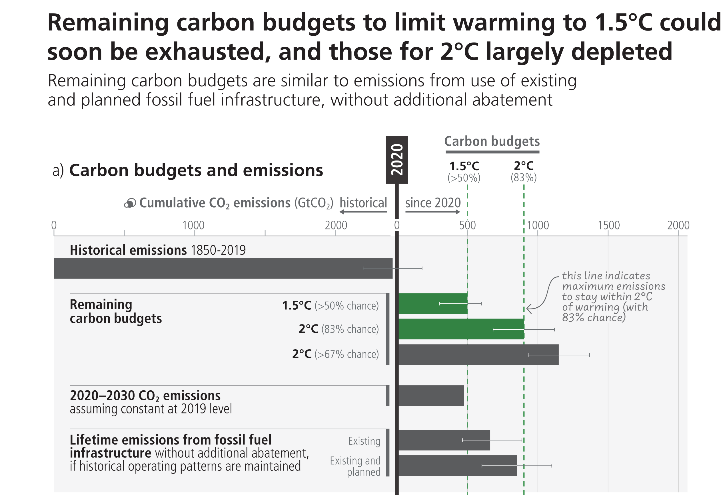
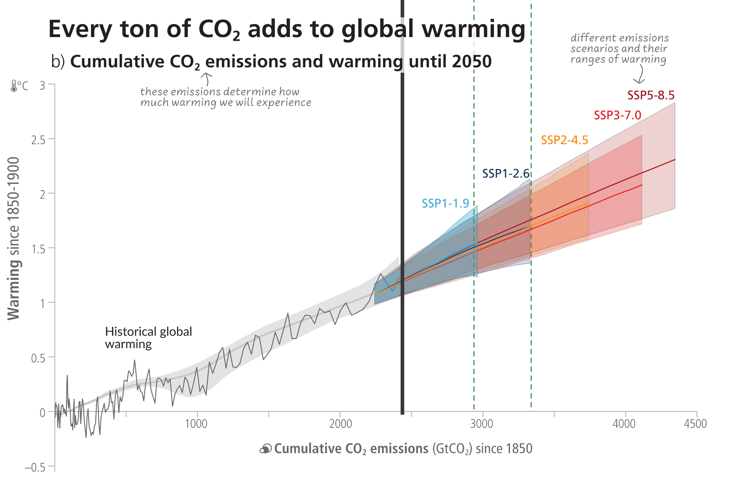
A two-part infographic separated by a vertical black line representing the year 2020. Panel A at the top uses horizontal bars to compare historical emissions against future carbon budgets. A massive grey bar extending to the left shows historical emissions from 1850 to 2019 nearing 2400 gigatonnes. To the right of the 2020 line, green bars show remaining carbon budgets of roughly 500 gigatonnes for a 1.5 degrees Celsius limit, and 900 gigatonnes for a 2 degrees Celsius limit. Below these, grey bars show lifetime emissions from existing and planned fossil fuel infrastructure totalling roughly 850 gigatonnes. Visually, the chart demonstrates that emissions from planned infrastructure exceed the 1.5-degree budget and consume almost the entire 2-degree budget. Panel B below is a line and area graph showing the direct relationship between cumulative emissions and global warming. A jagged black line tracks historical warming to roughly 1.1 degrees Celsius by 2020. From 2020, the graph splits into five upward-trending coloured bands representing future scenarios. The lowest scenario in blue shows warming stabilising near 1.5 degrees, while the highest scenario in dark red shows temperatures climbing steeply towards 2.5 degrees. Vertical dashed lines connect the carbon budgets in Panel A directly down to the corresponding temperature thresholds in Panel B.

Figure 3.5: Cumulative past, projected, and committed emissions, and associated global temperature changes. Panel (a) Assessed remaining carbon budgets to limit warming more likely than not to 1.5°C, to 2°C with a 83% and 67% likelihood, compared to cumulative emissions corresponding to constant 2019 emissions until 2030, existing and planned fossil fuel infrastructures (in GtCO2). For remaining carbon budgets, thin lines indicate the uncertainty due to the contribution of non-CO2 warming. For lifetime emissions from fossil fuel infrastructure, thin lines indicate the assessed sensitivity range. Panel (b) Relationship between cumulative CO2 emissions and the increase in global surface temperature. Historical data (thin black line) shows historical CO2 emissions versus observed global surface temperature increase relative to the period 1850-1900. The grey range with its central line shows a corresponding estimate of the human-caused share of historical warming. Coloured areas show the assessed very likely range of global surface temperature projections, and thick coloured central lines show the median estimate as a function of cumulative CO2 emissions for the selected scenarios SSP1-1.9, SSP1-2.6, SSP2-4.5, SSP3-7.0, and SSP5-8.5. Projections until 2050 use the cumulative CO2 emissions of each respective scenario, and the projected global warming includes the contribution from all anthropogenic forcers.
Source: IPCC (2023) AR6 Synthesis Report Figure 3.5

“There is a near-linear relationship between cumulative CO2 emissions and the increase in global mean surface air temperature (GSAT) caused by CO2 over the course of this century for global warming levels up to at least 2°C relative to pre-industrial (high confidence).”

Source: IPCC (2021) AR6 WGI Chapter 5, pg. 678


“In addition to reaching net zero CO2 emissions, a strong reduction in methane emissions is the most critical component in non-CO2 mitigation to keep the Paris climate goals in reach.”

Source: IPCC (2022) AR6 WGIII Chapter 3, pg. 319


Aggregate greenhouse gas (GHG) emissions of global mitigation pathways (coloured funnels and bars) and projected emission outcomes from current policies and emissions implied by unconditional and conditional elements of NDCs, based on updates available by 11 October 2021 (grey bars)
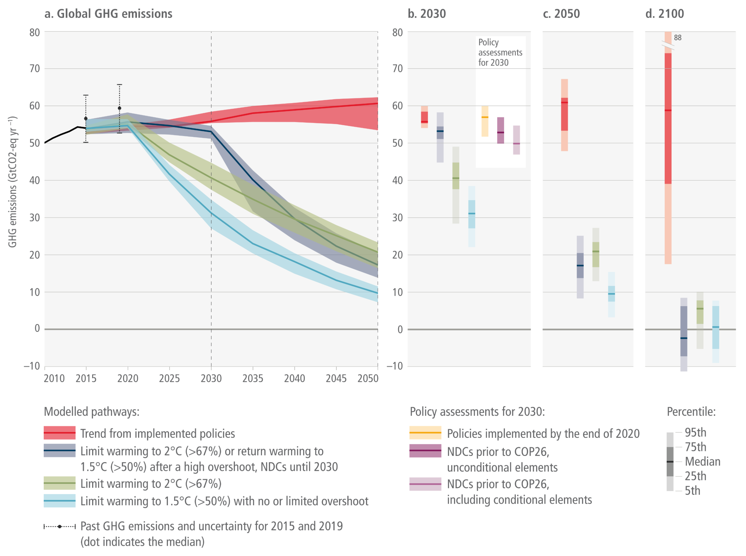

A multi-panel chart illustrating global greenhouse gas emission pathways from 2010 to 2100. The large left panel is a line graph with shaded funnels showing four projected trajectories up to 2050. The red band, representing trends from implemented policies, remains high and slightly increases near 60 gigatonnes. The light blue band, representing the 1.5 degrees Celsius limit, drops sharply from 2020 towards 10 gigatonnes by 2050. The green and dark blue bands represent 2 degrees Celsius limits, with the dark blue line remaining flat until 2030 before dropping steeply. Three smaller panels on the right display vertical bars representing emission ranges for snapshot years 2030, 2050, and 2100. These snapshot panels visually highlight that by 2100, the 1.5 and 2 degree pathways plunge to or below the zero line, indicating net-zero or negative emissions, whereas the red implemented policy trend remains extremely high.
Figure TS.9:  Aggregate greenhouse gas (GHG) emissions of global mitigation pathways (coloured funnels and bars) and projected emission outcomes from current policies and emissions implied by unconditional and conditional elements of NDCs, based on updates available by 11 October 2021 (grey bars). Shaded areas show GHG emission medians and 25–75th percentiles over 2020–2050 for four types of pathways in the AR6 scenario database: (i) pathways with near-term emissions developments in line with current policies and extended with comparable ambition levels beyond 2030; (ii) pathways likely to limit warming to 2°C with near-term emissions developments reflecting 2030 emissions implied by current NDCs followed by accelerated emissions reductions; (iii) pathways likely to limit warming to 2°C based on immediate actions from 2020 onwards; (iv) pathways that limit warming to 1.5°C with no or limited overshoot. Right-hand panels show two snapshots of the 2030 and 2050 emission ranges of the pathways in detail (median, 25–75th and 5–95th percentiles). The 2030 snapshot includes the projected emissions from the implementation of the NDCs as assessed in Section 4.2 (Table 4.1; median and full range). Historic GHG emissions trends as used in model studies are shown for 2010–2015. GHG emissions are in CO2-equivalent using GWP100 values from AR6.
Source: IPCC (2022) AR6 WGIII TS, Figure TS.9

Global emissions projections to 2035 and emissions gaps to Paris target
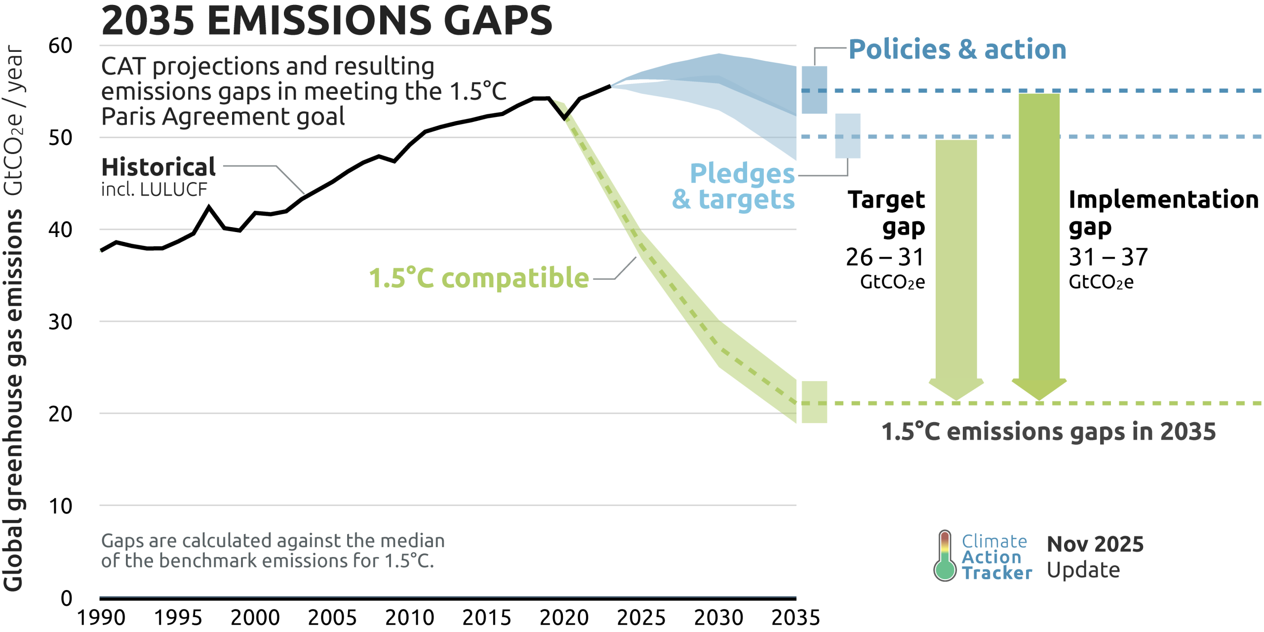
A line graph titled 2035 Emissions Gaps comparing projected global greenhouse gas emissions against a 1.5 degrees Celsius compatible pathway. The vertical axis measures emissions from 0 to 60 gigatonnes of CO2 equivalent per year, and the horizontal axis spans from 1990 to 2035. A black line shows historical emissions steadily rising to a peak near 55 gigatonnes around 2023. Projections to 2035 split into three distinct paths. The highest path, a blue band representing policies and action, remains high between 50 and 55 gigatonnes. Below it, a lighter blue band representing pledges and targets dips slightly to roughly 48 to 52 gigatonnes. In stark contrast, a green dashed line representing the 1.5 degrees compatible pathway drops sharply to approximately 21 gigatonnes by 2035. Two large downward-pointing arrows on the right highlight the massive shortfalls in 2035: a target gap of 26 to 31 gigatonnes, and an implementation gap of 31 to 37 gigatonnes.
Climate Action Tracker (2025). 2035 Emissions Gap: CAT projections and resulting emissions gap in meeting the 1.5°C Paris Agreement goal. November 2025. Source: https://climateactiontracker.org/global/emissions-gaps/

Climate Action Tracker evaluations of national net zero target designs
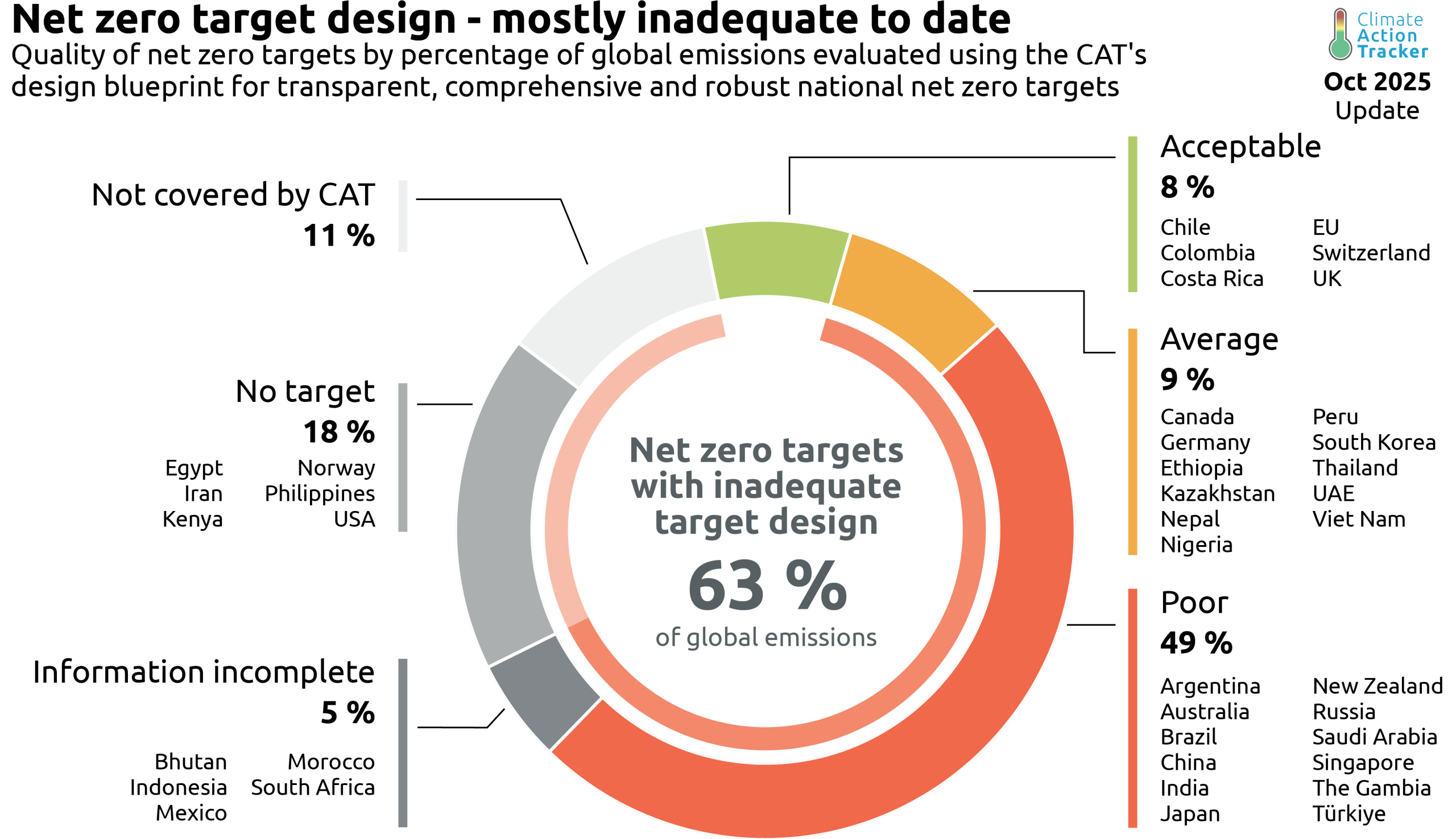
A doughnut chart titled Net zero target design - mostly inadequate to date, visualising the quality of national net zero targets by percentage of global emissions as of October 2025. The centre of the chart highlights the primary finding: 63 percent of global emissions fall under net zero targets with inadequate target design.  The chart is divided into six colour-coded segments around the perimeter:  Acceptable (Green): 8 percent of emissions, listing countries such as Chile, Colombia, Costa Rica, the EU, Switzerland, and the UK.  Average (Orange): 9 percent of emissions, listing countries including Canada, Germany, Peru, and the UAE.  Poor (Red): The largest segment at 49 percent, featuring nations like Argentina, Australia, Brazil, China, India, Japan, and Saudi Arabia.  Information incomplete (Dark Grey): 5 percent of emissions, including Indonesia, Mexico, and South Africa.  No target (Medium Grey): 18 percent of emissions, listing the USA, Norway, Iran, Egypt, Kenya, and the Philippines.  Not covered by CAT (Light Grey): 11 percent of global emissions.  Visually, the Poor, Average, and Information incomplete segments form a large block of the chart, reinforcing the central message that the majority of current net zero target designs remain inadequate.
Climate Action Tracker (Oct. 2025). CAT net zero target designs – mostly inadequate. Source: https://climateactiontracker.org/global/cat-net-zero-target-evaluations/

Rating the comprehensiveness of national net zero target design
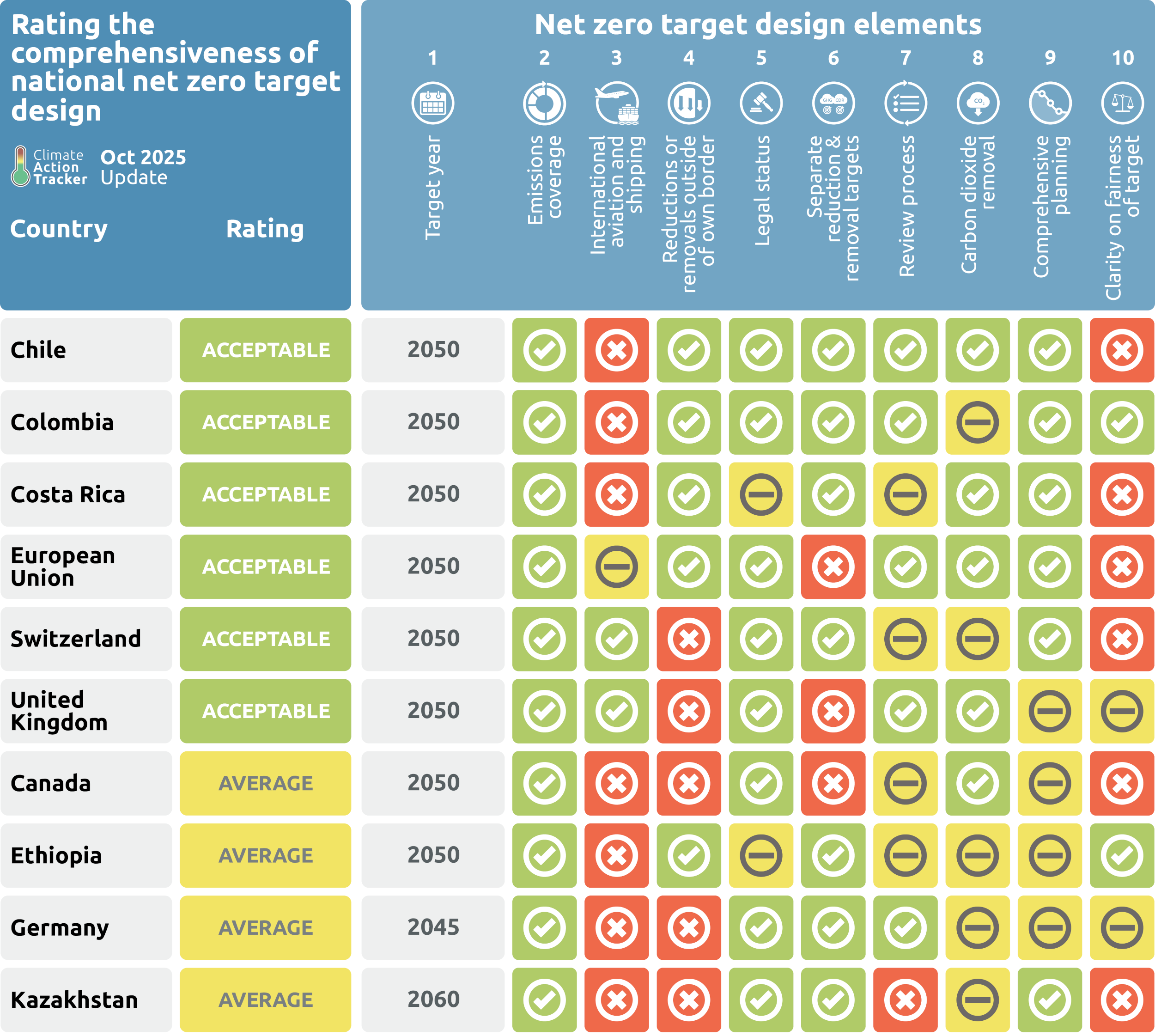
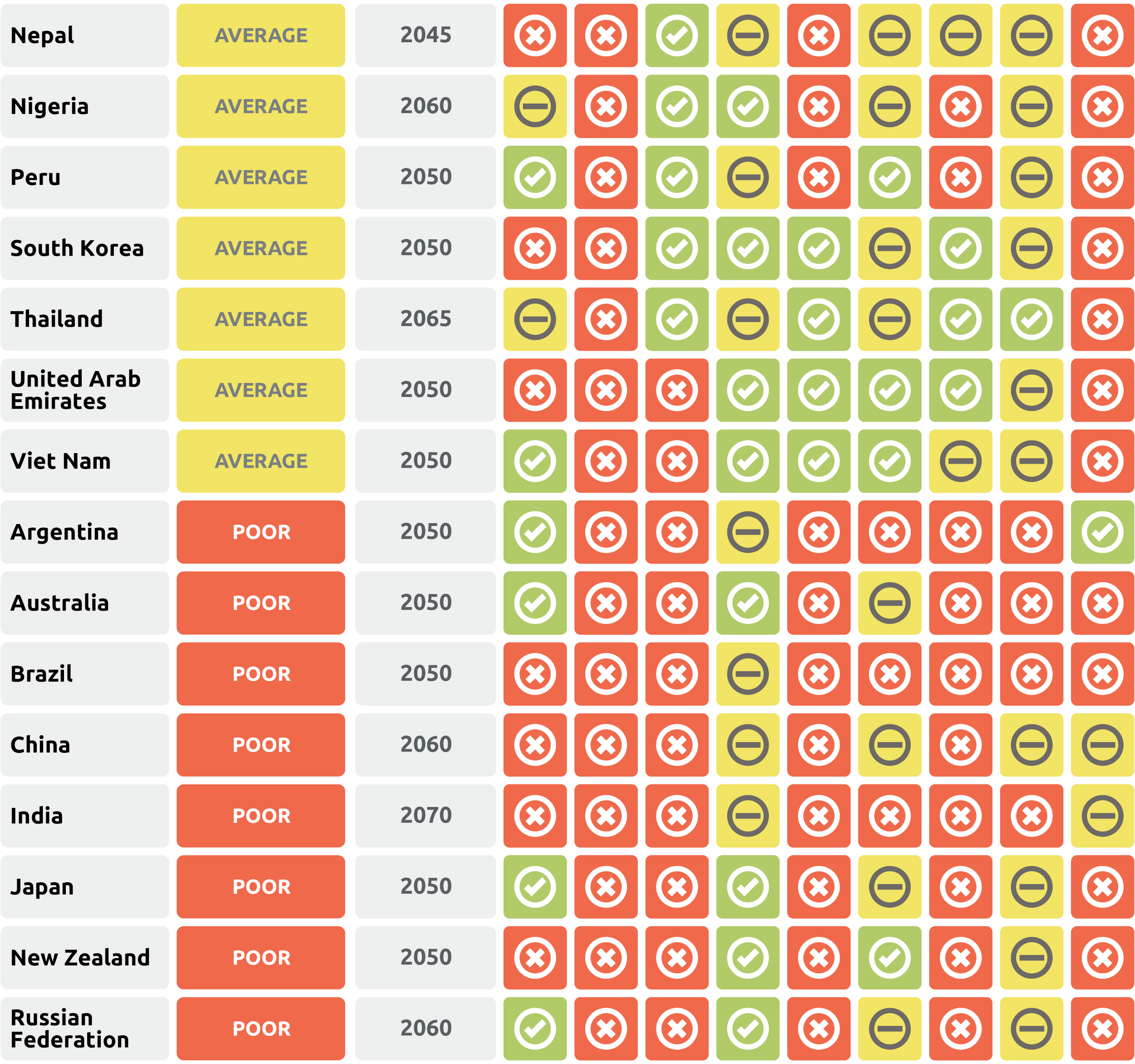
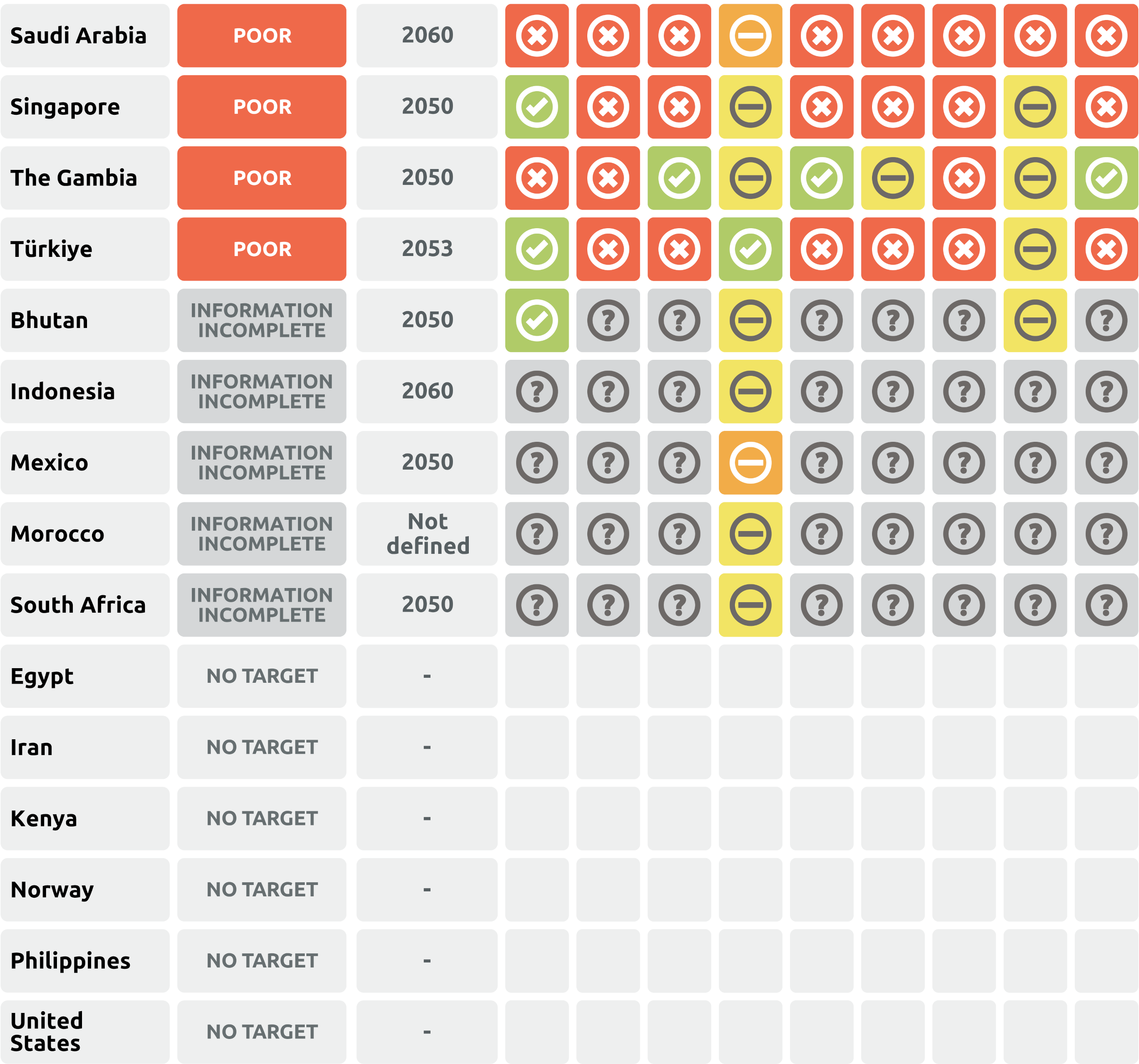
A large score-card table visualising the Climate Action Tracker evaluations of national net zero target designs across evaluated countries. The table groups countries by overall rating, listing target completion years and scoring each country across 10 key design criteria (such as emissions coverage, international transport inclusions, legal status, review processes, and fairness clarity) using colour-coded icons for pass, partial, fail, or incomplete data.  The evaluated categories break down as follows:  Acceptable Rating: Includes Chile, Colombia, Costa Rica, European Union, Switzerland, and the United Kingdom, all with a net zero target year of 2050 and predominantly green pass marks across key criteria.  Average Rating: Includes Canada (2050), Ethiopia (2050), Germany (2045), Kazakhstan (2060), Nepal (2045), Nigeria (2060), Peru (2050), South Korea (2050), Thailand (2065), UAE (2050), and Viet Nam (2050), showing mixed evaluations with several yellow partial and red fail marks.  Poor Rating: Includes Argentina (2050), Australia (2050), Brazil (2050), China (2060), India (2070), Japan (2050), New Zealand (2050), Russian Federation (2060), Saudi Arabia (2060), Singapore (2050), The Gambia (2050), and Türkiye (2053), showing predominantly red fail marks across design elements.  Information Incomplete: Includes Bhutan (2050), Indonesia (2060), Mexico (2050), Morocco (not defined), and South Africa (2050), where most criteria are marked as uncertain due to missing data.  No Target: Includes Egypt, Iran, Kenya, Norway, Philippines, and the United States, which have no target year or design criteria values evaluated.

Climate Action Tracker (Oct. 2025). Table 1. Overview of Climate Action Tracker’s net zero target evaluations for G20 member countries (excluding France and Italy as both not separately analysed by the CAT) and selected other countries per key elements as of October 2025. Source: https://climateactiontracker.org/global/cat-net-zero-target-evaluations/

The global carbon cycle
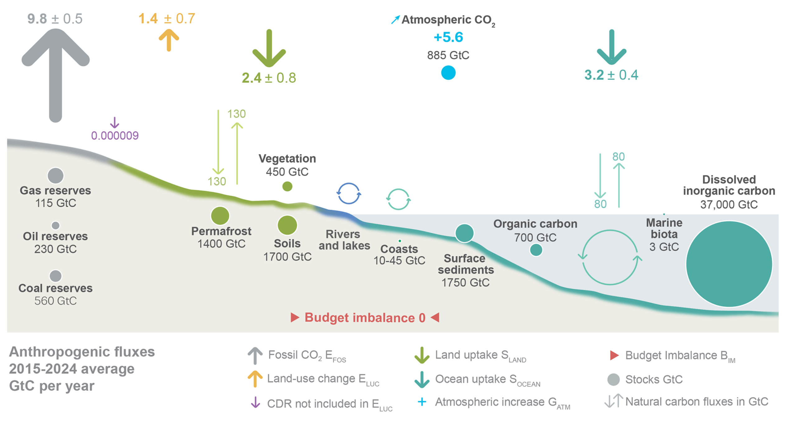
A schematic diagram visualising the global carbon cycle, depicting carbon stocks in gigatonnes and average annual anthropogenic fluxes in gigatonnes of carbon per year for the decade 2015 to 2024.  The top half of the image uses thick, colour-coded arrows to show human-caused fluxes. Upward arrows indicate emissions: 9.8 gigatonnes from fossil fuels and 1.4 gigatonnes from land-use change. Downward arrows show carbon sinks: land uptake absorbs 2.4 gigatonnes and ocean uptake absorbs 3.2 gigatonnes, with a microscopic purple arrow showing carbon dioxide removal at 0.000009 gigatonnes. This results in a net atmospheric increase of 5.6 gigatonnes per year, adding to the total atmospheric stock of 885 gigatonnes.  The bottom half illustrates the major global carbon stocks. On the left, underground fossil reserves hold 560 gigatonnes of coal, 230 of oil, and 115 of gas. Moving right across the land surface, stocks include 1400 gigatonnes in permafrost, 1700 in soils, and 450 in vegetation. The ocean section on the far right holds massive reservoirs, dominated by 37,000 gigatonnes of dissolved inorganic carbon, alongside smaller stocks in surface sediments and organic carbon. Thin background arrows indicate natural carbon exchanges, showing 130 gigatonnes cycling annually between the land and atmosphere, and 80 gigatonnes cycling between the ocean and atmosphere. At the bottom centre, the overall budget imbalance is listed as zero.
Figure 2. Schematic representation of the overall perturbation of the global carbon cycle caused by anthropogenic activities, averaged globally for the decade 2015–2024. See legends for the corresponding arrows. Fluxes estimates and their 1 standard deviation uncertainty are as reported in Table 7. The CDR estimate is for the year 2024. The uncertainty in the atmospheric CO2 growth rate is very small (±0.02 GtC yr−1 ) and is neglected for the figure. The anthropogenic perturbation occurs on top of an active carbon cycle, with fluxes and stocks represented in the background and taken from Canadell et al. (2021) for all numbers, except for the carbon stocks in coasts which is from a literature review of coastal marine sediments (Price and Warren, 2016). Fluxes are in GtC yr−1 and reservoirs in GtC. This figure was produced by Nigel Hawtin.
Source: Friedlingstein et al (2026) Global Carbon Budget 2025, Figure 2

Global carbon (CO2) budget (2010–2019)
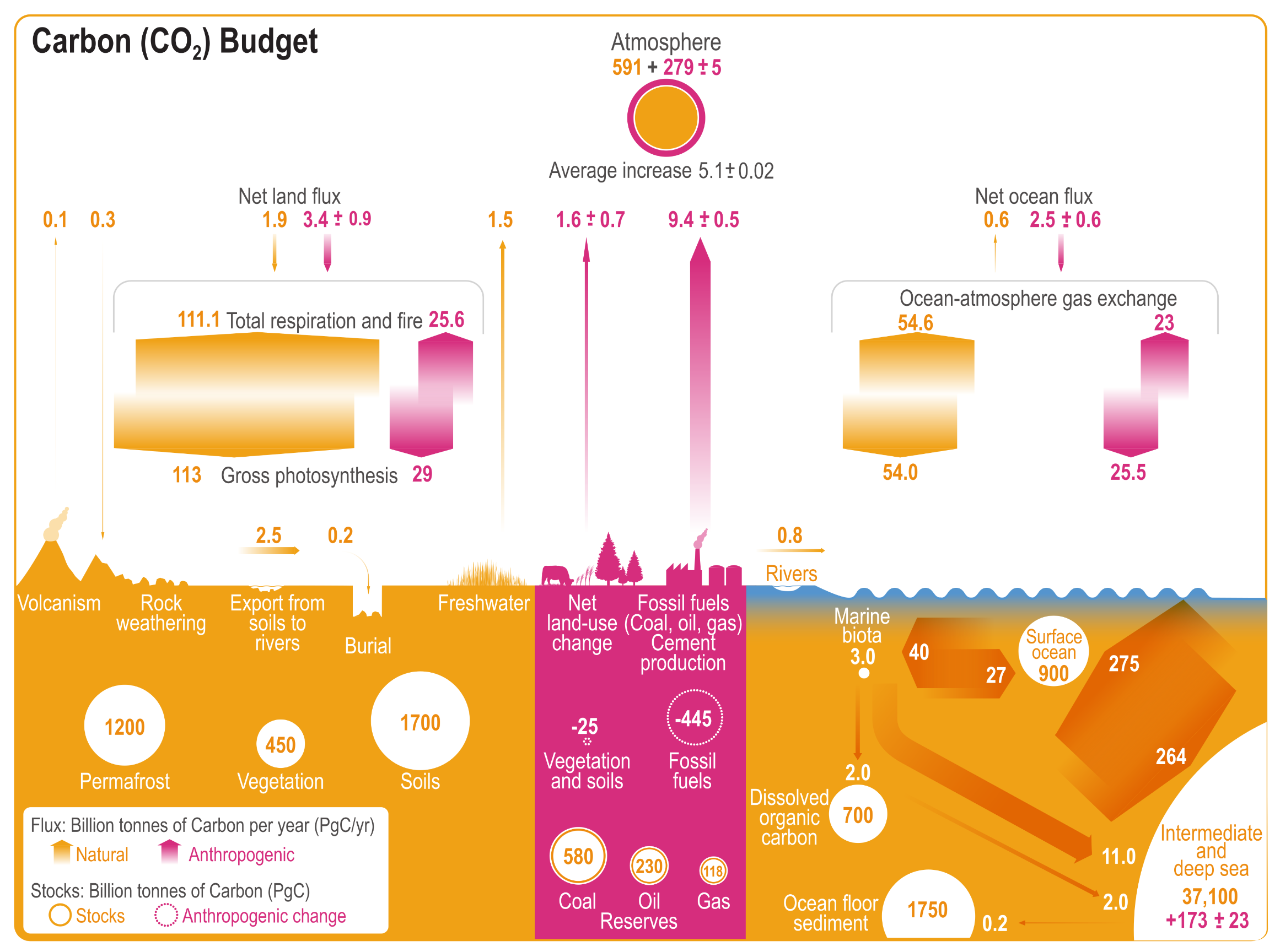
A detailed infographic titled Carbon (CO2) Budget visualising the global carbon cycle. The diagram is split into three main environments: land on the left, human activities in the centre, and the ocean on the right, all interacting with the atmosphere at the top. A key in the bottom left explains that yellow and orange represent natural carbon stocks and fluxes, while pink represents anthropogenic, or human-caused, changes. All values are in billion tonnes of carbon.  At the top, the atmosphere circle shows a natural stock of 591, with a human-caused addition of 279.  On the left, the land section displays large natural stocks in permafrost, soils, and vegetation. Massive opposing block arrows show the natural cycle of gross photosynthesis and total respiration, with pink additions showing human impact.  In the centre, large pink arrows represent human activities. They show carbon being extracted from fossil fuel reserves and emitted into the atmosphere, with the largest upward flux being 9.4 from fossil fuels and cement production.  On the right, the ocean section shows massive carbon stocks, particularly in the intermediate and deep sea, which holds over 37,000. Opposing arrows illustrate the ocean-atmosphere gas exchange, showing that while massive amounts of carbon cycle naturally, there is a net human-caused flux of 2.5 entering the ocean annually.
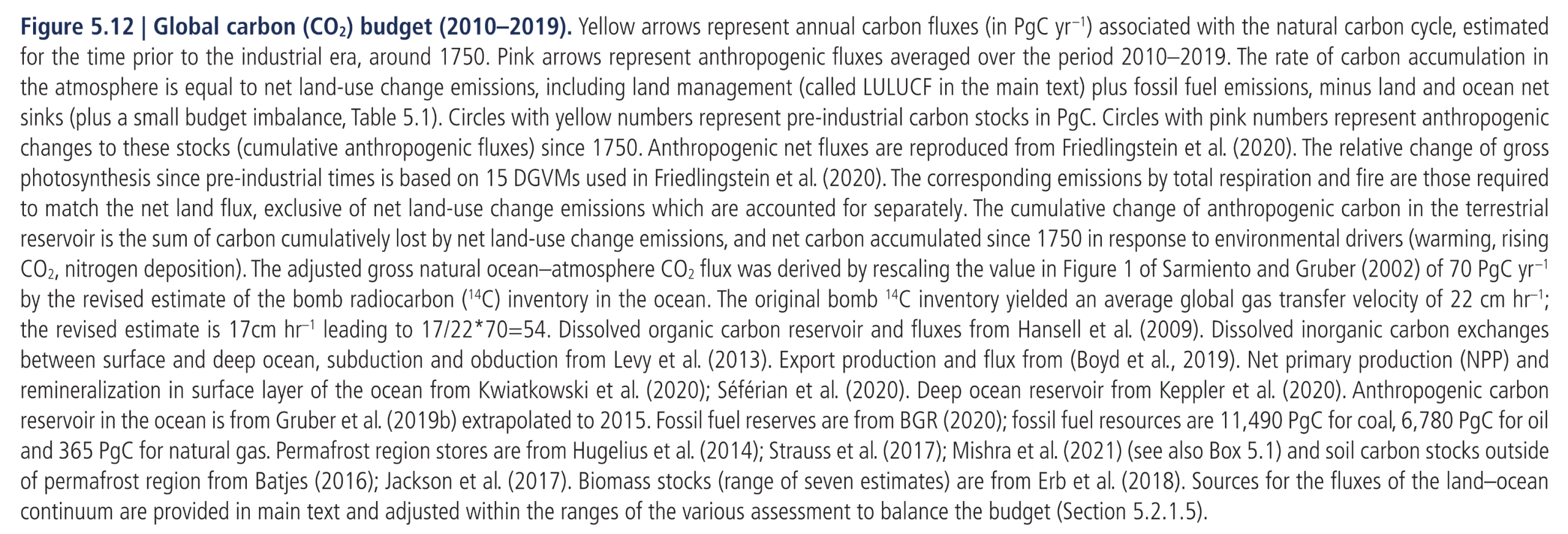
Figure 5.12:  Global carbon (CO2) budget (2010–2019). Yellow arrows represent annual carbon fluxes (in PgC yr –1) associated with the natural carbon cycle, estimated for the time prior to the industrial era, around 1750. Pink arrows represent anthropogenic fluxes averaged over the period 2010–2019. The rate of carbon accumulation in the atmosphere is equal to net land-use change emissions, including land management (called LULUCF in the main text) plus fossil fuel emissions, minus land and ocean net sinks (plus a small budget imbalance, Table 5.1). Circles with yellow numbers represent pre-industrial carbon stocks in PgC. Circles with pink numbers represent anthropogenic changes to these stocks (cumulative anthropogenic fluxes) since 1750. Anthropogenic net fluxes are reproduced from Friedlingstein et al. (2020). The relative change of gross photosynthesis since pre-industrial times is based on 15 DGVMs used in Friedlingstein et al. (2020). The corresponding emissions by total respiration and fire are those required to match the net land flux, exclusive of net land-use change emissions which are accounted for separately. The cumulative change of anthropogenic carbon in the terrestrial reservoir is the sum of carbon cumulatively lost by net land-use change emissions, and net carbon accumulated since 1750 in response to environmental drivers (warming, rising CO2, nitrogen deposition). The adjusted gross natural ocean–atmosphere CO2 flux was derived by rescaling the value in Figure 1 of Sarmiento and Gruber (2002) of 70 PgC yr –1 by the revised estimate of the bomb radiocarbon (14C) inventory in the ocean. The original bomb 14C inventory yielded an average global gas transfer velocity of 22 cm hr–1; the revised estimate is 17cm hr–1 leading to 17/22*70=54. Dissolved organic carbon reservoir and fluxes from Hansell et al. (2009). Dissolved inorganic carbon exchanges between surface and deep ocean, subduction and obduction from Levy et al. (2013). Export production and flux from (Boyd et al., 2019). Net primary production (NPP) and remineralization in surface layer of the ocean from Kwiatkowski et al. (2020); Séférian et al. (2020). Deep ocean reservoir from Keppler et al. (2020). Anthropogenic carbon reservoir in the ocean is from Gruber et al. (2019b) extrapolated to 2015. Fossil fuel reserves are from BGR (2020); fossil fuel resources are 11,490 PgC for coal, 6,780 PgC for oil and 365 PgC for natural gas. Permafrost region stores are from Hugelius et al. (2014); Strauss et al. (2017); Mishra et al. (2021) (see also Box 5.1) and soil carbon stocks outside of permafrost region from Batjes (2016); Jackson et al. (2017). Biomass stocks (range of seven estimates) are from Erb et al. (2018). Sources for the fluxes of the land–ocean continuum are provided in main text and adjusted within the ranges of the various assessment to balance the budget (Section 5.2.1.5).
Source: IPCC (2021) AR6 WGI Chapter 5, Figure 5.12

Global methane (CH4) budget (2008–2017)
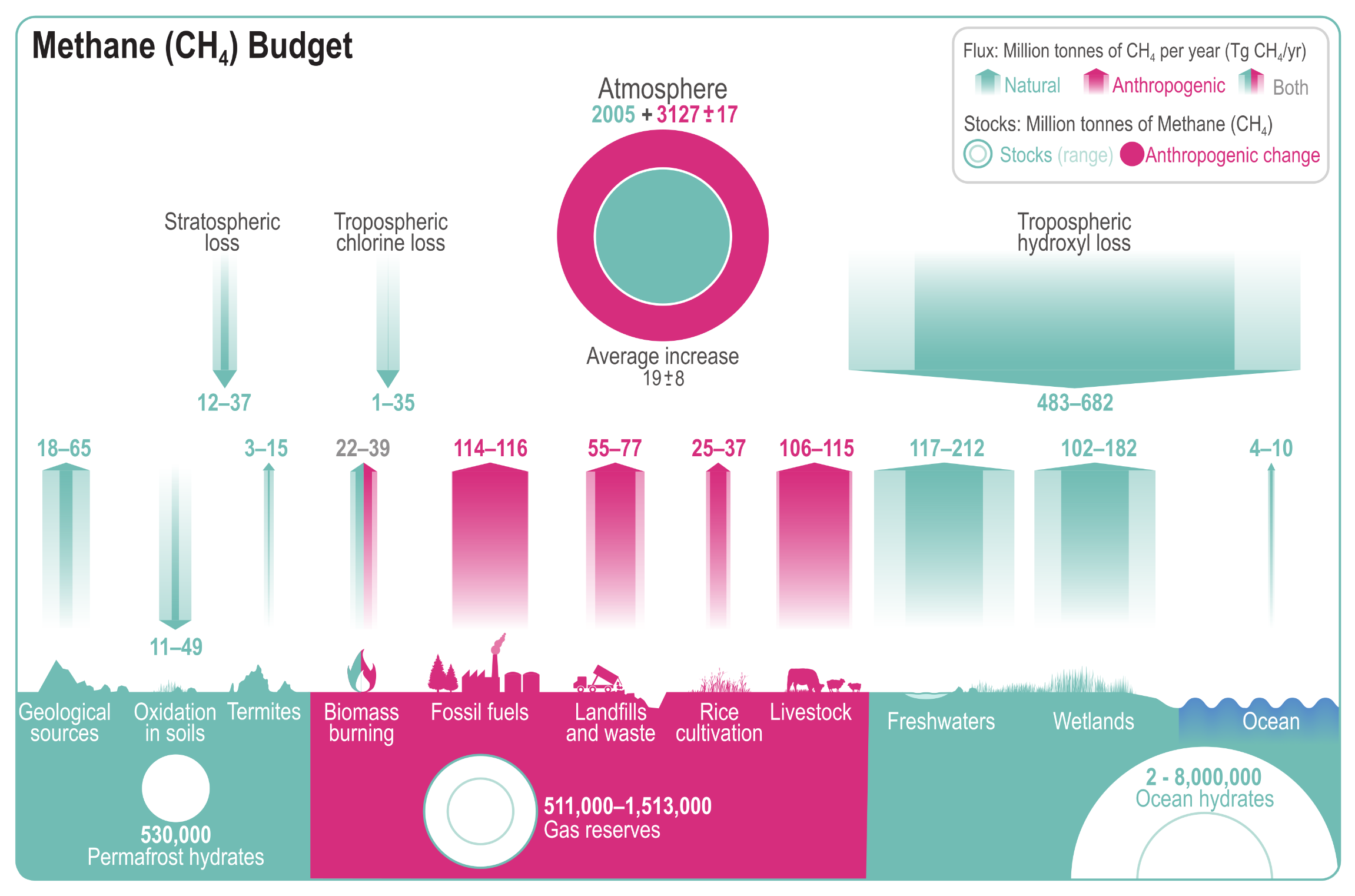
A detailed infographic titled Methane (CH4) Budget visualising the global methane cycle. A key in the top right explains that teal represents natural fluxes and stocks, pink represents anthropogenic or human-caused changes, and mixed colours represent a combination of both. All values are in million tonnes of methane.  In the upper centre, the atmosphere is depicted as a teal circle representing a natural stock of 2005, surrounded by a thick pink ring showing a large human-caused addition of 3127, resulting in an average annual atmospheric increase of 19. Above the surface, large downward-pointing teal arrows show atmospheric methane sinks, heavily dominated by tropospheric hydroxyl loss, which removes between 483 and 682 million tonnes annually.  Along the bottom, upward-pointing arrows illustrate various surface emissions. On the left and right, teal arrows highlight major natural sources such as wetlands emitting 102 to 182, and freshwaters emitting 117 to 212. In the centre, pink arrows highlight significant human-caused emissions, primarily from fossil fuels at 114 to 116, livestock at 106 to 115, landfills and waste at 55 to 77, and rice cultivation at 25 to 37. Biomass burning is shown as a mixed natural and human-caused source. Below the surface landscape, circles indicate massive subterranean and underwater methane stocks, including gas reserves, permafrost hydrates, and ocean hydrates.
Figure 5.14:  Global methane (CH4) budget (2008–2017). Values and data sources as in Table 5.2 (in TgCH4). The atmospheric stock is calculated from mean CH4 concentration, multiplying a factor of 2.75 ± 0.015 Tg ppb–1, which accounts for the uncertainties in global mean CH4 (Chandra et al., 2021).
Source: IPCC AR6 WGI Chapter 5, Figure 5.14

Global nitrous oxide (N2O) budget (2007–2016)
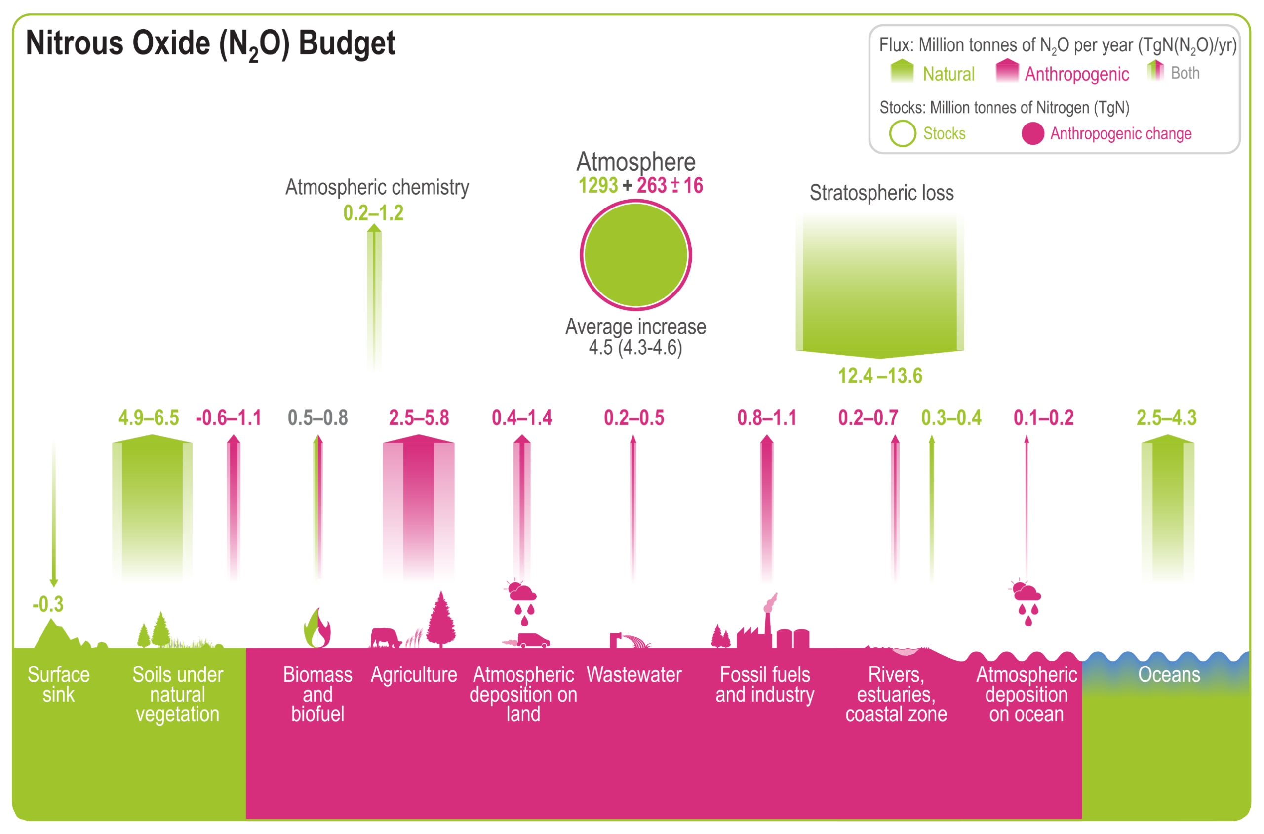
A detailed infographic titled Nitrous Oxide (N2O) Budget visualising the global nitrous oxide cycle. A key in the top right explains that green represents natural fluxes and stocks, pink represents anthropogenic or human-caused changes, and a mix of both colours represents combined sources. All flux values are in million tonnes of N2O per year.  In the upper centre, the atmosphere is depicted as a green circle representing a natural stock of 1293, surrounded by a pink ring showing a human-caused addition of 263, resulting in an average annual atmospheric increase of 4.5. To the right, a massive downward-pointing green arrow shows stratospheric loss acting as the primary atmospheric sink, removing between 12.4 and 13.6 million tonnes annually.  Along the bottom, upward-pointing arrows illustrate various surface emissions. On the left and right, large green arrows highlight major natural sources: soils under natural vegetation emitting 4.9 to 6.5, and oceans emitting 2.5 to 4.3. In the centre, pink arrows highlight significant human-caused emissions, heavily dominated by agriculture at 2.5 to 5.8. Smaller anthropogenic contributions include fossil fuels and industry at 0.8 to 1.1, wastewater at 0.2 to 0.5, and atmospheric deposition on land and oceans.
Figure 5.17:  Global nitrous oxide (N2O) budget (2007–2016). Values and data sources as in Table 5.3. The atmospheric stock is calculated from mean N2O concentration, multiplying a factor of 4.79 ± 0.05 Tg ppb–1 (Prather et al., 2012). Pool sizes for the other reservoirs are largely unknown.
Source: IPCC (2021) AR6 WGI Chapter 5, Figure 5.17

Global net anthropogenic GHG emissions (GtCO2-eq yr –1) 1990–2019
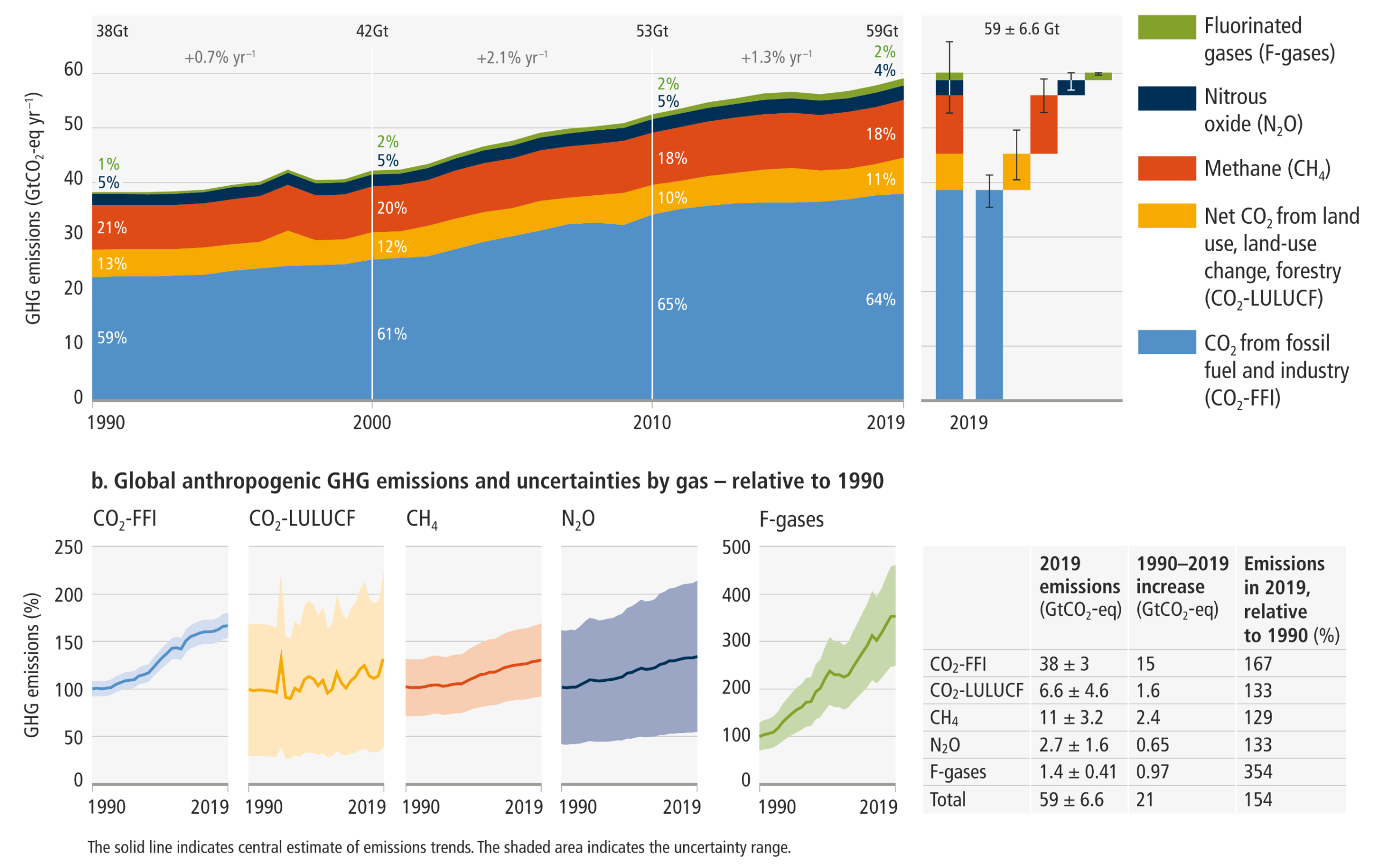
A comprehensive two-part chart from the IPCC AR6 report, detailing global net anthropogenic greenhouse gas emissions from 1990 to 2019.  Panel a, at the top, is a stacked area chart measuring GHG emissions in gigatonnes of CO2 equivalent per year on the vertical axis, scaling from 0 to 60. The horizontal axis spans the decades from 1990 to 2019. A legend defines the five emission categories by colour: light blue for CO2 from fossil fuel and industry; yellow for net CO2 from land use, land-use change, and forestry; red for methane; dark blue for nitrous oxide; and green for fluorinated gases. The chart shows total emissions growing steadily from 38 gigatonnes in 1990 to 59 gigatonnes in 2019. By 2019, the breakdown is 64 percent light blue, 11 percent yellow, 18 percent red, 4 percent dark blue, and 2 percent green. To the right of the area chart, a stacked bar breaks down the 2019 total of 59 plus or minus 6 point 6 gigatonnes into these individual components, complete with error bars indicating uncertainty for each segment.  Panel b, at the bottom, features five individual line charts showing global emissions and uncertainties by gas relative to 1990. The vertical axes measure GHG emissions as a percentage. The axes scale from 0 to 250 percent for the first four gases, and from 0 to 500 percent for the rapidly growing F-gases. The horizontal axes span from 1990 to 2019. Each chart displays a solid line for the central estimate surrounded by a shaded area for the uncertainty range, coloured to match the legend in panel a. To the right of these charts, a data table summarises the 2019 absolute emissions, the absolute increase since 1990, and the 2019 emissions expressed as a percentage of 1990 levels for each specific gas, highlighting a 354 percent increase for F-gases compared to a 154 percent increase for the total overall.
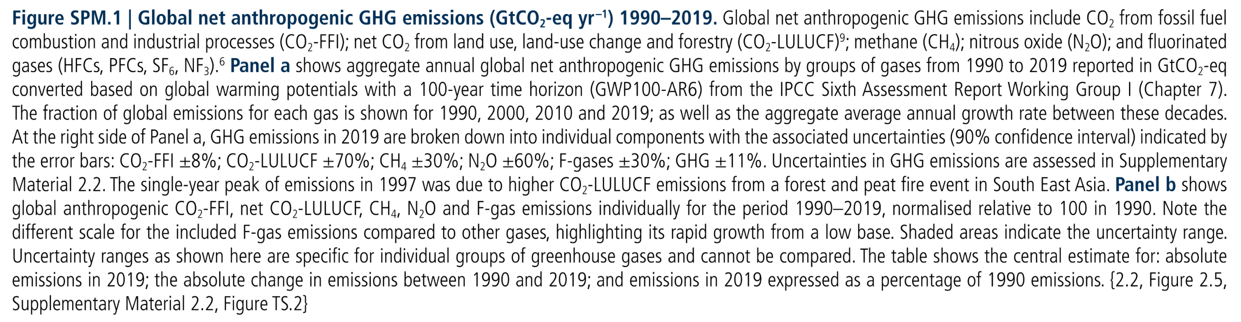
Figure SPM.1:  Global net anthropogenic GHG emissions (GtCO2-eq yr –1) 1990–2019. Global net anthropogenic GHG emissions include CO2 from fossil fuel combustion and industrial processes (CO2-FFI); net CO2 from land use, land-use change and forestry (CO2-LULUCF); methane (CH4); nitrous oxide (N2O); and fluorinated gases (HFCs, PFCs, SF6, NF3).6 Panel a shows aggregate annual global net anthropogenic GHG emissions by groups of gases from 1990 to 2019 reported in GtCO2-eq converted based on global warming potentials with a 100-year time horizon (GWP100-AR6) from the IPCC Sixth Assessment Report Working Group I (Chapter 7). The fraction of global emissions for each gas is shown for 1990, 2000, 2010 and 2019; as well as the aggregate average annual growth rate between these decades. At the right side of Panel a, GHG emissions in 2019 are broken down into individual components with the associated uncertainties (90% confidence interval) indicated by the error bars: CO2-FFI ±8%; CO2-LULUCF ±70%; CH4 ±30%; N2O ±60%; F-gases ±30%; GHG ±11%. Uncertainties in GHG emissions are assessed in Supplementary Material 2.2. The single-year peak of emissions in 1997 was due to higher CO2-LULUCF emissions from a forest and peat fire event in South East Asia. Panel b shows global anthropogenic CO2-FFI, net CO2-LULUCF, CH4, N2O and F-gas emissions individually for the period 1990–2019, normalised relative to 100 in 1990. Note the different scale for the included F-gas emissions compared to other gases, highlighting its rapid growth from a low base. Shaded areas indicate the uncertainty range. Uncertainty ranges as shown here are specific for individual groups of greenhouse gases and cannot be compared. The table shows the central estimate for: absolute emissions in 2019; the absolute change in emissions between 1990 and 2019; and emissions in 2019 expressed as a percentage of 1990 emissions.
Source: IPCC AR6 WGIII SPM, Figure SPM.1

Total annual anthropogenic GHG emissions by major economic sector and their underlying trends by region
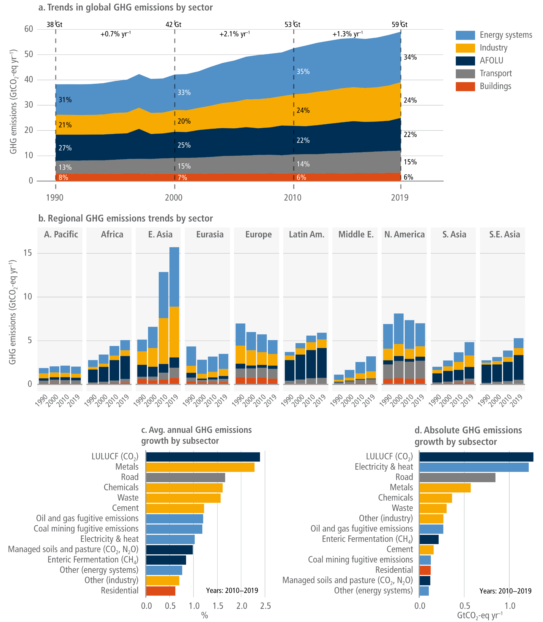

A four-panel infographic visualising global and regional greenhouse gas emission trends by major economic sector from 1990 to 2019.  Panel A is a stacked area chart showing total global emissions rising steadily from 38 gigatonnes in 1990 to 59 gigatonnes in 2019. Energy systems and Industry are the largest and fastest-growing sectors, making up 34 percent and 24 percent of the 2019 total respectively. They are followed by Agriculture, Forestry and Other Land Use at 22 percent, Transport at 15 percent, and Buildings at 6 percent.  Panel B features a series of stacked bar charts breaking down these sectoral emissions across ten global regions for the snapshot years 1990, 2000, 2010, and 2019. East Asia shows the most dramatic increase, becoming the largest regional emitter by a wide margin in 2019, heavily driven by energy and industry. Europe and North America show slight recent declines, while regions like South Asia, South-East Asia, and Africa show steady upward trends.  Panels C and D are horizontal bar charts detailing subsector growth from 2010 to 2019. Panel C highlights average annual percentage growth, led by land use change, metals, and road transport. Panel D highlights absolute growth, visually demonstrating that land use change, electricity and heat, and road transport added the highest total gigatonnes of emissions to the atmosphere during this period.
Figure 2.13:  Total annual anthropogenic GHG emissions by major economic sector and their underlying trends by region. Panel (a): Trends in total annual anthropogenic GHG emissions (in GtCO2-eq yr –1) by major economic sector. Panel (b): Trends in total annual anthropogenic GHG emissions (in GtCO2-eq yr –1) by major economic sector and region. Panels c and d: Largest subsectoral changes in GHG emissions for the reporting period 2010–2019 in relative (% annual change) and absolute terms (GtCO2-eq yr –1). Emissions are converted into CO2-equivalents based on global warming potentials with a 100-year time horizon (GWP100) from the IPCC Sixth Assessment Report. Source: based on Lamb et al. (2021b); Data: Crippa et al. (2021); Minx et al. (2021).
Source: IPCC (2022) AR6 WGIII Chapter 2, Figure 2.13, pg. 238

Regional GHG emissions, and the regional proportion of total cumulative production-based CO2 emissions from 1850 to 2019
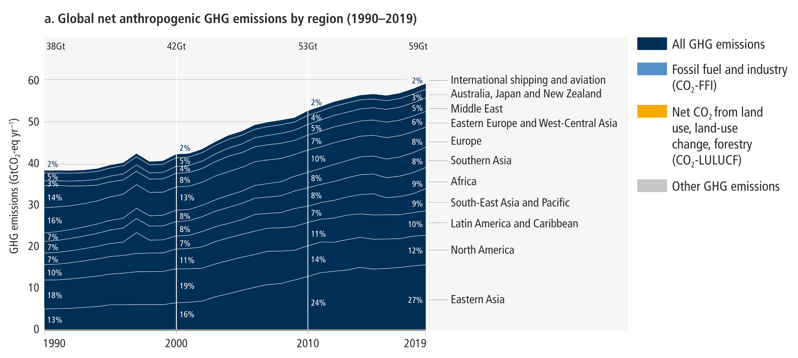
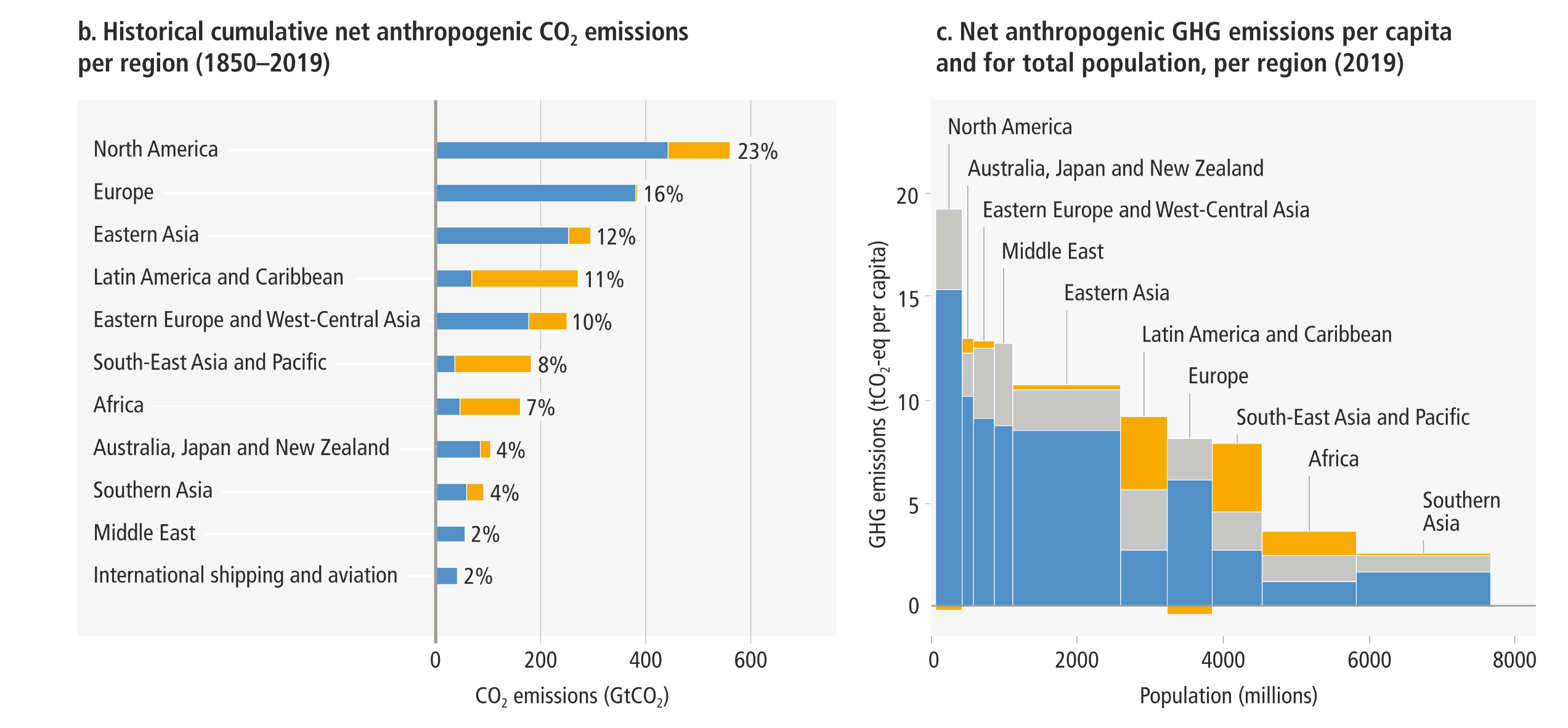
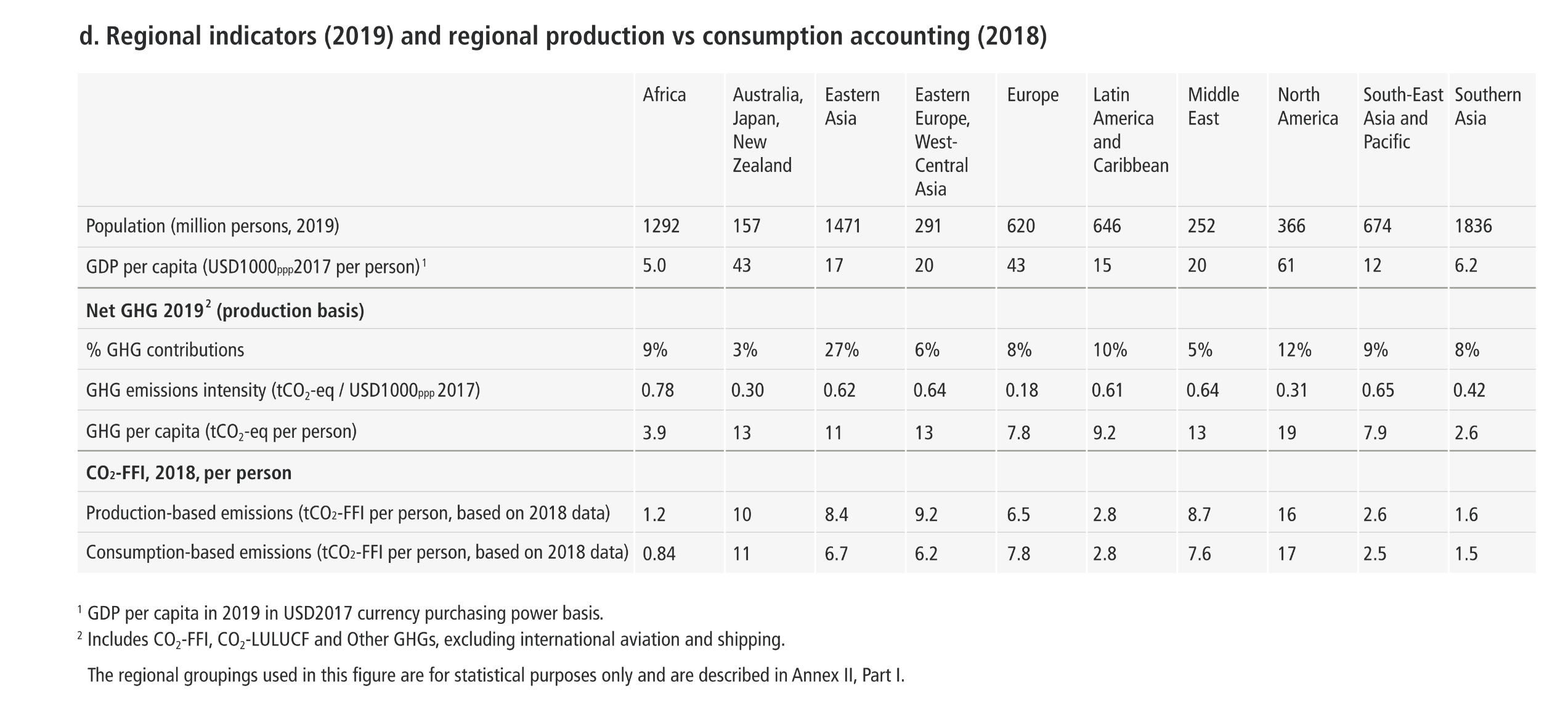
A comprehensive four-panel infographic detailing global and regional greenhouse gas emissions.  Panel A is a stacked area chart showing total global emissions rising from 38 gigatonnes in 1990 to 59 gigatonnes in 2019. Eastern Asia forms the largest and fastest-growing layer at the bottom, expanding to represent 27 percent of the total by 2019, while the proportional shares of North America and Europe visually narrow over time.  Panel B is a horizontal bar chart ranking historical cumulative carbon dioxide emissions from 1850 to 2019. North America leads with 23 percent, followed by Europe at 16 percent and Eastern Asia at 12 percent. Most top-emitting regions show a heavy dominance of blue fossil fuel emissions over yellow land-use emissions.  Panel C is a variable-width bar chart comparing per capita emissions on the vertical axis against total population on the horizontal axis for 2019. It visually highlights extreme disparities: North America has the tallest bar indicating the highest per capita emissions, whereas Southern Asia has the widest but shortest bar, reflecting a massive population with very low individual emissions.  Panel D is a detailed data matrix summarising 2019 regional indicators, comparing metrics such as population, GDP per capita, and production versus consumption-based emissions across ten global regions.


Figure SPM.2:  Regional GHG emissions, and the regional proportion of total cumulative production-based CO2 emissions from 1850 to 2019. Panel a shows global net anthropogenic GHG emissions by region (in GtCO2-eq yr –1 (GWP100-AR6)) for the time period 1990–2019.6 Percentage values refer to the contribution of each region to total GHG emissions in each respective time period. The single-year peak of emissions in 1997 was due to higher CO2-LULUCF emissions from a forest and peat fire event in South East Asia. Regions are as grouped in Annex II. Panel b shows the share of historical cumulative net anthropogenic CO2 emissions per region from 1850 to 2019 in GtCO2. This includes CO2 from fossil fuel combustion and industrial processes (CO2-FFI) and net CO2 emissions from land use, land-use change, forestry (CO2-LULUCF). Other GHG emissions are not included.6 CO2-LULUCF emissions are subject to high uncertainties, reflected by a global uncertainty estimate of ±70% (90% confidence interval). Panel c shows the distribution of regional GHG emissions in tonnes CO2-eq per capita by region in 2019. GHG emissions are categorised into: CO2-FFI; net CO2-LULUCF; and other GHG emissions (methane, nitrous oxide, fluorinated gases, expressed in CO2-eq using GWP100-AR6). The height of each rectangle shows per capita emissions, the width shows the population of the region, so that the area of the rectangles refers to the total emissions for each region. Emissions from international aviation and shipping are not included. In the case of two regions, the area for CO2-LULUCF is below the axis, indicating net CO2 removals rather than emissions. CO2-LULUCF emissions are subject to high uncertainties, reflected by a global uncertainty estimate of ±70% (90% confidence interval). Panel d shows population, GDP per person, emission indicators by region in 2019 for percentage GHG contributions, total GHG per person, and total GHG emissions intensity, together with production-based and consumption-based CO2-FFI data, which is assessed in this report up to 2018. Consumption-based emissions are emissions released to the atmosphere in order to generate the goods and services consumed by a certain entity (e.g., region). Emissions from international aviation and shipping are not included.
Source: IPCC AR6 WGIII SPM, Figure SPM.2

Different perspectives on historic emissions and equity
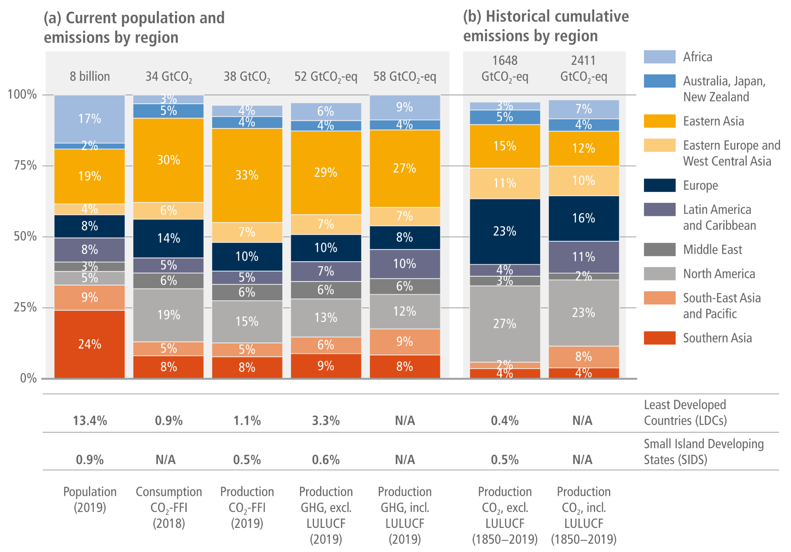
A two-part 100 percent stacked bar chart and data table comparing regional global population shares against current and historical greenhouse gas emissions.  Panel A on the left displays current data across five stacked bars, contrasting the 2019 population distribution with various 2018 and 2019 emission metrics. It visually highlights significant regional inequities: Southern Asia and Africa account for 24 percent and 17 percent of the 8 billion global population respectively, yet their shares of current global emissions are disproportionately small. Conversely, Eastern Asia represents 19 percent of the population but accounts for 30 to 33 percent of current CO2 emissions, forming the largest blocks in the current emissions bars.  Panel B on the right displays historical cumulative emissions from 1850 to 2019 across two stacked bars. It illustrates that North America and Europe account for massive historical shares, 27 percent and 23 percent respectively when excluding land-use change, despite representing only 5 percent and 8 percent of the current global population.  A data table beneath the charts further underscores this inequity, showing that Least Developed Countries comprise 13.4 percent of the global population but contributed only 0.4 percent of historical cumulative CO2 emissions. Similarly, Small Island Developing States represent 0.9 percent of the population but contributed 0.5 percent or less of historical emissions.
Figure 2.10:  Different perspectives on historic emissions and equity. Panel (a) shows the regional proportion (%) of total global population or emissions in 2018 or 2019, for five categories: population (persons); consumption-based CO2-FFI emissions (GtCO2); production-based CO2-FFI emissions (GtCO2); production-based GHG emissions excluding CO2-LULUCF (GtCO2-eq); and production-based GHG emissions including CO2-LULUCF (GtCO2-eq). Panel (b) shows the regional proportion (%) of total cumulative production-based CO2 emissions from 1850 to 2019, including and excluding CO2-LULUCF (GtCO2). In the lower panels, the proportion of each population or emissions category attributable to Least-Developed Countries and Small Island Developing States (SIDS) are shown, where available (CO2-LULUCF data is not available for these regions). GHG emissions are converted into CO2-equivalents based on global warming potentials with a 100-year time horizon (GWP100) from the IPCC Sixth Assessment Report (Forster et al. 2021a). Source: data from Friedglinstein et al. (2020).
Source: IPCC (2022) AR6 WGIII Chapter 2, Figure 2.10, pg. 235

Change in regional GHGs from multiple perspectives and their underlying drivers
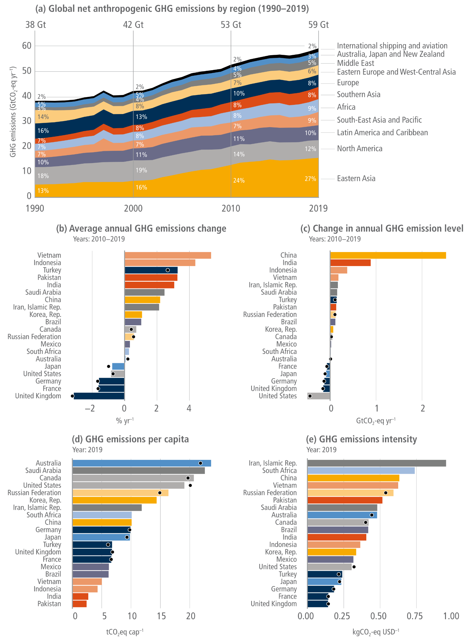
A five-panel infographic visualising changes in regional greenhouse gas emissions and their underlying drivers.  Panel A is a stacked area chart tracking global net anthropogenic emissions from 1990 to 2019. It shows total emissions rising from 38 to 59 gigatonnes. Eastern Asia forms the largest bottom layer, expanding from 13 percent to 27 percent of the global total, while the proportional shares of North America and Europe visibly narrow over time.  Panels B and C are bar charts detailing emissions changes for the 20 largest emitters from 2010 to 2019. Panel B shows the average annual percentage change, highlighting Vietnam and Indonesia with the highest growth rates, while nations like the United Kingdom, France, Germany, and the United States show percentage reductions. Panel C shows the absolute change in gigatonnes, visually dominated by a massive increase in China that far exceeds all other nations, followed by India, while the United States and United Kingdom show the largest absolute decreases.  Panels D and E are bar charts showing underlying drivers for the top 20 emitters in 2019. Panel D ranks emissions per capita, with Australia, Saudi Arabia, Canada, and the United States displaying the highest individual carbon footprints, whilst India and Pakistan show the lowest. Panel E ranks emissions intensity per GDP, with the Islamic Republic of Iran, South Africa, and China at the top, and the United Kingdom, France, and Germany at the bottom.
Figure 2.9:  Change in regional GHGs from multiple perspectives and their underlying drivers. Panel (a): Regional GHG emissions trends (in GtCO2-eq yr –1) for the time period 1990–2019. GHG emissions from international aviation and shipping are not assigned to individual countries and shown separately. Panels (b) and (c): Changes in GHG emissions for the 20 largest emitters (as of 2019) for the post-AR5 reporting period 2010–2019 in relative (% annual change) and absolute terms (GtCO2-eq). Panels (d) and (e): GHG emissions per capita and per GDP in 2019 for the 20 largest emitters (as of 2019). GDP estimated using constant international purchasing power parity (USD2017). Emissions are converted into CO2-equivalents based on global warming potentials with a 100-year time horizon (GWP100) from the IPCC Sixth Assessment Report (Forster et al. 2021a). The black dots represent the emissions data from UNFCCC-CRFs (2021) that were accessed through Gütschow et al. (2021a). Net LULUCF CO2 emissions are included in panel (a), based on the average of three bookkeeping models (Section 2.2), but are excluded in panels (b–e) due to a lack of country resolution.
Source: IPCC (2022) AR6 WGIII Chapter 2, Figure 2.9, pg. 234

Consumption-based CO2 emissions trends for the period 1990–2018
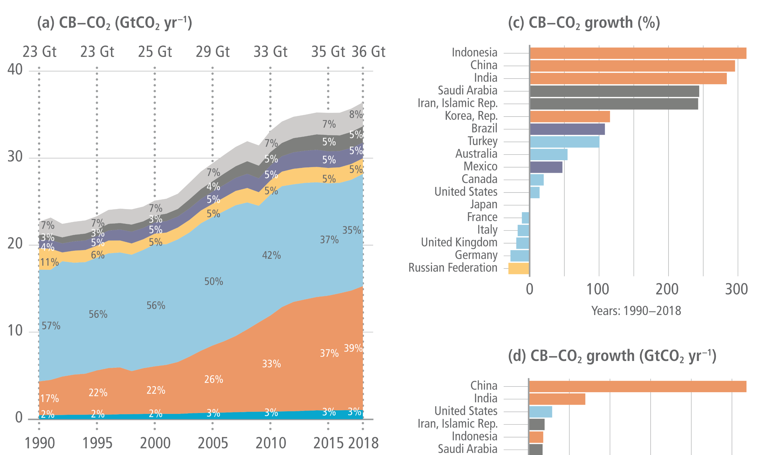
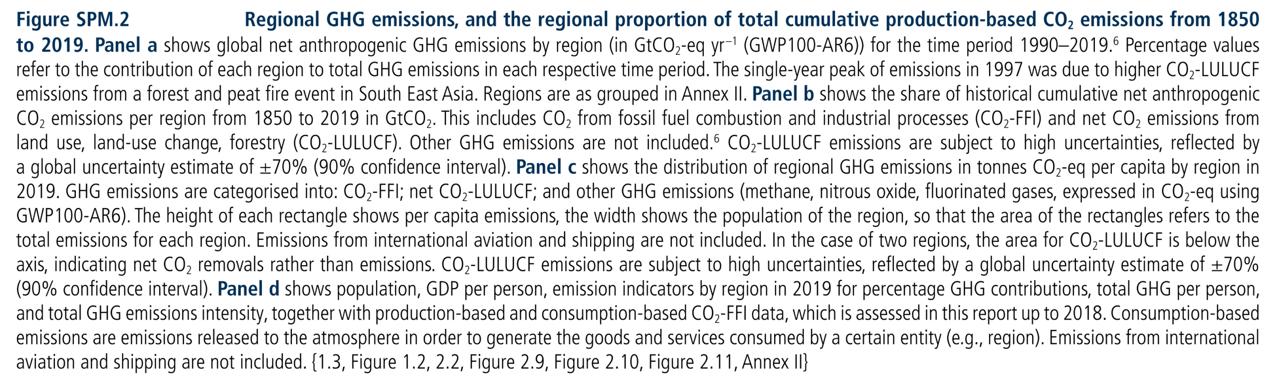
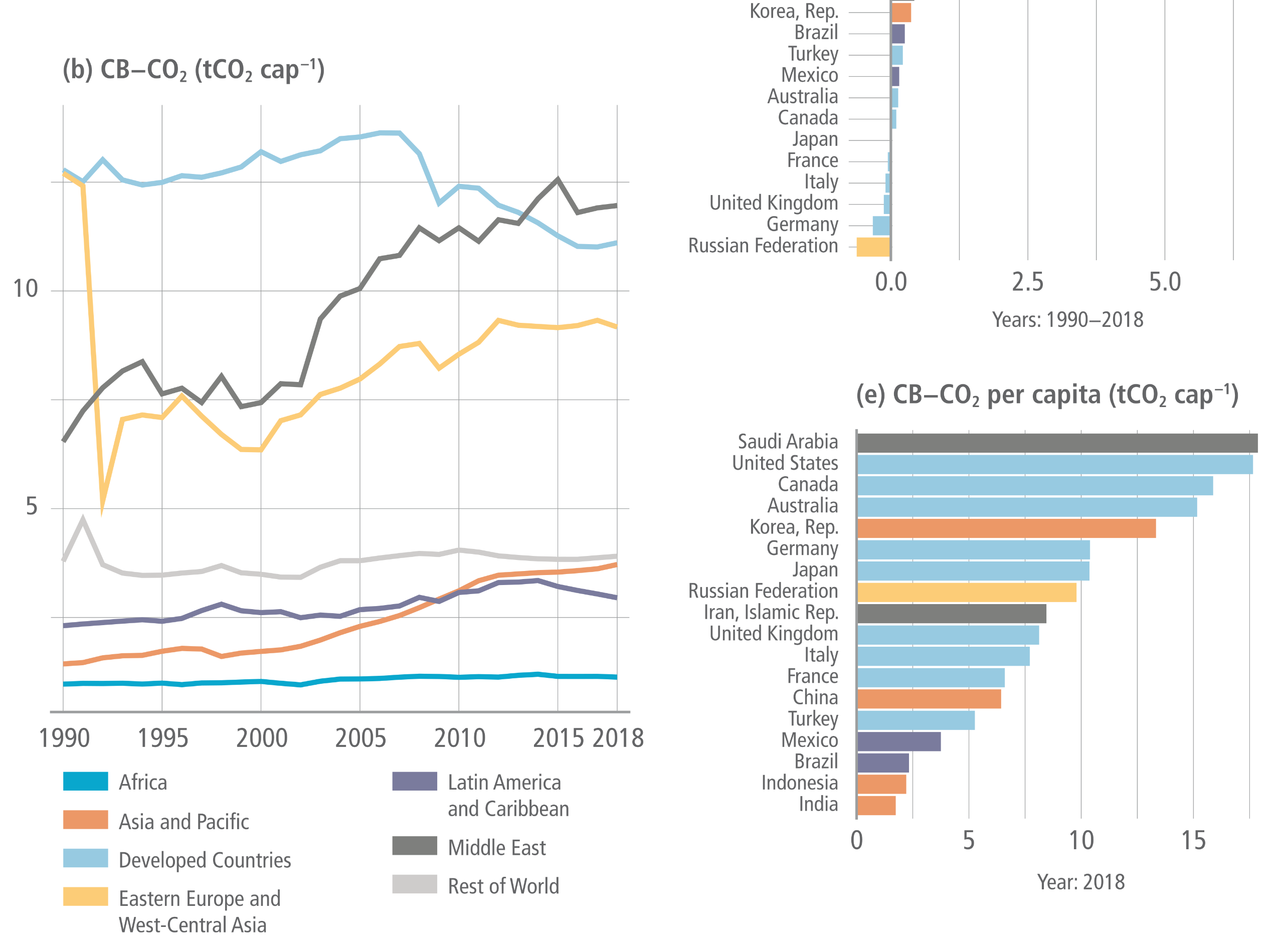
A five-panel infographic visualising consumption-based carbon dioxide emissions trends from 1990 to 2018. A colour-coded legend identifies seven global regions.  Panel A is a stacked area chart showing total global consumption-based emissions rising from 23 gigatonnes in 1990 to 36 gigatonnes in 2018. It visually highlights a major regional shift: the proportional share of Developed Countries shrank from 57 percent to 35 percent, while the Asia and Pacific region expanded massively from 17 percent to 39 percent.  Panel B is a line graph tracking per capita emissions across these regions over the same period. Developed Countries consistently maintain the highest per capita levels, although the Middle East shows a sharp upward trend, nearly matching them by 2018. The Asia and Pacific, Latin America, and Africa regions remain near the bottom with much lower per capita averages.  Panels C and D are horizontal bar charts detailing emissions growth for specific nations between 1990 and 2018. Panel C shows percentage growth, led by Indonesia, China, and India at near 300 percent, while several European nations and the Russian Federation show percentage reductions. Panel D shows absolute growth, visually dominated by a massive increase in China that dwarfs all other nations, followed by India, whilst the Russian Federation shows the largest absolute decrease.  Panel E is a bar chart ranking 2018 per capita emissions by country. Saudi Arabia and the United States display the highest individual carbon footprints, whilst Indonesia and India display the lowest.

Figure 2.14:  Consumption-based CO2 emissions trends for the period 1990–2018. The CBEs of countries are collected from the Global Carbon Budget 2020 (Friedlingstein et al. 2020). Source: this figure is modified based on Hubacek et al. (2021).
Source: IPCC (2022) AR6 WGIII Chapter 2, Figure 2.14, pg. 241

Sustainable development pathways towards fulfilling the Sustainable Development Goals
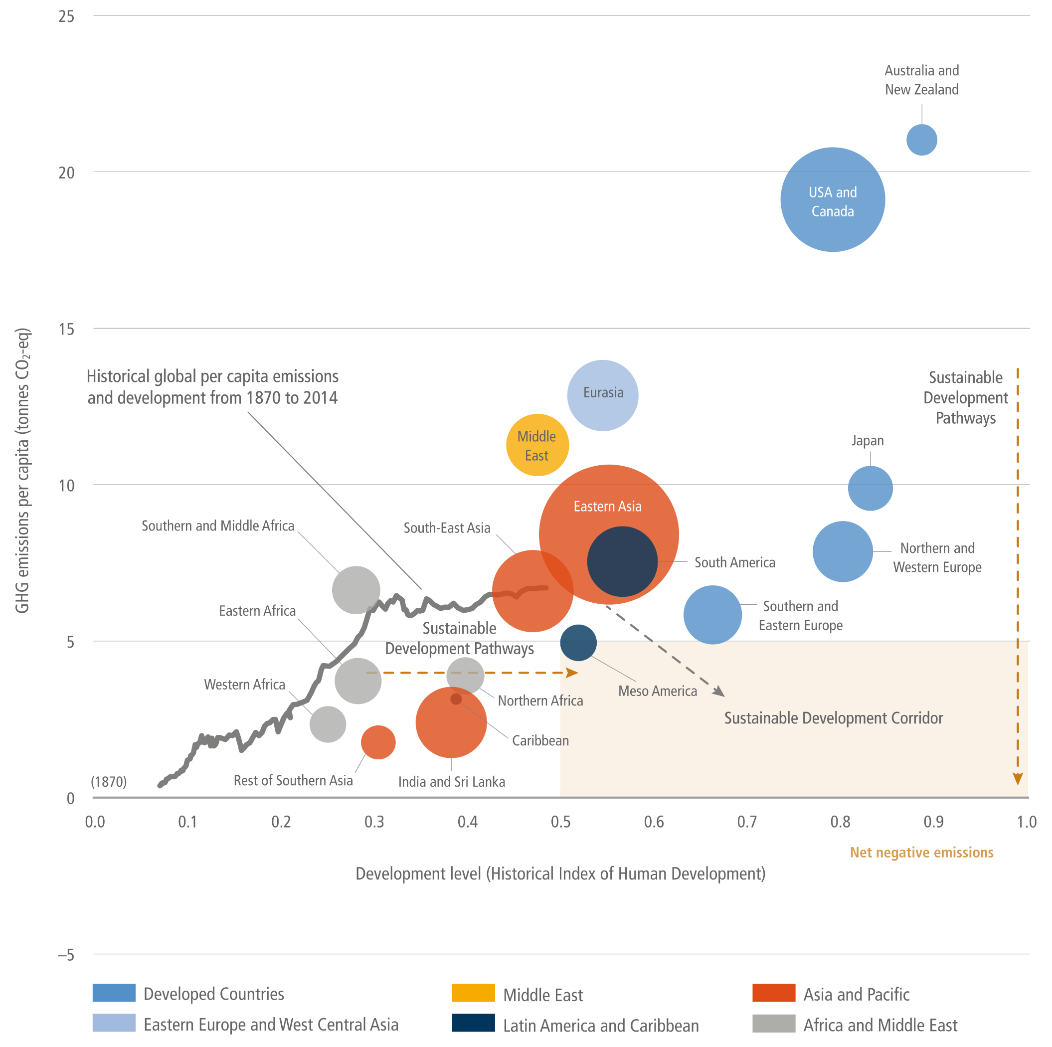
A bubble chart plotting regional greenhouse gas emissions per capita against human development levels. The vertical axis measures emissions from minus 5 to 25 tonnes, and the horizontal axis measures the Historical Index of Human Development from 0.0 to 1.0.  A jagged grey line traces global history from 1870, starting near zero for both metrics and rising to roughly 6 tonnes and a 0.5 development score by 2014. Scattered across the chart are coloured bubbles representing 2015 regional data. In the bottom left, grey and orange bubbles for African and South Asian regions show low development scores and emissions below 5 tonnes. In the middle, a massive orange bubble for Eastern Asia sits around 8 tonnes and a 0.6 development score. In the top right, blue bubbles for developed nations show high development but extremely high emissions, peaking with the USA and Canada near 19 tonnes, and Australia and New Zealand near 21 tonnes.  In the bottom right corner, a pale brown box highlights the sustainable development corridor, defined by high development above 0.5 and emissions below 5 tonnes. Dashed brown arrows illustrate required pathways into this zone, showing that highly developed nations must drastically reduce emissions downwards, while developing nations must increase their development scores rightwards without significantly raising emissions.
Figure TS.1:  Sustainable development pathways towards fulfilling the Sustainable Development Goals. The graph shows global average per-capita GHG emissions (vertical axis) and relative ‘Historic Index of Human Development’ (HIHD) levels (horizonal) have increased globally since the industrial revolution (grey line). The bubbles on the graph show regional per-capita GHG emissions and human development levels in the year 2015, illustrating large disparities. Pathways towards fulfilling the Paris Agreement (and SDG 13) involve global average per-capita GHG emissions below about 5 tCO2-eq by 2030. Likewise, to fulfil SDGs 3, 4 and 8, HIHD levels (see footnote 7 in Chapter 1) need to be at least 0.5 or greater. This suggests a ‘sustainable development zone’ for year 2030 (in pale brown); the in-figure text also suggests a ‘sustainable development corridor’, where countries limit per-capita GHG emissions while improving levels of human development over time. The emphasis of pathways into the sustainable development zone differ (dashed brown arrows), but in each case transformations are needed in how human development is attained while limiting GHG emissions.
Source: IPCC (2022) AR6 WGIII TS, Figure TS.1, pg.56


Sources for this post:


Featured image: background by Arthur Yao on Unsplash, foreground IPCC (2022) AR6 WGIII TS Figure TS.3b